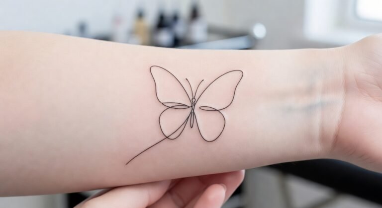
Fine Line Sleeve Tattoo Women can age well when your symbols, spacing, placement, and aftercare work together from the first sketch. I learned that the hard way after watching tiny details blur when they were packed too tightly. Your sleeve needs a plan before the needle arrives. Start with the skin, not the trend.
A clear reference board, a realistic budget, and a patient artist will save you from rushed decisions. You’ll want black ink, thoughtful negative space, and enough breathing room for every motif to stay readable.
Before You Start: What Will Your Sleeve Need?
Before you book, collect references that match your desired line weight, placement, and mood. Your artist can’t read your mind, so bring fine line tattoo ideas that show what you like and what you’d reject. Include healed examples when you can, because a fresh tattoo only shows the first chapter.
You’ll also need a budget conversation. A typical US studio minimum may sit around $50 to $100, while many artists charge roughly $100 to $250 per hour. Your final price depends on the artist, region, design density, and session plan.
Don’t choose someone only because they’re cheaper.
Your sleeve may need multiple sessions, especially if you’re combining symbols, florals, and larger negative-space areas. You’ll want to ask about breaks, deposits, touch-ups, and how the artist documents healed work. This fine-line placement guide can help you prepare better questions.
Bring your own boundaries, too. If you don’t want the design visible at work, say so before placement begins.
If you’re sensitive around the wrist or elbow, say that clearly. Your artist can’t protect preferences you haven’t shared.
A reference board should include several styles, but it shouldn’t become a pile of copied designs. Add one or two striking examples, a few delicate ones, and notes about what attracts you. That mix makes your taste easier to explain.
Before you commit, check whether the artist’s portfolio includes healed work on skin close to yours. Fresh tattoos can look crisp, vibrant, and almost luminous at first. Healed results tell you whether the artist’s decisions remain readable later.
- Start With Fine Line Sleeve Tattoo Women Sketches
- Pick Delicate Symbols For A Feminine Arm
- Place Botanical Linework Along The Forearm
- Choose Meaningful Motifs For Your Sleeve
- Plan Dainty Arm Tattoo Flow Around Curves
- Keep Fine Lines Crisp Through Layered Designs
- Add Intricate Details Without Crowding The Skin
- Balance Minimal Shapes With Striking Accents
- Match Tattoo Design Drawings To Your Style
- Prepare For Pain During Arm Sleeve Sessions
- Protect Elegant Linework Through Careful Healing
1Start With Fine Line Sleeve Tattoo Women Sketches
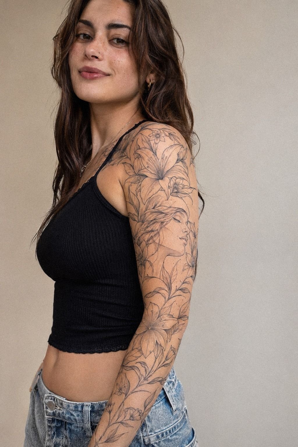
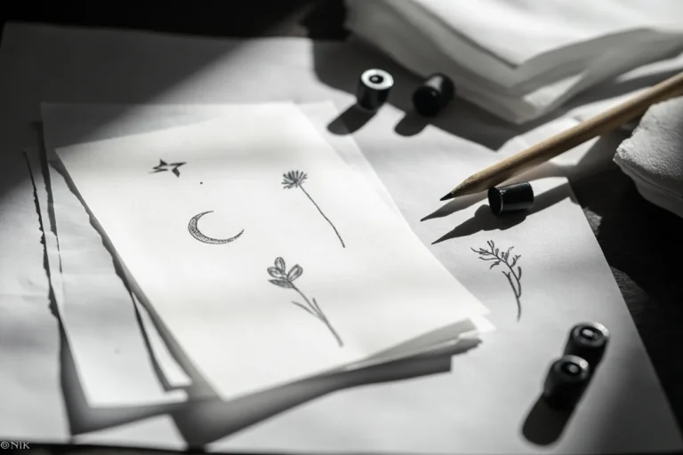
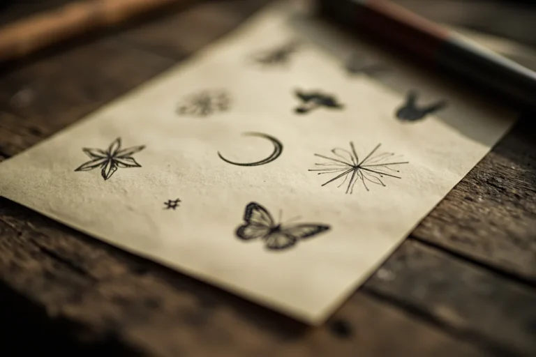
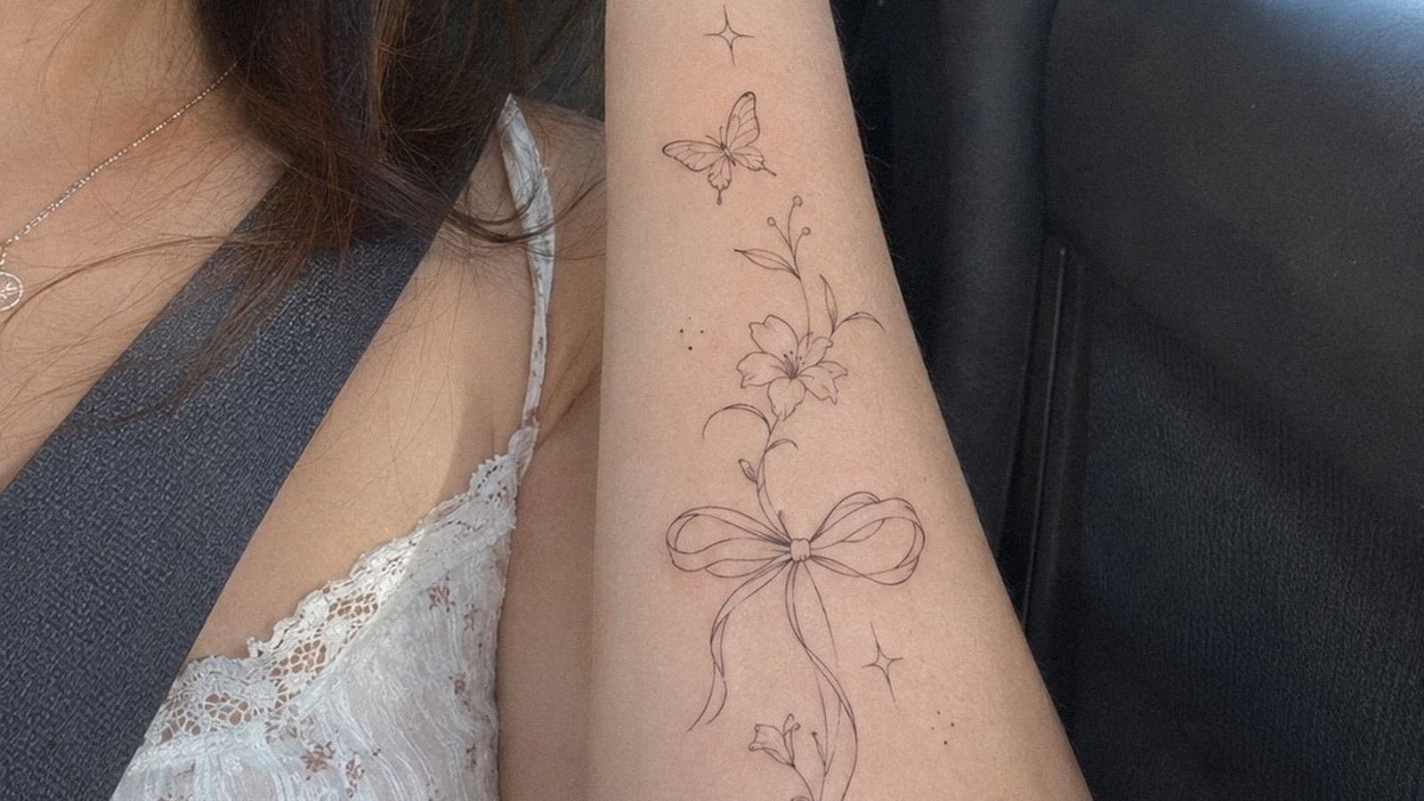
Start with several loose sketches before you commit to one polished composition. Your first board might include stars, moons, leaves, small animals, lettering, and abstract marks, but the final sleeve shouldn’t feel like eleven unrelated stickers. Choose one visual thread, such as a repeated single-needle line, a shared curve, or a consistent symbol scale.
I’d begin with three large categories: anchors, connectors, and quiet spaces. Anchors carry the eye, connectors guide it, and quiet spaces stop the sleeve from becoming noisy.
A few delicate stars can support a larger botanical form, but they shouldn’t compete with it. Your sketch should show where the eye rests first.
Don’t let Pinterest decide every detail for you. A design can look intricate on paper and still feel awkward on your arm. Print the sketch at approximate size, tape it to your forearm, and look at it while your arm bends.
You’ll notice whether the symbols remain readable or collapse into a dark cluster.
Use a fine-line planning reference for research, then edit aggressively. I’d skip copying a complete reference because your anatomy won’t match the model’s.
Choose the mood, not the exact arrangement. Your final drawing should feel personal, expressive, and slightly unexpected.
Let your artist know which motifs must remain recognizable from a distance. A main focal motif may need more open skin than the smaller supporting marks. If every piece receives equal emphasis, your sleeve can lose its visual hierarchy.
Build a Motif Map Before You Book
A motif map turns scattered ideas into a readable story. Write down the symbols you want, then mark each as an anchor, connector, accent, or pause. This simple step can reveal that you have six focal pieces and no quiet space between them.
Your anchors might be a flower, a moon, a portrait detail, or a meaningful object. Connectors can be stems, ribbons, dots, stars, or a flowing botanical branch.
Pauses are just as important. They give your eye somewhere to rest and help each mark stay crisp as the skin changes.
I’d keep the most personal symbol somewhere you’ll enjoy seeing often. A hidden inner-arm detail can feel sacred, while an outer-forearm piece can be more visible and conversational. Neither choice is automatically better.
It depends on what your tattoo means to you.
2Pick Delicate Symbols For A Feminine Arm

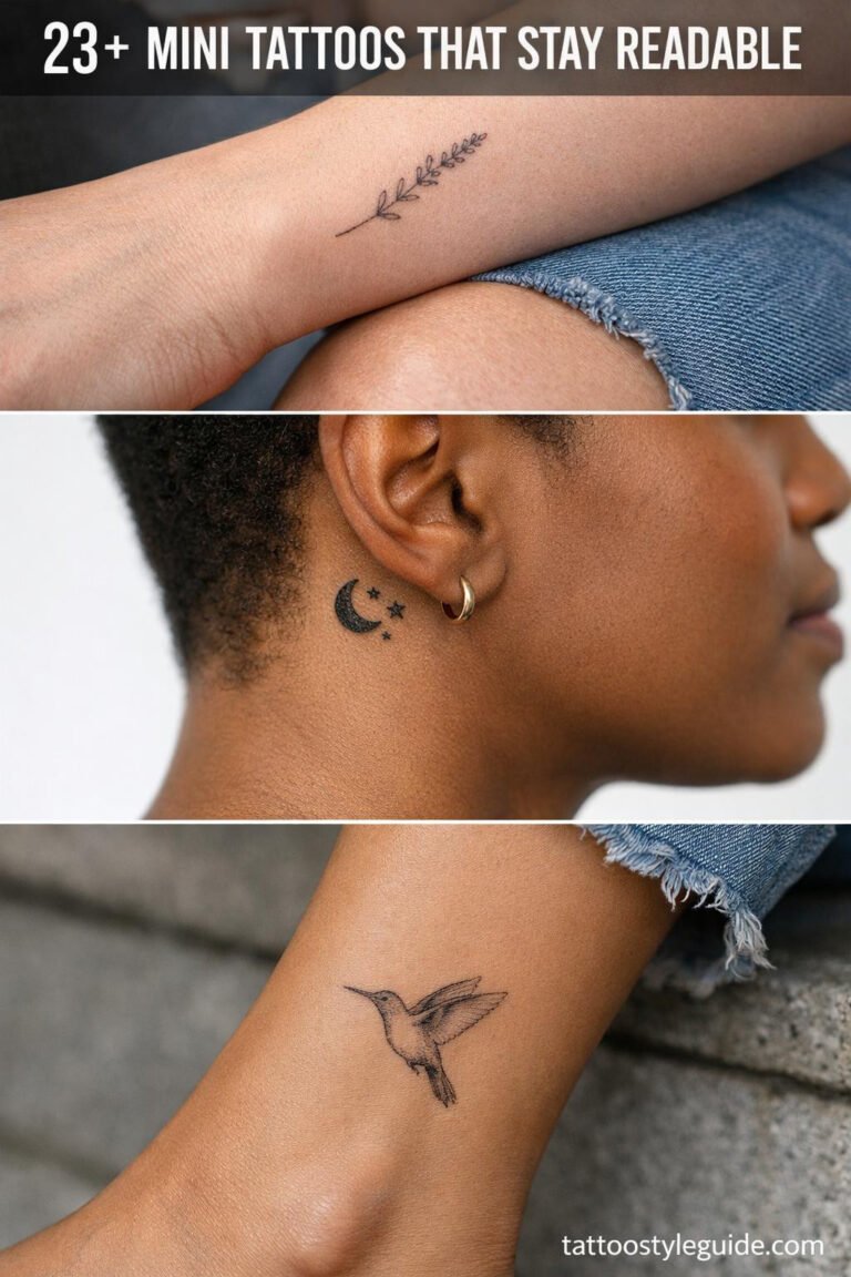
Pick symbols that carry meaning without requiring a large block of ink. A crescent, tiny key, open eye, ribbon, bird, or birth flower can create a feminine sleeve when the placement feels intentional.
Your choice doesn’t need to be traditionally feminine to look dainty. Scale, curvature, and spacing do more work than the subject itself.
For a fine line tattoo words concept, keep lettering short and give every letter room. Small script can become difficult to read if the strokes are too close, especially near a crease. Ask your artist to test the phrase at the intended size and to show you how it follows the arm’s natural direction.
Don’t confuse tiny with timeless. Symbols that are reduced too far may lose their crisp edges as the ink settles. I’d rather see one meaningful symbol at a readable scale than five miniature marks competing for space.
Your sleeve should feel elegant today and legible later.
Consider contrast between motifs. A quiet moon beside a sharp star creates movement.
A soft floral mark beside a bold heart creates hierarchy. You’ll want one or two daring symbols so the design doesn’t become visually flat.
The result can be personal, polished, and still unmistakably yours.
A birth flower symbol can feel meaningful without dominating the whole composition. If you choose one, ask whether its petals need open outlines, selective shading, or a slightly larger scale. Your artist can preserve its identity without forcing every botanical detail into a tiny space.
Let Skin and Scale Set the Rhythm
Scale is where a beautiful concept becomes a wearable sleeve. A symbol that looks ornate on a screen may need to be enlarged before it can survive on skin. Your artist should show you the design at actual size, not only as a small digital drawing.
Try holding your arm naturally while you review the stencil. A readable tattoo scale should work when your arm is relaxed, bent, and turned. If you can understand the main shapes only when you twist into one position, the design needs another pass.
You can also vary detail by location. The outer forearm may support a crisp focal piece, while the wrist benefits from a simpler mark. The inner arm can hold a personal detail, but friction and movement deserve consideration.
3Place Botanical Linework Along The Forearm
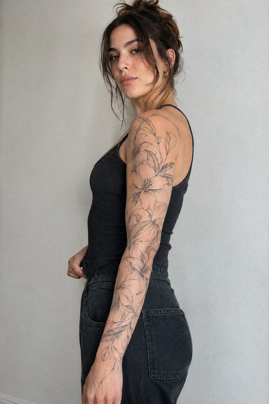
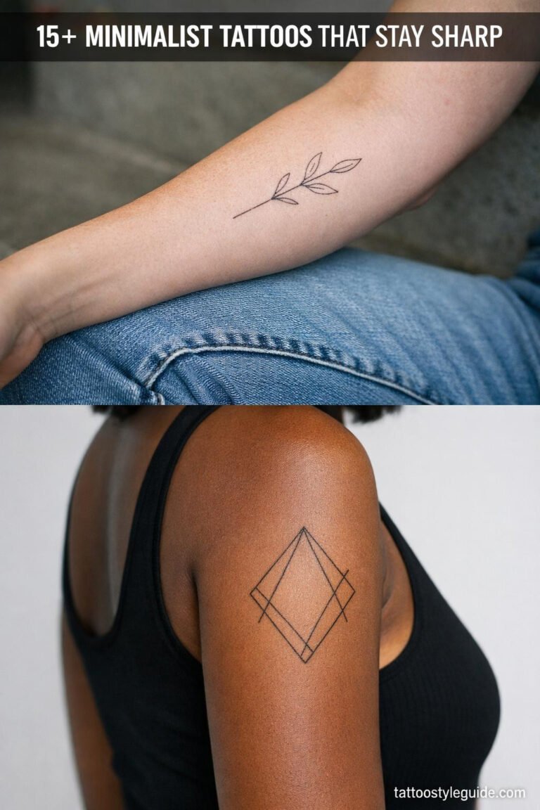
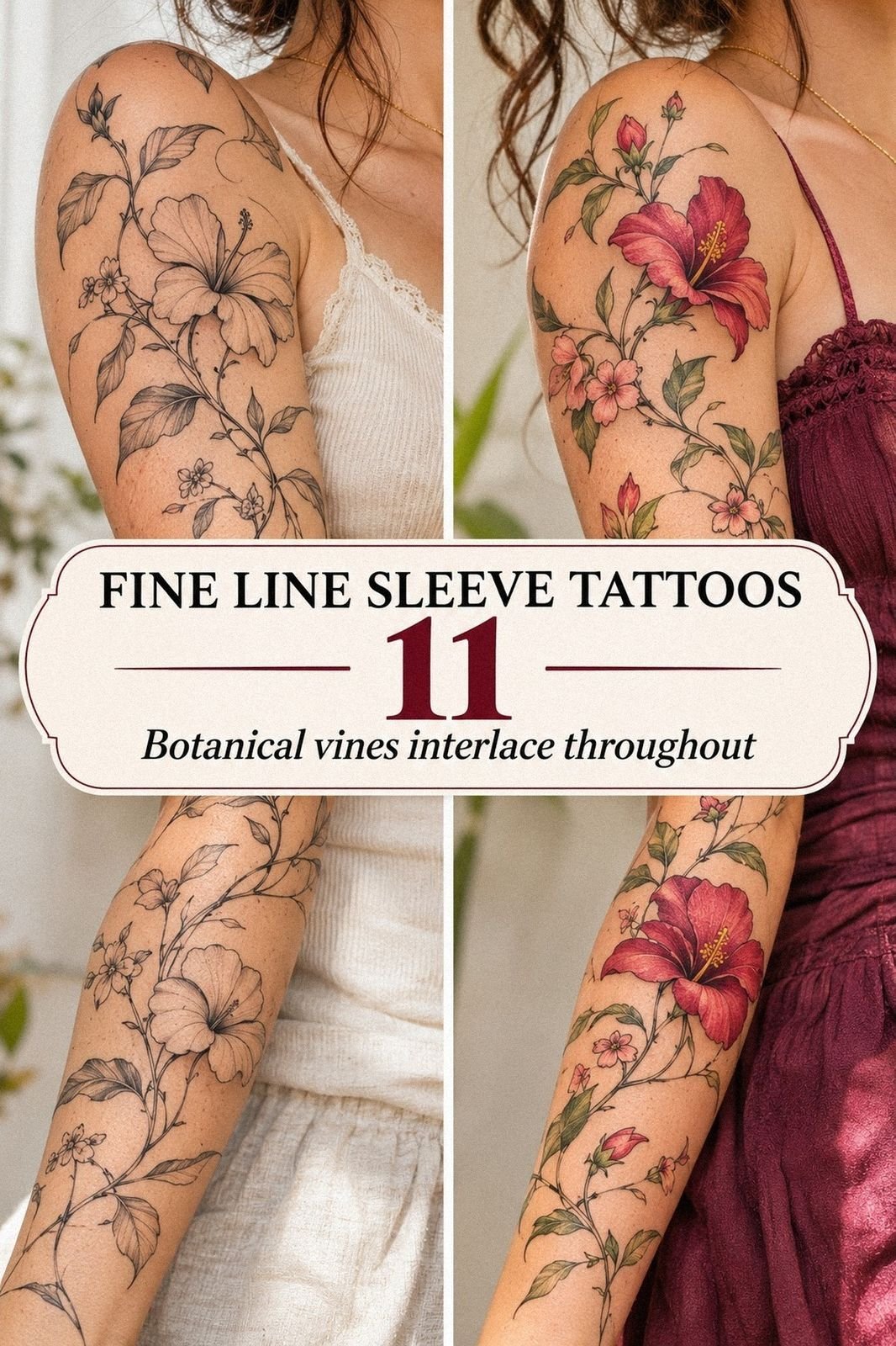
Place botanical linework where the stems can follow your arm instead of fighting its movement. A fine leaf branch can travel from the lower forearm toward the elbow, while smaller petals can point toward the wrist. Your artist should rotate the design on your body, because a drawing that looks graceful on paper may twist when your hand turns.
A fine line lily tattoo can work beautifully as an anchor when the petals have enough open skin around them. Ask for the flower to be shaped around the forearm rather than stamped straight across it. The stem can create a flowing path, while the leaves fill awkward gaps without making the sleeve feel crowded.
I’d avoid placing every flower at the same angle. Repetition can become stiff, especially when each bloom faces forward. Instead, let one flower look open, one turn slightly away, and one sit in profile.
You’ll get a graceful rhythm that feels drawn rather than assembled.
Think about the future before you add background marks. Fine botanical details may soften with time, so heavy shading between every leaf can make the sleeve harder to refresh. These sun-line tattoo references may help you compare open botanical layouts with denser compositions.
The stem direction matters more than many people expect. A curved botanical stem can visually lengthen the arm, while a horizontal branch may make the forearm feel wider. Ask your artist to show both options before you decide.
4Choose Meaningful Motifs For Your Sleeve

Choose motifs that still matter when the trend disappears.
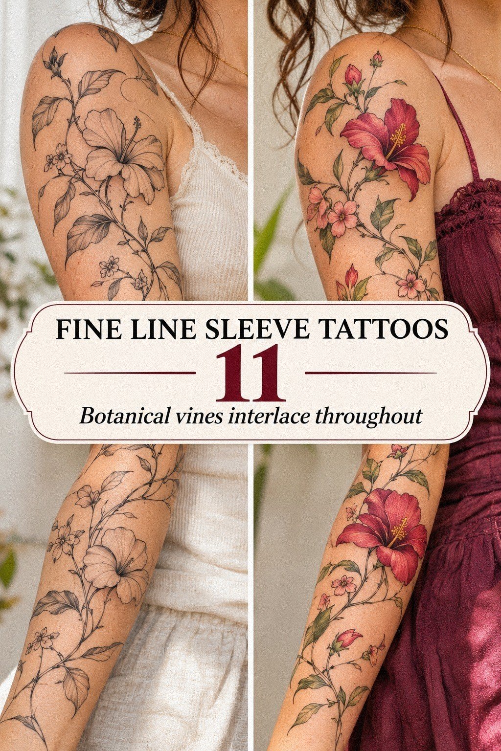
5Plan Dainty Arm Tattoo Flow Around Curves
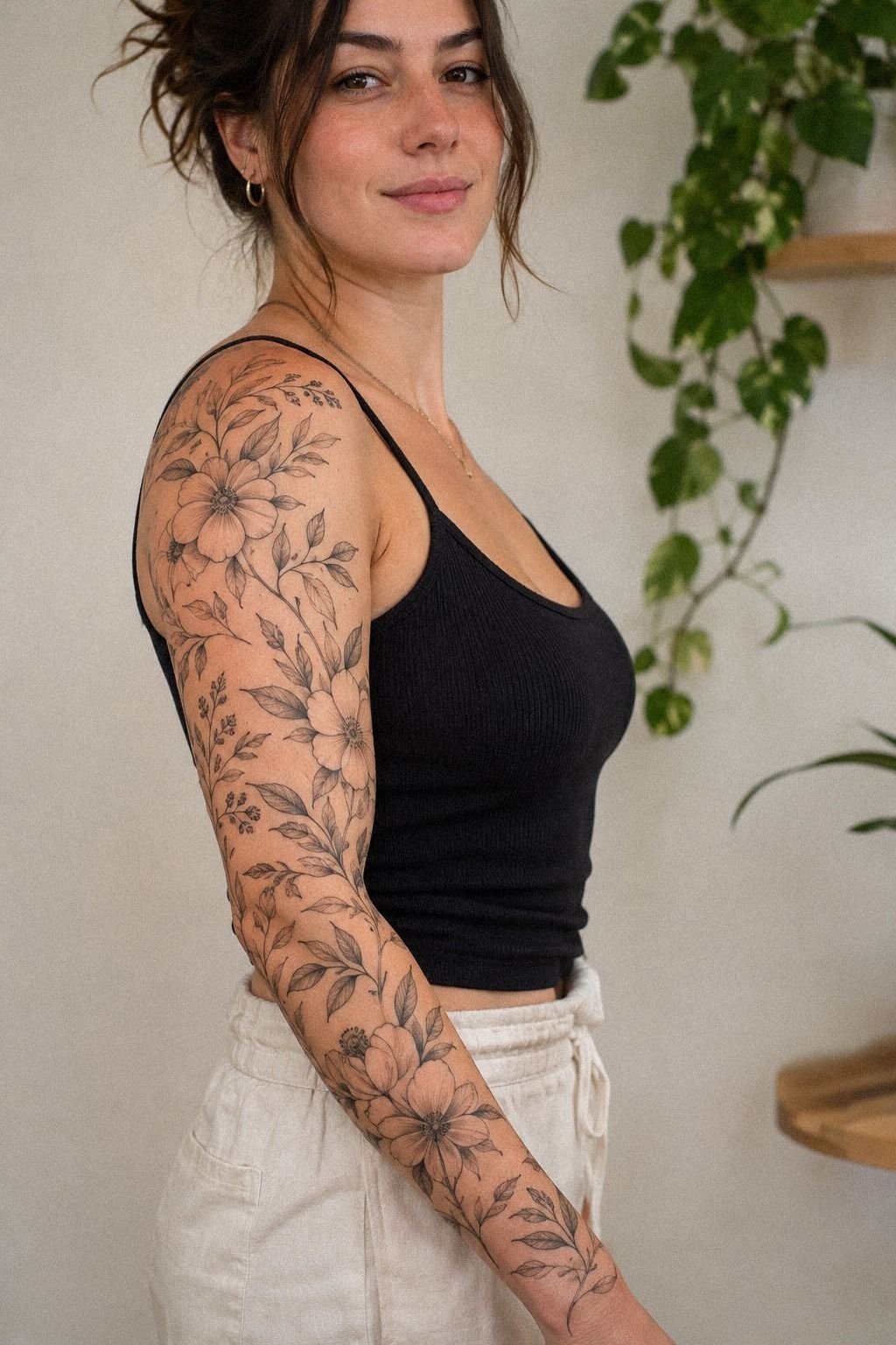
Plan the sleeve while your arm is relaxed, bent, and turned outward. The wrist, elbow crease, and inner arm all change the way your lines appear.
A dainty arm sleeve tattoo should follow those curves rather than flatten them. Your artist can place the focal mark where it reads best in your natural posture.
The elbow deserves special attention. Fine details across a moving crease may need more spacing than details on the outer forearm.
You’ll want to ask whether a motif should stop before the crease, cross it with a simpler line, or continue around the side. The best choice depends on your skin, movement, and tolerance for visibility.
I’d skip a perfectly symmetrical layout unless your references truly demand it. Real arms are not flat canvases, and forced symmetry can make the composition look rigid. A sleek stem on one side and a small symbol on the other can create balance without copying the same shape twice.
Use a temporary stencil or paper mock-up for at least one day. Walk around, wear your usual sleeves, and check whether you still like the placement from different angles. You’ll catch practical issues before the appointment, and your final design will feel more confident.
Your wrist placement needs extra thought because watches, bracelets, and frequent movement can affect how the design is seen. A small gap above the joint may keep the lowest motif cleaner. Ask your artist whether the line should end before the crease or curve around it.
What Changes at the Wrist and Elbow?
The wrist is visually narrow, so even a small mark can become a focal point. A crisp symbol may look striking there, but it needs enough space around it. If you crowd the wrist with several tiny pieces, they may compete instead of creating a graceful finish.
The elbow has a different problem. Skin folds, stretches, and moves constantly.
A simple elbow transition can age more predictably than a dense cluster of dots, lettering, and petals. Your artist may use a larger curve or a quieter connector to carry the design across that area.
Look at your arm from the side, too. A tattoo that reads beautifully from the front may disappear when your arm turns. The most successful placement considers your everyday gestures, not just one fixed position.
6Keep Fine Lines Crisp Through Layered Designs
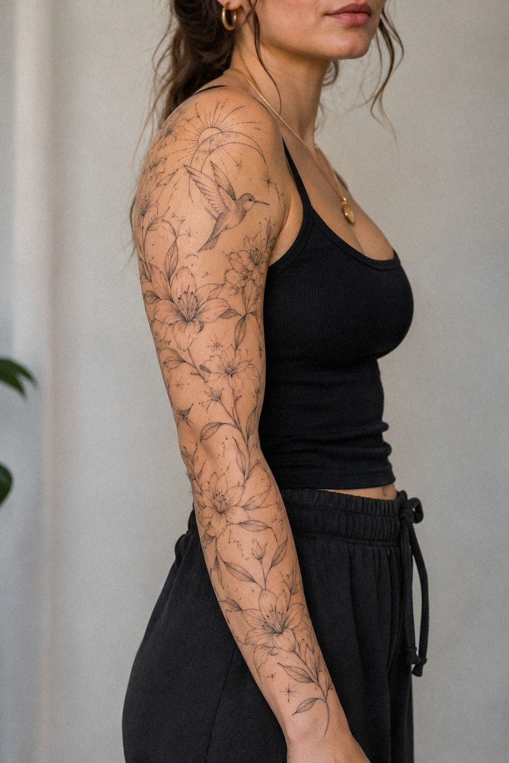
Keep the first layer simple enough that every line can be read on its own. When several motifs overlap, your artist should decide which line leads and which one fades behind it.
Black ink usually gives the clearest structure, but density still matters. Too many thin marks in one area can merge as the tattoo settles.
Ask about line weight instead of requesting “the thinnest possible.” Your skin, placement, and design size all affect what will remain visible. A crisp line on the outer forearm may need a different approach near the wrist or elbow. Your artist should explain the choice without making you feel rushed.
I’d avoid stacking tiny circles, lashes, and lettering in the same inch of skin. That cluster may look sharp in a stencil and muddy once the lines soften.
Give your eye a clear pause between layers. The contrast will make the entire sleeve feel more polished.
Protect the work after the appointment. Avoid direct sun while the skin heals, wash gently, moisturize as directed, and skip swimming until your artist says it’s safe. This fine-line longevity guide can help you compare technique, placement, and long-term expectations.
A consistent line-weight plan keeps the sleeve from feeling accidental. You might use a finer treatment for tiny accents and a slightly stronger contour for the main flower. Your artist should explain where that contrast helps readability.
7Add Intricate Details Without Crowding The Skin

Add intricate details only after the main shapes are working.
When Should a Detail Stay Out?
A detail should stay out when it requires an explanation to remain recognizable. If a tiny portrait, feather, or script phrase becomes an indistinct mark at the intended scale, enlarge it or remove it. Your sleeve has limited visual bandwidth.
You can also leave out details that create maintenance problems. Dense pale shading, tightly packed dots, and delicate lines across a high-friction crease may need more attention later. A clear negative-space gap can protect the design’s structure.
Some motifs work better as suggestions. A few graceful lines can imply a feather, wave, or stem without drawing every edge. That understated approach often feels more timeless than a miniature illustration packed with texture.
8Balance Minimal Shapes With Striking Accents

Balance minimal shapes with one or two striking accents that pull the eye across your arm. A small crescent, clean heart, or open circle can act as a visual pause beside a more detailed flower.
Your sleeve doesn’t need constant drama to feel bold. Quiet shapes can make the strongest mark.
Try grouping motifs by scale. One medium symbol can sit near several smaller pieces, while a long flowing line can connect them without adding heavy shading. Fine line arm tattoo layouts often look strongest when the empty areas are as carefully planned as the marks.
I’d avoid filling every gap simply because you have room. A minimal sleeve can feel more timeless than a dense one, especially if you want future flexibility. Your tattoo should still look sharp when viewed from several feet away, not only when someone studies it closely.
Remember that skin tone changes how contrast reads. Your artist should show healed examples on skin close to yours, especially if you’re considering very pale gray details. You’ll make a more informed choice, and the final design can stay crisp, personal, and balanced.
A minimal accent shape can give a busy composition somewhere to breathe. Think of it as a visual beat rather than an unfinished area. Your eye should move through the sleeve, not stop at every mark.
9Match Tattoo Design Drawings To Your Style
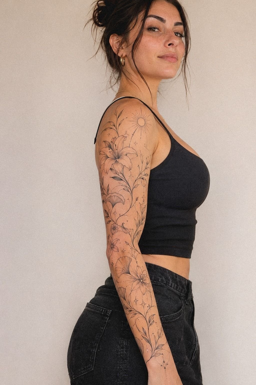
Match the drawings to the way you already dress, move, and express yourself.
How Will Your Sleeve Read From Across the Room?
Stand several feet away from your stencil and relax your arm. The smallest details may disappear, but the main rhythm should remain visible. A strong silhouette gives your sleeve presence even when individual marks are no longer legible.
Then move closer and check the finer layer. You want discovery, not confusion. The large shapes should catch attention first, while the delicate details reward a second look.
Ask someone you trust what they notice first. You don’t need to accept every opinion, but their response can reveal whether your focal point is actually working. If they notice a tiny accent before the main symbol, your hierarchy may need adjusting.
10Prepare For Pain During Arm Sleeve Sessions
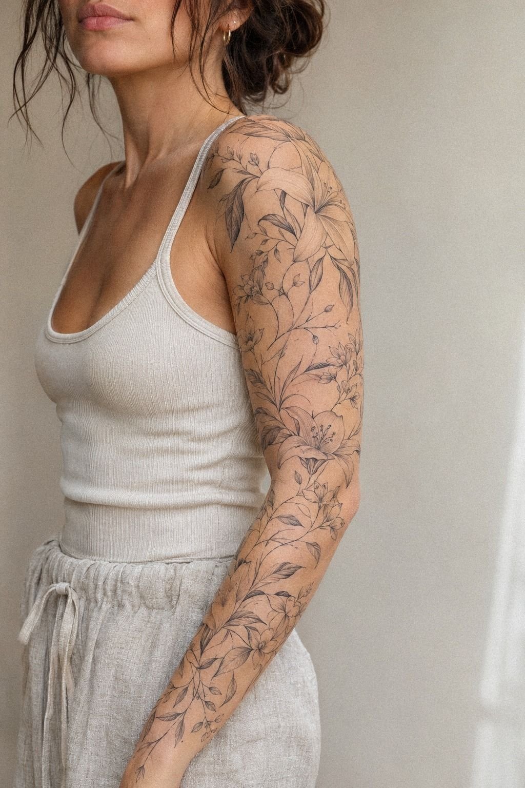
Prepare for pain by planning the session, not by pretending it won’t happen. The forearm, upper arm, thigh, and shoulder are often more tolerable than the ribs, feet, hands, and sternum. Your experience can still vary, but placement gives you a useful starting point.
Eat beforehand, drink water, and wear clothing that leaves the area accessible. Bring headphones, a quiet distraction, and a snack if your artist allows it. A healed tattoo stencil comparison can remind you that the appointment is one stage in a longer process, not the final appearance.
I’d schedule difficult areas separately if you’re new to tattooing. Long sessions can make your skin feel raw and your patience thin.
You don’t need to prove anything by staying still for hours. Tell your artist when you need a break, because clear communication protects the design and your experience.
Don’t use numbing products without discussing them first. Some artists have specific policies, and some products may affect how they work.
Your goal is a calm, manageable session. A fierce sleeve can come from a patient process, and you’ll make better choices when you’re not rushing through discomfort.
You can also plan the order of your appointments. Starting with an outer-arm section may help you learn how your skin responds before you commit to more sensitive placements. Your first session should give you useful information, not pressure you to finish everything.
11Protect Elegant Linework Through Careful Healing
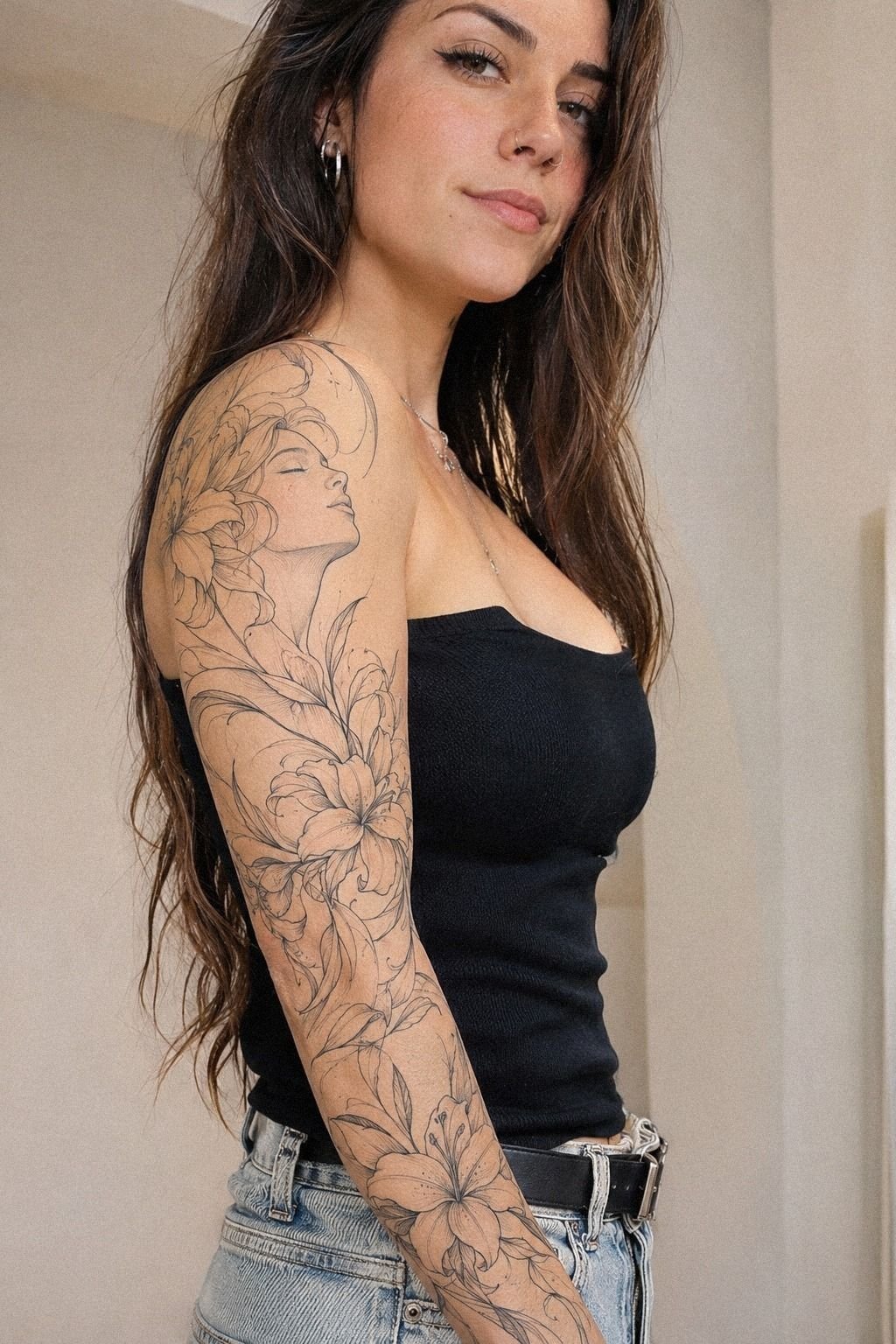
Protect elegant linework during the first few weeks, when the surface may peel, feel tender, or look darker than expected.
Why Crisp Linework Wins Over More Detail
I’ve changed my opinion about fine line sleeves after seeing how much spacing affects the final result. I used to think a fuller design automatically looked more finished. Now I’d choose a smaller, clearer composition over a crowded sleeve almost every time.
The skin needs room for the eye to understand what it’s seeing.
The most memorable sleeves aren’t always the ones with the most symbols. They’re the ones where every mark has a job.
One flower creates movement, one symbol carries memory, and one open section gives the whole arm a pause. That structure feels timeless because it isn’t relying on novelty alone.
I also think artists should show more healed work before clients approve delicate designs. Fresh ink can look breathtaking at first, but healed examples reveal whether the lines remain crisp, whether pale details disappeared, and whether the spacing still works.
Ask for that evidence. You’re allowed to take your time!
My own preference is clear: choose placement and line quality before adding decoration. A polished, meaningful sleeve can remain feminine without becoming predictable, and it can feel bold without covering every inch. If your design still reads beautifully after the details are reduced, you’ve found the right foundation.
The best result may be less ornate than your first idea. That isn’t failure. It means your final sleeve composition has enough confidence to let the skin participate in the design.
The Questions I Get Asked Most
How much does a Fine Line Sleeve Tattoo Women usually cost?
A typical US studio minimum may be about $50 to $100, while hourly rates often fall around $100 to $250. Your final price depends on the artist, region, size, number of sessions, and design density.
Ask for a consultation estimate instead of guessing from a single online reference. You’ll want to confirm deposits, touch-ups, and whether the artist prices by time or project.
Are Fine Line Sleeve Tattoo Women a good idea for a first tattoo?
Yes, they can be a good first choice when your placement and design are realistic. An outer forearm placement is often more tolerable than ribs, feet, hands, or sternum, and it gives you a clear view of the healing process.
Start with a manageable section if you’re unsure. Your artist can build the sleeve gradually, which lets you learn how your skin reacts before adding more motifs.
How do I choose a tattoo artist for Fine Line Sleeve Tattoo Women?
Choose an artist whose portfolio shows clean linework, healed examples, and designs similar to your goal. A healed linework portfolio tells you more than a collection of fresh tattoo images.
Check hygiene standards, consultation habits, and communication. You’ll want an artist who answers questions clearly and respects your boundaries around size, placement, skin tone, and session length.
How much do Fine Line Sleeve Tattoo Women hurt?
Pain varies by person and placement. The ribs, feet, hands, and sternum are commonly more sensitive, while the forearm, thigh, and shoulder are often more tolerable.
Your session may feel sharp, hot, or repetitive rather than unbearable. Bring water, eat beforehand, and tell your artist when you need a break. Good communication can make the appointment feel far more manageable.
How long does a Fine Line Sleeve Tattoo Women take to heal?
The surface usually heals in about 2 to 3 weeks, while complete healing can take around 2 to 3 months. Your artist’s aftercare instructions should guide the exact routine.
Gentle washing, light moisturizing, no swimming during healing, and sun avoidance are common precautions. Don’t judge the final line quality until the skin has fully settled.
What’s the best placement for Fine Line Sleeve Tattoo Women?
The outer forearm is a strong starting point because it’s visible, usually more tolerable, and easy to inspect during healing. The upper arm and shoulder can also work well when you want more privacy.
Avoid placing the smallest details directly across high-friction creases unless your artist recommends it. These fine-line spine references may help you compare how different body areas change the flow of a design.
Can fine line tattoos stay readable on darker skin tones?
Yes, but contrast, scale, and line choice need to be discussed honestly with your artist. A skin-tone-specific consultation can help you understand how healed lines and lighter details may appear.
Ask to see healed work on skin with similar undertones. Your artist may recommend stronger outlines, more open spacing, or fewer pale details so the design remains expressive.
Should a fine line sleeve be completed in one session?
Usually, a full sleeve is easier to manage across multiple sessions. Your artist can assess healing, adjust spacing, and make sure the developing composition still feels balanced.
A multi-session tattoo plan also gives you time to live with the first section. If you want to change the direction later, you’ll have more flexibility.
Where I’d Start First
If I had to pick one step, I’d start with the sketch and placement plan. A clear composition gives every later symbol room to age, while extra detail can’t rescue a crowded layout. Save your references, ask for healed examples, and book only when the design still feels personal after a week.
I’d choose one meaningful anchor, two or three connectors, and several intentional pauses. That structure gives your artist a strong foundation without locking every inch of skin into a rigid plan. Start there!
Before your appointment, review the artist’s healed work, confirm the cost, discuss pain and breaks, and ask how the design will move with your arm. You’ll feel more confident when your decisions are specific.
Your sleeve doesn’t need to be the biggest, darkest, or most intricate design in the room. It needs to remain readable, expressive, and yours.
That’s what makes a delicate tattoo feel powerful over time. Trust that instinct!