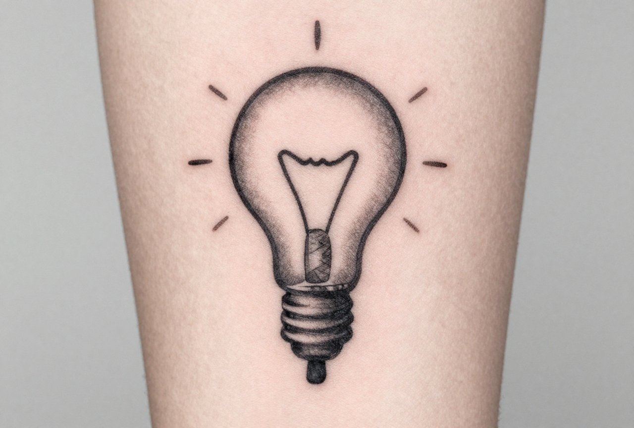
I’ve been putting ink on skin for over a decade, and I’ve watched trends come and go like seasons. Japanese dragons gave way to geometric mandalas, then fine-line florals, then back to bold trad again. But the tattoos that still look good ten years later? They share something simple: they were built for the body, not just for Instagram. Let me walk you through what actually works, what I’ve learned from healing thousands of pieces, and how to avoid the regret I see walk back into my shop every month.
Popular Styles That Age Well
Style isn’t just aesthetic preference. It’s a technical choice that determines how your tattoo lives on your skin. I’ve tattooed every major style, and I can tell you which ones hold their lines and which ones blur into mush.
American Traditional
Bold black outlines. Limited color palette. Heavy saturation. This is the style that built tattooing, and it’s still the most reliable bet for longevity. I’ve got clients with trad pieces from the 90s that read clear from across the room. The thick lines don’t bleed out like fine work does. The skin ages, the ink stays readable. Roses, anchors, eagles, pin-up girls, script banners, classic for a reason. In my chair, I tell people: if you want something that’ll look like a tattoo in twenty years, not a bruise, start here.
Japanese (Irezumi)
Full sleeves, back pieces, dragons coiling through waves, koi swimming upstream. The rules are strict, the storytelling is deep. What makes Japanese work last is the contrast, solid black backgrounds against bright skin, bold color against negative space. I’ve done koi sleeves that took forty hours, and the clients still send me photos years later because the saturation holds. The downside? It’s a commitment. Half a dragon looks like half a dragon. You finish the story or you live with the cliffhanger.
Black and Gray Realism
Portraits, wildlife, religious imagery. This is where I spend most of my hours now. The trick is understanding that gray wash isn’t just “light black.” It’s layered, it’s temperature-controlled, it’s about how the skin receives the pigment. I’ve seen beautiful portraits of deceased parents that made me cry in the moment, and I’ve seen others that looked like a Xerox after two years because the artist didn’t understand saturation. Realism needs touch-ups. Plan for them.
- Neo-Traditional: Bold like trad, but with expanded color palettes and more illustrative detail. Good middle ground.
- Blackwork: Solid black, ornamental patterns, dotwork. Holds incredibly well. Very graphic.
- Fineline: Trendy, delicate, risky. I’ve seen beautiful fineline florals that fell apart in eighteen months. Choose your artist like your life depends on it.
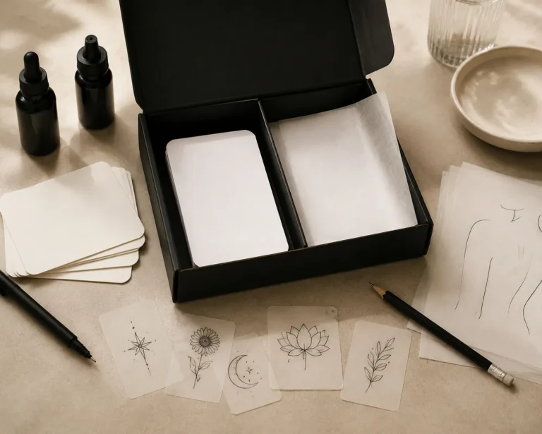
Design Ideas That Mean Something
The best tattoos I’ve done weren’t the most technically complex. They were the ones where the client knew exactly why they were there. That said, “meaning” doesn’t have to be deep trauma. It can be stupid, funny, weird. I’ve tattooed a client’s favorite gas station snack on their thigh. They smile every time. That’s the point.
Personal Symbols
Family crests, coordinates of first meetings, handwriting from deceased relatives. These carry weight because they can’t be replicated. I did a piece last month of a grandmother’s recipe card, her actual cursive, copied from a stained index card the client brought in. The ink will outlast the paper. That’s the whole appeal.
Nature and Animals
Wolves, bears, snakes, birds in flight. These work because the body becomes the landscape. A snake coils around a forearm naturally. A bird’s wingspan opens across a chest. I’ve placed hundreds of animals, and the ones that work best follow the muscle flow. A roaring tiger on a flat calf looks trapped. A sleeping tiger flowing down a ribcage looks alive.
- Botanicals: roses for trad, peonies for Japanese, wildflowers for fineline. Each style has its native flora.
- Skulls and memento mori: timeless, adaptable to any style, always readable.
- Abstract and ornamental: for clients who want the experience and the visual without the narrative.
Best Placements for Longevity
Where you put it matters more than most people think. I’ve watched identical designs age completely differently based on placement alone. Skin is not uniform. Some areas stretch, some rub, some see sun every single day.
The upper arm, outer thigh, and upper back are the sweet spots. Stable skin, less sun exposure, minimal friction from clothing. I’ve got a full sleeve on my own left arm that looks almost identical to day one, seven years later. Meanwhile, the finger tattoos I did in my apprenticeship? Most are ghosts now. Hands and feet shed skin constantly. The ink doesn’t settle deep enough to survive the turnover.
Ribcage and sternum hurt more, but they also hold ink well if you can sit still. The sternum specifically, I’ve had clients tap out on outline alone. But the skin there is relatively protected, and the canvas is flat and visible. Stomach is tricky. Weight fluctuation, pregnancy, age, it all distorts the image. I’ve seen beautiful stomach pieces become unrecognizable after two kids. Not saying don’t do it. Saying know the trade.
- Inner bicep: Hidden, personal, decent longevity. Fades some from arm movement.
- Calf: Great for vertical designs. Muscle definition helps readability.
- Neck/throat: Visible, professional implications, but the skin actually holds ink well. I’ve done throats that stayed crisp.
- Behind the ear: Cute, trendy, almost always falls out. I warn every client. Some still want it. That’s their choice.
Color Choices: What Lasts and What Fades
Black ink is carbon-based, stable, predictable. Color is where things get complicated. I’ve mixed my own pigments, I’ve watched brands reformulate, I’ve seen reds cause reactions that swelled a whole sleeve.
Blacks and Grays
Your foundation. I build every tattoo on black, even the colorful ones. Gray wash, black ink diluted with distilled water or mixing solution, creates depth without adding variables. A solid black and gray piece will still read in fifty years. I’ve tattooed over old blackwork from the 70s. The lines were fuzzy but the image was there. Can’t say that about most color work from the same era.
Colors That Hold
Dark blues, deep greens, burgundy reds. These have larger pigment particles, more stability. I’ve got a client with a navy and emerald traditional piece from 2015 that still punches. Bright yellow? Almost always fades to a sickly greenish tint. White? Disappears on most skin tones, turns yellowish on others. I use white for highlights only, never as a primary element. Neon colors, newer pigments, less long-term data. I tell clients: you’re the experiment.
- Skin tone matters. What pops on pale skin disappears on melanin-rich skin. A good artist adjusts saturation, not just design.
- Color needs more touch-ups. Budget for it.
- Red reactions are real. I patch test now if a client mentions any history of sensitivity.
Tips for Choosing Your Artist
This is the part that matters most, and it’s where I see people stumble. A great idea with a bad artist becomes a bad tattoo. A mediocre idea with a master becomes something you live with happily.
Look at healed photos, not just fresh work. Every shop has Instagram now, but the fresh photos are misleading. Saturation looks deeper, lines look crisper. Ask to see something healed six months, a year, five years. We see this a lot in shops, clients who chose based on flash and lighting, not on technical execution. I’ve fixed enough of those to know the pattern.
Style matching matters. I don’t do watercolor. I can mimic it, but it’s not my language, and the healed results would embarrass me. Find someone who specializes in what you want. If an artist’s portfolio is 90% black and gray, don’t ask them for bright neo-traditional. They might say yes, they need the money, but you won’t get their best work.
- Consultations are free most places. Use them. Talk about placement, size, how your life actually works (gym clothes, work uniform, wedding dress).
- Price shopping is a red flag. Good work isn’t cheap. Cheap work isn’t good. I’ve had to charge double to fix a “deal” someone found.
- Trust your gut. If the shop feels wrong, if the artist rushes you, if the stencil placement seems lazy, walk. I’ve told clients to sleep on it, to go eat, to come back tomorrow. The ones who respect that hesitation usually come back. The ones who argue? Bullet dodged.
Final Thoughts
I’ve tattooed lawyers and felons, eighteen-year-olds and seventy-year-olds getting their first piece. The ones who are happiest years later share something: they were patient, they were informed, and they chose something that fit their actual life, not their fantasy self. The best tattoo idea isn’t the most original or the most impressive. It’s the one you’ll still want to explain, or not explain, when you’re sixty and the lines have softened and the color has settled into something that lives with your skin, not on it. That’s the goal. Everything else is just ink.
Frequently Asked Questions
How do I know if a tattoo idea is too trendy?
If you’ve seen it on ten influencers this month, it’ll date fast. I tell clients to sit with the image for six months. If you still want it after the hype dies, it’s probably real for you.
Should I bring my own design or let the artist create it?
Reference images help, but let the artist redraw for your specific body. I’ve had clients bring printouts they want copied exactly, tattooing doesn’t work like that. The body curves, the design must adapt.
How much should I expect to spend on a quality piece?
In my shop, small simple work starts around $150, full sleeves run into the thousands. Budget for the work you want, not the work you can afford today. Saving six months beats regretting six decades.
Is it okay to get tattooed while traveling or on vacation?
I get this question constantly. Fresh tattoos and sun, swimming, and sleeping weird in hotels don’t mix. Plan the trip around the tattoo, not the other way around. Wait until you’re home and healed to show it off.