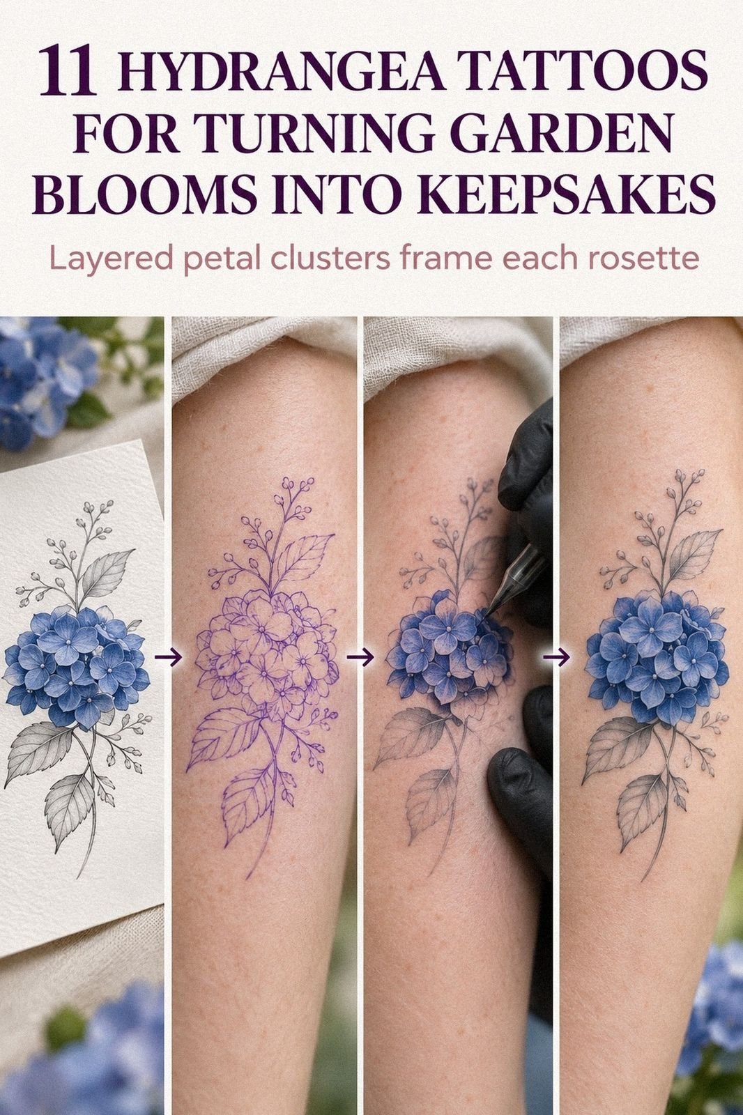
I chose a Hydrangea Tattoo at 30, expecting the fine lines to soften quickly. They didn’t. Deliberate sizing, terracotta-and-olive pigment, and careful forearm placement kept the petals crisp through years of sunlight, work, and ordinary life. If you’re considering one, the design choices matter more than the flower alone. Short version: placement wins.
Here’s what it looked like before
Before the appointment, I had a clean patch of skin saved for the right idea. It was the outer forearm, fair with a cool-pink undertone, and it looked almost too plain beside my smaller tattoos.
I didn’t want a loud sleeve or a dense black shape. I wanted one flower that could stay readable from a few feet away and still reward a closer look.
My reference folder was messy. A hydrangea reference sketch with terracotta petals sat beside a delicate September birth-flower drawing, botanical studies, and one idea that was far too ornate for me.
I kept returning to the same question: would a fine-line flower still feel personal after the novelty wore off? That hesitation mattered.
I wasn’t choosing an accessory. I was choosing a mark I’d see every day.
Before You Book, Test the Idea
Start with the design, placement, and artist rather than chasing the lowest tattoo budget. A cheap appointment can lose its value quickly if the flower needs correction, cover-up work, or removal later.
Ask to see healed botanical work on skin close to yours. Fresh tattoos can look striking, but healed examples reveal whether the contours remain crisp, the pigment settles evenly, and the negative space survives.
I’d also save a few different references, including a minimalist hydrangea tattoo and a hydrangea tattoo meaning guide. You’re not copying them. You’re learning which choices feel meaningful, personal, and genuinely worth it.
- I Chose a Deep-Blue Hydrangea Tattoo (The Blue Bloom Rule)
- What the Skin Test Changed (The Skin-Test Method)
- Fewer Petals, Stronger Bloom (The Negative Space Rule)
- September Made the Flower Personal (The Birth-Month Thread)
- Why the Outer Forearm Won (The Visibility Test)
- Minimalist or Ornate? (The Detail Ladder)
- I Bent the Leaves Into the Movement (The Stem-and-Leaf Rule)
- Vertical Bloom, Gentle Movement (The Vertical Bloom Method)
- Does Placement Change the Pain? (The Placement Truth)
- Healing: Crisp Lines Need Patience (The Crisp-Line Check)
- My Personal Mark Was Almost Invisible (The Personal Mark)
1I Chose a Deep-Blue Hydrangea Tattoo (The Blue Bloom Rule)
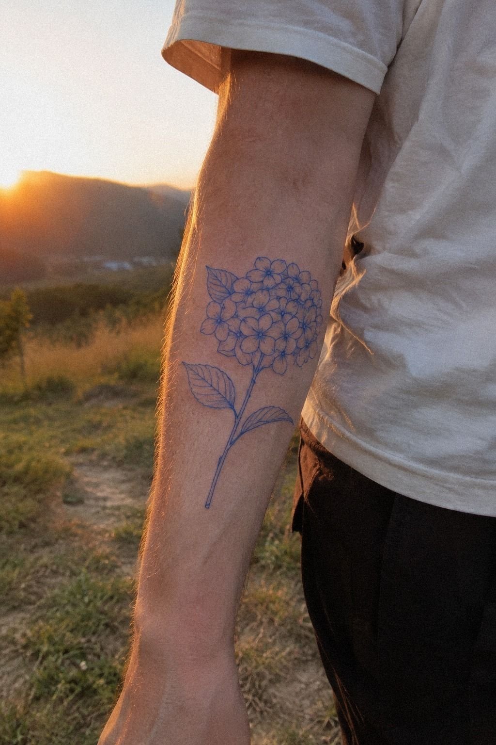
I first called it a deep-blue Hydrangea Tattoo, but the final palette became more earthy: terracotta petals, olive accents, and stone-colored negative space. On fair cool-pink skin, those tones felt expressive without turning the flower into a heavy black emblem.
The petals stayed crisp, while the tiny gaps kept the bloom from becoming a solid patch. I asked for hair-thin single-needle lines, but I didn’t ask for every petal to be outlined.
The artist showed me two versions. One had twelve tightly packed petals, and the other had fewer, broader shapes with open negative space.
I picked the second. It felt more elegant and symbolic, and it wouldn’t force the eye to decode a blur later.
You’ll want your artist to explain which details will remain visible, not just which design looks impressive on a screen.
I brought a printed terracotta hydrangea study and a simple olive floral sketch. The color was a reference, not a promise that the pigment would stay jewel-bright forever.
Tattoo color changes with skin, sun, and time. I’d rather have a crisp muted tone that settles gracefully than a vibrant shade packed into a design with no breathing room.
If you’re drawn to a restrained style, compare this with a minimalist hydrangea tattoo. I didn’t copy one design, but it helped me see how much a flower can say with fewer marks. And yes, I nearly chose the busier version.
I’m glad I didn’t!
2What the Skin Test Changed (The Skin-Test Method)
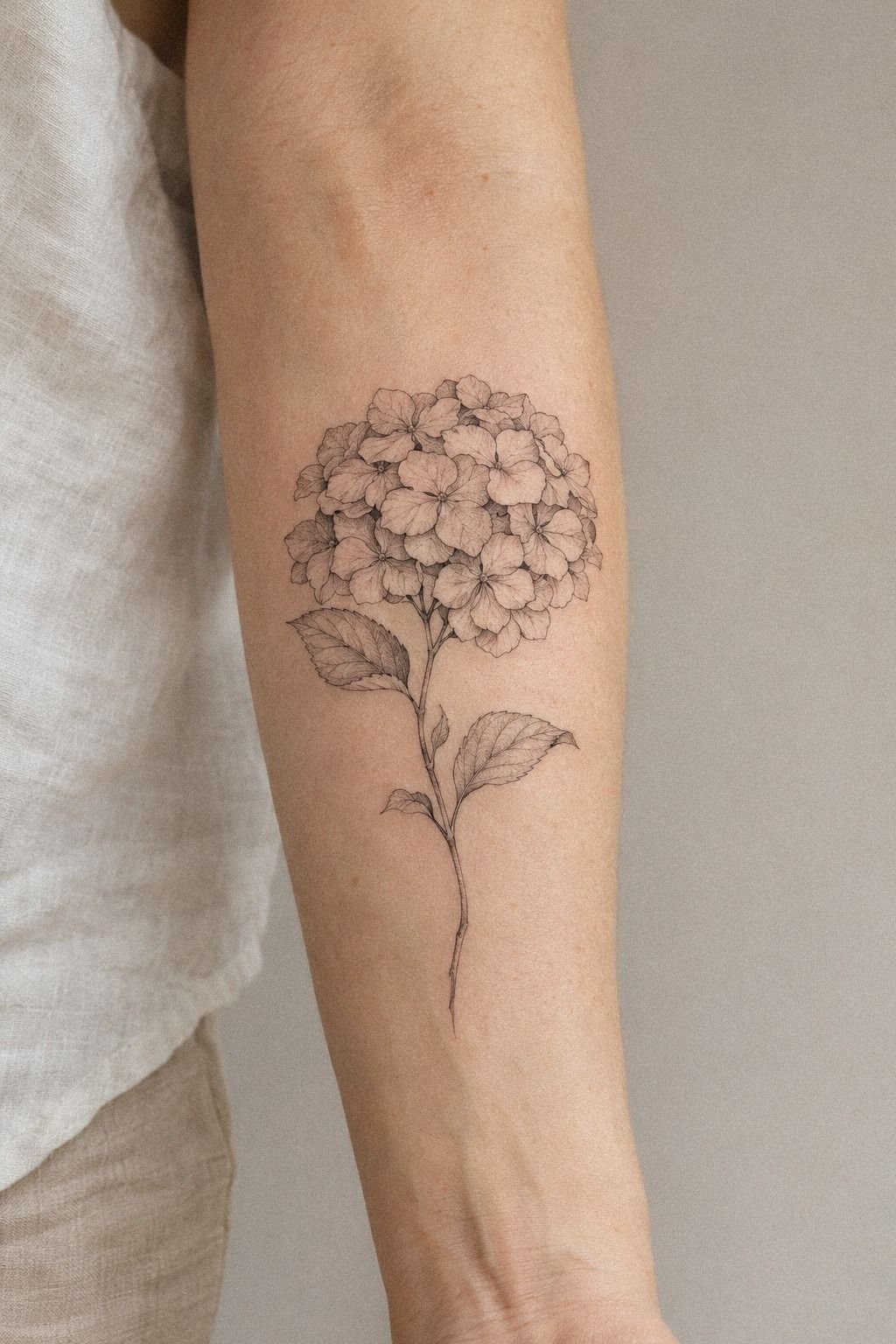
I tested my Hydrangea Tattoo stencil as a sketch before agreeing to the final placement. The stencil sat along the ribs in one reference, and that placement made the flower feel intimate rather than decorative. Ribs give a vertical bloom room to stretch, but they also make every proportion feel more noticeable.
My artist printed three sizes and held each paper version against the body. The smallest looked dainty but lost the center detail. The largest was more expressive, though it would have taken longer and felt less understated.
I chose the middle option, close to four inches tall, because the stems and petals could stay separate.
The sketch used a clay-toned flower outline with linen-colored gaps and aged-brass accents. That detail helped me understand where the needle would pass and where skin would remain untouched.
I wanted the final tattoo to feel delicate, not fragile. Those are different things. Delicate describes the line; fragile describes a design that has no room to age.
I also compared the draft with a hydrangea tattoo meaning guide, because symbolism can affect your choices. The flower can suggest gratitude, change, abundance, or a memory tied to a place. You don’t need a dramatic explanation, but you should know why your version matters.
3Fewer Petals, Stronger Bloom (The Negative Space Rule)

I added delicate petals to the linework only after removing several. The final plum-gray outline carried a restrained rose-gold accent, which made the bloom feel intricate without overcrowding the center.
4September Made the Flower Personal (The Birth-Month Thread)

I linked my Hydrangea Tattoo to September because the flower is associated with that month, and the connection gave the design a personal anchor. September marked a move, a new job, and the first year I felt settled in my own decisions.
That didn’t mean the tattoo had to look sentimental. I kept the symbolism quiet, using a September birth-flower sketch as the starting point and letting the linework carry the emotion.
A birth-flower tattoo can become generic when the reference does all the talking. I changed the petal count, narrowed the stem, and chose a slightly tilted angle. You’ll want one detail that belongs only to you, whether that’s a date hidden in the leaves, a familiar color, or a shape from a garden you remember.
I considered adding initials, but I rejected them. They would have made the design more literal and less timeless.
A small leaf would have been a better personal mark, though I decided to leave the bloom alone. For another symbolic direction, you could read about yellow rose tattoo meaning and compare how different flowers carry memory.
The final palette stayed navy, warm white, and walnut-brown, so the September connection felt classic rather than sugary. That small color shift made the meaning quieter and more personal.
5Why the Outer Forearm Won (The Visibility Test)

I placed the tattoo on my forearm tattoo placement because I wanted to watch it become part of my daily life. The outer forearm gave me a stable, readable area and enough length for the bloom to breathe.
It also meant I could protect the design from direct sun more easily than I could protect a hand or wrist. You’ll want to think about visibility from both directions. I checked how the flower looked with my arm relaxed, turned inward, and resting naturally.
My artist placed the thermal stencil slightly below the widest part of the forearm. That kept the bloom from wrapping awkwardly around the arm and left enough skin around it for the petals to breathe. The stem followed the natural length of the bone without sitting directly on the sharpest edge.
I’d choose the forearm over the hand for a first floral tattoo. Hands can be more exposed to UV, washing, friction, and frequent movement, while the forearm gives you more control during healing. If you’re considering a different symbolic piece later, yin yang tattoo meaning has useful placement ideas too.
The emerald, gold, and cream accents also looked more balanced on the forearm than they would have on a cramped wrist. The result felt polished without losing its raw botanical quality.

6Minimalist or Ornate? (The Detail Ladder)

I compared a minimalist version with an ornate one on deeper skin, using rib placement as a test for contrast and scale. The forest-green, rust, and natural-tan palette made the ornate draft feel bold, while the minimal version stayed sleek and readable.
7I Bent the Leaves Into the Movement (The Stem-and-Leaf Rule)

I integrated thin leaves into the motif only after testing the flower by itself. The first leaf draft was too symmetrical. Every leaf pointed outward at the same angle, and the result looked manufactured.
I changed the fine leaf contour so one leaf curved toward the flower and another opened away from it. That small imbalance made the design feel more organic and expressive without adding more pigment.
You’ll want to check the direction of every leaf against the way your body moves. On a forearm, a leaf can look graceful when your hand rests naturally and strange when your wrist turns. I tested the stencil while my arm was relaxed, bent, and turned.
I kept the leaves thin. I didn’t want them competing with the petals, so the artist used fewer interior veins than the reference suggested.
The dusty-rose, charcoal, and brass palette gave the leaves a slightly vintage character. If you like botanical tattoos with a stronger story, Yggdrasil tattoo meaning shows how branches and leaves can carry symbolism without crowding the main form.
8Vertical Bloom, Gentle Movement (The Vertical Bloom Method)

I chose a vertical floral composition after comparing the hydrangea with a wildflower sprig on a wrist.
The vertical shape followed the natural length of my forearm and made the flower feel graceful without becoming formal. A horizontal version looked playful, but it lost some of the bloom’s quiet power.
I asked the artist to tilt the stem slightly rather than drawing it perfectly straight. That small change made the composition feel flowing and alive. It also kept the design from looking like a symbol stamped onto the skin.
The warm-white, camel, and black palette made the vertical bloom feel understated and crisp. Check the design while your arm is relaxed, bent, and turned. A composition that looks iconic on paper can feel awkward once the body changes its position.
9Does Placement Change the Pain? (The Placement Truth)
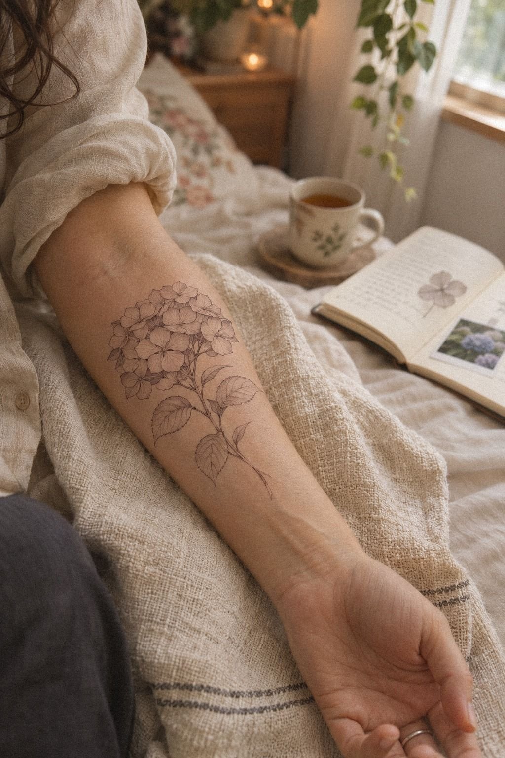
I checked the pain level before the needle touched my skin, and that preparation made the appointment feel less intimidating. The forearm tattoo session was uncomfortable, but it stayed manageable.
Ribs, feet, hands, and sternum can feel sharper because they sit close to bone or experience constant movement. The forearm, thigh, and shoulder are usually more tolerable, though everyone’s pain response is different.
I ate beforehand, drank water, and planned a short break. That mattered more than trying to act fearless. A fierce tattoo idea doesn’t require a heroic pain story.
If you’re deciding between locations, compare visibility, friction, healing demands, and cost. The midnight-blue, copper, and ivory accents were secondary to comfort and placement. The most meaningful tattoo isn’t useful if you’ll resent how difficult it is to protect.
My artist also explained the needle grouping before starting. Knowing how the delicate lines would be built made the session feel less mysterious. No drama!
10Healing: Crisp Lines Need Patience (The Crisp-Line Check)

I followed the healing stages closely because fine lines need calm, consistent aftercare. The fresh version looked darker and sharper than the healed one, and that change was normal.
The surface settled in about two to three weeks. Complete healing took closer to two to three months, which is why I didn’t judge the final result after the first few days. You’ll want to wash gently, pat the area dry, use the recommended moisturizer, and avoid swimming and direct sun while the skin repairs itself.
My fragrance-free aftercare lotion went on in a very thin layer. Too much product left the skin shiny and uncomfortable, so I stopped treating heavier application as better. The tattoo peeled lightly, then looked muted before the sage-green and warm-cream accents returned to a softer tone.
But healing doesn’t end when the peeling stops. UV exposure can fade pigment, and very fine lines may spread as years pass.
I use sunscreen once the skin is fully healed and cover the area during long sunny days. That habit has done more for the tattoo than any dramatic product claim.
If you’re budgeting for the appointment, include aftercare in the total cost. A good lotion and sunscreen are small expenses compared with correcting neglected linework later.
11My Personal Mark Was Almost Invisible (The Personal Mark)

I personalized my Hydrangea Tattoo through restraint. My personal mark was a small break between two petals. It represents a year when I changed direction without having a perfect plan.
Nobody else needs to notice it. I do. You’ll want your own private detail, even if it’s as simple as an angle, a leaf, or the choice to leave one section open.
The artist used terracotta and olive tattoo pigment with stone-colored negative space and a few darker strokes in the center. I didn’t add a quote, initials, or date because those elements would have explained the meaning too loudly. The flower already carried enough history for me.
I’d skip copying a viral design exactly. The reference might be elegant, but your skin, placement, and story aren’t identical to the original. If your idea needs a stronger spiritual direction, you can compare it with YHWH tattoo meaning or Zeus tattoo meaning, then return to the flower with a clearer sense of what belongs to you.
The best value came from paying for judgment, not extra detail. My artist knew when to stop adding marks, and that decision still matters years later.
How Much It Cost
My artist priced the design by minimum and time rather than by the flower name. That’s typical in the US. A small Hydrangea Tattoo may fall near a studio minimum, while a larger botanical piece takes longer because the stencil, line spacing, and placement need more attention.
You’ll get a better estimate if you send the artist your reference, approximate size, placement, and whether you want color. I wouldn’t ask for an artificially low quote. The cheapest appointment can become expensive if you later need a correction, cover-up, or removal.
My choice was worth the money because the artist understood fine-line botanical work and showed healed examples. I’d spend less on extra marks and more on a portfolio with clear, healed results. That’s where the real value lives.
Before booking, ask whether the quoted cost includes the stencil consultation, color, touch-up policy, and aftercare guidance. Those details can change whether the appointment is genuinely worth it.
What I’d Ask Before Booking
I’d ask how the artist simplifies small petals, what size they recommend, and how the fine-line tattoo process changes across different skin tones. A confident answer is useful. A vague promise that every detail will remain perfect isn’t.
I’d also ask to see healed work at least several months old. Fresh work can look vibrant, crisp, and polished, but healed work tells you much more about technique and long-term value.
If your artist specializes in symbolic designs, you might also compare yin yang tattoo meaning with Yggdrasil tattoo meaning. Those references can help you decide whether your Hydrangea Tattoo needs additional symbolism or already says enough.
Keep your budget realistic. A skilled artist may cost more per hour, but the cheaper option isn’t automatically better value if the flower loses its structure.
Ask how the artist handles skin undertones, healed color changes, and small areas of fading. Those answers tell you whether they’re thoughtful or simply trying to close the appointment.
Why I Chose a Flower That Doesn’t Shout
I’ve had years to decide whether choosing a hydrangea was sentimental, practical, or simply a response to seeing too many floral tattoos online. It was all three, but the practical part surprised me.
I didn’t want a symbol that demanded an explanation every time someone noticed it. I wanted a flower with enough structure to look intentional and enough softness to remain mine.
My first mistake was treating the reference image as the finished tattoo. The reference had flawless skin and enlarged every hair-thin line. Real skin moves.
Real skin has texture. I learned to ask what would remain legible at four inches, in ordinary daylight, after the initial contrast settled.
I also went back and forth on color. Deep blue felt personal, but black would have been more predictable for longevity.
In the end, I chose a terracotta-and-olive palette with restrained stone tones. It gave me the mood I wanted without relying on bright pigment alone.
If you’re unsure, ask your artist to show healed work in similar skin tones.
The part I’d repeat is the paper test. I wore the stencil for a while, moved my arm, and looked at it in a mirror.
That sounds minor, but it exposed the tilt that felt wrong. You can’t fix a placement decision by admiring the design on a phone.
You need to see it on your own body before the needle begins.
I’d also protect the design from becoming too delicate. Fine line can be elegant, crisp, and timeless, but it still needs enough spacing to age well.
A few strong contours gave my flower a fierce little backbone. That’s the balance I’d recommend: personal meaning, visible structure, and no unnecessary detail added just to make the appointment feel more elaborate.
For another floral comparison, wildflower tattoo ideas helped me see why the hydrangea felt right. Its structure is intricate, but the finished mark can still be sleek and understated.
The Detail I Wouldn’t Add
The hardest part was deciding what to leave out. I considered a small ornamental border, extra leaves, and a second bloom, but each addition made the main flower less commanding.
A tattoo can be ornate and still feel empty if every symbol is explained too literally. I wanted the meaning to stay personal, slightly haunting, and open to interpretation.
The strongest version had one bloom, one stem, and one private interruption in the petal line. That combination felt more iconic than the crowded draft. More wasn’t better.
Before you approve the final stencil, ask yourself what the design would lose if one detail disappeared. If the answer is nothing, remove it. Worth it!
A Healed Result Tells the Truth
The healed result mattered more to me than the first-day version. Fresh tattoo linework can look sharp because the pigment is still dark and the skin hasn’t finished settling.
I asked to see examples several months old, especially botanical pieces with fine contours. Those examples showed how the artist handled spacing, softened color, and small shifts in line weight.
Look for readable petals, clean transitions, and pigment that hasn’t pooled into one heavy shape. A slightly softened tattoo can still be striking. It just needs to keep its identity.
I’d also compare examples on skin with a similar tone and undertone. That gave me a more realistic idea of how the olive pigment might settle. The answer wasn’t identical to my reference, but it was honest.
Blue or Black? The Long-Term Choice
Black pigment is predictable, while color can feel more expressive and personal. I didn’t want a bright, saturated flower that depended on perfect color to work.
The compromise was a muted terracotta-and-olive palette. The darker center gave the design structure, while the earthy petals kept it romantic and distinctive.
If you’re choosing color, ask whether the tattoo still reads clearly in grayscale. Mine did. That gave me confidence that the design wouldn’t lose its character as the color softened.
I’d rather have a timeless muted palette than a vibrant shade forced into every petal. The restrained choice made the flower feel polished, elegant, and quietly daring.
A Few Things Worth Answering
How much does a Hydrangea Tattoo usually cost?
A Hydrangea Tattoo usually costs about $100 to $300 in the US for a small design, though studio minimums often run about $50 to $100 and hourly rates about $100 to $250. Your artist, region, size, color, and placement will decide the final quote. A healed portfolio matters more than a bargain.
Is a Hydrangea Tattoo a good idea for a first tattoo?
Yes, a Hydrangea Tattoo can work well as a first tattoo when the placement and size are sensible. The forearm, upper arm, shoulder, and thigh are usually more tolerable than ribs, feet, hands, or sternum. Clear line spacing gives beginners an easier design to understand while it heals.
How do I choose a tattoo artist for a Hydrangea Tattoo?
Choose an artist with clean botanical linework, healed examples, strong hygiene practices, and experience with your preferred skin tone. Ask how they simplify small petals and what size they recommend. A healed portfolio shows more than a fresh appointment result, so don’t skip that review.
How much does a Hydrangea Tattoo hurt?
Pain depends on your body and the placement. Ribs, feet, hands, and sternum are often more painful because they sit close to bone or experience movement.
The forearm, thigh, and shoulder are usually more tolerable. Your comfort improves when you’ve eaten, hydrated, and planned breaks.
How long does a Hydrangea Tattoo take to heal?
The surface usually heals in about two to three weeks, while complete healing can take two to three months. Wash gently, moisturize lightly, and avoid direct sun, swimming, and friction during early healing. Patience protects fine lines, so don’t judge the final color after only a few days.
What’s the best placement for a Hydrangea Tattoo?
The forearm is a strong choice for visibility, readable linework, and moderate pain. The upper arm and thigh offer more privacy and protection from daily friction, while ribs create a more intimate result. Choose a surface with enough room for open petal shapes, especially if you want the tattoo to age clearly.
Where I’d Start First
If I had to pick one, I’d start with the outer forearm. It gives fine petals enough room to breathe, and you can protect it from UV more easily than a hand or wrist.
Pin this Hydrangea Tattoo idea for later, then test the stencil before you book. Compare the placement, expected cost, healed portfolio, and meaning before committing. The right design should feel bold enough to matter and personal enough to keep choosing.