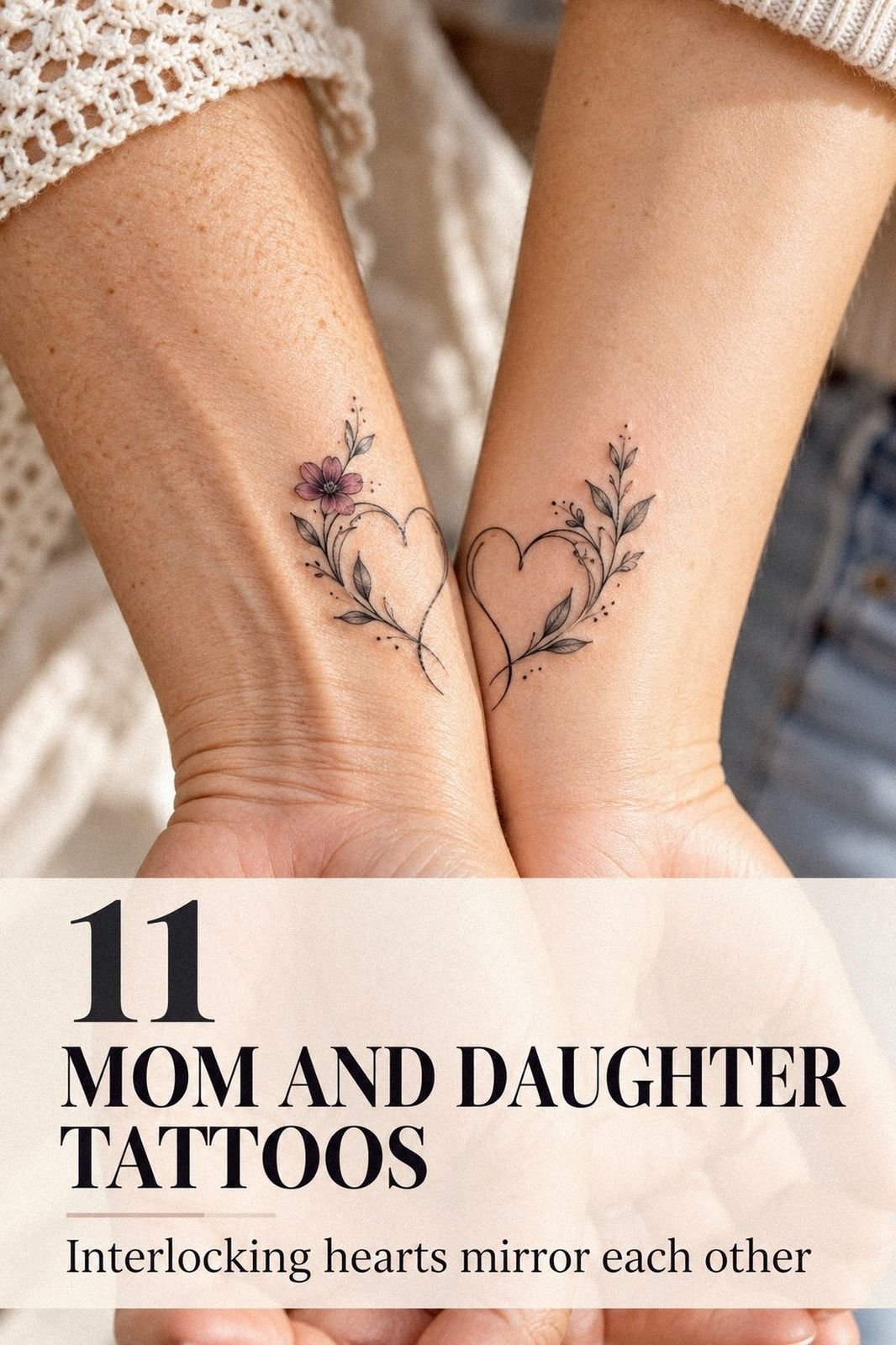
Meaningful mother-and-daughter tattoos hurt less when the design, placement, and timing are chosen together. My mother and I planned a delicate matching piece, compared pain honestly, and finished with tattoos that felt personal instead of copied. We were nervous, but we still laughed through the appointment!
The final matching moth design became a striking symbol of change, persistence, and family. It was intricate enough to feel special, yet understated enough for everyday wear.
If you’re considering one, start with the story before the style. A tattoo can be symbolic, feminine, masculine, or completely personal, depending on how you shape it.
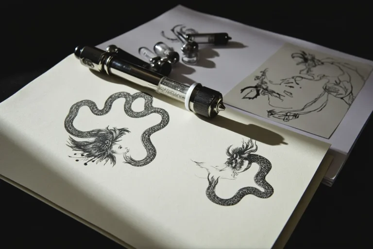
Here’s what it looked like before:
Before the appointment, I had bare skin and too many saved references. My mother wanted something meaningful, but she didn’t want a large, ornate design dominating her wrist or shoulder. I wanted a striking symbol with enough detail to feel like ours, not a random matching mark.
We spread sketches across paper and compared them in daylight. A moth felt symbolic because it suggested change, persistence, and returning to the same light.
We also considered initials, birth flowers, and a tiny heart. None felt right until we saw the moth drawn with open wings and a crisp central body.
The pain question stayed between us. I knew fine-line work could be delicate, but I didn’t assume it would be painless.
If you’re choosing a similar tattoo, look at healed linework from the artist and compare placements before you book. Your favorite design still needs to suit your skin, routine, and comfort level.
For more personal starting points, I also looked through these very meaningful tattoos and paid attention to which symbols still felt powerful without needing a long explanation.
Before We Booked the Appointment
We didn’t book the first artist whose work looked polished online. We compared healed results, asked about small details, and checked whether the artist had experience with matching tattoos on different skin types. That research gave us more value than rushing toward the first available appointment.
My mother cared about comfort and privacy. I cared about design longevity and whether the moth would remain readable after the fresh sharpness softened. We agreed that the tattoo had to work on two bodies, two routines, and two different ideas of what felt stylish.
We also set a budget before contacting the studio. A matching tattoo can seem inexpensive when the design is tiny, but two separate appointments, shop minimums, consultations, and aftercare can change the total cost quickly.
Knowing the likely shop minimum made the decision feel worth it instead of impulsive. Worth it!
- The Moth We Chose
- Which Two Small Symbols Belonged Together?
- Birth Flowers, But Not Identical
- Test the Delicate Linework First
- Why the Wrist Placement Worked
- Compare Pain Before You Commit
- Two Daughter Marks for Mom
- Keep Initials in the Background
- The Tiny Heart We Nearly Cut
- Plan Healing Around Real Routines
- The Finished Mother-Daughter Moth
1The Moth We Chose
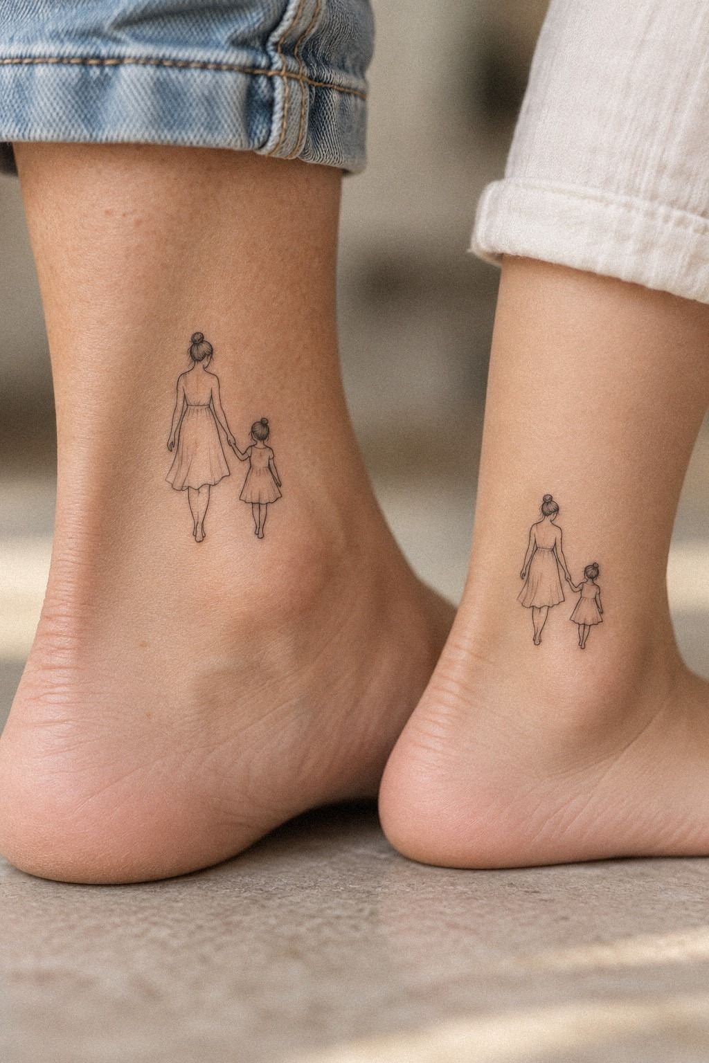
I chose a moth with spread wings because it felt expressive without becoming overly literal. The reference had fine-line moth artwork, a narrow body, and wings that opened like a small emblem.
It was feminine on my shoulder, but it could also read as masculine or understated on another placement. That flexibility mattered to us.
The artist showed us two versions. One used dense black fill, while the other left more negative space between the wing markings.
I picked the second version because it made the design feel ethereal and helped each small section remain readable. My mother liked that it looked graceful rather than childish.
We changed the lower wing shape after seeing it on paper. The first sketch was too rounded, almost cartoonish.
The final version had black ink concentrated near the body with lighter linework toward the tips. If you’re choosing your first matching tattoo, compare the stencil from several positions before the needle starts.
I’d skip copying the exact same size if your bodies and placements differ. Matching meaning matters more than identical measurements, and your artist can make the design personal without breaking the connection. For more symbolic starting points, I saved ideas from these very meaningful tattoos.
2Which Two Small Symbols Belonged Together?
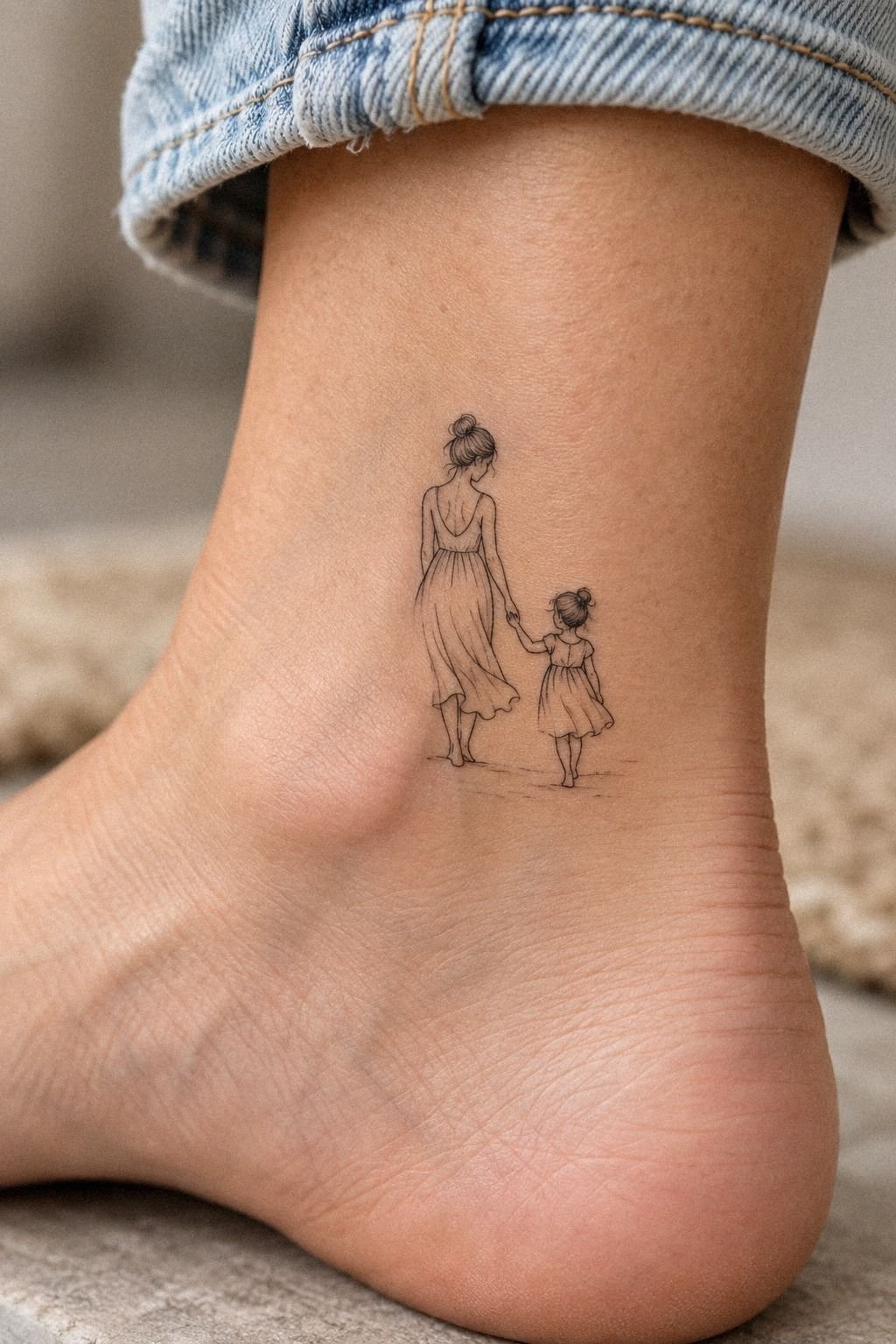
My mother wanted a symbol that could stand alone if someone didn’t know the story. We tested a small heart beside a moth, then compared both with a pair of initials.
The moth felt more powerful because it carried movement and change without explaining everything. The heart was playful, but it worked better as a secondary detail. That distinction helped us choose a symbolic design instead of forcing every idea into one tattoo.
3Birth Flowers, But Not Identical
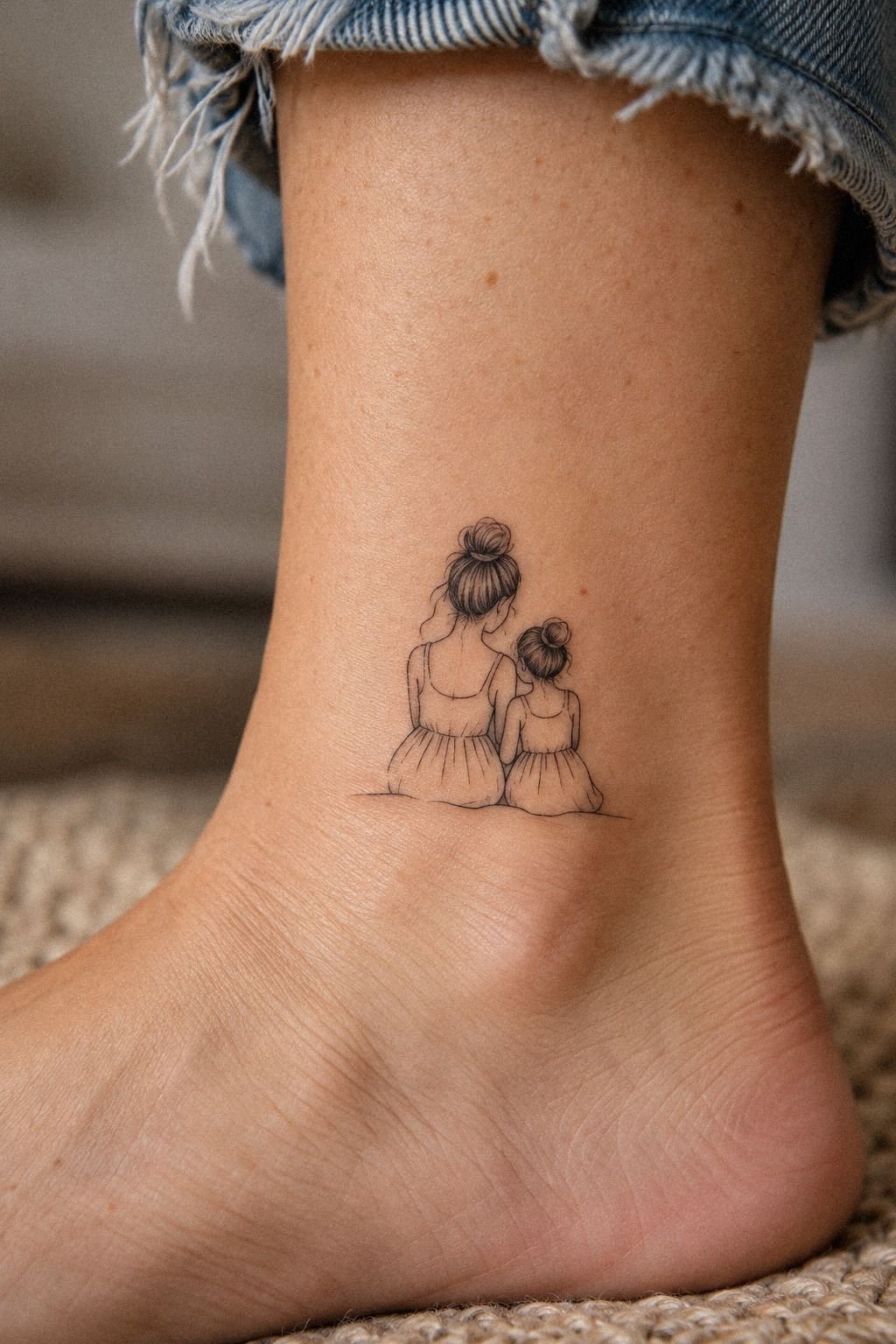
Birth flowers gave us a way to make matching tattoos related without making them identical. I chose a single stem with layered petals, while my mother selected a flower tied to her birth month. The botanical symbol felt romantic and personal, but the linework stayed sharp enough for a small shoulder tattoo.
The artist drew botanical fine-line work with one stem, three leaves, and petals that opened outward. We removed two extra leaves after seeing the stencil.
The original was ornate, but it hid the flower shape. A crisp silhouette mattered more than squeezing every botanical detail into the design.
I placed my flower beside the moth rather than merging the symbols. That separation kept the composition understated and let each mark have its own emotional weight. My mother chose a nearby placement, so our tattoos would echo each other without looking like a single copied stamp.
If you’re using birth flowers, check the reference carefully because artists interpret petals differently. I’d choose a bold central contour over hair-thin decoration everywhere.
A tattoo can be delicate and still need structure. For more family-centered ideas, browse these tattoos dedicated to mom before you settle on one flower.
4Test the Delicate Linework First
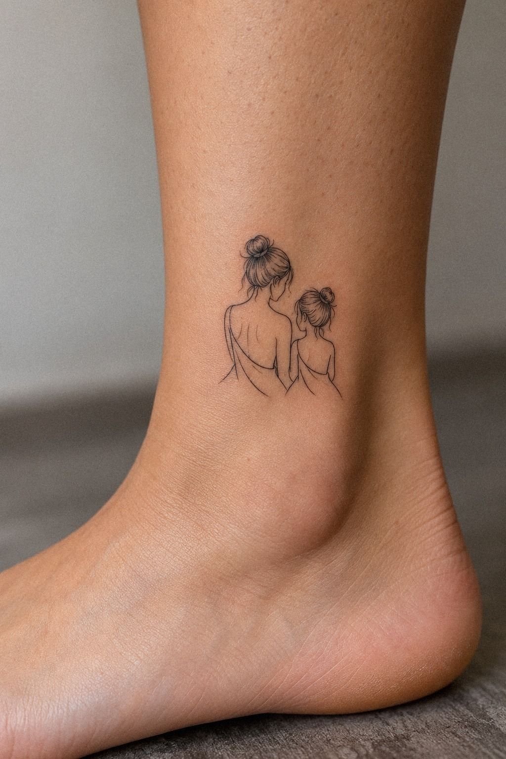
The ankle was my mother’s first choice because it felt discreet. We asked the artist to compare that placement with the shoulder and forearm before committing.
The ankle looked sleek, but the skin moved more than we expected. My mother decided the outer wrist would be easier to live with, while I kept the shoulder because it gave the moth more breathing space. That small test saved us!
5Why the Wrist Placement Worked

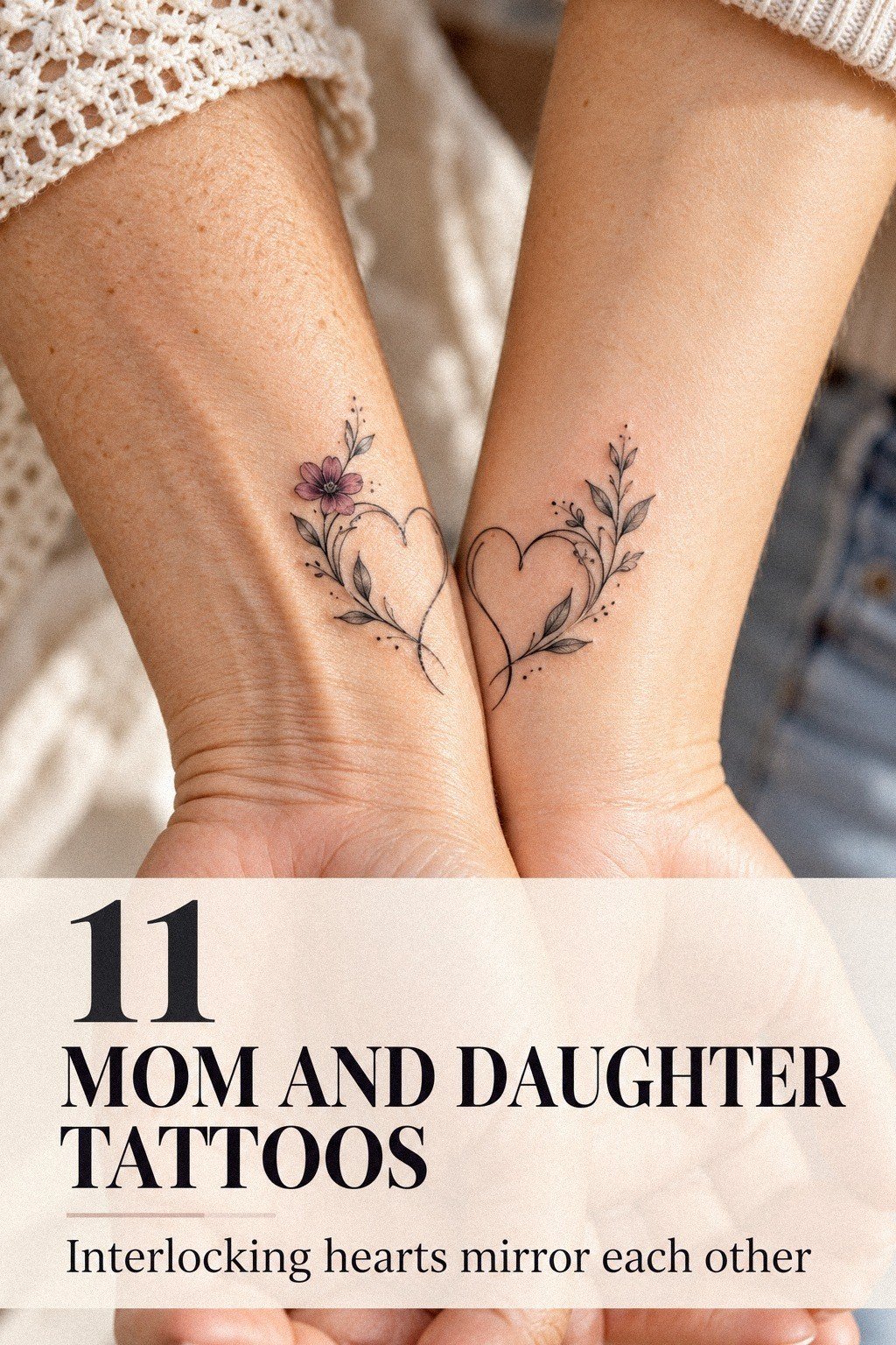
The wrist gave us the visibility we wanted. We could glance down and see the design during ordinary moments, but the tattoo would still fit beneath a sleeve when we wanted privacy. I chose blackwork flash references with open shapes, small symbols, and enough contrast to survive quick viewing.
The artist placed the stencil on the inner wrist first, then moved it slightly toward the side. That adjustment mattered because the first position crossed a crease. Skin folds can interrupt a small design, and I didn’t want the moth’s body to look bent whenever I moved my hand.
My mother chose the outer wrist, where the skin felt less tender during the test placement. The tattoos still looked connected because the scale and line weight matched.
They didn’t need to sit in the exact same direction. Personal placement made each one feel more natural.
Would I choose the wrist again? Yes, but I’d ask about daily friction first.
Watchbands, bracelets, and repeated rubbing can make healing annoying. Keep the design simple, and compare your options with these small meaningful tattoos before the appointment.
6Compare Pain Before You Commit

I asked the artist to place a small stencil on my inner forearm and another near the wrist. The test didn’t predict the exact sensation, but it showed us how much the design would move with the skin. My mother appreciated knowing where the tattoo would sit before discussing the pain.
Our pain comparison was honest rather than dramatic. The wrist felt sharper for me, while the forearm felt more repetitive because the artist needed several passes. My mother found the outer wrist manageable but didn’t enjoy the area near the bony edge.
We agreed on comfort breaks before the appointment. Neither of us wanted to treat pain like a competition, and neither of us wanted to pretend a small tattoo would feel painless. If you’re planning your first piece, these very small tattoos can help you compare scale and placement before you commit.
7Two Daughter Marks for Mom
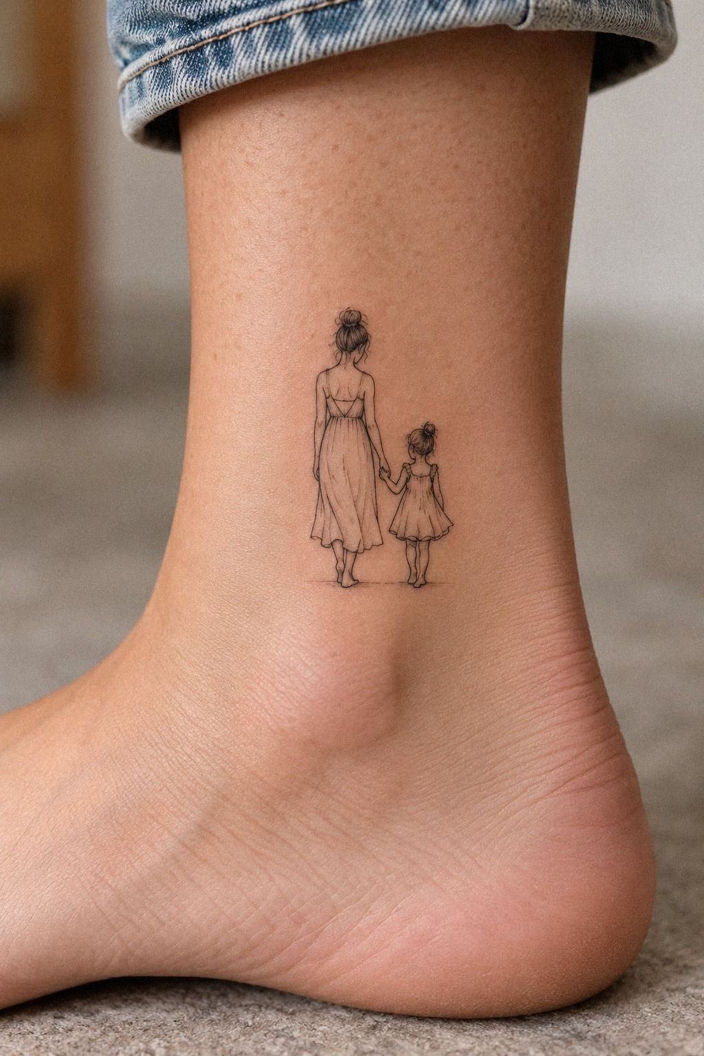
When two daughters are part of the story, a single matching mark can feel too simple. I designed one moth with two small accent marks, one for each daughter. The accents stayed close to the body, so the design remained bold and readable instead of becoming a crowded family diagram.
We tested the idea in solid black pigment first. The artist warned us that tiny unfilled shapes could soften as the tattoo aged, especially if they were packed too closely.
I kept the central body dark and let the wings carry the lighter detail. That balance gave the piece a timeless outline.
The emotional trigger came when my mother recognized the two marks immediately. She didn’t need an explanation, and I didn’t have to label them with initials.
The family symbol said enough on its own. That’s the kind of meaningful detail I’d recommend when a parent wants a tattoo connected to more than one child.
If you’re planning two-daughter tattoos for Mom, resist stacking names into every open space. One symbol per relationship can feel more empowering than a list. These daughter tattoos for mom gave us more ideas for honoring family without losing a crisp silhouette.
8Keep Initials in the Background
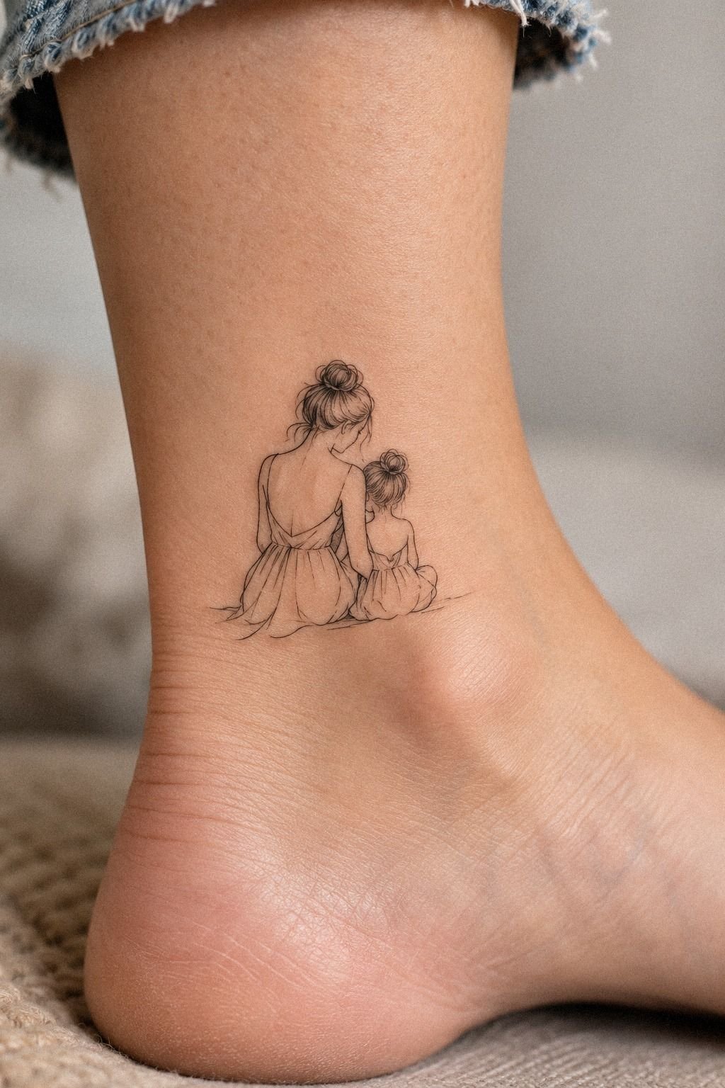
Initials were tempting because they made the connection obvious. We tested them beneath the moth, beside the heart, and inside the lower wing.
The artist advised us to treat lettering as a supporting detail rather than the main design. Small initials can blur when they are squeezed into a narrow space, especially near a moving joint. We kept one initial in the reference sketch and removed it from the final stencil.
That choice made the tattoo more expressive. The story stayed ours without becoming overly literal.
9The Tiny Heart We Nearly Cut

The heart came from a joke between us. My mother wanted something serious, while I kept sketching a tiny heart beside the moth. We finally added one small outline on the upper back, where the shape could stay clean and playful without crowding the main tattoo.
The artist used thin black outline and left the heart unfilled. That gave it an open quality that balanced the darker moth body. It was whimsical, but not childish.
The detail made us smile during the appointment, which was exactly why it belonged there.
I considered placing the heart near the wrist instead, but the upper-back placement gave it more room. The skin there also felt less distracting during the session. You might prefer a visible placement, but a private symbol can carry just as much meaning.
The heart became my favorite detail because it wasn’t planned at the beginning. It arrived after we’d already made the serious choices.
If you’re adding a playful element, keep it small and let it support the story. These cute mom and daughter tattoos show how warmth can exist without turning the design sugary.
10Plan Healing Around Real Routines

We booked the appointment before a quiet weekend because healing needed attention. A fresh tattoo can look crisp at first, then peel and feel dry as the surface recovers. I didn’t want either of us rushing through care after a long workday or exposing the skin to a pool.
The artist gave us gentle aftercare cleanser instructions: wash carefully, pat dry, use a light moisturizer, and avoid scratching. Surface healing usually takes about two to three weeks, while complete healing can take about two to three months. We planned clothing and errands around that healing window.
The fresh version looked darker and sharper than the healed result. The healed pigment looked softer, but the moth still held its shape because the main contours were clear. That difference is normal, and you shouldn’t judge the final result too quickly.
Protect the tattoo from direct sun after healing. UV exposure can soften fine lines and fade dark pigment over time.
Avoid swimming while the surface is healing, too. If you’re planning a first appointment, these very small tattoos can help you choose a design you’ll be willing to care for.
11The Finished Mother-Daughter Moth

The finished moth sat on my wrist, while the artist adjusted the skin-tone reference for my mother’s version. The spacing changed slightly so the design would remain clear rather than forcing every detail into the same tiny scale.
We compared the two tattoos before leaving. The linework wasn’t perfectly identical, but the shared shape, central body, and wing rhythm made the connection obvious. That difference felt daring in the best way because each tattoo respected the person wearing it.
The final check focused on line weight, stencil position, and how the moth moved with each wrist. We also asked about care, cost, and when to judge the healed result. Those small questions gave us more confidence than trying to rush toward a finished look.
For more related ideas, I compared these daughter tattoos for mom before we settled on the moth.
What We Changed Before the Stencil
The strongest decisions happened before the appointment. We removed two leaves, reduced the initials, moved the moth away from the crease, and left more open skin inside the wings. Each change made the design less crowded and more readable.
I was tempted by a more ornate version because it looked impressive on paper. My mother preferred the minimal version because it felt easier to wear every day. We met in the middle with an intricate outline and a restrained amount of detail.
That compromise also improved the cost. Fewer unnecessary elements meant less needle time, but we didn’t reduce the size or spacing needed for quality.
The goal wasn’t the cheapest tattoo. It was the best value for a design we’d still recognize years from now.
How Much Did It Cost?
Our final quote depended on the shop minimum, the artist’s experience, the placement, and the amount of linework. There isn’t one universal price for matching mother-and-daughter tattoos, and a reputable artist should explain the estimate before the session.
Our decision was to spend on design work and careful placement before adding extra details. I’d skip a cheaper appointment if the artist can’t show healed linework. Your budget should include the consultation, both tattoos, aftercare, and a little flexibility if the design needs adjustment.
For a realistic estimate, send the artist the same reference, placement, approximate scale, and number of people getting tattooed. Ask whether the minimum applies to each person. The answer can vary by studio, and you’ll want that clear before you book.
The price felt worth it because we knew what we were paying for: time, hygiene, consultation, steady linework, and adjustments that made the tattoos suit us. A low quote isn’t always good value if it leaves you correcting a rushed design later.
For another comparison point, these very meaningful tattoos helped me separate a genuinely personal design from a trend I’d forget.
Why Meaning Beat Perfect Matching
I used to think matching tattoos had to look identical to feel connected. Sitting beside my mother changed that opinion.
Her skin, wrist shape, and comfort level were different from mine, so an exact copy would have forced one of us into a less natural choice. The stronger decision was to share the moth, the line quality, and the story while allowing the placement to belong to each body.
I also learned that pain becomes easier to handle when nobody pretends it won’t exist. My ankle hurt more than my shoulder.
My mother found the wrist sharper than the forearm. We took breaks, drank water, and talked through the parts that felt intense.
That honesty made the appointment feel intimate rather than dramatic.
The design needed restraint. We removed extra leaves, reduced the initials, and left open skin inside the wings.
I wanted something intricate, but I didn’t want detail for its own sake. A tattoo can be bold without being oversized, and it can be personal without displaying every fact about your family.
The biggest lesson was about aging. Fine lines may spread, and sun can soften them faster.
Strong placement, clear spacing, and solid black structure give a tattoo a better chance of staying readable. If you’re choosing between a crowded design and a simpler one, I’d choose the simpler one with the more powerful symbol.
What makes a matching tattoo last emotionally isn’t identical ink. It’s the decision you remember making together.
We still disagree about placement, pain, and how many details belong in a design. That makes the finished tattoos feel real. They hold the conversation, not just the symbol.
If you’re still comparing options, these tattoos dedicated to mom helped me think about family symbolism without turning the design into a literal family tree.
What the Appointment Felt Like
We arrived with the same reference but different nerves. My mother asked about the stencil twice. I asked about the line weight, healing, and whether the wings would remain open at the chosen scale.
Neither question was excessive; a careful artist should expect both.
The first few passes felt sharper than I expected. Then my body adjusted, and the sensation became more predictable. My mother preferred conversation, while I needed a quiet minute when the needle crossed the tenderest part of my wrist.
The best part was the shared rhythm. One of us would tense, the other would notice, and we’d pause without embarrassment. The appointment felt raw and honest, but it also felt graceful because neither of us had to perform bravery.
By the end, the design looked darker than planned. The artist explained that fresh pigment and mild swelling can make lines appear heavier. That explanation gave us confidence in the healing process and made the consultation feel worth the price.
For more placement ideas, I also checked these small meaningful tattoos before the appointment.
What Changed After the First Week
During the first week, the tattoo looked less polished than it had immediately after the appointment. The skin felt dry, and some surface peeling made the wings seem uneven. I followed the artist’s instructions instead of judging the design while it was still recovering.
My mother was more concerned about friction from her sleeve. I was more concerned about sunlight and whether the wrist placement would interfere with daily tasks. We compared notes, but we didn’t copy each other’s aftercare routine because our placements were different.
By the second week, the surface looked calmer. The healed black pigment wasn’t as dramatic as the fresh version, but the central moth remained clear. The open areas helped, and I was glad we’d rejected the crowded sketch.
That experience changed how I think about cost and value. The appointment itself was only one part of the commitment. Research, planning, aftercare, and patience all affected whether the final tattoo felt worth it.
These very small tattoos are useful when you want to think through scale before making a long-term decision.
The Questions I Get Asked Most
How much does a Meaningful Mom And Daughter Tattoos usually cost?
A small matching tattoo usually falls around a shop minimum of about $50 to $100, while hourly rates often run about $100 to $250 in the United States. The final quote depends on the artist, region, placement, size, and detail. Ask whether each person pays a separate minimum.
Are Meaningful Mom And Daughter Tattoos a good idea for a first tattoo?
Yes, especially when you choose a tolerable placement and a design with clear lines. A personal symbol can feel less intimidating than a trend-based image. Forearm, thigh, and shoulder placements are often easier to manage than ribs, feet, hands, or sternum.
How do I choose a tattoo artist for Meaningful Mom And Daughter Tattoos?
Choose an artist who shows clean linework and healed photographs, not only fresh tattoos. A strong portfolio reveals how the artist handles spacing, skin tone, and small details. Confirm studio hygiene, consultation time, placement advice, and aftercare instructions before booking.
How much do Meaningful Mom And Daughter Tattoos hurt?
Pain varies by person and placement. Forearms, thighs, and shoulders are often more tolerable, while ribs, feet, hands, and sternum can feel more intense because of bone and sensitivity. Fine-line work still involves repeated passes, so don’t assume a small tattoo will feel painless.
How long does a Meaningful Mom And Daughter Tattoos take to heal?
Surface healing usually takes about two to three weeks, while complete healing can take about two to three months. Gentle washing and sun protection support recovery, along with avoiding pools during surface healing. Follow your artist’s instructions if they differ from general guidance.
What’s the best placement for Meaningful Mom And Daughter Tattoos?
The best placement is one that suits your routine, comfort level, and design size. Forearm and shoulder placements offer visibility with generally tolerable pain, while the wrist gives a more intimate daily reminder. Avoid placing fine details where constant friction could irritate the skin.
Where I’d Start First
If I had to pick one, I’d start with the shared moth symbol. Its open wings keep the design readable, while the meaning gives both tattoos emotional weight. Choose the placement together, then let the artist adjust the stencil to each body.
I’d set a realistic budget, compare healed work, and leave room for one final design change. The smartest value isn’t always the lowest cost. It’s choosing a personal, timeless symbol that you’ll still be glad to see years later.
For more family-centered directions, I’d begin with these daughter tattoos for mom and then simplify whatever catches your attention. Keep the story, keep the spacing, and let each tattoo belong to the person wearing it.