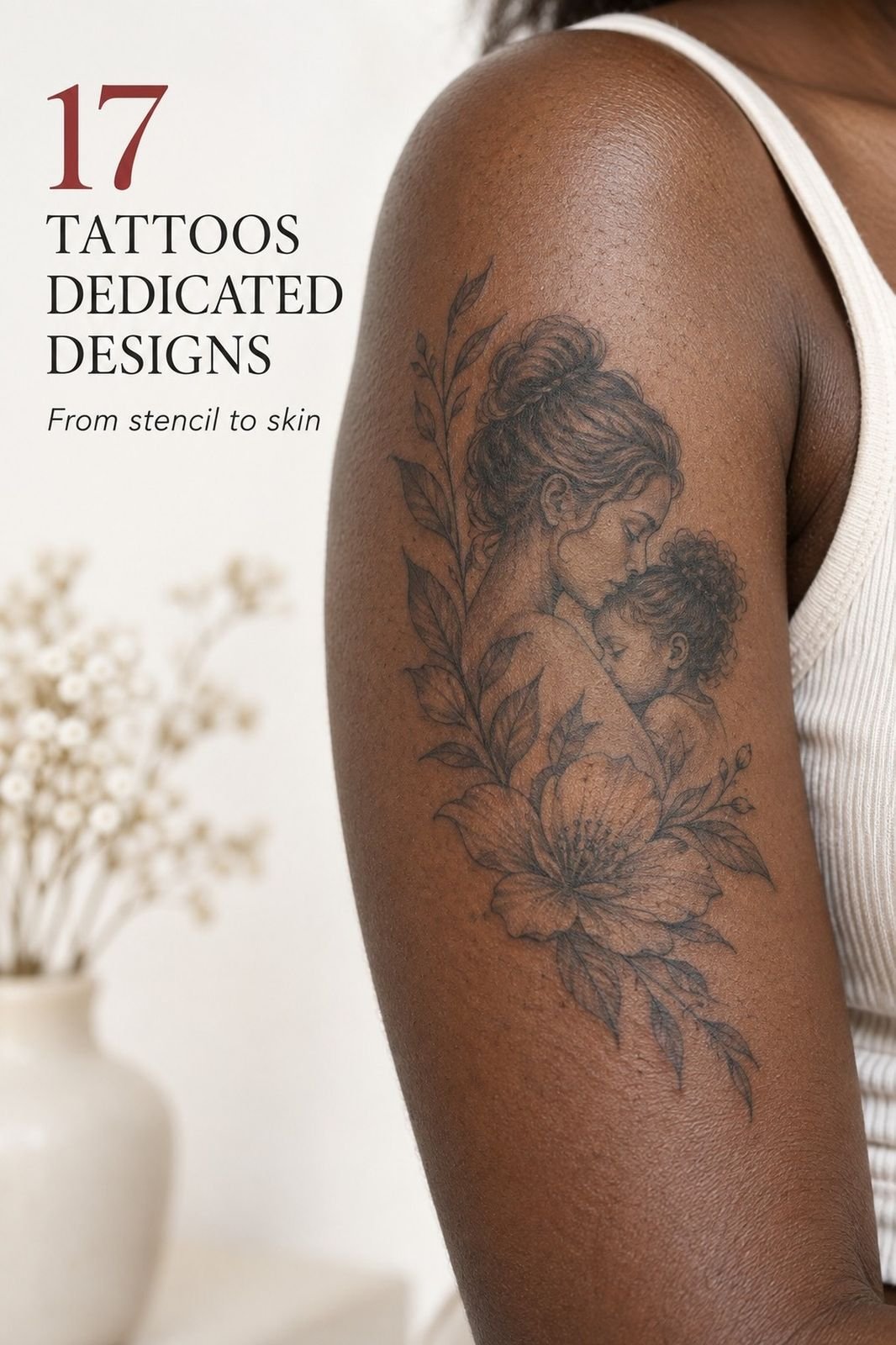
Tattoos Dedicated To Mom can cost about $100 to $300 in the US, depending on size, placement, and the artist’s rate. I chose a fine-line tribute after months of hesitation, then watched one handwritten word turn into something personal, striking, and unexpectedly powerful.
The design changed. So did I. The finished piece felt bold enough to matter, but delicate enough to still feel like her.
Before the appointment, I had a blank patch of skin and too many saved references. Some were bold. Others were delicate, ornate, or overly complicated.
None sounded like my mother. I wanted a tattoo with a clear reason, but I didn’t want a generic heart with a date beneath it.
My notes held her favorite flower, one sentence from an old birthday card, and the date she taught me to drive. That was enough. I’d finally found the raw material for an expressive design, and my artist helped me turn it into crisp black linework without crowding the skin.
The first fine-line stencil looked almost too simple. Then I saw the details together: her handwriting, the flower, and one date. It felt timeless without trying to look important.
That one real detail gave the whole idea a pulse.
What Should Stay Out Of A Tribute Tattoo?
I started by removing anything that explained too much. A generic heart felt obvious, and a full portrait seemed too ambitious for the memory I wanted to hold. The strongest idea was smaller and more personal.
I also cut three extra dates, a quote, and several decorative symbols. That design boundary gave the tattoo a sharper emotional center. You don’t need every detail that matters to you in the final piece.
I nearly kept a set of ornamental flourishes, but they made the design feel polished in a way my mother never was. Her humor was direct.
Her handwriting was uneven. Those flaws mattered.
If you’re narrowing down your own concept, unique word tattoos can help you compare simple lettering ideas before adding too many symbols.
Mom’s Handwriting Takes the Lead
I started with her handwriting because it carried her personality better than a font could. The reference was a scanned grocery list, complete with a crooked lowercase “m.” It wasn’t polished, but that little wobble felt expressive and timeless.
The artist traced the word into a fine-line stencil and showed me three versions. I chose the most understated one, not the prettiest. Single-needle black ink kept the mark crisp without making it look like a logo.
If you’re collecting references, my guide to daughter tattoos for mom has more personal lettering directions.
The artist preserved the lowercase loop instead of correcting it. I almost picked a decorative script. I’m glad I didn’t.
Script would’ve looked ornate in the sketch, but her actual handwriting felt more honest against my fair cool-pink skin. And yes, I stared at the stencil for nearly twenty minutes before saying yes!
Let the Iris Breathe
My mother’s favorite flower was a simple iris, so I asked for one iris stem instead of a full bouquet. The sketch showed a narrow stalk, two leaves, and layered petals near my collarbone. That restraint made the design feel graceful, feminine, and quietly powerful.
The artist used a 0.25 mm needle grouping for the first outline, then left the interior mostly open. I liked that choice because dense shading could’ve made the image harder to read over time. You’ll want to ask how your artist handles negative space, especially if your reference has thin petals or overlapping shapes.
I rejected a watercolor version because it felt too sentimental for my story. The single stem was clearer and more personal. If you’re considering negative-space petals, compare them with these white ink tattoos before choosing your final contrast.
One Date Or The Full Year?
The birthdate went beneath the flower in a small month-and-day format, centered with enough separation to remain readable. I used the month and day only because the full year made the design feel crowded. That decision gave the piece a clean, symbolic rhythm.
My artist tested the numbers on black transfer stencil paper first. It showed how the date would sit on my medium olive skin, and I noticed the first version was too close to the stem. You’ll want a narrow strip of skin between separate elements, even when the tattoo looks tiny on paper.
I considered Roman numerals, but ordinary numbers felt more honest. They’re easier for you to read, easier for your mother to recognize, and less likely to blur into decorative marks. Read about why tattoos blur over time before approving very small lettering.
Choose the Inner Forearm
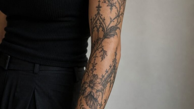
I chose the inner forearm because I wanted to see the tattoo during ordinary moments, not only in a mirror. The placement felt visible, practical, and personal. On my golden tan skin, the black lines looked crisp against the natural undertone.
You’ll want to think about visibility before thinking about symbolism. I work with my hands, so I skipped the wrist and fingers. The placement consultation also showed me that the forearm gave the flower enough length to breathe without making it too noticeable.
The first mockup sat too close to my elbow crease, and I vetoed it. That area bends constantly and can make a fine line look uneven while healing. If you’re comparing visible options, this guide to wrist tattoos for men explains why placement changes the whole experience.
Move the Stencil Before You Commit
The flash sheet showed several versions of the same idea, from a narrow 1.5-inch stem to a fuller 3-inch composition. I liked the smallest sketch first, but it lost the flower’s inner shape when reduced. The 2.5-inch temporary stencil looked more balanced, crisp, and elegant without becoming dramatic.
We placed the stencil on my forearm and checked it from different angles. You should move your arm, bend your wrist, and look at the design in regular daylight. A tattoo can seem perfect while you’re seated, then feel oddly tilted when your muscles shift.
The daylight check changed my mind about the smallest version. Smaller isn’t always more delicate; sometimes it’s simply harder to read. If you’re planning your first piece, where tattoos hurt less can help you compare surface area, bone, and session length before booking.
Fine Line Or Bold Blackwork?
I chose a fine-line tattoo because the memory itself felt quiet. I didn’t want heavy shading to overpower the handwriting or make the flower seem fiercer than it was. The minimal approach left the story visible.
The alternative was bold blackwork, with thicker petals and a darker heart. That version looked sleek and iconic on the stencil, but it felt less like my mother. Your tattoo can be striking without becoming loud.
Looking at a healed reference helped me decide. Fresh ink can appear sharp and dramatic, while healed lines reveal the real balance.
I wanted something refined enough to stay readable, but raw enough to keep its personality. White ink tattoos are another useful comparison if you’re deciding how much contrast you want.
Watch the First Inked Lines
The first lines went onto my shoulder because that was the placement I finally trusted for the larger version. The shoulder placement felt manageable, and the skin gave the artist enough space to work carefully. The sensation was sharp but manageable, more scratchy than fierce.
The stencil used carbon-free purple transfer ink, which made the final black outline easy to follow. You’ll want to check that the stencil is straight before the needle starts, because fine-line corrections aren’t as forgiving as broad traditional work. My artist paused twice, and I appreciated the care.
I had expected the emotional moment to arrive at the end. Instead, it happened when the black outline of the first petal appeared.
That tiny curve felt haunting and empowering at the same time. That was the moment! For another contrast, make tattoo hurt less explains how preparation can affect the appointment.
Mom’s Handwriting, Kept Imperfect
The handwriting took longer than the flower because every curve had to stay recognizable. I watched the artist stretch the skin, wipe away excess ink, and rebuild the letters one stroke at a time. The result looked raw, personal, and slightly imperfect.
We used archival handwriting reference paper beside the stencil, not a phone screen. That made comparison easier and prevented the letters from becoming too smooth. You’ll want to bring more than one sample if your mother’s handwriting changed over the years.
I asked for the name to remain plain, without stars or decorative flourishes. My mother isn’t flashy, so a bold embellishment would’ve felt false. The final plain lettering was delicate but readable, and that balance made it feel like her voice had found a permanent place on my skin.
Mom’s Grocery Note: The Detail That Survived
The original word came from a lemon note she’d written before a family dinner. She probably forgot it existed.
I didn’t. That tiny detail made the tattoo feel more sacred than a formal quote would have.
I tested several handwriting samples, but the handwriting sample with the crooked “m” carried the clearest memory. You’ll want to choose the version that makes you remember a moment, not simply the version that looks most polished.
The surviving detail became my favorite part of the tattoo. A flower can be graceful and symbolic, but a family memory gives it a pulse. That’s why I’d start with one real object, phrase, or gesture before choosing a style.
Add One Tiny Heart, Then Stop
The tiny heart went behind the ear in the smallest design I considered. It had a clean outline, no shading, and enough distance from the name to keep both shapes readable. The outline heart felt small, restrained, and lighthearted without becoming childish.
My artist used a 3RL round liner for the heart and checked the outline under bright studio light. I asked whether a filled heart would last longer, and she said it could, but the solid mark would change the balance. That honest answer mattered more than choosing the darker option.
I nearly added a second heart for my siblings. Then I stopped.
The single symbol carried more meaning because it pointed directly to my mother. If you like symbolic blackwork with a stranger edge, witchy tattoos can offer ideas for small icons without copying this tribute.
Show Mom the Unfiltered Version
The finished piece sat along my ribs, where the lines curved slightly with my breathing. I took the first photograph near a window because window light showed the details without harsh glare. The flower looked elegant and crisp, while the handwritten word gave the tattoo its emotional center.
I photographed healed black linework from three angles, then waited before sending anything. You’ll want to capture the tattoo while the skin is calm, not immediately after the session when redness can distort the edges. A close crop showed the petals, while a wider frame showed how the design followed my body.
My first photo was too dramatic and made the tattoo look darker than it was. I retook it with a neutral background and no filter. The second image felt more honest, and that’s the one I showed Mom.
Make tattoo hurt less also helped me prepare for the appointment itself.
Give Fine Lines Time to Heal
The stencil and healed comparison made one thing obvious: fine lines need patience. The surface healing usually takes about 2 to 3 weeks, while complete healing can take around 2 to 3 months. During that period, the design may look dry, bright, or slightly uneven before it calms.
I followed the artist’s instructions with fragrance-free aftercare lotion, washing gently and avoiding unnecessary rubbing. You’ll want to keep the area away from swimming and direct sun while it heals. I also stopped picking at flakes, even when the skin looked rough.
The first week wasn’t glamorous. It was itchy, inconvenient, and oddly reassuring.
I learned that healed ink tells the truth better than fresh ink. Those healing flakes can be annoying, but patience protects the final lines. Read why tattoos blur over time before deciding whether your design needs slightly heavier marks.
Mom Laughs at the Lemon Note
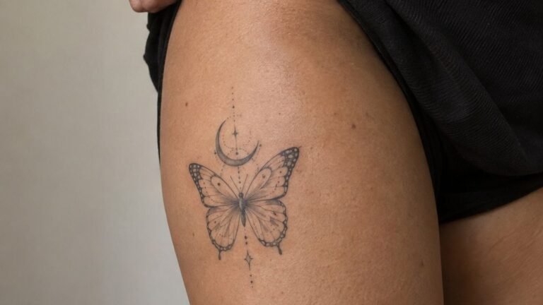
I waited until I could visit her instead of sending a message. The tattoo was on my thigh, so I wore something comfortable and showed her the flower first. The thigh placement made the reveal private without making the tattoo feel hidden.
The piece used solid black pigment with open skin around the petals, which kept it readable against my deep brown skin with warm undertones. You’ll want to think about how your mother might respond to the design, not just how it photographs.
She laughed because the handwriting came from a note about buying lemons. That handwriting reveal made the moment feel real instead of staged.
I’d expected tears, but the laugh was better. It was affectionate, unmistakably hers!
For another placement comparison, daughter tattoos for mom explores designs built around family connection.
How Much It Cost
My written budget was $220, but the final amount depends on your artist, region, design complexity, and minimum charge. US studios commonly set a minimum around $50 to $100, while hourly rates often fall near $100 to $250. A small tribute may still meet the studio minimum even if the tattoo takes less than an hour.
I spent time comparing artists instead of chasing the lowest price. Fine-line consultation was included with my booking, and that saved me from paying for a redraw later. You’ll want the quote in writing, especially if you’re adding handwriting, a flower, or a date after the first consultation.
For my budget, the design fee and session stayed within the planned amount. I skipped an unnecessary color accent because the black linework already felt alive and connected. If you’re considering a rib placement, do rib tattoos hurt can help you understand why the appointment may feel more intense.
What Would I Choose Again After Living With It?
I chose fine line because it matched the memory, not because it was fashionable. That distinction matters. Fine lines can widen with time, and UV exposure can soften contrast, but thoughtful sizing, solid black pigment, and sensible placement give the design a stronger chance of aging well.
I’d choose blackwork line consistency again, but I wouldn’t shrink the piece below 2 inches. My smallest reference looked charming on paper and became vague on skin. The larger flower gave the petals room to remain expressive, while the handwriting stayed readable.
My biggest mistake was treating the tattoo like a graphic design assignment. It needed a memory, a body placement, and a reason to exist. The imperfect handwriting is the part I’d protect first.
It’s not polished, but it’s personal, and that makes it feel lasting. If you’re preparing for your own session, make tattoo hurt less covers a few practical choices I’d repeat.
Why This Tribute Still Feels Meaningful?
I used to think a memorial tattoo had to explain the entire relationship. It doesn’t. Mine holds one flower, one date, and a few letters from a grocery note.
That’s enough because the meaning lives behind the ink, not inside a complicated illustration.
My mother’s handwriting gave the piece an intimate center, while the flower added a graceful visual shape. Personalized tattoo lettering kept the design connected to her instead of turning it into a generic tribute. I skipped a portrait because I didn’t want the tattoo to depend on perfect realism.
This is the choice I’d defend most strongly: select one memory and let it stay specific. A vague symbol can be memorable, but a specific memory from real life can feel resonant every time you see it. If you’re weighing lettering against imagery, unique word tattoos offers useful examples of how text can carry the whole idea.
What People Always Want to Know
How much does a Tattoos Dedicated To Mom usually cost?
A Tattoos Dedicated To Mom usually costs about $100 to $300 in the US, although a shop minimum may be $50 to $100 and hourly rates often run $100 to $250. The final quote depends on size, artist, region, lettering, and placement, so ask before booking.
Are Tattoos Dedicated To Mom a good idea for a first tattoo?
Yes, they can be an excellent first tattoo because you can choose a tolerable placement, clean linework, and a subject that already matters to you. A first tattoo feels less intimidating when the design has a clear personal reason behind it.
How do I choose a tattoo artist for Tattoos Dedicated To Mom?
Choose an artist with clean linework, healed photographs, strong hygiene practices, and experience with your preferred skin tone. Healed portfolio images matter most because fresh ink can hide spreading, uneven lines, or weak contrast. Ask for a consultation before paying a deposit.
How much do Tattoos Dedicated To Mom hurt?
Pain varies by placement. Ribs, feet, hands, and the sternum tend to feel more intense, while the forearm, thigh, and shoulder are often more tolerable. Pain tolerance is personal, so review where tattoos hurt less before choosing.
How long does a Tattoos Dedicated To Mom take to heal?
The surface usually heals in about 2 to 3 weeks, while complete healing can take around 2 to 3 months. Wash gently, moisturize as directed, and avoid sun, pools, and picking.
Patient aftercare protects fine lines, especially during the first week. You can also review why tattoos blur over time before booking.
What’s the best placement for Tattoos Dedicated To Mom?
The forearm, shoulder, or thigh can work well because they’re often more tolerable and give fine lines room to age. Ribs and hands may feel more intense. Placement choice should reflect how often you want to see the tattoo, then you can compare options with wrist tattoos for men.
Where Would I Start First?
If I had to pick one, I’d start with Mom’s handwriting. It carries a detail no font can imitate, and even a tiny imperfect loop can bring back a whole conversation. Pin this idea for later, then save the note that makes the design yours.
It still makes me smile!