Unique Word Tattoos can stay personal for years if you choose a word that breathes at the right size. I got my first single-word piece the week I turned 30, after cutting three “meaningful” options that already felt like somebody else’s caption. The final word was quieter. Better.
- I Chose One Word With Staying Power
- I Tested My Word In Three Lettering Styles
- I Cut Meaningful Words That Felt Too Obvious
- I Matched The Word To My Handwriting
- I Picked A Body Placement For Visibility
- I Sized The Letters For Long-Term Clarity
- I Compared Black Ink With Fine Red Ink
- I Checked Pain Levels Before Booking Placement
- I Reviewed Single Word Tattoo Sketches Carefully
- I Confirmed Spacing Before The Needle Started
- I Protected The Fresh Lettering During Healing
- I Let The Finished Word Speak Quietly
1I Chose One Word With Staying Power
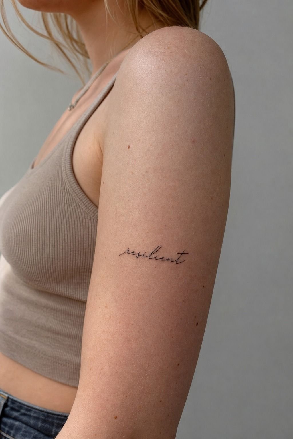
I wanted a word I could live with on a bad Tuesday, not just one that sounded good in a Pinterest caption. That meant I stopped chasing motivation quotes and started looking for language that described how I move through life. “Steady” won because it wasn’t trying too hard, and it still felt true when the initial excitement wore off.
For your own Single Word Tattoos, test the word in a sentence you’d say out loud. If you’d cringe saying it to a friend, don’t put it on your skin. I’d skip “fearless” unless it has a very specific personal link, because broad power words can feel borrowed fast.
The upper arm is a clean place for this. You can see it in a sleeveless top, but it’s not yelling from across the room. Fine-line black ink on that smoother outer-arm skin tends to heal soft and readable when you give the letters enough room.
And give yourself a week before booking. If the word still lands after ordinary life gets loud, you’re probably onto something.
2I Tested My Word In Three Lettering Styles
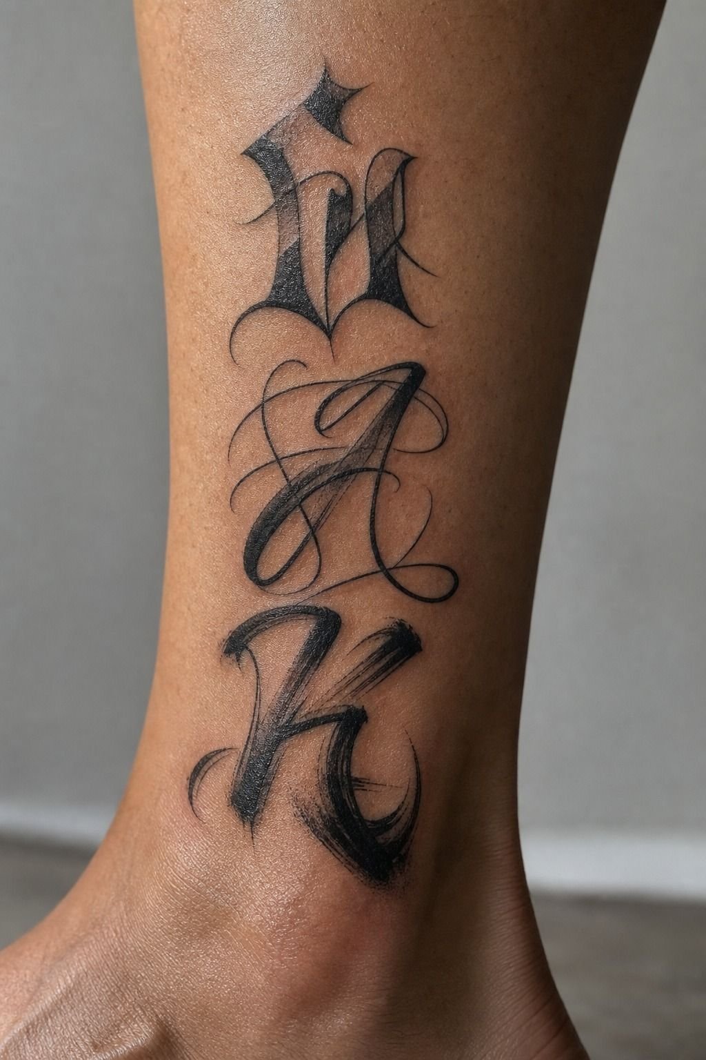
The word itself was only half the decision. Script, serif, and loose handwriting can turn the same five letters into three completely different tattoos. I printed each option at actual size and taped them near my ankle, because a tiny digital mockup lies to you.
For Cool Word Tattoos, I like a restrained serif or a casual handwritten style more than ultra-thin cursive. Cursive can look airy at first, but tight loops on an ankle become a chewed-up little mess if the artist has to squeeze every turn into a narrow strip of skin.
My favorite test was simple: Baskerville Italic, a clean single-needle script, then my own scanned handwriting. The handwriting felt most intimate, but the serif read better from a few feet away. You want both.
A word tattoo should feel personal up close and still look intentional from across the room.
But don’t ask an artist to copy a typeface blindly. Bring references for mood, then let them redraw it for your anatomy. That’s how you get crispy, confident lines instead of ten fuzzy little pulls.
If you’re drawn to words with cultural or language roots, read through these Arabic word tattoo meanings before committing to a translation.
3I Cut Meaningful Words That Felt Too Obvious
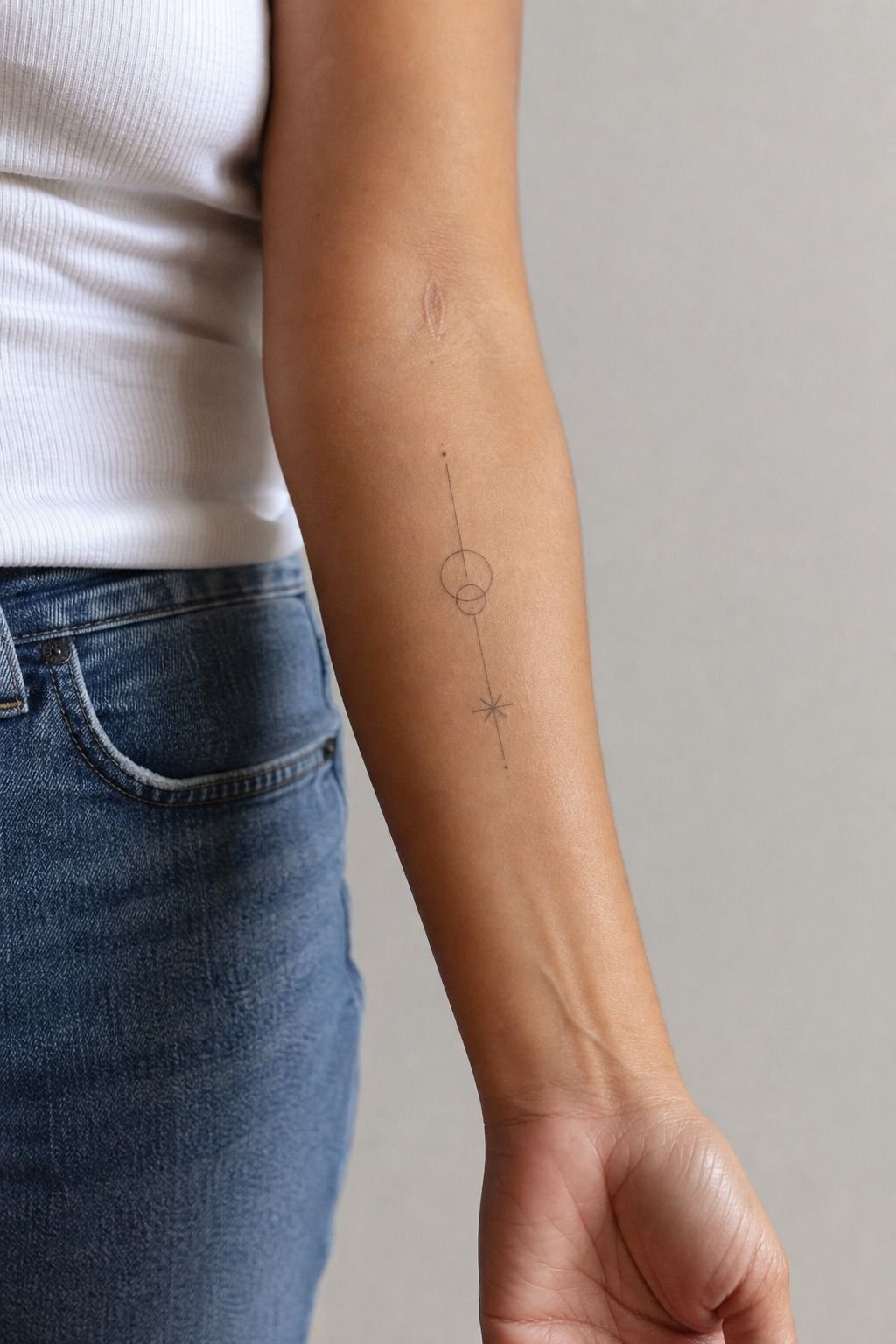
I had a long list at first. “Breathe.” “Bloom.” “Wander.” They weren’t bad words. They just felt like they belonged on a dozen different forearms, including mine.
So I used what I call the Three-Year Filter. Could I picture the word on my skin after a job change, a breakup, a move, or a weird year?
If the answer depended on a specific mood, I cut it. A tattoo doesn’t need to explain your whole story, but it should survive the next chapter.
For Tattoos With Deep Meaning, specificity beats drama every time. A word from a grandmother’s handwriting, a private family phrase, a place name shortened to one word, or a value you’ve had to practice can hold more weight than a loud declaration.
I’ve seen “angel” work beautifully when it refers to a real person. I’ve also seen it chosen because the font was pretty.
The second version doesn’t have the same roots. Your word needs roots.
You can browse meaningful word tattoos for direction, but don’t lift one word exactly because it got a lot of saves. References are for vibe, not copy-and-paste.
4I Matched The Word To My Handwriting
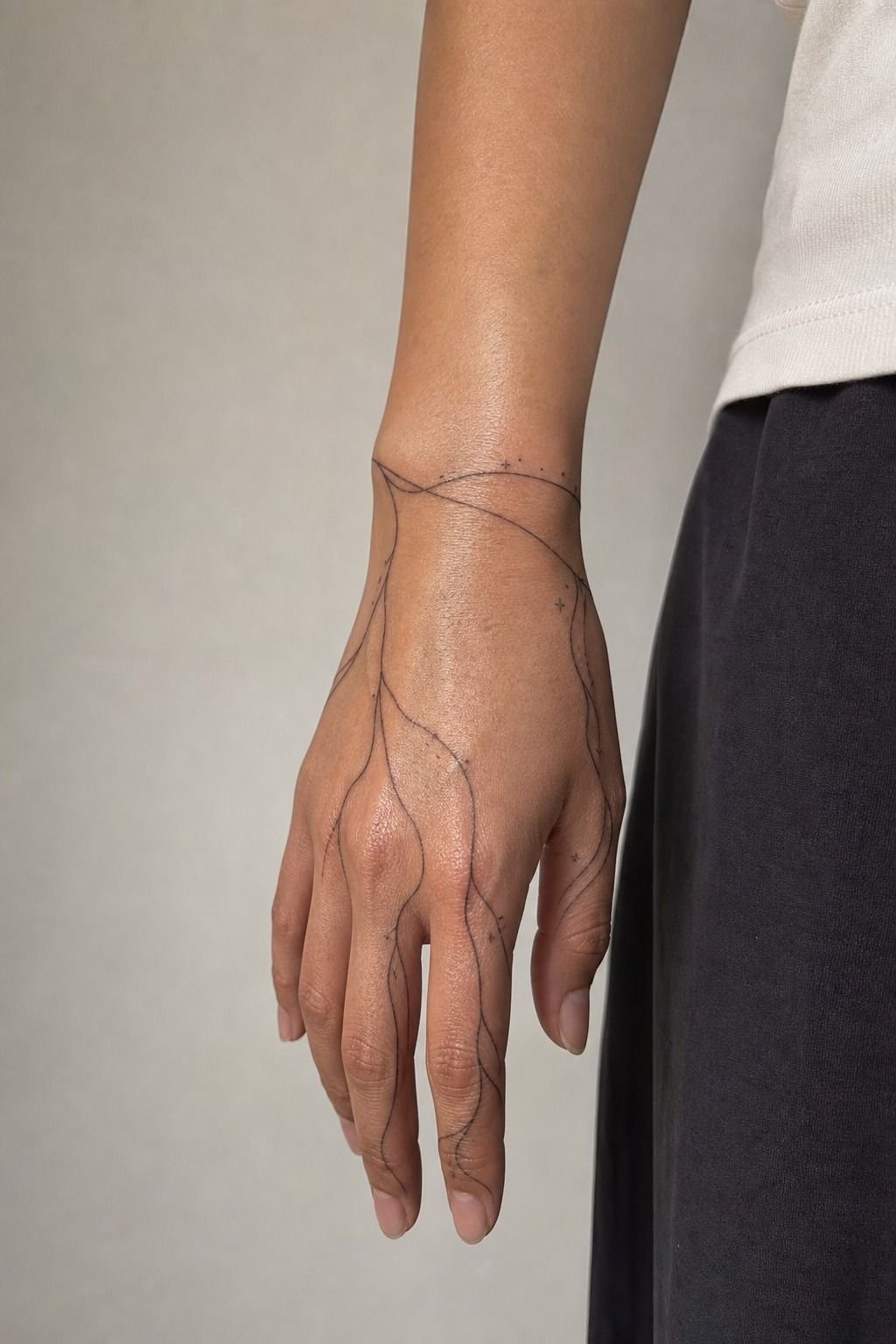
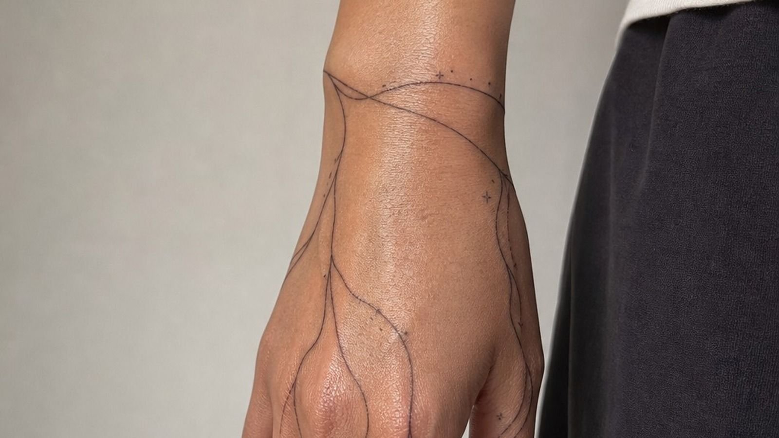
The hand placement photo is pretty, but I’m going to be blunt: hands are high-wear zones. They wash constantly, rub against everything, fade faster, and ask for touch-ups. If you want a word over the side of your hand, choose a short one with open spacing and accept the maintenance.
I matched my lettering to the slant and uneven little rhythm of my handwriting. Not every wobble.
Just enough personality that it didn’t look like a stock font. Single-needle linework can make that feel refined, especially when the artist leaves a little air around each letter.
For Little Word Tattoos, keep the hand version to roughly 1 to 2 inches when possible, with letters that aren’t packed together. That size gives ink somewhere to settle as it ages.
Smaller isn’t always cuter. Sometimes smaller is just future soup.
Would I put a long word across the fingers? No. I’d bump it to the side of the hand or forearm where it can breathe and heal nicer.
Your artist should say that too. If they’ll tattoo anything at any size without a conversation, keep looking.
5I Picked A Body Placement For Visibility

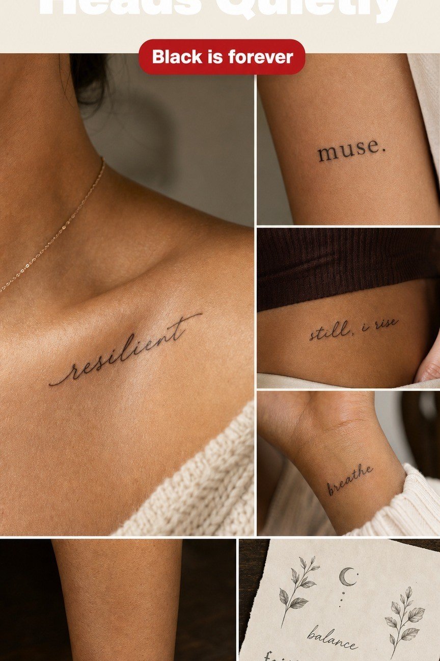
Before I picked a placement, I looked at flash sheets instead of only finished photos. Flash makes you see the structure: where the word starts, where it ends, how it follows a curve, and whether the design needs a little leaf, star, or underline to balance it.
The Visibility Ladder is my simple rule. Inner forearm sits high because you’ll see it often.
Outer arm gives you control because it appears when you want it to. Collarbone feels more deliberate and dresses up nicely, but it’s also spicier.
Behind the ear is subtle, yet you may forget it exists.
For One Word Tattoo Ideas, I’d choose the inner forearm if the word is for you, not for an audience. You’ll catch it while driving, reaching for coffee, or pulling on a sleeve. That small repeat can matter more than a dramatic placement.
Black-and-grey ink works best on most flash-inspired word tattoos because black is your best friend for longevity. Color is spice. The paper flash look can be charming, but don’t force every little decorative flourish onto your skin.
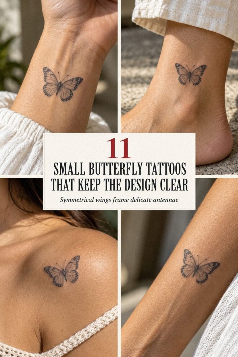
And if butterflies are part of your visual language, these unique butterfly tattoos show how to pair a small symbol with lettering without crowding the word.
6I Sized The Letters For Long-Term Clarity
Fine line doesn’t mean microscopic. This is the part people hate hearing because tiny lettering photographs so well on fresh skin. Then the lines relax, the skin moves, and the word loses its clean separation.
I sized my letters based on the narrowest part of the word, not the widest. Letters with tight counters, like “a,” “e,” “o,” and “p,” need more room than a row of simple capitals. A 3-inch forearm word usually gives a tattooer enough space to keep each letter distinct without making it feel huge.
For Simple Word Tattoos, ask your artist to stencil the design, then step back at least six feet. Can you still read it?
Good. If it only works in a phone macro, it’s too small for that placement.
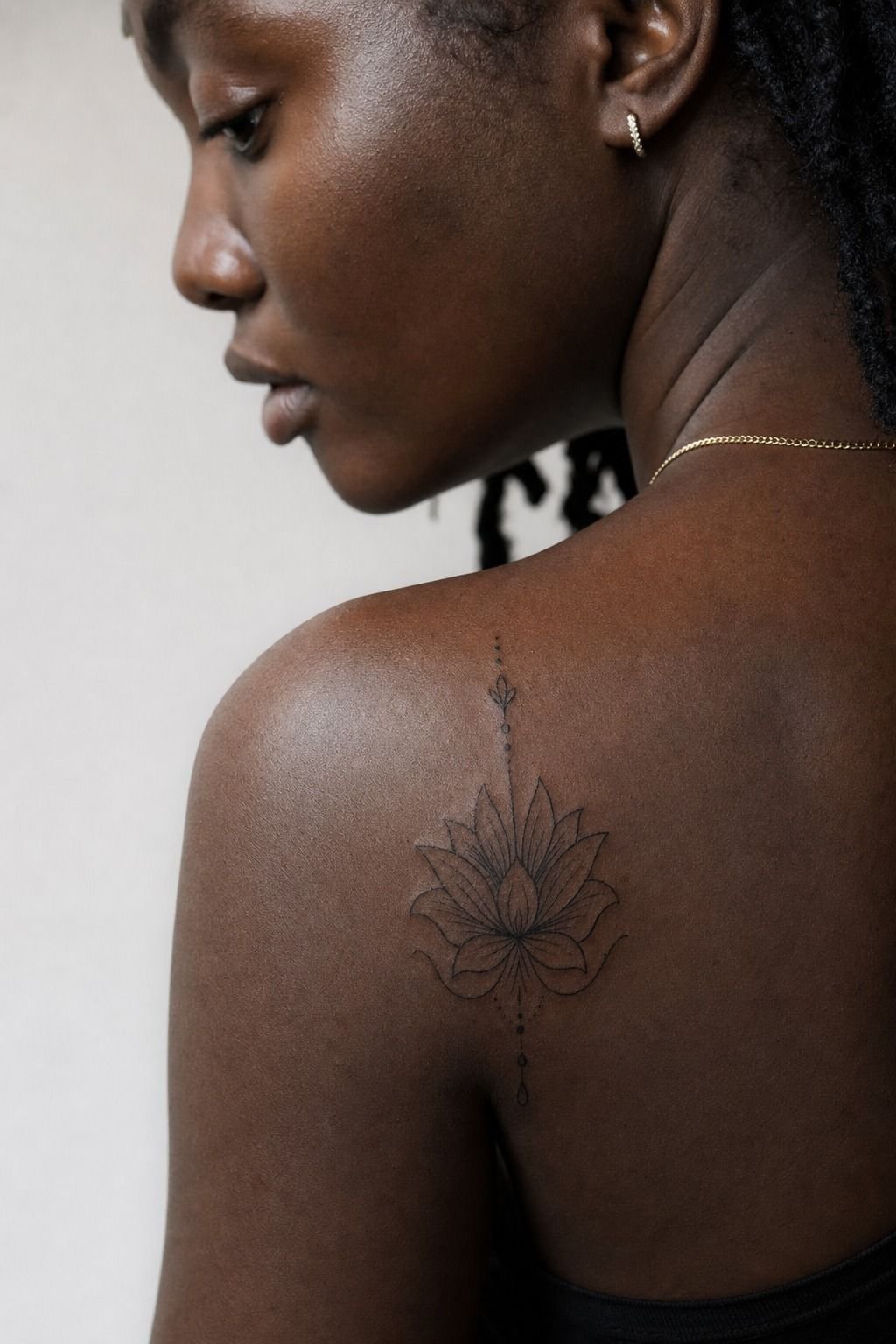
On deep ebony skin, I’m especially careful about contrast and stroke width. A solid black line can look bold and gorgeous against rich skin tones, while a pale grey wash may heal too subtle. Don’t let anyone treat every skin tone like the same canvas.
But avoid asking for a hair-thin line just because it looks delicate. Delicate can still be durable. It needs a confident pull and enough spacing to hold.
7I Compared Black Ink With Fine Red Ink
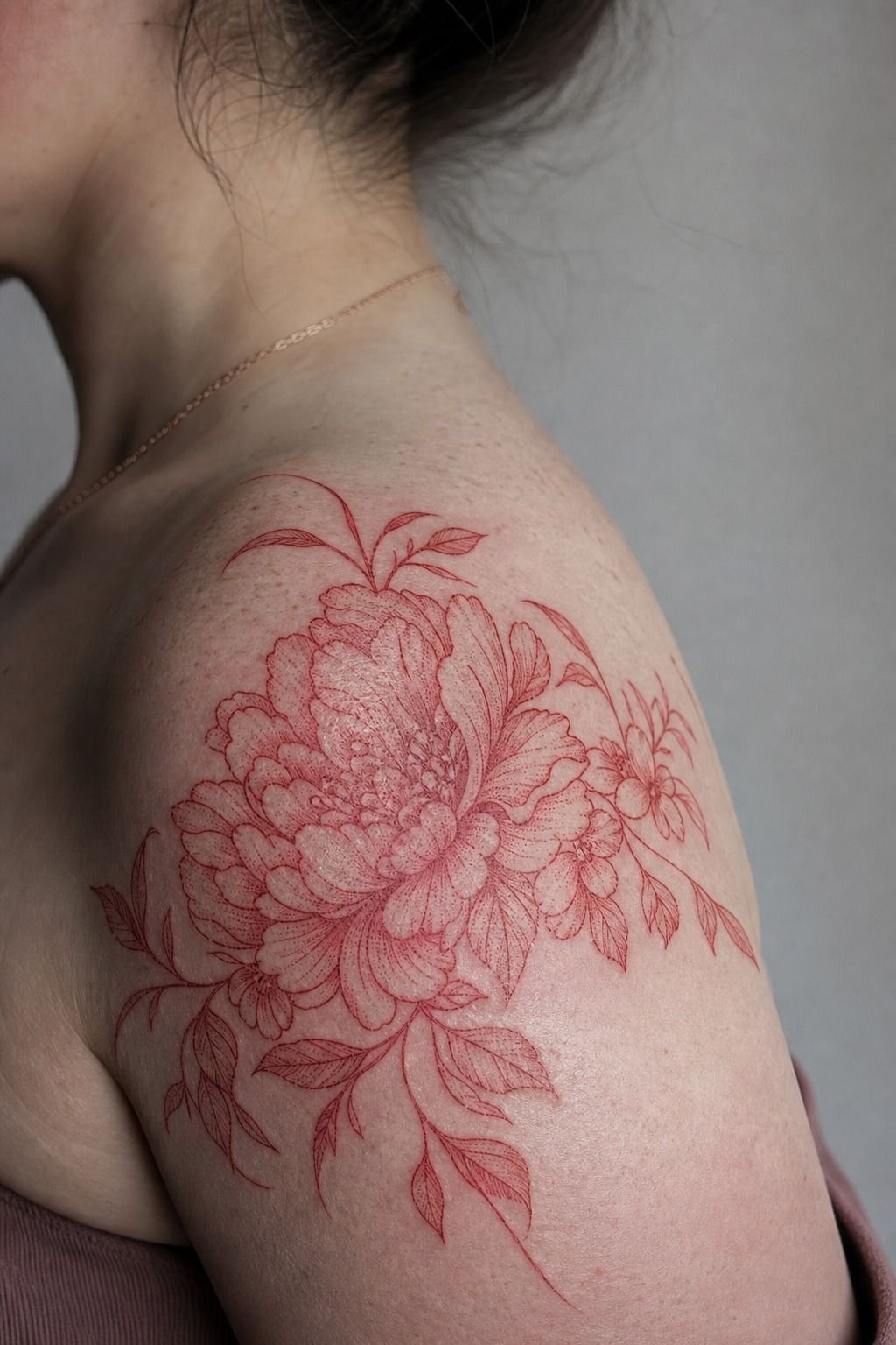
Fine red ink has a moody, romantic look on fair skin, especially on a shoulder where the skin is relatively low-wear. I get why people love it. That fresh red lettering can look soft, intimate, and a little unexpected.
Still, I’d choose black tattoo ink for the first version of a word tattoo. Black gives you stronger contrast, ages more predictably, and makes a short word read from across the room. Fine red can be lovely, but it’s not the durable default I’d use for a deeply personal word.
If you want red, keep the design simple. One word.
Open letters. No tiny floral frame, no pale pink shadow, no micro-detail trying to compete with the text.
Fine red ink should be saturated in a controlled pass, not scratched into the skin until it looks irritated.
I’ve watched clients go back and forth over red for twenty minutes, then choose black once they saw both stencils against their skin. That’s normal. The stencil answers questions your saved images can’t.
For another color-specific option, see our guide to white ink tattoos. White is even less forgiving, so it’s worth seeing healed examples first.
8I Checked Pain Levels Before Booking Placement
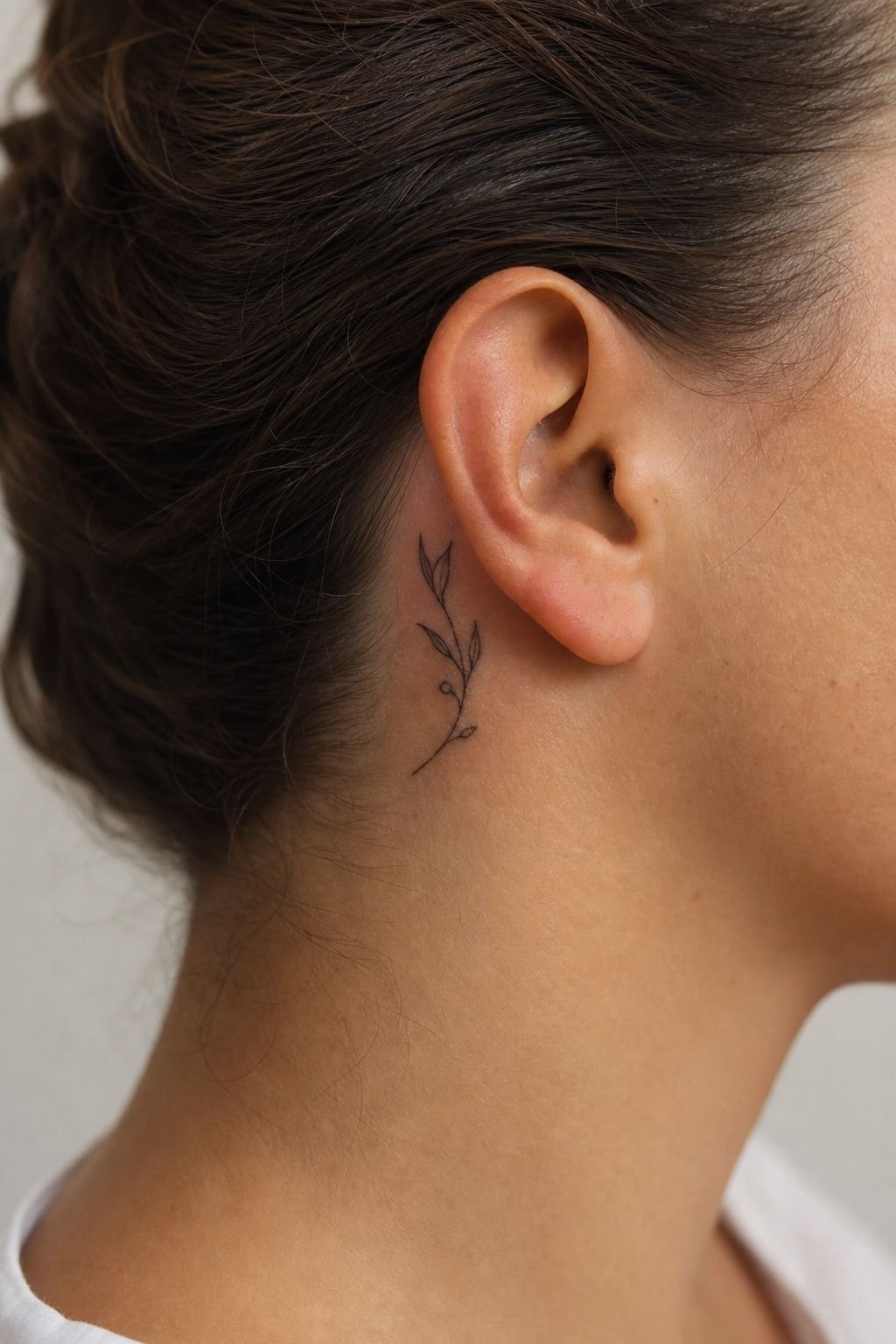
Pain isn’t a personality test. You don’t get extra points for suffering through a rib tattoo when your first word could sit calmly on your outer arm.
Here’s the honest version: lines feel sharper, shading feels like a dull burn, and color packing is usually the spiciest part. For a quick word tattoo, the session may be short, but that doesn’t make a bony placement magically chill. Behind the ear, ribs, feet, sternum, hands, elbows, and knees can all feel intense.
For Unique Word Tattoos, I tell nervous first-timers to start with outer forearm, calf, thigh, or upper arm. You’ll still feel it, obviously. But you’re less likely to spend the appointment gripping the chair and regretting your placement.
Tap out for five rather than pass out on me. Eat first, hydrate, and wear clothing that gives your artist clean access. You can compare zones in this guide to where tattoos hurt less.
9I Reviewed Single Word Tattoo Sketches Carefully
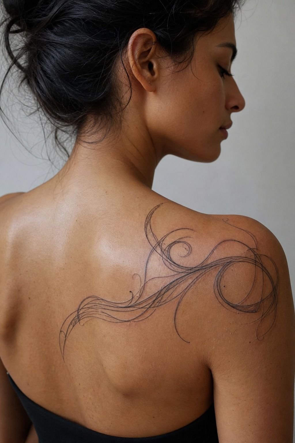
A good sketch does more than show the spelling.
10I Confirmed Spacing Before The Needle Started
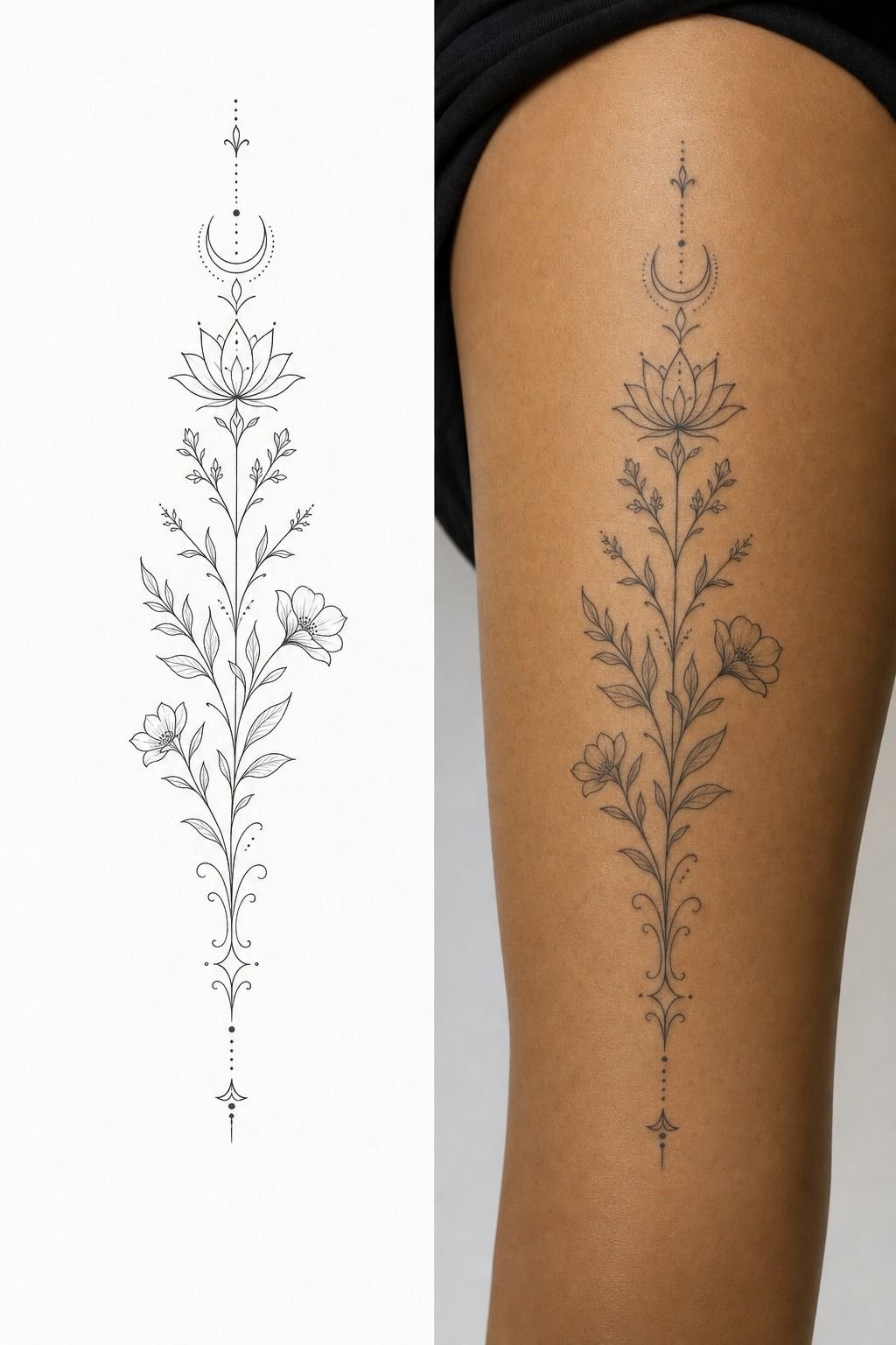
The split between stencil and healed tattoo tells the whole story. Fresh lettering can look slightly tighter, darker, and more exact than the healed result. Healing softens edges.
That’s normal. Planning for it is what separates a tattoo that ages cute from one that mashes together.
I checked the spacing with my arm relaxed, bent, raised, and hanging at my side. Skin shifts.
A word that looks centered in one pose may pull sideways in another. Purple stencil transfer is your chance to catch that before a needle touches you.
For Little Word Tattoos, I like visible gaps between letters more than decorative flourishes. The gap is doing real work. It keeps the word legible after the surface heals over and the ink settles into the skin.
But don’t stare at the stencil until you invent a problem. Check spelling, placement, size, and flow. Then trust the decision you made.
You’re allowed to take ten minutes for this, because moving a stencil is free and covering a tattoo isn’t.
If longevity is your biggest concern, read why tattoos blur over time. It’ll make the “slightly bigger, slightly simpler” advice click.
11I Protected The Fresh Lettering During Healing
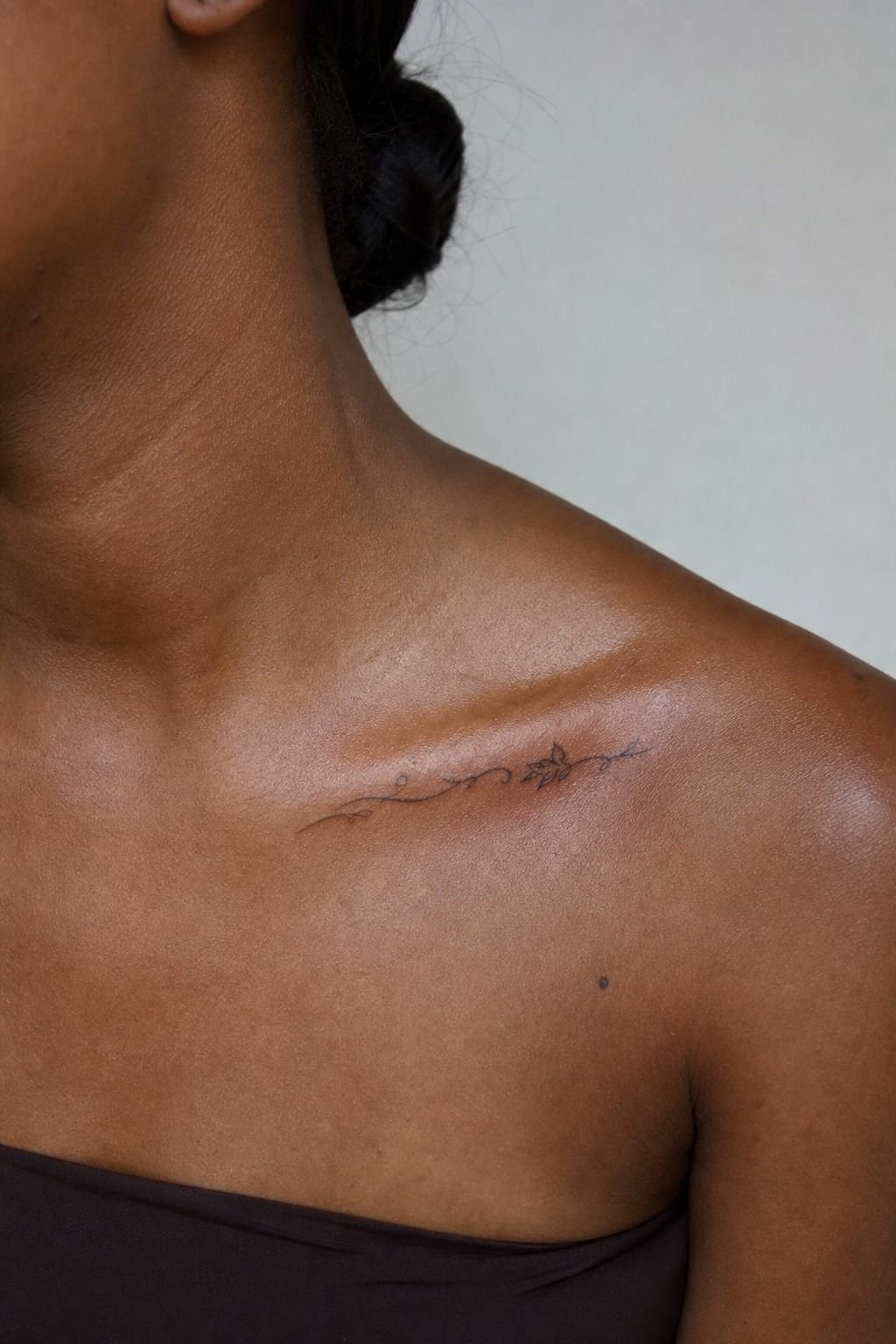
First few days, it’s an open wound. Treat it like that. I know a fresh collarbone word looks tempting under a fitted top, but friction, sweat, sun, and pool water can make a clean tattoo heal patchy.
Wash it gently with unscented liquid soap, pat it dry with a clean paper towel, and use a thin layer of fragrance-free ointment only if your artist recommends it. You’re moisturizing, not marinating it. Too much product can make the tattoo feel soggy and irritated.
For Simple Word Tattoos on the collarbone, loose cotton clothing is your friend. Skip necklaces that rub directly over the lettering, skip hard gym straps for a bit, and keep it out of direct sun.
Surface healing usually takes about 2 to 3 weeks. Complete settling can take 2 to 3 months.
It’ll peel like a sunburn. Don’t pick flakes or you can pull color out. That shiny silver-skin stage looks strange, but it passes.
And yes, sunscreen matters after it’s fully healed. Broad-spectrum SPF helps black ink stay crisp longer than wishful thinking ever will!
12I Let The Finished Word Speak Quietly
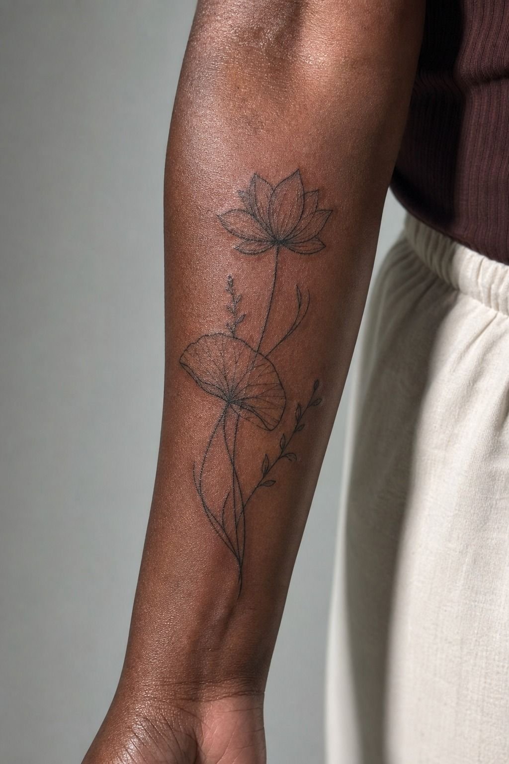
Once it healed, I stopped trying to make the tattoo “mean” something to everyone else.
The Decision Framework I Use With First-Timers
I’ve learned that people rarely regret a word tattoo because the word was too plain. They regret it because they rushed one of four decisions: meaning, lettering, size, or placement. You don’t need to solve all four in one late-night scroll.
I’d rather see you come in with one clear word and three rough references than fifteen screenshots that don’t agree with each other.
Start with meaning. Your word should have a private anchor, even if you never explain it.
Then test the lettering at the actual size your body can support. A long elegant script may look refined on paper, but your wrist isn’t paper.
It bends, gets sun, rubs on sleeves, and changes with you. That doesn’t make tattooing fragile.
It just means design has to respect skin.
Next, choose visibility on purpose. Do you want to see it every day, or do you want it to show only when you choose?
I used to think inner forearm was automatically best for personal pieces. Now I think it depends.
Some people need the word in their sightline. Others want it tucked on a shoulder so it feels intimate instead of performative.
And be honest about pain and maintenance. A hand tattoo can be gorgeous, but hands are for people who accept touch-ups. A tiny ankle word can look gentle, but it needs enough width to avoid turning into soup.
There’s nothing less romantic than pretending those tradeoffs don’t exist.
The best tattoo appointment has a little pause before it starts. You look in the mirror.
The stencil sits right. Your stomach settles.
That’s the feeling I trust.
How Much It Cost
A word tattoo’s price depends on size, placement, artist demand, and the shop’s minimum. I’d rather you budget for a tattooer with healed lettering photos than chase the cheapest quote. Cheap linework can become expensive cover-up work.
For a small custom word, plan around the shop minimum through roughly an hour of time, then ask directly how that studio handles touch-ups. Disposable needle cartridges, sterile barriers, and a clean setup aren’t optional extras. They’re the baseline.
What People Always Want to Know
How much does a Unique Word Tattoos usually cost?
Most Unique Word Tattoos cost about $100 to $300 in the US, depending on size, placement, and artist. A skilled lettering artist is worth budgeting for. Shop minimums commonly sit around $50 to $100, while hourly rates often run $100 to $250.
Are Unique Word Tattoos a good idea for a first tattoo?
Yes, they can be a great first tattoo if you keep the lettering readable and choose a manageable placement. Outer arm or forearm placement keeps the experience simpler. Short word. Clean black ink.
Enough size for the letters to heal clearly.
How do I choose a tattoo artist for Unique Word Tattoos?
Look for healed lettering in the portfolio, not only fresh close-ups. Crispy linework matters more than a trendy feed. You want clean single-pass lines, readable spacing, a sterile studio, and an artist whose handwriting style fits your word.
How much do Unique Word Tattoos hurt?
They can be pretty tolerable on the outer forearm, thigh, calf, or shoulder. Ribs, feet, hands, and sternum feel much spicier. Lines feel sharp, but a short word session is often easier than a large shaded tattoo.
How long does a Unique Word Tattoos take to heal?
Surface healing usually takes about 2 to 3 weeks, while full settling can take 2 to 3 months. Gentle aftercare protects the linework. Unscented soap.
Thin moisturizer. No picking, pools, or direct sun while it’s fresh.
What’s the best placement for Unique Word Tattoos?
The inner forearm is my pick for a word you want to see often, while the outer shoulder is better for a more private piece. Low-wear skin helps lettering age better. Avoid fingers unless you’re comfortable with future touch-ups.
Where I’d Start First
If I had to pick one, I’d start with a black-ink inner-forearm word. You can’t rescue cramped letters with sentimental meaning, but that placement gives them room to stay readable. Pin your favorite word, then let it sit with you for a week.