White ink tattoos look subtle, but they can fade, yellow, blur, or heal unpredictably depending on skin, placement, and technique.
Quick answer: White ink tattoos are subtle and low contrast. They can work for tiny highlights or private marks, but they are harder to predict than black ink and often age less visibly.
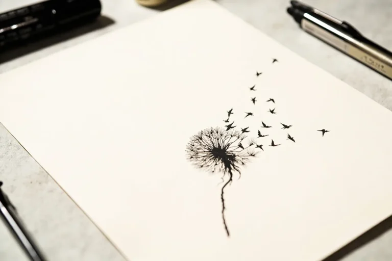
White Ink Tattoos style directions
A tattoo style is more than a look. It decides line weight, shading, color, artist fit, and how the piece will read years after the first photo.
| Direction | Best use | Watch out for |
|---|---|---|
| Tiny white symbol | Private mark | May fade |
| White highlight | Adds shine to color | Needs restraint |
| White script | Subtle lettering | Readability risk |
| Scar-like look | Low visibility | Unpredictable |
| White ornamental | Soft detail | Can yellow or blur |
How to make it work on real skin
White ink is the only tattoo style that looks best the day you get it.
White ink is not a cheat code for a tattoo nobody sees. Sometimes it heals barely visible, and sometimes it heals in a way the wearer did not expect.
Ask for healed white ink photos on skin similar to yours before committing.
White Ink Tattoos: Subtle Look, Real Aging Tradeoffs: artist fit and aging
This style depends on execution. Line weight, contrast, spacing, and the artist’s healed portfolio matter more than the label used on social media.
Ask what should be simplified for your skin, placement, and size. A good tattooer will protect the design from becoming too fragile.
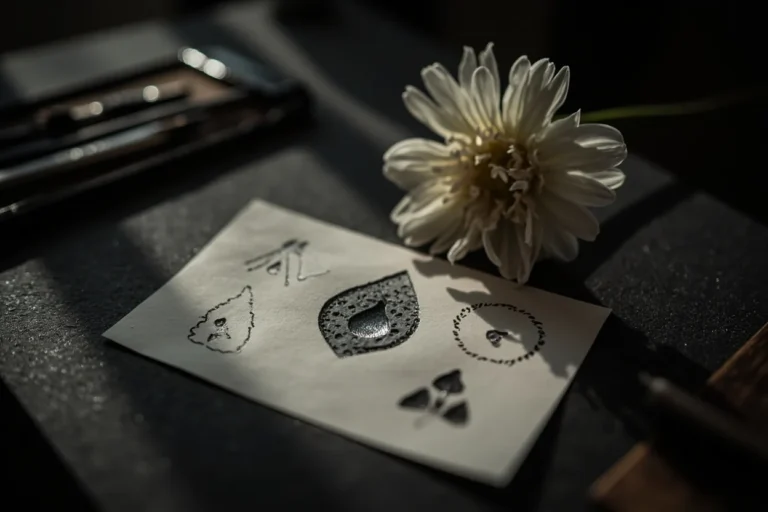
- Ask to see healed white ink work.
- Use white as accent if unsure.
- Avoid tiny script if readability matters.
- Discuss skin tone and healing honestly.
Mistakes to avoid
Do not choose white ink because you are afraid of visible tattoos.
Do not expect it to behave like black linework.
Safety source note: This guide keeps medical and skin-safety advice conservative and links to public-health or dermatology sources where the topic needs it.
What makes this style work after the fresh photo
A good white ink tattoos tattoo is not just a surface look. It depends on line weight, contrast, spacing, artist fit, and how the design will settle after the skin stops looking glossy.
Use the style directions as a way to compare references: Tiny white symbol, White highlight, White script, Scar-like look, and White ornamental. If those examples look unrelated, the style may need a tighter brief before the artist can design something coherent.
| Reference to compare | What to inspect | Decision rule |
|---|---|---|
| Tiny white symbol | Private mark | May fade |
| White highlight | Adds shine to color | Needs restraint |
| White script | Subtle lettering | Readability risk |
| Scar-like look | Low visibility | Unpredictable |
| White ornamental | Soft detail | Can yellow or blur |
Artist fit matters more than the trend name
Some tattooers are strong at bold traditional work and weak at tiny realism. Some can draw ornamental symmetry but not faces. Some can pack black smoothly but struggle with delicate color. Match the artist to the style, not just the studio location.
Healed portfolio examples matter here. Fresh photos show the first hour. Healed photos show whether lines hold, shading settles smoothly, and the tattoo still reads without perfect lighting.
How to brief the design without over-controlling it
Bring references for mood, placement, and detail level. Then give the artist room to redraw the idea for skin. A tattoo design has to survive curves, pores, movement, sun, and time; a flat reference image does not.
Visual reference note: Save references that show healed work, not only viral fresh tattoos. If a style looks good only under studio lighting, ask what it looks like six months later.
Reader questions before you book
Is this style good for a first tattoo?
It can be, if the design is readable, the placement is realistic, and the artist has healed examples in the same style.
How do I know if an artist can do this style?
Look for healed work, not just fresh photos. Check line consistency, shading, symmetry, and whether similar designs still read clearly.
Should I make the design smaller to save money?
Not if size is what keeps the tattoo readable. Shrinking a detailed style often creates a weaker tattoo and a future touch-up problem.
What should I bring to the consultation?
Bring style references, placement photos, a rough size range, and notes on what you do not want. That is enough for a good artist to design from.