I’ve tattooed a lot of constellations over the years. They started showing up heavy around 2015, and they never really left, just evolved. What I love about minimalist constellation work is the restraint. You’re drawing three to twelve dots and some connecting lines, and somehow that sparse geometry carries someone’s whole night sky, their birthday month, a lost person they still talk to. In my chair, I see clients come in nervous about “too simple”, worried it’ll look like they didn’t try. I tell them the opposite is true. Minimalist constellation tattoos are hard to get right because there’s nowhere to hide. Every dot placement, every line weight, every millimeter of spacing matters. Let me walk you through what actually works, what ages well, and what I sketch on paper before I touch skin.
Popular Styles
Not all minimalist constellation tattoos read the same. The style you pick changes how it sits on your body, how fast it fades, and whether it still looks intentional in ten years.
Single-Line Connective
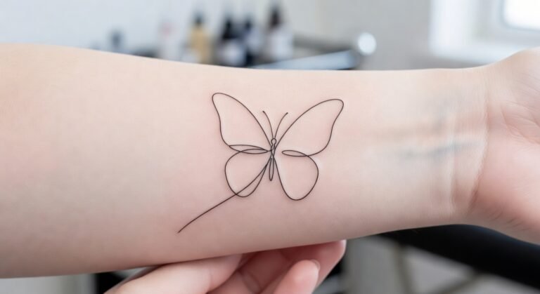
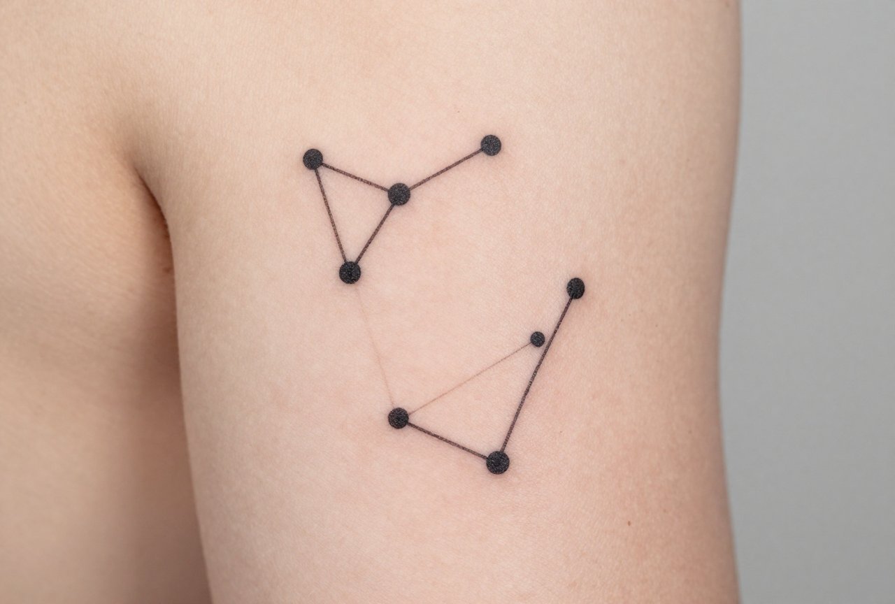
This is the classic: tiny dots for stars, thin continuous lines linking them in the actual celestial pattern. Orion’s Belt. The Big Dipper. Cassiopeia’s W. I use a 3RL or 5RL needle, single pass, no shading. The magic is in the negative space. Too close together and it blurs. Too spread out and it looks accidental. I usually draw these at 2-3 inches minimum for legibility. Anything smaller and the dots heal into soft blobs. I had a client last year who wanted her grandmother’s zodiac, Virgo, behind her ear at an inch. We talked for twenty minutes. She left with it on her inner forearm instead, and thanked me six months later when she saw how her friend’s micro-tattoo aged.
Dot-Only Variations
No connecting lines. Just the star pattern rendered as dots of varying sizes. Brighter stars get slightly heavier dots. This reads more abstract, more “if you know, you know.” It ages better than lined versions because there’s less ink to spread. I use this for clients who want something genuinely hidden, wrist side, rib cage, back of the neck. The trick is size variation. Uniform dots look like a skin condition. Varied dots look like intention.
Design Ideas
Here’s where people get stuck in my shop. They know they want “something with stars” but haven’t connected it to themselves yet. I keep a sketchbook of starting points.
- Birth constellation + coordinates. The star pattern plus a tiny line of right ascension and declination numbers. Keeps it personal without being literally a birthday banner.
- Constellation + landscape silhouette. The stars above, a thin horizon line below, mountains, ocean, city skyline. I’ve done this for people who moved cross-country and want both homes represented.
- Two constellations overlapping. Your sign and your partner’s. Your sign and a parent’s. The overlap creates new geometry. I did this for twins once, Gemini and their shared rising sign, and the intersection point became a slightly larger star.
- Constellation as a larger shape. The stars connect to form something else, a cat’s outline, a coffee cup, a guitar. This walks the line of minimalist and illustrative. I usually push for simpler: if the secondary image needs more than five extra lines, it fights the constellation.
- Faded or “disappearing” star. One dot lighter, or as a tiny open circle. For loss. For someone who feels distant. This one gets requested in whispers, and I always take extra time on the stencil.
Best Placements
Where you put this matters more than most tattoos because the design is so dependent on precision. A line that wanders half a millimeter on a big traditional piece? Nobody notices. On a constellation? It breaks the whole illusion.
High-Movement vs. Low-Movement Areas
I steer people away from finger constellations unless they understand the reality. Fingers shed ink fast. That delicate connective line? Gone in two years, dots only. Inner bicep, outer forearm, collarbone, rib cage, these stay stable. The rib cage moves with breathing but the skin doesn’t twist much. I’ve seen beautiful Orion pieces on ribs that look identical five years later. Ankles are popular but take longer to heal and blur slightly more from sock friction and sun. Behind the ear works for dot-only, but the curvature makes lined versions tricky; I have to distort the stencil to read correctly from the front.
Direction and Flow
Constellations have a natural orientation. Rotating Cassiopeia to fit a wrist changes it from recognizable to random squiggle. I print multiple stencils, rotate them on the body, and we stand back and look. Sometimes the “wrong” angle actually flows better with the limb’s movement. Trust your artist on this. I’ve had clients insist on a placement that fights the design, and I gently push back. It’s not about ego; it’s about the piece working when you’re not in my chair anymore.
Color Choices
Black and grey dominates, but there’s room to play.
- Black linework. The standard. Crisp, readable, ages predictably. I use a medium black like Dynamic or Solid Ink, nothing too watery.
- Dark blue ink. Subtle variation that reads black from distance but softens up close. I’ve used this for ocean-adjacent people, night swimmers, anyone who wants the reference without the literal water imagery.
- White ink highlights. One or two stars picked out in white over healed black. Risky, white fades to yellowish or disappears entirely depending on skin tone. I only do this on clients with realistic expectations and lighter skin where the contrast shows.
- Single accent color. One connecting line in a thin red or teal, or one star in color. Birthstone color, favorite color, whatever. The restraint of keeping it to one element makes it feel considered, not decorative.
What I don’t do: full color fills in the stars. That’s not minimalist anymore, and it ages into soft circles faster than open dots.
Tips for Choosing
After fifteen years, here’s what I wish every constellation client knew before they sat down.
- Verify the actual pattern. I’ve had people bring in screenshots from apps that compress constellations into prettier shapes. The real sky doesn’t care about aesthetics. We look up the actual star positions together. Small adjustments for flow are fine; inventing new astronomy is not.
- Consider the negative space. Minimalist tattoos are defined by what isn’t there. A constellation sleeve fails. A constellation with a busy background fails. Let it breathe.
- Think about scale over time. I show healed photos from my portfolio, not fresh ones. Fresh tattoos lie. They swell, they redden, they look bolder than they’ll be. Healed work is honest work.
- Bring reference, not a command. The best pieces come from collaboration. I had a client bring a poem about her father’s workshop, and we extracted the constellation visible the night he died, placed it among faint tool outlines. She couldn’t have designed that alone. I couldn’t have imagined that story alone.
- Plan for touch-ups, but don’t expect them. Good minimalist work shouldn’t need regular maintenance. If it does, something went wrong in execution or aftercare. That said, I offer one free touch-up within six months because skin is weird and unpredictable.
Final Thoughts
Minimalist constellation tattoos work because they borrow meaning from something older and bigger than the person wearing them. The stars were there before your grief, your love, your birth. They’ll be there after. What you’re doing is marking a specific human moment against that permanence. That’s heavy, even in three dots and two lines. In my shop, we see this a lot: people wanting something small because they’re afraid of commitment, but choosing something cosmic because they actually want depth. The contradiction is the point. The restraint is the respect. If you’re considering one, sit with the actual sky first. Go somewhere dark. Find your constellation if you can. Then come in, and we’ll translate that particular night into something that stays.
Frequently Asked Questions
Do constellation tattoos blur or fade faster than other fine-line work?
They can, especially if the dots are too small or the lines too thin. I use slightly heavier dot weight than I would for other minimalist work, and I avoid anything under two inches. Proper aftercare and sun protection matter enormously for longevity.
Can I get a constellation that isn’t my zodiac sign?
Absolutely. I tattoo people’s children’s signs, anniversary constellations, even random patterns that just spoke to them. The personal meaning matters more than astrological correctness. Just make sure the star map is accurate to whatever you’re referencing.
How do I know if my skin tone works with white ink accents?
White ink is unpredictable on everyone, but it shows most reliably on lighter skin tones. On darker skin, it can heal to a raised, yellowish tone or disappear entirely. I always do a small test dot first if someone is set on it, and I talk through the real odds before we commit.
What’s the most common mistake people make with constellation placement?
Choosing a spot because it’s trendy, not because it fits the design. Behind the ear looks great on Instagram but curves the pattern awkwardly. Fingers seem subtle but require constant touch-ups. I always trace the stencil and have clients move the limb to see how the shape shifts with motion.