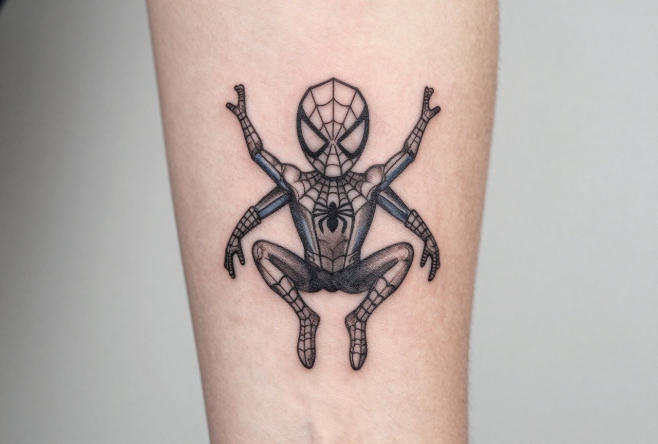
I’ve had a guy in my chair, corporate lawyer, never been tattooed before, who wanted Spiderman but couldn’t risk a full sleeve at the country club. We did a single red dot and two thin black lines on his inner wrist. His kid recognized it instantly. That’s the thing about minimalist Spiderman work: it doesn’t need to scream. The web-slinger’s been in the cultural bloodstream since 1962, so even a whisper of that mask or web pattern hits hard. I’ve tattooed dozens of these over the years, from tiny blackwork spiders behind ears to single-line masks on ribs. Here’s what actually works, where it goes, and how to keep it looking crisp five years down the road.
Popular Styles
Minimalist isn’t one look. In my shop, we break it down by how much ink actually hits skin. The style you pick determines everything, healing time, how it ages, whether your artist needs a single needle or can run a three-round.
Single-Line and Continuous Line
This is the one that blows up on Instagram. One unbroken line forming the mask outline, maybe a web suggestion inside. I’ve done these with the needle never lifting, my hand cramping by minute forty, but the result is hypnotic. Works best at two to three inches. Any smaller and the line gets muddy; any bigger and the “single line” gimmick loses its charm. The continuous line spider itself is trickier than it looks. Those eight legs need balance or the whole thing tilts. I always sketch it on paper first, tracing it blindfolded almost, to make sure the flow holds.
Blackwork and Negative Space
Here we fill the mask shape solid black and let the eyes glow in negative space. Or reverse it, skin-tone mask with blacked-out eyes. I’ve tattooed the solid black spider silhouette on forearms, on ankles, between shoulder blades. The negative space eyes are what make it readable. Without that contrast, it’s just a blob. Blackwork ages like a tank if you go deep enough. I tell clients: this will heal lighter than you think, so I pack it darker than feels right in the moment.
Geometric and Abstract
Triangles suggesting a web. A hexagon with eight radiating lines. The Spiderman logo broken into three shapes. These read more “design nerd” than “comic fan,” which some people want. I’ve had clients who work in architecture request these specifically. The geometric stuff demands precision. Shaky lines ruin it instantly. I use a stencil, then freehand the final pass to sharpen corners. Takes longer than it looks.
Design Ideas
Specific imagery that translates well to minimalism:
- The classic mask, oval with two large white eyes and web lines. Most recognizable. I’ve done this as small as a dime on a collarbone. The web lines inside are the challenge; too many and they blur together in a year.
- The spider emblem, the chest logo, simplified to eight legs and a body. Clean, symmetrical, reads from any angle. I did one on a guy’s calf where the legs extended to wrap slightly around the muscle. Movement in the design.
- Web patterns, partial web in a corner, or a full web with a tiny spider at center. The partial web behind an ear is surprisingly popular. Heals fast, easy to hide.
- Quote integration, “With great power” in thin script, a tiny spider hanging from the final letter. I’ve only done two of these. The text has to be large enough to hold; I won’t go below 7-point equivalent or it’ll be a blue smear in three years.
- Miles Morales variant, the spray-paint style spider, or just red and black color blocks suggesting his suit. The younger clients ask for this. The red we use is usually a brighter orange-red; true red fades pink fast.
Best Placements
Where you put it changes the design. I see this constantly, someone brings a reference sized for a bicep, wants it on a finger. Not happening. Not and have it last.
High-Visibility Spots
Forearms, wrists, collarbones. These get sun, get bumped, get seen. The inner wrist is classic but brutal, skin there moves constantly, heals thick, fades fast. I did a tiny spider there last year; we touched it up at four months, which is normal. Behind the ear is safer from sun but hard to reach for aftercare. Collarbones look incredible but hurt more than people expect. Bone right under thin skin. I warn everyone: you’ll feel the vibration in your teeth.
Hidden or Personal Areas
Ribs, inner bicep, ankle, back of neck under hairline. The rib placement is for the committed. I’ve had clients tap out on a twenty-minute spider. The inner bicep is my favorite for this design, flat skin, easy stretch, heals clean. Ankle spiders are cute but take abuse from socks and shoes. I always go slightly bigger than the client wants, knowing it’ll tighten up.
Color Choices
Minimalist doesn’t have to mean black only. But color choices matter for longevity.
- Black and grey, the default. Ages best, lowest maintenance. A black spider on unlined skin will hold for decades. The grey wash for web shading needs to be crisp; I use a 50/50 mix, no lighter, or it disappears.
- Classic red and blue, the suit colors. I limit these to small blocks: red mask outline, blue web fill. Full color saturation in minimalist design looks wrong, like a sticker. I did one where the eyes were solid blue, everything else black. Hit perfectly.
- Red and black (Miles or symbiote era), bolder contrast, more modern feel. The red I use is usually Eternal Ink’s Crimson; it holds better than cheaper reds. Black spider on red circle is a clean logo variant.
- White ink, I talk people out of this regularly. White fades to yellow, disappears on pale skin, looks like a scar on dark skin. If someone insists, I do white highlights over black, never white alone.
I had a client want the exact hex color from a movie screenshot. Screens lie. I mix until it looks right under shop lights, then photograph it. That’s the color they remember.
Tips for Choosing
After years of doing these, here’s what I tell people in consultations:
- Reference the source, don’t copy it, bring three images: the comic panel, the movie still, the tattoo you almost like. I combine them. Direct copies of someone else’s tattoo are stale; your artist wants to solve the design problem fresh.
- Size for the detail, web lines need space. At under two inches, they merge. I draw it at size, show the client, let them see the blur risk. Sometimes we simplify: four web lines instead of eight.
- Think about your future self, the guy with the wrist spider is forty now, still happy. But I’ve covered teenage Spiderman tattoos that aged badly because the design was trendy, not timeless. Minimalism helps here. Less to date.
- Aftercare is design care, a minimalist tattoo with blown-out lines is a failed tattoo. I see this when clients soak it, pick it, or let it dry out. The first two weeks determine the next twenty years. I give specific instructions: unscented soap, thin lotion, no sun, no swimming, no gym if it means rubbing.
- Artist selection matters more than price, a minimalist tattoo has nowhere to hide. Shaky line work in a busy traditional piece gets lost in the chaos. Here, every millimeter shows. I charge more for single-needle work because it takes longer, requires more focus. Cheap minimalist tattoos look cheap forever.
We see this a lot in the shop: someone got a $50 spider from a walk-in, now wants it fixed. The legs are blown out, the body is a grey oval. I can fix some, but there’s no detail to work with. Start with someone who does clean lines regularly.
Final Thoughts
Minimalist Spiderman tattoos work because the character is already embedded in how we see heroism, responsibility, awkwardness, the mask hiding and revealing at once. You don’t need a full back piece to carry that. I’ve tattooed these on grandmothers who read the comics to their kids, on teenagers who discovered Miles Morales last year, on middle-aged guys who finally have permission to get the ink they wanted at fourteen.
The best ones I’ve done share something: the client knew exactly why they wanted it. Not because it was trending, but because that small spider or mask means something specific to them. That’s what makes the needle time worth it, for both of us. Keep it clean, place it smart, heal it right, and you’ll have a piece that lasts longer than any movie franchise reboot.
Frequently Asked Questions
How small can a minimalist Spiderman tattoo be before it blurs?
I won’t go below two inches for anything with web detail. At that size, lines need to be spaced enough to heal separately. A simple spider silhouette can go smaller, around an inch, but the mask needs room for the eyes to read clearly.
Do minimalist tattoos hurt less than detailed ones?
Not really. Pain depends on placement and your personal sensitivity, not the design style. Single-needle work actually takes longer per area, so some clients find it worse. The inner wrist and ribs hurt regardless of how simple the image is.
How long does a minimalist Spiderman tattoo take to heal?
Surface healing is two to three weeks, but the skin settles for two months. I tell clients to expect the lines to look slightly thicker during healing, that’s normal swelling and plasma. The true result shows at six weeks.
Can you add to a minimalist design later if I want more detail?
Absolutely, and I plan for it. I leave negative space strategically, use line weights that can support shading later. It’s easier to build up from minimal than to simplify an overworked piece. Just wait until the first tattoo is fully healed, about three months.