I’ve had a client bring in a screenshot of the Death Star trench run paused at exactly the frame they wanted. Another guy sat in my chair with a full color still from Spirited Away on his phone. Movie tattoos are everywhere in shops now, and I’ve done enough of them to know what works on skin versus what looks great on a screen. Here’s the real breakdown from someone who’s been putting ink down for years.
Popular Styles
Not every movie image translates to tattoo. I’ve learned that the hard way after trying to cram too much detail into a 3-inch piece. Here’s what actually holds up.
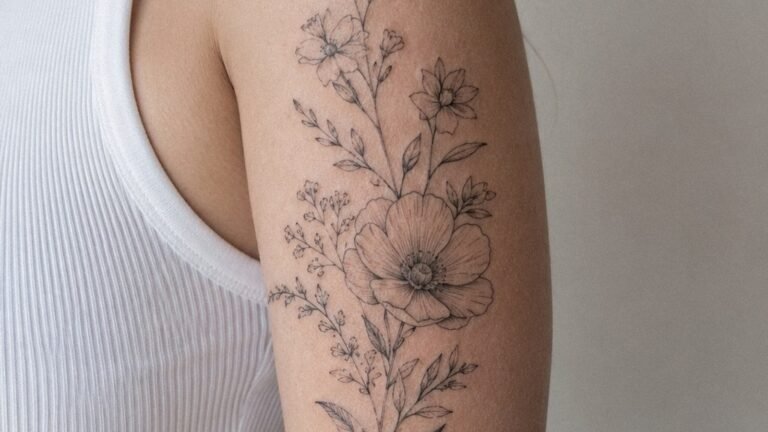
Linework and Black & Grey
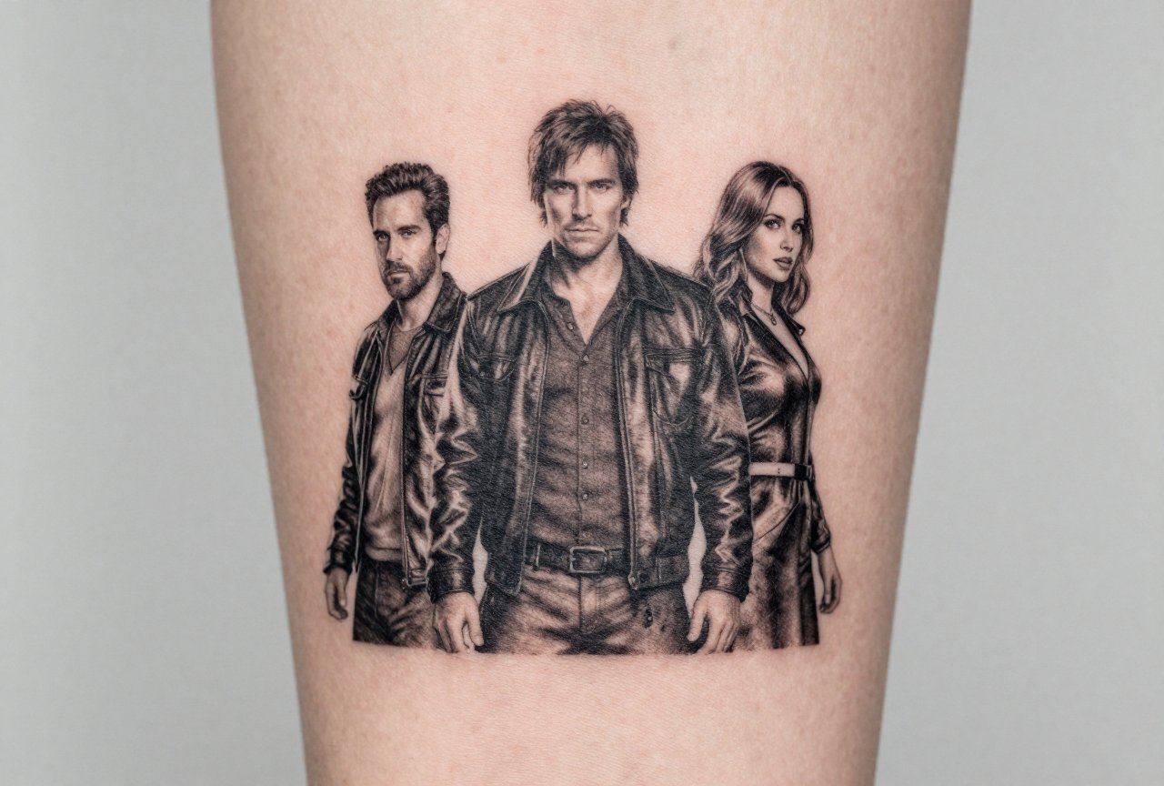
Single needle and fine line work are huge right now, especially for film stills and portraits. I did Robert De Niro’s face from Taxi Driver last month, just grey wash, no color, about the size of a baseball on a guy’s calf. The key is contrast. Movies are lit for camera; skin is lit by sun and office fluorescents. I always tell clients: that moody noir scene you love? It needs to be brightened up for tattoo or it’ll look like a bruise in five years.
- Portrait realism: Needs space. Minimum 4-5 inches for a face to read correctly. Smaller than that, and nostrils become dots, eyes become blobs.
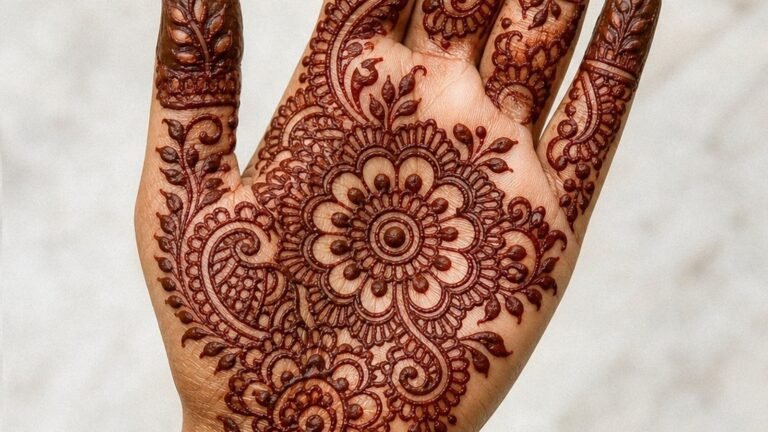
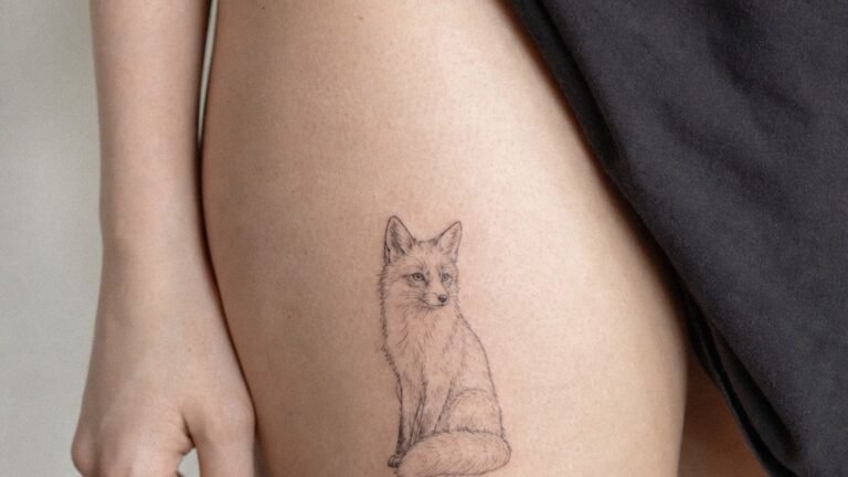
- Minimalist line art: Great for iconic silhouettes, Batman cowl, lightsaber hilt, the Millennium Falcon from below. These age better than you’d think because there’s less ink to blur.
- Black & grey stills: My bread and butter. The Godfather, Seven Samurai, anything Tarkovsky. The tonal range gives me room to work.
Neo-Traditional and Illustrative
Some clients want the movie reference without the photorealism. I’ve tattooed Jaws as a traditional dagger-through-skull variant, the shark’s mouth replacing the skull. We see this a lot with horror movies, taking the icon and running it through a tattoo filter. Bold lines. Limited palette. It reads instantly from across a room, which is more than I can say for some hyper-detailed portrait that’ll need a touch-up in two years.
Design Ideas
People ask what movies tattoo best. After fifteen years, I have opinions. Strong ones.
Horror That Lasts
Horror movie tattoos are a massive chunk of my bookings. The Shining twins. Pennywise. The Babadook’s pop-up book style. What works: the image that scared you, simplified to its essence. The Grady twins in that blue hallway? Perfect. Just the hallway pattern alone? Also perfect. What doesn’t work: trying to get every frame of a jump scare into one piece. I turned down a guy who wanted the entire opening of Scream as a sleeve. Pick the knife. Pick the mask. Move on.
Sci-Fi and Fantasy
Blade Runner is tattooed constantly in my shop. The origami unicorn. The Tears in Rain monologue as script. The spinner car in profile. Star Wars is obvious, too obvious sometimes, but the best pieces I’ve done are the weird deep cuts. A client got the probe droid from Empire, just the mechanical legs and that spherical body, black and grey on his ribs. Another woman has the three suns from Tattooine’s sunset, no characters, no ships, just that orange gradient. That’s the stuff that makes other fans nod instead of roll their eyes.
- Studio Ghibli: Totoro, No-Face, the soot sprites. The art style already looks like tattoo flash. Miyazaki basically designed for us.
- 2001: A Space Odyssey: The monolith. The star child. HAL’s eye. Minimal and heavy with meaning.
- Mad Max: Fury Road: The War Rig’s steering wheel. The chrome spray. Immortan Joe’s mask. Bold shapes that read at any size.
Comedy and Cult Classics
These are riskier. I’ve done The Dude’s rug from Big Lebowski maybe eight times. It’s funny. It’s specific. But I warn people: joke tattoos get less funny. The guy who got Ron Burgundy’s mustache on his finger in 2004 probably has complicated feelings now. Better to go with imagery that stands alone, the red stapler from Office Space, the Wilson volleyball from Cast Away. The reference lands without needing the whole setup.
Best Placements
Where you put it matters as much as what you get. I’ve watched movie tattoos disappear into armpits and warp around ankles. Here’s where they actually survive.
Flat Panels and Flow
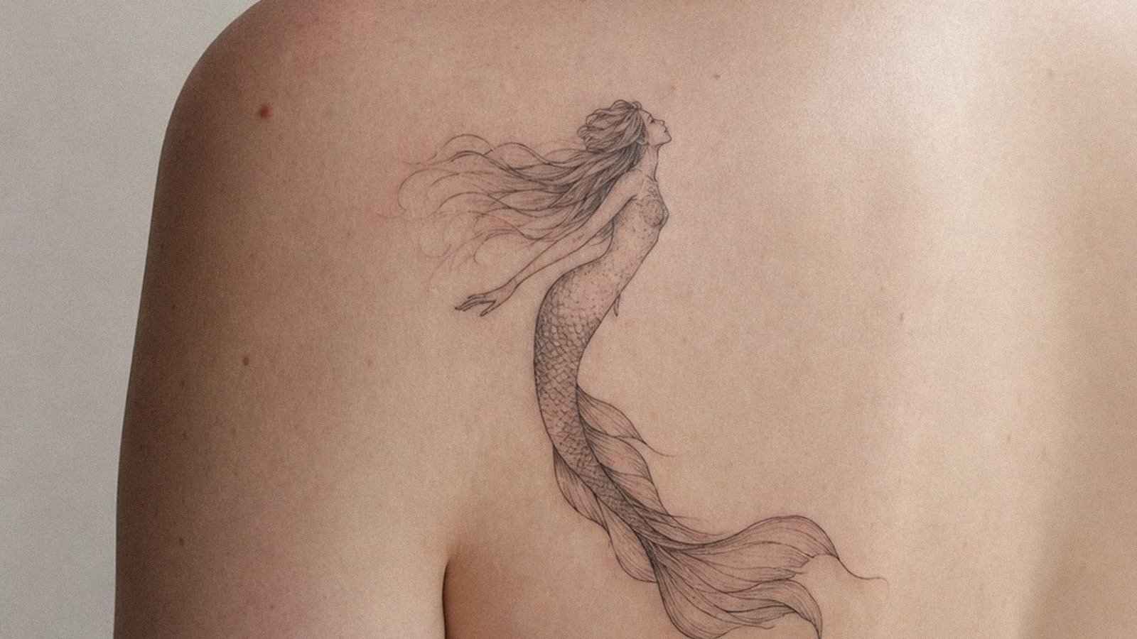
Thighs. Calves. Outer upper arms. These are the real estate I push for anything with a frame or composition. I did a full back piece of the opening shot from Touch of Evil, just that bomb in the car, the clock, the street. The back gave me the horizontal space to keep the perspective intact. Ribs? That same image would be torture to sit through and would distort with every breath.
Forearms work for vertical movie posters. I’ve tattooed the Pulp Fiction poster layout, Uma on the bed with the gun, maybe six inches tall. The forearm’s cylinder shape actually complements that upright format. But I steer people away from hands and fingers for anything with detail. The ink falls out. The lines spread. I’ve had to redo a Joker face on a knuckle three times before the client gave up and blacked it out.
Size Reality
This is where I get firm with clients. That opening shot from La La Land, the traffic jam on the freeway? Beautiful. You want it 3 inches wide? No. I won’t do it. Not because I’m lazy, because in two years it’ll be a smear of red and yellow. Movie tattoos need room to breathe. The rule I give people: if you can’t tell what movie it’s from at arm’s length, it’s too small or too cluttered.
Color Choices
Color in movie tattoos is where dreams go to die. Or at least fade badly.
What Fades and What Doesn’t
I’ve watched the emerald green of the Matrix code dull to grey-green in three years. The saturated orange of Clockwork Orange’s cover? That holds better than you’d think, red-based oranges have more staying power than yellow-based. Blues are the worst. That perfect TARDIS blue? Gone in five years unless you touch it up. I always tell clients: pick the movie moment that works in black and grey first. If color is essential, we add it. But never rely on color to carry the whole piece.
- Black and grey + selective color: The Sin City approach. I love doing this. Everything monochrome except one red element. The rose in Beauty and the Beast. The red dress in Schindler’s List. That single color pop lasts longer because there’s less of it fighting the sun.
- Full color animation: Ghibli pieces can handle it. The palettes are already limited and intentional. But I still push for heavier black outlines than the source material has.
Tips for Choosing
Before you book that appointment, here’s what I’d tell you if you were sitting in my chair right now.
Reference Quality
Bring me a 4K screenshot, not a blurry JPEG from 2007. I need to see the edges. The contrast. If your reference is garbage, the tattoo will be too. I’ve had clients bring in printed photos from eBay that were clearly fifth-generation copies. We spent the first hour of their session just finding better source material online.
The Test of Time
That movie you love right now, have you loved it for five years? Ten? I have a rule I suggest: if you haven’t watched it at least three times, spaced across years, don’t get it tattooed. The guy who got the Birdman tattoo in 2014 doesn’t return my texts. The woman with the Alien chestburster from 2009? She’s in my chair every year adding to her sci-fi sleeve. Longevity of love matters more than intensity.
- Talk to your artist about aging: Ask specifically how the piece will look in ten years. If they can’t answer, find someone who can.
- Consider the negative space: Movie frames are full. Tattoo skin needs to breathe. I often crop and simplify, and clients need to trust that process.
- Think about coverage: That beautiful scene with the sky? Solid blue sky is a lot of ink. It’ll need touch-ups. Budget for that.
Final Thoughts
Movie tattoos are about capturing a feeling you had in the dark, watching something that changed you. The best ones I’ve done aren’t the most accurate reproductions. They’re the ones where the client and I found the single image that distilled the whole experience. The lightsaber not in action, just ignited and waiting. The mask not worn, but held. The frame not moving, but alive with memory.
I’ve tattooed film my whole career. It still excites me when someone brings in something I haven’t seen before, some deep cut from a Tarkovsky film or a forgotten noir. The movies we love become part of us. Tattoo just makes it visible. Choose carefully. Sit with the idea. Then find an artist who actually watches movies, who gets why it matters, and let them translate that light into something that lives in your skin.
Frequently Asked Questions
Will a movie portrait tattoo look exactly like the actor?
Realistically, no. Skin isn’t paper. Even the best portrait artists work within the limitations of how ink settles and ages. I always aim for recognizable and emotionally true rather than photographically identical. The goal is to capture who that person was in that role, not to replace a Blu-ray cover.
How small can a movie quote tattoo be and still be readable?
Script needs to be at least 10-11 point equivalent to stay legible long-term, and even then it’ll blur. I won’t do lettering smaller than that. If you want a full monologue, you need a big area, ribs, thigh, back. Otherwise you’re choosing between readable and tiny, and tiny always loses over time.
Is it weird to get a tattoo of a movie that came out recently?
Not weird, but risky. I’ve had clients request things from films that didn’t hold up culturally, and they regretted it. I suggest waiting at least two years. If you’re still obsessed after that, it’s probably real. The best movie tattoos I’ve done are from films the person has loved for a decade or more.
Can you tattoo a specific frame from a movie, or do you need to change it?
I can work from a frame, but I almost always need to adjust it. Film is backlit, projected, or on a screen. Tattoo is matte pigment in skin. I typically boost contrast, simplify backgrounds, and sometimes recompose to fit the body part. The frame is the starting point, not the finish line.