Moon Inspired Tattoo was the first piece I nearly talked myself out of, then booked at thirty. I wanted a minimal crescent moon that felt personal without becoming precious, and I needed the design to stay readable as my skin changed. The result is meaningful, delicate, and still one of my most timeless choices.
I couldn’t decide quickly, but that wasn’t a problem. The hesitation helped me notice which details mattered, which ones felt forced, and what I was actually willing to pay for a piece I’d see for years.
Before I Booked: The Blank-Skin Rule
Before the appointment, I had unmarked skin and too many saved references. Some showed ornate moon tattoos with heavy shading. Others were tiny stars that looked dainty on a screen but disappeared beside real skin.
The blank area wasn’t something I needed to fill quickly. It was a decision I wanted to live with, and I kept returning to a crescent outline with a few stars and generous spacing.
My rule became simple: if I couldn’t recognize the design from several feet away, I wasn’t ready to book it. You’re choosing a permanent mark, so the design test has to work beyond a phone screen.
I also studied healed examples, not only fresh work. Fine lines can spread gradually, especially with sun exposure, so I wanted age-aware spacing and a shape that would remain legible.
If you’re collecting references, compare these moon tattoo ideas with healed work before you show your artist a final board. I also reread the symbolism in this unique moon tattoo guide because it helped me separate a personal idea from a passing trend.
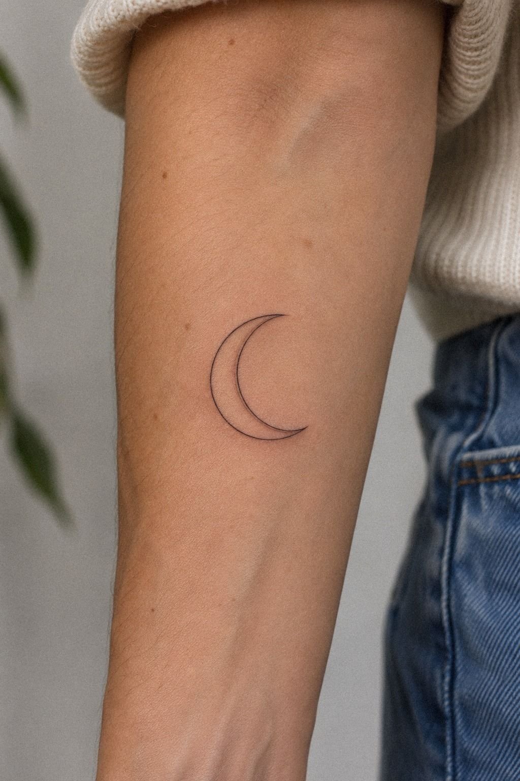
- Choose a Minimal Crescent Moon
- Draw a Delicate Lunar Face
- Pair the Moon With Stars
- Test a Small Crescent Behind the Ear
- Add Flowers Around the Crescent
- Which Line Weight Was Worth It?
- Black or Color: What Held Up?
- Place the Moon on the Clavicle
- How Did the Rib Placement Feel?
- Prepare the Aftercare Before the Appointment
- Watch the Lunar-Inspired Tattoo Heal
1Choose a Minimal Crescent Moon
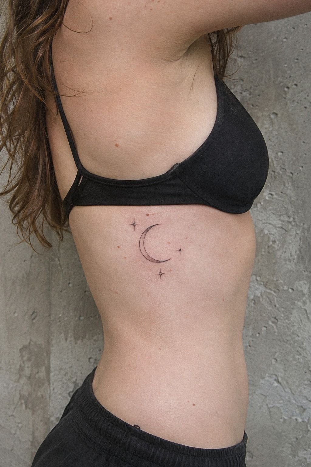
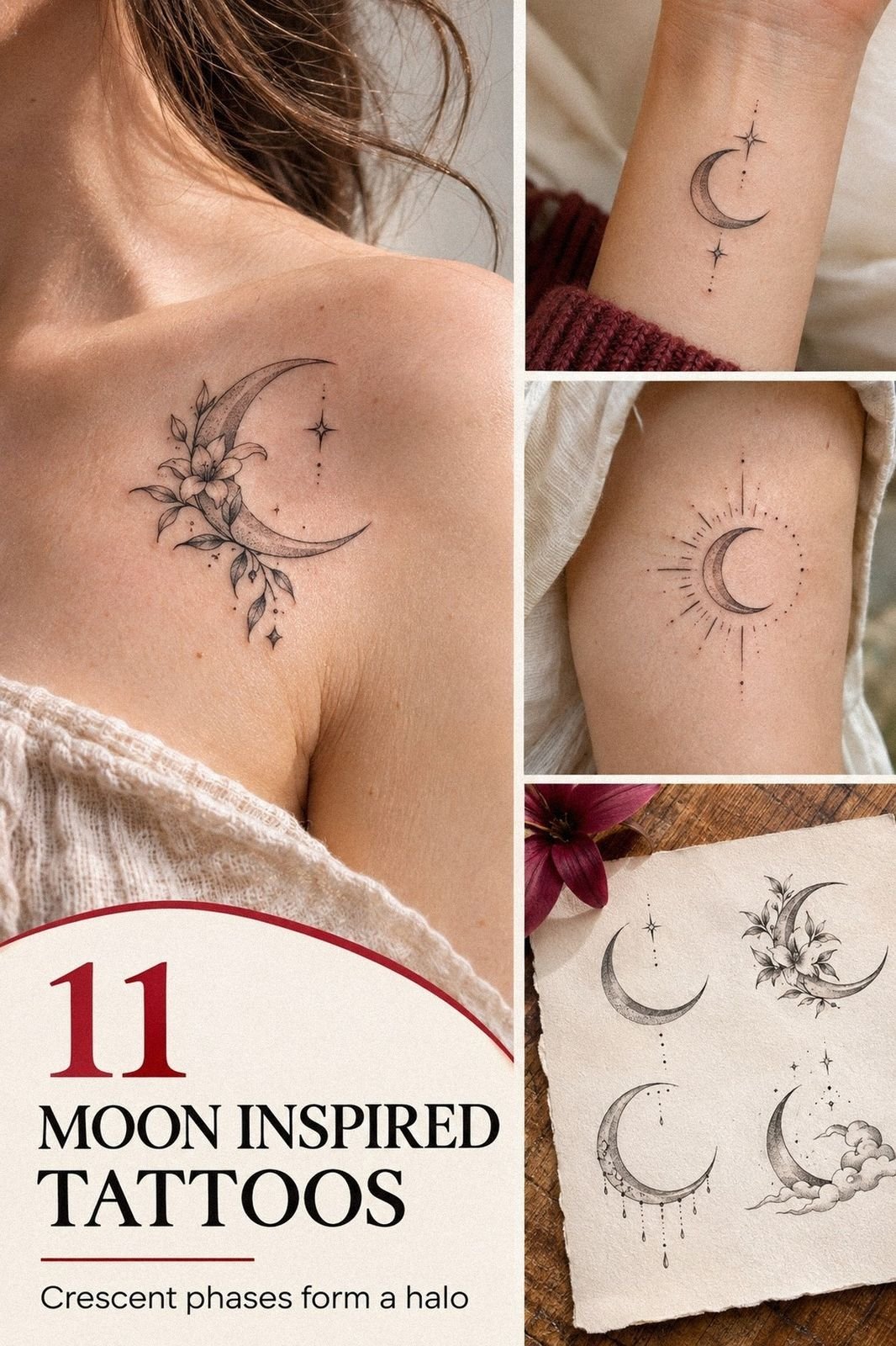
I started with a crescent because it gave me a strong silhouette without asking for a large piece. My first sketch was about 1.5 inches tall, with a narrow inner curve and three small stars.
The shape felt minimal, but it wasn’t empty. You could read it instantly, and I didn’t need heavy shading to make the moon recognizable.
The artist showed me a stencil using a single-needle configuration, then moved the crescent slightly so the curve followed my ribs instead of cutting across them. That adjustment made the design feel more graceful.
I’d skip an ultra-tiny version if you want visible stars. Details need breathing space to remain crisp as the skin changes.
I chose black ink with open skin inside the crescent. You’ll want to ask how the artist expects the negative space to age, since very fine lines may widen gradually.
My reference point was this guide to moon tattoo meaning, especially its ideas around cycles, change, and renewal. I also compared the scale with several unique moon tattoo designs before settling on one curve.
The moment I saw the stencil in the mirror, I stopped scrolling through alternatives. That was it!
Your first tattoo doesn’t need ten symbols to carry feeling. One symbolic crescent can do more work when the line has room around it.
2Draw a Delicate Lunar Face
A moon face sounded charming in theory, but I was cautious. The wrong expression can look cartoonish, while a few controlled marks can feel expressive and almost watchful.
I placed the face on my upper back in the reference sketch because the wider area allowed the features to stay separate from the outer crescent.
The artist drew the nose and closed eye with three short strokes, not a full portrait. You’ll want to keep the face smaller than the moon itself.
Otherwise, the design starts competing with its own outline. I made the mistake of asking for lashes at first. They looked playful on paper and cluttered under the stencil.
The final design used a fine-line blackwork face with tiny stars around the outer curve. It reminded me of the quieter examples in this realistic moon tattoo guide.
I chose a simpler style, though. If you’re comparing references, place the face stencil on your skin and watch it while you move.
I went back and forth for almost a week. Once the face became subtle instead of decorative, it felt right.
Your design should still look like a moon from several feet away, even if someone notices the tiny expression only up close. That readability is worth protecting.
3Pair the Moon With Stars
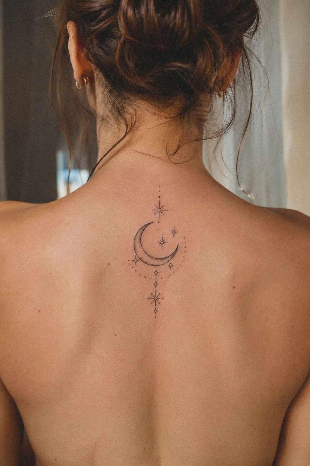
The stars were the part I nearly overdid. I wanted a constellation effect, but five or six stars made the crescent feel busy.
The final version used three small points and one slightly larger four-point star, all spaced unevenly so the arrangement felt organic rather than stamped.
I asked the artist to vary the star shapes instead of repeating identical diamonds. That gave the composition an intricate quality without adding heavy detail.
You’ll want to decide whether your stars are solid, outlined, or tiny dots. Each choice creates a different visual rhythm on skin.
The wrist reference in my saved folder had a crisp crescent with stars following the arm instead of sitting in a perfect row.
I linked it visually to sun, moon, and stars tattoo ideas, but I left the sun out. A second celestial symbol would have made my first piece less personal.
I asked myself an irritating question: did I want a night sky, or did I want a moon with decoration? The answer changed the star count.
Your stars should support the moon’s shape, not compete with it. Mine finally looked balanced once I removed two.
4Test a Small Crescent Behind the Ear
I tested a little crescent behind the ear before choosing the ribs. The placement looked edgy and discreet, but it also made the stars feel cramped.
Behind the ear can work well for a small moon tattoo, especially if you want something hidden by hair. The available placement area changes the entire design conversation.
My stencil was about an inch wide, and the artist kept the line deliberately simple. You’ll want to think about visibility, friction, and how often the area sees sunlight.
I liked the placement in references, but I didn’t love how the curve looked when my head turned. That movement mattered more than a static design.
The test saved me from making a rushed choice. I compared it with the placement notes in unique moon tattoo designs, then moved the idea to my ribs.
There, the crescent could become more feminine without becoming overly ornamental. Your body movement matters more than a flat inspiration reference.
The behind-ear version wasn’t wrong. It just wasn’t mine. I’d choose it for a single clean crescent, not for a face, stars, or flowers.
The smaller the placement, the more understated your design needs to be. That restraint can save money and keep the lines readable.
5Add Flowers Around the Crescent
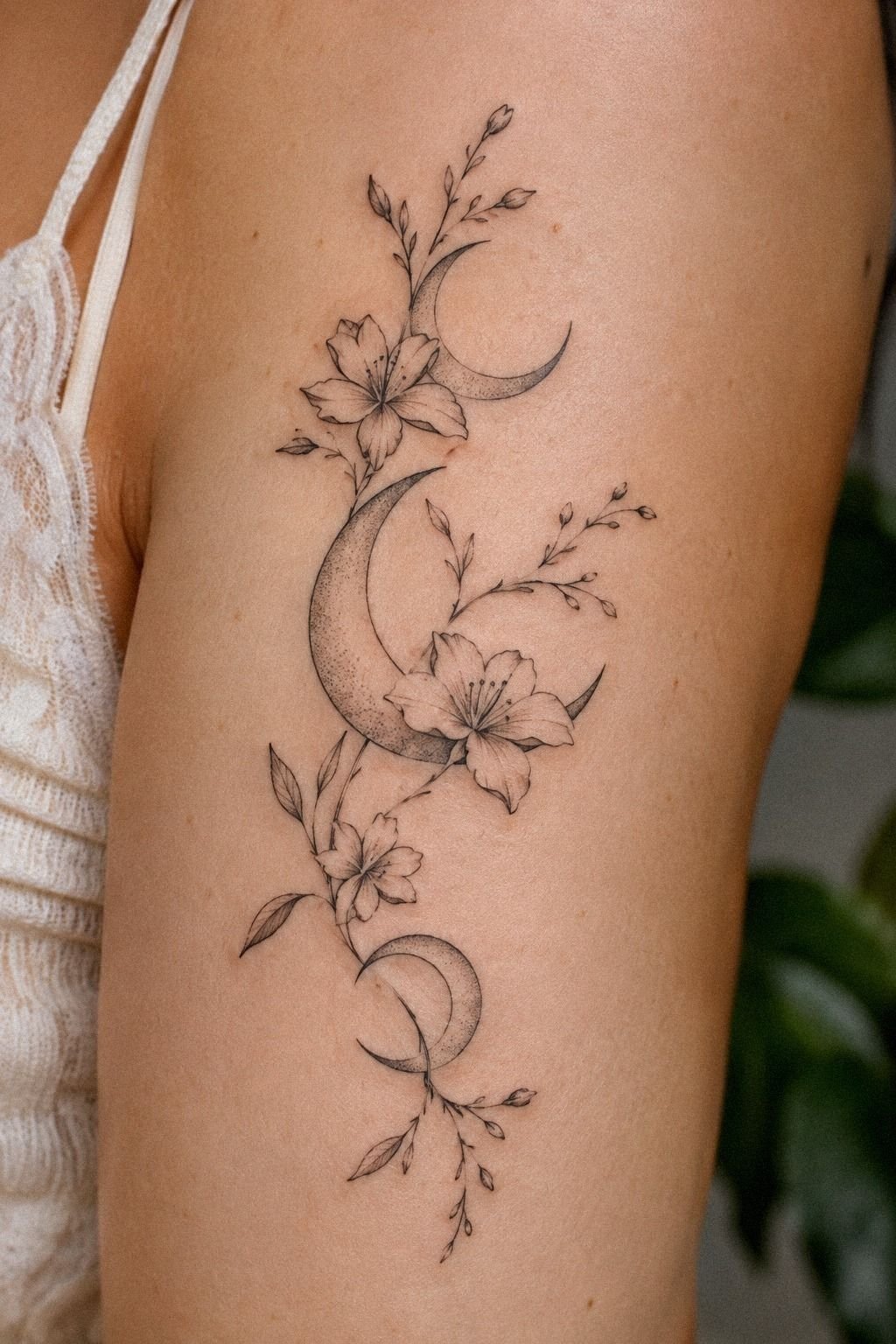
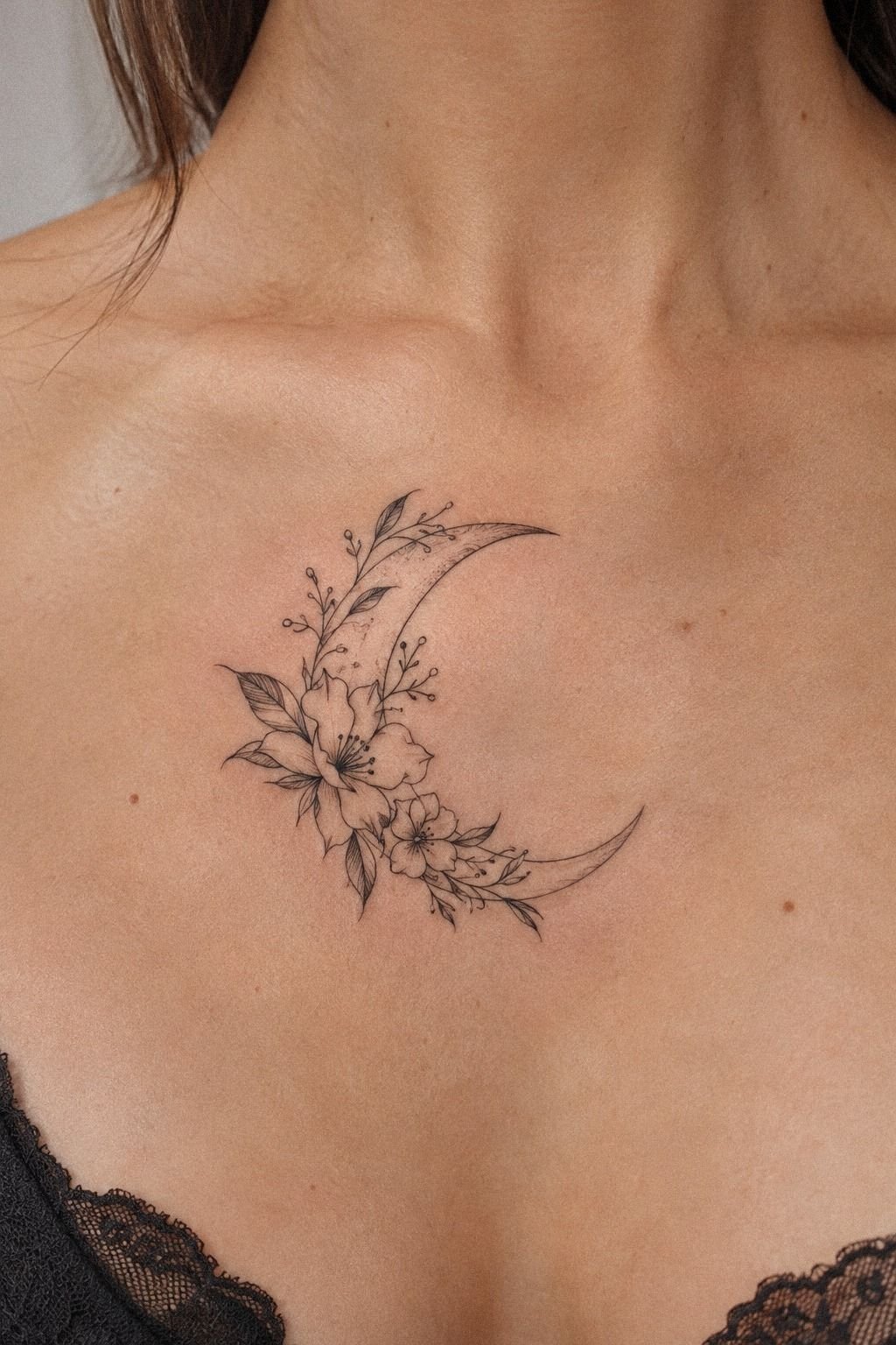
Flowers were my first emotional impulse. I imagined a crescent wrapped in delicate wildflowers, but I didn’t want the stems to swallow the moon.
The artist drew a small botanical arc beside the crescent instead of weaving flowers through it. That kept the central moon symbol visible.
We tested a few flower types on paper: tiny daisies, a narrow stem, and one pointed leaf. The daisy felt too romantic for the rest of my design.
The leaf gave the composition a sharper edge. You’ll want to choose flowers based on their line structure, not only their meaning.
Petals need breathing room, especially when the final tattoo is small. A crowded botanical detail can cost more without adding much value.
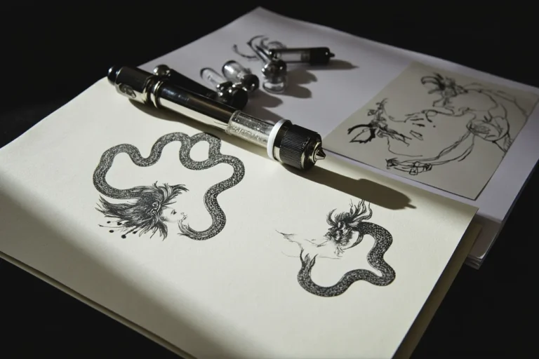
The flash sheet I studied had fine black designs on warm paper, and I liked the vintage quality of those sketches.
Still, I removed most of the botanical detail before the appointment. You can explore unique moon tattoo inspiration without copying every element that catches your eye.
I kept one small stem near the lower curve. It was enough!
If you’re building a feminine moon tattoo, one controlled botanical detail can feel more elegant than a full wreath, especially when the tattoo is under two inches.
6Which Line Weight Was Worth It?
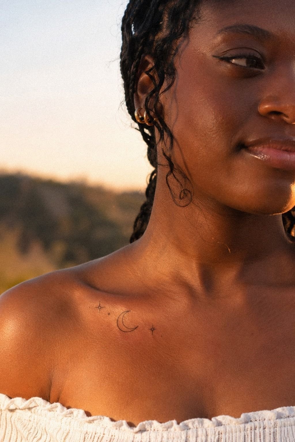
This was the decision that took the longest.
I tested delicate fine-line work against a bolder, crisp outline. The sleeker version kept the crescent readable without swallowing the stars. That contrast clarified everything!
I chose a medium line weight because it felt fierce without making the design look heavy.
7Black or Color: What Held Up?
I arrived thinking black ink was the obvious answer, then saved a neo-traditional moon in muted blue. Color can make a moon feel vibrant, but it also changes the mood.
The blue looked striking on paper and less personal against my skin. That difference mattered more than the trend.
The artist tested a small swatch beside the stencil, using deep charcoal-black ink for the main option and muted blue for comparison. You’ll want to view color in natural light.
Studio light can make every shade look richer. If your budget is limited, black ink may offer better value for clarity.
Color isn’t automatically a bad idea. A tiny accent star or muted lavender detail could feel whimsical and intentional in a larger design.
I didn’t want to schedule a future touch-up just because my first choice was chasing a trend. That potential future cost changed my decision.
The black version won. It looked more powerful against the open skin, and the crescent stayed visually clean.
If you’re considering a sun symbol too, compare the palette ideas in this sun inspired tattoo guide before mixing several celestial colors. I also checked sun, moon, and stars tattoo ideas to see how limited palettes held together.
8Place the Moon on the Clavicle
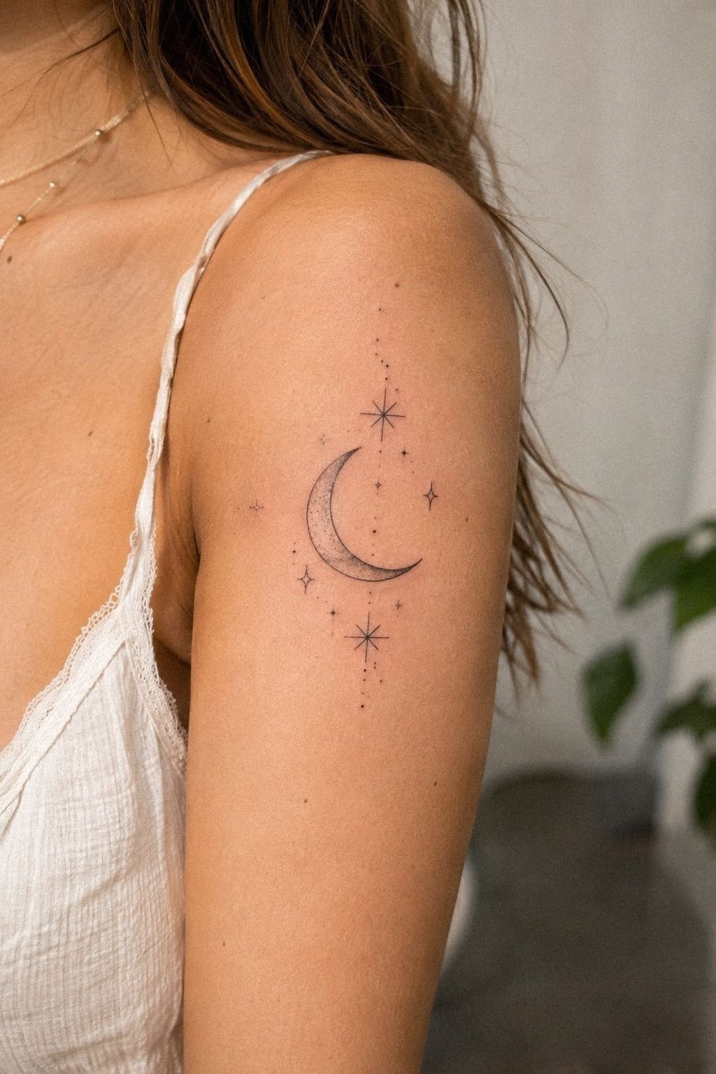
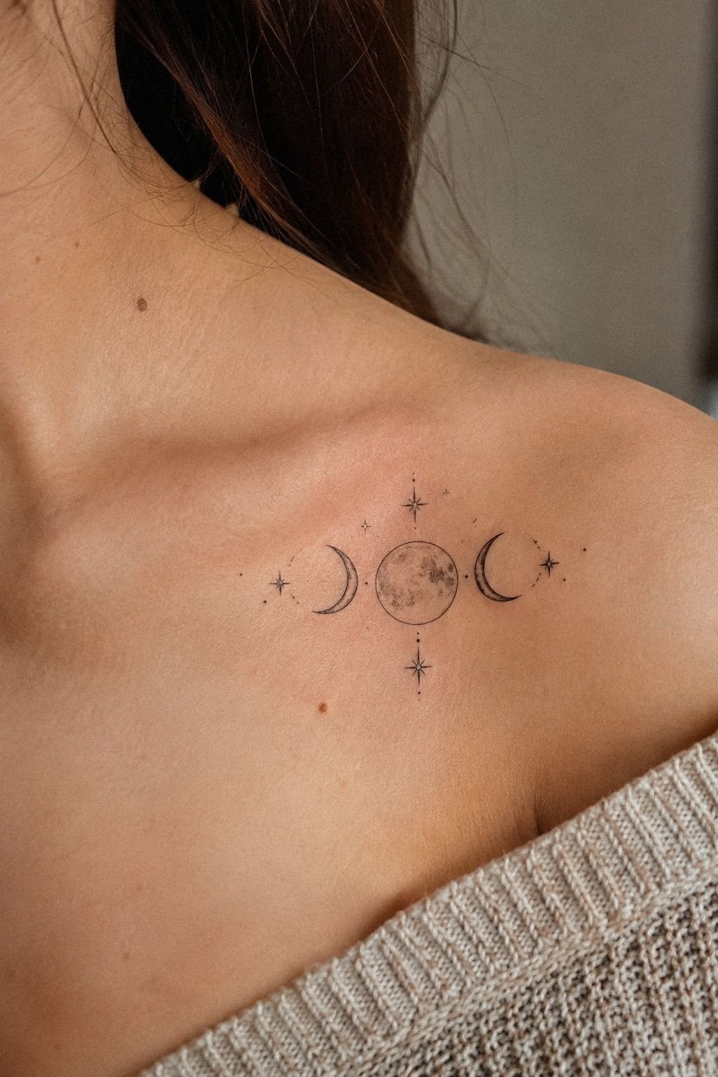
The clavicle placement looked bold in references, but I learned quickly that the bone changes the way a crescent sits.
A design that seems centered on paper can tilt once your shoulder relaxes. I used a temporary stencil for a full afternoon and watched it while I talked, reached, and turned.
The artist recommended keeping the moon slightly below the bone instead of placing the lower point directly on it. You’ll want to consider clothing friction, sun exposure, and whether you need the tattoo hidden at work.
A clavicle crescent can be visible and elegant, but it isn’t the easiest area for every lifestyle. The placement value depends on how often you’ll actually see it.
I eventually chose my ribs, though the clavicle test helped me understand scale. The moon needed a little more width than I expected to keep the stars readable.
I compared the shape with the placement discussion in moon phases tattoo meaning, then removed the extra phase symbols.
The clavicle option felt daring, just not practical for my first piece. Your best placement isn’t always the one that feels most dramatic.
It’s the one you’ll still like when your shoulder is relaxed and your collar moves. That practical judgment is worth more than a dramatic reference.
9How Did the Rib Placement Feel?
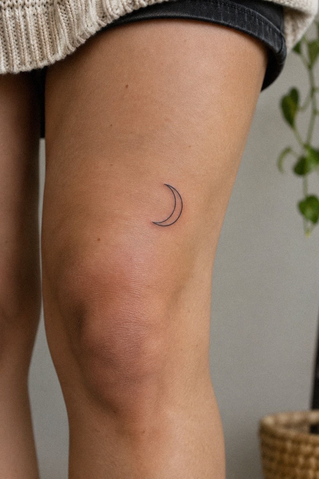
I expected the ribs to be difficult, and they were.
I braced myself! The sensation was sharp but manageable, and the appointment stayed short because the design was compact. The private placement still felt meaningful once the rib placement was set.
10Prepare the Aftercare Before the Appointment
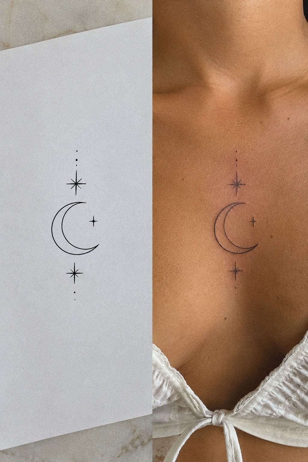
The aftercare plan was simple, and that was a relief. I washed the area gently with fragrance-free cleanser, patted it dry, and followed the artist’s instructions.
The aftercare sheet mattered more than any product recommendation I had saved online. You’ll want to use what your artist recommends rather than layering several formulas over fresh skin.
I avoided swimming, direct sun, and tight clothing while the surface settled. The first days felt sensitive, and the tattoo looked darker than the healed version.
You should resist picking at flakes or judging the final design too early. The surface can look dull during normal healing stages.
A typical surface healing period is about two to three weeks, while complete healing can take roughly two to three months. I kept the area protected.
I used sunscreen only after the skin had fully closed. The realistic moon tattoo guide also helped me compare fresh work with healed examples.
The stencil-to-healed comparison was surprisingly emotional. The lines softened, but the crescent remained graceful and readable.
If you’re planning your own appointment, write down the care steps before you leave. A tired version of you won’t remember every detail.
11Watch the Lunar-Inspired Tattoo Heal
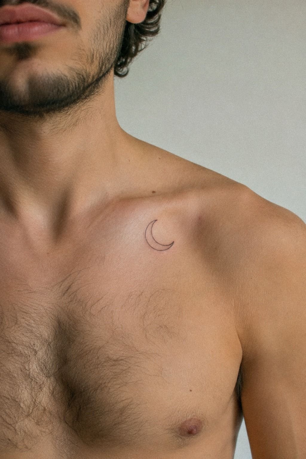
The first healed look wasn’t the morning after the appointment.
By the second week, the surface looked calmer and the black ink had settled into a softer tone. The crescent still felt elegant, and the healed crescent remained easy to recognize.
What I Asked Before Booking
The consultation was more useful than another hour of scrolling. I brought three references, one sketch, and a short list of practical questions.
I asked how the line weight might change, whether the placement would distort with movement, and what the shop minimum covered. The answers made the decision easier.
I also asked to see healed work in the artist’s portfolio. Fresh work can look polished while hiding how spacing changes later.
The artist didn’t push me toward a larger design. That made me trust the recommendation and helped me protect my planned budget.
I left with a clearer stencil and fewer doubts. I hadn’t expected a conversation to change the design so much.
How the Design Moved With Me
The stencil looked different when I stood still, reached forward, and turned sideways. That small experiment revealed how the crescent followed my ribs.
The final curve felt flowing instead of rigid. It didn’t look like a separate sticker placed on top of my body.
I asked the artist to shift the stars by a few millimeters. That tiny adjustment created a more natural alignment.
The change didn’t add much time or cost. It simply made the piece feel more connected to my movement.
I’m glad I checked the stencil while moving. A design can look perfect in a mirror and still feel wrong when your posture changes.
The Details I Cut
I removed two stars, most of the flower, and the extra lunar phase symbols. The cuts made the design quieter but also more recognizable.
I had been treating every attractive detail as necessary. The editing process taught me that a focused concept can carry more meaning than a crowded one.
The face stayed because it gave the moon a subtle expression. The flowers stayed because one stem connected the curve to the rest of the design.
Everything else had to earn its place. If it didn’t improve the silhouette, meaning, or readability, I left it out.
That restraint made the final tattoo feel classic rather than dated. I didn’t need every saved reference to appear on my skin.
The Cost: A Small-Scale Budget
I planned around typical US ranges rather than pretending every studio charges the same. A small Moon Inspired Tattoo may fall near a shop minimum, while a larger or more detailed piece can move toward an hourly rate.
My own design stayed small because I wanted a compact blackwork crescent, not a long appointment filled with shading. You should ask for the shop minimum before sending a deposit.
Confirm whether a consultation or touch-up policy is included. Those details can change the final cost.
A cheaper appointment isn’t a win if the spacing is crowded or the artist has no healed examples. Your budget should protect line quality, hygiene, and the experience of the person working on your skin.
The best value was the consultation. It caught the cramped stars, the awkward clavicle angle, and the face detail I didn’t need.
That conversation made the final tattoo feel intentional before the needle touched my skin. For me, the extra planning was worth the cost.
What Made the Price Worth It
I’d spend more on a clean portfolio than on an elaborate design. The portfolio value showed up in the healed work, not just the dramatic fresh references.
The artist understood small-scale spacing and didn’t promise that every detail would stay identical forever. That honesty mattered.
I also paid for a consultation that changed the stencil. The session itself was short, but the decision-making behind it wasn’t rushed.
A low price can look attractive until you calculate a correction, cover-up, or removal. I wanted the long-term value to come from getting the first design right.
That doesn’t mean the most expensive artist is automatically the best choice. It means price should be considered alongside skill, healed results, hygiene, and communication.
The final number felt fair because I knew what I was paying for. I wasn’t buying complexity; I was paying for a readable symbol with thoughtful placement.
Why This Lunar Idea Still Works
I think this tattoo lasted emotionally because I gave it one job. It marks a period when I needed a reminder that change could be empowering without being loud.
The crescent carried that idea, while the stars made it specific to me. I didn’t ask the design to represent every chapter of my life.
I’ve also learned that a first tattoo doesn’t need to announce itself. The small scale feels understated, but the meaning hasn’t shrunk with it.
When I catch the curve in a mirror, I remember the decision, not only the appointment. You’ll know your concept is strong when you can explain why one element stays.
The design process taught me to distrust endless inspiration scrolling. It can make every option look equally urgent, even when half of them don’t belong to you.
I’d rather choose one symbolic image and refine it than collect twenty references pulling in different directions. That choice made the tattoo feel personal.
The final design has a haunting calmness that I didn’t expect from such a small mark. It feels sacred to me because the meaning is mine, not because the symbol has one fixed definition.
If you’re deciding between a little moon tattoo and a more elaborate piece, give yourself seven quiet days. Save the sketch, stop editing it, and see whether you still want the same line.
That pause made my choice feel sharp, raw, and honest. It also kept me from spending money on details I would have removed later.
The Questions Worth Answering First
How much does a Moon Inspired Tattoo usually cost?
A Moon Inspired Tattoo usually costs about $100 to $300 in the US, depending on size, placement, artist, and region. Many shops have a minimum around $50 to $100, while hourly rates often run about $100 to $250. A clear quote protects your tattoo budget.
Are Moon Inspired Tattoos a good idea for a first tattoo?
Yes, Moon Inspired Tattoos can suit a first appointment because a small crescent offers clear lines, flexible placement, and personal symbolism. You can choose a tolerable area and avoid crowded detail. A simple design gives you design confidence.
How do I choose a tattoo artist for Moon Inspired Tattoos?
Choose an artist with clean linework, healed work, strong hygiene practices, and experience with your preferred style. Ask to see work on skin tones similar to yours. A healed portfolio matters more than heavily edited fresh work.
How much do Moon Inspired Tattoos hurt?
Pain varies by person and placement. Ribs, feet, hands, and sternum often feel sharper, while forearms, thighs, and shoulders tend to be more tolerable. Placement changes the experience, so ask your artist about break options before the session begins.
How long does a Moon Inspired Tattoo take to heal?
The surface usually heals in about two to three weeks, while complete healing can take roughly two to three months. Wash gently, moisturize as directed, and avoid sun and swimming until healed. Patience protects the fine linework.
What’s the best placement for Moon Inspired Tattoos?
The best placement depends on visibility, pain tolerance, and design size. The forearm, upper arm, and thigh are practical choices, while ribs and sternum feel more private but can hurt more. Choose skin that lets the crescent stay visually readable.
Where I’d Start First: The One-Choice Test
If I had to pick one, I’d start with the minimalist crescent. Its open shape gives fine lines room to age without losing the symbol.
I’d save the sketch, compare it with celestial moon tattoo references, and wait a week before booking. If you still want the same curve, you’ve found your piece.
Before paying a deposit, I’d also reread moon tattoo meaning and compare a few healed examples. The strongest choice is the one that still feels personal after the excitement fades.
A Moon Inspired Tattoo doesn’t need to be large, complicated, or expensive to matter. Mine stayed meaningful because every remaining line had a reason to be there.