A realistic moon tattoo isn’t a cartoon crescent with a face. It’s the actual lunar surface rendered in skin, craters catching light, maria sinking into shadow, that chalky, desolate texture that makes you want to reach out and feel the dust. I’ve tattooed dozens of these over the years, and the best ones make people stop and stare. The worst ones look like a grey smudge someone tried to pass off as the moon. This guide breaks down what actually works, what heals poorly, and how to get something that holds up.
Origins & History
Moon imagery in tattooing goes back to sailor traditions and early Americana, but those were symbols, simple, graphic, meant to be read from across a bar. The realistic moon is a different animal entirely. It emerged from the black and grey realism boom of the 1990s and 2000s, when artists started treating skin like canvas and photographic reference became standard in every shop.
I remember when I first saw a Jack Rudy moon phase done with actual telescope photography as reference. It changed how I thought about celestial subject matter. Suddenly the moon wasn’t just a symbol anymore; it was a landscape. That shift, from icon to environment, is what defines the style today.
From Sailor Jerry to Telescope Lenses
Traditional moon tattoos were about meaning: travel, femininity, cycles. Realistic moon tattoos are about observation. The client brings in a photo from NASA’s LRO camera, or a shot they took through their own telescope with a phone adapter. The artist’s job becomes translation, how to render that cold, airless geology in warm, living skin.
Why It Took Off
Social media helped, sure. But the real driver was accessibility of reference. When every phone has NASA’s image library, when backyard astronomy went mainstream during the 2017 eclipse, clients started walking in with actual expectations. They knew what Tycho looked like. They wanted that.
Key Characteristics & Motifs
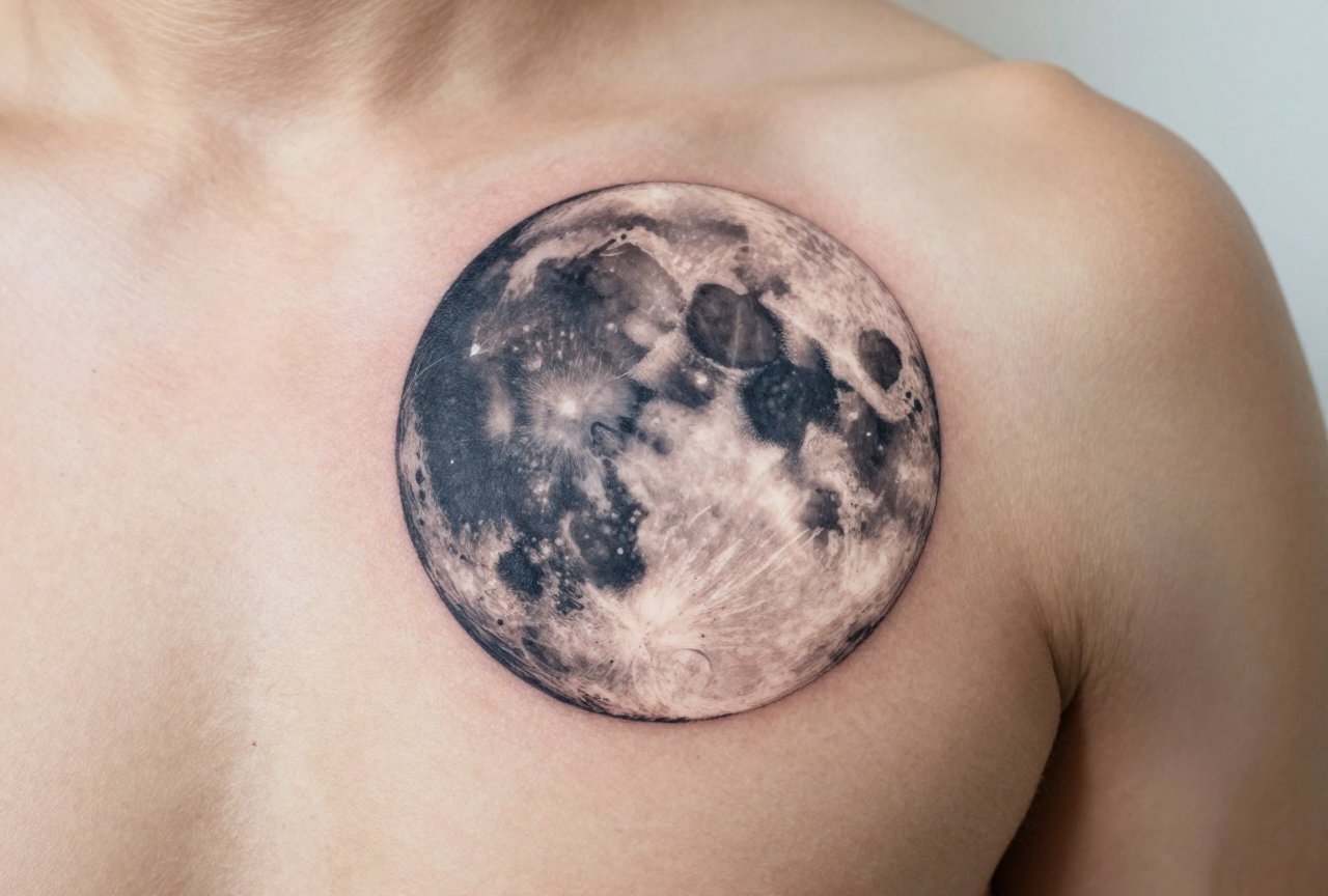
A realistic moon tattoo lives or dies on three things: edge softness, crater depth, and that particular flat-yet-dimensional quality of lunar geography. The moon isn’t a sphere with shadows; it’s a battered surface with no atmosphere to soften anything. Light hits hard. Shadows drop off clean.
- Surface texture: Thousands of impact craters at varying scales, not three token dents. The best work has crater walls catching rim light while floors disappear into black.
- Maria vs highlands: The dark “seas” (mare) are actually basalt plains, smoother, darker, less cratered. The highlands are chaotic, pitted, lighter in tone. Good artists separate these zones distinctly.
- Terminator line: That sharp shadow boundary between lunar day and night. In tattooing, this is where you separate flat grey from saturated black. Weak work blurs this; strong work makes it razor-crisp.
- Scale cues: Small secondary craters overlapping larger ones, ejecta rays, rilles. These sell the realism.
I tell clients: the moon is basically a portrait of a dead rock. Treat it with the same respect you’d give a face. Every crater has character. Every shadow has a source.
Common Compositional Additions
Stars, obviously, though I warn against too many, competing light sources break the illusion. Atmospheric haze around the limb. Earthshine on the dark portion. Orbit trajectories as fine single-needle lines. I’ve also done pieces where the moon sits behind silhouetted landscape, mountains, city skylines, ocean horizons. The contrast between rendered celestial body and flat black silhouette is striking when executed cleanly.
Color vs Black and Grey
Here’s where opinions split in my shop. Black and grey is the traditional choice for lunar work, and for good reason. The moon actually is grey. But “grey” in tattoo ink behaves differently than grey in light.
Black and grey realism uses black ink diluted with water or mixing solution to create wash tones. On skin, these heal slightly warmer than they look fresh, olive undertones in some people, pinkish in others. The moon’s actual neutral grey is hard to hit. I often add a tiny touch of blue to my grey wash for lunar pieces; it cools the tone and reads more like actual regolith under Earth light.
When Color Works
Blood moons, harvest moons, that particular teal of an eclipse. Color realistic moons are harder and heal trickier, but they can be stunning. I did a piece last year where the moon was in full eclipse, deep amber core, blood-red umbra, blue-tinged penumbra. Took three sessions. The client still sends me photos; it held beautifully. But I was selective about saturation. Too much red in skin and you get a rash-like quality after healing.
My rule: if the reference photo shows color, consider color. If it’s a standard waxing gibbous, stick to black and grey and nail the values.
Best Placements
The moon is round. This sounds obvious, but it drives placement decisions in ways clients don’t initially consider.
- Upper arm/shoulder: The deltoid’s curve can complement or fight the moon’s edge. I prefer slightly off-center placement here, letting the terminator line follow the muscle contour.
- Forearm: Flat plane, good visibility, but limited scale. Small realistic moons are harder, less room for crater detail, more risk of muddiness.
- Thigh: Excellent real estate. Large, relatively flat, easy to heal. I’ve done full lunar surfaces here that read like satellite photography.
- Ribs/side: The curvature actually helps. A moon wrapping slightly around the torso gains dimensionality. But healing is miserable, movement, friction, hard to keep clean.
- Chest: Over sternum works for smaller pieces; the pectoral flatness suits the composition. Over heart, symbolic, but the skin there is thin and finicky.
One thing I avoid: the moon as a standalone circle dead center on someone’s back. It looks like a target. I need context, asymmetry, something to activate the space around it.
Scale Reality
Palm-sized is my minimum for any realistic moon. Smaller than that, and craters become dots, maria become vague grey patches. I’ve seen beautiful tiny crescents, but they’re not realistic, they’re illustrative. Different genre.
Who It Suits
Not everyone. I say this with love. Realistic moon tattoos demand commitment to the aesthetic. They’re not flash-friendly. They don’t pair well with busy traditional surrounding work unless carefully planned. They read best on people who want something contemplative, slightly scientific, maybe a touch solitary.
Skin tone matters technically, not aesthetically. On darker skin, I adjust my approach: heavier reliance on black for the terminator, more selective use of mid-tones, stronger contrast overall. The moon’s brightness comes from highlight reservation, leaving skin untouched, not from light ink. This works across tones when planned properly.
I’ve had astronomers, photographers, insomniacs, people who just feel lunar-tuned. The through-line is observation. These clients notice things. They’ll catch a missing crater. They’ll appreciate the Copernicus ray system I snuck in. That engagement makes the tattoo better; it pushes me to be precise.
Modern Variations
The style keeps stretching. I’m seeing more artists treat the moon as negative space, black sky, uninked moon, crater details rendered as black dots and lines within the skin-tone void. Clever. Hard to heal cleanly around the edges.
Split moons are popular: half realistic surface, half geometric decomposition, or half floral. I enjoy these when the transition is intentional, not just indecision. A moon dissolving into constituent elements, craters becoming eyes, maria becoming continents, speaks to that old symbolic tradition while keeping the realistic rendering.
Phase sequences done realistically, rather than as simple black shapes. This is technically demanding; each phase needs proper shadow geometry. I’ve done forearm bands of five phases that took six hours. The client wanted Copernicus visible in every phase where geometry allowed. We made it work.
Choosing an Artist
This is where I get serious with you. Not every black and grey artist can do a moon. The skills overlap but aren’t identical. Portrait artists understand facial structure; lunar artists need to understand impact geology, light behavior on airless bodies, how to render powdery texture without making it look like skin disease.
- Check their healed work: Fresh photos lie. Ask for six-month-healed lunar pieces. Craters should still read as depressions, not grey blobs.
- Ask about reference: Do they work from actual lunar photography? Can they explain maria composition? An engaged artist will have opinions about LROC vs Apollo photography.
- Look at their blacks: The terminator needs to saturate fully. Weak black work means a weak moon.
- Discuss size honestly: If they suggest something smaller than your palm for a full disk, push back or walk.
In my chair, I spend the first twenty minutes of a moon consultation just looking at reference with the client. We zoom into Copernicus, Tycho, the weird rectilinear rilles near Aristarchus. We decide on libration, whether to show the near side straight-on or slightly angled. This isn’t wasted time. It’s the difference between a generic moon and their moon.
Final Thoughts
A realistic moon tattoo is a strange thing to carry. It’s not personal in the obvious ways, no name, no date, no totem animal. But it’s deeply specific. The phase you choose, the craters visible, whether it’s waxing or waning, Earthshine or full illumination: these are decisions about how you relate to cycles, to observation, to that particular loneliness of looking up.
I’ve watched clients cry in my chair while I worked on their moons. Not from pain. From that recognition. The surface of another world, rendered in their own living skin. It gets them.
Do your research. Find an artist who geeks out about selenography. Commit to the scale and the sessions. Heal it like your skin’s job depends on it, because the tattoo’s job does. A good realistic moon doesn’t just sit there. It hangs. It catches light like the real thing. It reminds you, every time you see it, that someone looked closely enough to render dust and shadow, and that you carry that attention forward.
Frequently Asked Questions
How long does a realistic moon tattoo take to heal?
Plan for 2-3 weeks of careful afterkeeping before the surface looks normal, and 2-3 months before you can truly judge the healed result. Lunar work has subtle greys that settle differently than bold black pieces.
Will a realistic moon tattoo fade to a grey blob over time?
Poorly executed ones can, especially if the artist used muddy mid-tones without strong black anchors. A well-done piece with proper contrast and saturated darks ages into softer detail, not shapeless grey.
Can I get a realistic moon tattoo if I have freckles or moles in the area?
Yes, but the artist needs to work around them strategically. Freckles can read as extra craters if placed well, or disrupt the surface texture if ignored during design.
Is it okay to add a realistic moon to an existing traditional sleeve?
It’s tricky. The rendering styles clash, photographic realism against bold graphic linework. Some artists bridge this with transitional elements, but I’d recommend consulting someone who specifically enjoys solving composition puzzles.

