Neo trad Japanese sits in that sweet spot between two heavyweight styles. You’ve got the bold outlines, limited palettes, and graphic punch of American traditional. Then you fold in Japanese imagery, dragons, koi, cherry blossoms, foo dogs, waves, without the full sleeve commitment or the strict rules of tebori. I’ve tattooed this hybrid for years, and it hits different than either parent style alone. It reads clean from across the room, holds up for decades, and lets you play with subject matter that straight trad doesn’t always make room for.
Origins & History
This style didn’t emerge from some grand theory. It grew out of shops, out of artists getting bored, out of clients wanting Japanese imagery without the time and money for a full back piece or bodysuit. American traditional guys started borrowing Japanese flash from the 1960s and 70s, think Sailor Jerry’s dragon sheets, Ed Hardy’s Japanese-influenced work. They kept the bold lines and flat color but loosened the compositional rules.
How It Differs From Pure Japanese
Real irezumi follows centuries of convention. Backgrounds flow with the body. There’s wind, water, and negative space working together. The imagery tells stories, carries meaning. Neo trad Japanese doesn’t care about any of that. I’ve had clients bring me a single koi they want on their forearm, no background, no narrative. Just a badass fish with thick black outlines and saturated red and gold. That’s the whole point. It steals the look without the obligation.
The American Traditional DNA
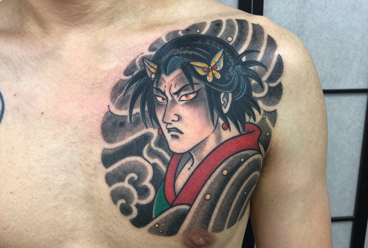
You can’t strip the trad out and still call it neo trad Japanese. The line weight matters, those fat, confident outlines that heal to a soft grey. The color palette stays limited: strong reds, deep greens, solid blacks, maybe some gold or cream. No gradients, no photorealism, no soft edges. In my chair, I tell people: if you want that misty, atmospheric Japanese painting feel, this isn’t your style. This is a poster. A sticker. Something that punches.
Key Characteristics & Motifs
Walk into any shop and you’ll spot the recurring imagery fast. Some of it works better in this hybrid than others.
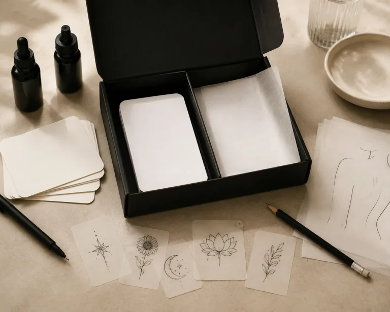
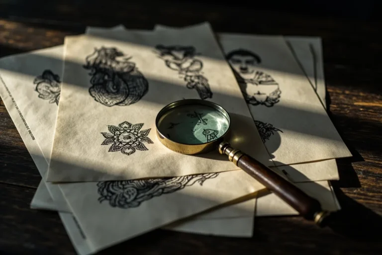
- Koi and dragons: The classic Japanese subjects translate perfectly. The scales give you that repetitive pattern trad loves. Bold lines keep them readable at any size.
- Cherry blossoms and maple leaves: These work as filler or standalone pieces. The petal shapes are simple, graphic, and color beautifully.
- Fu dogs and oni masks: Great for larger pieces. The faces have character, expression, teeth you can really carve in with a mag shader.
- Waves and wind bars: Stripped-down versions of Japanese background elements. I often do these as armbands or to frame other pieces.
- Snakes paired with Japanese flowers: A weirdly natural marriage. The snake’s body creates movement; the flowers break up the scale pattern.
What doesn’t work? Geishas in full kimono with soft shading. Temples with perspective. Anything that needs subtlety or distance to read. This style lives on immediate impact.
Color vs Black and Grey
Here’s where shop opinion splits. Some artists insist neo trad Japanese must have color, that red and green is half the identity. Others, myself included, do plenty in black and grey.
When Color Wins
Color pops on skin types that hold it well. I’ve seen saturated koi on medium skin tones that look like they were painted yesterday, ten years on. The limited palette actually ages better than realism’s 20-color blends. Less mud, less confusion. But you need a black that stays truly black. Nothing worse than a dragon where the outline softened to grey and the red turned pink. We see this a lot with cheap work or poor aftercare.
Black and Grey’s Case
Black and grey neo trad Japanese reads tougher, more graphic. It suits clients who want the imagery but work conservative jobs. It also heals more forgivingly, no color fallout to worry about. The tradeoff is you lose some of that poster-like quality. It becomes more illustration, less sticker.
Best Placements
Not every spot on the body plays nice with this style. The bold lines need flat or gently curved surfaces. I’ve tattooed neo trad Japanese pieces from ankles to throats, but some placements just sing.
- Forearms: The sweet spot. Enough real estate for detail, visible enough to show off, flat enough for clean lines.
- Calves: Wrap potential. Dragons and snakes love to coil around the calf. The muscle gives subtle dimension without distorting the image.
- Thighs: Big canvas for bigger subjects. Koi swimming up the thigh, cherry blossoms falling. Room to breathe.
- Chest panels: Classic placement stolen from Japanese tradition. Centered, symmetrical, hits like a truck.
- Hands and fingers: Risky. The lines spread, the color falls out. I do them, but I warn clients: this is a maintenance tattoo, not a forever piece.
Ribs and stomach? The stretching and breathing kills the crispness. I steer people away unless they’re committed to touch-ups.
Who It Suits
Style-wise, neo trad Japanese fits people who want visible tattoos with immediate recognition. It’s not whispering. The guy with the koi forearm sleeve at the bar, you know he’s tattooed. It’s for collectors who appreciate trad’s history but want something beyond anchors and eagles. It’s also an entry point. I’ve had first-timers sit for a small koi or dragon, then come back for more after they realize the pain wasn’t that bad and the result looks this strong.
Skin tone matters less than with some styles. The heavy black lines provide contrast that carries across types. Lighter skin shows color more vibrantly, but I’ve done saturated reds on deep skin that held beautifully. The key is the artist knowing their pigments and not trying to force colors that won’t show.
Modern Variations
The style keeps mutating. I’ve seen artists pushing it in directions that barely resemble either parent.
Neo Neo Trad Japanese
Some younger artists are loosening the line work, adding texture, incorporating graffiti influences or anime styling. The Japanese subjects stay, kitsune masks, takoyaki, modern Tokyo imagery, but the execution gets weird. I don’t personally tattoo this way, but I respect the evolution. It’s keeping the hybrid alive instead of letting it become another flash sheet from 2005.
Micro and Single-Needle Takes
This one’s controversial. Single-needle or tight 3rl work for tiny neo trad Japanese pieces, little koi behind ears, miniature dragons on wrists. They look stunning fresh. I’ve done a few. But I make clients sign extra paperwork practically. The lines are so fine that aging becomes a real gamble. Five years out, that delicate koi might be a koi-shaped blob. It’s a choice between immediate beauty and longevity.
Choosing an Artist
This matters more than almost anything. Not every trad artist can handle Japanese imagery. Not every Japanese specialist will stoop to bold outlines and simplified forms. You need someone who actually lives in both worlds.
- Look at healed photos, not just fresh work. That shiny new koi means nothing if it’s grey and blurry at year three.
- Ask about their line weight preferences. If they say “whatever the design needs,” press harder. Neo trad Japanese demands commitment to thick, confident outlines.
- Check if they’ve studied actual Japanese tattooing, even if they don’t practice it. Understanding why the imagery works helps them not butcher it.
- Shop culture tells you plenty. If the place does mostly walk-in trad and the artist is squeezing your Japanese piece between two eagles, maybe keep looking.
I’ve turned down neo trad Japanese requests when the client wanted something too soft, too realistic, too far from what the style does well. A good artist will do the same. The ones who say yes to everything are the ones you worry about.
Final Thoughts
Neo trad Japanese isn’t a compromise. That’s the thing people get wrong. It’s not Japanese-lite for people who can’t commit to a full sleeve. It’s its own animal with its own rules, its own history, its own reasons for existing. I’ve watched this style explode in the last decade, then watched it get watered down by artists who thought bold outlines plus a dragon equals instant neo trad. It doesn’t. The best work still comes from people who respect both traditions enough to bend them without breaking them. If you’re considering this style, bring reference. Know what you want. But also listen when the artist pushes back. That’s usually where the good stuff lives.
Frequently Asked Questions
How long does a neo trad Japanese sleeve typically take?
A full forearm sleeve runs 15-25 hours depending on complexity and how dense the imagery sits. Thigh pieces can push 30. I always tell clients to think in sessions, not sittings, your skin and my back both need breaks.
Will the bold lines look too heavy on smaller bodies?
Scale matters more than body size. I’ve put thick-lined koi on petite clients and they looked perfect because we adjusted the design density, not the line weight. Skinny lines on small people actually age worse.
Can I mix neo trad Japanese with other styles in a larger piece?
You can, but transitions are tricky. I’ve seen it work where neo trad Japanese sits as a focal point surrounded by softer Japanese background. Mixing it with realism or watercolor usually looks like two different tattoos fighting.
How do I know if an artist’s healed work actually holds up?
Ask to see photos from 2+ years out. Any artist can make a tattoo look good fresh. If they only show Instagram posts from last week, that’s a red flag. Real confidence comes from showing the long game.