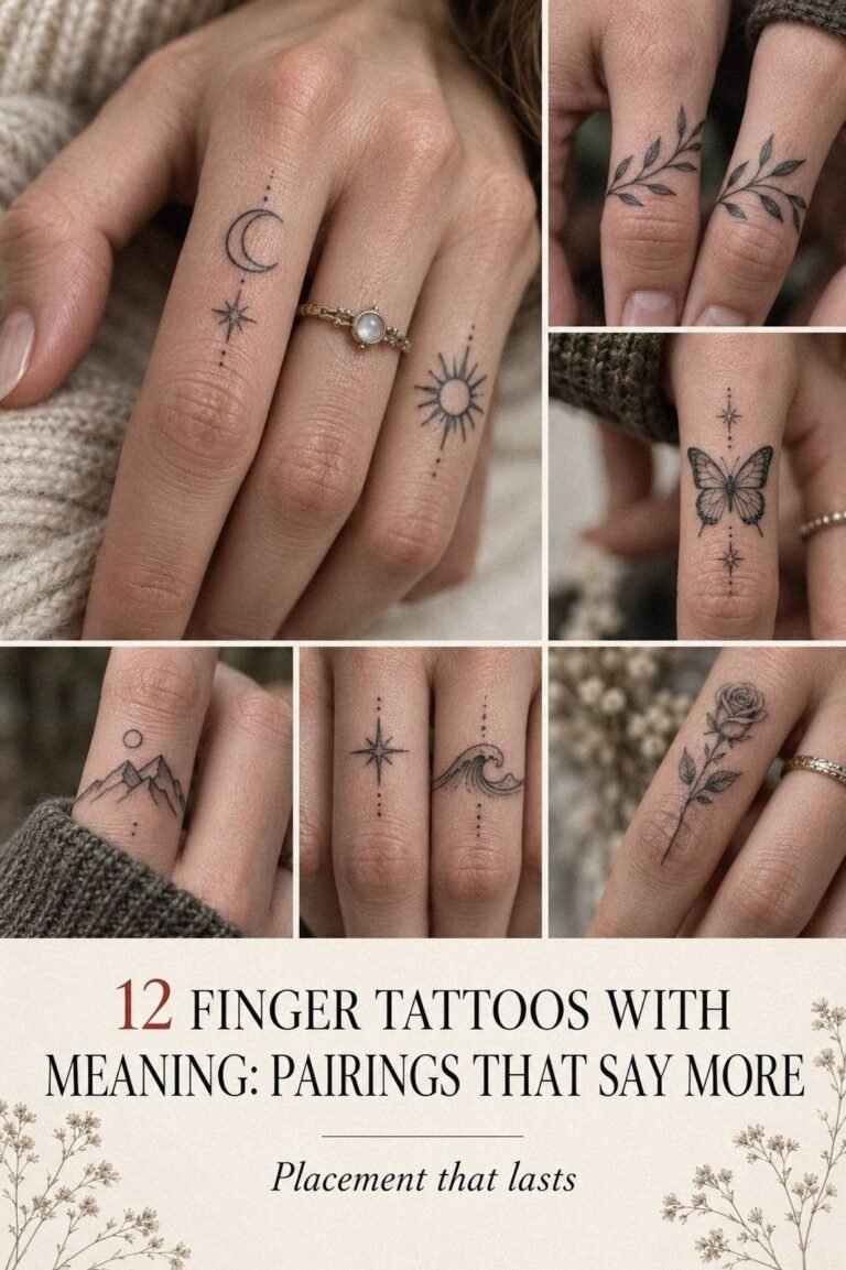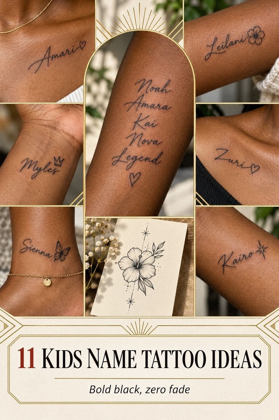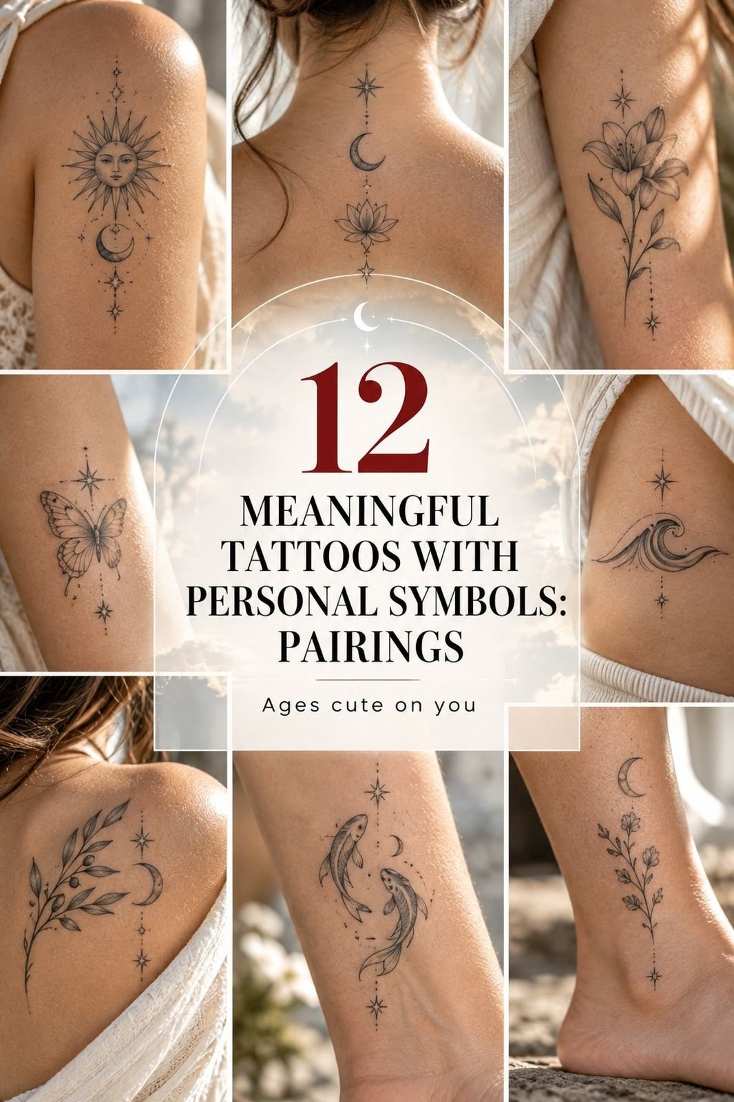
Very meaningful tattoos can stay crisp blackwork without a huge budget, especially when you choose a simple symbol, a tolerable placement, and an artist whose healed work looks strong. I learned that after pricing a large tribute piece, then choosing a smaller handwritten design instead. The meaning got bigger. The tattoo didn’t.
I wanted a personal tattoo that felt expressive without becoming ornate. The answer was more delicate, more understated, and far more striking than the expensive idea I first saved.
Here’s What It Looked Like Before
Before I chose anything, I had blank skin and a phone full of saved tattoo sketches. None felt personal enough. Some were too ornate, some too generic, and one bold design looked fierce on paper but wrong for my daughter’s story.
I gave myself one rule: the final mark had to make me feel something before anyone else could understand it. That narrowed the field fast. If you’re collecting ideas, browse these small meaningful tattoos first, then notice which shapes keep pulling your eye back.
I also wrote down what I didn’t want: a copied symbol, crowded linework, or a trendy phrase I’d stop recognizing as mine. That list became surprisingly useful.
The first quote was higher than expected because the design needed more time, more shading, and a longer appointment. I wasn’t looking for the absolute cheapest option. I wanted an intentional tattoo that wouldn’t punish me later.
The One Rule That Narrowed Everything
My personal tattoo rule was simple: remove anything that only looked stylish. I wanted a mark with a real memory behind it, even if the finished design seemed minimal to everyone else.
That decision changed the search. I stopped comparing dramatic designs and started asking sharper questions.
Would I still want this after ten years? Would the symbol feel personal without an explanation?
Could an artist keep it elegant at a smaller size?
I kept returning to meaningful word tattoos because words gave me an emotional anchor. Still, I knew a sentence could become too obvious. The strongest idea might be only one letter, one curve, or one imperfect stroke.
- I Chose My Daughter’s Handwriting: The Inkprint Rule
- What Changes When You Use Her Initial?
- A Kite String Became a Symbol: The Memory Mark
- Which Line Belongs Here?
- Heart Placement Over Visibility
- Tiny Details Only I Understand
- Script Over Ornament
- Comfort Before Style
- The Aging Ink Test
- Healing Over Hurry
- I Carried Her Story In Permanent Ink
1I Chose My Daughter’s Handwriting: The Inkprint Rule
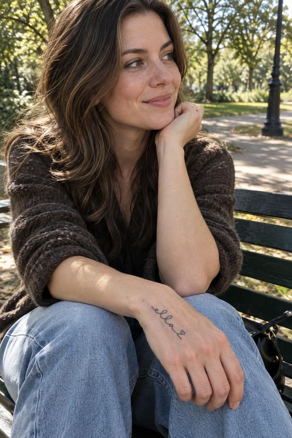
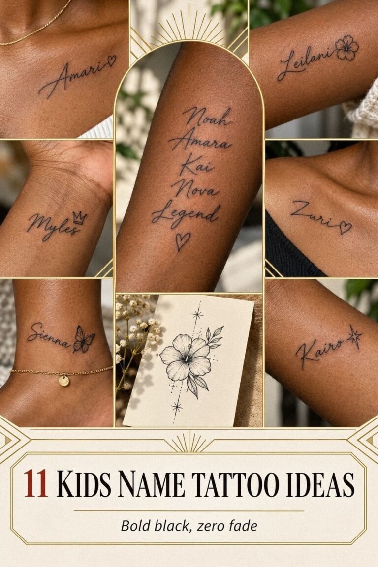
I started with my daughter’s handwriting because the uneven letters carried more emotion than a polished font. Her lowercase “a” leaned slightly left, and the final stroke rose higher than the others.
That tiny flaw made the design personal and expressive. It mattered!
The artist traced the original writing into single-needle linework, then adjusted only the spacing. I asked for black ink with no shading, no flourishes, and no outer border. You don’t need extra detail when the source already holds a whole memory.
I placed the name on the inside of my forearm, where I could see it without turning my body. That inner forearm placement felt gentle enough for a first piece, and the skin gave the letters space to breathe. If you’re considering names, compare ideas in this guide to meaningful word tattoos before you commit.
I kept the size modest, roughly 1.5 inches wide. A larger version would’ve cost more and made the handwriting look less like hers. The final line was delicate but readable, exactly where I wanted it.
That was the first moment it felt undeniably hers. The result was dainty, symbolic, and more meaningful than the larger design I had nearly booked.
2What Changes When You Use Her Initial?
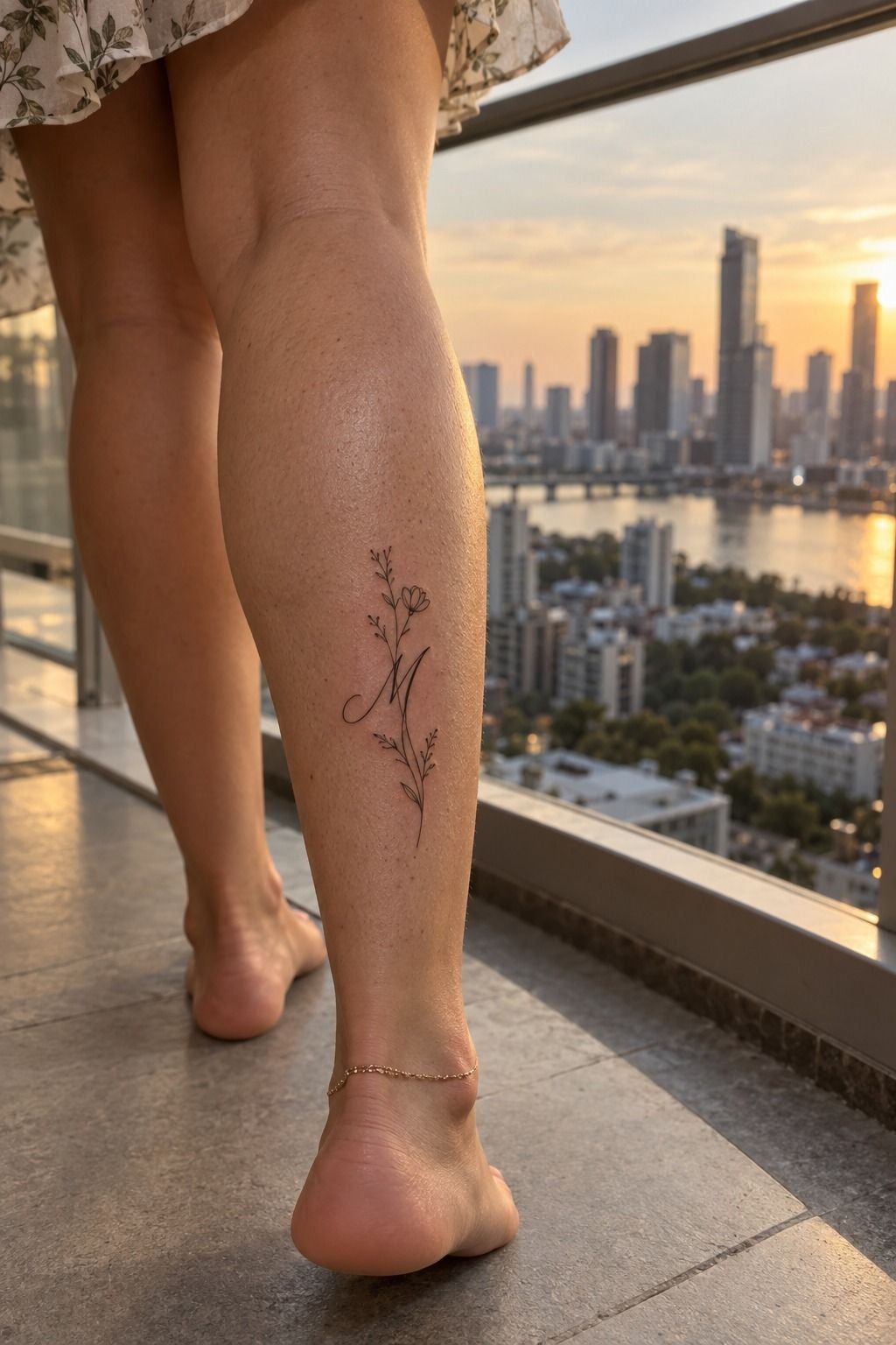
For the second idea, I used one initial instead of the whole name.
3A Kite String Became a Symbol: The Memory Mark
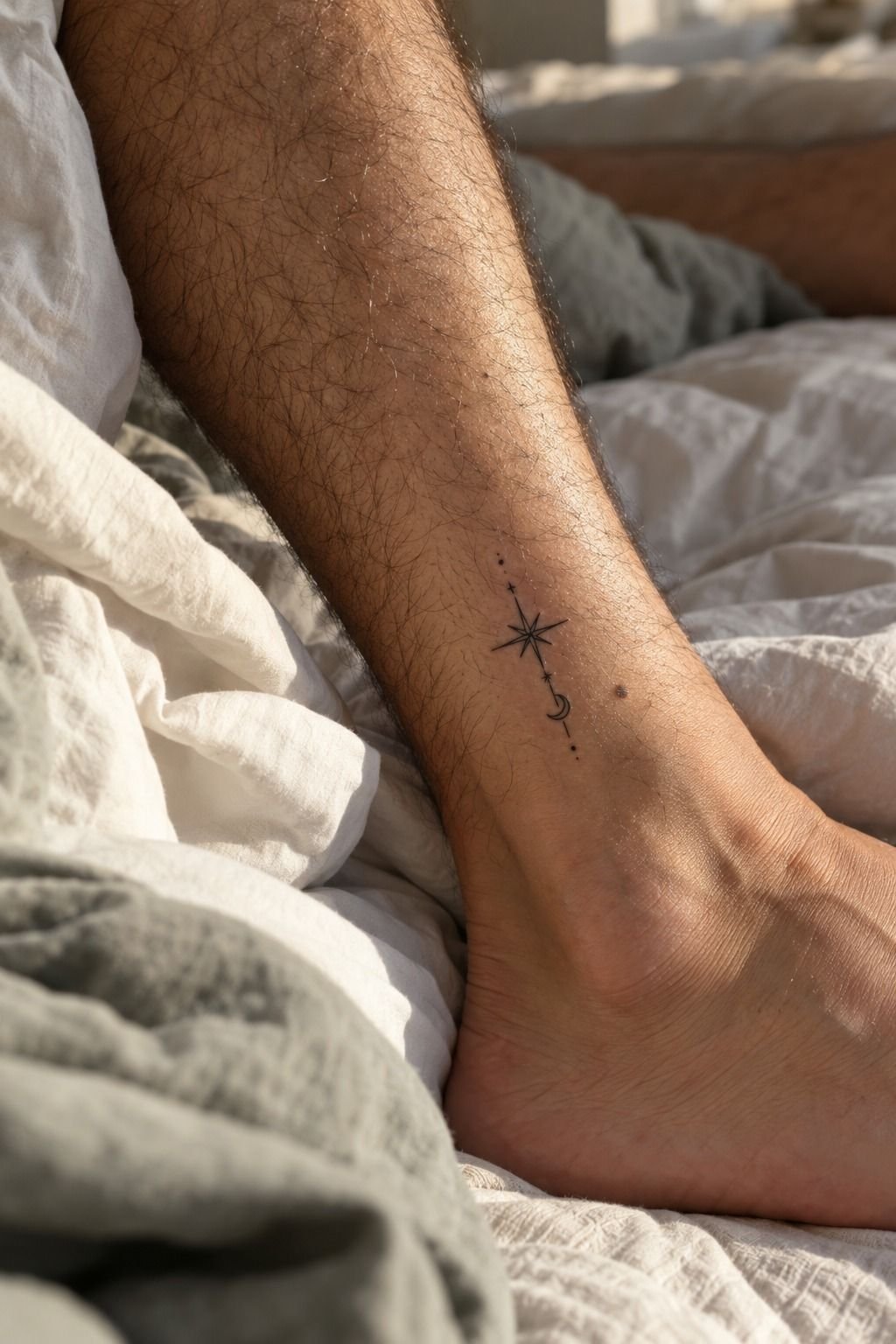
Names weren’t the only option. I chose a small symbolic shape from a family story: a curved line based on the kite-string curve my daughter held during a windy beach afternoon. The symbol looked almost abstract, but I knew exactly what it meant.
On the ankle, the design became discreet and slightly edgy. The artist used black single-line ink, keeping the curve narrow and the ends rounded so it wouldn’t look harsh against medium olive skin. You should ask to see the stencil from several angles before the needle starts.
The original sketch had three tiny knots. I removed two. That decision was difficult, but the extra marks made the image look busy at less than two inches.
The remaining three tiny knots became one clean interruption in the line.
Would anyone else recognize the kite? Probably not.
That was part of the appeal. If you’re choosing a mark that belongs to your story, the meaningful symbol tattoos guide helped me separate personal symbols from shapes that only looked fashionable.
The final curve was iconic in the quietest way. It felt raw and a little haunting because I was the only person who knew the full story.
What I Cut Before It Reached My Skin
The original tattoo sketch had too many references packed into one small design. There was a kite, a letter, three knots, and a tiny heart. Each detail mattered to me, but together they weakened the idea.
I kept the strongest symbol and removed the rest. That gave the line more breathing space and made the tattoo feel polished instead of complicated.
This is where a meaningful tattoo can become empowering. You aren’t deleting the memory. You’re deciding which part deserves permanent space.
I compared the reduced sketch with examples of best friend tattoos meaningful and noticed the same pattern: the clearest designs usually had one emotional center.
The cut wasn’t a compromise. It was the moment the tattoo became more personal.
4Which Line Belongs Here?
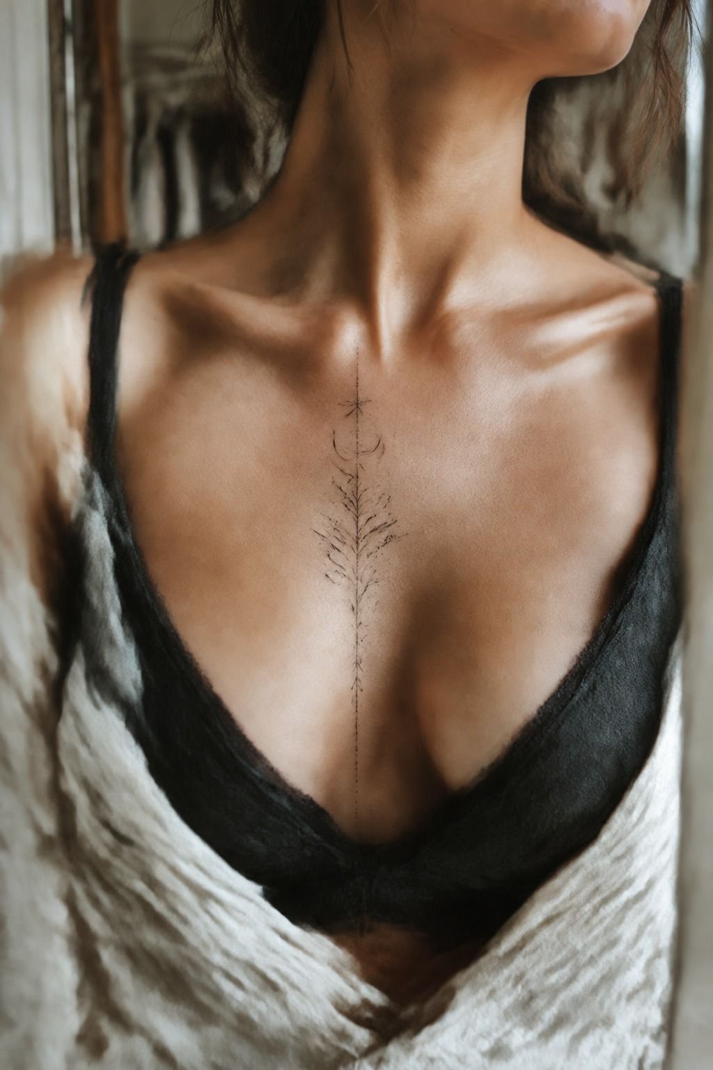
I printed the design at three sizes and taped each version near my sternum. The smallest looked dainty but disappeared from a short distance.
The largest felt dramatic and too loud for the intimate idea I had in mind. The middle version won!
The three-size stencil test mattered because paper lies. It showed how the curved lettering moved with my skin, and I could finally see whether the lines looked balanced against my golden tan undertone. You should walk, bend, and inspect the stencil in ordinary light.
I also tested black density. A fine line can look crisp on white paper, then appear less visible against deeper or warmer skin tones.
My artist suggested slightly stronger line weight, not heavy shading. That small adjustment made the result more striking without losing its delicate character.
But I didn’t rush the appointment. I sat with the stencil for twenty minutes, took photographs, and noticed one letter looked too close to the natural fold. Moving it half an inch gave the design a cleaner finish.
That pause saved me from a daring choice I would’ve regretted. A tattoo can be bold and still need editing.
5Heart Placement Over Visibility
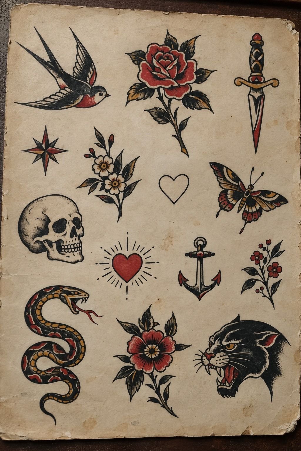
For one design, I considered the sternum because the meaning felt intimate.
A Private Placement Has a Different Job
A private tattoo placement doesn’t need to perform for strangers. It can be a personal reminder you notice while dressing, moving, or catching your reflection.
That changed how I judged the design. I wasn’t asking whether it would photograph well. I was asking whether it would still feel sacred when the first excitement faded.
The best placement also depends on how often you want to see the mark. If the tattoo is for you alone, the unique word tattoos examples can help you compare discreet positions without copying their lettering.
I chose visibility for the handwritten name and privacy for the kite curve. That contrast made both ideas feel more deliberate.
6Tiny Details Only I Understand
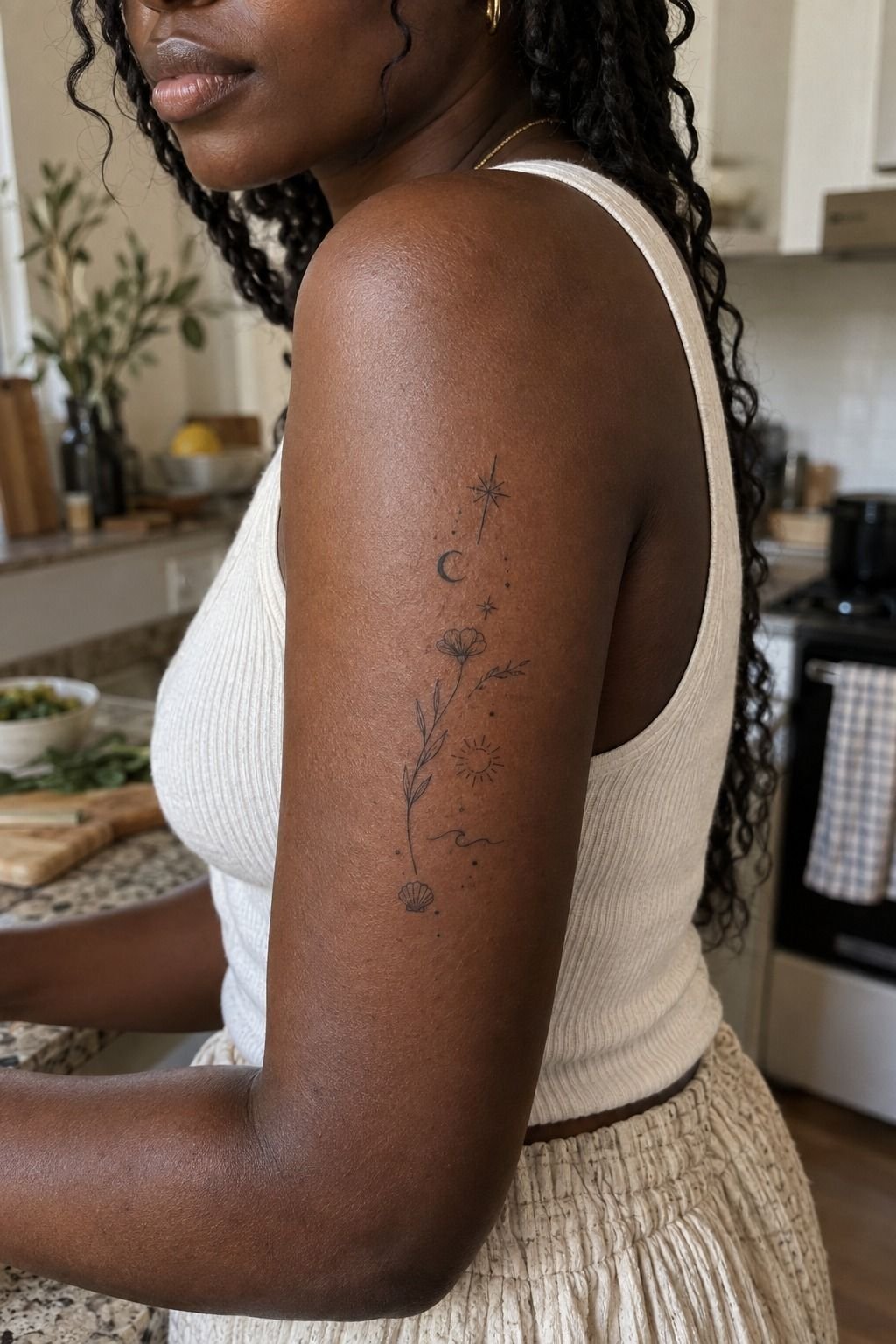
The upper-arm design began as a bold outline, but I added one tiny detail from our family life: three short marks representing the steps outside our old apartment. Nobody else needs to decode them. I know what they are, and that knowledge gives the tattoo its force.
The artist used black micro-line ink on deep ebony skin, adjusting the contrast so the marks stayed clear without becoming heavy. Fine linework can look refined when the spacing is generous, but tiny details need discipline.
I kept the symbol under two inches and placed the private marks inside the main outline. That protected them from looking like random dots. My first sketch had seven details, and I removed four because the design started reading like a diagram.
That edit made the tattoo more elegant. If you’re building a personal symbol, start with the one detail only you can explain, then stop before the story becomes crowded. The best friend tattoos meaningful examples showed me how much feeling a restrained mark can hold.
The final family symbol was understated but fierce. It didn’t need to be understood by anyone else.
7Script Over Ornament
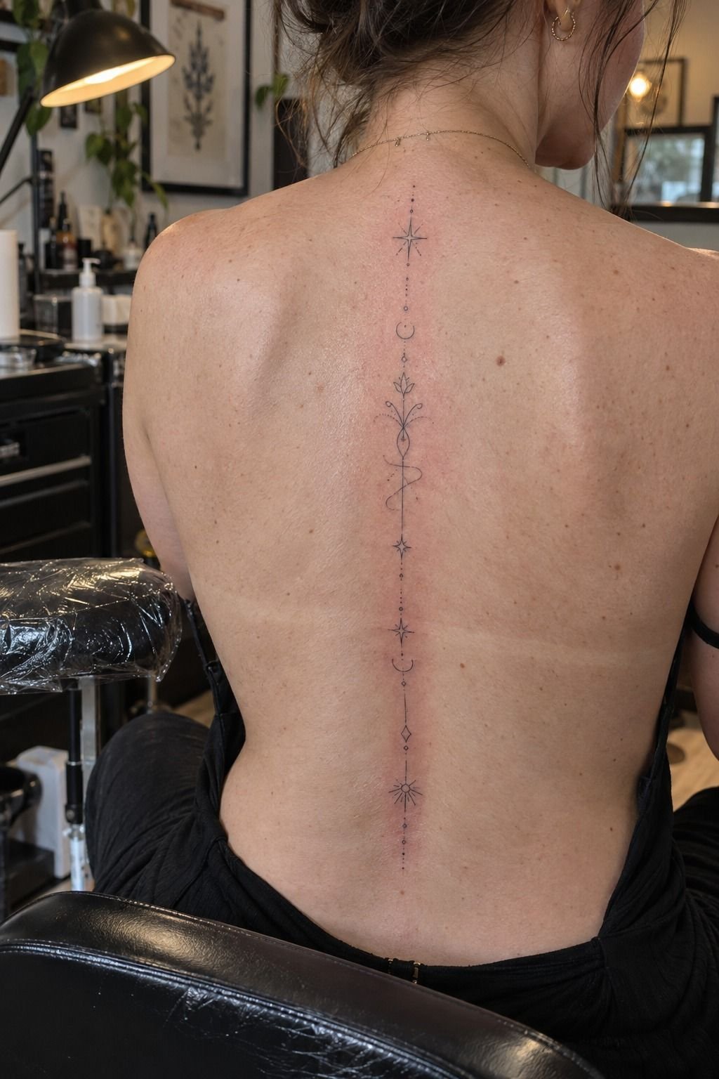
Her handwriting wasn’t the only script option. I tested a rounded typeface, a sharp serif, and a flowing handwritten version. The flowing one won because it felt playful and feminine without turning the tattoo into a generic phrase.
The artist transferred the final letterforms with carbon stencil film, then softened one hard corner by hand. That adjustment made the word look more natural on the spine, where a rigid line can feel mechanical. You should ask whether the script still reads at your intended size.
I rejected a popular ornate font because the loops were too close together. It looked gorgeous in a digital preview, but the narrow gaps could close over time. A crisp, understated script gave the meaning a better chance of staying legible.
I also checked the spelling three times. A meaningful tattoo doesn’t get a forgiving edit later. For more wording ideas, I returned to unique word tattoos and saved only designs with clear letter spacing.
The finished script was flowing and graceful, but the handwriting still felt more timeless than the ornate version. I wanted the letters to feel alive, not overloaded.
8Comfort Before Style
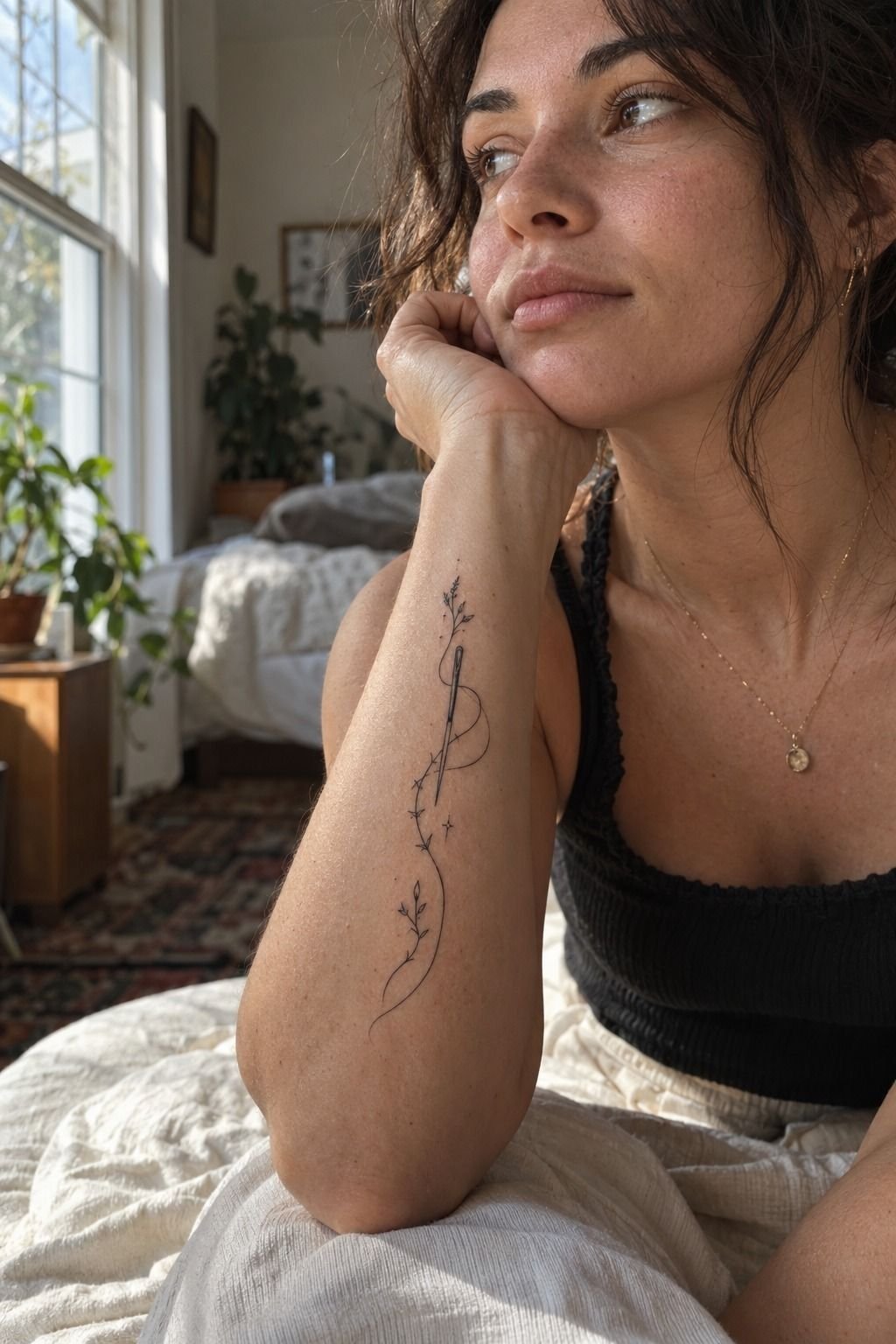
I expected the needle to feel like a hot scratch, and that was close. The needle sensation was sharper over bone and softer where the skin had more padding.
I told the artist when I needed a pause. You don’t win anything by pretending you’re comfortable when you’re not. A short conversation kept the session controlled, and the appointment ended before the discomfort became overwhelming.
The tattoo was small enough for a short tattoo session, which helped keep the cost predictable. I was ready for that!
I also ate beforehand, brought water, and wore clothing that didn’t press against the placement. These choices weren’t dramatic, but they made the experience more manageable.
Comfort didn’t decide the design, but it did influence the placement. A meaningful tattoo should feel daring enough to matter without making the process miserable.
9The Aging Ink Test
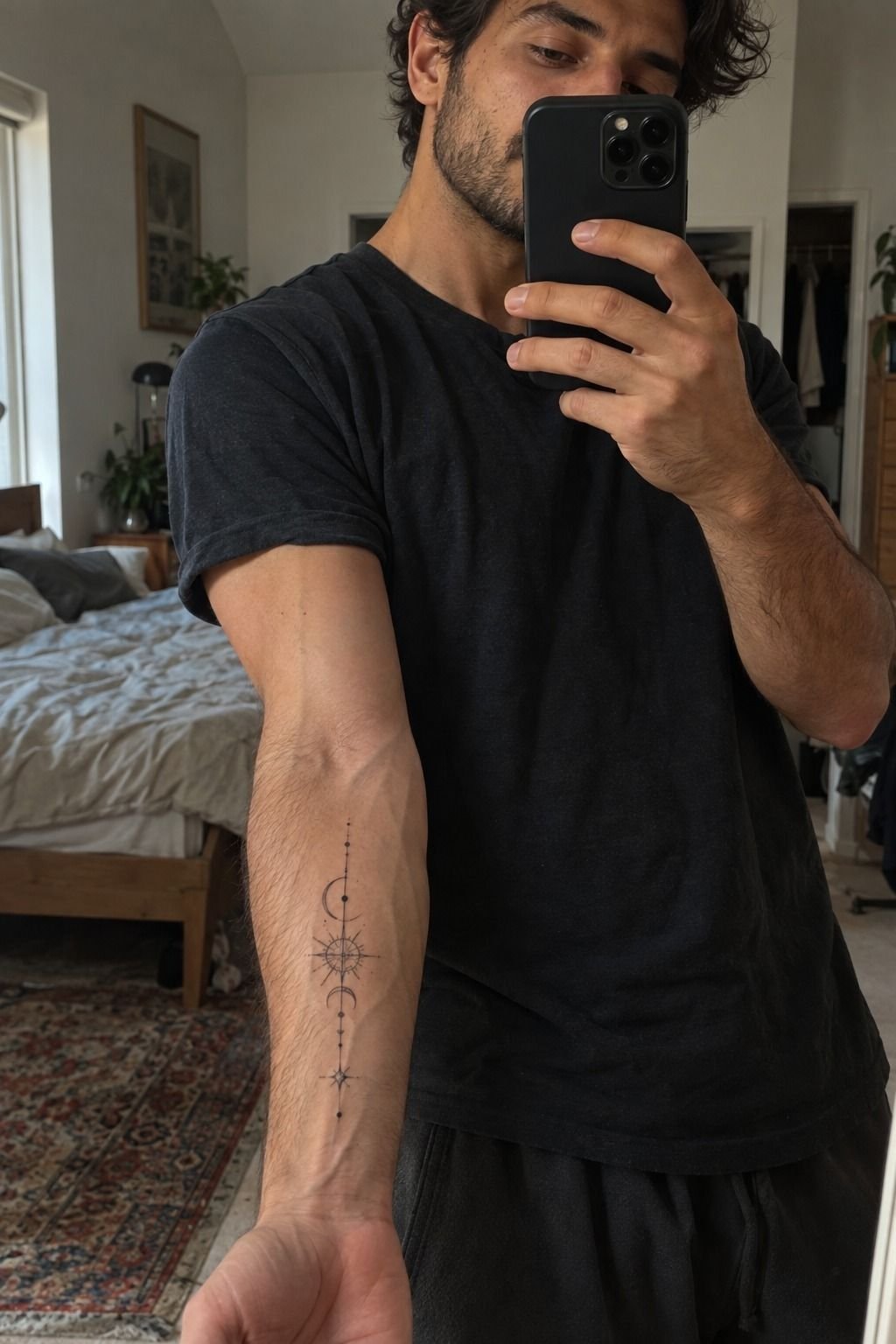
The first day looked darker than the final result.
10Healing Over Hurry
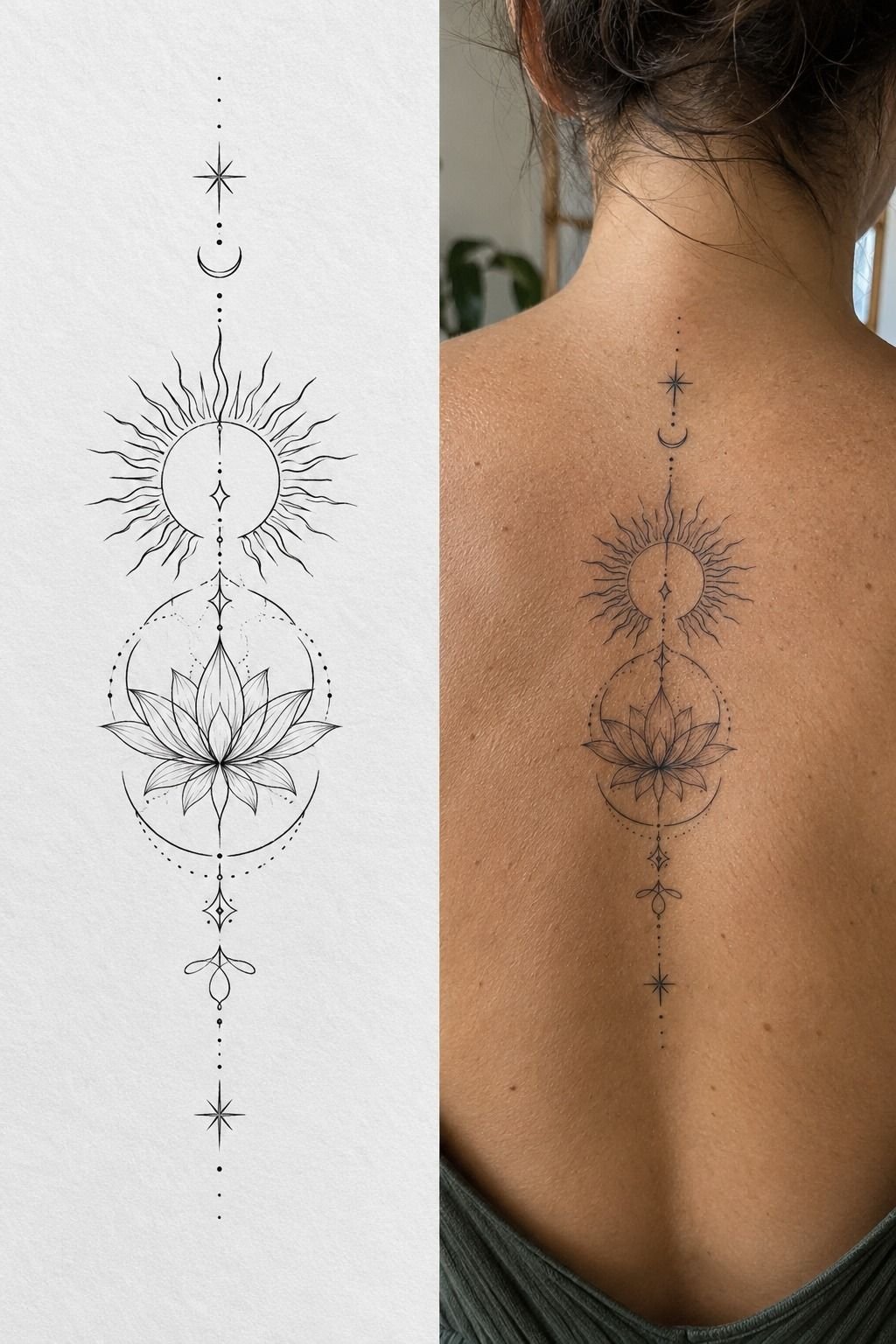
The stencil looked sharp and stark, while the healed version looked softer and more integrated. That healing timeline changed my expectations before I booked the appointment.
The surface usually heals in about 2 to 3 weeks, while complete healing can take roughly 2 to 3 months. During that time, I used fragrance-free cleanser, avoided soaking the tattoo, and kept direct sun away from it.
I skipped pools and long baths because softened skin and fresh ink are a bad combination. You should also avoid tight clothing that catches on flakes or rubs the placement. The goal is simple: leave the skin alone long enough to repair itself.
After healing, I added sunscreen whenever the tattoo was exposed. Direct sunlight can fade black linework gradually, and protecting it costs less than correcting it later.
I didn’t judge the final design too early. The meaning stayed intact while the surface changed. If you’re planning a first session, the wrist tattoos men guide has useful placement comparisons for visibility, movement, and healing.
Healing rewarded patience. The result became more polished and more integrated with my skin.
11I Carried Her Story In Permanent Ink
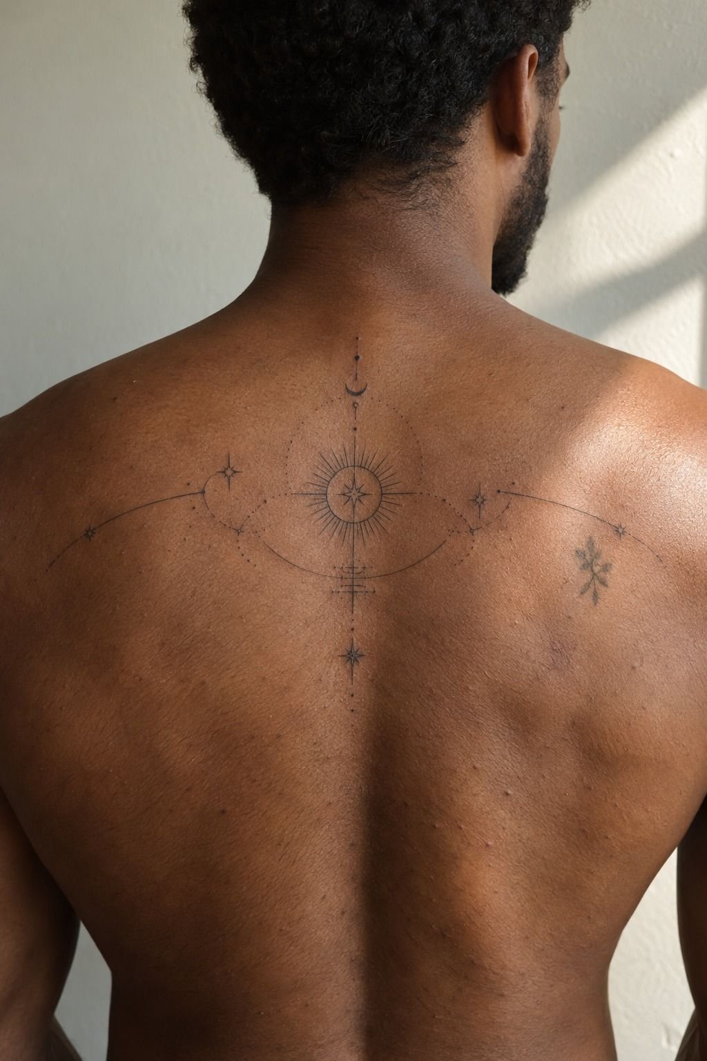
The final upper-back idea became the most personal one. The upper-back tattoo was private enough to feel intimate, but it still gave the design space to remain readable.
I kept the shape connected to my daughter’s story rather than copying a trendy reference. The mark was small, symbolic, and personal. It didn’t announce itself, and that made it feel more powerful.
A meaningful tattoo doesn’t have to explain every part of my daughter’s story to be successful. I know why the curve bends, why one mark is missing, and why the placement matters.
When I compared the healed tattoo with the original idea, I noticed how much had changed. The final result was less ornate, more classic, and easier to live with.
The healed tattoo looked like it belonged to me rather than sitting on top of my skin. That was the point all along.
How Much It Cost: My $200 Ceiling
I set a personal ceiling of $200 before booking, even though the studio’s minimum and hourly rate could have pushed the total higher. My small meaningful tattoo stayed within that limit because the design used black linework, required one short appointment, and didn’t need a large shaded area.
Typical US tattoo rates vary by artist, region, placement, and session length. These are useful planning ranges, not a quote from every studio.
My cheapest idea was the initial, but it wasn’t automatically the best idea. I paid for a consultation, a custom stencil, sterile supplies, and the artist’s time. You shouldn’t choose solely by price because clean linework and healed results matter more than saving a few dollars.
The best value was the symbol with fewer lines. It looked more deliberate, healed more cleanly, and didn’t require a longer session.
If you’re working with $100, ask about the studio minimum first. If you’ve got $300, you may have room for a custom design and a more experienced specialist.
I also asked what was included before I booked. The consultation, stencil adjustments, and custom design were part of the value, even though they weren’t visible in the final price.
A cheaper tattoo can still be a stylish, empowering choice when the design is intentional. The savings came from reducing clutter, not from accepting careless work.
What I Learned About Meaningful Ink
I used to think a meaningful tattoo had to explain itself instantly. Now I think the strongest designs can stay quiet. My daughter’s handwriting, the kite curve, and the tiny private marks don’t announce their stories.
They hold them.
I also learned that cheap doesn’t have to mean careless. A smaller design can be a thoughtful choice when you reduce clutter, choose a sensible placement, and work with an artist who understands line weight. The losing option, for me, was a large design packed with symbols I couldn’t see clearly.
The most important decision wasn’t choosing a trendy style. It was deciding what memory deserved permanent space.
If you’re choosing between an ornate image and a minimal symbol, ask which one you’d still want after the excitement fades. That question gave me a calmer, more personal answer.
The handwritten name remained my favorite meaningful tattoo idea because it carried a real voice. The symbol was more discreet, but the name felt empowering every time I saw it.
I also liked that the final piece was feminine without being overly sweet. It was crisp, personal, and quietly fierce.
For another comparison, I saved a few meaningful symbol tattoos and looked at them only after I had finished my own sketch. That kept inspiration from becoming imitation.
Which Detail Earns Permanent Space?
My own mistake was approving a draft too quickly because I was excited. I went back, removed four tiny marks, and made the final piece more elegant.
You can do the same. A pause isn’t indecision when the design will live on your skin.
The first tattoo draft had more information, but the revision had more feeling. That distinction matters. Meaning isn’t measured by the number of symbols you can fit into one design.
If you’re choosing between several ideas, keep the one that still feels personal after you remove its most obvious ornament. That is usually where the real memory is hiding.
I used the same test with small meaningful tattoos: remove the trend, remove the extra flourish, and see whether the emotional center survives.
The answer doesn’t need to be dramatic. It only needs to remain yours.
What People Always Want to Know
How much does a Very Meaningful Tattoos usually cost?
A small meaningful tattoo typically costs about $100 to $300 in the US, though boutique minimums may run $50 to $100 and hourly rates often range from $100 to $250. Your artist, region, placement, detail, and session length will change the final quote. These small meaningful tattoos are useful for comparing how size affects the idea.
Are Very Meaningful Tattoos a good idea for a first tattoo?
Yes, especially when you choose clear linework and a tolerable placement. Forearms, thighs, and shoulders are often easier starting points than ribs, feet, hands, or the sternum. A subject that genuinely matters to you also makes the decision feel less temporary.
How do I choose a tattoo artist for Very Meaningful Tattoos?
Study healed photographs, not only fresh tattoos, and look for consistent line quality in the style you want. Check the artist’s portfolio, ask about hygiene, and confirm that the studio uses sealed disposable supplies.
A consultation should feel specific, not rushed. You can also compare lettering through meaningful word tattoos before contacting an artist.
How much do Very Meaningful Tattoos hurt?
Pain depends on placement, size, and your own tolerance. Forearms, thighs, and shoulders are often more manageable, while ribs, feet, hands, and sternum can feel sharper because they sit near bone or have less padding. The meaningful symbol tattoos examples helped me think about placement before choosing a final shape.
How long does a Very Meaningful Tattoos take to heal?
The surface usually heals in about 2 to 3 weeks, but complete healing can take 2 to 3 months. Wash gently, moisturize as directed, avoid pools and soaking, and protect the healed tattoo from direct sun with sunscreen. The wrist tattoos men guide is helpful when comparing exposed placements.
What’s the best placement for Very Meaningful Tattoos?
The forearm is practical for visibility and generally manageable discomfort, while the upper arm offers more privacy and protection from daily sun. Tattoo placement should balance meaning, pain, visibility, and aging, especially if your design uses very fine lines. The unique word tattoos examples show how the same lettering can feel different in each position.
Where I’d Start First
If I had to pick one, I’d start with my daughter’s handwritten name. The uneven letters are impossible to replace, and the 1.5-inch design stayed personal without inflating the cost.
I’d also save a few examples of small meaningful tattoos and compare them after a week. The design that still feels personal after the initial excitement is usually the one worth keeping.
Pin the idea for later, then choose the mark that still matters when nobody else understands it. That is a strong test!