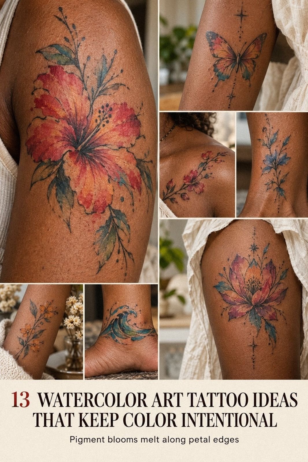
A watercolor art tattoo doesn’t try to look like a tattoo. It tries to look like a page torn from a sketchbook. Soft bleeds, ragged edges, color that runs past the line on purpose. I’ve watched this style go from rare to everywhere in about ten years, and the good ones still stop me cold. The weak ones turn into a bruise by year three. So this guide covers both sides: the striking pieces worth saving, and the choices that keep them readable for decades.
Start with the painting, then find the tattoo
Most people do this backwards. They pick a subject first, then ask for “watercolor style” on top of it. That’s how you end up with a stiff flower wearing a color splash like a costume.
Work the other way. Find a painting you already love.
A loose gouache bird, a wet ink wash, a page of student studies. Bring the painting to your consult, not a Pinterest screenshot of somebody else’s arm. Your artist reads brush behavior from a painting.
They read nothing useful from a healed photo shot in yellow light.
I ask clients one question at this stage. What do you want the color to do? Bloom outward, drip down, sit in a soft halo, or explode sideways.
Each answer changes the whole build. A bloom needs open skin around it.
A drip needs a vertical placement like the forearm.
Pick the motion first. The subject gets easier after that, and the piece feels personal instead of borrowed.
What actually makes a tattoo look like watercolor?
Four things, and none of them is “bright colors.”
First, the edges have to be soft on at least one side of every shape. Real watercolor pools at one border and fades at the other. A tattoo with four crisp edges reads as new school, no matter how pretty the palette is.
Second, the color sits in transparent layers. You should see one wash through another where they cross. That overlap creates a third color, and it’s the most convincing trick in the style.
Third, there’s negative space inside the color. Painters leave white paper for highlights. Your artist leaves bare skin.
Skip that step and the piece turns into a flat sticker.
Fourth, the composition has an imperfect shape. No tidy circle, no neat rectangle. The outline of the whole design should feel a little loose, a little raw.
Get those four right and the style works with almost any subject. Get them wrong and you’ve got a regular color tattoo with blurry parts. That difference is the entire game, and it’s why two artists quote the same design so differently.
Anchor the splash with fine linework
Pure wash with zero structure is the riskiest version of this style. It’s also the one that ages worst.
The fix is an anchor. A thin black or deep sepia line drawing sits inside the color and holds the shape as the wash softens. Think of a fine-line sketch dropped onto a wet page.
Ask for the line to be broken, not continuous. A closed outline kills the painted feel instantly. Your artist should leave gaps where the color carries the eye across.
The anchor can also be a small block of solid black. One filled wing, one dark stem, one shadow under a jaw. That weight makes every surrounding color look more vibrant than it really is.
Turner versus Klimt: pick your color mood
Two painters, two completely different results on skin.
Turner gives you atmosphere. Washed horizons, storm light, colors that melt into each other with no hard border anywhere.
A Turner-minded piece feels ethereal and a little haunting. It suits landscapes and mountain scenes.
Klimt gives you ornament. Gold, pattern, tight decorative shapes floating in loose color. A Klimt-minded piece reads as elegant and deliberate rather than accidental. It suits portraits, florals, and anything you want to feel a bit iconic.
Name your reference in the consult. “Turner” or “Klimt” tells an artist more in one word than three paragraphs of adjectives.
Why do watercolor tattoos get a bad reputation?
Because of survivorship bias, mostly. You see gorgeous fresh photos and healed disasters, and nothing in between.
Here’s what’s really happening. Skin is not paper.
Paper holds pigment on the surface. Skin holds it in a living layer that pushes, spreads, and lightens over time.
A wash placed too thin gets eaten by that process.
The pieces that fail are the ones built entirely from pale, low-saturation color with no dark values. Soft lilac, pale peach, baby blue. Beautiful for a year. Ghostly by year four.
The pieces that survive have a full value range. Something near-black, something mid-tone, something light.
Squint at the design. If it turns into one gray blob, it won’t hold.
Pigment density matters too. A skilled artist packs the saturated zones properly instead of feathering everything. Feathering looks soft on day one, then reads as patchy later.
So the style isn’t cursed. It’s just unforgiving of shortcuts. Ask any artist for healed photos at three years, minimum.
If they only show fresh work, that tells you plenty. Good ones are proud of the healed shots, and they’ll send them without being asked.
Build a palette of three colors
Three. Not seven. One dominant, one supporting, one accent that appears twice and nowhere else.
Limited palettes are what separate a painting from a paint spill. Watch how fast your design gets more expressive when you delete half the colors!
Soft wash against a hard black silhouette
This pairing is my favorite in the whole style, and it’s badly underused.
Take a solid black subject. A crow, a tree, a running figure.
Behind it, a wide wash of two colors bleeding into each other. No outline on the wash at all.
The black stays sharp forever while the color does the emotional work. You get contrast that photographs well and ages honestly.
It also plays nicely with existing black and grey work. Color behind, black in front, no clash.
Hummingbirds, koi, and jellyfish
Some subjects were built for this style. Anything with translucent parts, motion, or trailing edges.
Hummingbird wings blur in real life, so a wash reads as accurate. Koi trail fins through water. Jellyfish are basically living watercolor.
Pick a subject where the bleed explains something true about the animal.
Where does a watercolor piece sit best on the body?
Flat, roomy, low-friction skin. That’s the short answer.
The outer forearm is the strongest spot. It’s flat, easy to heal, and you see it every day. The upper back and the shoulder blade come next, with plenty of space for a wash to spread.
Avoid hands, fingers, feet, and elbows for soft color. Those areas rub constantly and drop pigment fast. A pale wash there can look thin within a year.
The ribcage works visually but hurts more and heals slower. Worth it for a graceful vertical design, if you’re patient. Check a pain chart before you commit to a long session there.
One placement note that people miss. Sun exposure is the fastest killer of color.
A piece on your outer forearm needs sunscreen for life. A piece on your shoulder or thigh spends most of the year covered.
So there’s a trade. Visible placements give you daily joy and faster fading. Hidden placements stay vibrant and you barely see them.
Pick your side on purpose.
Monet florals for a shoulder that flows
Monet’s water lilies are the template here. Blurred petals, no outlines, colors that argue slightly with each other.
A Monet-style floral wraps a shoulder beautifully because the shape can follow the muscle. Let the blooms cluster at the deltoid and thin out toward the bicep. That gradient makes the arm look longer.
Keep the flowers loose. Recognizable from across a room, abstract up close. If someone can count the petals, it’s too tight for this style.
Two or three flower types maximum. A romantic peony, a couple of small buds, one stem of something wild. That’s a full design, and it grows well if you extend it later!
Dainty single stem or a full sleeve?
Both work. They just fail differently.
A dainty piece needs restraint and perfect placement. A small first tattoo in this style should stay under three inches with one bold value inside it.
A full sleeve needs a map before the first needle touches you. Build it in panels that connect through color, and read a sleeve plan first.
Layer your color the way a painter glazes
This is a technique section, and it’s the one to quote back to your artist.
In painting, a glaze is a thin transparent layer over a dry one. You build depth through many passes. Each layer changes what’s underneath without hiding it.
The tattoo version works the same way. Your artist lays a light wash, lets it settle, then passes a second color over part of it. Where they overlap, you get a color neither tube contains. That’s what gives a piece real depth instead of flat patches.
Compare that to the shortcut. One pass, heavy hand, colors placed side by side and blended wet on the skin.
It looks fine fresh. It goes muddy fast, because the pigments mix in the skin instead of stacking.
Ask a direct question at your consult. “Do you build the color in passes, or blend it in one?” The answer tells you everything about how the piece will heal.
Layering costs more time and more sessions. A large glazed piece might take three sittings where a flat one takes one. Pay for the extra chair time. It’s the single best money you’ll spend on a painted design, and the difference shows up around year five, when your friend’s one-pass piece has gone gray and yours still reads as a painting.
How does your skin tone change the color?
It changes everything, and a good artist will bring it up before you do.
Your skin is a filter sitting over the ink. Deeper tones warm and mute cool colors, so pale blue and soft lilac can disappear. Fair tones show pastels easily but can make warm reds look raw while healing.
On deeper skin, lean into saturated jewel tones and strong contrast. Deep teal, burnt orange, magenta, gold. Those hold beautifully and look powerful rather than faded.
Ask to see healed work on skin close to yours. Not similar, close. That portfolio check matters more here than in any other style.
Frida Kahlo energy: portraits with a painted wash
Portrait work in this style is hard, and the results can be gorgeous.
The rule is simple. Keep the face in controlled black and grey, then let the color go wild around it. Hair, flowers, background, clothing. Never the features.
Skin tones built from loose washes drift as they heal, and a drifting face looks wrong in a way a drifting flower never does.
This approach gives you a portrait with real emotion and zero risk of a muddy cheekbone. It’s also how you get that symbolic, expressive feel without a stiff photo copy.
Splatter, drips, and the honest mess
Splatter is seasoning. A little makes the piece feel alive. A lot makes it look like an accident.
Cap it at five or six marks, grouped on one side. Random scatter in every direction reads as filler.
Read a portfolio before you book
Here’s my checklist, and it takes ten minutes.
Look for healed photos first. Fresh work is easy.
Scroll until you find a piece tagged one year or older, and judge the artist on that one. If there are none, ask. A confident artist sends them within the hour.
Check whether their pieces have dark values. Flip through ten designs. If everything is pale and pretty, you’re looking at someone who hasn’t learned what survives yet.
Watch for repetition. An artist who paints will show you many subjects with one clear hand. An artist copying a trend will show you the same three compositions in different colors.
Look at the negative space. Do they leave skin open inside the color, or fill every gap? Open space is a sign of confidence.
Finally, read how they talk about aging. The good ones are blunt about it.
They’ll tell you which color will soften, which will hold, and when you’ll want a touch-up. That honesty is worth more than a slicker Instagram feed, and it’s the whole point of the portfolio checklist I use before every session.
Protect the color through the first month
Healing decides how your piece looks for the next twenty years. Color needs a bit more care than black.
Keep it out of direct sun for a full month, no exceptions. Fresh pigment and UV light are a terrible combination. After that, sunscreen becomes a lifelong habit.
Don’t soak it. No pools, no baths, no ocean for two to three weeks. Water pulls pigment out of a fresh wash faster than it does from solid black.
Moisturize lightly and often. A dry scab lifts ink with it when it flakes. A supple one falls away clean.
Expect the piece to look dull around day eight. That’s the healing layer on top, and it passes.
Judge nothing until week four, when the skin clears and the color comes back up. Full details live in the color aftercare guide.
Book your touch-up at the two-month mark. Small gaps are normal in washed work, and they’re quick to fix.
Cover an old piece with color
Watercolor can hide lighter work surprisingly well, though it can’t erase a solid black tribal band.
Your artist will build the new dark values right on top of the old shapes. The wash then floats around them and breaks up the old outline.
If the existing piece is heavy, look at cover-up options with more structure first.
Frequently asked questions
Do watercolor tattoos fade faster than other styles? Not automatically. Poorly built ones do. A design with real dark values, packed saturation, and a line anchor ages about like any color tattoo.
A pale, unanchored wash fades much faster. The build matters more than the style label.
Can I get a watercolor tattoo without any black? You can, and I’d think hard about it. Black gives the eye somewhere to land.
If you want to skip it, ask for a very dark version of your main color instead. Deep indigo or oxblood does the same job with a softer feel.
How much does one cost? Usually more than a black and grey piece of the same size. Color takes longer, uses more passes, and often needs a second session.
Expect to pay for chair time, not for the design. Small abstract pieces stay affordable.
Will it work on my darker skin tone? Yes, with the right palette. Saturated jewel tones, strong contrast, and a confident dark anchor.
Skip pastels. Ask your artist for healed photos on skin close to yours before you book.
What subjects suit the style best? Anything with motion or translucency. Birds, fish, flowers, butterflies, smoke, waves. Rigid subjects like lettering or geometric shapes fight the softness and usually lose.
How long before I can add to it? Six to eight weeks once it’s fully healed. Painted designs extend well, since a new wash can bleed into the old one. Plan the direction of growth now, even if you never use it.
Is it a bad first tattoo? Not at all, as long as you go small and pick your artist carefully. A single bird with one wash behind it is a fine place to start.
Your next step
Watercolor work rewards the people who plan it. The whole style lives or dies on four choices: a painting you actually love, a limited palette, a real dark value, and an artist with healed proof.
Get those four right and you’ll wear something expressive and timeless that still looks hand-painted a decade from now. Get them wrong and you’ll be in a cover-up chair by year five.
So do this today. Save three paintings you’d hang on a wall, pick your three colors from them, then message one artist and ask for healed photos at two years or older.
That’s it. One message is the whole barrier between you and a piece you’ll keep forever, and I promise the answer comes back faster than you think!