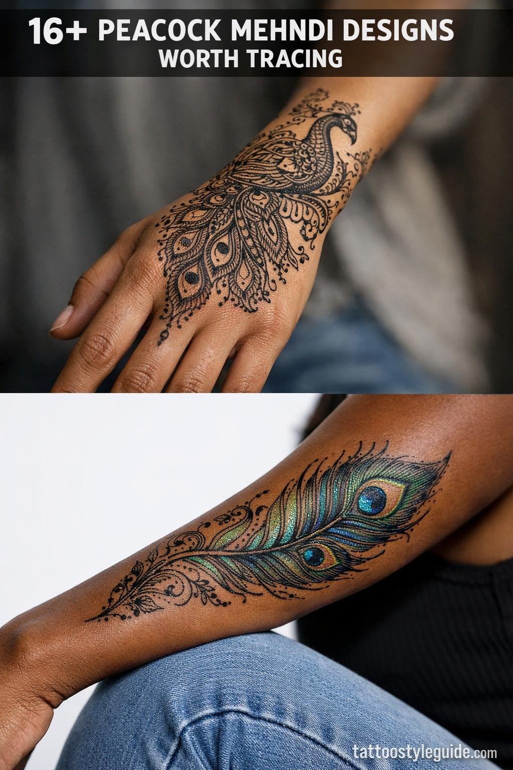
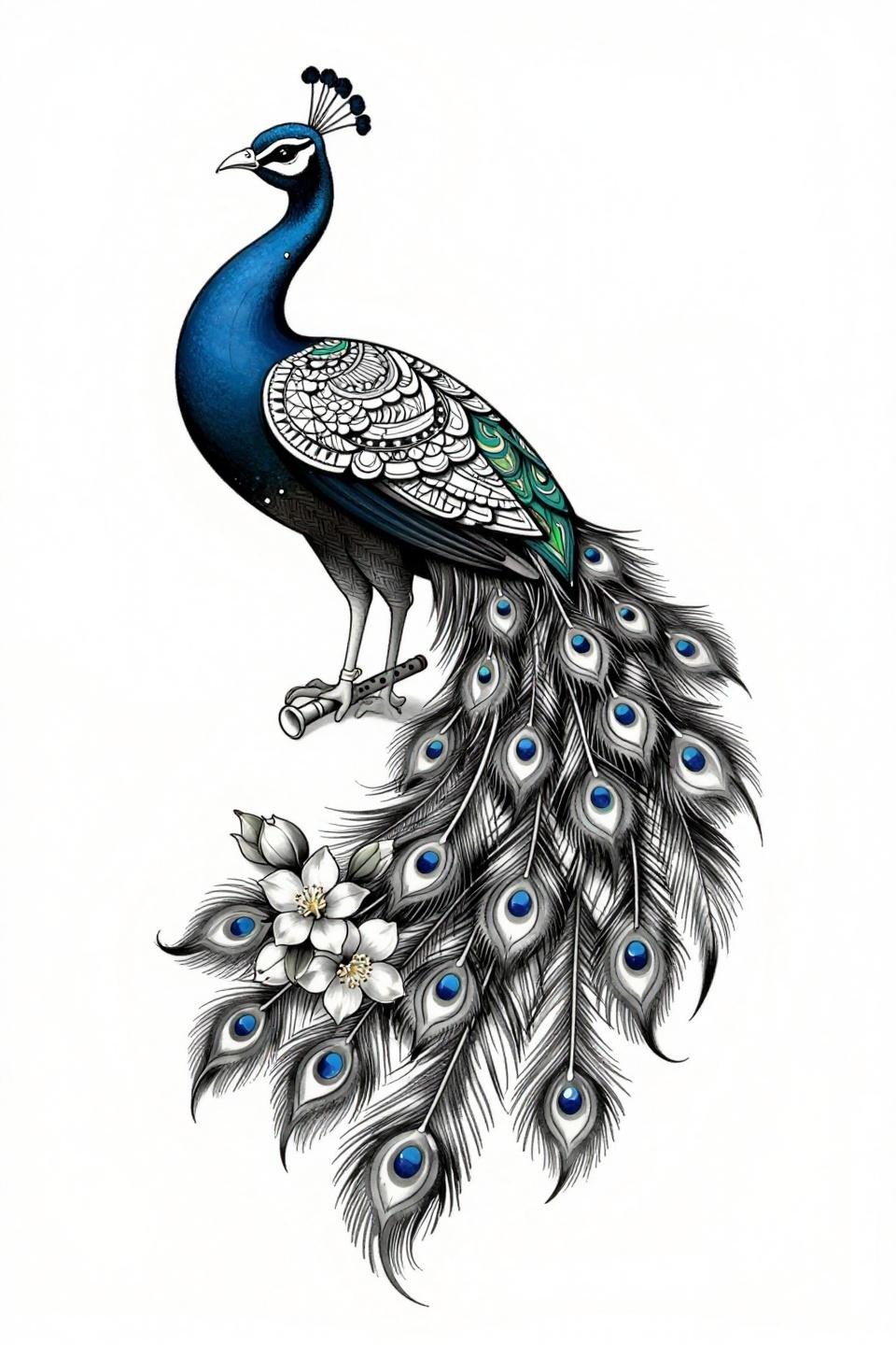
Peacock mehndi designs fail when artists treat the feather eye as decoration instead of structure. The eye motif is the compositional anchor. Every spiral, teardrop, and lattice fill should radiate from it or terminate into it.
The feather is also the most technically demanding element in the style. Consistent dot size across a gradient, clean paisley curves with no wobble at direction changes, these are the signals that separate strong work from rushed work.
When the Front Hand Carries the Whole Design
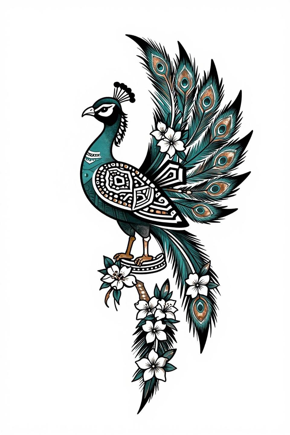
Tribal geometric structure applied to a peacock profile, with feathers arranged as interlocking mehndi diamonds and hexagons in deep teal and copper. The bilateral mirrored symmetry locks the composition so it reads cleanly on the front hand without needing a frame or border.
On olive and darker skin tones, the teal-to-black contrast holds. On lighter skin, the copper accent risks reading muddy if the artist doesn’t push saturation on the black outlines first.
Dotwork Gradient Where the Feather Edges Go Quiet
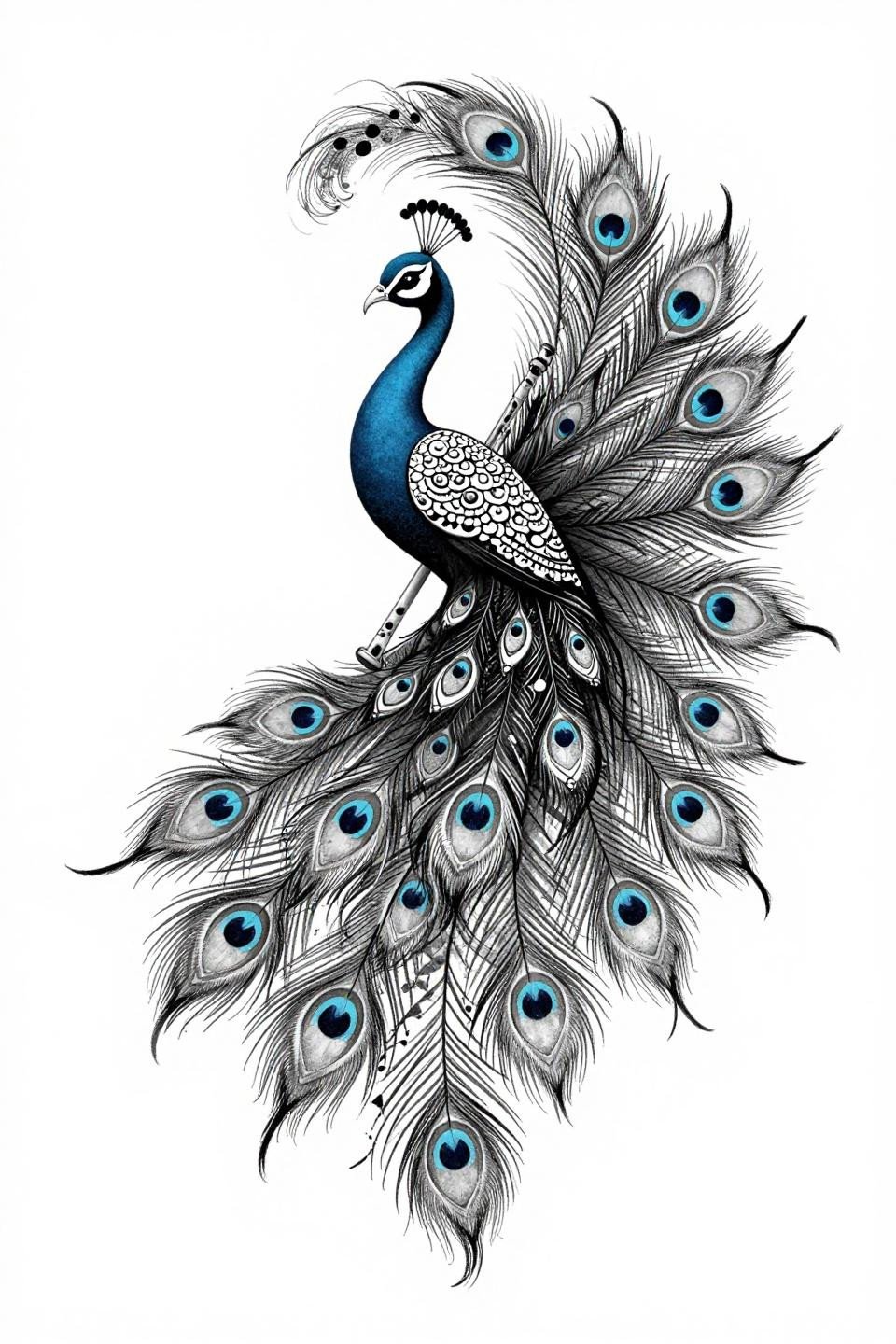
Blackwork dotwork with peacock eye motifs built entirely from stipple clusters, dense at the feather core and dissolving to open negative space at the tips. The stipple density gradient here runs from roughly 90% packed at center to near-open at the outer edge.
This technique requires an artist who controls machine speed consistently across a full session. Check their healed dotwork portfolio, not fresh shots, because uneven dot size shows immediately once the skin settles.
The Full Spread That Earns Its Scale
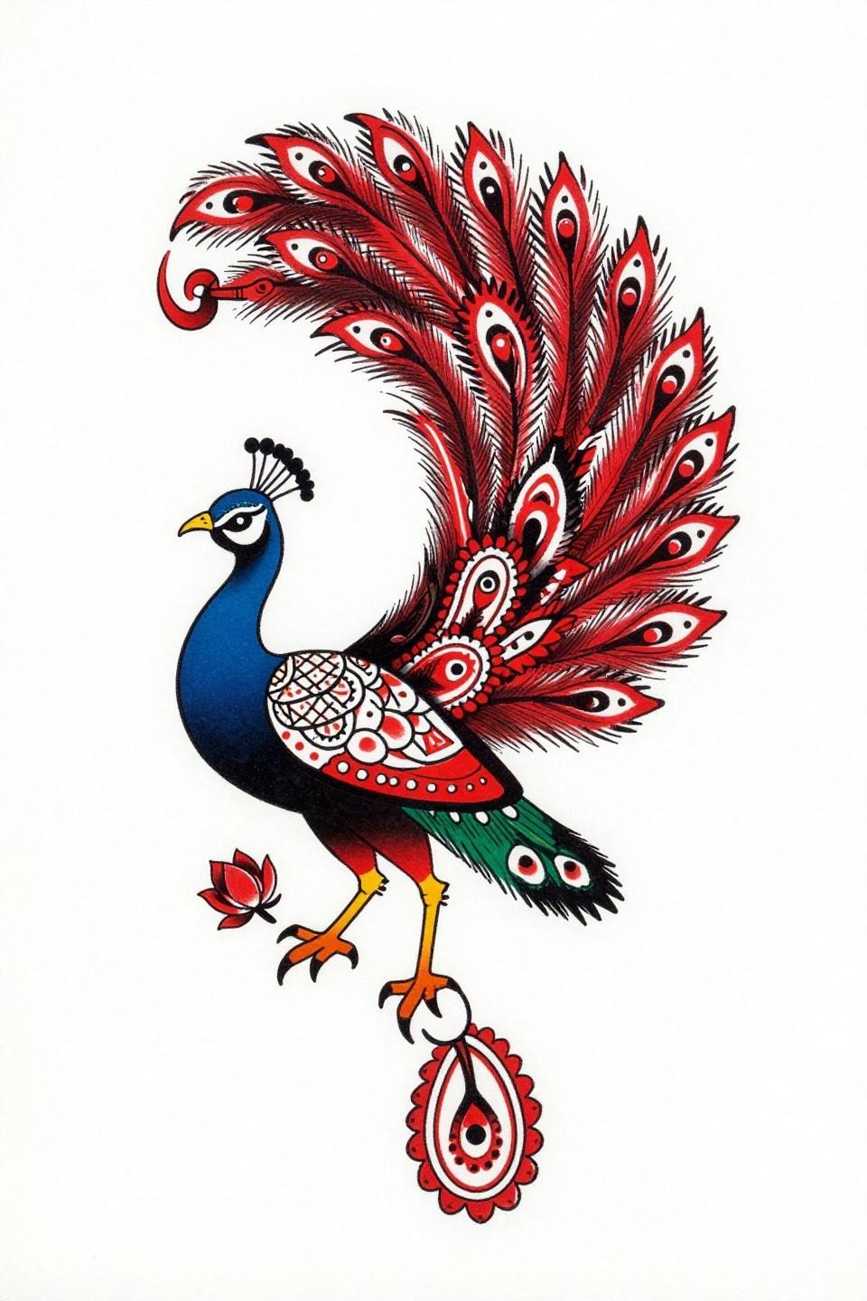
Traditional American structure applied to peacock mehndi, with tail feathers rendered as bold paisley motifs and geometric lattice fills in flat crimson red on solid black. Bold 2-3pt outlines at this weight hold clean for 10-plus years on protected placements.
The asymmetric flowing pose works better than a centered spread for this style because it allows the tail to extend across a natural limb curve without forcing artificial symmetry. Ideal for upper arm or thigh.
The Surrealist Peacock Built From Paisley Logic
Surrealist construction with the peacock body as a negative space silhouette and all tail feathers built from interlocking paisley spirals and dot-mandala clusters. The crosshatch etching shading adds depth without relying on grey wash, which keeps the aging profile predictable.
Navy blue and solid black as the only ink colors is a considered choice. Two-color blackwork ages more cleanly than multi-color mixes because there’s no color separation risk at the fade line.
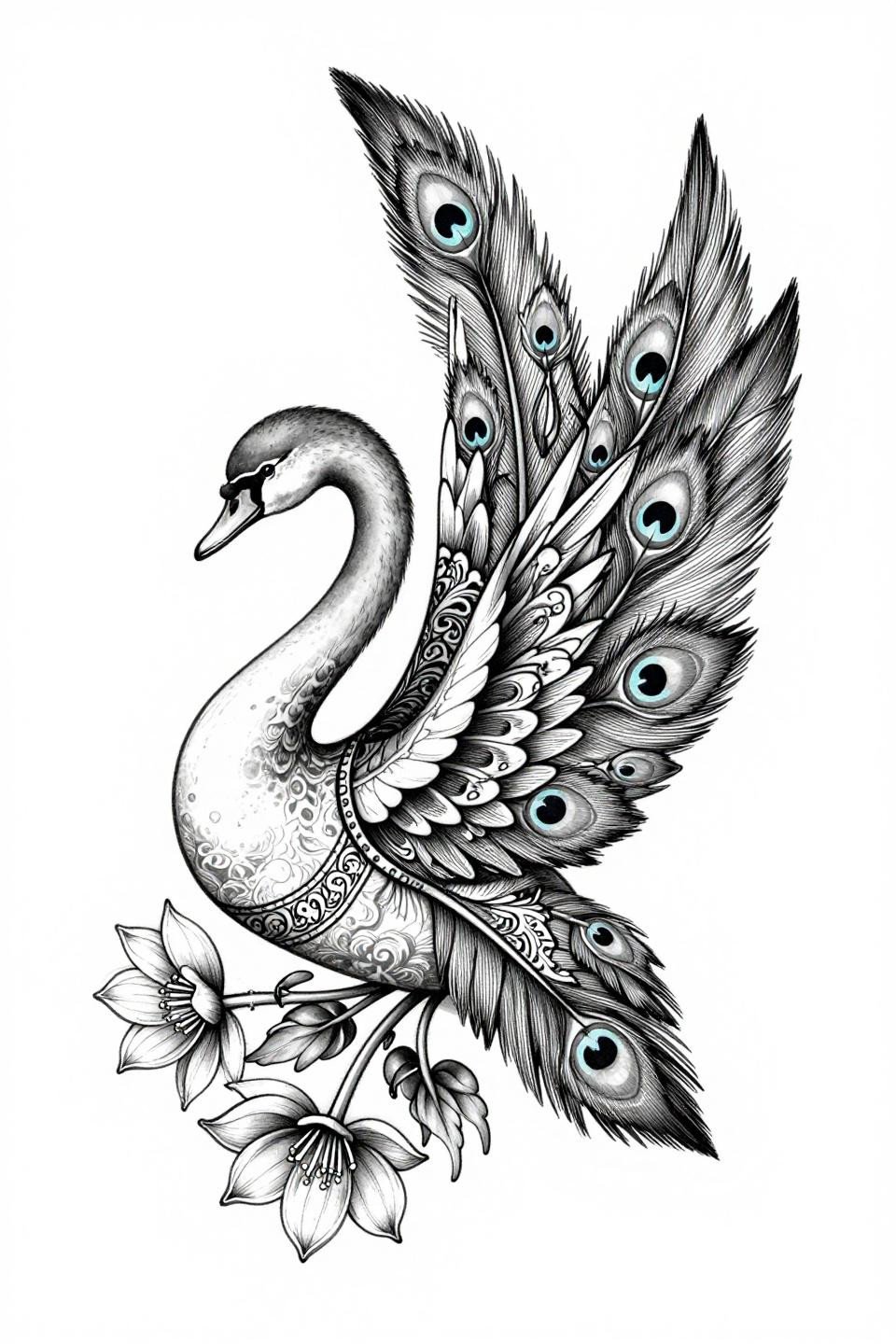
Swan Ignorant Style With Peacock Eye Geometry Inside
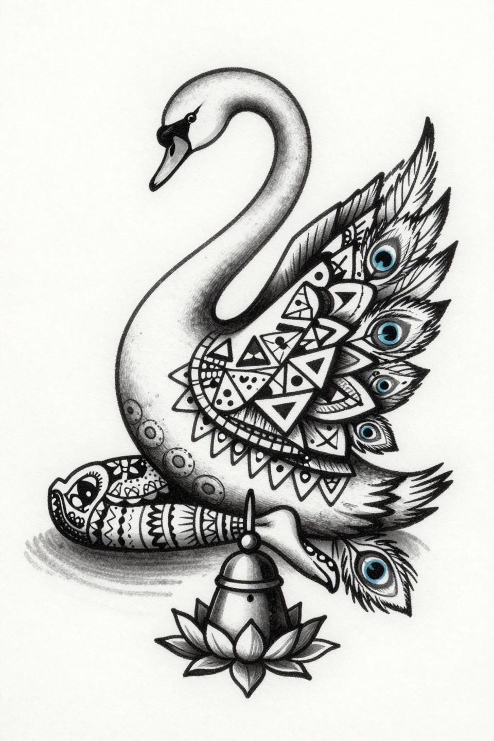
Ignorant style swan with the body filled by mehndi geometric triangles and hexagons, peacock eye motifs embedded directly into the wing feathers. The intentionally uneven line weight is the style’s signature, not a mistake, and it ages with character rather than looking degraded.
No grey wash means no muddy midtones over time. Flat black fills on well-prepped skin hold density indefinitely if the artist commits to layered passes during application. This is one of the more forgiving styles for high-friction placements.
Trash Polka Feathers Built Around Lotus Mandalas
Trash polka applied to peacock mehndi, with tail feathers composed of interlocking lotus mandalas and geometric star patterns, crimson red accents cutting against solid black. The aggressive negative space carving is the move that makes this composition readable at scale.
Crimson on black is one of the more stable two-color combinations over time, since red doesn’t shift green or blue the way some pigments do on warmer skin undertones. Still, verify your artist’s red ink brand before committing.
Celtic Knotwork Feathers That Close Without Breaking
Celtic knotwork structure applied to a full peacock tail spread, with the body formed from continuous interlocking knot bands and feathers nested with lotus and jasmine blooms. The bilateral radial symmetry is compass-tight here, which is the technical signal that separates a planned design from an improvised one.
Coral and charcoal as fill colors is an unusual pairing for this motif, and it reads well on lighter skin tones. On deeper skin tones, coral loses contrast against the outline and needs to shift toward a deeper terracotta to hold.
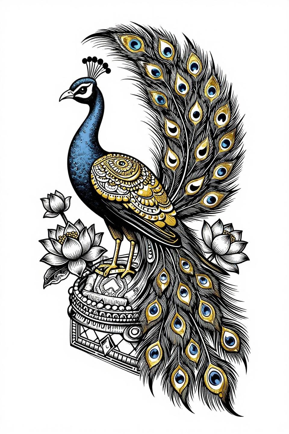
Neo-Traditional Feathers Where Gold Does the Structural Work
Neo-traditional with feathers built from interlocking mehndi teardrop and crescent moon shapes, forest green and gold leaf fills inside a circular mandala frame. The negative space silhouette body keeps the form from competing with the feather detail, a compositional choice that most peacock designs miss.
Gold leaf ink requires maintenance. It oxidizes faster than standard pigments, especially on placement areas with sun exposure. Protected placements like sternum or upper back give this palette its best shelf life. For henna designs for special occasions, this color range translates directly from mehndi to skin ink without losing its ceremonial weight.
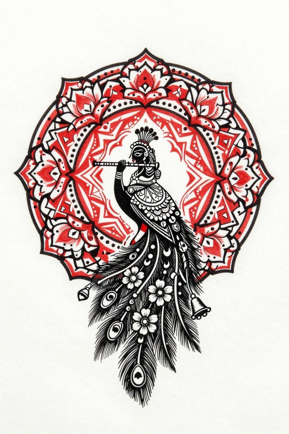
Krishna Profile Built From Feather, Not From Figure
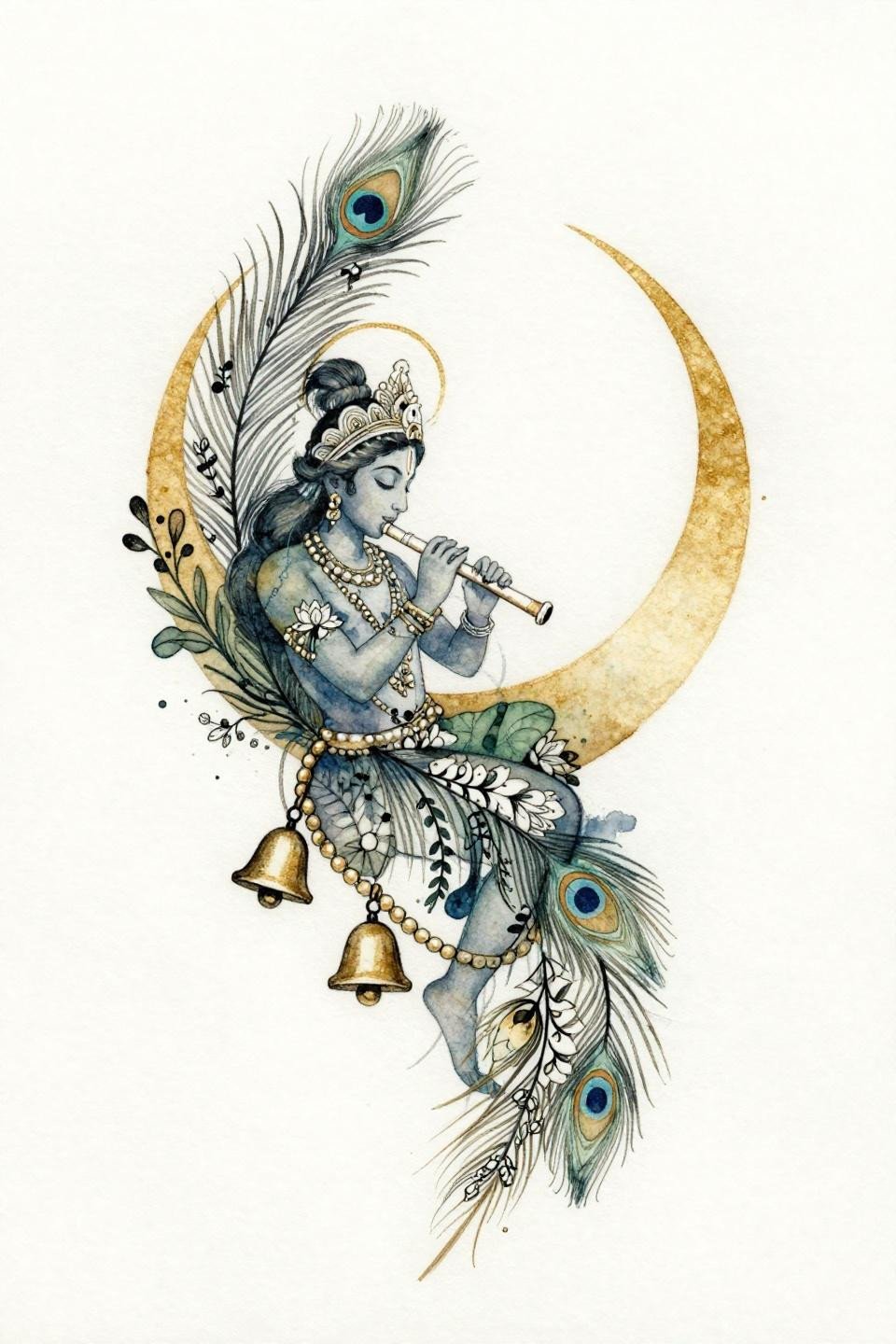
Watercolor splash style with Krishna’s profile composed entirely of interlocking peacock feathers filled with fine-line botanical vines, calligraphic brush marks driving the line structure. The muted indigo and sage wash bleeds sit below the ink layer, not on top, which is the technique that keeps watercolor work from looking blown out.
Watercolor without an anchoring black outline blurs by year three to five. This design has the calligraphic marks as its anchor, which extends the readable lifespan, but touch-up is still part of the long-term plan for this style.
Hindu Geometry in Chicano Grey Wash Hands
Chicano grey wash technique applied to a peacock in asymmetric S-curve, feathers built from mehndi crescents and geometric chevrons, whip shading running from dense black to open pale dilution. The S-curve pose is the smartest composition choice for grey wash peacock work because it follows the natural taper of a limb.
Grey wash dilution from dense to open with no muddy midtones is the technical target here. The tell is the transition zones. Any patchiness in the mid-dilution range signals an artist who rushes the needle speed change.
Feather Eye in Woodcut Lines That Hold for Decades
Etching woodcut style with feathers rendered as interlocking mehndi teardrop shapes and crescent moons, parallel line engraving creating the shadow structure, gold leaf and solid black as the only fills. The woodcut block print linework at this weight is one of the most age-resistant techniques available.
Bold parallel engraving lines hold their separation better than dotwork or fine line over time because the ink sits in wider channels. On any skin tone, this approach maintains contrast through the decade where most detail styles start softening. See more simple mehndi patterns and styles that use similar line-weight logic for longevity.
Front Hand Geometry With Zero Wasted Negative Space
Tribal geometric peacock in profile with feathers as interlocking mehndi diamonds and hexagons, the ankle bracelet pattern wrapping the lower form serving as a natural border that terminates the composition without a hard frame line.
Single needle 1RL work like this needs an artist who controls speed. Any inconsistency in the hexagon geometry reads immediately at scale, especially on a flat surface like the front hand where there’s no curve to absorb a wobble.
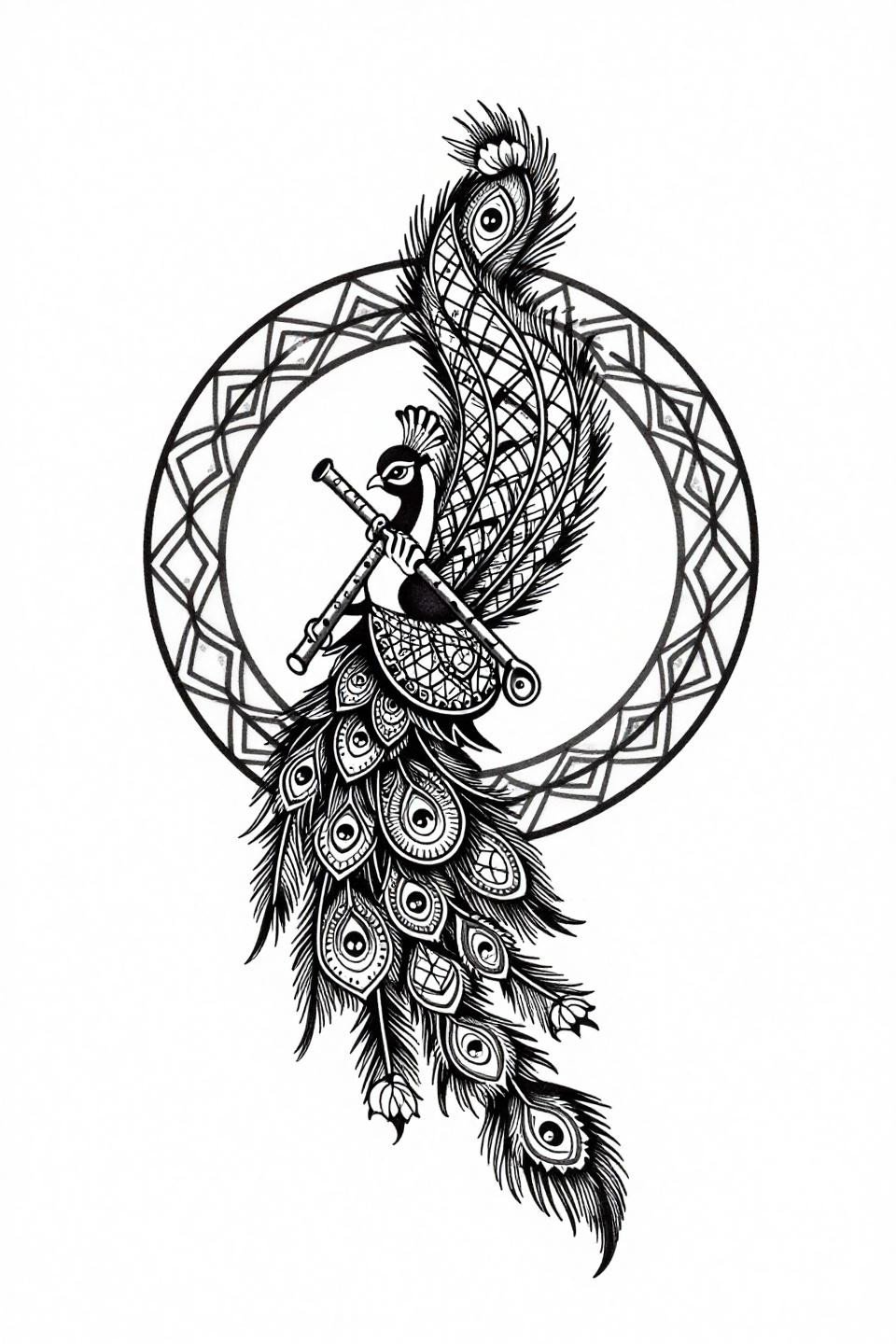
Trending Dotwork Where the Eye Motif Does Double Duty
Dotwork peacock with feather eye motifs built entirely from stipple dot clusters, the Krishna flute integrated at the throat curve so it reads as part of the silhouette rather than an added element. The bindi motifs at feather tips create a secondary rhythm that pulls the eye outward across the full spread.
This composition is designed for a protected placement. Finger or wrist placement would destroy the feather-tip detail within two years from friction alone. Upper arm or shoulder blade is where this style holds its resolution. For similar compositional approaches, modern mehndi ideas for inspiration cover how dotwork translates from henna to skin ink.
All-Mehndi Vocabulary, One Surrealist Peacock Body
Full mehndi vocabulary consolidated into one surrealist form: paisley spirals, dot-mandala clusters, lotus root tendrils, and negative space carving all used simultaneously without any element competing for dominance. The lotus root tendrils at the base ground the composition so the eye doesn’t drift off the lower edge.
Crosshatch etching as the shadow technique ages cleanly because parallel lines don’t merge the way stipple dots can when skin relaxes over years. This is the aging-resistant choice for anyone who wants mehndi density without the dotwork maintenance conversation.
Art Nouveau Swan Where Botanical Logic Drives the Form
Art nouveau swan with the body mapped by fine-line botanicals, peacock eye motifs scattered across wing planes, trailing water lily vines with stamen detail at the base. The hairline 0.5mm single-needle strokes require an artist who controls depth precisely, because this weight on the wrong skin type migrates within the first year.
On lighter skin tones, this reads with sharp botanical clarity. On olive and darker skin, the fine lines need heavier weight to maintain contrast, so discuss line gauge adjustments with your artist before finalizing the reference.
Sak Yant Geometry Locked Into a Peacock Silhouette
Sak Yant structure applied to a peacock form, feathers rendered as geometric lattice tile patterns with traditional Hindu angular fill, a circular mandala eye anchoring the tail base. The compass-drafted vector precision is the defining technical signal here, and any deviation in the geometry would read as a flaw, not a style choice.
Flat black fills with no grey wash means this holds density indefinitely if the artist commits to layered passes. This is the right structure for anyone who wants a ceremonial-weight piece that doesn’t rely on color to carry meaning.
Stipple Botanical Where Lotus and Feather Share Equal Weight
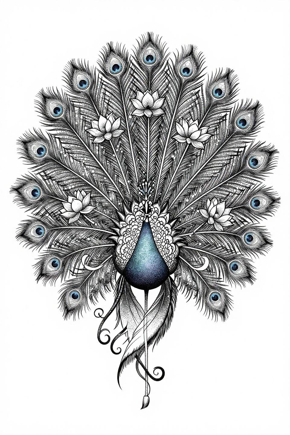
Botanical scientific style with the full peacock tail spread, lotus flowers placed between feather plumes at equal compositional weight to the feathers themselves, bindi motifs at each tip, vine tendrils closing the base. The dense-to-open stipple gradient is the technique that makes this read as scientific illustration rather than decorative flash.
Look for consistent dot size across the full gradient as the artist quality signal on this one. Any variation in dot diameter breaks the gradient logic and turns it into texture noise. Consistent dotwork at this density is a senior-level skill.
Pull three to five of these references based on placement first, style second. A dotwork gradient that works on an upper arm reads as blur on a finger. Match the technique to the surface, then send the shortlist. That’s the entire brief your artist needs.