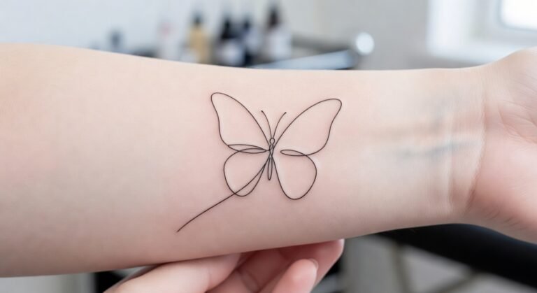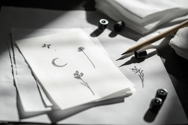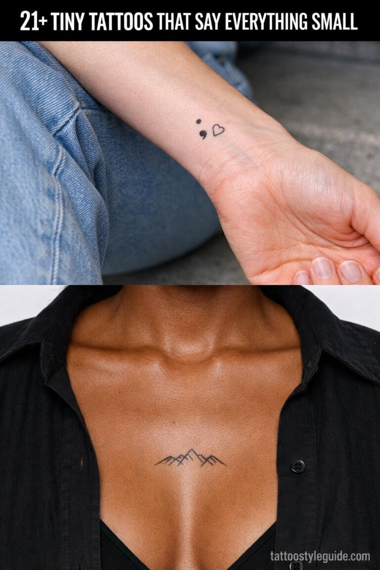
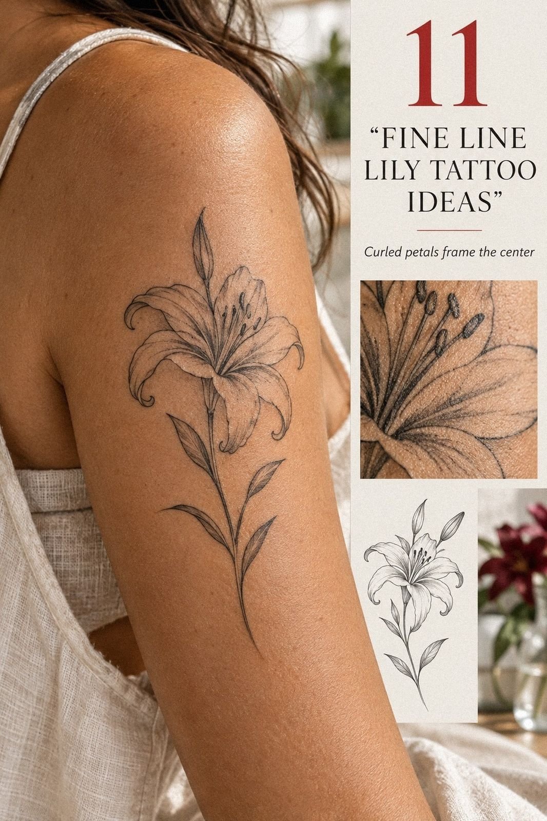
Fine Line Lily Tattoo ideas can feel delicate in a sketch and still become deeply personal on skin. I got mine while turning 30, after weeks of changing the stem, placement, and scale. I expected sharp discomfort. Instead, the process felt focused, quick, and surprisingly calm!
I wanted personal meaning, symbolic detail, and readable lines without becoming visually loud. If you’re comparing ideas, my guide to fine line tattoo ideas helped me separate a meaningful design from one that only looked impressive when enlarged.
- I Chose a Vertical Fine Line Lily Stem
- Why an Open Lily Worked Better for Me
- I Tested a Discreet Forearm Placement
- Strip the Details Back for a Minimalist Lily Tattoo
- Choose a Small Vertical Lily Tattoo
- How Open Should the Petals Stay?
- Add One Narrow Leaf Near the Stem
- Pair the Lily With a Personal Initial
- Can Fine Line Still Read Clearly on Skin?
- Build the Healing Plan for My Dainty Lily Tattoo
- Admiring My Healed Fine Line Lily Tattoo
1I Chose a Vertical Fine Line Lily Stem
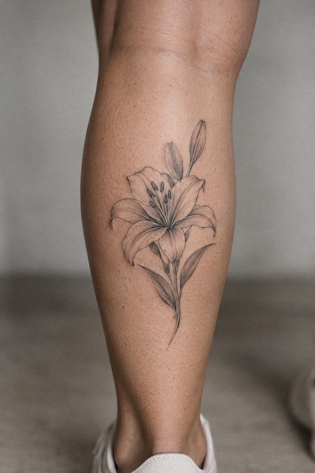
I chose a vertical lily stem because it gave the flower direction. A horizontal bloom felt pretty, but it didn’t have the same quiet movement.
The stem pulled the eye upward, while the petals opened slightly to one side. On my reference sheet, the line looked flowing, graceful, and more natural than the symmetrical versions I’d saved.
The artist and I tested the design beside a ruler, then printed it at two practical scales. I didn’t need a measurement forced into the tattoo, but I did need enough length for the stem and petals to breathe. You’ll want to look at your design from several steps away, because a tattoo that looks perfect beneath bright light can become muddy when viewed normally.
I made the mistake of treating the flower as the important part and the stem as an afterthought. That was backwards.
The stem carries the composition, and black ink gives it the visual anchor that makes the fine petals feel intentional. If you’re considering more references, my guide to fine line tattoo words and shapes helped me compare botanical forms without copying one artist’s exact drawing.
The budget mattered, too. I didn’t want to spend less on a design that would need correction later. For me, paying for careful planning was worth the consultation time.
2Why an Open Lily Worked Better for Me
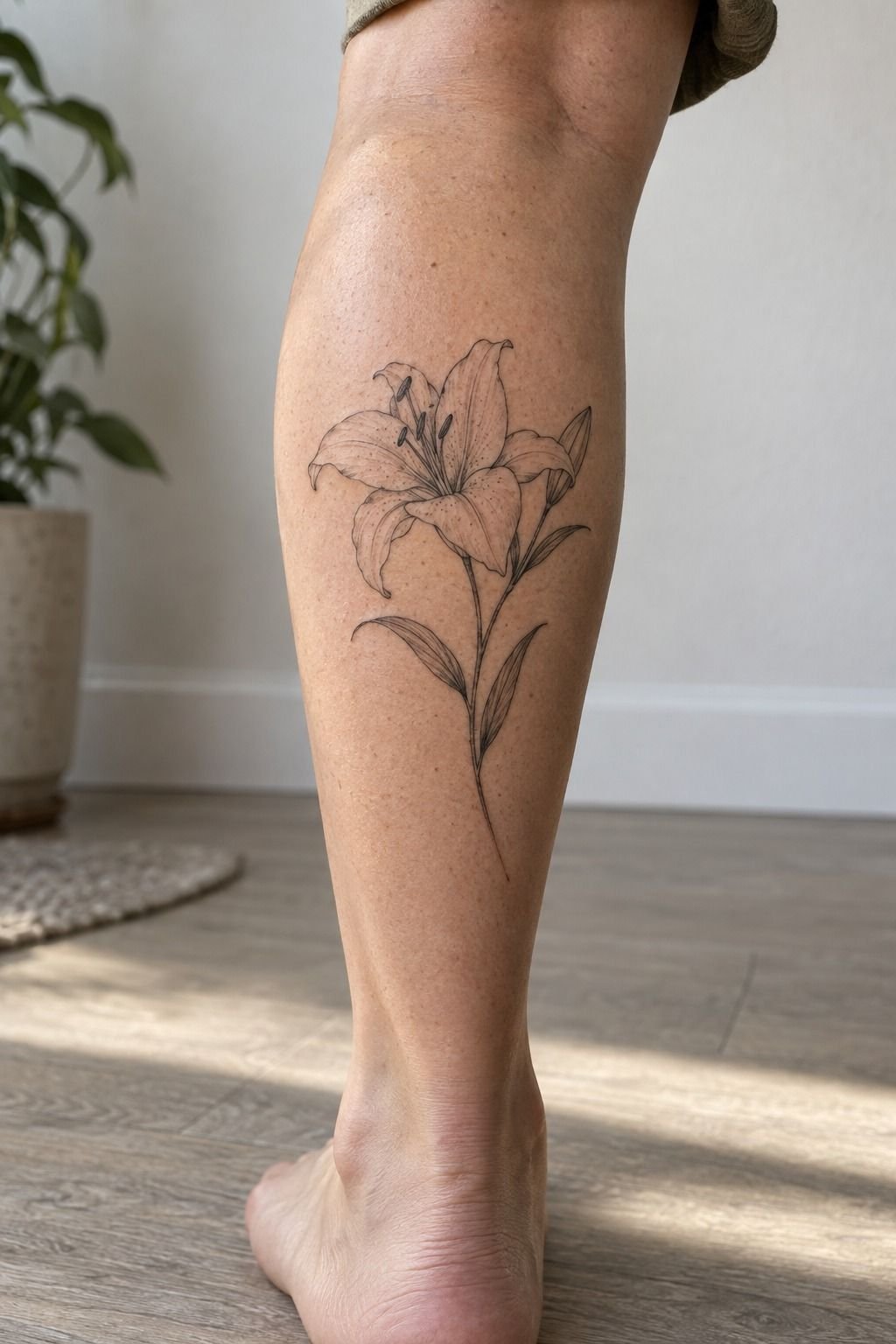
I compared several Lily Tattoo Designs before choosing one with an open bloom. Closed buds looked minimal and neat, but they didn’t carry the same emotional weight for me. A lily with separated petals felt more meaningful, especially because you could see the negative space between each line instead of one solid silhouette.
The sternum reference I kept coming back to had a centered flower, a narrow base, and petals that leaned outward. I liked how delicate the design felt from a normal distance, but I worried that the center would become too busy.
You shouldn’t choose a design only because every tiny detail seems impressive. Ask how your eye will read the whole shape when the tattoo is several feet away.
My artist showed me a version with decorative dots and another with extra interior shading. I skipped both.
The dots made the lily feel less sleek, and the shading competed with the petal edges. You’ll get more long-term value from a clear structure than from details added simply to make a sketch feel finished.
The fine line tattoo wording guide also helped me think about meaning before I committed to the final drawing.
That choice was worth it. The open bloom gave the tattoo an immediate identity without requiring a large flower silhouette. It also left the design feeling slightly ethereal, which suited the symbolism better than a dense floral shape.
3I Tested a Discreet Forearm Placement
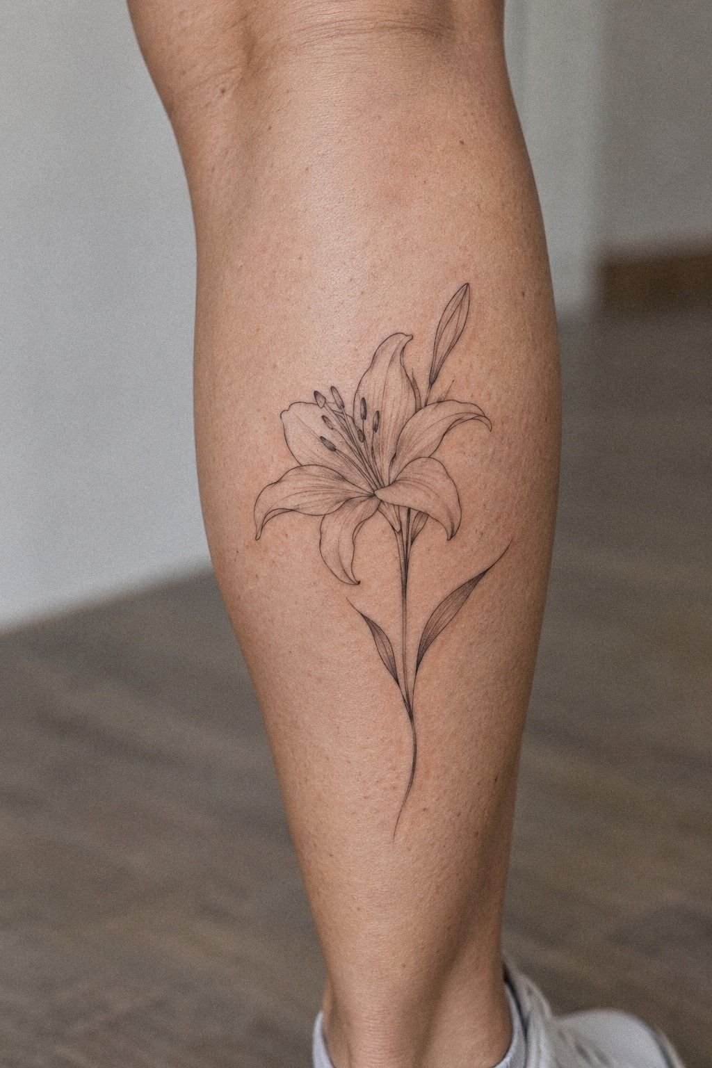
I tested the behind-the-ear placement first, even though I eventually chose a different location. Behind the ear looked edgy and discreet, and it gave the lily a small, private quality.
But the available area would have forced the stem shorter and the petals tighter. I couldn’t make the flower both readable and genuinely fine line at that scale.
The forearm placement gave me more flexibility. It’s a practical area for checking visibility, and the skin felt less intimidating than the sternum, ribs, or feet.
You’ll still feel the tattoo, of course, but many people find the forearm more tolerable than bony zones. I’d rather have a slightly more visible placement that protects the drawing than hide a design so small that it loses its shape.
I tested the stencil while moving my wrist, not only while holding it still. That small check mattered.
The stem looked polished when my arm rested, but it became compressed when I bent my wrist. If you’re comparing placement options, check the stencil in motion and beside ordinary clothing.
The fine line needles, longevity, and placement guide gave me a better framework for that decision.
The cost of a consultation was easier to justify once I understood how much placement affected the final result. A cheap appointment wouldn’t have offered the same value if the flower lost its original proportions.
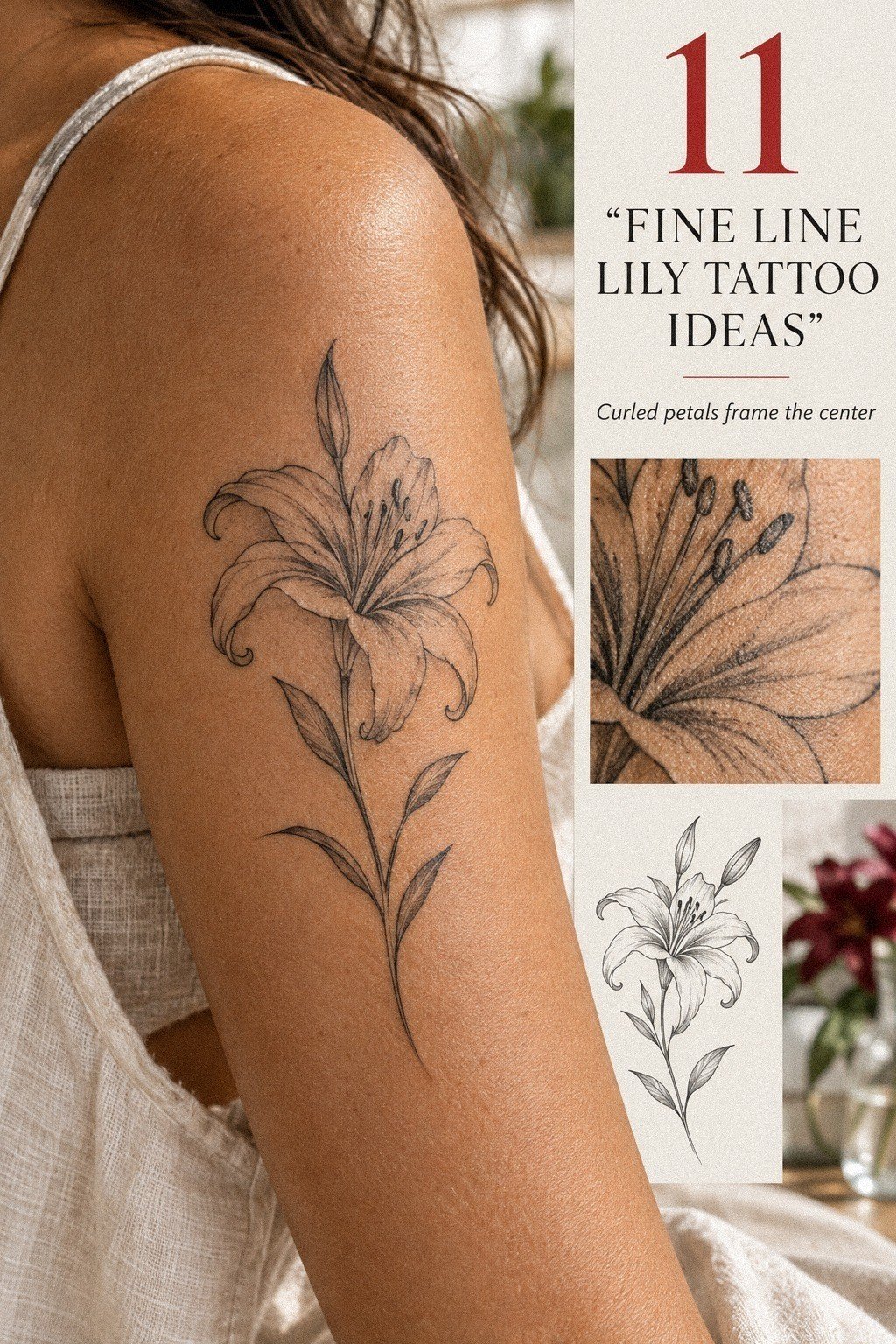
4Strip the Details Back for a Minimalist Lily Tattoo
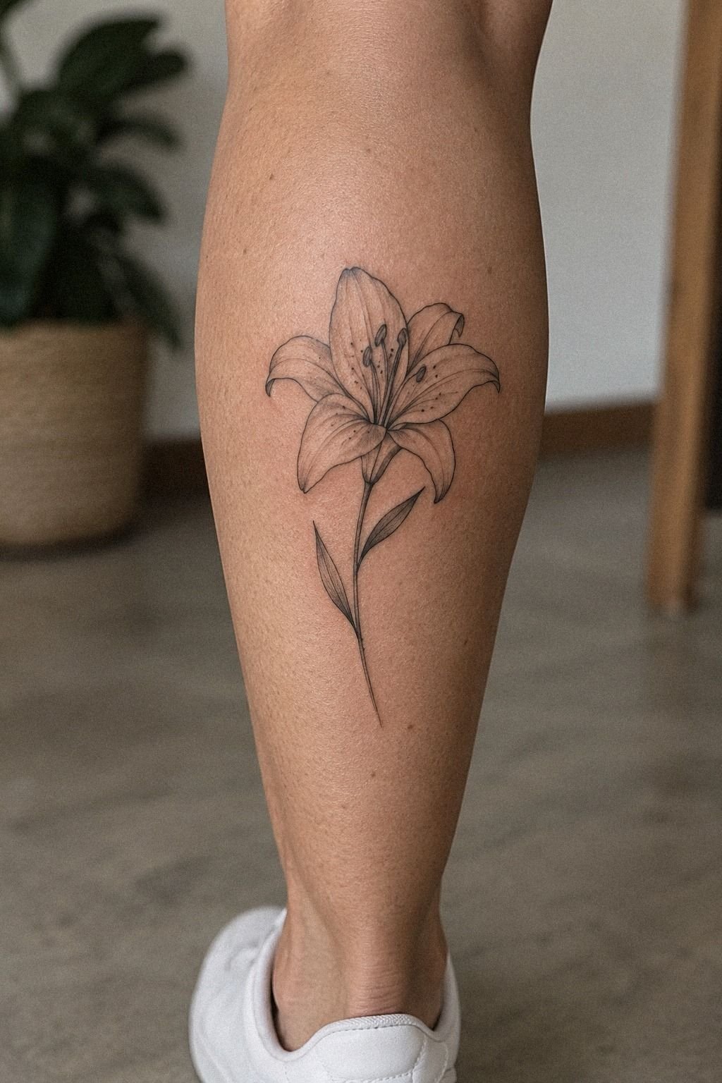
For my Minimalist Lily Tattoo, I removed more than I added. The cleaner version felt more elegant because the stem, bloom, and open skin could work together without competing marks.
5Choose a Small Vertical Lily Tattoo
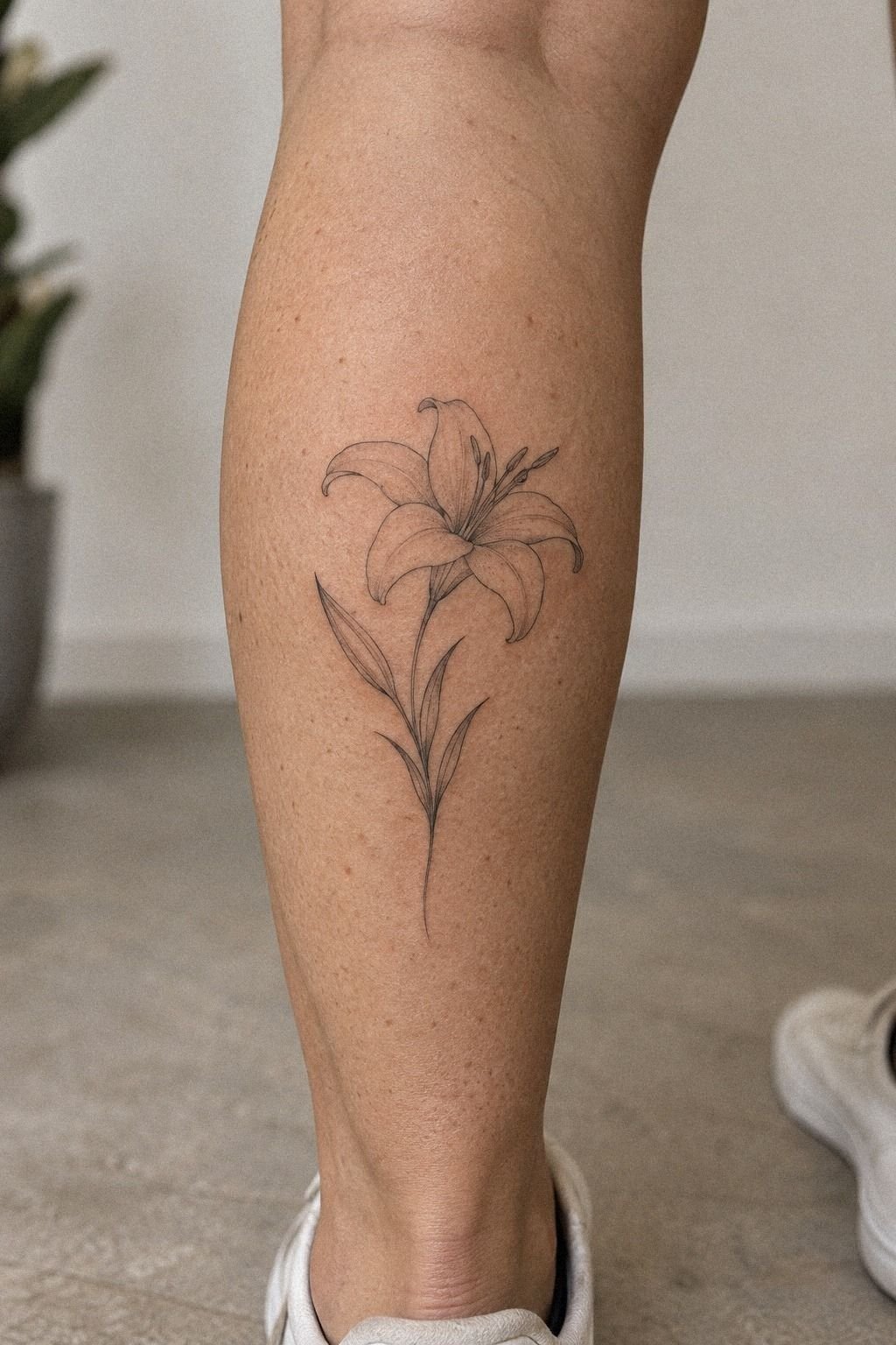
I selected a Small Lily Tattoo in a vertical format because I wanted the flower to feel dainty without looking unfinished. A tiny horizontal lily would have needed wider petals to remain legible, while the vertical version could use length instead of bulk. That made the composition feel refined and gave the stem a clear role.
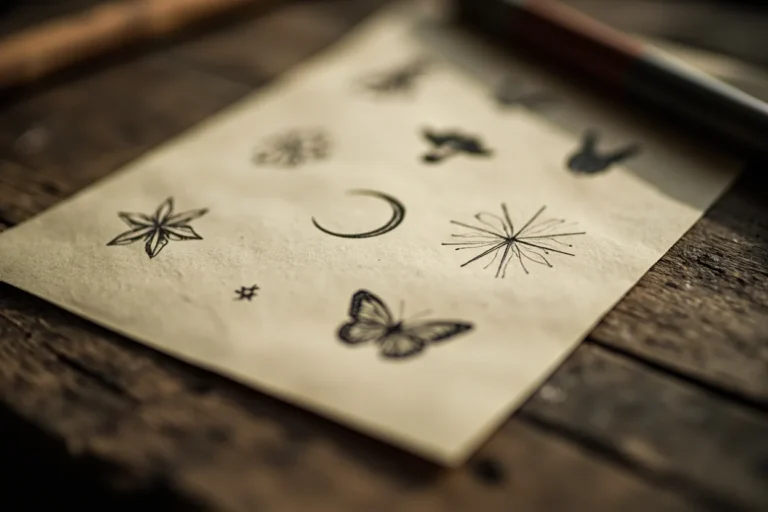
The flash sheet helped me compare several options without getting attached to one sketch too early. I looked for a bloom with a visible center, a stem that didn’t wobble, and enough open skin around the design.
You’ll want to examine the print at normal size, not only with your attention fixed on the smallest details. Fine line work can feel impressive when enlarged while losing its identity at actual viewing distance.
I also asked for a clean stencil rather than a heavily shaded preview. The stencil made the decision feel more honest.
No smoky effects, no digital polish, just the actual path of the single-needle linework. If you’re shopping for a small design, the feminine fine line tattoo collection gave me ideas for scale without pushing me toward a generic floral symbol.
The price wasn’t the only factor. I compared the artist’s healed work, consultation style, and approach to small details before deciding whether the appointment fee was worthwhile.
6How Open Should the Petals Stay?
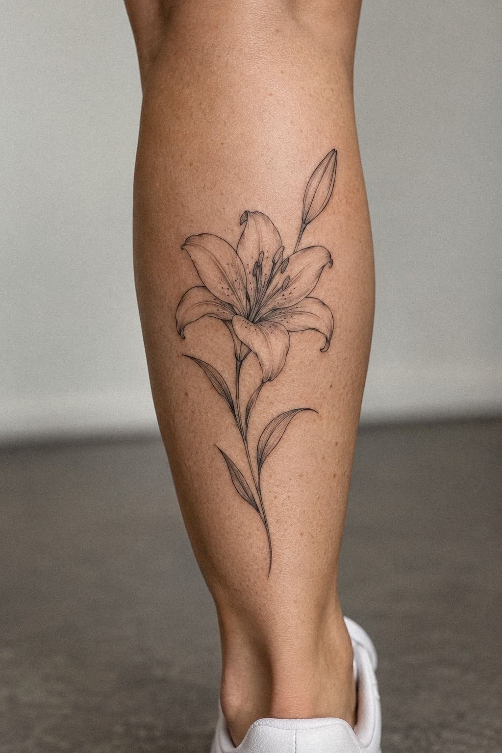
I drew the slightly open petals because a fully closed flower looked too formal. The open shape felt more expressive and gave the lily room to breathe without adding extra lines.
7Add One Narrow Leaf Near the Stem
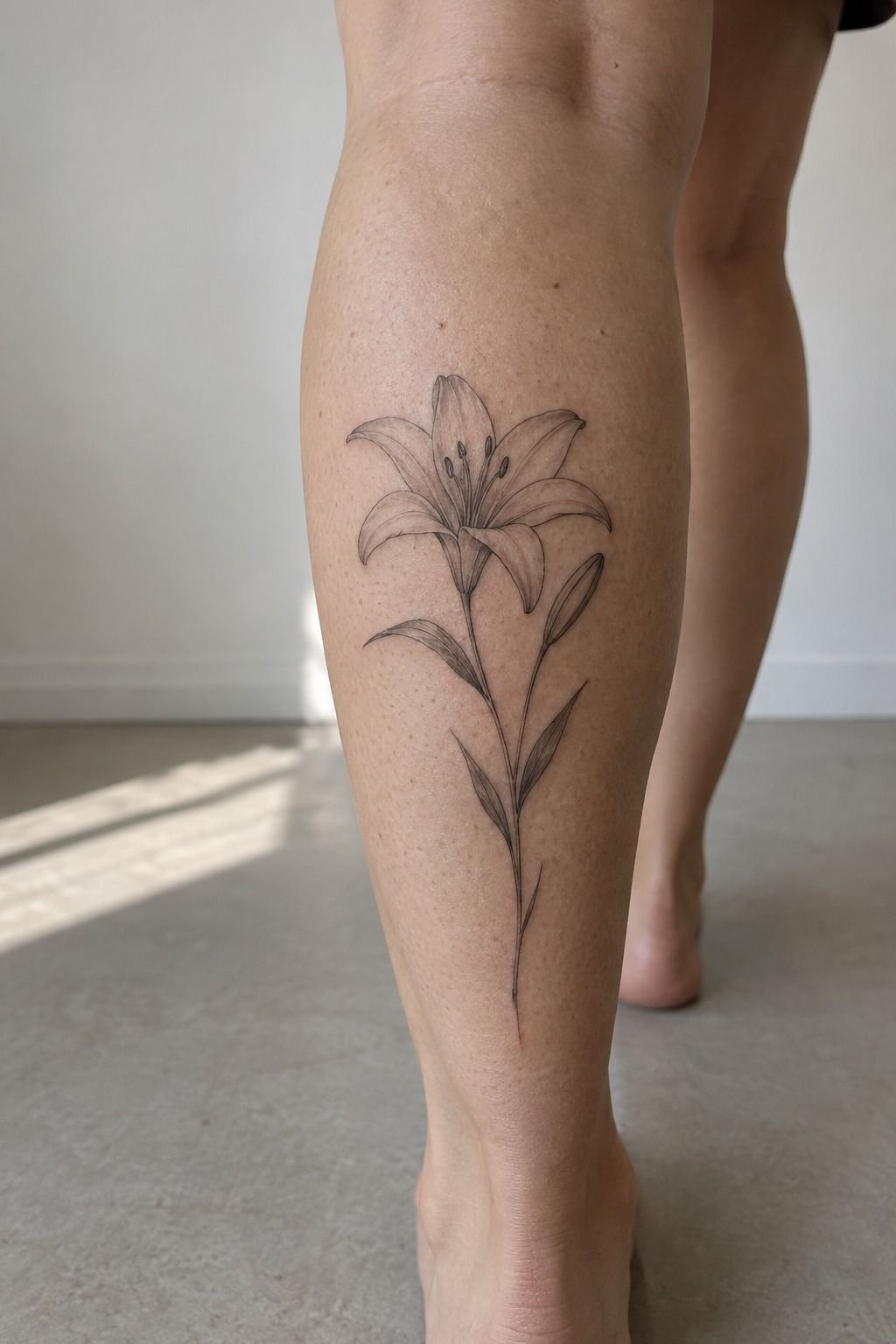
I added one narrow leaf beside the stem after seeing the first stencil. Without it, the lily looked clean but slightly unfinished.
With it, the line gained a small change in direction. That single mark made the design more organic and gave the eye a place to pause before following the stem downward.
The leaf needed to stay smaller than the bloom. I tested a broad leaf first, and it immediately became the second subject. You’ll want the supporting detail to support, not compete.
My final leaf used a simple outer contour and one interior vein, which kept the result understated while still making the composition feel complete.
I placed the leaf on the side that followed the natural curve of the forearm curve. On the upper back, I’d have angled it differently.
Placement changes the gesture, so don’t treat one stencil as universal. The fine line tattoo placement guide helped me think about movement, friction, and sun exposure before the needle touched skin.
I didn’t add another leaf just to make the design seem fuller. That would have increased the visual cost without adding real symbolic weight.
8Pair the Lily With a Personal Initial
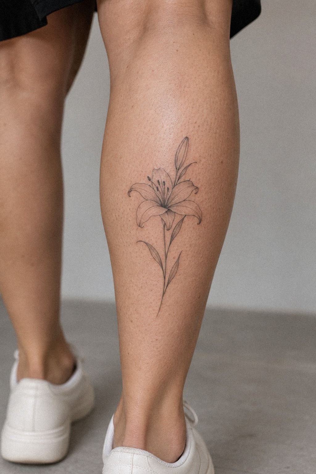
I considered adding an initial beneath the lily, but I didn’t want the lettering to turn the piece into a memorial plaque. The final personal initial was small, clean, and separated from the stem by enough space to keep both elements readable. That made the tattoo feel personal without making the meaning obvious to everyone who sees it.
The thigh reference showed how a lily and initial can share one vertical rhythm. I liked the idea, but I knew my own placement needed a simpler relationship. You’ll want to decide whether the letter should be noticed first, second, or only after someone looks closely.
My preference was clear: the flower should lead, and the letter should reward attention.
I tested three lettering styles on paper. A flourished script looked romantic, but it fought the fine petals.
A plain serif was more timeless, and a narrow handwritten form felt too casual. I chose the serif because it echoed the stem’s restraint. If you’re building a meaningful tattoo, start with the symbol that carries the emotion and let the text stay quiet.
The initial added value because it belonged to my story. I wouldn’t add lettering merely because a design feels unfinished without it. The small serif letter had to earn its place.
9Can Fine Line Still Read Clearly on Skin?
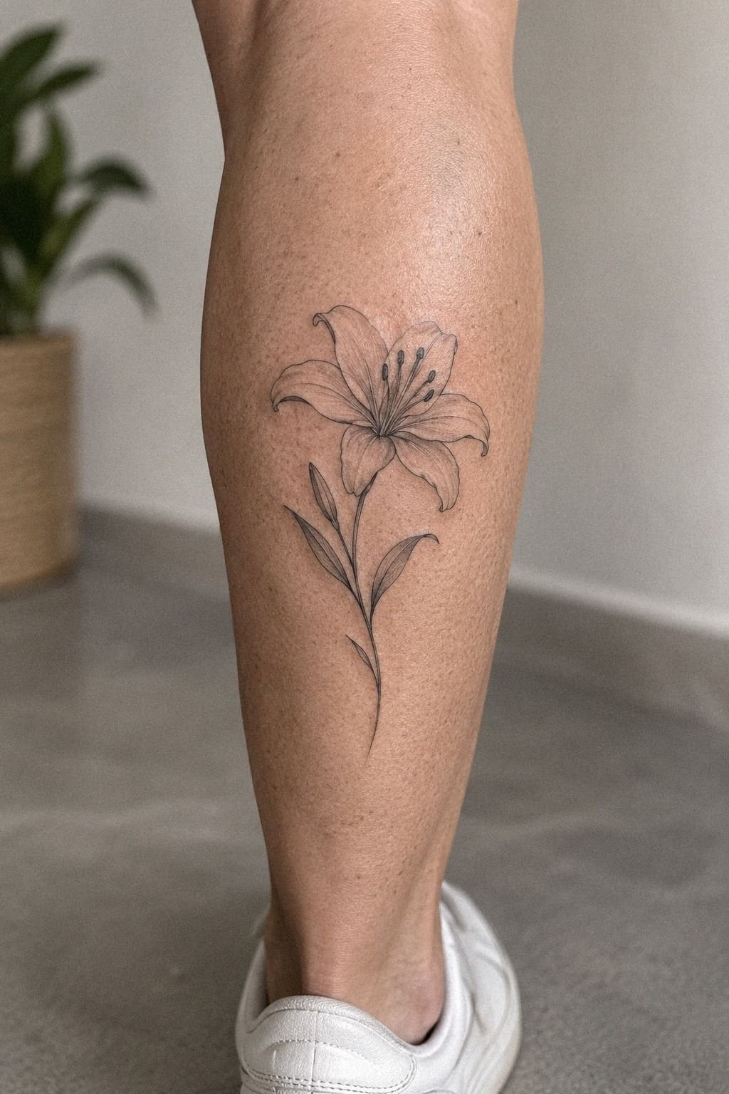
I checked the linework under normal lighting, not only beneath a bright studio lamp. The forearm reference looked clear beside a window and under a warmer bulb.
That test exposed one issue: the two smallest petal lines were nearly touching. I removed one before the appointment.
The change made the design feel more sharp and vibrant without making it heavier. You’ll want to inspect the stencil from arm’s length and from nearby.
If the flower only reads when your face is inches away, the design may need stronger hierarchy. Fine line should feel light, but light doesn’t mean vague.
I also asked to see the artist’s healed examples. Fresh tattoos can look striking because the ink is dark and the skin is newly irritated.
Healed work tells you much more about spacing, edge control, and whether thin lines remain legible. If you’re researching artists, the can you fix a bad fine line tattoo guide is useful because it shows why prevention matters more than a later correction.
The portfolio made the decision feel worthwhile. I wasn’t paying only for the appointment; I was paying for judgment, consistency, and a better chance of keeping the line spacing readable. That distinction matters!
10Build the Healing Plan for My Dainty Lily Tattoo
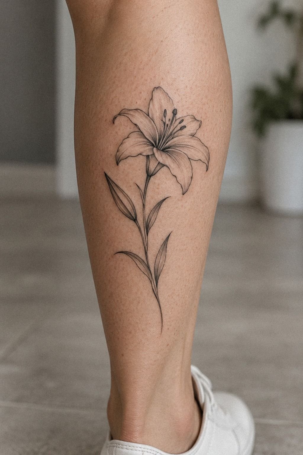
I prepared for the healing stage before getting my Dainty Lily Tattoo. I bought gentle cleanser, followed the artist’s instructions, and planned around swimming, direct sun, and tight clothing.
11Admiring My Healed Fine Line Lily Tattoo
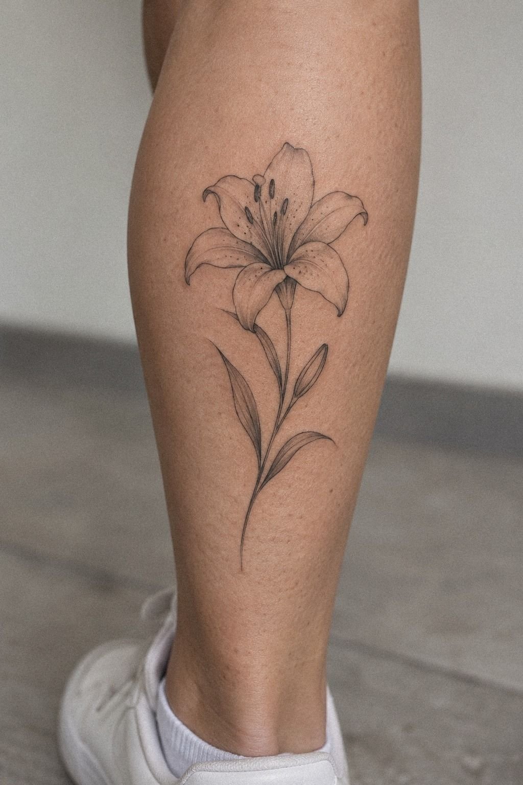
When I saw the healed Fine Line Lily Tattoo on the spine reference, I understood why placement and spacing mattered more than the original drama of the appointment. The lines had softened slightly, but the bloom remained readable. The stem still moved upward, and the single leaf still gave the design its graceful turn.
I expected to miss the fresh darkness of the ink. I didn’t.
The healed version felt more integrated and more haunting, as if it had always belonged there. You’ll probably notice tiny changes in the first months, especially as the surface settles.
That doesn’t mean the tattoo failed. It means skin is living material, and fine line work has to be judged after it calms.
The spine placement looked powerful on deep brown skin because the design stayed narrow and the contrast remained clear. I’d still ask an artist to show healed work on skin tones close to yours.
You’re choosing a collaborator, not just a design. If you want another placement comparison, the fine line spine tattoo guide helped me think about visibility, movement, and long-term readability.
The long-term value came from that clarity. The design didn’t need to remain perfectly fresh to keep its healed identity.
Test the Placement Before You Commit
The question was simple: did I want the lily hidden, visible, or easy to check throughout the day? I couldn’t answer that until I tried the stencil placement in several positions. The upper back felt more private, while the forearm made the vertical composition easier to assess.
I eventually chose the location that protected the design’s proportions. If you’re uncertain, ask the artist to place the stencil, walk around, bend the joint, and view it from a normal distance. The tattoo ideas by placement guide helped me compare visibility, friction, and movement before I committed.
A meaningful placement doesn’t have to be secret. It only has to feel right when you live with it. The stencil test answered more than a digital preview could.
Fine Line vs. Bold Blackwork
Fine line and bold blackwork create completely different impressions. Fine line can feel feminine, restrained, and detailed, while heavier work can look masculine and graphic. Neither approach is automatically better.
I considered a thicker stem so the lily would stand out more. The change made the design feel commanding, but it also erased the fragile quality I liked. If you’re comparing styles, the fine line tattoo ideas guide can help you notice how line weight changes the entire mood.
The right choice depends on your priorities. If you want distance readability and strong contrast, heavier lines may offer better value.
If you want subtle movement and open space, fine line may be worth it. The line-weight choice should serve your intention.
The Reference I Nearly Chose
The reference I nearly chose had a larger bloom, three leaves, and a daring curve. It looked iconic, but the design belonged to someone else’s proportions. When I placed it beside my own stencil, the extra details felt borrowed rather than personal.
I kept the curved stem as inspiration but removed the third leaf. That small edit made the result more honest. You’ll save money and regret if you decide which parts of a reference express your idea before asking an artist to recreate its surface.
A reference should start a conversation, not replace one. My saved reference was useful only after I made it mine.
Skip What Doesn’t Earn Its Place
I wouldn’t add shading simply because the petals look empty. I wouldn’t add a quote beneath the stem because the initial already carried the personal meaning. I also wouldn’t use multiple flower types just to make the composition feel richer.
Those decisions kept the lily minimal and stylish. The tattoo still has personality, but every mark has a reason. If you’re tempted to keep adding, wait a week and look at the design again before increasing the price or the visual weight.
Restraint can be more memorable than decoration. The empty space was part of the design.
Judge the Value Beyond Price
I judged value by asking what would still matter after the appointment. A polished stencil, a readable silhouette, healed examples, and honest advice all mattered more than a fast booking. The fine line tattoo longevity guide helped me understand which choices affected the result over time.
I also compared the artist’s process with my budget. The cheapest option wasn’t automatically a good deal, and the highest price wasn’t proof of quality. What felt worthwhile was finding an artist whose portfolio matched the scale and line weight I wanted.
That approach made the cost easier to accept. I wasn’t buying a trend; I was choosing something I hoped to keep recognizing years from now. The healed portfolio mattered most.
Choose When a Bolder Lily Wins
A bolder lily may be the better choice if you want the design to read from several feet away, survive more visual competition, or hold a stronger graphic presence. A thick outline can look crisp, classic, and immediately recognizable.
I considered that route because I wanted the flower to remain legible. Still, the delicate version felt more like me. If you prefer gritty, raw, or high-contrast work, ask the artist whether a heavier stem would protect the design without overwhelming the petals.
There isn’t one correct lily tattoo. There’s only the version that matches your skin, your intention, and your tolerance for maintenance. The bolder outline is a choice, not a requirement.
What the Budget Actually Bought
My appointment fit the typical US ranges I’d been given before booking. A small fine line lily may fall around $100 to $300, while many shops use a minimum of about $50 to $100 or charge an hourly rate around $100 to $250. The exact amount depends on the artist, region, studio minimum, placement, and time required.
I didn’t choose the cheapest quote. The artist’s healed portfolio, careful line control, and clear aftercare mattered more to me than saving a small amount at the appointment. You’ll want to ask what the quote includes before you book, especially if the design may need resizing or a second pass.
The table is a planning guide, not a promise. My own cost depended on the artist and the final drawing, and I’d rather keep that private than pretend one number applies everywhere. If you’re comparing quotes, look at the portfolio and hygiene standards first.
A licensed tattoo studio with strong healed examples is worth more than a bargain that leaves you anxious.
For me, the budget bought time, consultation, and a design that didn’t feel rushed. That was a better value than choosing based on price alone. The final quote covered judgment as much as labor.
Ask Before Booking
I’d ask to see healed work at a similar scale, especially on skin tones close to mine. I’d ask how the artist handles small gaps, whether the stencil can be adjusted, and what happens if the design needs a second pass. The healed fine line tattoo guide reinforced why those questions matter.
I’d also ask about the studio minimum, deposit, appointment length, and aftercare products. You don’t need to sound difficult. Clear questions protect your budget and help you understand the artist’s process.
Most importantly, I’d ask whether the artist thinks the design is large enough to age well. An honest answer is more valuable than instant agreement. The artist’s honest opinion can save you regret.
Keep the One-Line Rule
I’ve changed my mind about what makes a fine line lily successful. I used to think the most captivating design would be the one with the most petals, shading, and tiny marks.
After watching the stencil change on different parts of the body, I think the opposite is closer to the truth. A strong tattoo has a clear idea before it has extra decoration.
The best decision I made was protecting the outline. The stem, bloom, and leaf had to work together before the initial or any symbolic detail could join them.
You’ll make better choices if you rank your priorities: readability first, placement second, personal meaning third, and decoration last. That order sounds strict, but it kept me from adding marks I’d later regret.
And I still like the more dramatic sketches. Some are empowering, vintage, and beautifully raw. They simply weren’t right for me.
I wanted a flower that could feel intimate without becoming fragile, and fine line blackwork gave me that balance. If you’re stuck between several concepts, write down what you want the tattoo to say without using visual adjectives.
The answer usually reveals which details matter.
But I wouldn’t pretend fine line is maintenance-free. Lines may soften or widen, and sun can speed up fading. Good placement and solid black structure can help, but no tattoo stays frozen.
You’ll get the best result by choosing an artist whose healed work supports the style, then following the aftercare instead of improvising. The aftercare routine protects the work you paid for.
The Questions Worth Answering First
How much does a Fine Line Lily Tattoo usually cost?
A Fine Line Lily Tattoo usually costs about $100 to $300 in the US, although a studio minimum may be about $50 to $100 and hourly rates may run around $100 to $250. Artist experience matters, as do region, placement, design size, and appointment time.
Are Fine Line Lily Tattoos a good idea for a first tattoo?
Yes, a Fine Line Lily Tattoo can be a good first tattoo if you choose a readable design and a tolerable placement. Forearm, thigh, and shoulder areas are often easier than sternum, ribs, feet, or hands. A clear silhouette makes the first experience less overwhelming.
How do I choose a tattoo artist for a Fine Line Lily Tattoo?
Choose an artist with a portfolio showing clean linework, healed examples, and designs close to your preferred scale. Check studio hygiene and ask how they approach your skin tone. Healed portfolio work tells you more than a freshly completed tattoo.
How much do Fine Line Lily Tattoos hurt?
Pain varies by person and placement. Sternum, ribs, feet, and hands can feel more intense, while forearm, thigh, and shoulder placements are often more tolerable.
My experience was manageable, but you shouldn’t treat anyone else’s pain scale as a guarantee. The pain experience depends on the person.
How long does a Fine Line Lily Tattoo take to heal?
The surface commonly heals in about 2 to 3 weeks, while complete healing can take about 2 to 3 months. Wash gently, moisturize as directed, and avoid swimming and strong sun during early healing. Patient aftercare protects the final clarity.
What’s the best placement for a Fine Line Lily Tattoo?
Forearm, thigh, shoulder, upper back, and spine placements can work well, depending on visibility, friction, and your pain tolerance. Bony areas may hurt more, while sun-exposed areas need careful protection.
I’d choose the placement that gives your flower enough room to remain legible. Placement flexibility matters more than a trend.
Where I’d Start First
If I had to pick one, I’d start with the vertical upper-back lily. Its stem gives the flower room to breathe, so the lines don’t collapse into a tiny knot. I’d bring the artist a reference, a realistic budget, and a willingness to remove details that don’t earn their place.
The final design felt meaningful, personal, and quietly playful. Pin this idea for later, then show your artist the placement you keep revisiting!