Tattoo style is not just an aesthetic label. It decides line weight, color, pain time, aging, price, and which artist should touch the project. Choose the style before you choose the screenshot.
How to Think About Style
Why style matters more than the image
You will live with the technical decisions long after the subject stops feeling fresh. A rose in fine line and a rose in traditional are two different objects on your skin. One whispers. One shouts from across a room. One may need touch-ups within five years. One may hold for thirty. The style determines how the tattoo breathes, how it sits in your skin, and how it reads as you age.
Most people choose backwards. They find an image they like, then ask an artist to make it work. Better to find an artist whose style matches your idea, then trust the translation. A realism artist asked to do American traditional will produce something neither fish nor fowl. A traditional artist forced into fine line will overwork the skin trying to be delicate.
What changes with age
All tattoos soften. Lines spread slightly. Color cools or warms depending on your skin. Black settles into the tone your body makes of it. The question is not whether a tattoo will change, but which style gives you a dignified path through that change. Bold lines become slightly softer bold lines. Tiny details become suggestions, then ghosts.
Your skin type matters here. Oilier skin tends to hold fine detail less well. Darker skin shows some colors differently; purples may read near-black, yellows may need more passes. These are not limitations. They are parameters that good artists work with, not against.
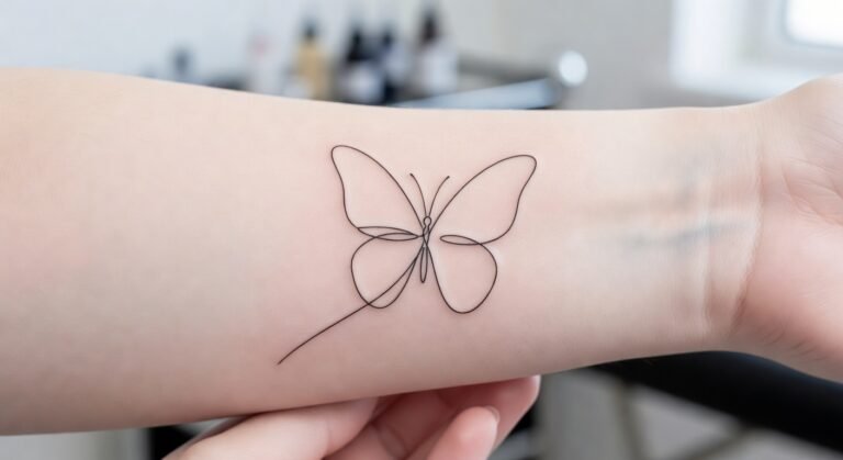
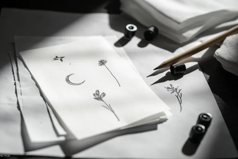
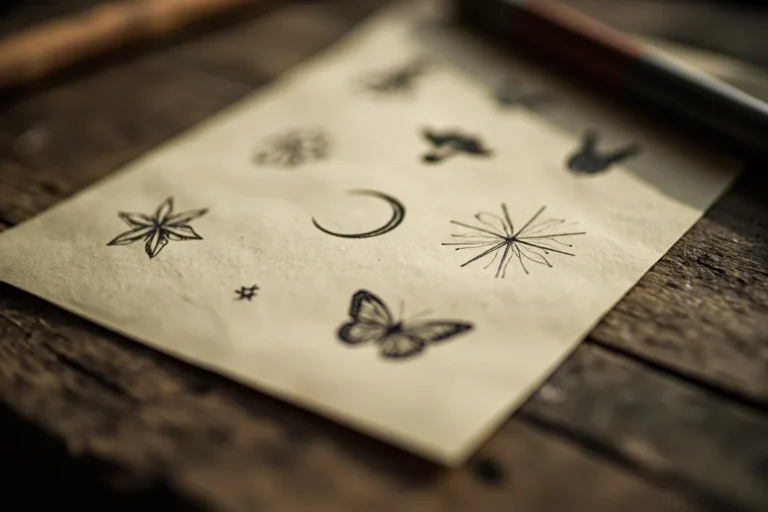
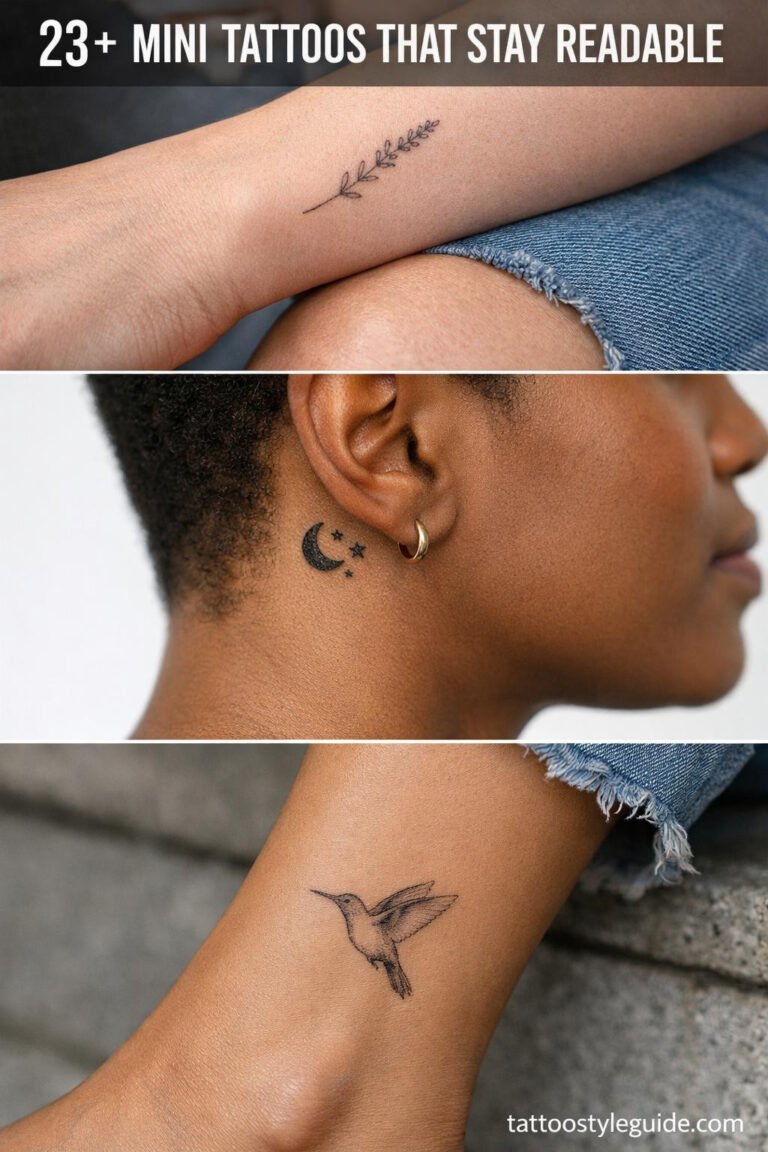
Fine Line
What it actually is
Fine line uses needles grouped tightly, often single needle or three-round liner, to draw hair-thin marks. The best work has restraint. The artist knows which lines need weight to survive, which can stay whisper-light, and where to leave skin breathing room so the design does not close up as it heals.
The danger is seduction. Fresh fine line looks immaculate. Instagram rewards it. Healed fine line tells the truth. Lines that were too shallow, too small, or placed on high-turnover skin will soften into gray fuzz. A line that looked crisp at two weeks may be a suggestion at two years.
Where it works and where it fails
Stable placements are the forearm’s inner surface, the upper arm, the shoulder, the calf. Areas with less friction, less sun, and less movement. The ribs can work if the design is simple enough. Fingers, feet, hands, and the side of the wrist are high-risk. The skin there turns over fast and fine lines often do not survive the first year intact.
Ask to see healed photos from at least eighteen months out. Not fresh work. Not filtered work. Healed, in normal light, on skin like yours. If the artist cannot show you this, you are buying a promise, not a result.
American Traditional
The logic of permanence
American traditional is built on a few unglamorous truths: bold black outlines hold, limited color palettes age evenly, readable silhouettes work from a distance. The motifs are familiar for a reason. Roses, daggers, eagles, panthers, ships, hearts with banners. These shapes have been tested across decades of fading skin.
The style is not simple because the artists lacked skill. It is simple because complexity is the enemy of longevity. A traditional tattoo that reads clearly at twenty feet will still read clearly at twenty years, even when the red has cooled and the green has settled.
What to watch for
Poor color packing is the main failure mode. Color that sits too shallow will fall out in patches. Color that is overworked will scar slightly and heal cloudy. The best traditional artists have a rhythm: consistent needle depth, consistent saturation, knowing when to stop. Ask about their ink choices. Some artists mix their own palettes based on years of watching how specific pigments heal in their hands.
This is one of the better styles for first tattoos. It forgives placement. It forgives aging. It does not forgive cheapness, but it does not require the budget of a full back piece to be honest work.
Japanese Traditional
Irezumi as composition
Japanese tattooing thinks in body units, not isolated images. A sleeve is not an arm with pictures on it. It is a flowing garment of narrative. Dragons, koi, hannya masks, peonies, cherry blossoms, waves, wind bars, and background elements like clouds or water are arranged to move with the body. The strongest work has direction. The dragon’s tail continues around the arm. The koi swims upward toward the shoulder. The background unifies what the foreground depicts.
This is not a style for small tattoos. Scale is part of the grammar. A single Japanese motif placed without background, without flow, without relation to the body is often a missed opportunity. It is not wrong, but it is not doing what the style does best.
Finding the right artist
Not every artist who can draw a dragon understands Japanese composition. Look for artists who have studied the structural traditions, who can explain why a certain background element belongs in a certain place, who have built sleeves or back pieces that hold together as whole garments. The work should feel inevitable, not assembled.
Start with the irezumi guide if you are serious about this path. It is a commitment of time, money, and skin. It is also one of the most rewarding traditions when done with patience.
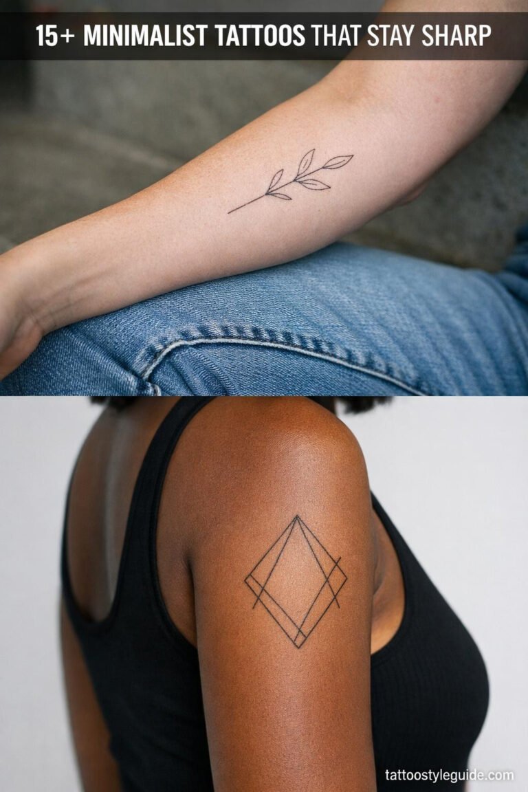
Blackwork and Geometric
Solid black, intentional space
Blackwork uses saturated black, pattern, contrast, and the skin itself as a design element. Geometric work adds symmetry, measurement, and the challenge of making straight lines on curved bodies. The risk is not always the pain, though solid black on bone can be intense. The risk is uneven saturation, crooked symmetry, or designs that ignore the body’s topography.
Fresh black can hide patchiness. A photograph of a new tattoo shows even tone because the surface is still uniform. Healed black tells you whether the artist packed ink at consistent depth. Look for healed photos. Look for older work. Look for black that stayed black rather than settling into mottled gray.
Geometric precision
Geometric tattoos are unforgiving of error. A line that is one degree off will be visible forever. A circle that is not truly circular will nag. The best geometric artists use measurement, stencils, and sometimes custom tools to maintain accuracy. Ask how they handle the curve of the body. A design that is flat on paper must bend to live on skin.
Realism
Reference under pressure
Realism is the translation of photographs into tattoo. Portraits, animals, statues, film stills. The challenge is that skin is not paper and ink is not paint. A tattoo cannot hold every detail from a reference image. The artist must choose what to keep, what to simplify, and what to sacrifice. Good realism is not reproduction. It is interpretation that preserves recognition.
Contrast is the most common failure. A photograph with subtle gradations of gray must become a tattoo with enough black to hold, enough white space to breathe, and enough mid-tone to carry form. Without contrast, realism becomes mush. A face becomes a smear. An eye becomes a dark spot.
The cost of error
Do not approach realism with a budget mindset. A poor portrait is not a quirky tattoo. It is a face you must explain, defend, or eventually cover. The best realism artists charge accordingly because the work demands time, focus, and the accumulated judgment of hundreds of previous pieces. This is not the place for a deal.
Neo Traditional
Between tradition and freedom
Neo traditional keeps the bold outlines and readable structure of American traditional but opens the color palette and subject matter. Animals, portraits, botanicals, and surreal imagery all appear, rendered with more gradation and more hues than the original style allows. The outlines keep it honest. The color keeps it contemporary.
The danger is that the style can become a catch-all. Artists who lack grounding in traditional structure may produce neo traditional that is just illustration with a thick outline. Look for work where the color supports the form, not where it decorates without purpose. The best neo traditional has the same silhouette readability as its parent style, just with more nuance in the rendering.
Watercolor
Color that needs bones
Watercolor tattoos borrow the look of paint on paper: splashes, bleeds, gradients, and organic color flow. They can be striking. They can also be structureless. Color without enough line, contrast, or black anchoring may fade into a soft stain that no longer resembles anything intentional.
The successful pieces usually have more structure than they appear to. A hidden outline. Strategic black. A recognizable shape that holds the color in place. Ask to see healed work from at least a year out. Watercolor that looks good fresh and muddy healed is common. Watercolor that stays legible over time is rare and worth the premium.
Ornamental and Mandala
Symmetry and flow
Ornamental tattoos are built on repeated shapes, radial balance, and the flow of pattern around the body. They are not designs placed on skin; they are designs that become part of the body’s architecture. Sternum, back, shoulder, thigh, and forearm can all work when the scale matches the curvature.
The failure mode is flatness. A mandala dropped onto a curved sternum without adjustment will look stamped on, not grown from. Good ornamental artists adjust geometry for the specific body. They account for movement, for how the design stretches and compresses with muscle and bone.
Patchwork
Collection as strategy
Patchwork is the accumulation of separate tattoos into a larger field. It can look effortless, but the best patchwork is planned enough to avoid chaos. Leave space. Repeat line weight or mood across pieces. Think about negative space as actively as you think about the tattoos themselves.
The common mistake is filling the easiest spots first. The forearm is visible, accessible, and tempting. But a forearm crowded with mismatched pieces can make later, more considered work harder to place. Start with intention, even if the collection grows organically. Know what you are building toward, not just what you want today.
Style Comparison
| Style | Aging strength | Best placements | Main risk |
|---|---|---|---|
| Fine line | Medium | Forearm, shoulder, ribs, calf | Too tiny, too light, wrong placement |
| Traditional | High | Arm, leg, chest, back | Poor color packing |
| Japanese | High | Back, sleeve, thigh, chest | Bad scale or weak background flow |
| Blackwork | High | Arm, leg, back, shoulder | Patchy saturation, uneven geometry |
| Realism | Medium | Upper arm, thigh, back | Low contrast, poor reference translation |
| Neo traditional | Medium-high | Arm, thigh, chest, calf | Weak structure beneath color |
| Watercolor | Low to medium | Forearm, shoulder, thigh | Fading without structural anchors |
| Ornamental | Medium-high | Sternum, back, shoulder, thigh | Flat placement ignoring body curve |
Before You Decide
Your tattoo style choice is permanent in a way the subject matter is not. A rose can be covered. A style is harder to escape. Fine line will ask more of you over time: touch-ups, careful sun protection, acceptance of softening. Traditional will hold but will always read as traditional. Japanese demands scale and commitment to do its best work. Realism requires budget and the right reference.
Match the style to your life, not just your taste. Consider how you dress, how you age, how much maintenance you will actually do. Talk to artists who work primarily in the style you are drawn to. Let them tell you what your idea becomes in their hands. The best tattoo is not the one that looks perfect on a screen. It is the one that lives well on your skin.
Frequently Asked Questions
What tattoo style ages the best?
Bold styles with clear lines, enough negative space, and strong contrast usually age best. American traditional, blackwork, and well-planned Japanese tattoos are strong examples because their structure remains readable even as detail softens.
Do fine line tattoos fade faster?
Fine line tattoos can fade or soften faster when they are too small, too light, or placed on high-friction skin like fingers or feet. Artist skill and placement matter more than the style itself. Healed photos from at least eighteen months out are the best way to judge an artist’s work.
What tattoo style should a beginner choose?
A beginner should choose a style that matches the idea and placement rather than following a trend. Small traditional, clean fine line on a stable area, simple blackwork, or a readable floral design can all work. The key is finding an artist whose primary style aligns with what you want.
How much should I budget for different styles?
Prices vary widely by region, artist experience, and session length. Small traditional pieces may start around $150 to $400. Larger Japanese work, realism portraits, or extensive blackwork can run into thousands. The cheapest option is rarely the best investment for styles that require technical precision.
Can I mix styles in one tattoo?
Mixing styles requires an artist who understands both traditions deeply. Some combinations work naturally, like neo traditional’s blend of traditional structure with expanded color. Others, like realism with watercolor, need careful planning so one does not undermine the other. Always ask how the artist will integrate the elements.