Memento mori is Latin for “remember you will die.” As a tattoo, it’s a deliberate, daily reminder that your time is limited, so you’d better use it. It’s not a dark joke or edgy shock value. It’s a philosophy etched into skin.
People who get this tattoo aren’t morbid for fun. They’re making a statement about how they choose to live. That shift in thinking, from death as taboo to death as motivator, is what makes this one of the most loaded and honest pieces you can wear.
What Memento Mori Actually Means
The phrase dates to ancient Rome. Soldiers returning from battle would have a slave whisper it into their ear during victory parades to keep their ego in check. You won, but you’re still mortal. That humility is baked into the phrase’s DNA. As a tattoo, the core meaning stays the same: mortality is universal, wealth and status don’t exempt you, and awareness of death is supposed to sharpen how you live.
Most people who get this tattoo interpret it as a call to presence. Stop wasting time. Stop drifting. The skull on your forearm isn’t there to scare people. It’s there to remind you, every single day, that the clock is running. That’s a Stoic framing, and it lines up closely with how Marcus Aurelius and Epictetus wrote about death, not as an enemy but as a clarifying fact.
Historical and Cultural Roots
You don't get the tattoo to celebrate death, you get it to stop wasting the life you have.
Beyond Rome, memento mori became a major artistic tradition in medieval and Renaissance Europe. Paintings, coins, jewelry, and pocket watches all featured skulls, hourglasses, and wilting flowers as reminders of death’s inevitability. These weren’t considered morbid. They were considered honest. The bubonic plague had a way of making people take mortality seriously, and artists responded by making it visual.
The Victorian era took this further with mourning jewelry that incorporated hair of the deceased, portraits of the dead, and skull motifs. Día de los Muertos in Mexican culture carries a related spirit, honoring the dead through celebration rather than fear. These traditions all feed into how people understand memento mori imagery today, though the tattoo itself is most directly tied to the Western Stoic and European artistic lineage.
Common Design Variations
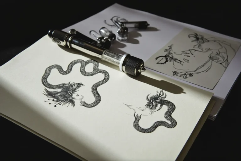
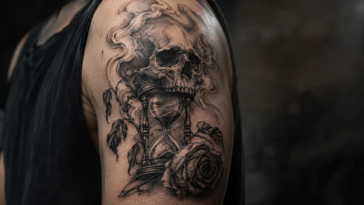
The skull is the most obvious anchor for a memento mori tattoo, but artists build around it in a lot of ways. Hourglasses show time running out. Clocks stopped at a specific hour can mark the time of a loved one’s death. Roses layered with skulls balance life and death in one image. Candles burning down, moths, ravens, and wilting flowers all carry the same message through different visual languages.
Text-only versions, just the phrase “memento mori” in serif lettering or a classic script, are clean and readable from across the room. Some clients pair it with “carpe diem” to get both sides of the coin: remember death, seize the day. Reaper figures, coffins, and anatomical hearts show up in more elaborate pieces. Whatever the imagery, the composition should feel intentional. Every element earns its space or it’s just clutter.
Black and Grey vs. Color
This subject fits black and grey like a glove. The muted tones, the contrast between deep blacks and soft greys, the way whip shading gives skulls dimension without weight, all of it suits the solemnity of the theme. A solid black and grey skull with crispy lines reads well and heals nice, especially in a style like neo-traditional or fine line realism. The palette matches the concept.
Color isn’t wrong, but it changes the tone. A colorful memento mori, say a skull surrounded by bright marigolds in a Día de los Muertos style, leans celebratory rather than contemplative. That’s a legitimate interpretation. Some clients want that warmth. Saturated purples, deep reds, and gold accents can look stunning and still carry the meaning. Just know the emotional register shifts when you add color. Clear that up before your artist starts sketching.
Best Placements and How It Ages
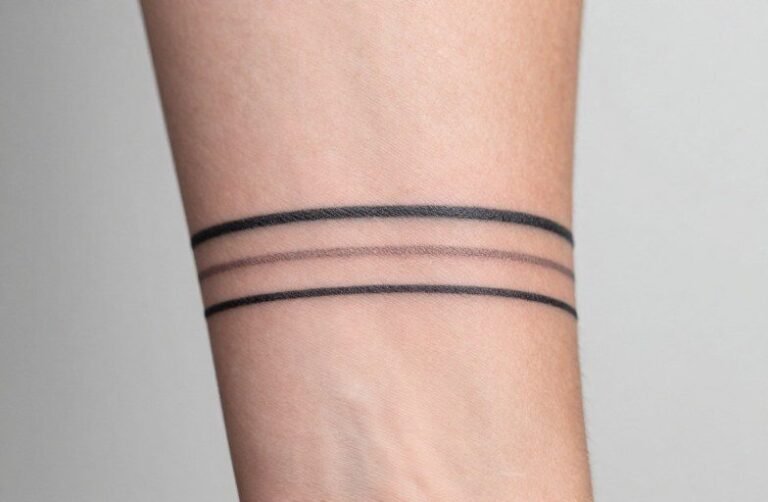
For a text-only piece, the forearm and collarbone are strong choices. The lettering stays legible, the client sees it daily, and low-wear skin means the fine details hold for years. Skull pieces with more complexity, especially anything with fine line shading or tight detail, do best on the upper arm, chest, or thigh. These are flatter surfaces with less movement, so the ink stays crispy longer.
Stay away from fingers, the inner wrist crease, and the side of the hand if you want longevity. High-wear zones blow out fast and fade within a year or two. A bold, well-executed skull with solid black areas and confident linework will hold its form far longer than a delicate fine line piece in a spicy spot. Talk to your artist honestly about your lifestyle. Someone who works with their hands needs a different placement plan than someone who doesn’t.
Who Gets This Tattoo and Why
Stoics and philosophy readers are a natural fit. So are people who’ve been close to death, their own or someone else’s, and walked away changed. Grief tattoos and cancer survivor tattoos often land on memento mori imagery because it doesn’t flinch from what happened. It names it directly. That directness is part of what makes the piece feel honest rather than sentimental.
Military veterans, first responders, and healthcare workers get this piece at a high rate. People in those fields live with mortality in a way most don’t, and the phrase carries real weight when it comes from actual experience. Beyond those groups, anyone who wants a daily reality check carved into their skin is a candidate. This isn’t a trend piece. People who get it tend to mean it, and that sincerity usually shows in how they wear it.
Making It Personal Without Losing the Meaning
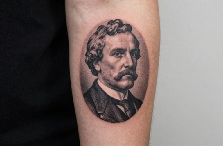
A birth date, a death date, or initials worked into an hourglass or scroll can anchor the piece to a specific loss without spelling out every detail. That keeps the meaning private and layered. Portraits combined with memento mori elements are another direction, honoring someone specific while keeping the broader philosophical message alive. Your artist can help you find that balance between personal and legible.
Avoid watering it down. Some clients want to soften the theme until the piece says nothing. Tiny butterflies everywhere, rainbows, cursive fonts that can’t be read past three feet. Memento mori lands because it’s direct. Keep the composition bold and the linework confident. Let it breathe. A well-placed, well-executed skull says more than a cluttered piece trying to soften a hard truth. Own what you’re putting on your body.