I’ve been putting image tattoos on skin for over a decade now, and here’s the thing nobody tells you upfront: not every beautiful picture wants to live on a body. I’ve had clients walk in with magazine spreads, Instagram screenshots, even framed family portraits, wanting them replicated exactly. Sometimes it works. Sometimes I have to be the guy who says, “This will look like mud in three years.” Image tattoos are about translation, not photocopying. You’re taking something flat and making it survive on curved, moving, aging skin. Let me walk you through what actually works in a real shop.
Popular Styles That Hold Up
Photorealism vs. Stylized Interpretation
Photorealistic image tattoos are the flashy portfolio shots every artist posts. I’ve done portraits where you can count eyelashes, where the client’s mom cried looking at it. But here’s the shop-floor truth: that level of detail needs space, good skin, and commitment to touch-ups. I did a photorealistic wolf face on a guy’s shoulder three years ago. Today the fur texture is softening, the deepest blacks have gone slightly blue-gray. It’s still striking, but it’s becoming a painting, not a photograph. Stylized interpretations, think bold outlines, simplified values, graphic poster-style work, often age cleaner. I tell clients: “Do you want this to look incredible for Instagram tomorrow, or do you want to still love it at your kid’s graduation?”
Black and Gray vs. Full Color
Black and gray image work is forgiving. It relies on contrast, and contrast survives. I’ve seen fifteen-year-old black and gray portraits that still read clearly from across a room. Color image tattoos? They’re a different beast. Bright reds and yellows fade fastest. Blues and greens hang around longer but can shift weirdly, turquoise sometimes goes almost gray, deep purples can look brown. I did a full-color image of a client’s childhood dog, that golden retriever orange-gold fur, and we had a long talk about how that specific warm tone would need refreshing. He came back in two years for a saturation pass. No shame in that. It’s maintenance, like tires on a car.
- Photorealism: stunning short-term, needs larger scale, plan for touch-ups
- Stylized/graphic: bolder lines, clearer aging, more placement flexibility
- Black and gray: classic longevity, reads at distance, lower maintenance
- Full color: vibrant initially, factor in future refresh sessions
Design Ideas That Actually Work
Portraits and Faces
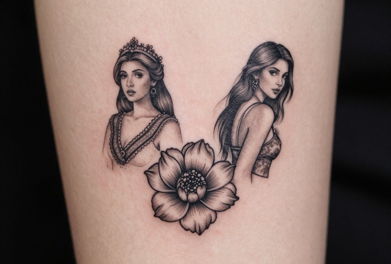
Portrait image tattoos are what people think of first. I’ve done deceased parents, living children, celebrity icons, even that one guy who wanted his own face on his own thigh (we talked him down). The key with faces is minimum size. I won’t do a portrait smaller than the palm of my hand. Anything less and the features collapse, noses become blobs, eyes lose their whites, expressions flatten into something uncanny. I always ask clients: “What expression matters most?” A slight smile is easier to maintain long-term than full teeth. Teeth go weird. I don’t know why, but they do. Something about the negative space.
Animals, Nature Scenes, and Objects
Animals are forgiving subjects. Fur texture hides aging. I’ve tattooed wolves, lions, pet cats, a client’s pet tarantula (that was a first). Nature scenes, forests, mountains, ocean waves, work best when you pick a focal point. The biggest mistake I see is trying to cram an entire landscape into a 4-inch space. It becomes visual noise. Pick the one tree, the one wave crest, the one mountain silhouette. Objects like cameras, musical instruments, vehicles? They need to be recognizable at a glance. Simplify the mechanical details. I’ve seen beautiful vintage camera tattoos where every dial and button was rendered, and two years later it’s just a confusing rectangle with dots.
- Portraits: palm-sized minimum, soft expressions age better, avoid tiny details
- Animals: fur and scales hide wear, pick dynamic poses over static
- Nature: single focal points beat busy scenes, silhouette versions last longer
- Objects: simplify mechanics, prioritize instant recognition
Best Placements for Image Tattoos
Flat Canvas Areas
Image tattoos need relatively flat, stable skin to read properly. I love the outer thigh for larger pieces, plenty of real estate, minimal distortion from movement, easy to heal because it’s not rubbing on clothing constantly. The upper back, between shoulder blades, is classic for a reason. I’ve placed countless image designs there: family portraits, spiritual imagery, memorial pieces. It frames nicely, ages evenly, and the client can actually see it in a mirror without gymnastics. The outer upper arm is another workhorse placement. It’s social, people see it when you gesture, but it’s not screaming for attention in every room.
Areas to Approach Carefully
Ribs. I hate to say it because clients love ribs, but image tattoos there suffer. The skin stretches dramatically with breathing, the area gets sun when you’re at the beach, and the healing is annoying because everything rubs, bra bands, shirt seams, seatbelts. I’ve done beautiful rib pieces, but I warn people: expect some blur, expect touch-ups, expect to be extra careful with sunscreen forever. Inner biceps are similar, soft skin, lots of movement, tendency to blow out slightly. Hands and fingers? I talk most image tattoo clients out of these. The detail just doesn’t survive. I’ve watched crisp image work on hands become unrecognizable smears in five years. It’s not the artist’s fault. It’s biology.
- Thigh and upper back: stable, flat, good for detail, easier healing
- Upper arm: visible but controllable, frames well with other work
- Ribs and inner bicep: possible but higher maintenance, more distortion risk
- Hands and fingers: generally avoid for detailed image work
Color Choices and Aging Reality
Color in image tattoos isn’t just about what looks good fresh. It’s about what pigment does under skin over time. I’ve watched yellows and oranges fade to almost nothing in sun-exposed placements. I’ve seen reds go pink, then go almost flesh-toned. Blues and greens are the survivors, cobalt, emerald, teal, they have staying power. Blacks do the heavy lifting in most image work I do. They create structure, define edges, provide the contrast that lets other colors pop. I often design image tattoos with a “black and gray foundation”, if the color fades, the image still reads. It’s insurance.
Skin tone matters more than most clients realize. On darker skin, I often push for bolder outlines and higher contrast. Subtle color gradations that look beautiful on pale skin can disappear entirely. I’ve learned this in my chair, watching healed results, adjusting my approach. There’s no one-size-fits-all. A good artist looks at your actual skin, not a color chart.
- Blues and greens: longest lasting, most stable
- Blacks: structural foundation, essential for longevity
- Yellows and oranges: plan for fading, especially with sun exposure
- Reds: can shift to pink or brown, choose deeper crimsons over bright scarlet
Tips for Choosing Your Image Design
Reference Quality Matters
The best image tattoos start with the best references. I can work magic, but I can’t invent clarity. Bring me a blurry phone photo from 2007 and we’re both struggling. Bring me high-resolution, well-lit images with clear shadows and distinct values, and I can translate that to skin. I tell clients: “Think like a painter choosing a subject.” Is there one light source? Are the important shapes clear even when you squint? Does the emotion come through without every tiny detail? I once had a client bring a professionally shot portrait of her grandmother, dramatic side lighting, every wrinkle visible. We used it. Five years later, that tattoo still stops people in the street.
Trust the Translation Process
Your artist isn’t being difficult when they suggest changes. We’re being practical. I’ve had clients married to a specific background that would be a muddy gray blob in two years. I’ve had to explain why a complex pattern behind a portrait would compete with the face. The translation to tattoo involves losing some elements, emphasizing others, sometimes changing composition entirely. The best image tattoos I’ve done came from collaborative push-and-pull. The client brought the meaning, I brought the technical knowledge of what survives. Find an artist whose healed work you can see, Instagram fresh shots are useless. Ask to see five-year-old photos. Real shops have those. We take them at touch-up appointments.
- Bring multiple high-res references, not one blurry image
- Be open to composition changes for longevity
- Ask to see healed and aged work, not just fresh tattoos
- Discuss future touch-up plans before you start
- Consider the story: will this image still matter to you in decades?
Final Thoughts
Image tattoos are some of the most meaningful work I do. I’ve cried with clients finishing memorial pieces. I’ve celebrated with them revealing surprise portraits to family members. But the emotional weight has to pair with technical reality. A beautiful image poorly translated to skin becomes a burden, something you hide instead of show. Take your time choosing. Find an artist who does this specific work regularly, not someone who dabbles. Ask hard questions about aging. Budget for the size and detail level that actually works, not the smallest possible version. And remember: your skin is living material, not paper. The best image tattoos respect that difference and become part of you rather than just on you. I’ve got a waitlist right now for a reason. Good image work is worth waiting for, worth paying for, worth maintaining. Treat it that way from day one.
Frequently Asked Questions
How big does a portrait tattoo need to be to look good long-term?
I won’t go smaller than palm-sized for any portrait with recognizable features. Anything tighter and noses flatten, eyes lose definition, and expressions go weird. Bigger gives the detail room to breathe as it ages.
Can I get a full-color image tattoo if I work outdoors?
You can, but be honest about maintenance. Sun exposure nukes color fast. I tell outdoor workers to plan for more frequent touch-ups, budget for that, and get religious about SPF on the tattoo. Black and gray might be smarter for your lifestyle.
Why do some image tattoos look blurry after a few years?
Usually it’s one of three things: too small for the detail level, poor aftercare during healing, or natural skin changes over time. Some areas like ribs and inner arms blur faster due to movement and skin texture. Good design choices upfront prevent most of this.
Should I bring my own design or let the artist create it?
Bring your references and your meaning, but let the artist translate it. I’ve seen clients cling to compositions that fight against the body. The best results come from collaboration, your vision plus their technical knowledge of what actually survives on skin.
