I’ve been tattooing for fifteen years, and I can tell you without exaggeration: heavy metal clients are some of the most passionate people who sit in my chair. They know exactly what they want, or they think they do until we start talking about how that intricate Metallica logo is going to blur in five years. I’ve done everything from delicate Iron Maiden Eddie portraits to full black metal sleeve landscapes that took thirty hours. This guide comes from real shop experience, not Pinterest boards. Let’s talk about what actually works on skin.
Popular Styles
Black and Grey Realism
This is what I get asked for most. Clients want that hyper-detailed portrait of Cliff Burton or the realistic rendering of a skull with headphones. Here’s the truth: black and grey ages beautifully on heavy metal imagery because the subject matter is already dark. I’ve tattooed a photorealistic Dio devil horns piece on a forearm that still looks crisp after eight years. The key is contrast. You need those deep blacks and bright highlights, or it all turns to mush. Line work in realism is minimal, so the skin does the talking as it heals. I always tell people: realism demands good skin care and sun avoidance, or you’re watching your favorite album cover turn into a grey blob.
Blackwork and Neo-Traditional
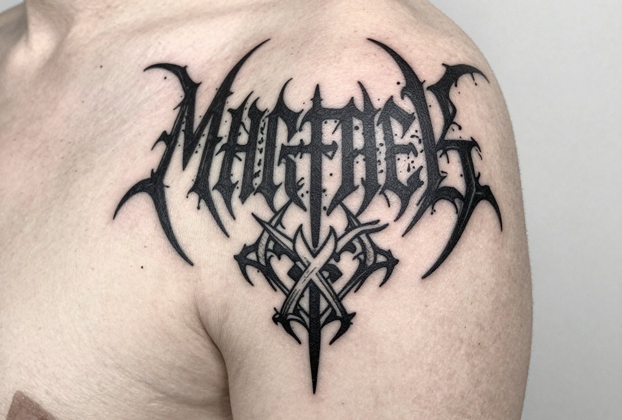
When someone wants a bold Slayer eagle or a traditional dagger through a skull, this is where we land. Blackwork holds. I’ve seen thirty-year-old black metal logos that still read clear from across a room because the original artist packed solid black and didn’t try to get fancy with grey wash. Neo-traditional gives you that bold line weight with a bit more illustrative flair, color optional. In my shop, we do a lot of neo-trad demons, reapers, and medieval imagery for metalheads who want something that references the aesthetic without copying an album cover verbatim.
- Blackwork: best for logos, sigils, and text-heavy designs
- Neo-traditional: great for character pieces with strong readable silhouettes
- Realism: demands larger size and experienced artist, rewards with stunning results
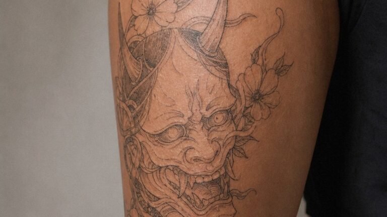
- Illustrative/etching style: increasingly popular for band portraits in crosshatch style
Design Ideas
Band Imagery and Logos
The classic. I’ve tattooed the Iron Maiden font more times than I can count. The Megadeth Vic Rattlehead. The Metallica ninja star. What people don’t consider: logos are designed for album covers, not skin. Thin lines in the Misfits skull? They spread. That intricate Celtic knot in a Primus logo? It becomes a black smear on a calf. I always push clients toward simplified versions or we redraw the logo with tattoo-specific line weights. I’ve had grown men cry happy tears getting their first band logo. I’ve also covered up badly done ones that aged like milk.
Original Dark Imagery
Some of my favorite pieces aren’t band-specific at all. A client brought me a concept for a plague doctor in a leather jacket covered in patches. Another wanted a mountain landscape made entirely of amplifier stacks. These original concepts let you reference the culture without the copyright headaches or the dated feeling of a specific album era. I’ve tattooed ravens with microphone heads, skeleton hands doing devil horns, coffins with turntables inside. The metal aesthetic is broad enough to build something personal.
- Reimagined mascots: Eddie in a different style, Vic Rattlehead with personal touches
- Dark fantasy: demons, warriors, post-apocalyptic scenes
- Musical elements: guitars as weapons, amps as architecture, vinyl as portals
- Occult and esoteric: sigils, alchemical symbols, runes (research meanings, please)
Best Placements
Placement changes everything. I’ve tattooed full back pieces of Bathory album art and tiny wrist logos that took twenty minutes. Both can work. Both have different rules.
High-Visibility Spots
Forearms, calves, hands. These are where metal tattoos live most visibly. I did a killer forearm piece of a skeleton in a denim vest covered in tiny band patches, each one readable because we had the real estate. Calves are underrated: flat skin, good for rectangular designs like album covers. Hands are commitment territory. I won’t tattoo a hand on someone who doesn’t already have substantial work. The skin there is different. It sheds faster, ink falls out, and that killer logo you wanted becomes a faded suggestion.
Large Canvas Areas
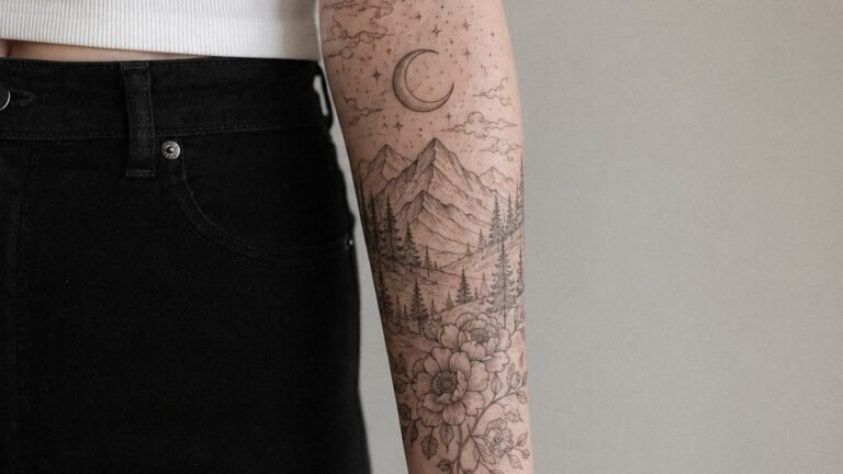
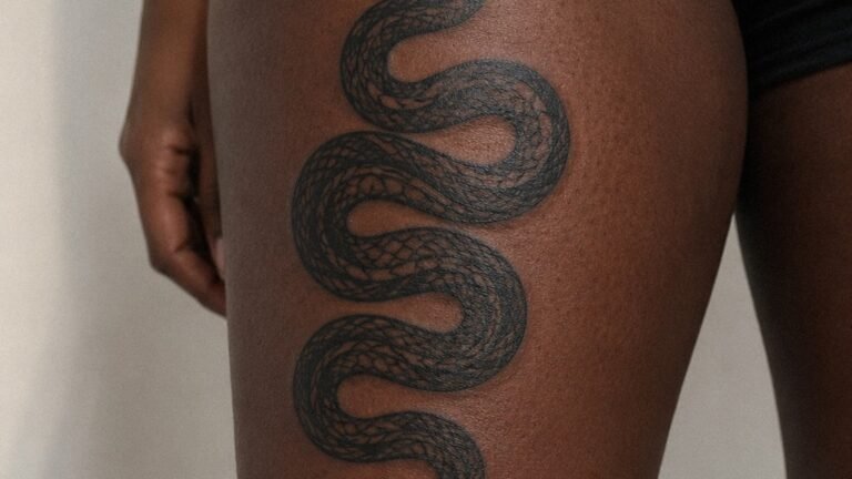
Thighs, backs, ribs, chest. For the serious collector. I spent forty hours on a back piece that was essentially a black metal landscape: dead trees, a burning church in the distance, wolves with glowing eyes. The ribs almost killed the client. We split it into six sessions. Large pieces let you do narrative work, multiple characters, atmospheric depth. The trade-off is time, money, and pain. I’ve had clients pass out on ribs. I’ve had others meditate through sternum work like it was nothing. You don’t know until you’re in it.
- Forearm: social visibility, moderate pain, excellent for medium-sized designs
- Calf: flat surface, lower pain, great for vertical compositions
- Thigh: hidden when needed, large area, tolerable pain for most
- Back/chest: ultimate canvas, demands commitment, worth it for serious pieces
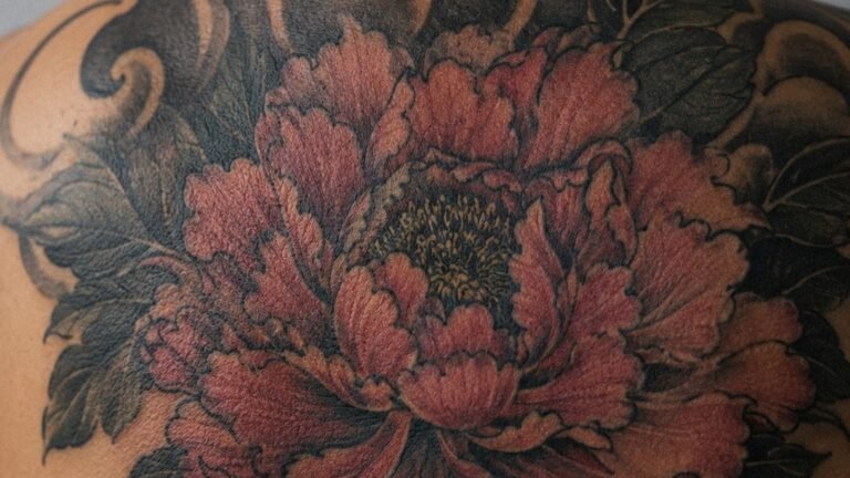
Color Choices
Here’s what I tell every metal client who wants color: think about what you’re actually seeing. Most heavy metal imagery is dark. That doesn’t mean color doesn’t work, but it needs purpose.
Red is the most requested. Blood, fire, demonic eyes. Red ages well if it’s saturated, not washed out. I’ve seen crimson demon wings that looked incredible at year ten because the artist packed it solid. Orange and yellow for flames? Trickier. They fade to a mustardy nothing unless you go bold. I did a piece with electric blue lightning behind a black skeleton that still pops because we used that blue as an accent, not a main event.
Black and grey with selective color is my recommendation for most metal work. One accent color, used sparingly, draws the eye without fighting the darkness. All-color pieces work for power metal, some prog, anything with that fantasy illustration vibe. But for death metal, black metal, doom? Let the black do the heavy lifting. I’ve watched too many colorful pieces look muddy in five years because the client wanted everything bright and the skin had other plans.
- Black and grey: timeless, reads at any distance, matches the aesthetic
- Selective red: blood, fire, eyes, classic metal accent
- Bold primaries: for classic heavy metal, NWOBHM, power metal styles
- Muted earth tones: for folk metal, Viking themes, naturalistic dark imagery
Tips for Choosing
Research Your Artist
Not every tattooer does dark imagery well. I’ve seen portrait specialists struggle with black metal atmosphere. I’ve seen traditional artists nail a Slayer piece because they understand bold simplicity. Look at healed photos, not just fresh work. Ask about their experience with the style you want. I turn down work I’m not right for. Good artists do. The ones who say yes to everything are the ones you worry about.
Think Long-Term
That band you love right now? Will you love them in twenty years? I have clients who got logos of bands that broke up, went mainstream in ways they hated, or had members do terrible things. A general aesthetic piece ages better than a specific logo. I’ve also done cover-ups of band tattoos that became embarrassing. The imagery should mean something beyond the moment. I got my first tattoo at nineteen. It was a band logo. I don’t regret it, but I understand now why my artist tried to talk me into something more personal.
- Bring reference, but let the artist interpret for skin
- Budget for quality; heavy metal detail takes time and skill
- Consider the long-term cultural context of imagery, especially controversial symbols
- Plan for multiple sessions on large pieces; healing between matters
Final Thoughts
Heavy metal tattoos are about identity. They’re about belonging to something louder and more raw than the mainstream. I’ve watched clients sit through eight hours of needle work without flinching because the meaning carried them. I’ve also watched people make impulsive choices they later regretted. The difference is usually preparation and honest conversation with your artist. Come in with passion, but listen when we talk about line weight, placement, and how skin actually holds ink. The best heavy metal tattoos I’ve done aren’t the most technically complex. They’re the ones where the person and the image were genuinely connected. That’s what lasts longer than any pigment.
Frequently Asked Questions
Will a detailed album cover tattoo look good in ten years?
Probably not if it’s copied exactly. Album art is designed for paper and screens, not skin. I always redraw detailed covers with bolder lines and simplified shapes that will age readable. The essence stays, the fragile details go.
Is it weird to get a tattoo of a band I’ve never seen live?
Not at all. I’ve tattooed classic metal imagery for people born after the band broke up. Connection to the music matters more than a ticket stub. Just be honest about why the art speaks to you.
Do hand tattoos really fade that much faster?
Yes, they do. Hands shed skin constantly, get sun exposure, and take abuse. I warn every client: that crisp logo will soften significantly. Some people love the worn-in look. Others are devastated. Know yourself before you commit.
How do I find an artist who actually understands metal culture?
Look at their portfolio for dark imagery, not just technical skill. Ask them about bands they like. I’ve had great sessions bonding over shared albums, and that understanding shapes better tattoos. The conversation matters as much as the Instagram grid.