A realistic cherry blossom tattoo isn’t some clip-art branch stamped on a shoulder. Done right, it’s a study in impermanence, petals caught mid-fall, edges curling, color bleeding from soft pink to white to nothing. I’ve tattooed these on ribcages, forearms, collarbones, and once a full back piece that took six sessions. The good ones make you feel like you could blow on the skin and watch them scatter. The bad ones look like bubblegum stickers. Here’s how to land in the first camp.
Origins & History
From Japanese Tradition to Western Realism
Cherry blossoms, sakura, carry weight in Japanese culture that most Western clients only vaguely grasp. Mono no aware, the pathos of things, the beauty in transience. Traditional Japanese tattooing (irezumi) used cherry blossoms as background filler, wind bars, seasonal markers. They weren’t typically the main event. The realistic approach we’re talking about now is largely a Western evolution, maybe two decades old, where photorealism techniques got applied to organic subjects.
I tell clients who want “something Japanese” that realism and irezumi are different bloodlines. You can reference the symbolism, but the visual language changes. Realism wants depth, shadow, individual petal texture. Traditional Japanese wants flat pattern, bold outlines, symbolic clarity. Both are valid. I’ve done cover-ups where someone got a realistic sakura piece from an irezumi specialist and it looked confused, wrong tool for the job.
What the Symbolism Actually Means
People ask about meaning constantly in my chair. Cherry blossoms represent the obvious: life is short, beauty fades, appreciate now. But I’ve also tattooed them for clients marking recovery, new beginnings, lost parents, survived accidents. The flower doesn’t care about your story. You bring the meaning. The artist brings the image. That’s the deal.
Key Characteristics & Motifs
Realistic cherry blossom work has specific technical demands that separate it from stylized or traditional approaches.
- Petal transparency: Real sakura petals are thin, slightly translucent. Good artists build this with white ink highlights, negative space, and careful gray wash underneath color. Bad artists make them opaque and plastic-looking.
- Edge variation: Petal edges aren’t smooth. They split, brown slightly, curl under. I spend probably 40% of my petal time on edges alone, tiny whip shading, single needle detail, making sure that slight decay reads as alive, not dead.
- Branch texture: Cherry wood has character: lichen patches, rough bark, young green shoots near blossoms. Smooth branches kill the realism instantly. I use magnum shaders for bark texture, then come back with liners for fine cracks.
- Movement and composition: Static branches look like diagrams. The best pieces show wind, gravity, a moment caught. I angle petals, overlap them deliberately, let some blur slightly at edges to suggest motion.
- Stamens and pistils: Those tiny filaments with dark anthers? They’re detail work that clients don’t notice consciously but feel subconsciously. Skip them and something’s missing. I use a tight 3-round for these, sometimes hand-poked for precision on small pieces.
Color vs Black and Grey
Color Realism
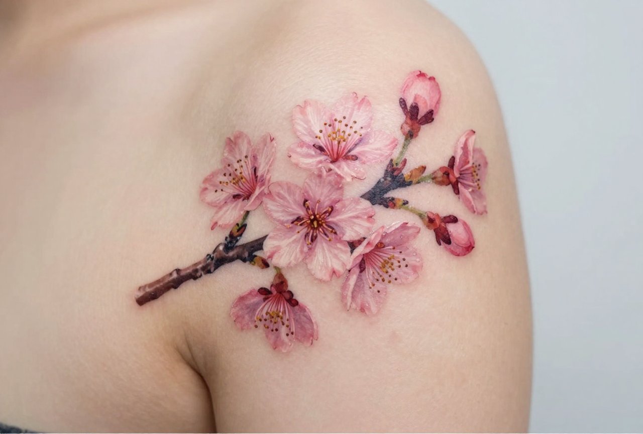
Color cherry blossoms are what most people picture: soft pinks, white with blush centers, maybe pale green stems. The challenge is pink fades fast. I’ve seen beautiful sakura pieces go muddy in five years because the artist used cheap magenta or packed too dense. I mix my pinks from red, white, and tiny touches of violet, never straight out the bottle. The white ink I use for highlights is quality stuff; cheap white yellows or disappears entirely.
Skin tone matters hugely here. On darker skin, I often push toward deeper magentas and use more contrast rather than subtle pastels. On very fair skin, I can get away with whisper-thin color that barely registers from across the room. That’s the goal sometimes: something you have to lean in to see.
Black and Grey
Black and grey cherry blossoms are underrated. Without color, you’re relying entirely on value, how light, how dark, where they meet. The best black and grey sakura work I’ve seen uses extreme contrast: velvety dark branches, almost-white petals with just enough gray to show form. It ages better than color, no question. I’ve got black and grey floral pieces on myself that look sharp after fifteen years. My color work? Softer, more lived-in.
Some clients choose black and grey specifically for the fade factor. Others because they want the piece to read as photographic, like an old film still. Both work. The wrong choice is letting an artist talk you into color because that’s their comfort zone.
Best Placements
Where this goes on the body changes everything about how it reads.
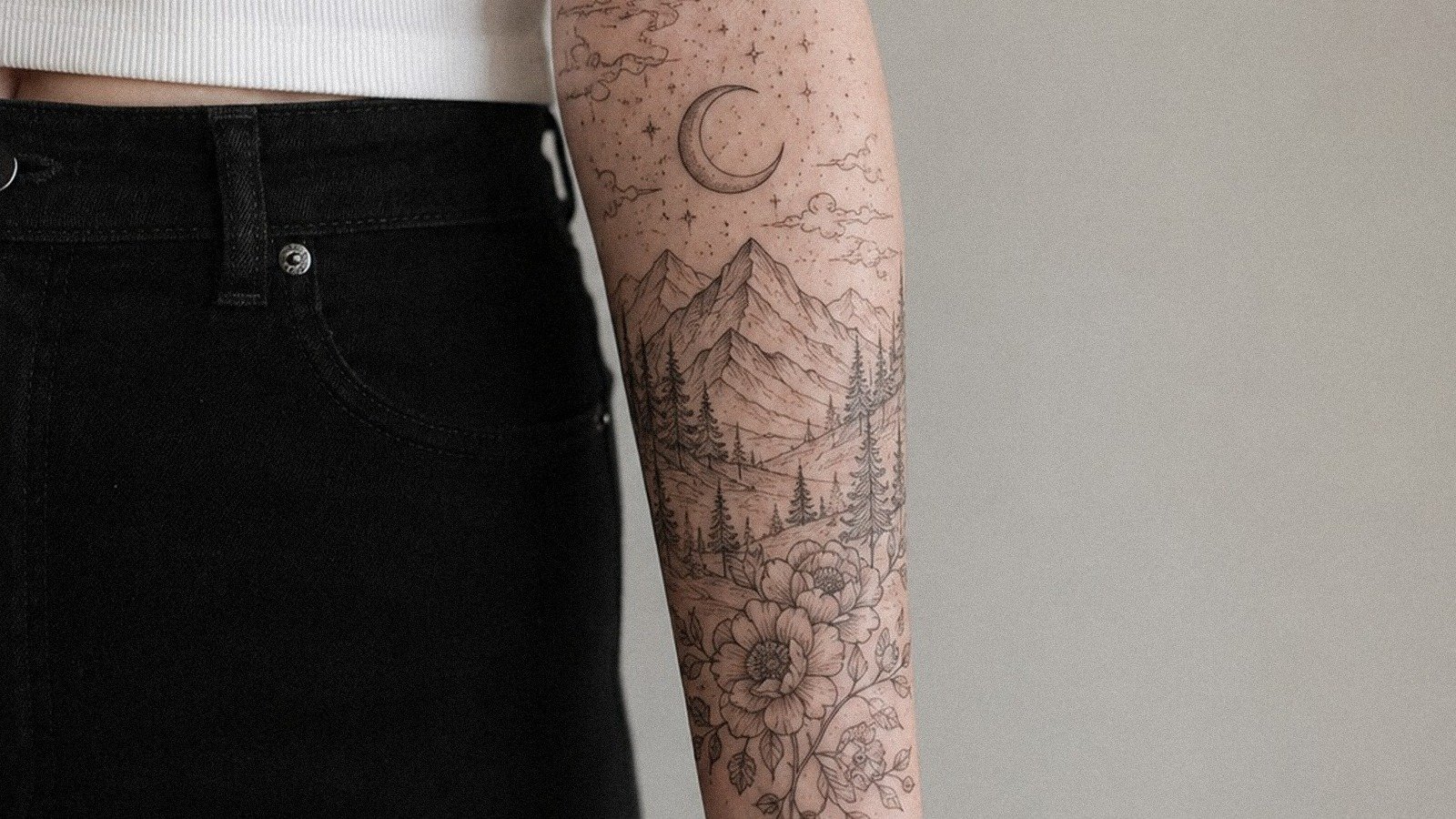
- Shoulder to collarbone: Classic placement. The branch can follow the clavicle, petals can drift toward the neck or chest. I’ve done dozens here. It frames the face, ages reasonably well because it’s not high-friction.
- Forearm: Visible, conversational. Good for medium-sized pieces with some negative space. The flat plane lets you show petal spread clearly. Watch the wrist bend area, heavy detail there blurs over time.
- Ribcage/side: Painful. Worth it for the canvas size. I’ve done rib pieces where the branch starts near the hip bone and blossoms across the floating ribs. The body’s curve becomes the branch’s curve. But healing’s rough, breathing moves the skin constantly.
- Thigh: Underrated. Large, relatively flat, easy to show or hide. I’ve done full thigh pieces with falling petals that wrap toward the knee. The muscle movement adds subtle life.
- Back: For the committed. Full back sakura with wind, maybe a moon, maybe nothing else. Takes serious time and money. I’ve got one client, three years in, still adding to hers.
Who It Suits
Not a gender thing, though some clients worry. I’ve tattooed cherry blossoms on construction workers, grandmothers, software engineers, other tattoo artists. The question isn’t who but why. If you want it because it “looks pretty,” that’s fine, plenty of art starts there. But you’ll be happier long-term if there’s some personal thread, even a thin one.
Skin condition matters more than people admit. Very dry, sun-damaged skin doesn’t hold fine detail well. I turn down work sometimes, suggest simpler approaches, or recommend skincare prep first. A realistic petal on crepey skin becomes a blob. Honesty in the consultation saves everyone.
Modern Variations
Mixed Media Approaches
We’re seeing realistic sakura combined with geometric frames, watercolor backgrounds, or even dotwork mandalas behind them. I’m skeptical of trends but have done some successful hybrids. The key is hierarchy: the blossom needs to read as primary, the stylized element as intentional contrast. When they fight for attention, both lose.
Single Needle and Micro-Realism
Single needle work, done with one tiny needle instead of groupings, can achieve insane detail. I’ve seen cherry blossoms the size of a quarter with individual stamens visible. The tradeoff is longevity. That fine line spreads, blurs, becomes gray wash eventually. I do micro pieces but warn clients: this is five-year art, not fifty-year art. Some people are fine with that. Know yourself.
Choosing an Artist
This is where most people stumble. Not all realism artists do botanicals well. Not all botanical artists do realism. Look for:
- Healed photos, not just fresh: Anyone can make ink look good for Instagram the next day. Ask for one-year-healed shots. Good artists keep them. I photograph my work at healing, one month, one year.
- Petal-specific portfolio: General realism doesn’t guarantee flower skill. Petals are their own challenge, soft edges, no hard lines to hide behind. Ask how many cherry blossom pieces they’ve done.
- Consultation quality: Do they ask about your skin, your lifestyle, your sun exposure? Do they explain how they’ll handle your specific tone? Or do they just nod and book you?
- Shop culture: I can tell a lot by how an artist talks about other artists. The ones who trash everyone else are usually insecure. The ones who reference peers, who know who’s doing good work in town, who send you elsewhere if it’s not their specialty, those are the ones you want.
Final Thoughts
A realistic cherry blossom tattoo, done well, is a contradiction: something permanent depicting something fleeting. That’s the whole point. I’ve watched clients cry in my chair, not from pain, from seeing something they carried internally finally made visible on their skin. I’ve also watched people sit through four hours for something they picked off Pinterest and regretted by the next summer.
The difference is usually preparation. Not just finding reference images, but understanding what you’re asking for technically. Knowing that soft pink needs touch-ups. That fine detail has limits. That the branch will look different at sixty than at twenty-six. There’s honesty in that. The blossom falls. The tattoo stays. Make sure both parts work for you.
Frequently Asked Questions
How long does a realistic cherry blossom tattoo take to heal?
Surface healing runs about two to three weeks, but the color fully settles over two to three months. I tell clients to expect some flaking and dullness around day five, that’s normal, not damage. Keep it clean, don’t pick, and stay out of sun during that window.
Will the pink color fade completely over time?
Pink doesn’t disappear, but it softens and shifts. Magentas tend to hold better than pale pastels. I usually plan a touch-up at the one-year mark for color sakura pieces, especially if the client tans or swims regularly.
Can realistic cherry blossoms work as a cover-up tattoo?
Sometimes, but the transparency that makes them beautiful works against cover-up needs. Dark old ink needs blocking, and cherry blossoms are inherently light. I’ve done cover-ups with sakura, but only when the old piece was already faded and small.
What’s the price range for a good realistic cherry blossom piece?
In most US cities, you’re looking at $150-$300 per hour for an artist who specializes in this level of realism. A palm-sized piece might be four to six hours. Full sleeves or large back work runs into thousands. Anyone charging significantly less is usually cutting corners on time, equipment, or both.