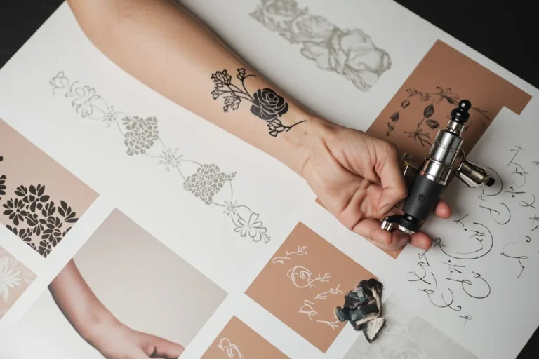
Traditional ship flash occupies a singular spot in American tattooing. The image of a tall-masted vessel cutting through stylized waves has been replicated on shop walls and skin for generations, yet it never quite loses its punch. Done right, it reads immediately from across a room. Done poorly, it collapses into muddy lines and indistinguishable blobs. This guide breaks down what separates the two, how the motif has shifted over decades, and what you should know before committing to the needle.
Origins & History
The ship motif entered Western tattooing through maritime culture, particularly among sailors in the late 19th and early 20th centuries. Atlantic port cities, Baltimore, Boston, New York, became incubators where European techniques met American boldness. The imagery carried practical weight: a ship meant travel, earning, sometimes survival. For those who spent months at sea, the tattoo was both badge and tally mark.
From Sailor Skin to Shop Walls
By the mid-20th century, ship designs had migrated from custom naval pieces to standardized flash sheets. Artists like Sailor Jerry, August “Cap” Coleman, and later Bob Shaw distilled the form into repeatable, readable templates. The transition mattered. Flash demanded clarity at small sizes, consistency in reproduction, and immediate visual recognition. Ships got simpler, fewer rigging lines, bolder sails, heavier outlines. The result was a durable icon that could be knocked out in under two hours and still read clean from ten feet away.
Symbolism Then and Now
Original meanings were straightforward: a ship for nautical miles logged, a fully rigged vessel for rounding Cape Horn, sometimes a specific hull for a sailor’s home ship. Contemporary wearers rarely carry those literal associations. The image persists because of its formal strengths, strong vertical composition, natural framing elements, room for banner text, rather than inherited symbolism. That said, some trace the motif’s ongoing appeal to a broader cultural nostalgia for pre-digital craft and physical travel.
Key Characteristics & Motifs
Recognizing authentic traditional ship flash means looking past the obvious subject matter to specific handling of form. Not every tattoo with a hull and sails qualifies.
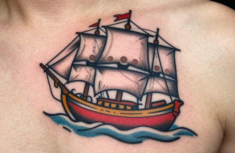
- Heavy black outlines: Typically 7-14 needle groupings, single-pass lines that hold weight even as color fades. The outline does the work; color fills it in.
- Limited but saturated palette: Navy blue, crimson red, mustard yellow, forest green, with black and skin-tone reserved for contrast. No gradients, no soft blends.
- Stylized waves: Repeated scallop or finger shapes, often with white highlights (negative space or solid white ink) suggesting foam. These frame the hull and push the eye upward.
- Cloud or wind bars: Horizontal background elements that create depth without perspective tricks. Usually rendered as solid black masses with stylized edges.
- Banner or ribbon: A scroll beneath or across the composition, sometimes left blank for names, sometimes bearing “HOLD FAST” or similar maritime phrases.
- Rope borders: Twisted cord framing the entire piece, common in knee-ditch placements and chest pieces where the design needs containment.
The ship itself is usually shown broadside or three-quarter view, never head-on. Masts create vertical rhythm; sails provide large, flat color fields that age predictably. The hull sits low, often overlapping the wave forms rather than floating above them.
Color vs Black and Grey
Traditional ship flash is overwhelmingly a color tradition, but black and grey interpretations exist and have their own logic.
Color work relies on the classic palette for a reason: those pigments, particularly the cadmium-based reds and cobalt blues, have proven longevity in skin. A solid red sail stays readable where a pastel pink would disappear into muted rose within five years. The tradeoff is that color ships demand more skin real estate. At under four inches, color fields merge and muddy. Minimum comfortable size for a readable color piece is roughly palm-width.
Black and grey versions strip away the maritime signal but gain graphic starkness. Without color to separate sail from sky, the artist must vary line weight and use whip-shading more aggressively. These pieces often read closer to engraving or woodcut aesthetics. They suit collectors who want the traditional form without the carnival brightness, or who need to work around existing black and grey surrounding pieces.
Best Placements
Ship flash was designed for specific body real estate, and it still shows.
Thigh and Calf
The vertical composition maps naturally onto the long axis of the leg. Thighs offer enough flat plane for detailed hull rigging; calves carry the image well but compress the vertical space, often forcing a simplified mast structure. The outer calf sees significant sun exposure, expect faster fading on red and yellow sails.
Chest and Ribs
Center chest placement lets the hull sit over the sternum with waves spreading to either pec. Rib placement is more common for smaller, single-masted vessels; the curvature distorts broadside views less than you’d expect if the artist accounts for it in the stencil. Breath movement here makes healing tricky, expect longer scabbing on the floating ribs.
Forearm and Knee Ditch
Forearm ships run vertically from wrist to elbow, often with the rope border wrapping the circumference. The knee ditch (back of the knee) is a classic traditional placement that few modern clients request, painful, awkward to heal, but historically significant for the motif. The natural diamond shape of the bent knee fits the hull’s geometry uncannily.
Who It Suits
There’s no demographic lock on this motif, but certain practical factors matter. Ship flash rewards commitment to the style’s constraints. If you want photorealistic rigging, hyper-detailed figureheads, or subtle atmospheric perspective, you’re asking traditional flash to do work it wasn’t built for. The collectors who wear these pieces best are those who genuinely respond to the graphic boldness, flat color, heavy line, deliberate limitation.
Skin tone affects color choices, though less than internet forums suggest. Darker skin carries black and red with exceptional longevity; yellows and light greens may need reinforcement or substitution for oranges and deep blues. A competent artist adjusts the classic palette without abandoning it.
Modern Variations
Contemporary artists have pushed ship flash in several directions without fully abandoning its bones.
- Neo-traditional scaling: Larger formats, more detailed figureheads and crew, sometimes limited background scenes. Still uses bold outlines but adds ornamental elements, mermaids, compasses, swallows, that would have been separate flash pieces historically.
- Japanese influence: Some artists fuse the American ship form with ukiyo-e wave handling, creating hybrid pieces that read as traditional from a distance but reveal different water and cloud logic up close.
- “Wrecked” or burning variants: A subversion of the triumphant sailing ship, showing broken masts, flames, or tentacle attacks. These lean on the same formal structure but invert the emotional register. They require careful handling, without the compositional clarity of the classic form, the image collapses into busy chaos.
Choosing an Artist
Flash work looks simple. The simplicity is deceptive. Every line must be placed with confidence; there’s nowhere to hide a wobble in a single-pass 14-round outline.
Look for portfolios with healed photos, not just fresh work. Traditional color settles dramatically in the first six months, reds darken, whites often drop out partially. An artist showing only fresh photography may not understand their own aging results. Ask specifically about ship or nautical pieces; general traditional competence doesn’t guarantee comfort with the specific geometry of hulls and rigging.
Consultation should cover stencil placement with you standing, not just lying down. Gravity shifts skin differently. A ship that looks level on the table may list noticeably when you’re upright. Good artists check this. Also discuss whether you want the banner blank, lettered, or omitted entirely, it’s a small decision that affects the composition’s balance.
Final Thoughts
Traditional ship flash endures because it solves a design problem elegantly: how to make a complex object readable, beautiful, and durable at small to medium scale. The solutions arrived at by early 20th-century artists, bold outline, flat color, stylized environment, still function. Your job as a collector is to respect those constraints rather than fight them. Find an artist who works within the tradition knowingly, who understands why the sails are red and the waves are fingers, not foam. The result will outlast trends and continue to read clean across rooms and decades.
Frequently Asked Questions
How much should a traditional ship flash tattoo cost?
Quality traditional work typically runs $150-300 per hour, with a palm-sized ship taking 2-3 hours. Flash designs sometimes carry flat rates. Extremely low prices often mean rushed linework or apprentice work, worth avoiding on a piece this dependent on clean outline.
Will the white highlights in the waves disappear?
White ink is the least stable pigment in tattooing. Some artists use negative space (your skin tone) instead, which lasts indefinitely. Ask your artist which approach they prefer and why. Healed photos will show their track record.
Can I add a ship to an existing traditional sleeve?
Absolutely, but placement matters. Ships need vertical or horizontal room to breathe. Cramming one between existing pieces usually forces distortion. A good artist will map the whole limb rather than treating the ship as a gap-filler.
Do ship tattoos age worse than simpler traditional designs?
Rigging lines and thin masts are vulnerable to spread and fade. The classic bold version, with thick masts, minimal fine lines, and solid sails, ages comparably to any other traditional piece. Request simplification if your artist proposes hair-thin detail.