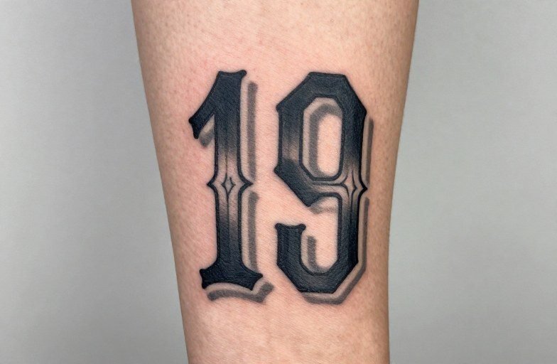
Traditional tattoo numbers are exactly what they sound like: numerals rendered in the bold, graphic style of classic American tattooing. Think thick black outlines, limited but saturated color palettes, and letterforms designed to stay legible for decades. Sailors, soldiers, and working-class collectors have worn these numbers for over a century, dates, lucky digits, coordinates, memorial years. The style prioritizes clarity above all else. A traditional number tattoo should read instantly from across a room, even after thirty years of sun and skin changes.
Origins & History
Naval and Military Roots
The tradition of wearing numbers on skin runs deep through American military and maritime culture. Sailors tattooed ship hull numbers, discharge dates, and longitude-latitude coordinates in ports from Honolulu to Norfolk. The style had to be simple because the conditions were harsh: salt water, sun exposure, and limited time in the chair. Artists developed numeral systems that could be knocked out quickly and would hold up under real abuse. Some trace the popularity of sparrow or swallow tattoos paired with numbers to sailors who wanted distance markers, each bird supposedly representing 5,000 nautical miles.
Counterculture and Prison Crossover
By the 1950s and 60s, traditional number tattoos had spread beyond military circles into biker, hot rod, and prison communities. Different contexts produced different conventions. Street-shop artists refined the style with cleaner lines and more consistent spacing. Prison tattooing, done with limited supplies, pushed toward simpler, more compact numeral designs that could be executed with a single needle and a guitar string. The visual language cross-pollinated. What reads today as “traditional” often blends these lineages, naval boldness with the compressed, blocky efficiency of institutional tattooing.
Key Characteristics & Motifs
Traditional number tattoos aren’t about font choice in the typographic sense. They’re about constructed letterforms built from tattoo-specific principles.
- Stroke weight: Heavy, consistent outlines, usually 7-14RL needles, create the backbone. The interior fill, whether color or black, sits well inside these borders to prevent bleed-out over time.
- Serifs and flourishes: When present, they’re chunky and geometric, not delicate. Think carved wood or cast metal, not calligraphic hairlines.
- Negative space: Traditional numbers need breathing room. Crowding digits together or cramming them into complex backgrounds kills readability.
- Common pairings: Roses, banners, daggers, skulls, and eagles frame numbers in classic compositions. The numeral is usually the focal point; the imagery supports it.
- Date formats: Roman numerals (MCMLXVII style) and Arabic digits (1967) both appear, but Arabic reads faster and ages better at small sizes.
Shading inside numbers, when used, tends toward flat single-pass saturation or simple drop shadows, never smooth gradients. The goal is poster-like impact, not photographic realism.
Color vs Black and Grey
Classic Color Approach
The traditional palette, red, yellow, green, blue, black, gives numbers immediate presence. Red numbers with black outlines pop against most skin tones. Yellow fill demands a heavier hand and more passes; it’s notorious for fading to mustard or disappearing entirely on darker skin. Green, often malachite or seafoam, was a sailor staple and still reads as vintage. Color traditional numbers work best at palm-sized or larger; below two inches, individual color fields blur together during healing.
Black and Grey Durability
Black and grey traditional numbers are arguably the more versatile choice. They heal faster, require fewer touch-ups, and stay legible at smaller sizes. The grey comes from diluting black ink or using a separate greywash, traditional artists often prefer the former for consistency. Over decades, black and grey numbers settle into a soft, weathered look that still reads clearly. Color, by contrast, can shift unpredictably: blues sometimes go muddy, reds can brown out, yellows frequently vanish. For dates you want to carry permanently, birth years, death dates, anniversaries, black and grey offers fewer surprises.
Best Placements
Traditional number tattoos need flat, stable skin to maintain their geometry. Wrinkles, heavy muscle movement, and frequent sun exposure distort numerals faster than organic imagery because the brain expects letterforms to be precise.
- Forearms: The classic choice. Outer forearm for visibility, inner for privacy. Flat plane, moderate sun exposure, easy to show or hide.
- Upper arms (outer bicep/deltoid): Stable skin, good scale, traditional framing with banners or scrolls works naturally here.
- Chest (over pectoral): Bold statement placement. Numbers here tend toward larger scale, often paired with eagles or ship wheels.
- Hands and fingers: High visibility, high maintenance. Knuckle numbers fade fast and blur from constant flexing. The skin here is different, thinner, more prone to blowout. Commit only if you’re prepared for regular refreshers.
- Shins and calves: Good flat surfaces, though shin bone proximity can make the tattoo feel more intense. Lower leg placement was common among sailors for visibility while wearing shorts.
Ribs and stomachs generally suit traditional numbers poorly. The skin stretches and compresses too much; numerals warp and the heavy outlines can spread.
Who It Suits
This style doesn’t demand a particular aesthetic or subculture. What matters is the reason for the number and the commitment to its visibility. Traditional number tattoos read as deliberate, unapologetic, slightly vintage. They don’t whisper. Someone drawn to minimalist fine-line lettering will likely feel this style is too loud. Someone who wants a birth year visible in a T-shirt sleeve will find it perfect.
The style also suits collectors building traditional-heavy limbs. A forearm with a ship, a swallow, and a banner date develops coherence, the numbers belong to the same visual family. Mixed-style sleeves can accommodate traditional numbers, but they need thoughtful placement so the boldness doesn’t fight adjacent realism or watercolor work.
Modern Variations
Neo-Traditional Expansion
Neo-traditional artists keep the bold outlines and limited palettes but introduce more complex ornamental frames, jewel tones, and illustrative detail. Numbers might emerge from a tiger’s mouth or float inside a stained-glass window. The readability rule still applies, but the surrounding imagery gets richer. This appeals to collectors who find pure traditional too sparse but want the numeral to remain the clear subject.
Contemporary Simplification
Some modern practitioners strip traditional numbers to their essentials: black outline, no fill, generous spacing, sometimes slightly irregular hand-drawn quality. This reads as contemporary while nodding to tradition. It ages well because there’s less ink to shift, though the sparse approach can look unfinished to purists. The variation works best at medium to large sizes where the negative space becomes intentional rather than seeming like an incomplete tattoo.
Choosing an Artist
Not every traditional tattooer handles lettering well. Numbers require specific skills: consistent curve weight, proper negative space management, understanding how adjacent digits interact visually. Look for portfolios with healed photos of lettering, not just fresh work. Fresh traditional numbers always look crisp; healed ones reveal whether the artist understands spacing and saturation for longevity.
Ask to see healed dates or numeral pieces at five-plus years. Ask how they handle serifs at your chosen size, whether they thicken them for durability or keep them fine. A confident artist will explain their choices without defensiveness. Be wary of anyone who treats numbers as an afterthought or suggests “we can figure it out on the day.” Traditional numeral tattoos demand planning. The composition is simple, so every proportion matters.
Flash sheets with number options exist, but custom work is standard for dates and coordinates. If you’re bringing reference, vintage naval tattoos and early Sailor Jerry numeral sheets set the right baseline. Avoid computer fonts as direct stencils; they need translation into tattoo-specific forms with adjusted spacing and thickened terminals.
Final Thoughts
Traditional number tattoos carry a straightforward honesty that suits their subject matter. A date is a date. A coordinate is a coordinate. The style doesn’t dress it up with ambiguity, it presents the information boldly and expects it to last. That directness is the appeal. In an era of increasingly subtle and hidden tattoos, traditional numbers remain unashamedly visible, rooted in a craft tradition that values function as highly as form. Choose them for permanence, for clarity, and for the particular satisfaction of wearing something built to be read.
Frequently Asked Questions
How small can traditional number tattoos be before they blur?
Below one inch in height, traditional numerals risk merging and becoming illegible over time. Two inches or larger is the safe standard for long-term readability, with one and a half inches acceptable for simple digits without serifs.
Do traditional number tattoos need touch-ups more often than other styles?
Not necessarily, black and grey traditional numbers actually age well. Color versions, especially yellow and light green, may need refreshing after five to ten years. Hand and finger placements always require more frequent maintenance regardless of style.
What’s the difference between Sailor Jerry style numbers and general traditional?
Sailor Jerry’s numeral work tended toward slightly more refined serifs and specific color combinations, heavy red, green, and yellow with black. General traditional encompasses a broader range of regional shop styles, often slightly rougher or more influenced by prison and biker conventions.
Can I mix traditional numbers with non-traditional tattoo styles nearby?
Yes, but placement matters. Traditional numbers hold their own against bold blackwork or Japanese styles. They struggle adjacent to fine-line, watercolor, or realism where the contrast in weight and saturation creates visual competition rather than harmony.
Related Style Guides
- Traditional Tattoo Stars: Complete Style Guide
- Tribal Sagittarius Tattoos: Complete Style Guide
- 500 Tattoo Designs for Ladies: Real Shop Inspiration
- Explore more