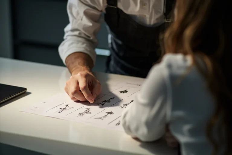
Tattoo flash is the painted or drawn sheet art that hangs on shop walls and lives in binders under the counter. Drawing it well means balancing visual punch from ten feet away with enough technical clarity that another artist can pick up your sheet and tattoo it cleanly. The best flash doesn’t just look good, it functions as a working document in a busy shop.
Start With the Right Paper and Format
Why Heavy Stock Matters
Flash sheets take abuse. They get flipped through by greasy hands, taped to walls, photocopied, and occasionally splashed with green soap. Standard 80lb cover stock (roughly 220gsm) is the minimum; many artists prefer 100lb or watercolor board for originals that will be displayed. Thin printer paper warps, tears at the holes, and looks cheap to collectors.
Standard flash sizes are 11×14 inches and 8.5×11 inches. The larger format gives you room for a big central design with smaller secondary pieces around it; the smaller format forces discipline and photocopies more easily for appointment books. Some artists work on 9×12 cold-press watercolor paper for one-off painted pieces, but that’s gallery flash, not shop flash.
Working Surfaces and Reproduction
Most flash is drawn in pencil, inked, then colored with marker, watercolor, or colored pencil. If you plan to sell reproductions, work on paper that scans cleanly, smooth bristol board captures fine lines better than heavily textured watercolor paper. Many working artists ink on vellum or translucent marker paper specifically so they can run clean photocopies for the colorist to work from without destroying the original line drawing.
Line Work: Readable From Distance, Precise Up Close
Flash line work operates at two scales simultaneously. From across the room, a customer needs to see the silhouette and major shapes. Under a tattooer’s lamp, that same design needs to show exactly where lines start, stop, and overlap.
- Outer contours: Use heavier line weight, 0.5mm to 0.7mm technical pen, or a confident brush line. These shapes need to read at distance.
- Interior detail: Drop to 0.3mm or 0.1mm for texture, fur, fabric folds, or secondary elements. Thin lines recede visually; thick lines advance.
- Line consistency: Wobbly lines in flash suggest wobbly lines in skin. Use tools that help you, light tables for tracing roughs, ellipse guides for wheels, French curves for smooth arcs.
- Overlaps: Show clearly which element sits on top. A dark line break where two forms cross prevents the “melted together” look that confuses tattooers and clients alike.
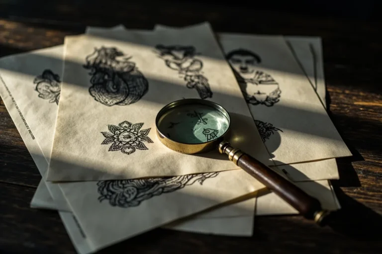
Traditional tattoo line work is bold, but “bold” doesn’t mean crude. The best flash from the 1940s and 50s, think Sailor Jerry, think early Bert Grimm, uses surprisingly delicate interior lines inside heavy borders. Study how those sheets handle hair, leaves, and rope texture without cluttering the overall form.
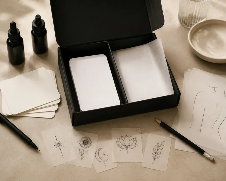
Color Planning: Limited Palettes, Maximum Impact
The Traditional Palette
Classic American flash built its reputation on a restricted palette: red, yellow, green, blue, black, and brown. Limiting yourself forces color harmony and ensures the tattoo will age with some coherence. A sheet with twenty competing colors looks like a candy wrapper; a sheet with six well-deployed colors looks intentional.
Plan for how tattoo ink behaves, not how marker behaves. Markers are transparent and layer cleanly; tattoo ink is opaque, granular, and sits in skin that isn’t white. The bright red you love in Copic marker will heal darker and slightly duller. The soft pink that looks delicate on paper may disappear entirely in pale skin or turn muddy in darker skin. Design with these constraints in mind, saturate your flash slightly more than you think you need, knowing the real tattoo will settle.
Color Application on Paper
Most flash uses flat color fields with minimal blending. This isn’t laziness, it’s clarity. A tattooer reading your sheet at 2 AM needs to know “this area is solid red, this area is solid yellow” without guessing at gradients. Where you do use shading, make it deliberate: a simple drop shadow under a banner, a single-tone gray wash for depth in a skull’s eye socket.
Colored pencil can achieve smooth gradients but scans poorly; marker is faster and more reproducible. Some artists lay watercolor washes first, then ink lines over them, this gives a softer, more painterly look but requires planning your values carefully. There’s no single correct medium, but there is a correct relationship between your medium and how the final sheet will be used.
Designing for the Body, Not the Page
A flash design that ignores human anatomy collects dust. The curved dagger that looks dynamic on paper becomes a distorted smear on a forearm. The perfectly symmetrical chest piece becomes a lopsided mess when the client breathes.
- Flow with muscle and bone: Even on paper, suggest how the design wraps. A snake flash should show the body curving, not rigid. A rose should have a slight tilt that suggests collarbone or shoulder placement.
- Scale indicators: Many artists include a small outline of the body part, palm-sized, forearm, thigh, so customers and tattooers understand proportions without guessing.
- Avoid impossible placement: A design with elements radiating in all directions works on a flat back piece but fights the cylinder of an arm. Flag this in your drawing or in the sheet’s title.
The best flash artists think like tattooers because they are tattooers. They know a hand-sized design needs simpler detail than a thigh piece. They know finger tattoos lose line definition fast. They draw what they want to tattoo, and what they know will heal well.
Composition and Sheet Layout
A single flash sheet usually holds multiple designs. The classic layout places the largest, most visually striking piece top-center, with smaller pieces arranged around it in rough symmetry. This isn’t mandatory, some effective sheets use a grid, a scattered “sticker sheet” approach, or a single large design with no satellite pieces, but the traditional layout persists because it works for shop display.
Leave breathing room. Crowded sheets look chaotic and cheap. Each design needs enough negative space that a customer can mentally isolate it. Titles or labels go at the bottom, traditionally in a simple banner or clean lettering. The artist’s name or shop mark goes somewhere consistent, bottom corner is standard.
Consider the photocopy factor. Flash gets copied, traced, shared. Draw with enough clarity that a third-generation Xerox still holds together. Avoid subtleties that vanish in reproduction: extremely light pencil tones, colors too close in value, hairline details that clog copier drums.
What Makes Flash Sell (or Sit)
Subject matter matters. Flash needs to appeal to walk-in traffic: roses, daggers, eagles, snakes, pin-ups, ships, skulls. These classics persist because people keep asking for them. That doesn’t mean you can’t innovate within the form, new color combinations, unexpected angles, contemporary references, but the core vocabulary connects immediately.
Execution matters more than originality. A beautifully drawn standard rose outsells a sloppily drawn concept piece every time. Customers browsing flash aren’t looking for your personal artistic breakthrough; they’re looking for something they want to wear, rendered clearly enough that they can imagine it on their body.
Pricing flash depends on your market and reputation. Established artists sell original painted sheets for hundreds; working shop flash sells for $20-50 per sheet or gets traded among artists. Digital files have complicated this, some artists sell printable downloads, others refuse to release digital versions to prevent unauthorized reproduction. There’s no universal ethics here, only shop culture and personal choice.
Key Takeaways
- Use heavy paper that survives shop handling and scans cleanly for reproduction.
- Line weight should create immediate visual hierarchy: thick outlines, thin details, clear overlaps.
- Limit your palette and design for how tattoo ink heals, not how marker looks fresh.
- Every design should suggest its intended body placement and scale.
- Composition serves function: readable from distance, reproducible, arranged for customer browsing.
- Execution beats novelty; master the classic vocabulary before attempting to expand it.
Drawing flash is a craft that rewards repetition. The hundredth rose you draw will be better than the tenth, and the thousandth better still. Study the sheets that have lasted, Sailor Jerry, Ed Hardy, the anonymous trad sheets that circulated hand to hand, and notice what they share: clarity, confidence, and a deep understanding that flash is meant to be used, not just admired.
Frequently Asked Questions
What paper do professional flash artists actually use?
Most use 80-100lb bristol board or heavy cover stock. Some prefer vellum or marker paper for clean reproduction, while others use cold-press watercolor board for one-off painted pieces. The key is durability and scan clarity.
How do I price my flash sheets?
Working shop flash typically sells for $20-50 per sheet or trades between artists. Established artists with collector followings can charge hundreds for original painted work. Digital files are a separate market with no fixed standard.
Should I draw flash if I don’t tattoo yet?
You can, but the designs will lack practical knowledge about how they heal and fit the body. Flash drawn by non-tattooers often sits unused because tattooers can spot the gaps in anatomical understanding.
How do I keep my flash from being copied without permission?
Many artists sell physical sheets only, avoid releasing high-res digital files, or watermark online images. Some accept that reproduction is inevitable and build their market on original execution quality that copies can’t replicate.