Colorful traditional tattoos, often called American traditional or old school, are built on a specific visual language: thick black outlines, limited but saturated color palettes, flat shading without gradients, and iconic subject matter like roses, anchors, swallows, and pin-up figures. The style emerged from naval and circus culture in the early 20th century and remains one of the most recognizable approaches in tattooing today. What separates a strong traditional piece from a weak one comes down to line weight discipline, color packing, and respect for the rules that have governed the style for over a century.
Common Mistakes to Avoid
Traditional looks simple, which makes it dangerously easy to mess up. The biggest error is line inconsistency, lines that waver in thickness or lose their boldness under the skin. Traditional demands confident, uniform outlines that hold the design together as it ages. Soft or sketchy lines collapse into indistinguishable blobs over time.
Color Packing Problems
Poor saturation kills traditional work. Color should be packed solid with minimal skin showing through. Patchy red in a rose or uneven yellow in a dagger handle reads as unfinished, not stylized. Another frequent mistake: adding too many colors. Traditional palettes typically run heavy on red, yellow, green, and black with occasional navy or brown. Throwing in purple, orange, and pink without structural reason breaks the visual coherence that makes the style work.
Subject Matter Drift
Mixing traditional linework with photorealistic shading or watercolor splatter usually fails. These approaches fight each other. Either commit to the flat, graphic quality of traditional or choose a different style entirely. Half-measures leave the tattoo looking confused and dated within a few years.
Origins & History
The style’s roots are often linked to sailors and naval culture of the late 1800s and early 1900s, though some trace key elements to even earlier European and Japanese influences. Norman Collins, known as Sailor Jerry, standardized much of what we recognize today through his Honolulu shop in the mid-20th century. His flash sheets, pre-drawn designs hung on shop walls, established the repeatable, bold imagery that traveled with servicemen across the Pacific.
Flash Culture and Accessibility
Flash sheets made traditional tattooing democratic. Clients pointed to a design, artists made minor adjustments, and the work was done efficiently. This practicality shaped the style’s constraints: bold lines read from distance, limited palettes kept costs down, and simple compositions healed reliably under rough conditions. Those constraints became aesthetic virtues rather than limitations.
Evolution Through the 20th Century
After Sailor Jerry, artists like Ed Hardy and later the entire California traditional scene expanded the subject matter while keeping the technical foundations. Japanese motifs, Mexican folk art influences, and later punk rock imagery all filtered through the traditional framework without abandoning its core rules.
Modern Variations
Contemporary artists have stretched traditional in several directions while maintaining its skeleton. Neo-traditional keeps the bold outlines but introduces more complex shading, softer color transitions, and expanded subject matter, often animals, portraits, or ornate decorative elements. The line between traditional and neo-traditional blurs depending on the artist, but the distinction matters for collectors seeking authenticity.
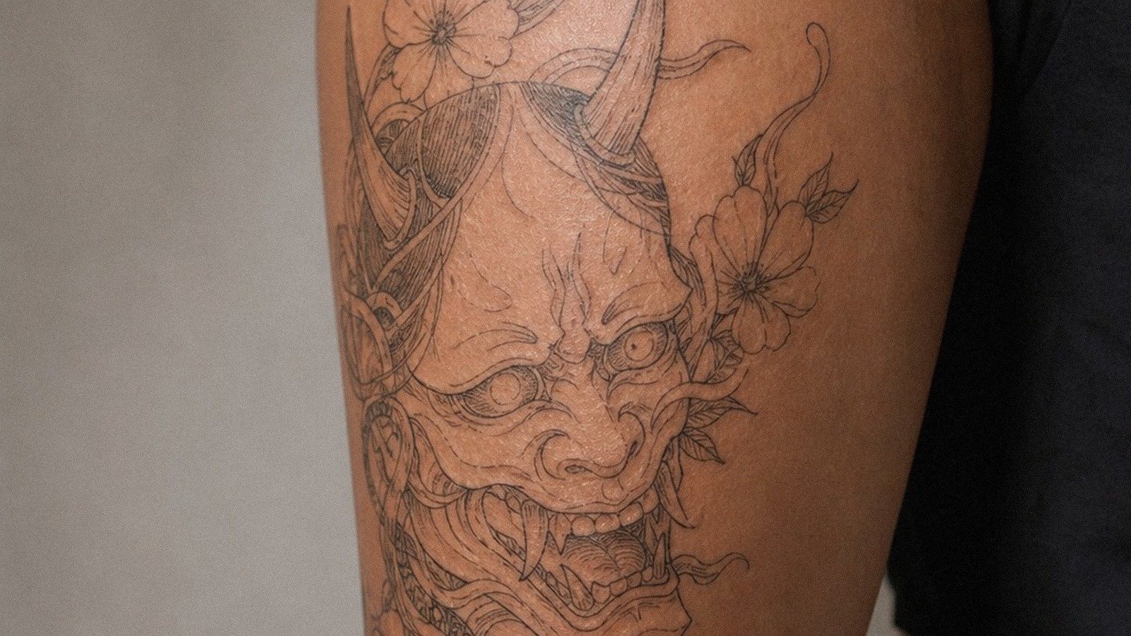
Japanese Fusion and European Traditional
Some shops specialize in Japanese-influenced traditional, incorporating waves, koi, or oni masks with American line weight and color rules. European traditional, sometimes called “Euro traditional,” tends toward darker overall palettes, more black fill, and slightly different iconography, skulls, religious imagery, and military references dominate. These aren’t separate styles so much as regional accents on the same language.
Contemporary Subject Matter
Today’s traditional artists tattoo subjects that didn’t exist in Sailor Jerry’s era: video game characters, modern pop culture references, political imagery. The success of these pieces depends entirely on whether they’re translated into traditional’s visual grammar. A Pokemon rendered with proper line weight and flat color can work beautifully. The same character with soft shading and realistic proportions looks like a mistake.
Best Placements
Traditional tattoos are designed to fit specific body shapes. The style’s graphic quality means it needs enough flat or gently curved surface to display properly. Arms, thighs, and chest panels are classic for good reason, the muscle structure provides stable, predictable canvas.
Arm and Leg Traditions
Outer forearms and upper arms remain the most requested placements. The cylindrical shape shows off the design’s front while wrapping cleanly around the sides. Thighs offer similar advantages with more room for larger compositions. Calf placements work but require careful scaling; too small and the bold lines crowd together, too large and the imagery loses its immediate readability.
Hands, Necks, and Commitment Pieces
Hand and neck traditional tattoos carry specific cultural weight within the tattoo community. These placements were historically earned after building substantial coverage elsewhere. That gatekeeping has loosened, but the visibility remains permanent. Traditional designs hold up better on hands than most styles due to their bold simplicity, though finger tattoos universally fade faster regardless of approach.
Who It Suits
This style favors collectors who want immediate visual impact over subtlety. The boldness that makes traditional readable from across a room also makes it impossible to hide in professional settings without covering clothing. Someone who wants their tattoo to whisper rather than shout should look elsewhere.
First-Timers and Building Collections
Traditional is genuinely excellent for first tattoos. The established rules mean you’re less likely to end up with a piece that looks dated in five years, it’s already dated by a century, and that stability is the point. For building larger collections, traditional sleeves or torso panels integrate cleanly because the style’s consistency allows pieces from different artists to read as unified.
Skin Tone Considerations
Traditional color palettes show up well on lighter skin tones, though skilled artists adjust saturation and line weight for darker complexions. Yellow and light green require particular attention. Black-dominant traditional with strategic red accents often reads more effectively on very dark skin than full color palettes. The style’s heavy outlines help maintain definition across all skin tones better than delicate approaches.
Color vs Black and Grey
Black and grey traditional exists, sometimes called “black traditional”, but it’s a minority approach. The style was built on color, and removing it changes the emotional register significantly. Black traditional tends toward darker, more aggressive imagery: skulls, daggers, spiders, and snakes. The same motifs in full color feel different, often more celebratory or nostalgic.
Healing and Aging Differences
Color traditional tattoos typically heal with more visible peeling and flaking than black work because the saturated color packing creates more surface trauma. Long-term, red and yellow pigments fade faster than black, though traditional’s heavy outlines maintain the design’s structure even as color softens. A twenty-year-old traditional piece often reads clearly as its original image where finer styles have become unrecognizable.
Touch-Up Expectations
Plan on color refreshes every decade or so, especially for pieces with significant yellow or light green. Black traditional ages more gracefully with less maintenance. Neither approach is superior, it’s a trade between initial visual impact and long-term stability.
The Takeaway
Colorful traditional tattoos endure because their constraints are their strength. Bold lines, saturated flat color, and iconic imagery don’t just survive aging, they improve with it, becoming clearer and more graphic as surrounding skin changes. The style demands technical precision from artists and clear commitment from collectors. Choose an artist whose portfolio shows consistent line weight and solid color packing. Verify they work regularly in the style rather than occasionally. Respect the rules enough to understand them before breaking them. Traditional isn’t about nostalgia for a past era; it’s about visual language that has proven it works on human skin across decades of wear, sun, and time.
Frequently Asked Questions
How much does a colorful traditional tattoo typically cost compared to other styles?
Traditional tattoos often cost less per hour than realism or watercolor because the straightforward approach takes less time. However, large traditional pieces like full sleeves require significant hours due to dense color packing. Flash designs may have set prices, while custom work runs hourly.
Can traditional tattoos be covered up or reworked easily?
The bold lines and heavy black fill make traditional tattoos both durable and challenging to cover. Dark existing work limits options, but skilled artists can sometimes rework faded traditional into fresh pieces using the same style’s strengths.
What should I look for in a traditional tattoo artist’s portfolio?
Check for consistent line weight throughout healed pieces, not just fresh photos. Solid color saturation without patchiness matters more than fancy subject matter. Look for variety in their traditional work, if every piece looks identical, they may be tracing rather than understanding the style.
Do traditional tattoos hurt more than other styles?
The dense color packing and repeated line passes can create more concentrated irritation than lighter styles, but pain varies enormously by placement and individual tolerance. Thighs and outer arms tend to be manageable; ribs, feet, and inner arms test most collectors.