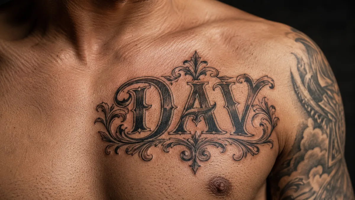
The DAV tattoo is a minimalist symbol that reads as a declaration: “I am greater than my highs and lows.” The three letters aren’t random. The D stands for “I” (the self), the A visually points upward for your highs, and the V points downward for your lows. Stack them together and the shape says you rise above both.
It’s one of those quiet tattoos that carries serious weight for the person wearing it. From the outside it looks like three letters, maybe a name or initials. On the inside it’s a promise the wearer made to themselves. That gap between public and private meaning is a big part of why people choose it.
What the DAV Symbol Actually Means
The DAV design is a shorthand for the affirmation “I am greater than my highs and lows.” Break it down visually: the A forms an upward peak, the V forms a downward dip, and the D anchors both as the self that contains them. The meaning is direct. You are more than your best moments and your worst moments combined. Your identity doesn’t live at either extreme.
This isn’t pop philosophy invented for Instagram. It’s a real grounding tool people lean on during mood swings, rough patches, and personal crises. The tattoo functions as a daily reminder that the swings are temporary and you are not defined by them. Short, clean, and completely honest about what it’s doing.
Where It Comes From
Three letters. One name. The word "Beloved" made permanent.
The roots trace to a Christian symbol: G greater than ^ v, meaning “God is greater than the highs and lows.” The G version has been widely used in faith communities as a statement that God’s love holds steady regardless of life’s peaks and valleys. The scriptural grounding points to passages like Romans 8 about nothing separating believers from that love.
At some point the G got replaced with I, shifting the subject from God to self. That’s not a rejection of the original. For some people both versions hold at once. For others the secular version speaks to personal resilience without religious framing. Both readings circulate openly, and many artists have inked both versions in the same week on different clients.
The Mental Health and Diabetes Communities
Two communities latched onto this tattoo hard and helped push it into mainstream awareness. The first is the mental health community, specifically people navigating bipolar disorder, depression, and anxiety. For them “highs and lows” is literal. Manic episodes and depressive crashes are the actual lived terrain. The tattoo is a physical anchor, something to look at when either extreme is pulling hard.
The second is the Type 1 diabetes community, where “highs and lows” also maps directly onto blood sugar levels. High glucose, low glucose, that daily management of dangerous extremes. Getting the DAV tattoo is a way for T1D folks to mark that reality and claim strength over it. You’ll see it in diabetes forums and on wrists across the community. It earns its meaning twice over.
Design Variations and Style Choices
The cleanest version is three bold letters in a simple sans-serif font, no frills. The A and V do the visual work just by existing. Fine line script versions soften the mood and feel more intimate. You’ll also see the full symbolic form written out as I > ^ v, which makes the mathematical logic explicit. Some artists incorporate the greater-than sign between the letters for clarity.
Blackwork treatments in solid block capitals read strong from a distance and hold well long-term. Bold will hold with this design because the negative space between letters is generous enough that ink spread over years won’t close it up. Fine line versions are beautiful but need a skilled hand to keep the strokes crispy. If your artist’s fine line work doesn’t look tight in photos, ask for a heavier hand or bump the size up.
Color Versus Black and Grey
Most DAV tattoos are done in solid black. That’s not a trend thing, it’s the right call for a symbol-based letterform tattoo. Black saturates fully, heals consistent, and the meaning doesn’t depend on color to land. Black and grey with a subtle gradient can add depth without complicating the design, especially on larger forearm or upper arm pieces.
Color can work on request but it usually adds noise to something that communicates through form and simplicity. Some clients choose a single color accent, a red outline or a navy fill, as a personal touch. If that means something to the client, go for it. Just make sure the lines stay clean and the letters remain readable. Readability is everything with lettering. It has to read from across the room, not just up close.
Best Placement and How It Ages
The inner forearm is the most popular spot and for good reason. Flat surface, low blowout risk, great readability, and the wearer can see it daily. That daily visibility matters for a tattoo that functions as a personal reminder. The outer forearm works too, more public facing. Collarbone placement looks sharp and follows the natural line of the body without forcing the lettering into a curve.
The wrist is another common choice, though it’s a high-wear zone. Sun exposure and friction from sleeves can fade it faster. Touch-ups after a few years are normal there. Ribs are spicy and not ideal for fine-line lettering since the skin moves a lot during healing. If you want the piece to stay tight for a decade with minimal maintenance, stick to the forearm or upper arm. Those areas heal nice and keep their structure.
Who Gets This Tattoo and How to Make It Personal
Clients who get this tattoo have usually been through something real. A diagnosis, a breakdown, a recovery, a turning point. It’s not a trend piece people pick from a flash sheet. It’s earned. That doesn’t mean you need to explain your history to your artist, but know that the best versions come from clients who have a clear reason and let that inform the style choice.
Making it personal doesn’t require adding elements. Keeping it minimal is already a statement. Some clients add a date beneath it, marking when the shift happened. Others stack it with a semicolon tattoo, another mental health symbol about choosing to continue. The script choice alone can carry personality, a handwritten style feels different from clean block caps. Let the font be the voice if you want variation without clutter.