Illustrative tattoos sit between drawing and tattooing, which makes artist fit more important than copying a reference exactly.
Quick answer: Illustrative tattoo style works for animals, flowers, mythic figures, objects, and narrative pieces. It should look drawn by the artist, not traced from a generic image.
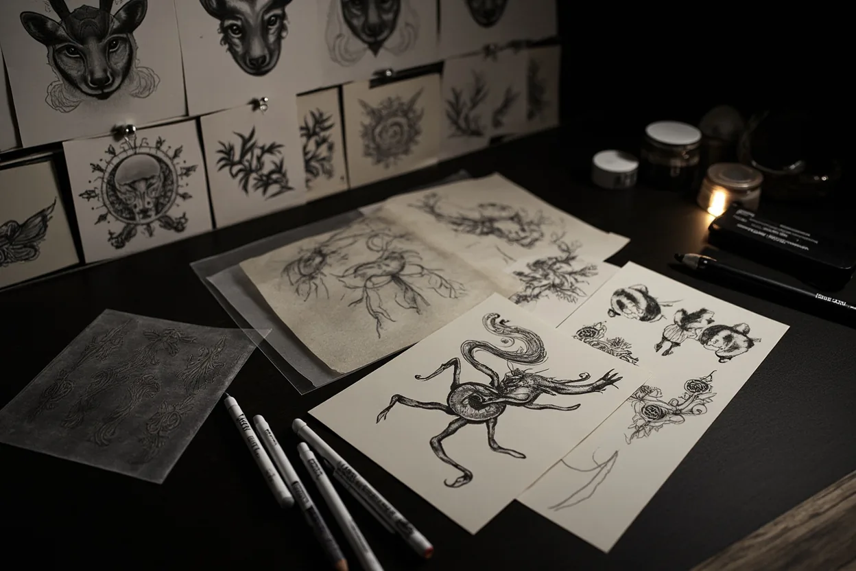
Illustrative Tattoo Style style directions
A tattoo style is more than a look. It decides line weight, shading, color, artist fit, and how the piece will read years after the first photo.
| Direction | Best use | Watch out for |
|---|---|---|
| Animal illustration | Character and movement | Artist drawing skill |
| Botanical illustration | Detailed nature look | Line spacing |
| Mythic figure | Story-driven piece | Composition |
| Object study | Personal symbol | Can look flat |
| Black and grey illustration | Classic drawing feel | Contrast |
How to make it work on real skin
Illustrative ink looks like it belongs in a sketchbook, the good ones still will in twenty years.
Illustrative tattoos are strongest when the artist has a point of view. If every reference looks like unrelated stock art, keep looking.
Line weight variety helps an illustrative tattoo stay readable without turning it into flat coloring-book art.
Illustrative Tattoo Style: Art-Driven Ink That Still Ages: artist fit and aging
This style depends on execution. Line weight, contrast, spacing, and the artist’s healed portfolio matter more than the label used on social media.
Ask what should be simplified for your skin, placement, and size. A good tattooer will protect the design from becoming too fragile.
- Choose an artist whose drawings you like.
- Ask how the design will be simplified for skin.
- Use enough contrast.
- Avoid overloading the piece with background.
Mistakes to avoid
Do not bring five illustration styles and expect one clean tattoo.
Do not choose an artist who only copies references.
What makes this style work after the fresh photo
A good illustrative tattoo style tattoo is not just a surface look. It depends on line weight, contrast, spacing, artist fit, and how the design will settle after the skin stops looking glossy.
Use the style directions as a way to compare references: Animal illustration, Botanical illustration, Mythic figure, Object study, and Black and grey illustration. If those examples look unrelated, the style may need a tighter brief before the artist can design something coherent.
| Reference to compare | What to inspect | Decision rule |
|---|---|---|
| Animal illustration | Character and movement | Artist drawing skill |
| Botanical illustration | Detailed nature look | Line spacing |
| Mythic figure | Story-driven piece | Composition |
| Object study | Personal symbol | Can look flat |
| Black and grey illustration | Classic drawing feel | Contrast |
Artist fit matters more than the trend name
Some tattooers are strong at bold traditional work and weak at tiny realism. Some can draw ornamental symmetry but not faces. Some can pack black smoothly but struggle with delicate color. Match the artist to the style, not just the studio location.
Healed portfolio examples matter here. Fresh photos show the first hour. Healed photos show whether lines hold, shading settles smoothly, and the tattoo still reads without perfect lighting.
How to brief the design without over-controlling it
Bring references for mood, placement, and detail level. Then give the artist room to redraw the idea for skin. A tattoo design has to survive curves, pores, movement, sun, and time; a flat reference image does not.
Visual reference note: Save references that show healed work, not only viral fresh tattoos. If a style looks good only under studio lighting, ask what it looks like six months later.
Reader questions before you book
Is this style good for a first tattoo?
It can be, if the design is readable, the placement is realistic, and the artist has healed examples in the same style.
How do I know if an artist can do this style?
Look for healed work, not just fresh photos. Check line consistency, shading, symmetry, and whether similar designs still read clearly.
Should I make the design smaller to save money?
Not if size is what keeps the tattoo readable. Shrinking a detailed style often creates a weaker tattoo and a future touch-up problem.
What should I bring to the consultation?
Bring style references, placement photos, a rough size range, and notes on what you do not want. That is enough for a good artist to design from.


