
A first matching skeleton tattoo can be meaningful, crisp, and surprisingly personal, but placement and line weight decide how it settles over time. I got mine after weeks of sketching, comparing healed references, and questioning whether fine-line work was too delicate. It wasn’t. The planning mattered more.
I wanted something personal, a little edgy, and connected to someone who’d stayed through several difficult years. The final pair became symbolic without feeling obvious.
Here’s What It Looked Like Before
Before the appointment, I had a clean patch of skin and a folder full of saved references. No grand announcement. No matching outfits.
I just knew I wanted a matching tattoo with enough meaning to hold up after the trend passed.
I wasn’t looking for identical copies. I wanted two designs that could stand alone but still feel related when placed side by side. You might want the same thing if your tattoo needs meaning without looking overly sweet.
My first instinct was to choose the largest sketch, but I didn’t. The smaller idea had more tension.
I also checked healed examples before booking. Fresh tattoos can look striking and dark, while older fine-line work tells you far more about spacing, fading, and line spread. If you’re saving references, compare them with skeleton tattoos for women and look for photos taken after the skin has settled.
That research changed the value of the appointment for me. A reference can look perfect on a screen and still lose its shape at actual tattoo size!
- I Chose Twin Skeletons for Our First Ink
- We Sketched Fine Line Skeletons Holding Hands
- Which Placement Made the Pair Feel Private?
- We Added Celestial Symbols Above Each Skull
- Fine Line or Blackwork? I Tested Both Before Booking
- The Flowers That Changed the Matching Set
- I Checked Pain Along My Forearm
- We Turned Their Bones Toward Each Other
- I Picked Crisp Shading for Lasting Contrast
- What Three Weeks Revealed About the Design
- I Added Initials Beneath Our Matching Skeletons
1I Chose Twin Skeletons for Our First Ink
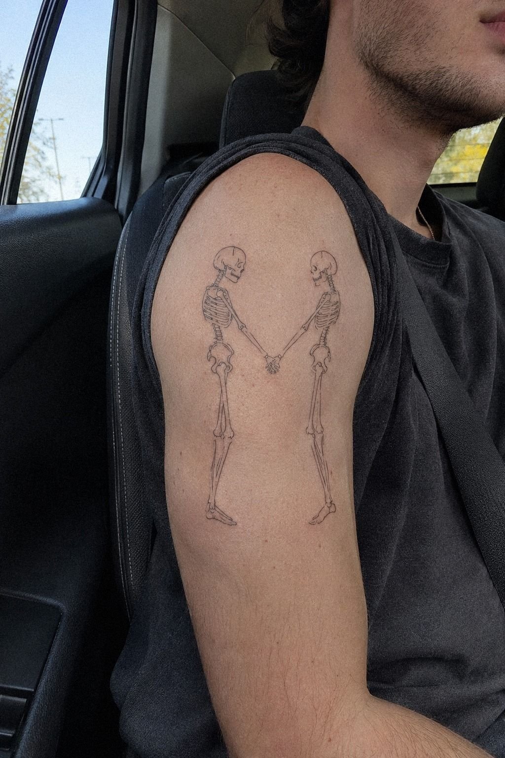
I chose two standing skeletons because the pose said more than a quote would have. Their shoulders were slightly turned inward, and their hands almost met. That tiny gap made the design feel meaningful without becoming sentimental.
The first sketch used a heavy blackwork skeleton, and I rejected it within a day. It was powerful, but it swallowed the small rib details and made both figures look stiff. I wanted delicate ribs, clean jaw lines, and enough negative space for the shapes to remain readable.
If you’re drawn to a darker direction, compare your idea with matching bestie tattoos for best friends before deciding how literal the pairing should be. That comparison can tell you whether the concept is worth the extra detail or whether a simpler design gives better value.
I asked for a fine-line version with a single-needle feel, but I didn’t ask the artist to make every mark microscopic. Fine line should still be readable from a normal distance. The line weight had to support the anatomy.
I kept one imperfect detail in the drawing: one skeleton’s arm sat a little lower. Identical isn’t always intimate. A controlled difference gave the pair a more expressive quality, and you’ll notice it every time you look closely!
2We Sketched Fine Line Skeletons Holding Hands

The hand-holding pose came after three sketches that looked like store-bought graphics. I wanted connection, not a logo. We placed the fine-line skeleton tattoo figures close enough that their fingers nearly touched, then removed one tiny connecting stroke.
That break made the drawing feel more understated and less staged. It also reduced the amount of ink we’d need, which helped the design stay within our budget.
You should test the design at the size you’ll wear it, not only on a large tablet screen. My artist printed the sketch at several sizes and taped each one to a practice surface. At the smallest size, the finger bones blurred together.
At the middle size, the anatomy stayed crisp while the hands remained readable. That was the version that felt worth paying for.
I didn’t approve the first version. The skulls were too round, and the wrists looked oddly thick. We narrowed the wrists and gave the fingers a little more separation.
If you’re considering hand placement, the examples in wrist tattoos for men can help you judge scale without copying the exact designs.
A matching piece needs rhythm. The skulls, shoulders, and hands should feel related, but they don’t have to line up like a diagram. That’s what made ours feel more graceful and less mechanical!
3Which Placement Made the Pair Feel Private?

I chose the ribs because the rib placement made the pair feel private.
4We Added Celestial Symbols Above Each Skull
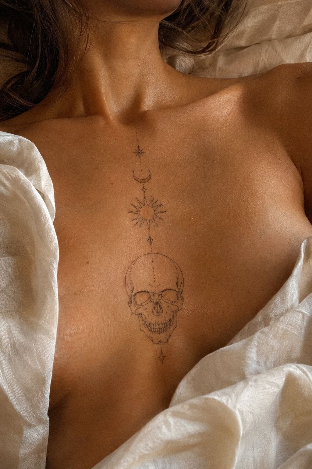
The stars and crescent shapes came from a late-night sketch where we wanted the pair to feel connected without adding words. We placed a small moon above one skull and a four-point star above the other. The marks were ornate enough to notice but still controlled.
You can use symbols to show shared meaning without explaining it to everyone who asks. I liked that the celestial symbols worked as a private reference rather than a full sentence.
I kept the symbols smaller than the skulls. That hierarchy matters. A large moon would have pulled attention away from the faces, while a tiny mark could disappear once the skin healed.
We tested a fine-line crescent and a small open star, then chose the version with wider negative space. The symbols stayed elegant because we removed anything that competed with the main figures.
The sternum reference we considered had a straight-on skull with a defined jaw, but I didn’t use it for my final placement. That version was more dramatic and bold, while our angled figures felt more natural.
If you want a stronger central composition, browse wrap-around wrist tattoos for ideas about how symbols can follow a curve. The same principle helped us decide how the moon and star should sit above the skulls.
But the symbol has to earn its place. I removed two extra dots because they made the design look busy. One moon, one star, and clean spacing were enough.
The finished detail felt timeless without pretending to be ancient!
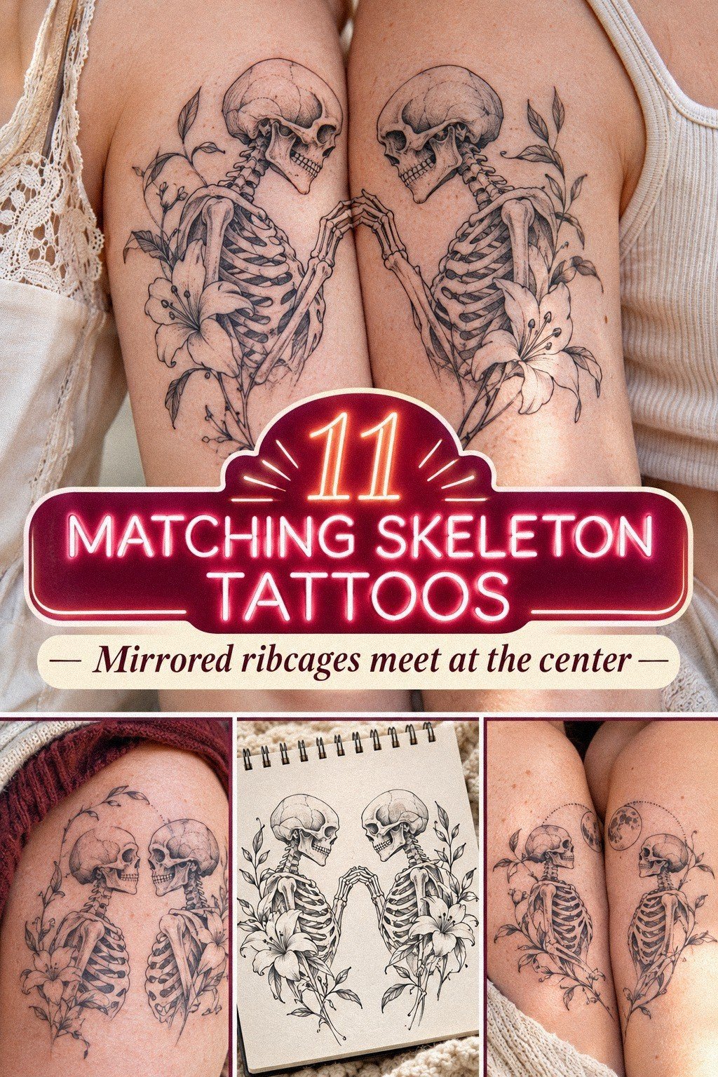
5Fine Line or Blackwork? I Tested Both Before Booking

Before booking, I asked to see a darker version of the design. The blackwork flash sheet had thick outlines, filled eye sockets, and broad shadow blocks. It looked fierce on aged paper, and for about ten minutes I thought it was the better choice.
Then I compared it with the fine-line draft at the same size. The dark version had more immediate impact, but it lost the small hand gesture and the narrow space between the ribs. My opinion changed fast.
I wanted the viewer to discover the relationship between the figures, not read it in one second. That made the finer version a better value for the story I actually wanted.
You should test both extremes if you’re unsure. Ask for a fine-line drawing, a heavier outline, and one middle version with selective black fill. I did this with a printed stencil, and it showed me which details were essential.
The skeleton tattoos for women collection is useful for comparing light outlines with more saturated black areas. I used it as a reference, not as a template.
The final design kept black pigment in the eye sockets and a few shadow pockets. Everything else stayed minimal and open. That balance gave the skulls a more gritty edge without making them look like stickers.
I won’t pretend blackwork is wrong. It simply tells a louder story. For my first matching tattoo, the louder story wasn’t mine!
6The Flowers That Changed the Matching Set
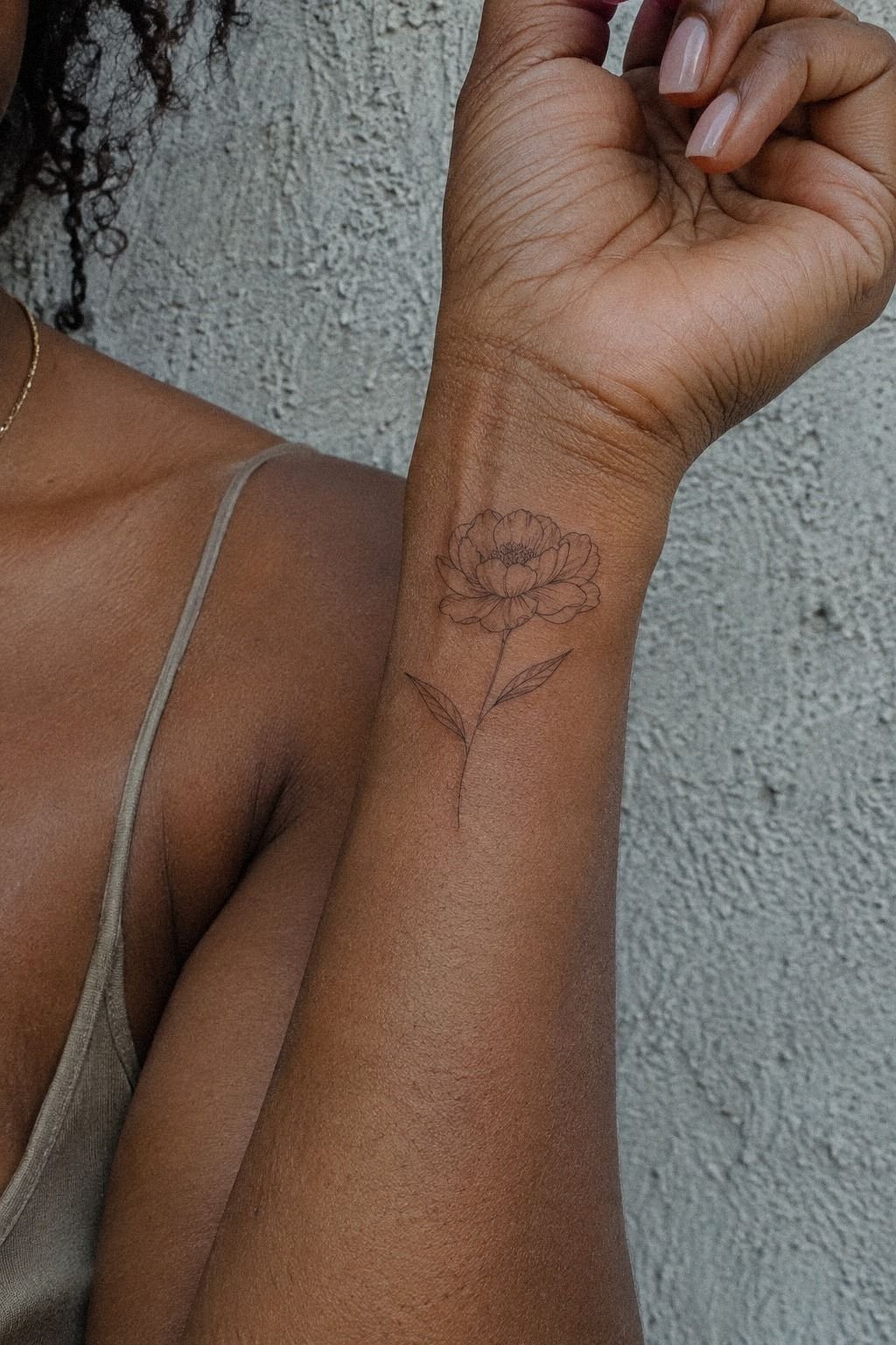
The flowers were the detail that made the tattoos feel like ours rather than a matching set from a reference folder.
7I Checked Pain Along My Forearm
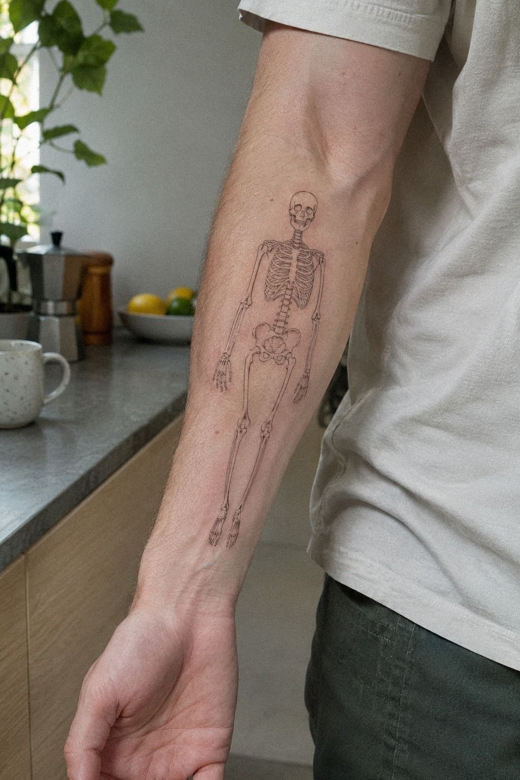
I practiced the placement on my forearm before committing to the ribs, partly because I wanted to understand how the design would read on a flatter area. The forearm stencil made every line look more visible, and the skin felt easier to work on.
If you’re getting your first tattoo, that difference can matter more than the drawing itself. A design may be worth the price only if you can live comfortably with its placement.
The forearm is generally more tolerable than ribs, feet, hands, or sternum, though everyone’s experience varies. My artist used a light touch with a single-needle setup, and the sensation felt scratchy rather than deeply sharp.
You won’t know your own pain response until you’re there, but you can choose a placement that gives you a little margin. I found the test useful because it clarified my placement decision before the appointment.
The forearm showed me another issue. The legs looked slightly too long when the design was vertical. We shortened them before finalizing the rib placement, which made the pose more balanced and sleek.
I also compared the idea with wrist tattoos for guys because wrist and forearm references reveal how linework behaves near movement and tendons. Don’t choose a placement only because the photo looks stylish.
Think about how often your skin bends, rubs against clothing, or sees sunlight. That practical check can protect the value of an expensive design.
The test didn’t replace the consultation. It simply helped me arrive with a better question list, and that made the appointment calmer!
8We Turned Their Bones Toward Each Other
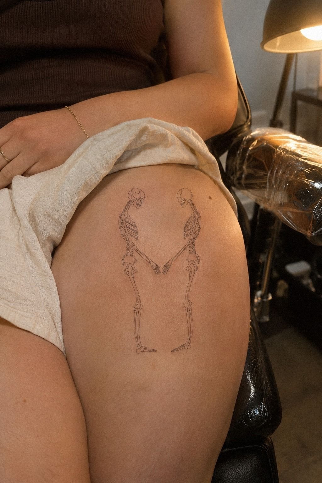
The biggest visual change came from turning the skeletons inward. That small adjustment gave the pair a powerful sense of connection without adding another symbol.
9I Picked Crisp Shading for Lasting Contrast

I wanted the tattoos to stay readable after the first bright weeks passed, so we discussed shading. The artist used small black shadow pockets beneath the skulls, around the jaw, and inside selected rib spaces.
It wasn’t full shading. It was controlled contrast.
Fine lines can spread slightly over time, especially when they’re packed too closely or exposed to repeated sun. You can’t stop every change, but you can give each line room and protect the skin from UV.
A few solid black marks may hold their presence better than a page full of equally thin detail. That was important to me because the shading plan had to balance longevity with delicacy.
My first draft had too many gray wash areas. They looked ethereal when fresh, but they didn’t give the skulls enough structure. I removed them and kept only the darker accents.
If you’re comparing styles, women’s back tattoos can show how larger placements use contrast without filling every open area. I also reviewed skeleton tattoos for women for smaller examples with selective blackwork.
The final shading was sharp, slightly dramatic, and easy to read. It gave the design a stronger skeleton shape while preserving the gaps around the hands.
I’d choose selective black again over pale gray wash for a first piece. The contrast gave me better value than adding dozens of fragile marks.
You should also ask to see the artist’s healed blackwork, not just fresh work under bright studio lights. Fresh contrast can flatter almost any tattoo!
10What Three Weeks Revealed About the Design
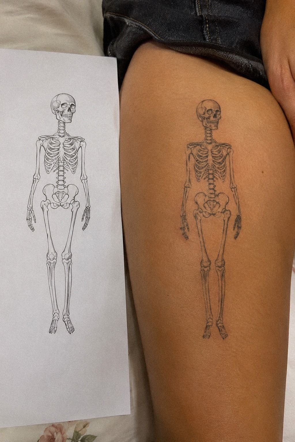
At three weeks, we compared the original stencil with the healed tattoo. The lines had softened slightly, but the hands, ribs, and symbols were still readable.
11I Added Initials Beneath Our Matching Skeletons
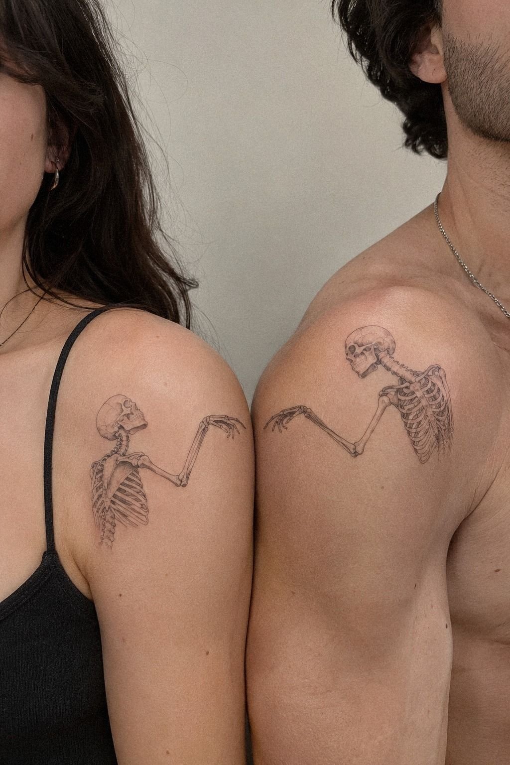
The initials were the last decision, and I nearly skipped them. The design already had the flowers, the inward turn, and the celestial symbols. Adding letters risked making it too literal.
Still, one small set of initials beneath each skeleton felt personal rather than crowded. The lettering gave the pair a private detail without turning the tattoos into labels.
We chose a narrow serif style and kept the letters smaller than the feet. The artist tested them in three widths because the first version looked generic.
You should view lettering at actual tattoo size, not enlarged on a phone. Tiny type can lose its shape quickly if the strokes sit too close together.
I also considered a date, but I didn’t want the tattoo tied to one calendar moment. The initials felt classic, empowering, and quietly personal.
If you prefer a word instead, word neck tattoos offers examples of how letter spacing affects a small design. I used the reference to compare spacing, not to copy the lettering.
The letters gave us a private detail that isn’t obvious from several feet away. You have to stand close to read them, which is exactly what I wanted. The result stayed understated instead of turning into a label.
Would I add initials to every matching tattoo? No.
If the main drawing already carries the relationship, leave it alone. In our case, the letters completed the story without taking over!
How Much It Cost
The honest answer is that matching skeleton tattoos don’t have one universal price. A studio may charge a minimum, an hourly rate, or a project quote based on the artist’s experience, location, size, placement, and detail.
I didn’t want to invent a neat receipt for the sake of a cleaner story, so I used the quote from the studio and asked what was included. Knowing the full tattoo cost made the decision feel more manageable.
For a small fine-line design, the shop minimum may land around $50 to $100 per tattoo. Artists who bill hourly often charge about $100 to $250 per hour. A matching pair can take different amounts of time if one placement is more difficult.
You shouldn’t assume two identical drawings will produce an identical total. Ask about revisions, deposits, touch-ups, and whether both appointments are included in the written quote.
My budget went toward the consultation, the two designs, and the appointment rather than extra detail. I also left room for a touch-up conversation if the healed lines needed attention.
You should ask whether touch-ups are included, how long the studio waits before assessing healed work, and whether the quote covers both tattoos. Those questions can reveal the real value of a lower-looking price.
If you’re comparing artists, don’t choose solely on the lowest number. A clean portfolio, strong hygiene practices, and healed examples matter more than saving a little upfront.
I would rather wait and pay the artist whose linework stays readable than rush toward a cheaper appointment. For me, that long-term value was worth the higher cost.
Where the Budget Creates Real Value
The cheapest option wasn’t automatically the smartest option. I compared the artist’s healed work, revision process, placement advice, and communication before deciding what I could afford.
A lower budget can work if the design is simple and the artist is experienced with that style. It becomes risky when a cheap quote depends on rushed planning or an artist who rarely handles anatomy.
I also considered the cost of fixing a poor result. A small saving at the beginning wouldn’t feel like a bargain if the hands blurred or the lettering needed a major correction.
That calculation helped me spend with more confidence. The best investment was the planning time, because it kept unnecessary details out of the final piece.
Why Matching Skeleton Tattoos Still Feel Personal
I used to think matching tattoos had to be perfectly identical to feel meaningful. Mine changed that opinion. The skeletons share an outline, a direction, and a visual language, but their flowers, placement adjustments, and initials make them distinct.
There’s also something honest about skeleton imagery. It doesn’t pretend relationships are polished or permanent in a simplistic way. It points toward time, humor, mortality, and the strange fact that people keep choosing one another anyway.
That can sound heavy, but the drawings themselves can still be playful, vibrant, and bold. The contrast is part of what makes the idea work.
I went back and forth on whether a first tattoo should carry that much meaning. The answer depends on you. If you need a design to remain emotionally flexible, choose symbols instead of a date or full name.
If you want a clear shared marker, initials or a familiar pose can make the connection more direct. A matching bestie tattoo can use the same principle without copying every mark.
The strongest matching tattoos aren’t identical objects copied twice. They’re related decisions. You might choose the same skull but different flowers, the same moon but different placement, or the same outline with different shading.
Those choices give the tattoo an iconic quality without making it feel frozen. They also let each person keep a little independence.
I learned not to rush because a reference is trending. A tattoo lives on your skin through ordinary days, changing weight, changing taste, and changing relationships.
The design needs enough structure to survive that reality. Mine does because we left room for it to be ours. That flexibility is what made the concept feel timeless.
What I’d Ask Before Paying for Matching Ink
Before paying a deposit, I’d ask to see healed work in the same style and on a similar placement. Fresh results can look polished, but healed references reveal far more about line spread and contrast.
I’d also ask how many revisions are included. A meaningful design may need several rounds before the proportions, symbols, and lettering feel right.
Ask whether the artist has worked with fine-line anatomy, small hands, and rib placement. Those details require a precise tattoo plan, especially when two pieces need to relate without being identical.
Finally, request a clear breakdown of the price. I wanted to know what the consultation, design time, appointment, deposit, and possible touch-up would cost before committing.
For additional scale references, male wrist tattoos and wrap-around wrist tattoos helped me compare how compact designs behave around movement.
The Questions Worth Answering First
How much does a matching skeleton tattoo usually cost?
A matching skeleton tattoo usually costs about $50 to $100 at a studio minimum or about $100 to $250 per hour, depending on the artist and region. Ask for a quote based on size, placement, and detail. A written estimate prevents surprises.
Are matching skeleton tattoos a good idea for a first tattoo?
Yes, matching skeleton tattoos can work well for a first tattoo if you choose a tolerable placement and a readable design. Forearm, thigh, and shoulder areas are generally easier than ribs or sternum. A personal symbol also gives the tattoo meaning beyond a trend.
How do I choose a tattoo artist for matching skeleton tattoos?
Choose an artist with clean linework, healed portfolio photos, and strong studio hygiene. Ask whether they regularly tattoo fine-line anatomy and small lettering. Comparable healed work matters more than a dramatic fresh photo.
How much do matching skeleton tattoos hurt?
Pain depends on placement and your own tolerance. Ribs, feet, hands, and sternum are often more painful, while forearm, thigh, and shoulder placements are usually more manageable. Placement control can make a first appointment feel much less intimidating.
How long does a matching skeleton tattoo take to heal?
The surface usually heals in about 2 to 3 weeks, while the tattoo can take roughly 2 to 3 months to settle fully. Wash gently, moisturize as directed, and avoid sun and swimming during early healing. Patient aftercare protects delicate lines.
What’s the best placement for matching skeleton tattoos?
Forearms, thighs, and shoulders are practical choices because they’re generally more tolerable and easier to protect from friction. Ribs and sternum create a private, dramatic result but can hurt more. Browse wrist tattoos for guys or wrap-around wrist tattoos before choosing your scale.
Where I’d Start First
If I had to pick one, I’d start with twin skeletons turned slightly toward each other. That small angle gives the tattoo emotion without adding extra symbols, and the pose still reads when fine lines soften.
Save the sketch, compare healed work, and let your artist adjust it to your body. The result can be intricate, meaningful, and personal without becoming overloaded.