A realistic spider tattoo isn’t some cartoon Halloween flash. It’s skin-crawling detail, hairs you can almost feel, eyes that catch light like wet glass, legs that seem to tense before they move. Done right, it stops people mid-conversation. Done wrong, it looks like a smudged potato with pipe cleaners. This guide breaks down what actually matters if you’re considering one: how the style developed, what separates the good from the garbage, where it lives best on your body, and how to find an artist who won’t turn your arachnid into a blob.
Origins & History
Realistic tattooing as we know it pulled from photorealism in fine art, Chuck Close, Richard Estes, the hyperdetailed stuff that emerged in the 1960s and 70s. But spiders specifically? That’s older dirt. Sailors carried spider motifs for protection against storms (spiders forecast weather, supposedly). Prison ink used crude black widows to mark time done or rank held. The realistic version, though, that’s a 1990s and 2000s development, riding the wave of tattoo machines that could finally push smooth graywash and single needles that didn’t chew skin to hamburger.
Early realistic spiders looked flat. Artists hadn’t figured out how to make legs read as round rather than striped ribbons. The breakthrough came with better reference photography, suddenly artists weren’t working from memory or flash sheets, but from macro shots of actual arachnids. You can spot pre-2010 realistic spiders by their uniform leg thickness and missing joint articulation. Newer work has the knobbly segmentation, the pedipalps, the slight asymmetry of a living creature.
From Street Shop to Fine Art Studio
Spider realism started in biker and street shops, the kind of places where you’d flip through binders of grim reapers and naked women. Now you’ll see them in appointment-only studios where the artist photographs your piece for a portfolio before you even stand up. The shift matters because it changed what clients expected, no more “close enough,” now it’s “make it look like it could crawl off my arm.”
Key Characteristics & Motifs
What separates a realistic spider from a stylized one? Let’s get specific.
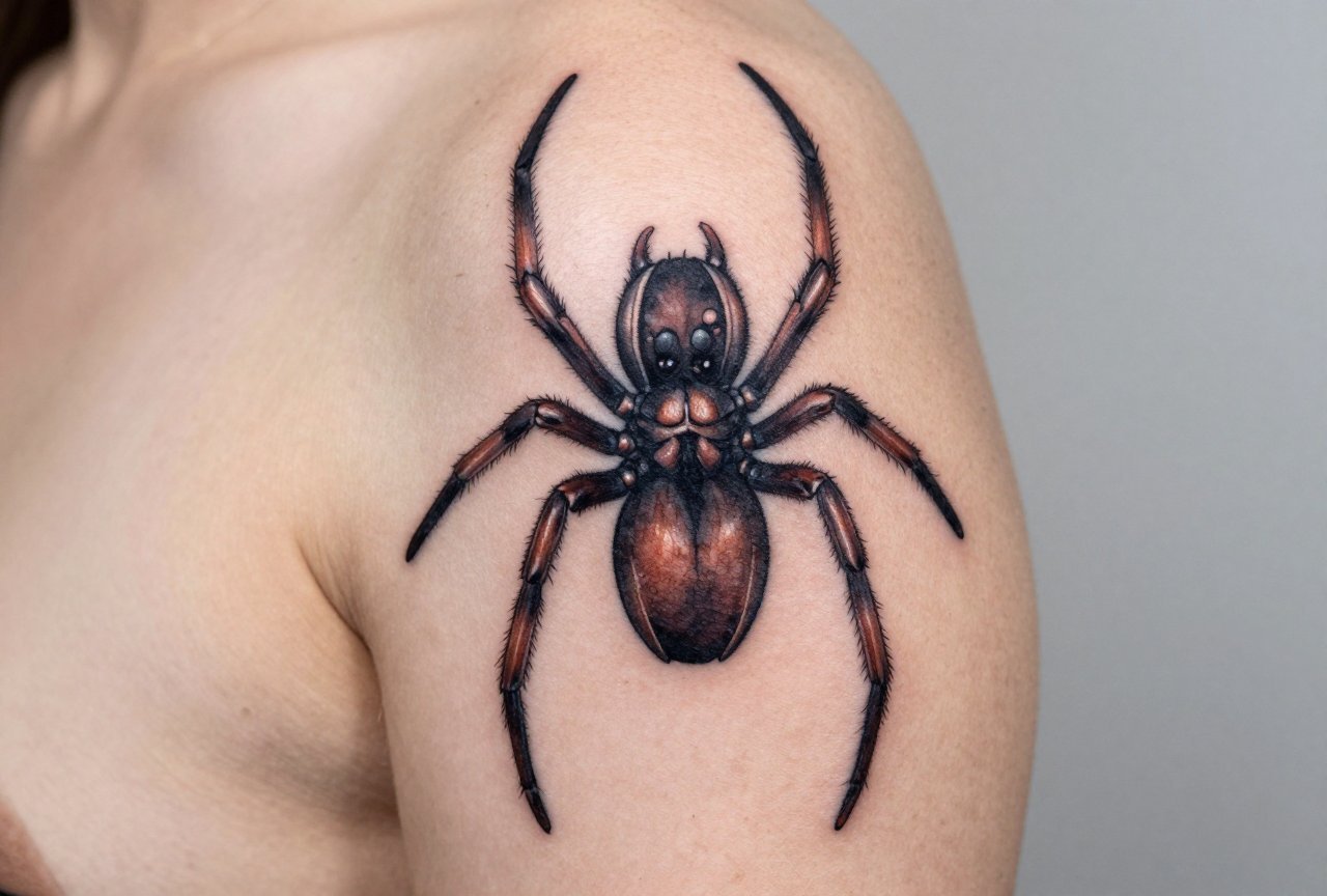
- Leg articulation: Real spiders have seven segments per leg. You don’t need to render every joint, but you need the suggestion, femur, patella, tibia, the slight bend where weight transfers. Flat legs kill the illusion immediately.
- Eye arrangement: Most spiders have eight eyes in specific patterns. Jumping spiders have that distinctive front pair, huge and forward-facing. Orb-weavers cluster theirs differently. Getting this wrong is like giving a human two noses, artists who know their stuff will ask what species you want.
- Hair and setae: Those fine hairs aren’t just texture; they catch light differently than bare exoskeleton. A good artist uses stipple, fine line, or negative space to suggest them without drawing every filament.
- Web integration (or not): Some pieces include silk threads, which adds compositional movement but also another technical challenge, web lines age poorly if too thin, blow out if too heavy.
Species choice matters too. Black widows read instantly but can feel cliché. Orb-weavers give you that bulbous abdomen with patterning. Jumping spiders offer those massive eyes and almost cute proportions. Tarantulas bring hair density and leg thickness that photograph incredibly. I’ve seen a Brazilian white-knee piece that looked like you could feel the urticating hairs, unsettling in the best way.
The Uncanny Valley Effect
Here’s something artists talk about in shops: spiders hit different than other realistic animals. A realistic dog? Cute, impressive. A realistic spider? Primal discomfort. That uncanny valley of “is it real?” triggers something ancient in viewers. Some clients want that. Others don’t realize how intense it gets until they’re three hours into a forearm piece and the eyes are staring back.
Color vs Black and Grey
Black and grey dominates realistic spider work for good reason. Spider exoskeletons are naturally desaturated, browns, blacks, muted tans. Greywash captures the waxy sheen of a carapace better than color ever could. You get depth through value contrast, not hue.
That said, color has its place. Some jumping spiders are iridescent. Certain orb-weavers have abdominal patterns in yellows and reds. A skilled color realism artist can make that abdomen look like polished enamel. The risk? Color fades faster, especially reds and yellows. What reads as bold at month six can look like a bruise at year five. Black and grey ages more gracefully, stays readable longer, and requires fewer touch-ups.
If you’re set on color, commit to the maintenance. Budget for a refresh session in 3-5 years. And be honest with yourself, are you choosing color because the spider demands it, or because you think black and grey is boring? The wrong reason leads to regret.
Best Placements
Where you put a realistic spider changes everything about how it reads and how it holds up.
- Forearm: Classic placement, good visibility, moderate pain. The flat surface lets you show the full body spread. Downside: sun exposure fades it faster, and everyone sees it.
- Thigh: Large canvas, manageable pain, easy to hide. Great for bigger species with full leg span. The muscle movement adds subtle animation, legs seem to shift as you walk.
- Hand/fingers: Aggressive choice. Spiders here read as confrontational, which some people want. The skin is thin, details blow out, and aging is brutal. I’ve seen finger spiders become indistinguishable from birthmarks in under a decade.
- Neck/throat: Bold. The spider appears to crawl up from your collar or descend from your jaw. Pain is significant. Employment implications are real. Don’t do this on impulse.
- Ribcage: Painful, private, excellent for compositions where the spider appears to emerge from shadow. The curve of ribs can enhance three-dimensionality if the artist plans for it.
One placement I love but rarely see: the side of the knee, spider positioned like it’s climbing up your leg. The knee’s movement creates constant subtle shifts in how the legs read. Pain is intense though, artists call that area “the ditch” for a reason.
Who It Suits
Not everyone should get a realistic spider. That’s not gatekeeping, it’s honesty.
You need to actually like spiders, or at least respect what they represent. Arachnophobia is common; if you flinch at garden spiders, waking up to a hyperrealistic one on your forearm might not improve your mornings. The people who love these pieces tend to fall into a few camps: biology enthusiasts who can name the species, people who identify with patience and precision (the web-weaver archetype), or those drawn to the darker aesthetic, gothic, metal, horror communities where a spider reads as elegant rather than repulsive.
There’s also the patience factor for the tattoo itself. Realistic spiders take time. A palm-sized piece with proper detail is 4-6 hours minimum. Larger compositions with environment, web, prey, leaf litter, can stretch across multiple sessions. If you tap out at two hours, talk to your artist about simplifying, not about rushing.
Modern Variations
The style keeps evolving. Here are directions I’m seeing in shops now:
- Biomechanical spiders: Exoskeleton replaced with machined plates, gears visible through translucent segments. Appeals to the same crowd as HR Giger-inspired work. Technically demanding, metal reflections and organic form don’t blend easily.
- Neo-traditional realism: Realistic rendering with bold, illustrative composition. Think spider as centerpiece with decorative web mandala, limited but saturated color palette. Best of both worlds for some, confused identity for others.
- Double exposure: Spider silhouette containing a forest scene, galaxy, or anatomical drawing. Trendy, requires an artist who understands both realism and graphic design. Can feel dated fast if the concept is thin.
- Micro-realism: Palm-sized or smaller, often on fingers, behind ears, along the collarbone. Impressive technically, but the longevity is genuinely poor. I’ve watched these blur into gray smudges within a few years. Cool for Instagram, frustrating for the wearer long-term.
Choosing an Artist
This is where most people stumble. Not every realism artist can do a convincing spider. Not every spider tattooist does realism. You need the overlap.
Look for healed photos, not just fresh work. Fresh spider tattoos look sharper than they stay, those hair-fine details that pop on day one can vanish by month three. Ask to see something from a year prior. If the artist doesn’t have healed shots of their spider work, that’s a conversation, not necessarily a dealbreaker, but you need to know what you’re gambling on.
Ask about their reference process. Do they work from photographs? Do they know the species? An artist who says “I can just make it look cool” is not your person for this style. The best ones will ask what species, what angle, whether you want it active or at rest. They’ll discuss whether the abdomen should be glossy or matte based on the actual spider’s cuticle.
Budget realistically. A good realistic spider from a specialist runs $400-800 for something palm-sized, more for larger or more complex work. The guy offering $150 might be talented and undercharging, but more likely he’s cutting corners on time or doesn’t value his own development. In tattooing, you usually get what you pay for, and bad realism is expensive to fix.
Red Flags in Consultation
- Artist wants to freehand the entire spider without reference.
- They promise “it’ll look even better once it heals” to explain shaky line work.
- Portfolio shows only fresh pieces, nothing healed or aged.
- They dismiss your species preference with “a spider’s a spider.”
Final Thoughts
A realistic spider tattoo is a commitment to detail, to a certain aesthetic, to the reality that some people will recoil and others will lean in closer. It’s not a safe choice. That’s the point. The best ones capture something genuinely arachnid, not the idea of a spider, but the specific, unsettling presence of an actual creature with weight and intention and too many eyes.
Take your time finding the right artist. Bring reference that excites you. Accept that perfection in tattooing is a direction, not a destination, skin is alive, it shifts, it ages. What you’re really buying is a collaboration between human and biology, artist and canvas, the spider and the person who chose to wear it. Make it count.
Related Style Guides
- Traditional Americana Flash Tattoos: Style Guide
- Free Tattoo Designs That Actually Work
- Classic Tattoo Designs That Never Go Out of Style
- Explore more
Frequently Asked Questions
How much does a realistic spider tattoo typically cost?
A realistic spider tattoo usually ranges from $150 to $500 for smaller pieces, while large or highly detailed designs can exceed $800. The price depends on the artist’s skill level, the tattoo’s size, and the complexity of the shading and detail work required.
What body placements work best for realistic spider tattoos?
The shoulder, forearm, and thigh are popular choices because their flat surfaces allow artists to create crisp detail and proper proportions. The neck and hand are also common but require more frequent touch-ups due to faster fading in high-movement areas.
Do realistic spider tattoos require a specific artist specialty?
Yes, you should seek an artist who specializes in realism or hyperrealism, as spider tattoos demand precise line work, smooth shading gradients, and accurate anatomical detail. Always review their portfolio for similar insect or arachnid work before booking.
How do I keep a realistic spider tattoo looking sharp over time?
Protect it from sun exposure with SPF 30 or higher, moisturize daily, and avoid picking at scabs during healing. Realistic tattoos rely on fine detail that can blur with age, so occasional touch-ups every few years will maintain the crispness.


