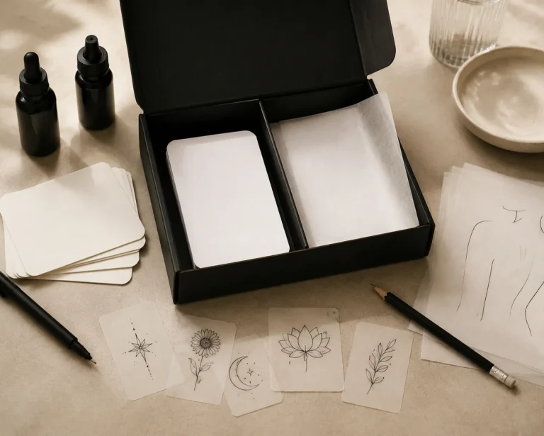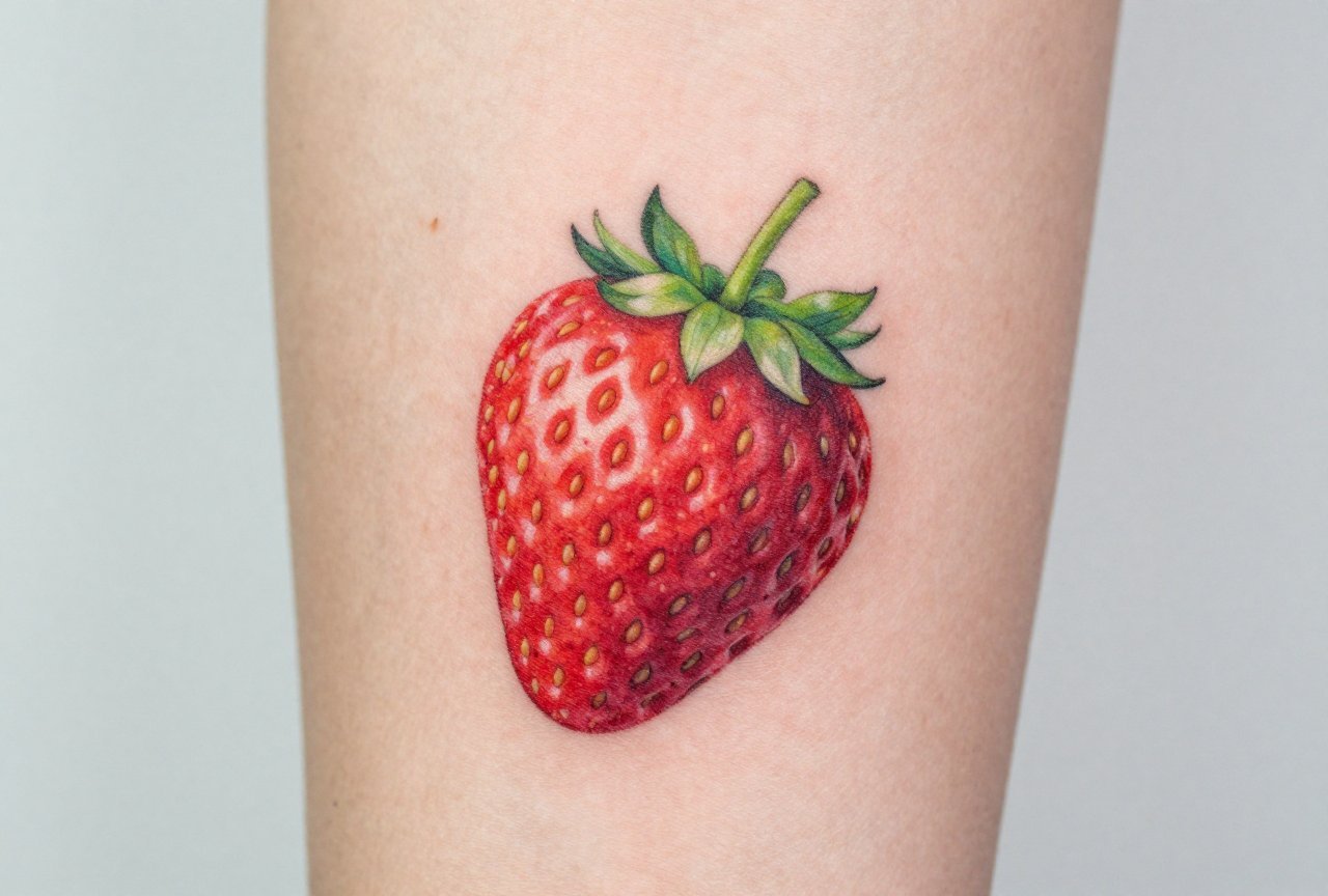
A realistic strawberry tattoo isn’t some cutesy cartoon with a smiley face. Done right, it’s a study in contrast: the deep, almost bloody reds of ripe flesh against the tiny, pale seeds dotting the surface, the jagged green crown of leaves catching light at odd angles. I’ve tattooed strawberries that look like you could bite them, and I’ve seen others that aged into pink blobs. The difference comes down to understanding how fruit actually works on skin, how color sits in different layers, and knowing when to push saturation and when to pull back. This guide comes from years of actually doing these pieces, watching them heal, and learning what holds up.
Origins & History
From Botanical Illustration to Skin
Realistic fruit tattoos have roots in old botanical illustration traditions. Those 18th-century hand-colored plates weren’t just science, they were art obsessed with accuracy. The modern realistic strawberry pulls from that same impulse: get the anatomy right first, then make it beautiful. I first started seeing serious fruit realism take off in the early 2010s, when hyperrealism as a tattoo style was exploding. Clients stopped wanting “a strawberry” and started wanting their strawberry, the one from their grandmother’s garden, the one they ate on a specific afternoon, the one that meant something beyond generic sweetness.
Traditional Americana had its own strawberry imagery, but that was bold outline, flat color, decorative. The shift to realistic rendering meant artists had to solve new problems: how do you make something look wet and translucent when you’re working with opaque pigment? How do you suggest the give of soft fruit under taut skin?
Symbolism That Actually Matters
People come in with strawberries for reasons that surprise me. Yes, summer and sweetness, but also: the fruit’s brief season, the way it bruises and rots fast, the Christian iconography of righteousness (that crown of leaves reads different once you know). I’ve done strawberries for clients who survived cancer, who lost farms, who just really love the taste. The realism matters because the symbolism is personal. A cartoon wouldn’t carry the same weight.
Key Characteristics & Motifs
What separates a realistic strawberry from a pretty illustration? Here’s what I focus on in my chair:
- Surface texture: Those tiny achenes (the seeds) aren’t just dots. They’re slightly recessed, each casting a miniature shadow. I build them with negative space, dotwork, or very fine stippling depending on the size.
- Color gradation: Real strawberries aren’t uniform red. They go from white-green at the top to deep crimson to almost black in the deepest hollows. That transition has to be smooth, no banding.
- The calyx: Those leaves are where realism lives or dies. They’re serrated, veined, and they twist in space. I see a lot of artists phone this part in. Don’t.
- Moisture and sheen: Highlights suggest the waxy, almost glossy surface of fresh fruit. Too many and it looks plastic; too few and it looks matte and old.
- Imperfection: The best pieces include a bruise, a bird peck, a leaf curling brown. Perfect fruit looks fake.
Scale matters enormously. At three inches, I can get individual seeds readable. At eight inches, I’m rendering the full curve of the berry, maybe water droplets, maybe the fuzz on the leaves. I’ve turned down clients who wanted a single strawberry the size of a dime on their wrist. That’s not realistic, that’s a red blob in five years.
Color vs Black and Grey
Color: The Full Experience
Color is where this style sings. I use a base of magenta-red, layer in crimson and burgundy for depth, then hit the very top with a touch of orange or even yellow where the light catches. The calyx gets mixed greens, sometimes I’ll add a hint of blue to push it back spatially. White highlights go in last, but sparingly; healed white on fair skin is subtle, on darker skin it can disappear or heal yellowish.
The catch: red is a notorious fader. I’ve seen strawberries that looked incredible at six months and muddy at five years. I tell clients straight: this will need a touch-up. The best longevity comes from packing red solid in the dermis, not relying on surface saturation that looks bright day one but falls out fast.
Black and Grey: Underrated and Striking
Black and grey strawberry tattoos are less common but can be stunning. The challenge is conveying “redness” without red. I solve this through contrast, deep blacks in the crevices, bright skin-tone negative space for the seeds, and extremely smooth grey wash transitions to suggest the roundness. These pieces read more graphic, more timeless. They also age better; black doesn’t shift the way red does. I’ve had clients specifically request black and grey because they work in conservative environments or just prefer the aesthetic.
Best Placements
Where you put a strawberry changes how I design it. Here’s the real talk from someone who’s put them on a lot of bodies:
- Forearm: Great visibility, flat canvas, easy to show off. I can go five to six inches and have room for detail. The downside: sun exposure fades color faster. I tell forearm clients to plan for sunscreen or accept the fade.
- Upper arm/shoulder: Classic placement. The curve of the muscle can echo the curve of the fruit. Slightly less sun damage, good size options. I’ve nested strawberries in among other pieces here as connective tissue between larger work.
- Ribcage: Painful, but the vertical space suits a strawberry with stem and leaves trailing. Skin here is thinner and stretchier; I adjust my saturation knowing it’ll settle slightly softer.
- Thigh: Big canvas, less sun, good for larger compositions. I’ve done strawberries falling through space, caught mid-air, on thighs. The meat here holds color beautifully.
- Hand or foot: I generally discourage these for realistic color work. The skin is different, thicker palmside, thinner backside, and the wear is constant. A hand strawberry will need constant maintenance. I won’t do them unless the client understands this fully.
One thing we see a lot in shops: people wanting strawberries “where I can see it” and choosing the inner forearm, then realizing they stare at it upside-down. I always have clients hold a mirror to check orientation from their own perspective.
Who It Suits
Realistic strawberry tattoos aren’t gendered, but they do attract certain personalities. I get a lot of food industry people, chefs, bakers, farmers, who want to wear their craft. I get people with specific memory attachments. I get botanical enthusiasts who know the Latin name (Fragaria) and care that I get the leaf serration right.
Skin tone affects color choices. On very dark skin, I push for deeper reds and more dramatic highlights; the lighter values that read as “bright” on fair skin can disappear. On freckled skin, I have to work around or incorporate the existing pattern. There’s no universal approach, which is why I insist on in-person consultations for color realism.
Pain tolerance matters for placement, not style. The tattoo itself isn’t more or less painful than any other color realism. The time in chair is what gets you, three to four hours of packed color is exhausting.
Modern Variations
The style keeps evolving. Here’s what’s crossing my appointment book lately:
- Deconstructed strawberries: The fruit sliced, the seeds scattered, the leaves pressed flat like a herbarium specimen. Scientific and melancholy.
- Strawberries with insects: A beetle crawling, a bee approaching. Adds narrative and scale contrast. The tiny detail of the insect against the larger fruit lets me show off.
- Macro compositions: Extreme close-up where the strawberry fills the entire frame, seeds huge, surface texture almost abstract. These read like landscapes.
- Vanitas elements: The strawberry rotting, molding, being consumed. Memento mori for the organic. Not for everyone, but powerful when done with commitment.
- Watercolor integration: Realistic berry with loose, splashing color around the edges. Tricky to execute well; the boundary between controlled and chaotic is easy to miss.
I’ve had clients bring in photographs of strawberries from their own gardens, and we work from those. The personal reference always produces better results than stock imagery. The light is real, the imperfection is real, the story is real.
Choosing an Artist
What to Look For
Not every realism artist does food well. Portraits and fruit share techniques but differ in crucial ways. I look for artists who show:
- Smooth, band-free color gradation in their portfolio
- Experience with organic textures (not just smooth skin in portraits)
- Healed photos, not just fresh work
- Comfort with reference photography and willingness to adapt it
Ask directly: “How do you handle red fading?” If they say it won’t fade, they’re lying or ignorant. A good artist has a strategy, pigment choice, saturation technique, touch-up policy.
Red Flags
Shop culture varies, but some warnings are universal. Beware the artist who only shows tiny, fresh photos on Instagram. Beware the portfolio with no color realism at all, who says “I can figure it out.” Beware the rush job, good strawberries take time. I’ve had to fix too many blown-out seeds and muddy reds from artists who treated fruit like a filler piece between “real” appointments.
Consultation matters. I want to see your skin, talk about your sun habits, understand why this specific fruit. The best strawberry tattoos come from collaboration, not transaction.
Final Thoughts
A realistic strawberry tattoo is a small thing that demands enormous care. The subject is humble, fruit, common, sweet, but the execution is anything but. I’ve learned to respect the strawberry more than I expected when I started tattooing. It tests your color theory, your patience with fine detail, your understanding of how organic forms translate to human skin. It also connects you to clients in surprising ways. People don’t get strawberries lightly. There’s always a story, and the realism is how they tell it true.
Take your time finding the right artist. Plan for the long game with color saturation and sun protection. And if you sit in my chair, be ready for me to ask about the specific berry you want, not just “a strawberry,” but the one that matters. That’s where the art lives.
Frequently Asked Questions
How long does a realistic strawberry tattoo take to heal?
Expect two to three weeks for the surface to close, with full settling at six to eight weeks. Color realism often looks dull and scaly during healing, don’t panic. The vibrancy returns once the dead skin sheds. Follow your artist’s aftercare and don’t pick at the scabs.
Will a red strawberry tattoo look good on darker skin?
Absolutely, but the approach changes. I use deeper, more saturated reds and stronger contrast with highlights. Lighter pinks and pale reds can heal muddy or disappear. A skilled artist adjusts their palette to your specific undertone, not a one-size-fits-all formula.
Can I get a realistic strawberry tattoo if I have other styles already?
Yes, but consider visual flow. A hyperrealistic strawberry next to traditional bold-line work can feel disjointed. Some artists specialize in blending styles; others don’t. I often suggest integrating realistic elements with transitional pieces, or keeping them in separate areas of the body.
How much should I expect to pay for a quality realistic strawberry?
Realistic color work isn’t cheap. A small, detailed piece might run $400-$600; larger compositions with multiple elements can hit $1,500 or more. Artists price by time, complexity, and experience. Anyone offering a full-color realistic tattoo for under $200 is cutting corners on pigment, time, or both.