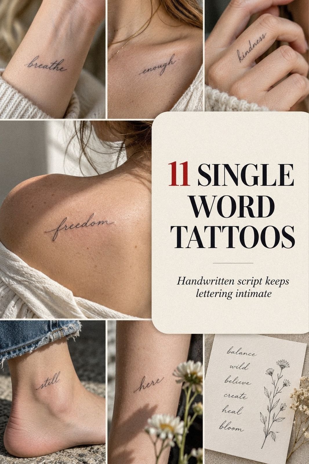
Single word tattoos can stay discreet at work when you plan meaning, lettering, placement, size, and healing in that order. I learned this after watching a tiny word become harder to hide than expected because its location mattered more than its width. You can avoid that mistake. Start here!
- A Meaningful Personal Word
- Pick Unique Lettering With Lasting Symbolism
- Which Cute Scripts Stay Readable?
- Explore Cool Fonts With Sharp Linework
- Keep Little Words Crisp and Readable
- Where Should a Hidden Word Go?
- Match Letterforms to Your Tattoo Style
- Pain vs Privacy in Sensitive Areas
- Test Size Before Committing to Ink
- Protect Fresh Lettering During Healing
- A Timeless Finish Starts With One Last Check
1A Meaningful Personal Word
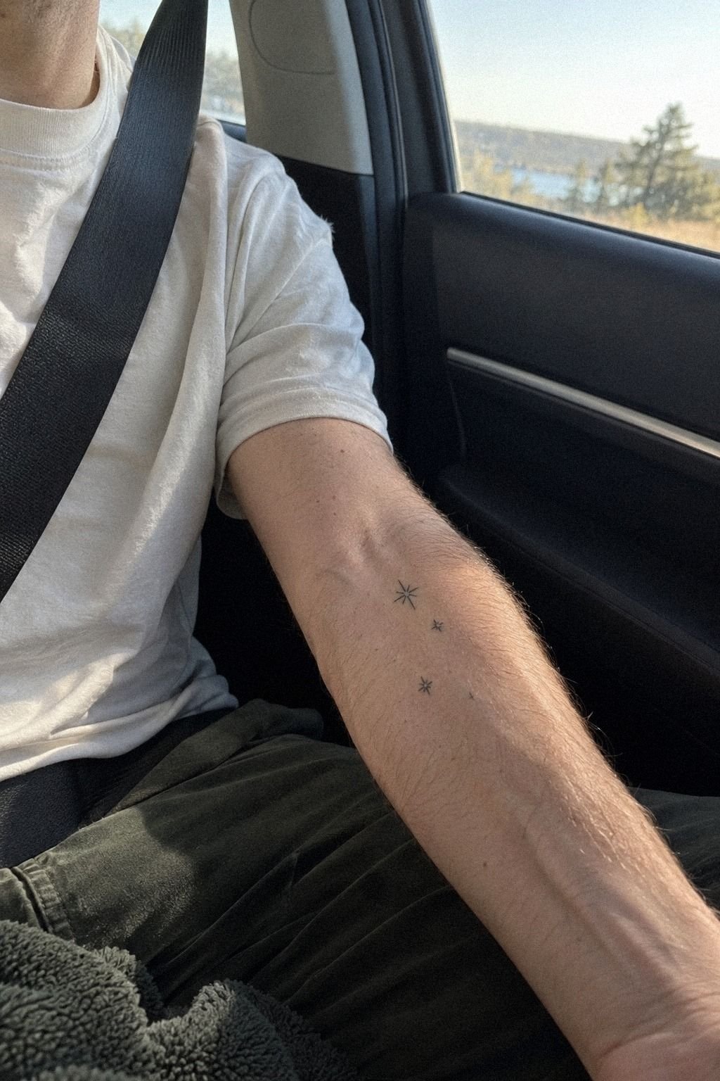
Choose a word you’ll still understand when the trend has moved on. A meaningful word might be a name, promise, place, or private reminder, but you shouldn’t pick it only because it looks good in a saved image. Write your shortlist on paper, then ask whether each word still feels personally meaningful without an explanation.
A word can be romantic, fierce, sacred, or playful depending on the memory behind it. You don’t need a dramatic backstory. Sometimes the most powerful choice is a simple word that quietly marks a person, season, promise, or turning point.
Read more examples in these meaningful word tattoos before your appointment. You’re not searching for something to copy. You’re testing the emotional response that makes your own word feel uniquely personal.
The Meaning Anchor Rule
Try the word in lowercase, uppercase, and handwriting. One version may feel romantic, another fierce, and another oddly formal. I’d skip any word that works in only one font because you may regret letting the lettering choose the meaning for you.
Write the word beside three private questions: What does it remind me of? Would I still choose it without explaining it?
Does it belong to my life, or only to this month? That small exercise gives the design a clear emotional anchor.
2Pick Unique Lettering With Lasting Symbolism
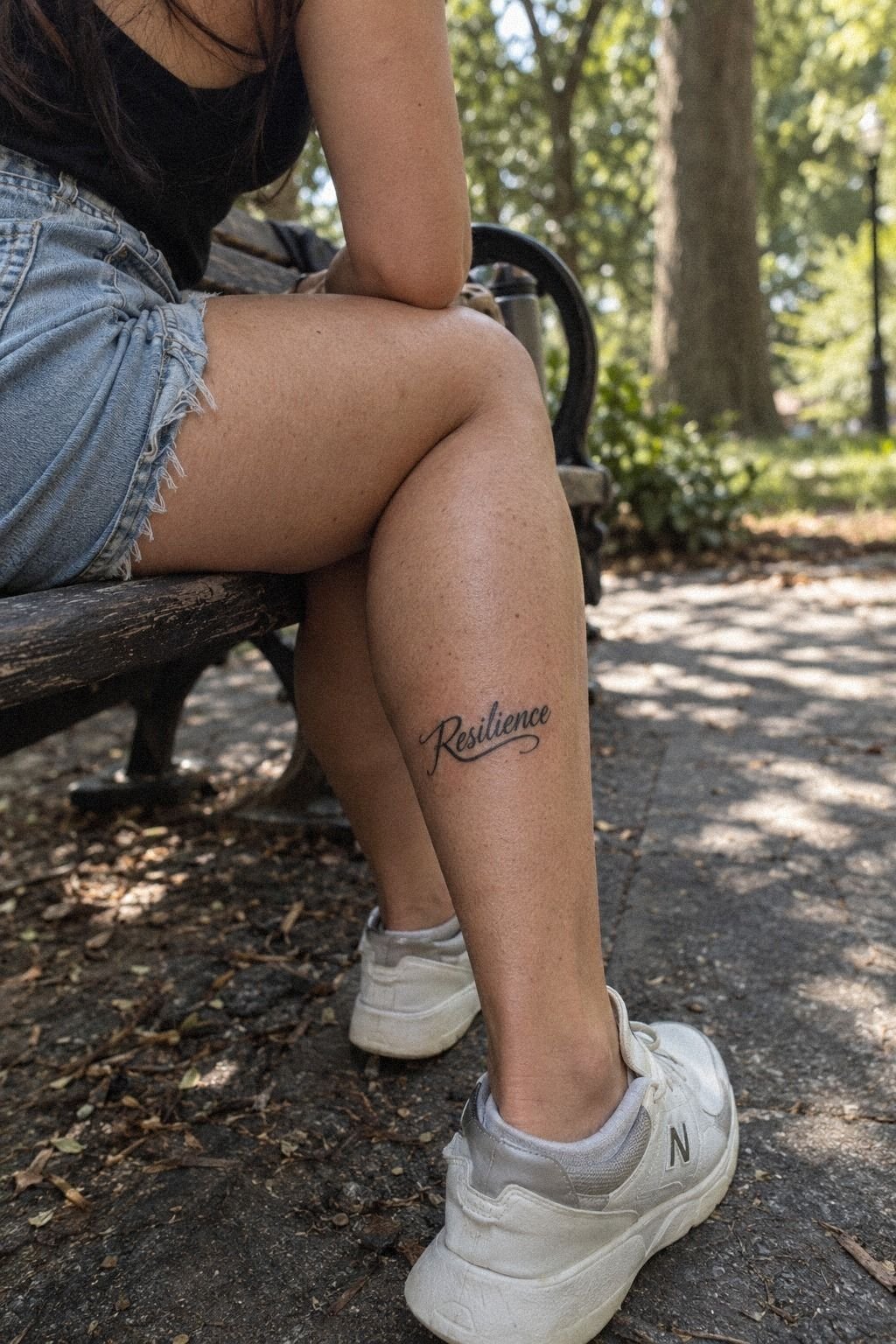
Lettering carries the mood before anyone reads the word.
3Which Cute Scripts Stay Readable?
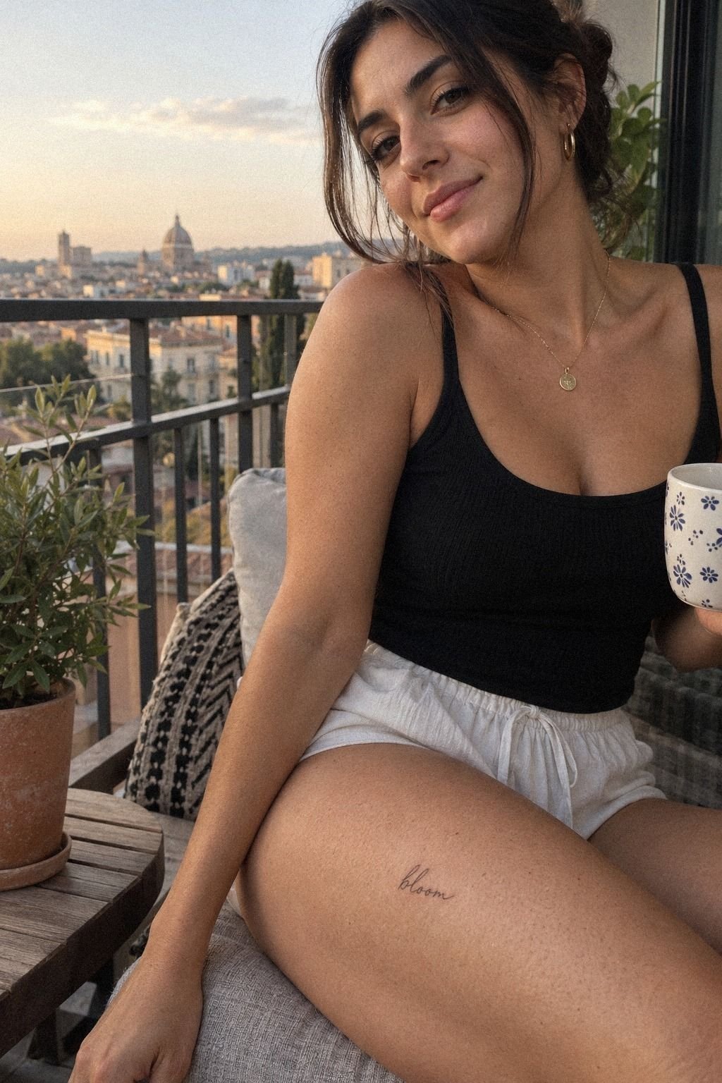
Cute word tattoos work best when the script has restraint. A short word with graceful curves can feel dainty without becoming childish, but every letter still needs enough separation to survive normal fading.
Ask your artist to show the word with a slightly heavier downstroke. That small adjustment can keep the script soft while giving each letter a clear spine. You’ll want balanced script weight, especially if the word contains repeated loops.
Tiny hearts, dots, and stars can be charming, but they shouldn’t compete with the word. If an extra mark doesn’t carry meaning, I’d leave it out. The result may feel more understated and more expressive.
The Quiet Script Filter
Look closely at the joins between letters. If one loop crosses another, the design may become difficult to read after the lines soften. You can keep one graceful flourish, but you shouldn’t ask for five decorative curls in a space smaller than your thumb.
Use a clean stencil and examine it from normal speaking distance. Compare it with these cute word tattoos before you decide. The best version may be less ornate than your first choice, yet more readable in everyday life.
4Explore Cool Fonts With Sharp Linework
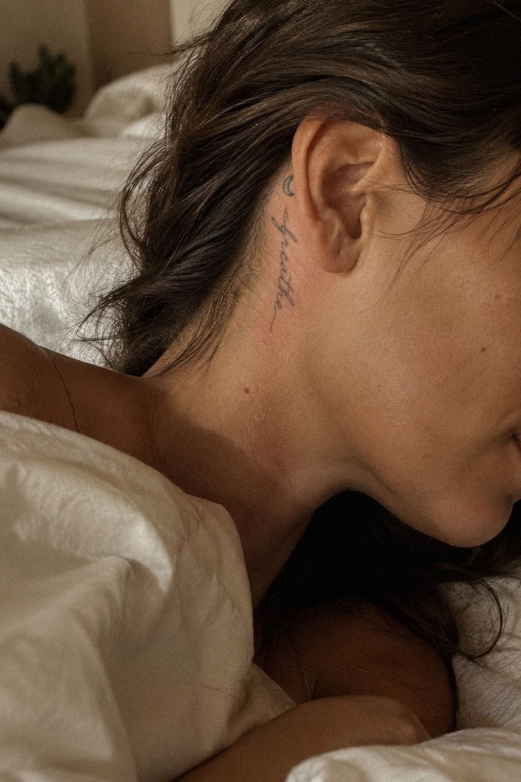
Cool word tattoos don’t need aggressive lettering. An edgy font can still be elegant when the strokes have room to breathe. A sleek sans serif may look modern, while a sharp serif can feel bold without becoming theatrical.
Test the font by tracing it with your finger. If the letters blur together when you move quickly, they’ll probably need more spacing. Your artist may suggest a cleaner font structure for a discreet placement.
Think about how the lettering will appear beneath work clothes, during meetings, or in photographs. You want enough character to feel stylish, but not so much density that the word disappears into a dark mark.
The Two-Read Test
Read the word close up, then step back and read it again. Both views should work. A tattoo that looks clever only from two inches away won’t give you much satisfaction once it’s healed.
I’d skip ultra-thin blackletter for a tiny placement. It can feel dramatic and haunting, but dense strokes may close faster than open lettering. These cool word tattoos can help you compare open and crowded lettering.
5Keep Little Words Crisp and Readable
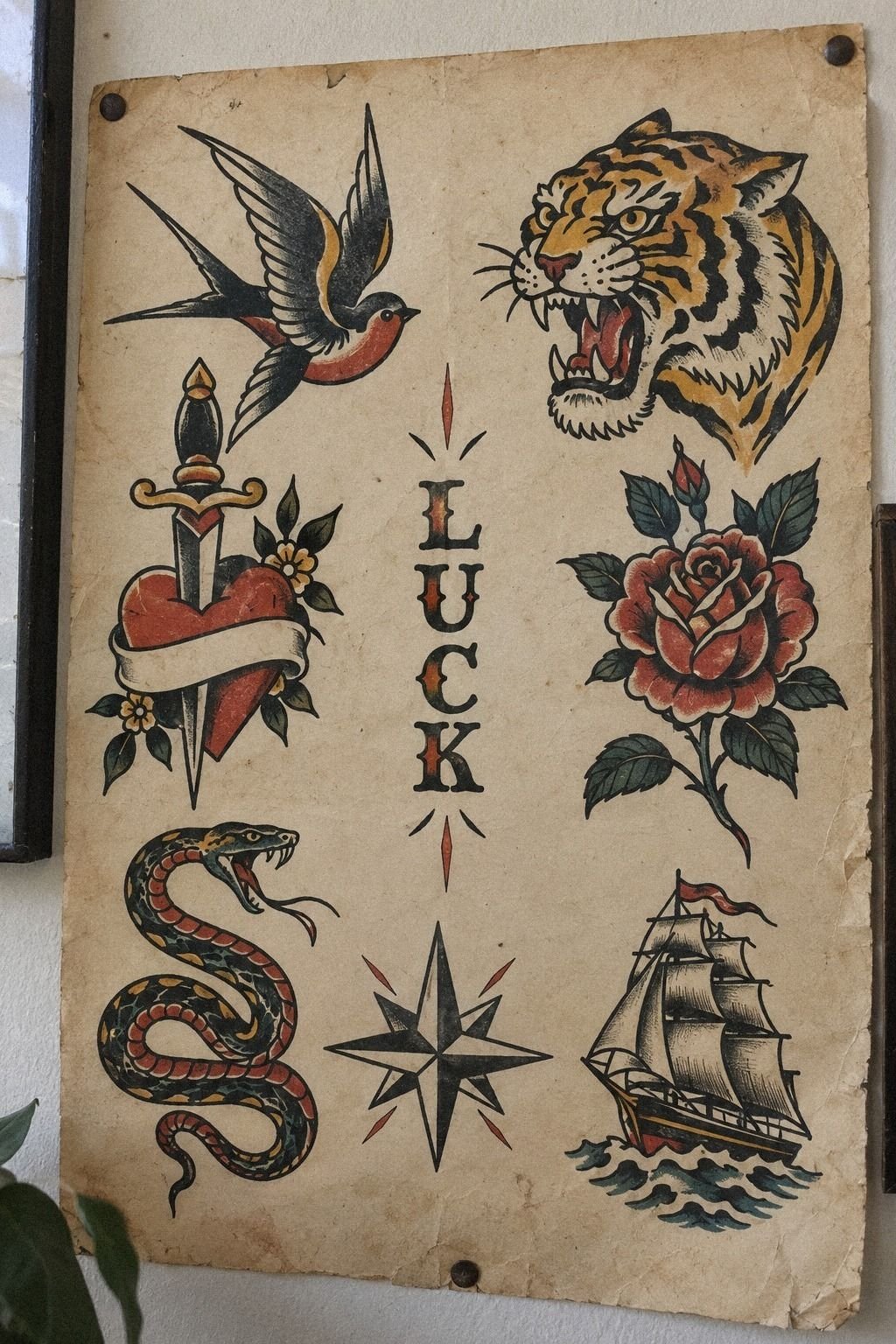
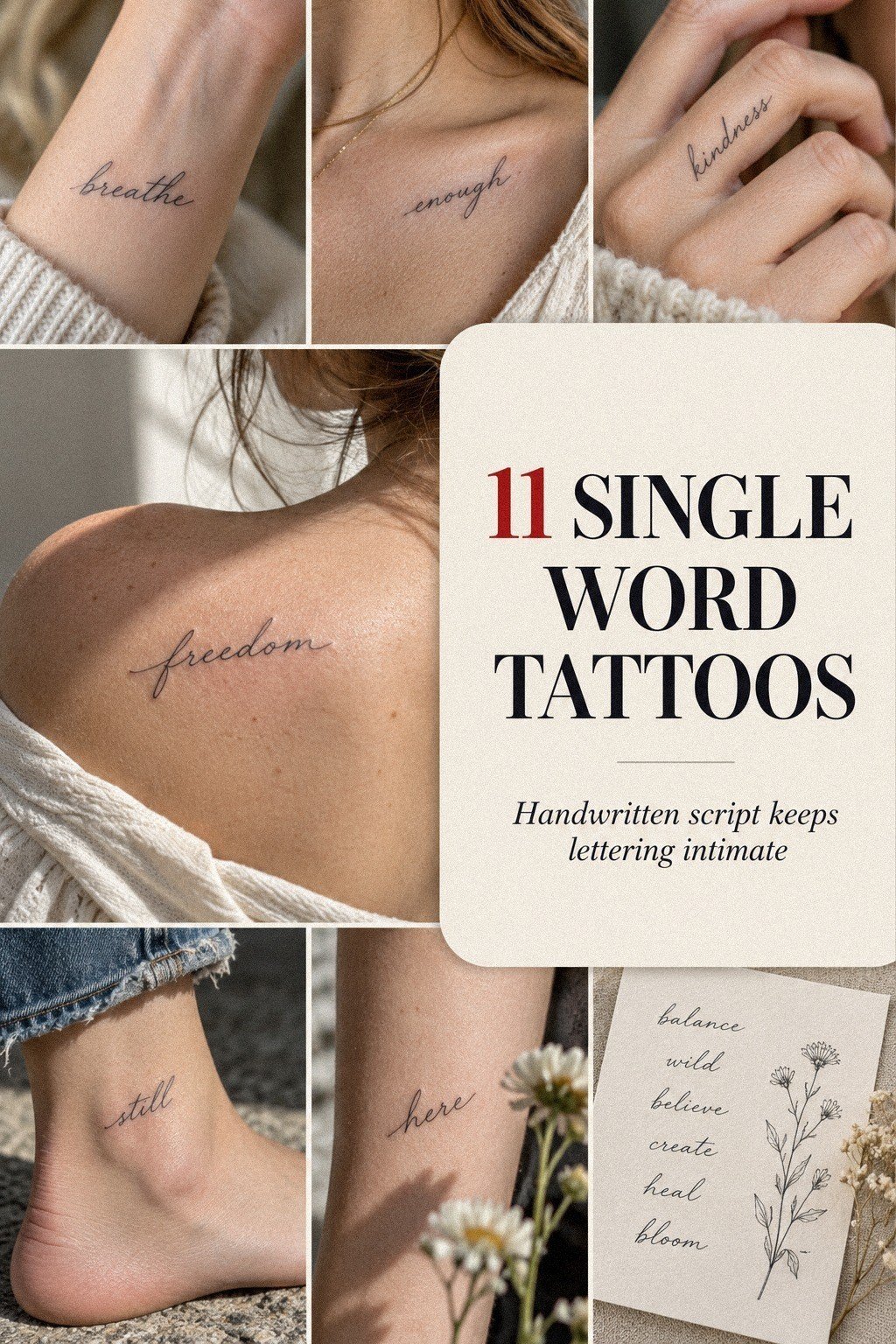
Little word tattoos need disciplined spacing more than extra decoration. Ask your artist to measure the full word, not only the tallest letter. A long word may need a wider stencil even when the letter height looks tiny.
Check the smallest interior spaces first. Those openings are often the earliest places to soften as the tattoo ages. You’re protecting long-term letter clarity, not simply choosing the smallest possible size.
A simple black design usually stays clearer than pale shading or crowded embellishment. Black ink with open negative space gives the eye somewhere to rest, and it photographs more cleanly for your records.
I once judged size from a screen and regretted it. The preview looked perfect there and much smaller on skin. Your phone can flatten scale, so trust an actual stencil more than a digital size preview.
Save this guide to why tattoos blur over time before you book. Fine lines can widen gradually, and understanding that process helps you choose a size that offers better future readability.
6Where Should a Hidden Word Go?
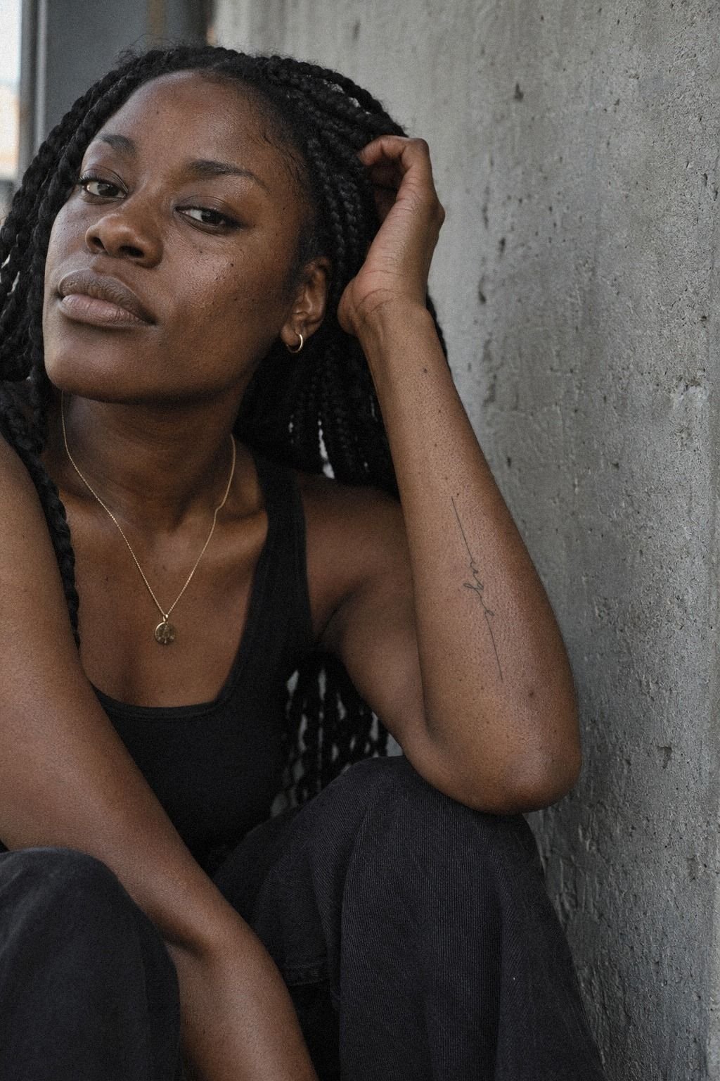
Placement decides whether your single word tattoo stays hidden at work. The inner forearm offers easy personal access, while the upper thigh can keep the design much more private. A wrist may show during typing, meetings, or hand gestures.
Think about your actual uniform, not an idealized outfit. Short sleeves, gloves, movement, and changing temperatures can reveal more skin than expected. A placement that seems discreet while standing still may become visible when you reach across a desk.
Your choice also affects cost and value. An easy-to-access placement may shorten the appointment, while a curved or sensitive area can require more careful positioning. The best location is worth it when it gives you reliable workplace privacy.
The Cover-Test Method
Wear the clothes you actually use for work. Sit, reach, bend, and lift your arms while someone checks whether the stencil appears. You’ll notice problems quickly if your job includes uniforms, short sleeves, or frequent movement.
I’d choose the upper arm or thigh over the hand when privacy matters. Hands can look raw, daring, and memorable, but they’re exposed during almost every ordinary task. Compare examples of wrist tattoos for men and notice how placement changes visibility.
7Match Letterforms to Your Tattoo Style
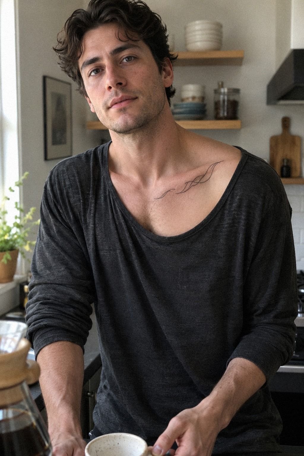
Your lettering should agree with the rest of your tattoos if you already collect them. A polished serif may clash with raw blackwork, while a minimal sans serif can bridge different pieces without taking over.
Write down two adjectives for your existing tattoos and two for your new word. If one list says ornate and sacred while the other says minimal and playful, you may need a transitional font. That contrast can become a powerful design choice when it feels intentional.
A personal word doesn’t have to look sentimental. It can be powerful, restrained, or slightly mysterious. Before you book, compare lettering with witchy tattoos if your word has a darker symbolic edge.
You’ll find inspiration without forcing a moon, dagger, or star into the design. The strongest result often has one controlled visual language rather than several competing ideas.
The Style Pairing Rule
Ask whether the word should feel feminine, masculine, neutral, playful, or timeless. There’s no correct answer. Your tattoo can be polished and fierce, delicate and bold, or understated and iconic.
A cohesive style can also improve value. You’re less likely to pay for a rushed redesign when you know what you want before the consultation.
Take your time. A thoughtful choice is worth it!
8Pain vs Privacy in Sensitive Areas
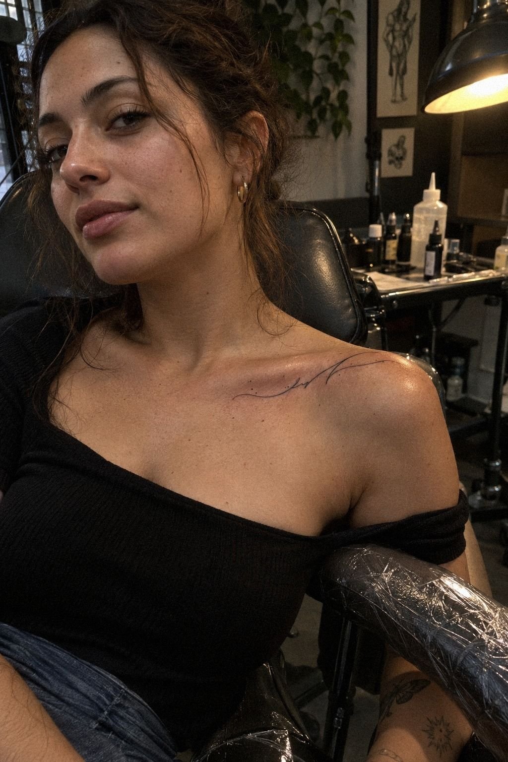
Pain varies by person, but placement gives you useful expectations.
9Test Size Before Committing to Ink
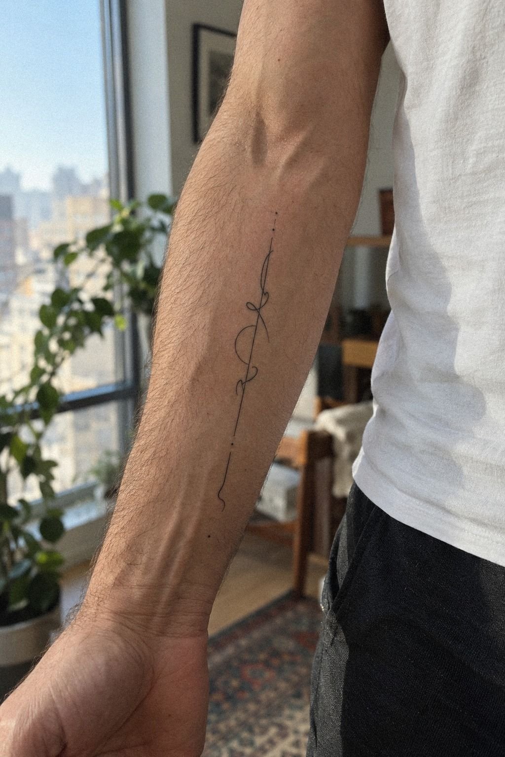
Before you approve the design, ask your artist to place the stencil at the exact size. Wear it for several minutes and look at it from close, medium, and normal speaking distance.
You’re checking readability, not chasing a flattering angle. If the letters disappear in every photograph, you may need more width, heavier lines, or a stronger font rather than a larger decorative symbol.
The stencil test protects your budget because it can prevent an expensive correction later. A slightly larger word may offer better value than a tiny design that loses its structure.
The Three-View Size Check
Look at the stencil with your arm relaxed, flexed, and turned sideways. A word that looks balanced from one position may compress when your skin shifts.
I’d rather increase the size slightly than force the letters into a cramped space. A refined word has enough room to breathe, and that open spacing can make it feel more elegant.
Ask to see the transfer on paper too. Paper won’t reproduce every curve of your body, but it can expose uneven spacing and awkward capitals before you pay the final tattoo cost.
10Protect Fresh Lettering During Healing
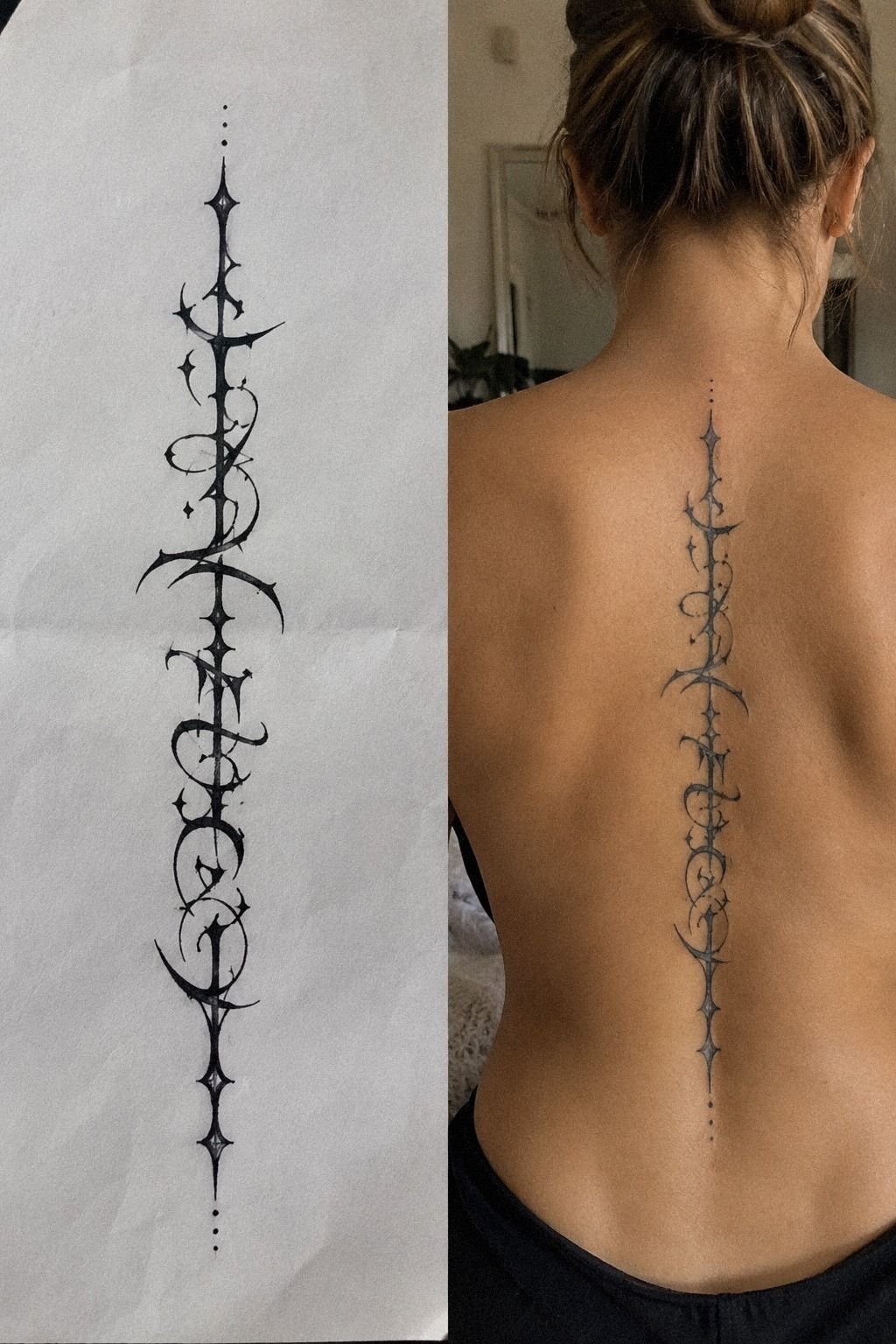
Fresh ink can look darker, glossier, and more striking than the settled result. You shouldn’t judge the final character during the first few days. The skin needs time to calm down.
A surface tattoo generally heals in about two to three weeks, while complete healing beneath the surface can take about two to three months. Follow your artist’s instructions, wash gently, moisturize as directed, and avoid swimming and direct sun while the skin is healing.
Those figures are typical US references, not a promise. Your cost can change with the artist, region, studio minimum, complexity, and appointment length. I’d never choose an artist only because the quote is low.
Use this white ink tattoo guide for comparison, not as a shortcut around healing decisions. White details can behave differently from black lettering, and your aftercare plan should match the ink and placement.
Healing also affects work privacy. Peeling, redness, or protective coverings may draw attention, so plan the appointment around your schedule. If your workplace is strict, ask how long the area may look visibly fresh.
11A Timeless Finish Starts With One Last Check
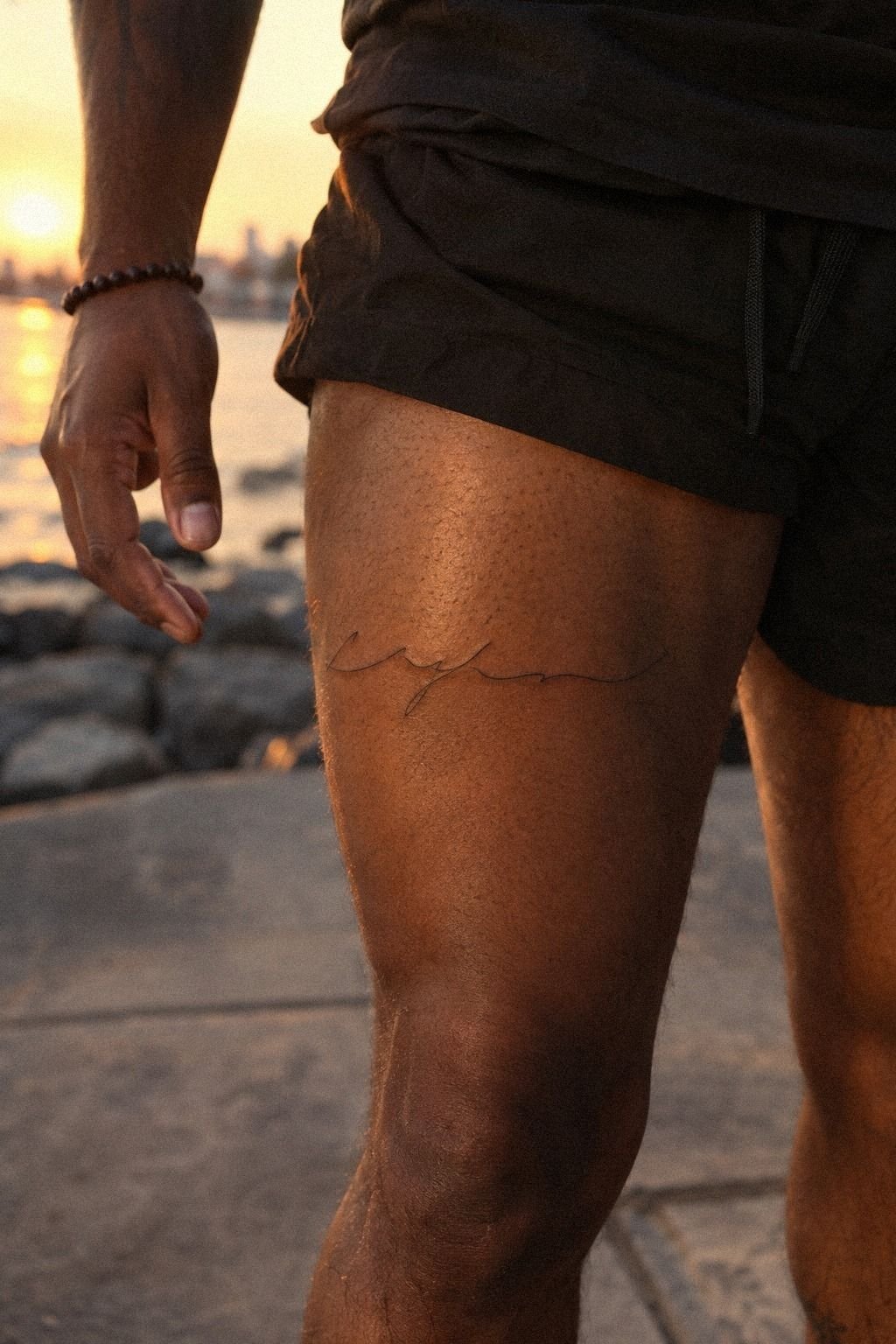
Before your appointment, ask to see the final stencil in the actual placement. You’ll catch uneven spacing before it becomes permanent.
Review every letter, including the first and last stroke. Check whether the baseline follows your body naturally and whether any accent mark is large enough to remain visible.
A timeless result usually comes from fewer details, better spacing, and a design that doesn’t depend on a passing trend. That restraint can feel elegant, crisp, and quietly iconic.
The Last-Pass Letter Check
Say the word aloud while you look at the stencil. Does the design still feel meaningful, empowering, or bold when the novelty disappears?
If not, pause. You can always reschedule, but you can’t easily erase uncertainty after the needle starts.
Ask your artist how the lines may age in that location and on your skin. Fine lines can soften, while solid black may remain more stable when placed well and protected from UV exposure.
These single word tattoo references can inspire you, but your final version should belong to your story. The strongest finish is a design you can explain only to yourself.
What I’ve Learned From Choosing Small Lettering
I used to think the word itself was the decision. It isn’t. The word starts the process, but the lettering, spacing, placement, and aftercare decide whether you’ll enjoy seeing it years from now.
A short word can carry a surprisingly large visual responsibility, especially when every letter sits close to the next. That’s why a meaningful choice still needs a careful technical plan.
My first mistake was trusting a digital preview too much. Screens flatten the body, ignore movement, and make tiny details look more open than they are. Now I ask to see the stencil from normal conversation distance.
That simple test saved me from choosing an intricate style that looked impressive only in a cropped image. It also helped me protect my budget because I could change the design before the appointment.
I’m less impressed by ultra-fine work than I used to be. Fine line can look ethereal, but it still needs enough structure to survive ordinary life. If your word is important, don’t hide it inside decoration.
A bold downstroke or a little extra spacing may protect the meaning better than another flourish. That practical adjustment can be more valuable than an elaborate detail.
Finally, I’d rather wait two weeks than rush a permanent design because an appointment opened up. You’re choosing something that will move with your body, appear in photographs, and possibly stay covered at work for much of the day.
That tension is part of the appeal. A discreet tattoo can still feel expressive, polished, and completely yours when the planning is honest!
The Questions I Get Asked Most
How much does a single word tattoo usually cost?
A small single word tattoo often costs about $100 to $300 in the US, though shop minimums may run about $50 to $100 and hourly rates about $100 to $250. Artist quality and placement matter more than a bargain quote. Your region and lettering complexity can change the total.
Are single word tattoos a good idea for a first tattoo?
Yes, single word tattoos can be a strong first choice because you can select a tolerable placement and a readable design. A meaningful word gives you a clear reason to keep it. Your artist can make the lettering simple enough to understand while you learn how your skin heals.
How do I choose a tattoo artist for a single word tattoo?
Choose an artist whose portfolio shows clean lettering, healed results, and consistent hygiene. Look for healed photos, not only fresh close-ups. Ask about their specialty, stencil process, shop minimum, and aftercare instructions before you book.
How much do single word tattoos hurt?
Pain depends on the person and location. Ribs, feet, hands, and sternum often feel more intense, while forearm, thigh, and shoulder placements are commonly more tolerable. Placement is your biggest variable, so you can choose a gentler area if you’re concerned.
How long does a single word tattoo take to heal?
The surface usually heals in about two to three weeks, while complete healing can take about two to three months. Gentle washing and sun avoidance support the process. You should also avoid swimming and follow your artist’s moisturizing instructions until the skin settles.
What’s the best placement for a single word tattoo?
The upper arm, thigh, or inner forearm can work well when you need control over visibility. The upper thigh offers more privacy, while the forearm makes the word easier for you to see. Hands, neck, and fingers are more exposed, so they may not stay hidden at work.
Where I’d Start First
If I had to pick one step, I’d start with the stencil size on your inner forearm. You’ll catch spacing problems before ink makes them permanent, and the area is easier to cover than a hand or neck.
Save the stencil photo, sit with it, and look at it under ordinary light. If the word still feels meaningful after several days, the design may be worth it. If doubt keeps returning, wait!