Tatuagem old school is the backbone of Western tattooing. Born in naval ports and circus tents, refined in street shops from the 1900s through the 1960s, it’s the style most people picture when they hear the word “tattoo.” Think thick black outlines, saturated color packed into limited spaces, and iconic imagery that reads instantly from across a room. I’ve been tattooing this style for over a decade, and I still reach for my old school needles weekly. The work holds up. That’s the whole point.
Origins & History
From Sailors to Street Shops
The old school story starts with sailors. In my chair, I’ve heard every version of this from collectors who’ve done their homework. The basics: Captain Cook’s crew brought tattooing back from Polynesia in the 1700s, but it was the American and European naval boom of the late 1800s that turned skin art into a working-class institution. Sailors got inked in Honolulu, San Diego, Portsmouth. They brought designs home. Shops opened near ports. The style codified.
By the 1920s, you had recognizable old school tattooing. Electric machines (Samuel O’Reilly’s rotary patent, then Percy Waters’ frames), carbon-based inks, and a visual language built from what traveled well: anchors, swallows, pin-ups, daggers, hearts with banners. These weren’t aesthetic choices in a vacuum. They were practical. Bold lines held on skin that got sunburned, scraped, and washed constantly. Limited palettes meant less mixing, more consistency between artists who might never meet.
The Golden Age Names
We see this a lot in the shop: clients name-dropping Sailor Jerry, Bert Grimm, Owen Jensen, Cap Coleman. These weren’t mythic figures to us. They were competitors, collaborators, guys who traded sheets in an actual network. Norman Collins, Sailor Jerry, ran his Honolulu shop from 1940 to 1973. His flash sets still circulate, still get copied, still get reinterpreted. That’s the test of a style: can someone pick it up fifty years later and make it work? Old school passes.
Key Characteristics & Motifs
Here’s what separates actual old school from “kinda traditional.” I tell clients this when they bring reference that doesn’t quite fit:
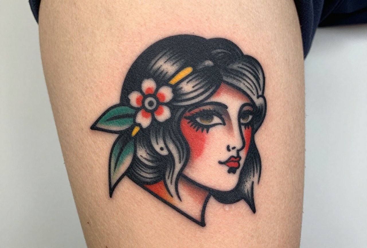
- Line weight: Thick, consistent outlines. Not delicate. Not sketchy. A single bold stroke that contains the whole design.
- Color saturation: Red, yellow, green, blue, black. Maybe brown for skin tones. That’s the classic palette. No gradients, no soft fades between hues.
- Minimal shading: When shading exists, it’s whip-shaded or solid black. No smooth gray washes. The contrast is sharp, not subtle.
- Readable imagery: You should know what it is from ten feet away. A rose reads as a rose. A skull reads as a skull. No abstraction for its own sake.
- Iconic subjects: Anchors, swallows, ships, pin-ups, daggers, snakes, panthers, roses, hearts, banners with names, eagles, sharks. The vocabulary is limited because it works.
The banner with a name? That’s old school DNA. I’ve tattooed “Mom” more times than I can count. The heart-and-banner isn’t ironic when it’s done right. It’s lineage.
Color vs Black and Grey
The Classic Palette
Real old school color is aggressive. The reds lean orange. The yellows are mustard, not lemon. Greens are forest, not mint. These weren’t aesthetic preferences, they were the pigments available. Cadmium reds, chrome yellows, Prussian blue. Some of those original pigments were toxic (lead, mercury), but they stayed bright. Modern equivalents approximate the look without the poison.
I pack color differently for old school. Tighter circles, more passes, more trauma to the skin actually. The color needs to sit dense. A washed-out traditional piece looks like a mistake. In my chair, I’ll warn clients: this is going to hurt more than a delicate blackwork piece, and it’s going to look bold longer because of it.
Black and Grey Old School
There’s a valid black and grey branch. Sailor Jerry did it. So did the Bowery guys. It’s less common in flash sets because color sold better, but the same rules apply: bold lines, limited tonal range, sharp contrast. No smooth black and grey realism gradients. The shading is still whip-shaded, still patchy, still deliberate. I have a black and grey swallow on my own forearm. Reads clean from across the shop.
Best Placements
Old school was designed for bodies that moved, worked, aged. The placements reflect that:
- Forearms: Classic visibility. A sailor’s handshake. Still the most requested spot in my shop for first traditional pieces.
- Upper arms: Biceps and outer deltoids. The “half-sleeve” of the 1940s. Holds detail without excessive stretching.
- Chest: Eagles, ships, pin-ups. Centered or off-center, the chest gives flat skin that ages predictably.
- Hands and knuckles: LOVE/HATE. HOLD FAST. These are old school traditions, not inventions. The skin here is different, tighter, more prone to blowouts. Experienced artists only.
- Thighs and calves: Larger flash pieces. Panthers, snakes coiled around daggers. The muscle padding helps with longevity.
What I don’t recommend: ribs, feet, inner biceps for your first old school piece. The style needs to breathe. Compression from shoes or constant friction from arm movement distorts those bold lines faster than you’d think.
Who It Suits
Old school doesn’t care about your aesthetic subculture. I’ve tattooed this style on punk kids, corporate lawyers, grandmothers getting their first piece at sixty. The common thread: they want something that won’t look dated in five years because it already looks like it’s from 1950. That’s the trick. It’s permanently retro.
Skin tone matters less than people assume. The bold lines carry dark skin beautifully. The saturation needs adjustment, some pigments read differently on melanin-rich skin, but the style itself doesn’t diminish. I adjust my palette case by case. Yellow might become gold. Red might shift to a deeper vermillion. The structure stays.
Modern Variations
Neo-Traditional
This is what most clients actually mean when they say “old school but more detailed.” Neo-traditional keeps the bold lines and readable composition but adds more complex shading, broader color palettes, and sometimes softer edges. Think Ed Hardy pushing into the 1970s, or contemporary artists like Valerie Vargas and Stewart Robson. I do both. In my chair, I’ll ask: do you want the restraint, or the expansion? They’re different commitments.
Japanese Fusion
Some artists blend old school structure with Japanese imagery, dragons, koi, oni masks in bold American lines. It works when the artist understands both traditions. It fails when it’s just a mashup. I’ve seen beautiful hybrid pieces and I’ve seen disasters. The line weight requirements clash if you don’t resolve them deliberately.
Choosing an Artist
This is where shop culture matters. Not every artist who can do realism can do old school. The confidence is different. The hand speed is different. I watch apprentices struggle with bold lining for months, it’s harder to commit to a single thick stroke than to build up delicate work.
Look for:
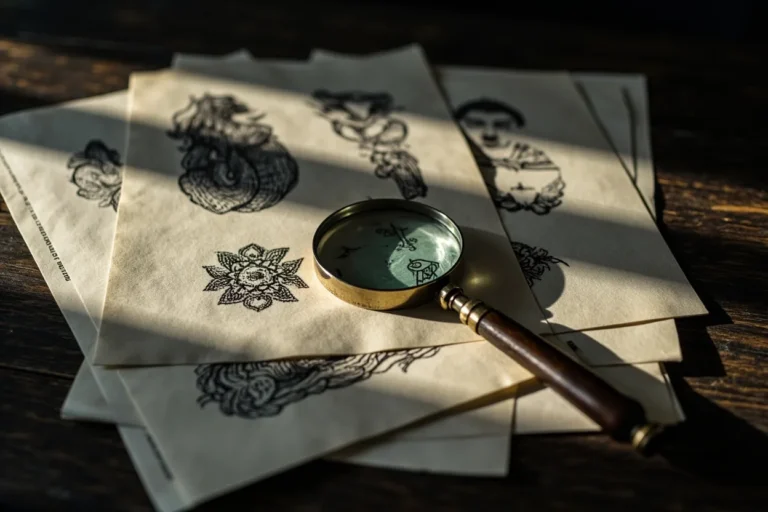
- Flash sheets: Does the artist paint their own? That’s commitment to the vocabulary.
- Healed photos: Old school should look similar fresh and healed. The lines stay, the color stays. Ask to see work from two years prior.
- Line consistency: In person, look at their healed pieces. Are the lines uniform? Any wobbles, any blowouts, any sections where the ink fell out?
- Shop talk: Do they reference the history naturally? Do they know why swallows mean 5,000 nautical miles? The knowledge signals respect for the tradition.
I’ve sent clients to other artists when the request was outside my strength. A good shop does that. A bad shop takes every booking regardless of fit.
Final Thoughts
Tatuagem old school isn’t nostalgia. It’s a living style with rules that exist because they solve real problems: how to make ink last on human skin, how to communicate across distance, how to build a visual language that travels. I’ve tattooed thousands of pieces in this style. I’ll tattoo thousands more. The work doesn’t get old because it was never trying to be new. It was trying to be true.
If you’re considering your first piece, or your fiftieth, the traditional route rewards research and respects commitment. Find an artist who lives in this vocabulary. Sit in the chair. Feel the machine. Walk out with something that would read clear to a sailor in 1943 and still reads clear on your grandkid’s phone screen. That’s the point. That’s old school.
Frequently Asked Questions
How painful is an old school tattoo compared to other styles?
The bold lining and dense color packing create more skin trauma than delicate styles, so it often hurts more during the session. But the tradeoff is longevity, those bold lines hold their shape for decades where finer work might blur or fade.
Can old school tattoos cover up older tattoos I regret?
Absolutely. The bold black outlines and solid color fields are excellent for cover-ups. I’ve reworked plenty of faded pieces with traditional panthers and daggers, the dark shapes swallow old ink effectively when designed right.
Why do old school tattoos sometimes look ‘simpler’ than what I see on Instagram?
That simplicity is intentional and functional. Every element exists to read clearly from a distance and to age well. Extra detail would blur over time. The restraint is the craft.
How do I care for an old school tattoo while healing?
Follow your artist’s specific aftercare, but generally: keep it clean, don’t pick at scabs, avoid soaking, and keep it out of sun. The bold lines heal relatively predictably, but color saturation depends on you not scratching that tight, packed skin.