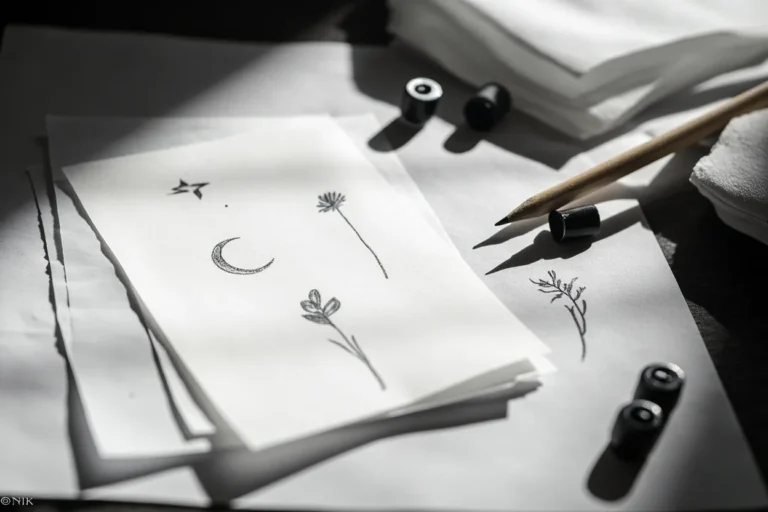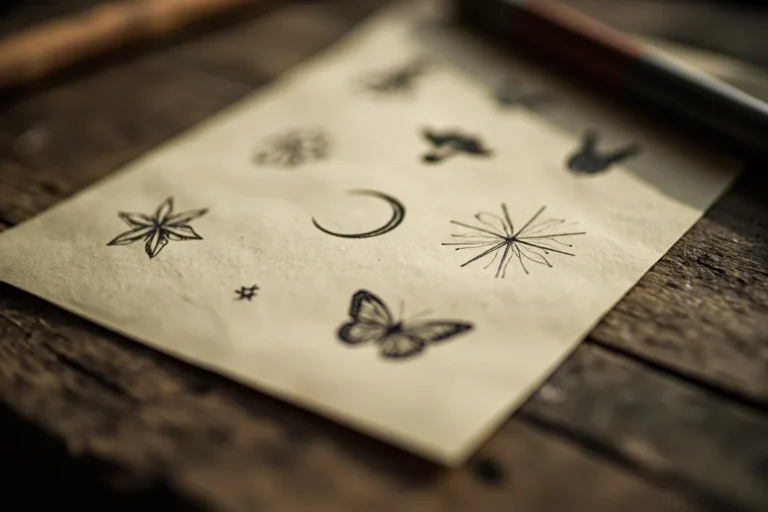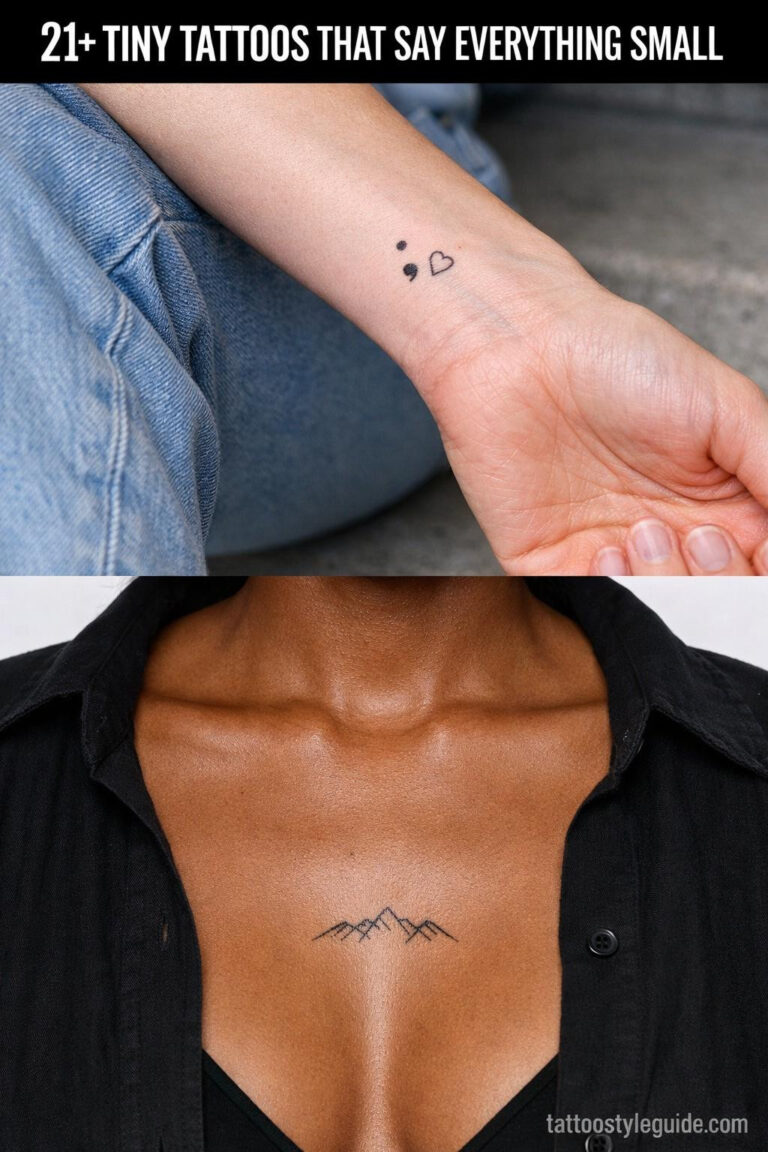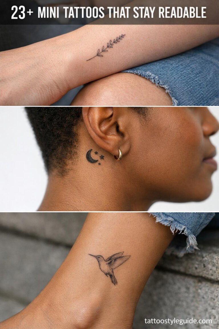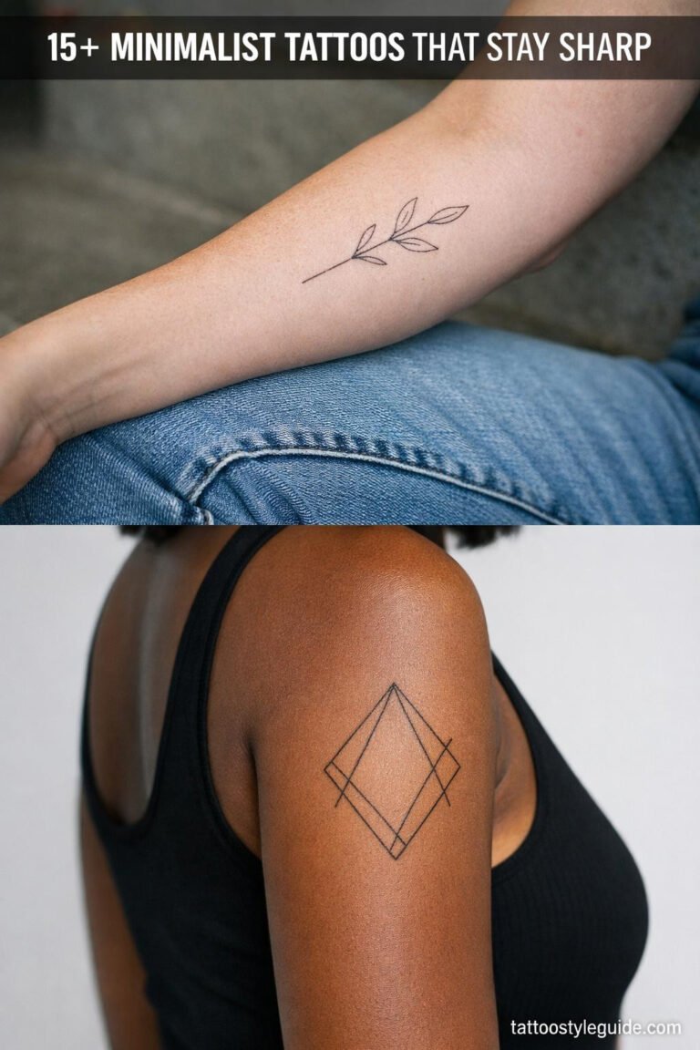
Classy tattoo ideas are usually less about the symbol and more about restraint. A rose can look elegant or cheap. A tiny script tattoo can look intentional or like an afterthought. Scale, spacing, and placement decide the difference.
Quick answer: Classy tattoo ideas include single-stem flowers, clean script, small blackwork, ornamental spine designs, fine line animals, traditional roses, shoulder pieces, and minimalist symbols sized large enough to heal clearly.
Classy tattoo ideas by mood
The safest classy tattoos have one focal point and a placement that gives the design room.
| Idea | Best use | Watch-out |
|---|---|---|
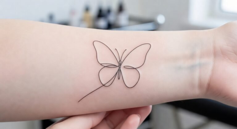
| Single-stem flower | Soft but readable design | Avoid crowded petal detail |
| Fine line animal | Quiet personal meaning | Use a clear silhouette |
| Black ornamental mark | Elegant contrast | Symmetry must be exact |
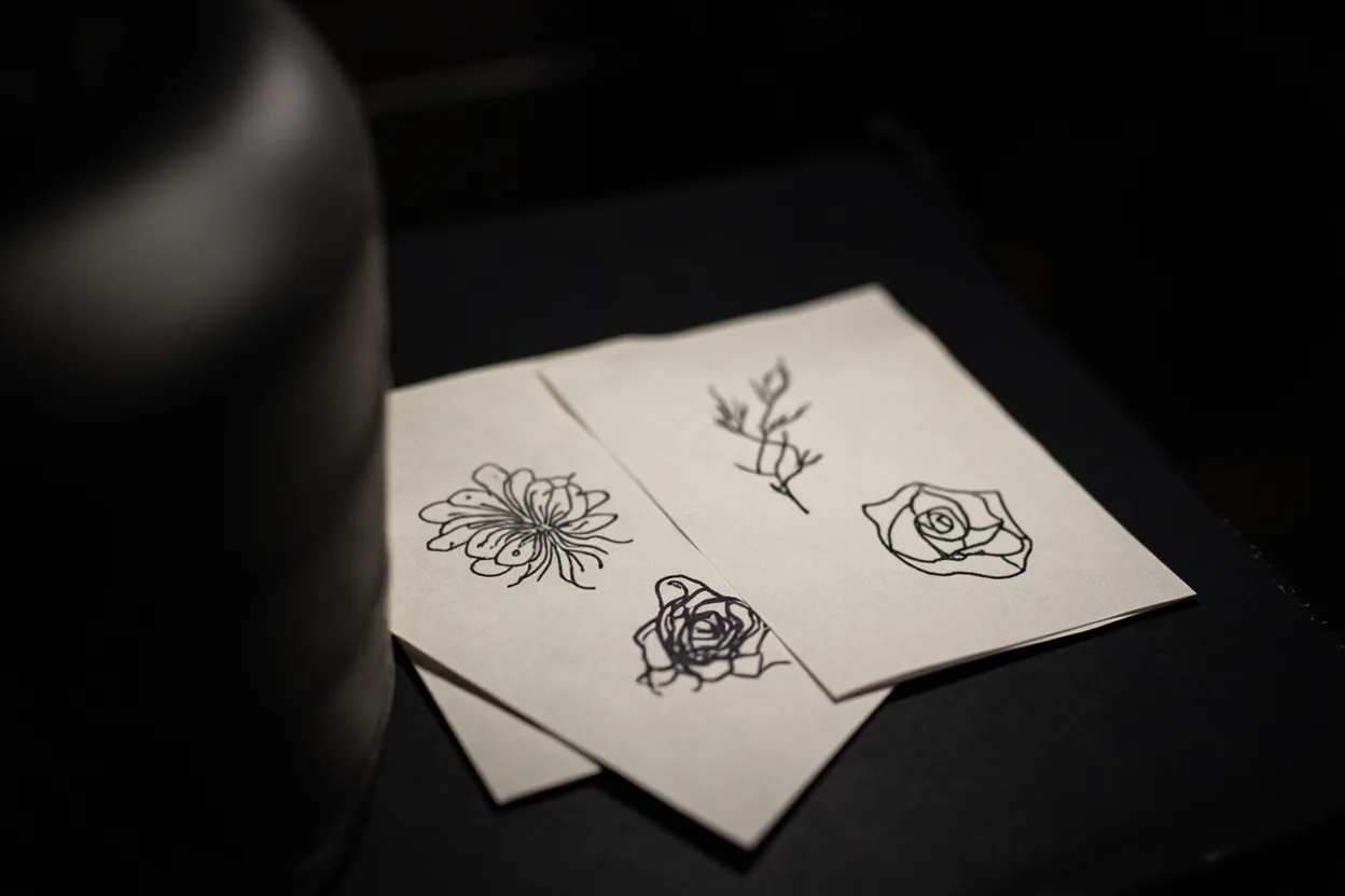
| Traditional rose | Timeless and bold | Needs confident line weight |
| One-word script | Private reminder | Letter spacing matters |
If you want quiet confidence, go black and grey with a single botanical or architectural subject. A sprig of olive branch on the forearm, a Roman arch on the upper arm, or a single peony on the shoulder blade all read as intentional without screaming for attention. These designs age well because they rely on clean composition rather than color saturation that fades and muddies over time.
For something with a little more edge but still polished, consider fine line portraits or small geometric forms on the inner wrist or collarbone. The mood shifts depending on the subject, not the size. A tiny vintage compass reads completely different from a tiny skull, even at the same scale. Know the vibe you’re going for before you walk in, not after.
Classy usually means edited down
Quiet confidence is the whole point, if it screams, it isn't classy.
The design should look like it belongs on the body part, not like a sticker placed on skin. Long designs work well on ribs, spine, forearm, and collarbone. Compact designs often work better on shoulder, ankle, wrist, or upper arm.
If you want the tattoo to feel refined, do not shrink it until every detail becomes fragile. A slightly larger clean tattoo usually looks more expensive than a tiny crowded one.
Most classy tattoos that hold up over ten years started as a bigger idea that got cut in half. Negative space does the heavy lifting. Your artist isn’t being lazy when they tell you to remove the filler swirls or drop two of the three flowers. They’re keeping your design from turning into a gray blob by the time you’re forty. Trust that edit.
Fine line work especially needs restraint. Pack too many elements into a small piece and the lines bleed into each other within two to three years, even on low-wear zones like the ribcage or thigh. A design that’s 60% skin and 40% ink reads crisper from across the room and heals way nicer than something crammed edge to edge. Less ink, more impact.
What to check in the portfolio
Classy tattoos expose weak execution. Look closely before booking.
- Line consistency: thin lines should not wobble or fade in the same healed photo.
- Spacing: petals, letters, and ornaments need open air.
- Placement photos: the tattoo should fit the body from more than one angle.
- Healed work: fresh fine line photos are not enough.
Look at healed work only. Fresh tattoos always look sharp. What you need to see is how that artist’s lines hold after six to twelve months, whether their black and grey stays smooth or gets splotchy, and if their fine line work survives without blowout. Ask directly for healed photos. Any solid artist has them and will share without hesitation.
Also check for consistent linework on curves, not just straight geometric pieces. Curves on the body are where shaky hands show up fast. Look at script, circular mandalas, and botanical stems. If the lines wobble on those, they’ll wobble on yours. Style consistency matters too. An artist who does bold traditional and hair-thin fine line equally well is rare. Pick someone whose sweet spot matches what you actually want.
What makes a classy tattoo look generic
The most common problem is copying the exact Pinterest reference. The second problem is adding too much meaning to prove the tattoo matters. Elegant tattoos usually trust one idea.
If the artist suggests slightly bolder linework, listen. Classy does not have to mean faint.
A classy concept goes generic fast when it’s pulled straight from a reference board without any customization. Infinity symbols, generic lotus flowers, and script quotes in basic fonts have been done tens of thousands of times. They’re not bad tattoos, they just carry zero identity. What makes a piece read as elevated is specificity, a detail, a reference, a proportion choice that belongs to you and not to a Pinterest category.
Placement turns generic into thoughtful almost immediately. That same simple line drawing of a wave placed intentionally along the inside of a forearm, following the natural contour of the muscle, looks completely different from the same image slapped flat on an ankle with no regard for the body beneath it. Talk to your artist about flow, not just subject matter. Placement decisions are half the design.