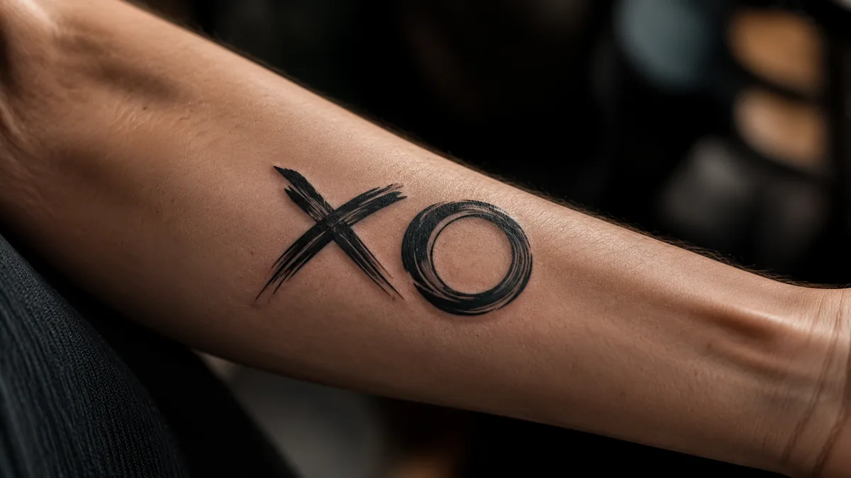
XO is two letters, zero ambiguity. X means a kiss. O means a hug. Put them together and you’ve got a shorthand for love and affection that people have been signing off letters with for over a century. As a tattoo, it carries that same charge, but permanent. It’s a bold declaration, a private reminder, or a tribute, depending on who’s wearing it.
What makes the XO tattoo work is how much it does with how little. Two characters, clean and readable, and you’ve got something with real emotional weight. It’s one of those pieces that looks deceptively simple but hits hard when you know the story behind it. And a lot of people have a story.
The Core Meaning: Love, Hugs, and Kisses
XO stands for hugs and kisses, full stop. X is the kiss, O is the hug. That pairing dates back to written correspondence, when people signed letters with X as a symbolic kiss, a gesture tied to swearing on the cross. The O got added over time to represent arms wrapping around someone, forming a circle. Together they became the standard shorthand for affection in English-speaking cultures.
As a tattoo, XO signals love loud and clear. Some people get it as a tribute to a partner, a parent, a child, or a friend they’ve lost. Others wear it as a general statement about how they move through life. Either way, the meaning is consistent: warmth, connection, love given and received. It’s never ambiguous. That’s part of why it works.
Cultural Background: Where XO Actually Comes From
Two letters, one meaning: the shortest love letter you'll ever wear.
The X-as-a-kiss tradition goes back to medieval times in Western Europe. Illiterate signers would mark documents with an X, representing the Christian cross, then kiss the mark to seal the oath. That gesture stuck. By the 1800s, X in written letters was understood as a kiss. The O is less documented, but the most accepted theory links it to Jewish immigrants in North America who used O instead of X to avoid the cross symbol, and the circle came to represent an embrace.
In modern pop culture, The Weeknd’s XO brand pushed the letters into a new lane. His label and fan community, XOTWOD, gave XO a second life as a symbol of loyalty, brotherhood, and devotion to craft. A lot of tattoo clients today carry that double meaning, classic affection and that crew loyalty angle. Both are legitimate. Neither cancels the other.
Popular Design Variations
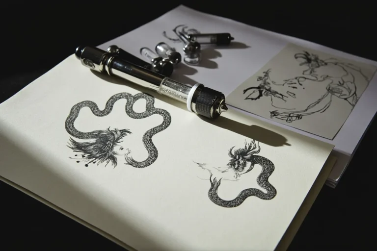
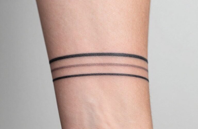
The most common version is just the two letters in a bold, clean font. Old English, serif, script, block caps, all of them are popular in shops. Some clients go minimal with fine-line lettering, barely a few millimeters tall. Others want it large and saturated, reading from across the room. Then there’s the symbol version: an X made from two crossing lines next to a clean circle, no letters at all, more geometric and graphic.
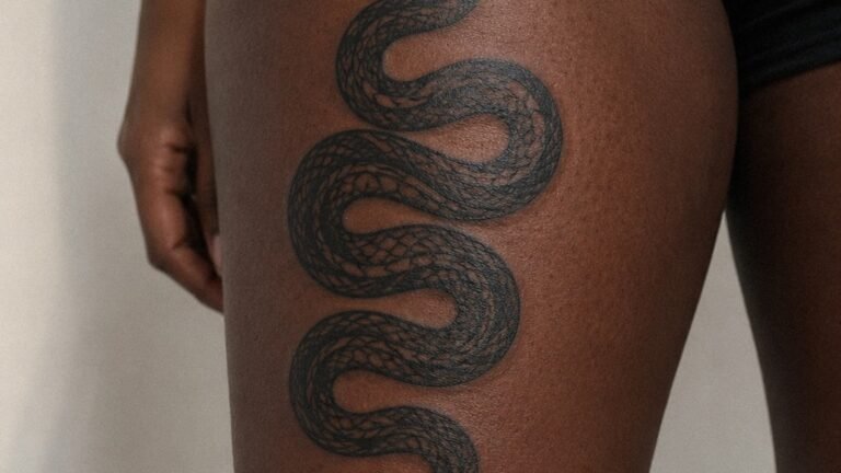
Beyond text and geometry, artists work XO into larger compositions. Heart outlines incorporating the letters, rose bouquets with XO scripted into a banner, matching pieces where two people each get one letter. Infinity symbols fused with XO show up regularly too. Some clients stack the letters vertically instead of side by side. The flexibility is real. A skilled artist can make the design fit almost any aesthetic, from neo-traditional to blackwork to illustrative.
Fine Line vs. Bold Traditional: Choosing Your Style
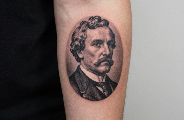
Fine line XO tattoos look stunning fresh out of the shop. Thin, precise letterforms with clean negative space. The catch is longevity. Fine line work in high-wear zones like fingers, wrists, or the sides of hands will fade and blur faster than you expect. The lines spread, the contrast drops, and what was crispy becomes muddy inside a few years. If you want fine line, go low-wear: inner arm, ribs, behind the ear, collarbone.
Bold traditional or blackwork XO tattoos hold up significantly better. Thick strokes, solid fills, strong contrast. Those pieces will still read clearly a decade in. Black and grey with some whip shading gives the letters dimension without the weight of a full black fill. Color works too, especially a single accent like red or gold on otherwise black letterforms. Saturated color in small lettering can bleed over time, so your artist needs to space those letterforms right.
Best Placements and How It Ages
XO is compact enough to go almost anywhere. Popular spots include the inner wrist, forearm, collarbone, behind the ear, finger, ankle, and the side of the neck. Each spot has tradeoffs. Fingers are a high-wear zone. The skin moves constantly, folds, grips, sweats. Expect touch-ups. Blowout risk is higher there too, especially on lighter skin tones. Collarbone and inner arm are lower-wear, hold ink cleaner, and age much more gracefully.
Placement also affects readability. A small XO on the wrist reads constantly, to you and everyone else. That visibility is intentional for a lot of clients. Behind the ear or ribcage is more private, something you choose to show. Both are valid choices depending on the intention. For longevity, avoid the palms and sides of fingers unless you’re committed to regular touch-up sessions. Inner bicep, sternum, and inner forearm are the sweet spots for this design aging well.
Pain Levels by Zone
XO tattoos are small, which keeps session time short regardless of where you place them. That said, location still determines how spicy it gets. The collarbone, ribs, and sternum are notoriously rough. Thin skin sitting directly on bone means every pass of the machine resonates. First-timers are often surprised by how intense the collarbone gets, even for a small piece. Behind the ear and on the neck are no joke either, lots of nerve endings, thin skin, sensitive.
Forearms, outer biceps, and the upper back are the gentler zones. More muscle and fat between skin and bone means the machine vibrates less into your skeleton. If this is your first tattoo, those areas let you get through the session without white-knuckling the chair. Inner wrist sits in the middle, not brutal, but not nothing. Fingers are less about pain and more about the unpleasant tickle and pressure of tattooing close to joints.
Who Gets XO Tattoos and How to Make It Personal
The XO crowd is genuinely wide. Young couples getting matching pieces. Parents tattooing it as a tribute to kids. People honoring someone they’ve lost, a parent, a best friend, a partner. Weeknd fans claiming the brand. People who just like the look of two clean letters with a strong meaning behind them. There’s no wrong reason. The design is accessible visually and emotionally, which is exactly why it stays consistently popular in shops.
To make yours personal, lean into the details. The font choice alone changes the entire feel. A handwritten script version of XO, copied from someone’s actual handwriting, turns a simple piece into something irreplaceable. Incorporating a meaningful date, coordinates, or a small additional element like a star or a single flower can anchor the piece to a specific memory without overcrowding it. Talk to your artist about what reads cleanly at your chosen size. Let the design breathe. The less clutter, the stronger it lands.