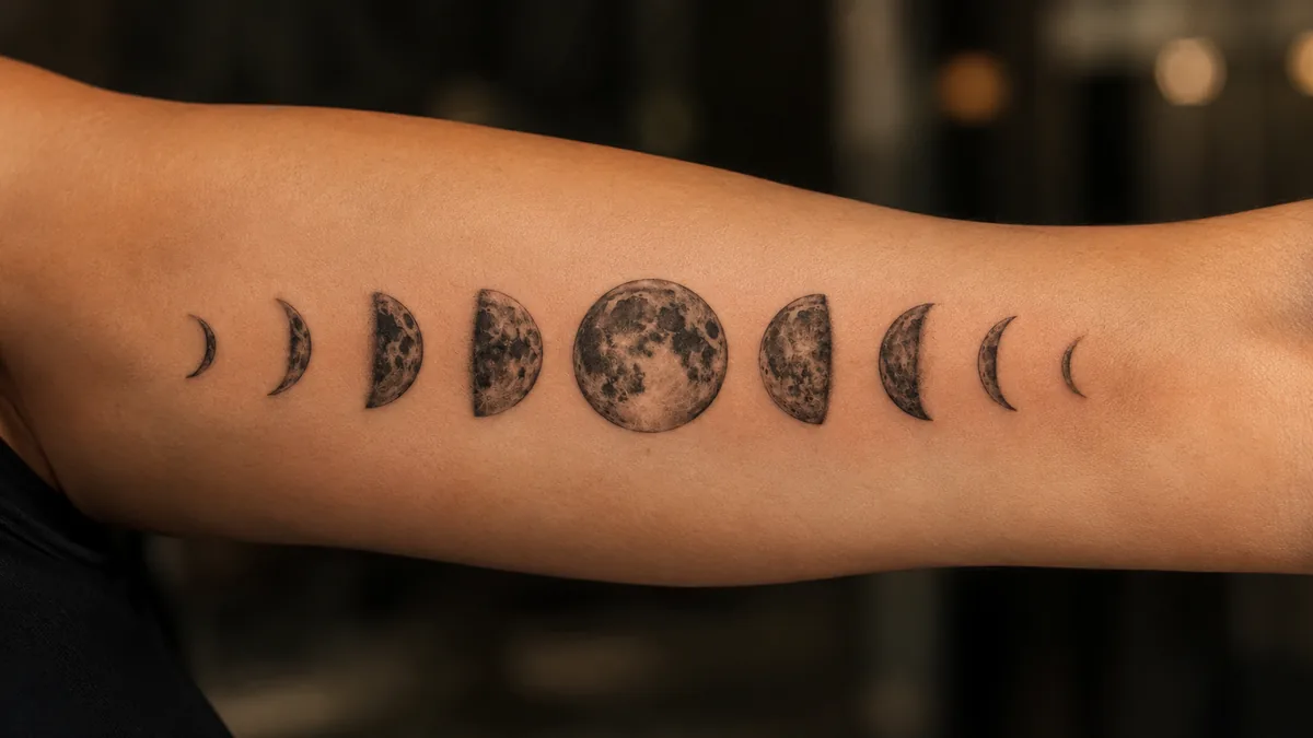
The moon cycle tattoo is one of the most requested pieces in any shop right now, and for good reason. It’s not just pretty. Each phase of the moon carries real symbolism, and stringing them together tells a full story about change, growth, and the passage of time.
Most people who walk in asking for this design have a personal connection to cycles, whether that’s grief turning into healing, a chapter ending, or just a deep pull toward something they can’t fully explain. That’s exactly what makes this tattoo work.
What the Moon Cycle Tattoo Actually Means
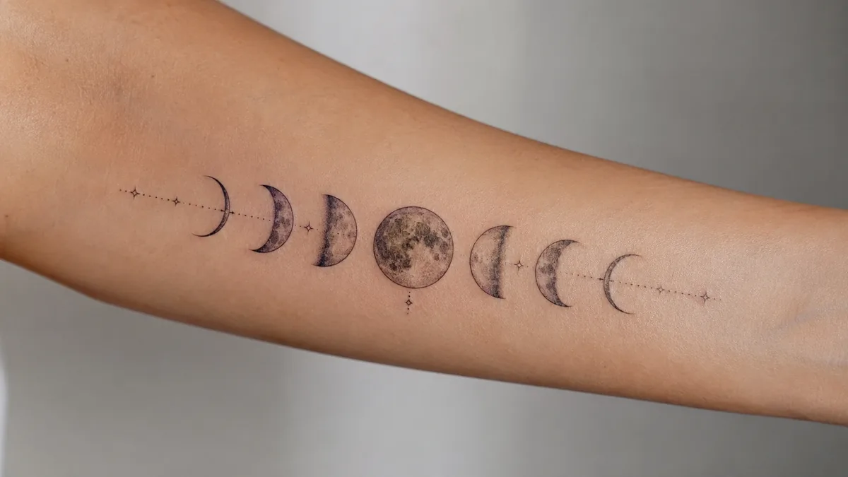
The core meaning is transformation. The moon moves through eight phases, from new moon to full and back again, and that complete arc represents a cycle of death and rebirth. Nothing stays the same. The new moon is potential, the full moon is peak energy or clarity, and the waning phases are release and rest. Together they say: everything changes, and that’s okay.
A lot of people also read it as balance. Light and dark, visible and hidden, active and still. The cycle never stops and never skips a phase. You can’t rush from new to full. That reminder to be patient with yourself, to trust the process, is something a lot of wearers carry intentionally every day.
Femininity, the Body, and the Moon
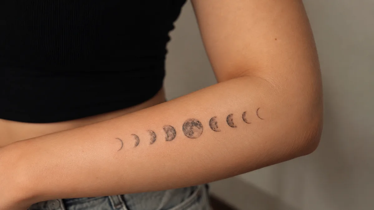
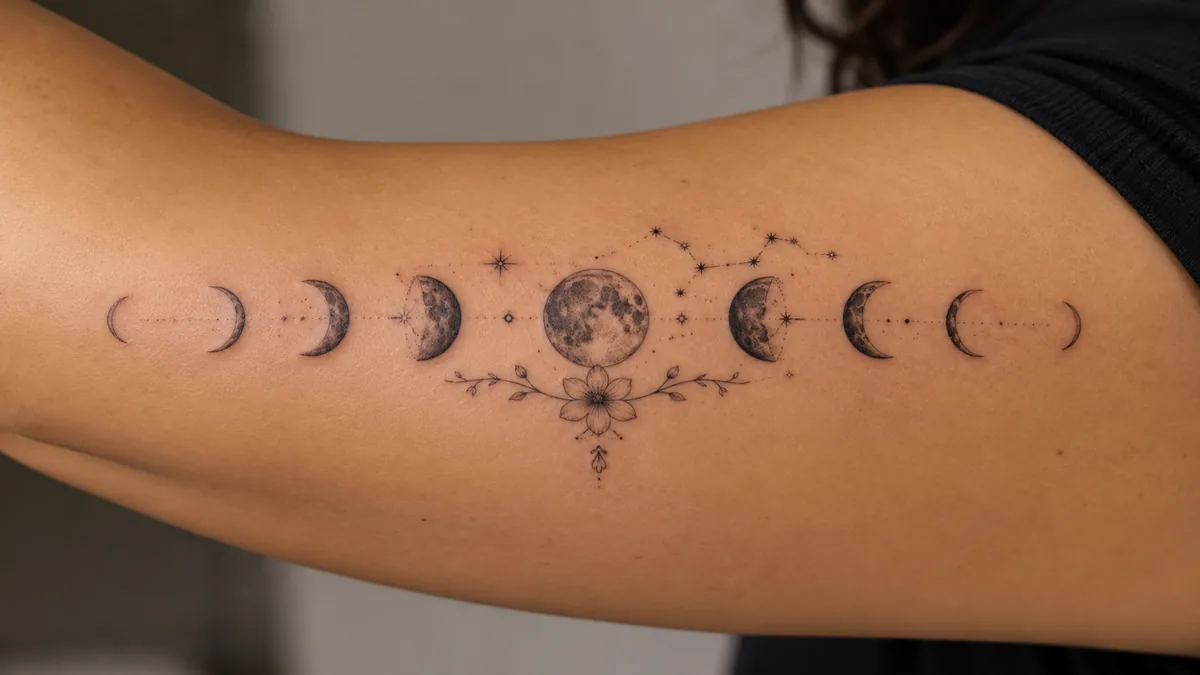
Eight moons, one story: everything ends so it can begin again.
The connection between the lunar cycle and the female body is ancient and genuinely documented across cultures. The average menstrual cycle runs close to the lunar month, roughly 29 days, and this parallel shows up in folklore, medicine, and spirituality going back thousands of years. Many wearers get this tattoo specifically to honor that connection, their body, their rhythms, their own natural cycles.
This doesn’t mean the tattoo is exclusively for women. Anyone drawn to the symbolism of cycles, intuition, or the body’s relationship to time claims it. But the feminine association is real and widely understood, so if a client brings it up, they’re not working from misinformation. That’s legitimate symbolism, not invented meaning.
Historical and Cultural Background
Moon symbolism is cross-cultural and runs deep. In ancient Greek tradition, the three phases of new, full, and waning mapped onto the Triple Goddess, Hecate, Artemis, and Selene. In many Indigenous traditions across North America, lunar cycles organized planting seasons, ceremonies, and the marking of time. Celtic traditions associated the moon with intuition and feminine divinity. Norse mythology gave the moon a named deity in Mani.
The full cycle as a single tattoo design is more of a modern Western tattoo convention than a singular ancient motif, but it pulls from all these real traditions. Clients aren’t picking something hollow. They’re borrowing symbolism with genuine historical weight across multiple cultures. That’s worth knowing when you’re consulting with them.
Popular Design Variations and Styles
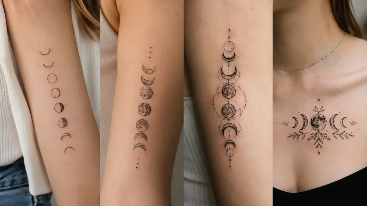
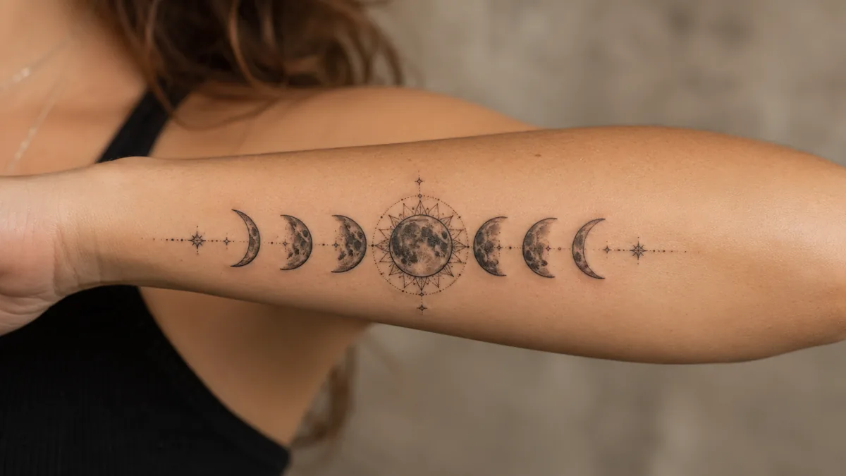
The most common layout is a horizontal row of phases: crescent, quarter, gibbous, full, back down the other side. Clean, graphic, reads well as a band across the ribs, collarbone, or spine. Fine line is everywhere right now and works beautifully here because the detail in each phase stays crispy when the linework is tight. Micro versions on the wrist or ankle are popular but need a skilled hand to hold long-term.
Beyond the classic row, you’ll see the cycle incorporated into larger pieces: surrounding a portrait, framing a botanical composition, or combined with a wolf, a woman’s face, or an eye. Geometric interpretations with mandala elements are common. Some clients want just three phases representing past, present, and future. Blackwork is strong here. Ornamental styles with dotwork shading give depth without color and hold up well over time.
Color vs. Black and Grey
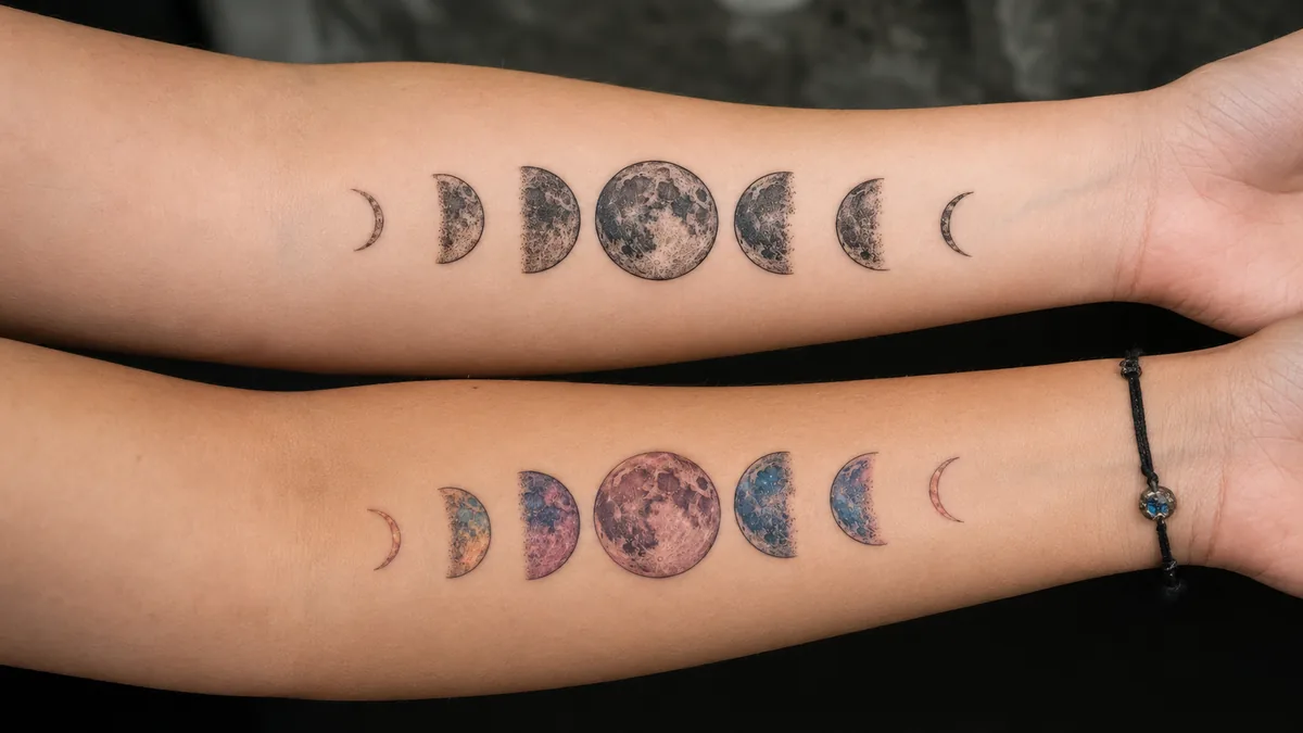
Black and grey is the dominant choice for moon cycle tattoos and it suits the subject. The moon is monochrome by nature. A well-executed black and grey piece with smooth whip shading on the gibbous and full phases looks clean, reads from across the room, and ages predictably. Fine line black work without any shading is also popular, especially in the minimalist or micro style, but be honest with clients: those hairline strokes will soften over five to ten years.
Color opens up options but changes the feeling. Deep navy or indigo for a night-sky effect, gold fills on the full moon, or iridescent white highlights can look stunning fresh. Saturated color holds better on some skin tones than others, and placement matters. High-wear zones like the inner wrist or fingers will fade faster regardless. If a client wants color, steer them toward placement on low-friction skin so the work stays looking intentional.
Best Placement and How It Ages
The horizontal row layout is ideal for the spine, collarbone, or along the ribcage. These spots give you a natural straight line and the length to space each phase properly. The spine is spicy, no sugarcoating that. The ribcage is worse. Both heal very well once you get through it, and the placement protects the tattoo from sun and friction. Forearm and sternum are solid mid-tier options for people who want visibility.
For aging, avoid the fingers and the sides of the hand entirely if the client wants this to stay legible. Fine line work in high-movement areas like the inner wrist will blur faster than work on the upper arm or shoulder blade. Bold outlines hold. If the design uses any thin negative-space detailing inside the crescent phases, those areas are the first to lose definition. Going slightly larger than a client initially asks for almost always results in a tattoo that holds longer and reads cleaner at every stage of its life.
How to Make It Personal
The most meaningful versions tie specific phases to specific events. A client who got sober during a new moon, who lost someone during a full moon, or who was born on a certain phase can anchor one phase with extra detail, a small addition, or a date in fine script beneath it. That’s the difference between a decorative piece and one they’ll never want to cover up.
Incorporating birth flowers, constellations, or an animal associated with their cultural background makes the design specific to them without cluttering the composition. Keep the phases readable. Everything added should support the central motif, not compete with it. A good consultation question: what does each phase represent in your life right now? The answer almost always points you to exactly the right additions.