Very Simple Mehndi Designs were my low-risk way to test tattoo flow before committing ink to skin. I wanted something light, clean, and readable from arm’s length, not a busy pattern that would turn to soup if I ever translated it into a fine line wrist piece. The surprise? The simplest version looked the strongest, and that made the whole test feel worth it.
- I Picked One Very Simple Palm Motif
- I Cleaned The Skin Before Henna Paste
- I Sketched A Tiny Center Dot First
- I Drew Minimal Lines Across Fingers
- I Kept The Palm Mandala Bare
- Why Add Leaf Trails Near Thumb?
- I Placed Tiny Florals Below Knuckles
- Clean Wrist Band Or Too Much?
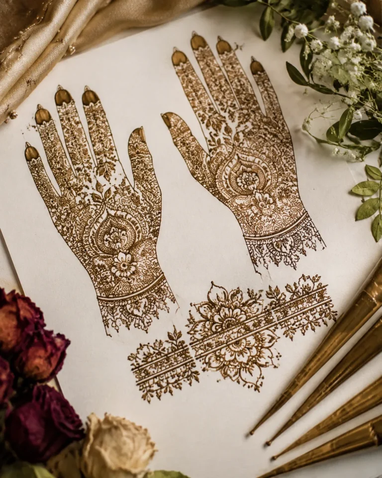
Here’s what it looked like before
Before I started, the area felt like that awkward patch of skin you keep saving for the right idea. My wrist had room, my hand movement had potential, but nothing connected yet. I kept screenshotting mehndi references with dense center fills, heavy fingertip caps, and crowded leaf clusters, then backing out because they looked chewed up the second I imagined them as healed tattoo lines.
What I wanted was cleaner than that. Think reddish-brown henna first, then a future tattoo that could still breathe in black ink at about 2 to 3 inches tall, maybe stretching 5 inches if the flow needed it.
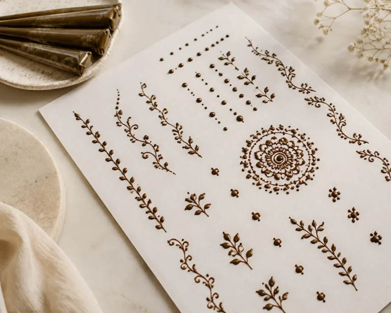
If you’re sorting references the same way, study what still reads fast. That’s why I kept coming back to 22 very simple mehndi designs that look effortlessly intentional. It helped me cut the clutter before I spent real money.
- I Picked One Very Simple Palm Motif
- I Cleaned The Skin Before Henna Paste
- I Sketched A Tiny Center Dot First
- I Drew Minimal Lines Across Fingers
- I Kept The Palm Mandala Bare
- Why Add Leaf Trails Near Thumb?
- I Placed Tiny Florals Below Knuckles
- Clean Wrist Band Or Too Much?
- I Used Negative Space Between Henna Lines
- Let The Arabic Finger Trail Travel
- I Added Dotwork Around The Palm Center
- Should Fingertip Caps Stay Light?
- I Matched Both Hands With Tiny Accents
- I Left Breathing Space Around Each Motif
- I Checked Line Thickness Before It Dried
- Fix The Smudges Fast
- I Let The Paste Stain Slowly
- I Photographed The Design In Natural Light
- I Picked The Simplest Mehndi Version
1I Picked One Very Simple Palm Motif
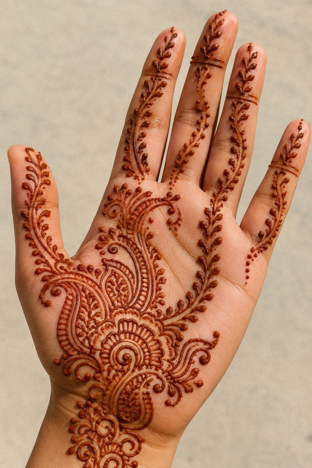
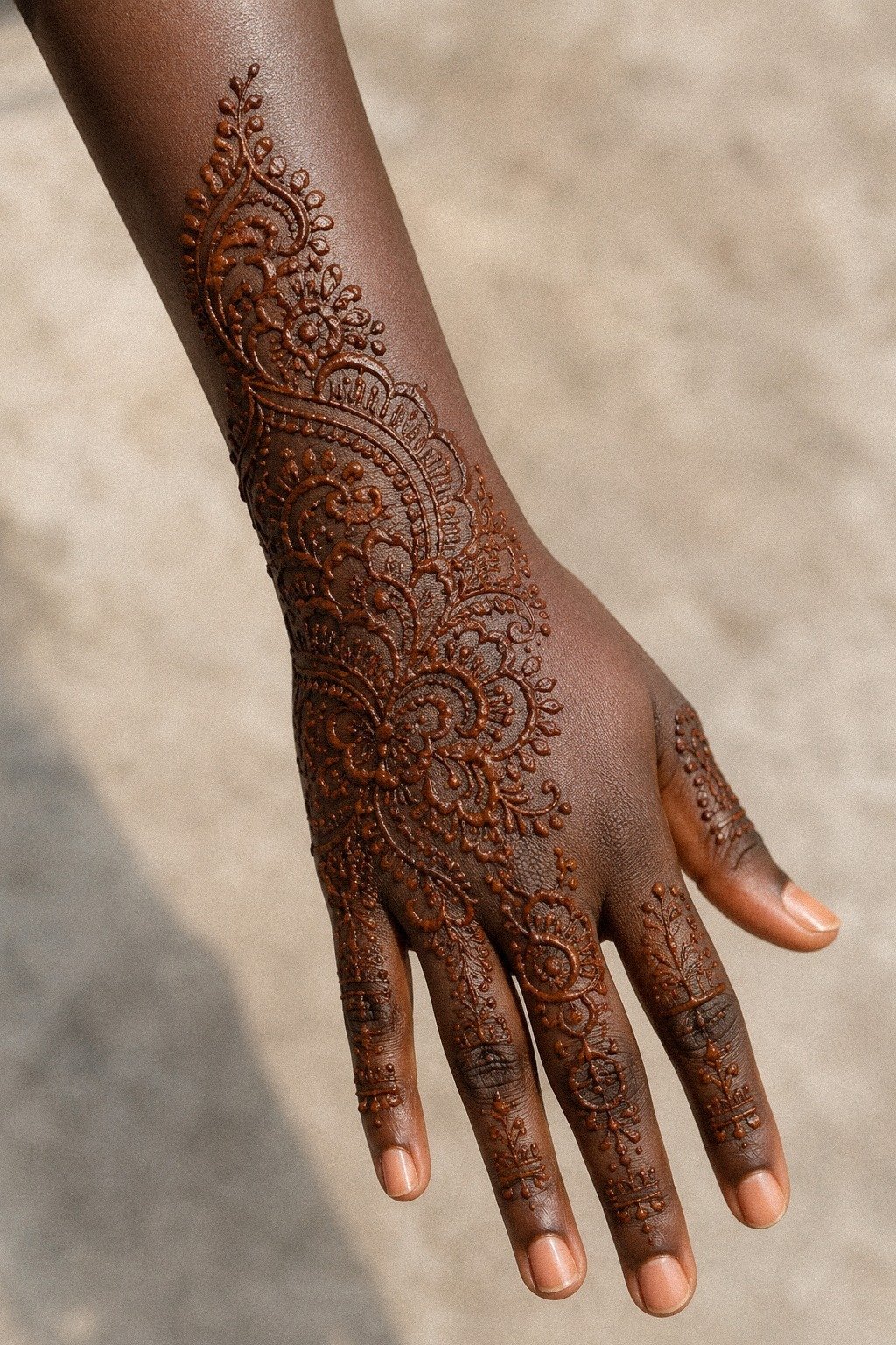
I started with one palm idea because too many focal points kill the read. On fair cool skin, that reddish-brown henna sat sharp enough that I could tell right away which shapes were clean and which ones were just filler. A single soft motif on the back of the hand gave me the same answer I give first-timers with tattoos: pick one hero motif, then let the rest support it.
You can feel the difference when a design has a center of gravity. I kept the motif around 1.25 inches wide so the lines had room to stay crispy, and I skipped extra curls near the edge.
If you like reference hunting, simple henna designs for beginners and modern mehndi designs are solid for spotting what reads clean instead of busy. That kind of editing adds real value before you ever think about tattoo cost.
2I Cleaned The Skin Before Henna Paste
Clean skin mattered more than the pattern. On medium warm ivory skin, any oil film made the paste skid, and that gave me fuzzy edges instead of one clean pull.
Same rule in tattooing, honestly. If the prep is lazy, the linework pays for it later.
I washed with gentle unscented soap, dried fully, then left the skin alone for ten minutes before touching the cone. No lotion. No body oil.
No last-minute hand cream because it felt dry. You want the surface calm, not slick.
If you’re testing placement ideas on both palms, 18 simple mehndi designs front hand you can copy fast gave me better palm spacing than most trend pages I saved.
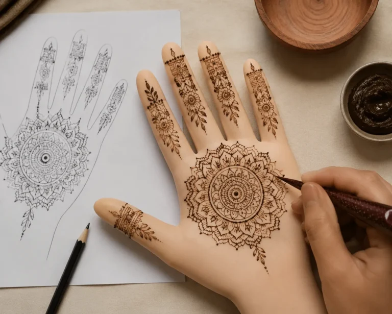
3I Sketched A Tiny Center Dot First
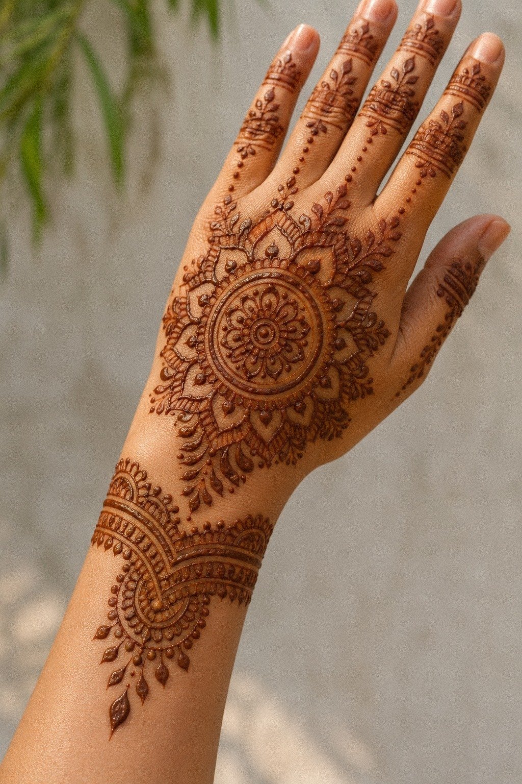
That tiny center dot saved the whole layout. On medium olive skin, I needed one anchor point before I committed to curves around the wrist, otherwise the pattern drifted left and looked accidental. A dot sounds small, but it acts like stencil discipline for freehand work.
Once the dot was down, I could judge distance instead of guessing. I left roughly a quarter inch between the center and the first ring so the design had breathing room. If you ever plan to turn a mehndi layout into a tattoo, this is the moment to think long term.
Tiny spacing closes up. Clean spacing heals nice.
I pulled extra inspiration from mandala mehndi designs because the good ones balance their center without choking it.
4I Drew Minimal Lines Across Fingers
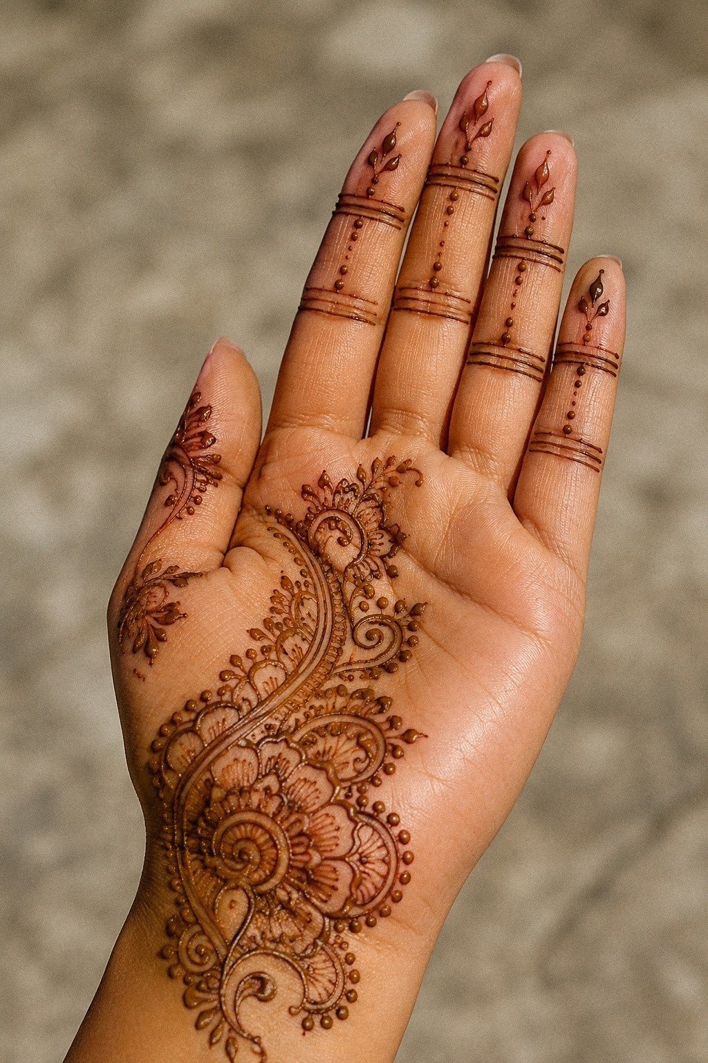
I used short lines that stopped before the joints instead of wrapping every segment.
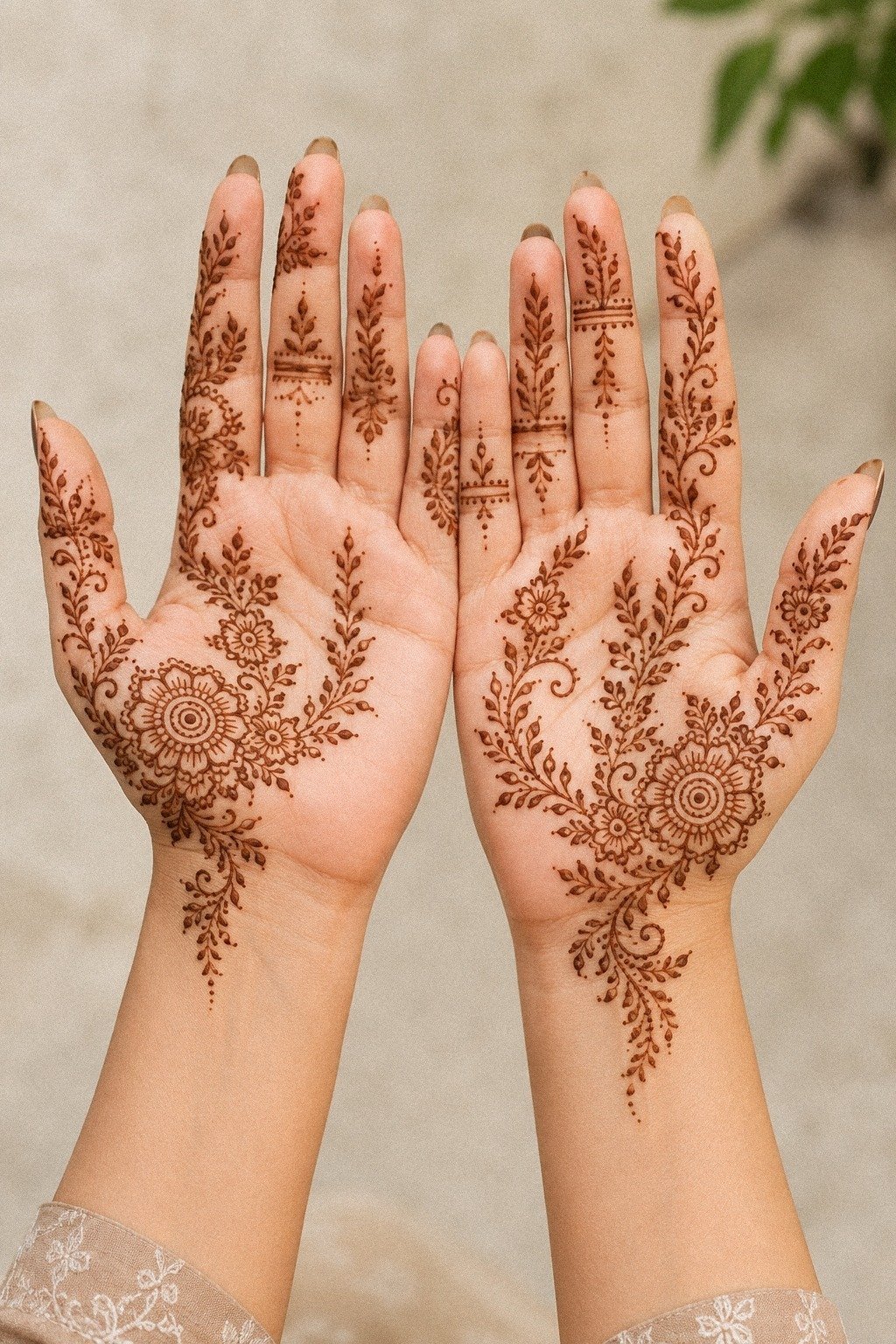
5I Kept The Palm Mandala Bare
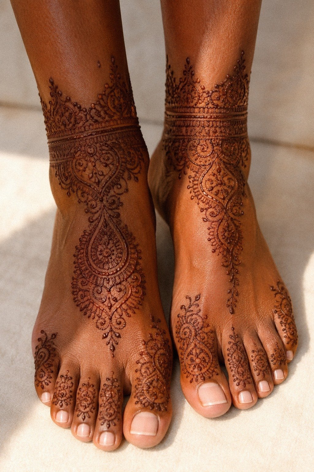
This section surprised me because the photo reference pushed me toward feet and ankles, not hands. On deep brown skin with warm undertones, a bare palm mandala translated beautifully when the center stayed open and the heavier detail sat farther out near the ankle curves. The open middle kept the design soft instead of packed, and that cleaner look would hold more value in a tattoo later.
If you want a tattoo takeaway here, treat the center like negative space, not empty real estate you have to fill. I left the inner circle mostly untouched and let the outer dots and petal edges carry the structure.
That choice gave the whole thing more calm. It also meant the stain looked richer because the skin around it stayed visible.
For more open-center layouts, mandala mehndi designs is where I cross-checked proportion.
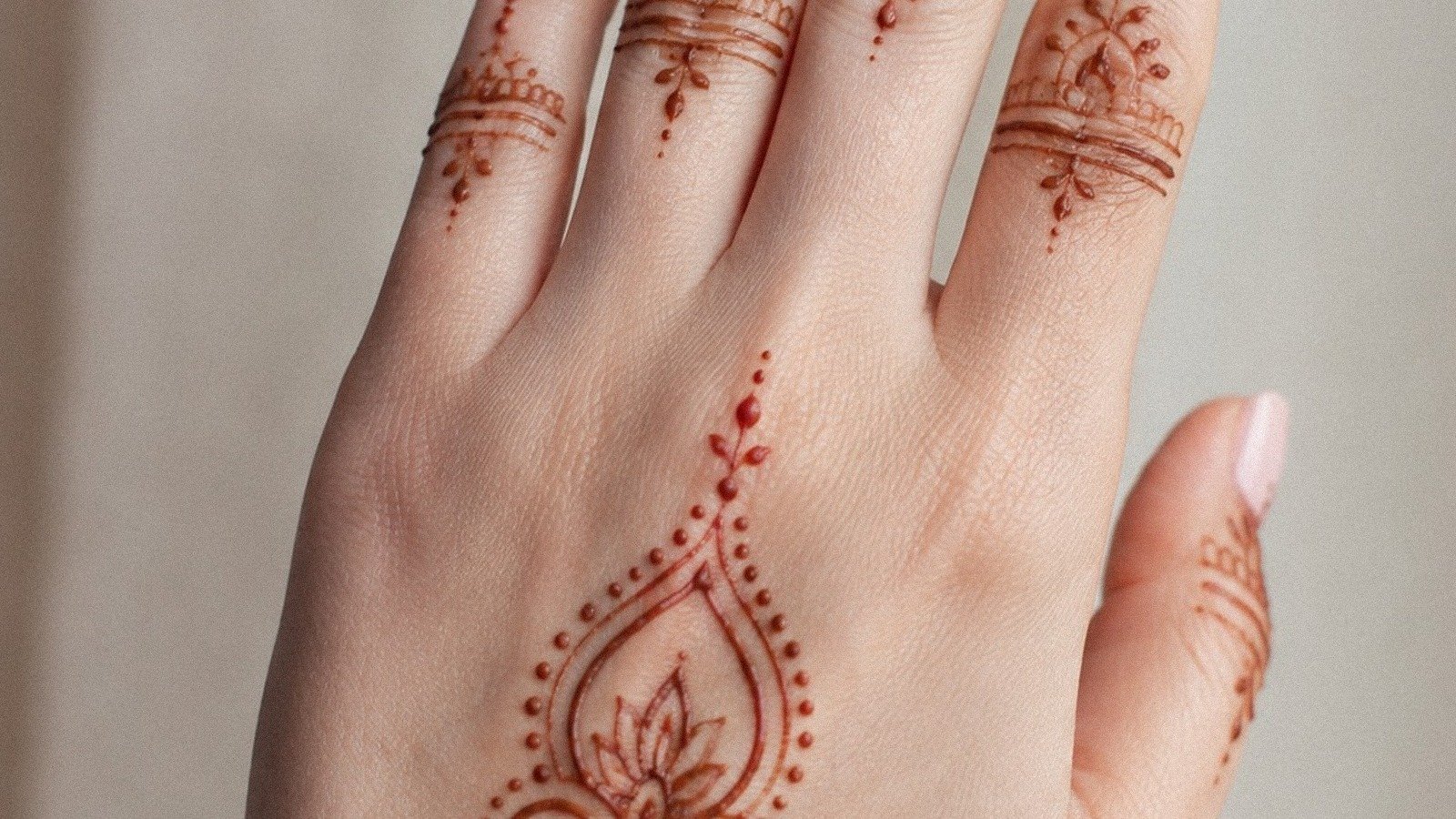
6Why Add Leaf Trails Near Thumb?
Leaf trails near the thumb can go sweet or scratchy fast.
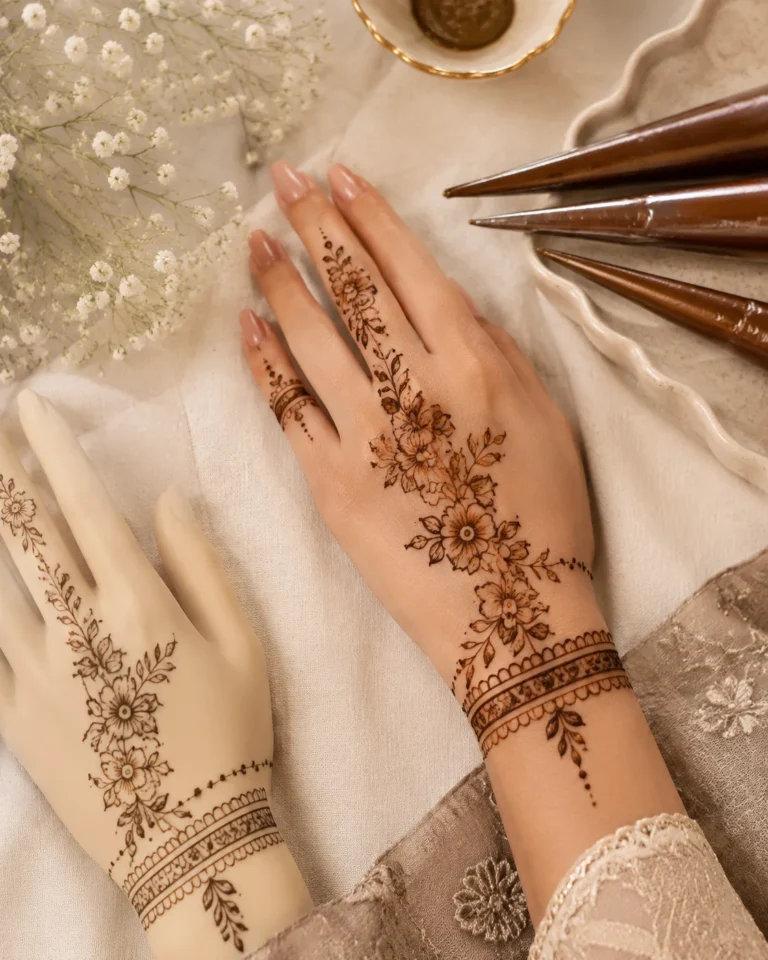
7I Placed Tiny Florals Below Knuckles
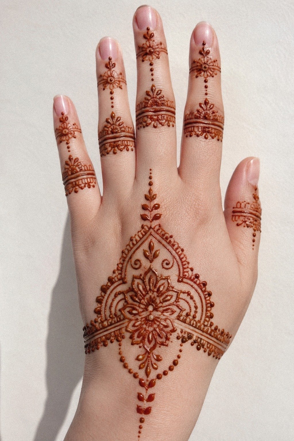
Tiny florals below the knuckles looked cute in screenshots and risky in real life. On fair cool skin, the flowers needed enough petal separation that each bloom read as a bloom, not a reddish blur.
I kept them tiny, but not microscopic. That difference matters more than people think, especially if you’re asking whether a small tattoo is really worth it.
Each floral sat just below the knuckle line instead of directly on top of it, because joints distort detail the second you move. If you’re thinking like a tattooer, that’s basic wear logic.
High-motion spots chew up precious detail. I also made each flower slightly different so the hand didn’t look stamped.
Want more clean hand references? 22 very simple mehndi designs that look effortlessly intentional showed me how to keep florals decorative without making them too fussy.
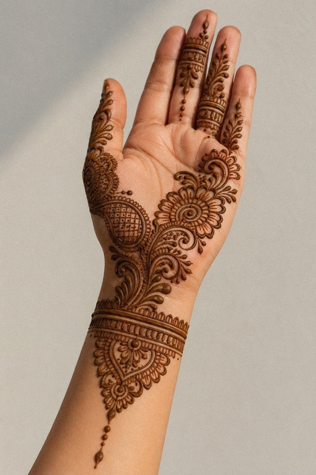
8Clean Wrist Band Or Too Much?
The wrist band is where the whole design either clicks or dies.
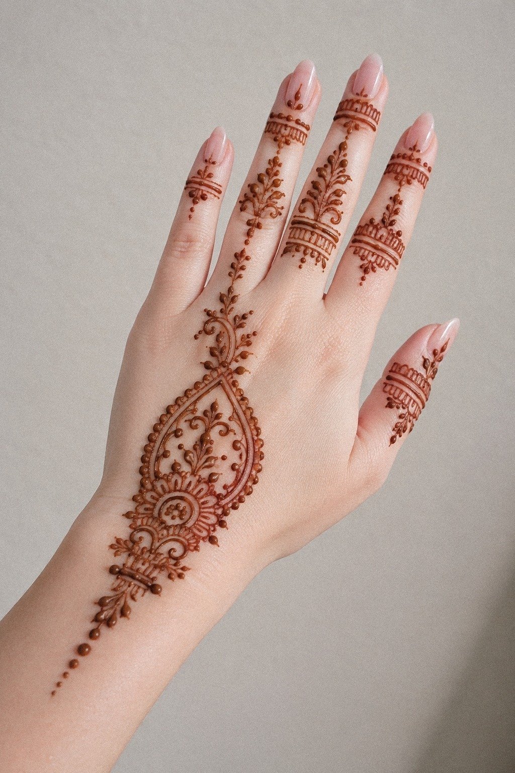
9I Used Negative Space Between Henna Lines
Negative space did the heavy lifting here. On a hand and wrist with medium olive skin, the spaces between the reddish-brown lines made the pattern look more expensive, more intentional, and way easier to read.
People chase detail when they should be chasing contrast. That’s true in henna, and blackwork is even less forgiving.
I left wider channels between the larger curves and tighter spacing only where I wanted the eye to slow down. But not too tight.
If the line gaps were under roughly 2 millimeters, I knew I was flirting with soup for a tattoo version later. Why crowd the part that makes it breathe?
For more examples of open spacing, I bounced between modern mehndi designs.
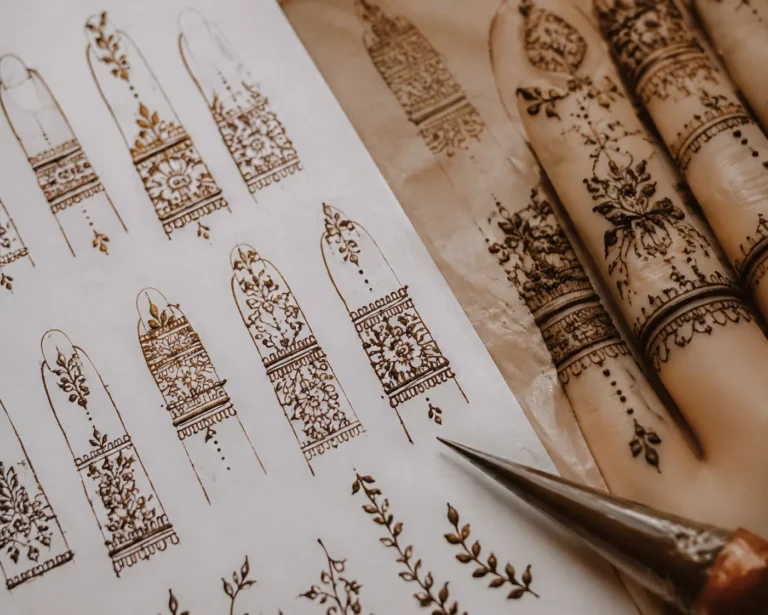
10Let The Arabic Finger Trail Travel
I kept the trail light near the fingertip, then gave it a little more weight as it came down the hand.
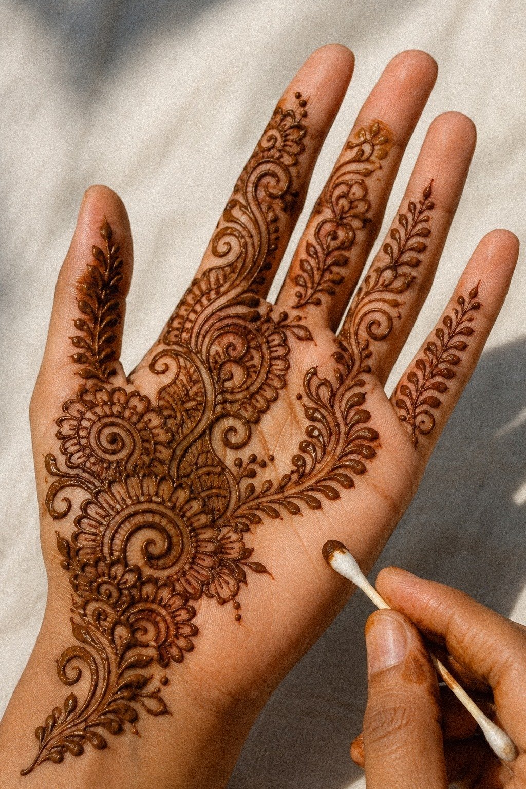
11I Added Dotwork Around The Palm Center
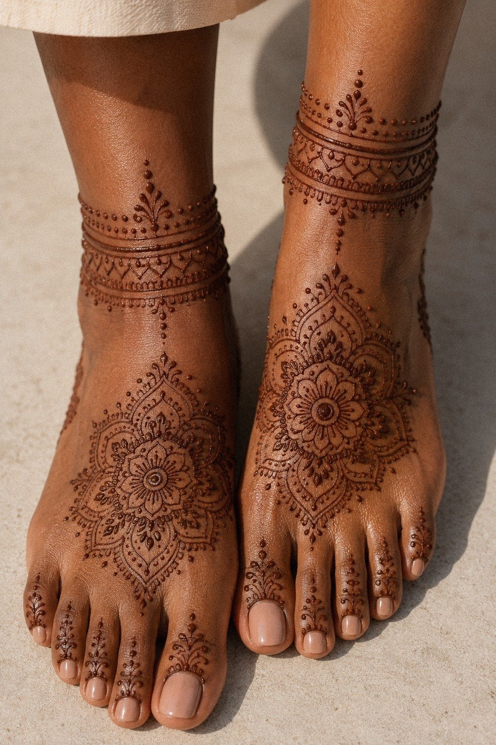
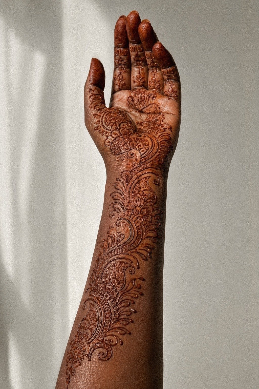
Dotwork is the quiet MVP. On feet and ankles with deep brown skin, those tiny points around the palm center softened the geometry without blurring it.
I didn’t need another petal ring. I needed texture that stayed light. That’s a tattoo lesson too, especially when you want movement without stuffing in more dotwork.
I placed the dots in loose halos, not perfect circles, so the design felt hand-drawn and alive. You can overdo dotwork in about thirty seconds, so I stopped as soon as it framed the center.
The stain looked richer because the dots gave the eye a fade instead of a hard stop. For anyone studying balanced dotwork, mandala mehndi designs are worth a look.
12Should Fingertip Caps Stay Light?
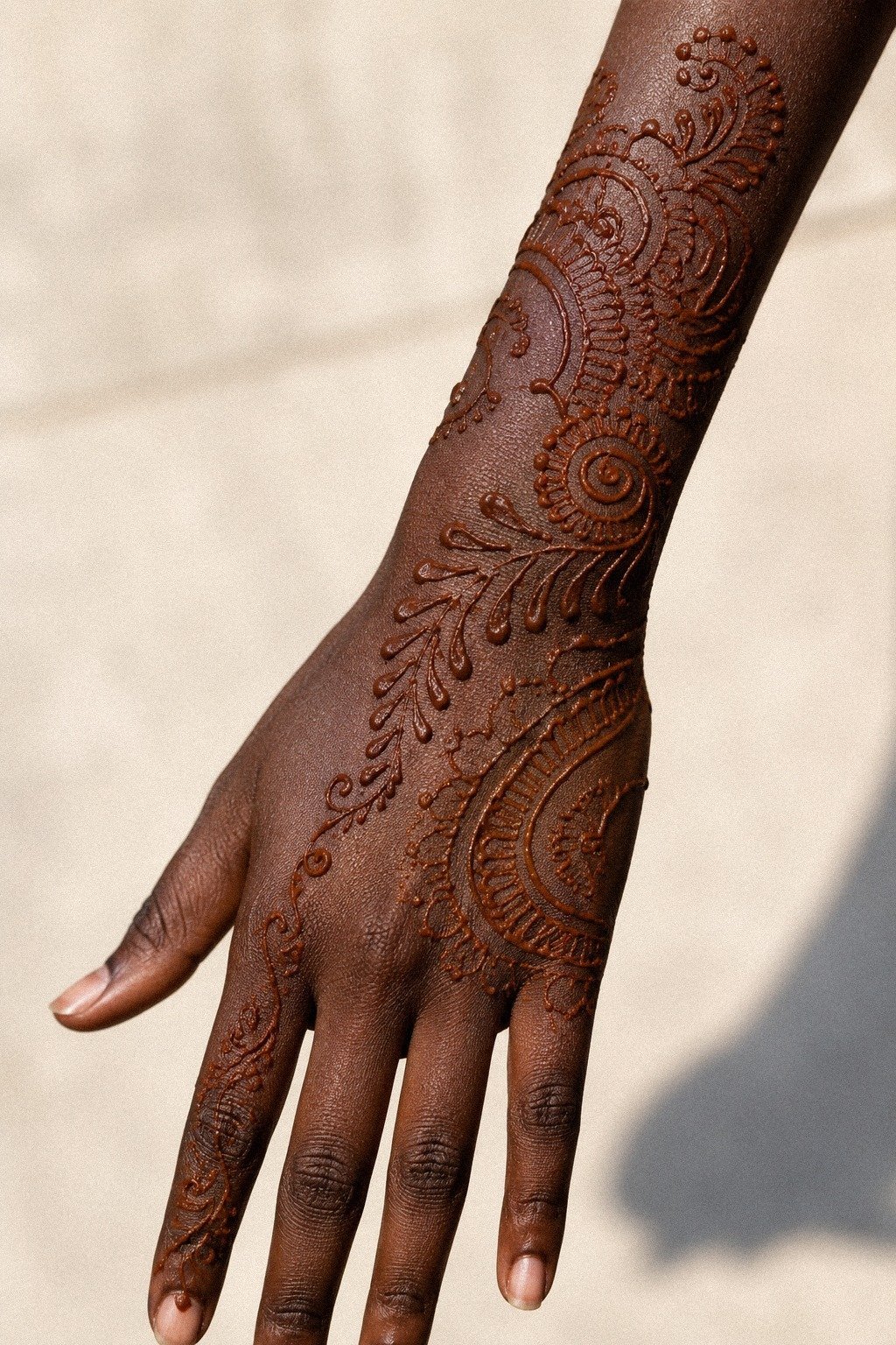
Full fingertip caps can be gorgeous, but on this deep ebony skin reference I wanted something lighter and cleaner.
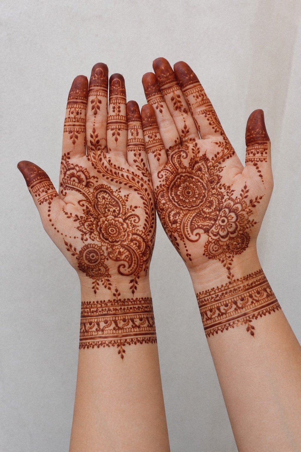
13I Matched Both Hands With Tiny Accents
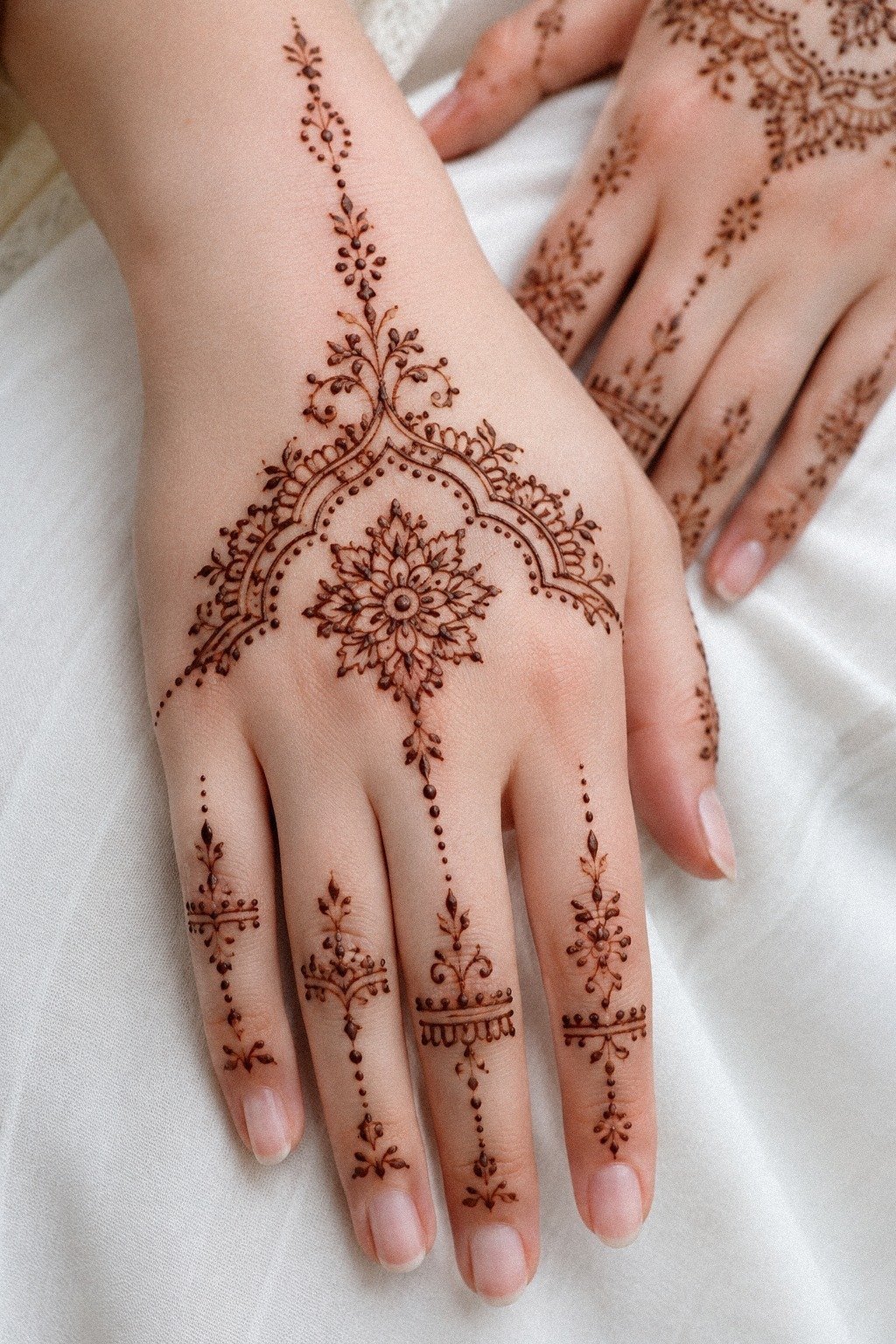
Matching both hands sounds easy until you try it. On fair cool skin, the tiny accents had to rhyme, not copy exactly, or the design started feeling stiff.
I mirrored the weight and spacing more than the exact shapes, which is also how I handle matching tattoo ideas when clients want balance without clone energy. That softer approach usually gives you better value than forcing perfect symmetry.
One side carried a small floral echo, the other side repeated the same dot rhythm near the fingers. That kept the pair connected while still letting each hand breathe on its own.
You don’t need symmetry so perfect it feels printed. You need symmetry that reads intentional when the hands move.
I checked 22 very simple mehndi designs that look effortlessly intentional and 18 simple mehndi designs front hand you can copy fast while refining this balance.
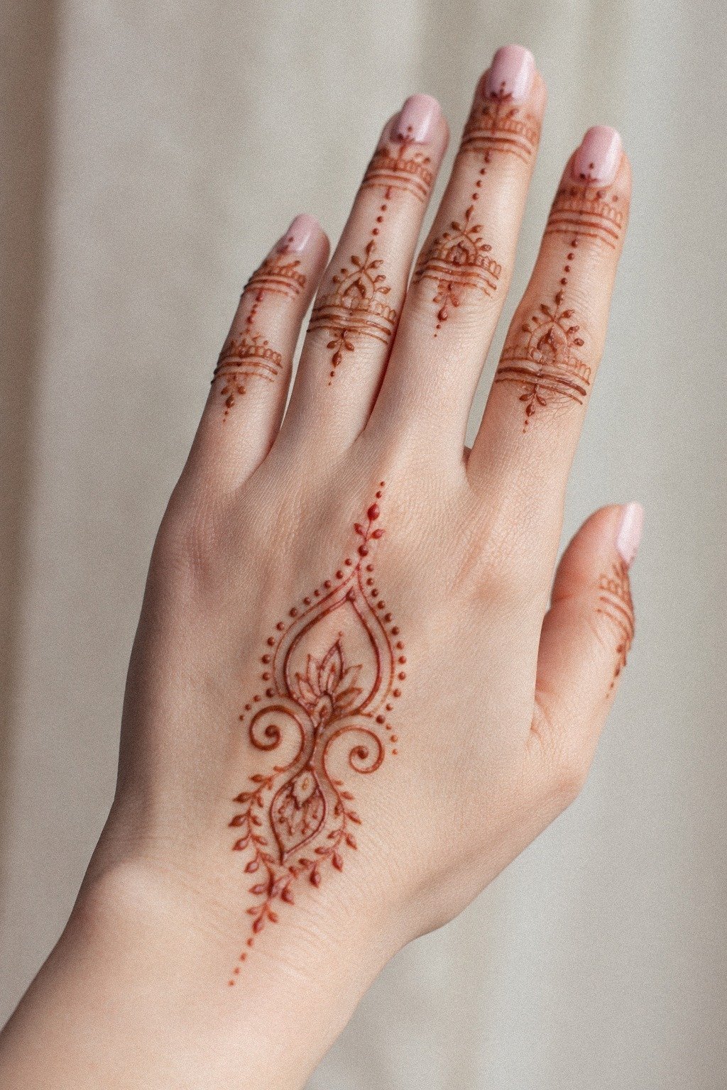
14I Left Breathing Space Around Each Motif
This was the move that changed everything. On both hands and palms with medium warm ivory skin, I left clear breathing room around each motif instead of filling every gap with dots, curls, or mini leaves.
Suddenly the whole layout looked calmer, cleaner, and more grown up. Less noise.
More confidence.
If you’re planning a small tattoo, take this rule seriously. Tiny super-detailed work often turns to soup later, especially on hands. I left roughly a finger-width of visual separation between the major elements, and that space made each line look more solid.
17 latest simple mehndi designs that transcend trends proves how strong restraint can look.
15I Checked Line Thickness Before It Dried
Wet paste lies to you a little. On medium olive skin, some lines looked bold enough while they were fresh, then thinner once they settled.
So I checked thickness before the paste dried and fixed the weak spots right away. That’s the same eye you need when you’re judging tattoo linework.
Crispy lines win over timid every single time.
I was looking for consistent pressure, especially in the curved wrist sections where wobble shows first. If a line felt too skinny next to the rest, I widened it slightly instead of pretending it would somehow look better later.
It will not. And if you’re using this as a tattoo reference, that honesty matters.
Modern mehndi designs gave me good examples of line contrast that stays soft, not patchy.
16Fix The Smudges Fast
Smudges happen fast when you’re working near fingers and palm creases.
17I Let The Paste Stain Slowly
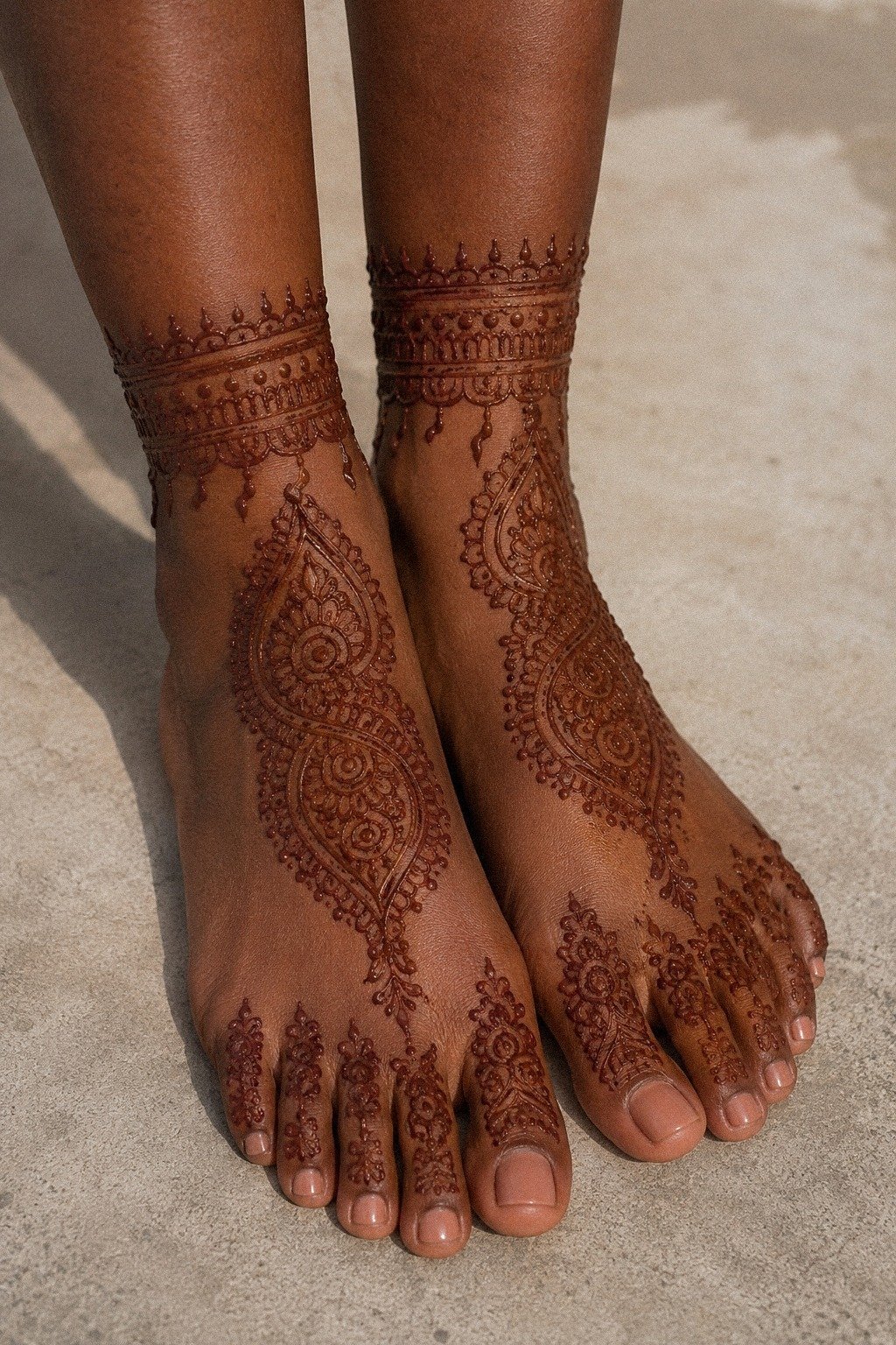
This part tested my patience more than the drawing did. On feet and ankles with deep brown skin and warm undertones, the stain deepened beautifully when I let the paste sit instead of messing with it every ten minutes.
Henna rewards stillness. Tattoo healing does too, just on a longer timeline.
I left the paste alone for hours, kept friction low, and resisted the urge to speed anything up. First few days after a tattoo, it’s an open wound, treat it like that.
Wash gentle unscented soap, thin layer ointment, don’t suffocate it. Surface healing usually lands around 2 to 3 weeks, full settling closer to 2 to 3 months.
If your design idea also leans ankle-heavy, peacock mehndi designs shows how graceful that placement can look.
18I Photographed The Design In Natural Light
Natural light told the truth. On a forearm and hand with deep ebony skin, the design looked softer indoors, but near a window the crisp lines, spacing, and light fingertip caps finally showed up the way they were supposed to. That is why healed tattoo photos in good daylight matter so much when you’re choosing an artist, and why they add real value when you’re judging whether the price is worth it.
I shot the design when the light was bright but indirect, around late morning, because harsh noon light flattened the stain. You could see the reddish-brown tone, the clean wrist band, and the negative space without glare. If you’re building a reference folder, save only images that tell the truth like that.
Modern mehndi designs and mandala mehndi designs gave me the clearest real-light references.
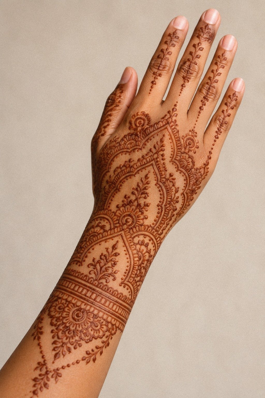
19I Picked The Simplest Mehndi Version
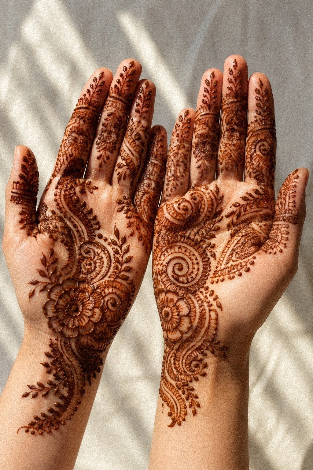
By the end, the simplest version won. On fair cool skin, the back-of-hand pattern with the clean wrist flow, restrained finger lines, and small supporting florals looked stronger than the more decorated tests.
Not louder. Stronger.
That’s a distinction worth trusting if you’re planning future ink, because clean work usually gives you better long-term value.
I cut the extra scrolls, kept the open gaps, and let one motif lead. The result felt intentional in the same way a good tattoo does.
It read fast, aged better in my head, and matched the body instead of fighting it. If you’re still deciding, compare your favorites against 22 very simple mehndi designs that look effortlessly intentional one more time.
The simplest one may be the one that ages cutest on you.
The Clean Wrist Rule
After doing this full test, I got clearer on why simple mehndi keeps pulling people in and why some of those ideas translate better to tattooing than others.
But the good versions respect movement. They do not just sit on skin like wallpaper. They travel with the wrist, pause at the knuckles, and leave enough open space that your eye can rest before moving again.
That is what makes them feel calm instead of busy. That also makes them more worth paying to tattoo, because you’re buying readability, not just decoration.
And I think a lot of people get distracted by how delicate henna looks in a screenshot. In real life, the design that wins is not always the most intricate one. It is the one with contrast, restraint, and a clear path across the body.
I have seen the same thing with fine line tattoos. People bring me tiny references packed with micro petals, lace textures, and ten extra details they swear they need. Then I show them a cleaner redraw with one confident motif, wider gaps, and slightly bolder anchors, and suddenly the whole piece breathes.
But if you’re treating mehndi as tattoo inspiration, here is the part I would keep front and center. Hands, fingers, feet, and wrists are all high-wear zones.
They move constantly. They get sun. They get washed, bumped, and rubbed raw by everyday life. So any linework you love there has to be simple enough to survive that abuse with grace.
Bold will hold is not just a trad saying. It is physics. Black is your best friend for longevity, color is spice, and tiny over-detailed ideas on high-motion skin need a reality check.
The part that worked for me was editing, not adding. I did not need more symbols.
I needed cleaner spacing, steadier line weight, and a wrist band that framed the whole design without choking it. That is the same decision-making framework I would use for a first tattoo.
Start with the read. Then check the wear.
Then ask whether the detail still makes sense five years from now. If the answer is yes, you’re probably on solid ground, and yes, that makes the extra spend on a better artist worth it!
How much did it cost, and was it worth it?
Because this was a henna test, the actual spend stayed low before any permanent tattoo decision. I used one henna cone, cotton tips, and gentle soap, then compared that cheap trial against what a future fine line tattoo would likely cost in a US studio. That side-by-side saved me from rushing into a placement that might need touch-ups sooner, which is a huge value win if you’re watching your budget.
If you asked me what was worth paying for, I would say line control and placement advice, every time. Cheap paste is fine for a trial. Cheap tattooing on hands and wrists is where people get chewed up.
That is where the money should go! If you’re balancing cost against value, spend on the artist, not on extra fuss.
The Two-Inch Breathing Rule
But if you turn a very simple mehndi idea into a real tattoo, give the design more room than the henna version needed. Around 2 inches of main flow on the wrist or 3 to 5 inches across the hand and forearm usually gives fine lines a better shot at aging well, especially when you keep the main flow solid and the shapes simple. More breathing room usually means better value, fewer touch-ups, and less regret later.
What People Always Want to Know
How much does a Very Simple Mehndi Designs usually cost?
About $100 to $300 is a common US range for a small tattoo version, though many studios start with a shop minimum around $50 to $100. Cost shifts with size, placement, artist demand, and if you’re asking for hand or wrist work. If you’re comparing options, the best value is usually the artist whose healed lines stay clean, not the cheapest rate.
Are Very Simple Mehndi Designs a good idea for a first tattoo?
Yes, they can be, especially when the design stays simple and the placement is smart. A clean version gives you readable linework without forcing too much detail into a tiny area, and it lets you learn what style feels like you. That’s a pretty solid first-tattoo value if you want something light but still intentional.
How do I choose a tattoo artist for Very Simple Mehndi Designs?
Look for healed photos, not just fresh ones. You want crispy lines, consistent spacing, and a portfolio that already shows hands, wrists, or other small-detail placements. Clean studio.
Solid hygiene. No scratchy one-pass work pretending to be delicate.
If the price is higher but the healed work is stronger, that’s usually money well spent.
How much do Very Simple Mehndi Designs hurt?
Pain depends on placement. Hands, feet, ribs, and sternum are usually spicier, while outer forearm, shoulder, and thigh are more chill.
Lines feel sharper. Shading feels like a dull burn.
Hand tattoos stay pretty, but they don’t come free, and the touch-up budget is part of the real cost.
How long does a Very Simple Mehndi Designs take to heal?
Surface healing is usually about 2 to 3 weeks, and full healing is closer to 2 to 3 months. Keep it clean and lightly moisturized, skip pools, watch sun exposure, and don’t pick flakes when it peels like a sunburn. Healing well protects the value of every dollar you spent.
What’s the best placement for Very Simple Mehndi Designs?
Outer wrist and forearm are usually the safest bets because the flow reads well and the lines age better there. Hands can look amazing, but they’re high-wear zones, so go there only if you accept faster fading, more maintenance, and possible touch-ups. That’s the real worth-it question.
The One I’d Keep: The Fast-Read Rule
If I had to pick one, I’d keep the clean wrist band. It frames the whole flow without crowding the fingers, and that’s why the design reads fast now and should age nicer later. Pin that move first.
Frequently Asked Questions
What makes a wrist flow mehndi design look clean?
A clean wrist flow comes from consistent line weight, smooth curves that follow the natural shape of the wrist, and intentional negative space. Avoiding overcrowding and keeping the design anchored to one focal point helps it feel intentional rather than messy.
How do you keep simple mehndi from looking too plain?
Even simple designs gain visual interest through subtle details like fine dots, delicate vines, or a single bold element. The contrast between thin lines and slightly thicker ones creates depth without adding complexity.
Why does the wrist feel harder to design on than the back of the hand?
The wrist has less flat surface area and more movement, so designs can distort when the hand moves. A good wrist flow accounts for this by placing the main design where the skin stretches least and keeping connecting elements flexible.
How long should you leave simple mehndi paste on for a dark stain?
Leave the paste on for at least 4-6 hours, or overnight if possible, and avoid water for the first 24 hours after removal. Simple designs often stain more evenly because there is less paste buildup to crack and flake prematurely.