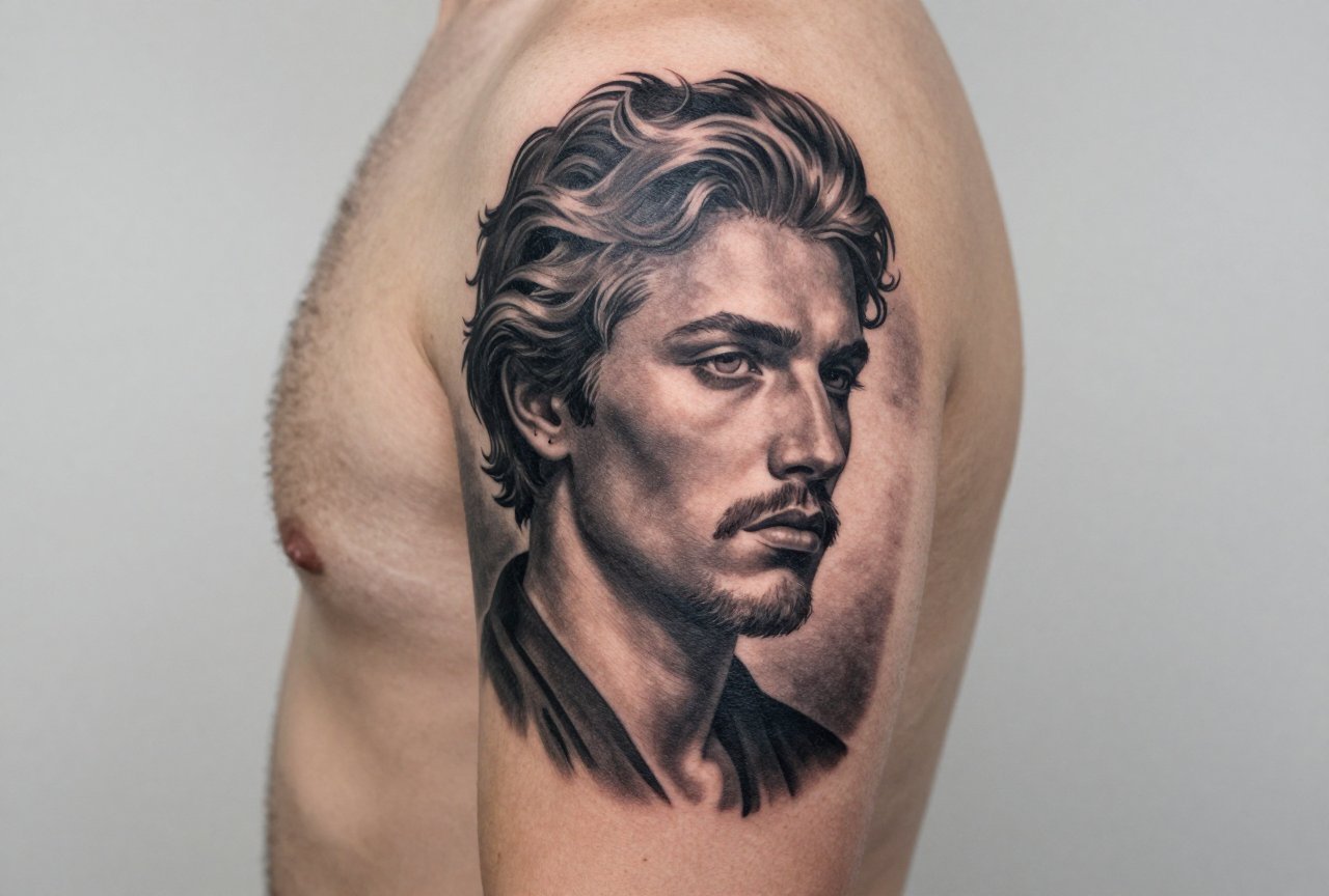
Realism tattooing is the style that makes people stop mid-conversation and ask, “Wait, is that a photo?” It’s not a filter, not a trick, it’s hours of needlework built on understanding how light actually behaves on skin, how shadows fall, and how the human eye reads detail. I’ve sat across from clients who brought me blurry snapshots of their grandparents, pets they’d lost, movie stills they couldn’t shake, and asked me to make it permanent. That’s the job. And it’s a completely different beast than traditional, neo-traditional, or any style built on bold outlines and graphic simplification. Realism lives or dies on subtlety. One wrong value shift and a portrait looks like a wax figure. One overworked highlight and you’ve got a scar instead of a catchlight in an eye.
Origins & History
From Photo Reference to Skin
Realism in tattooing didn’t emerge from some clean artistic lineage like you’d find in a museum. It crawled out of necessity and technology. In the 1980s and early ’90s, artists started getting their hands on better reference photography, actual printed photos they could study. Before that, most tattooing relied on flash sheets, bold designs that read from across a room. But clients started asking for their children’s faces, for reproductions of paintings they’d seen in books. The first artists who cracked realistic rendering were largely self-taught experimenters, guys like Paul Booth and later Nikko Hurtado, who treated skin like a canvas and figured out that smooth shading required completely different machines, needles, and hand speed than traditional work.
By the early 2000s, realism had splintered into camps. Some artists pursued hyperrealism, every pore, every wrinkle, every reflection. Others found that slightly softer approach, what I’d call “photorealistic illustration,” where the image reads as real but doesn’t fight the skin’s texture so aggressively. I’ve been tattooing through this whole evolution, and I remember when the first Cheyenne Hawk pens hit shops. Suddenly, smooth graywash became achievable for artists who’d struggled with coil machine consistency. Changed everything.
The European Influence
Don’t sleep on the European contribution here. Artists in Germany, France, and especially the UK pushed realism in darker directions, horror imagery, biomechanical blends, heavy atmosphere. They weren’t chasing pretty; they were chasing impact. That cross-pollination hit American shops through convention travel and early internet forums. I still have a cracked binder of printed forum pages from 2003, pages of healing photos and machine setup debates. That’s how we learned.
Key Characteristics & Motifs
Realism isn’t a subject matter, it’s a technique. You can tattoo a hyperrealistic banana or a hyperrealistic skull. The subject doesn’t matter; the execution does. What defines the style:
- No outlines. Realism lives in soft edges. We build form through value contrast, not black rings. Sometimes I’ll drop a dark line in a nostril or eyelash, but it’s a value decision, not an outline.
- Full tonal range. From paper white (skin tone, basically) to pitch black, with every gray in between. The magic is in the transitions.
- Light logic. The light source has to be consistent. I’ve seen beautiful pieces ruined because the face was lit from above and the background from the left. Your brain catches it even if you can’t name it.
- Detail hierarchy. Not everything gets equal attention. Eyes, mouths, focal points get the micro-detail. Background elements soften. This is how we make something readable at ten feet while rewarding up-close inspection.
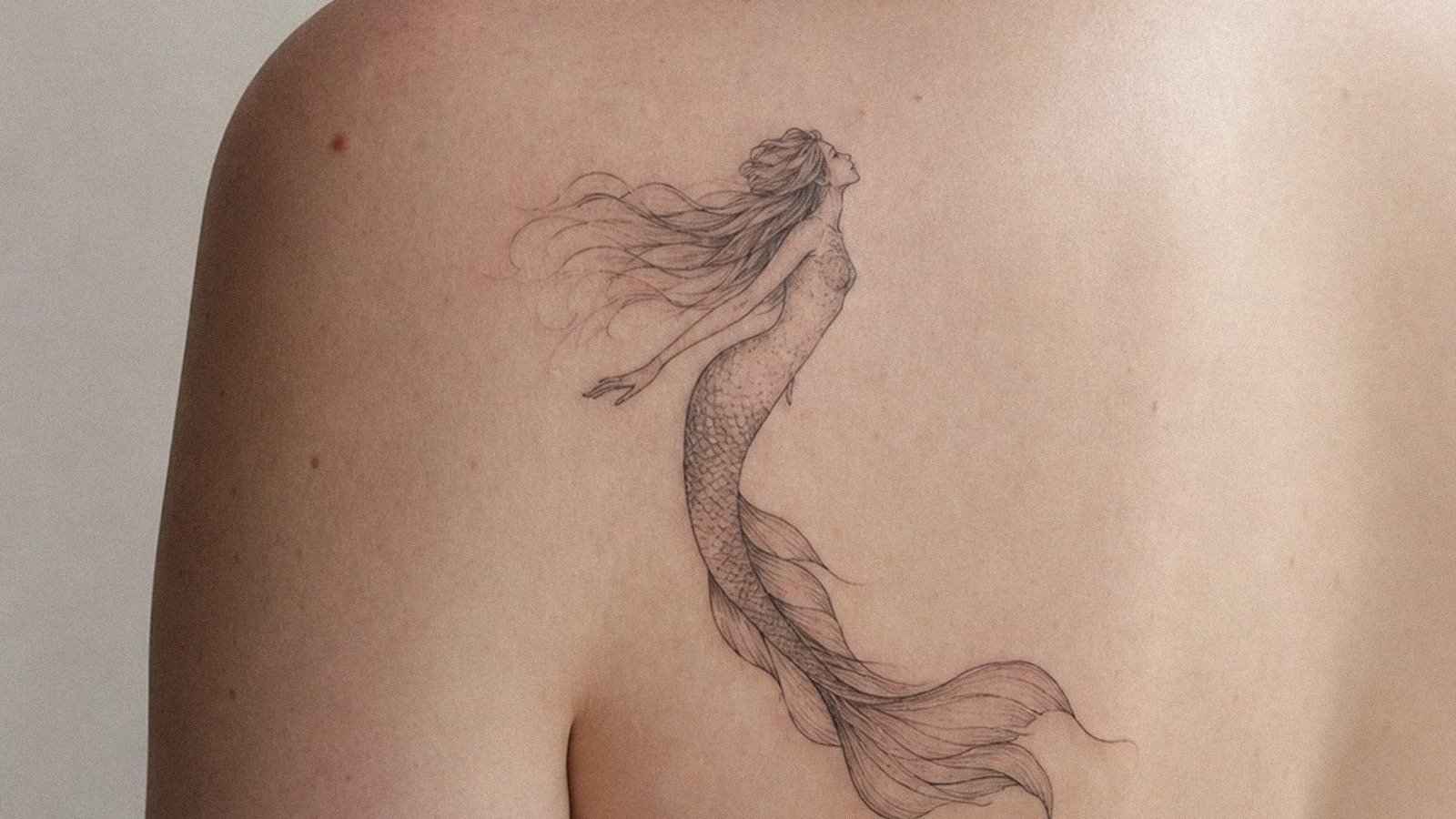
Common motifs? Portraits dominate, human and animal. Movie and music iconography. Nature photography: wolves emerging from mist, lions in dramatic side-light. Religious imagery reinterpreted through photographic reference. I’ve tattooed a photorealistic broken lightbulb that was actually a client’s photograph. The source material is infinite; the constraint is always the artist’s skill.
Color vs Black and Grey
Black and Grey: The Foundation
Most realism artists start here, and many never leave. Black and grey ages gracefully. The carbon in black ink is stable; it doesn’t shift chemically the way some pigments do. A well-executed black and grey portrait can look sharp for decades if the client takes care of it. The technique relies on graywash, black ink diluted to various tones, and the artist’s ability to layer these smoothly. In my chair, I tell clients that black and grey “lives in the skin” better. It doesn’t fight the body’s natural undertones the way color can.
Color Realism: The Advanced Class
Color realism is where artists prove themselves. It’s not just about matching a reference photo; it’s about understanding how color sits in skin, how warm undertones affect cool pigments, how yellows fade fastest and blues hold longest. Nikko Hurtado’s color portraits changed what clients expected. Suddenly everyone wanted that saturated, almost glowing quality. The reality? Color realism demands more sessions, more saturation passes, more healing patience. It also demands a bigger budget. I warn clients: color realism isn’t a one-and-done. That vibrancy you see fresh? It’s a negotiation with time. Expect a touch-up in 3-5 years if you want it singing.
Best Placements
Realism needs real estate. Not always huge, but the detail requires space to breathe. Here’s where I’ve seen it work and where I’ve talked clients out of bad decisions:
- Upper arm/outer bicep. Classic. Flat plane, good visibility, heals relatively predictably. Portraits here read immediately.
- Thigh. My favorite for larger pieces. The skin is stable, the muscle underneath provides consistent surface, and clients can hide or show easily.
- Back panels. The full back is a realism artist’s dream. Uninterrupted space, minimal movement distortion. I’ve done full back pieces that took 40+ hours.
- Forearm. Riskier. The skin here is thinner, more prone to blowout if overworked. And it’s always visible, clients need to be certain.
- Ribs/side. I try to dissuade realism here unless the client is committed to a softer, less detailed approach. The stretching, the breathing, the healing difficulty, it’s a battle.
- Fingers, hands, neck. I generally refuse realism in these spots. The skin is wrong, the healing is brutal, the detail falls out. I’ve seen too many disappointed faces at touch-up appointments.
Who It Suits
Realism isn’t for the impulse buyer. The sessions are long, 3-8 hours, sometimes multiple days. The cost is significant; you’re paying for specialized skill and time. The healing is demanding: no sun, no swimming, no picking, no sleeping on it wrong. I tell clients straight: if you can’t commit to aftercare, get a small traditional piece instead. Realism with poor aftercare becomes muddy realism, and muddy realism is just expensive disappointment.
But for the committed? There’s nothing like it. A perfect portrait of someone you’ve lost, rendered so accurately you can see their expression. A moment from your life frozen in photographic detail. The emotional payoff is why I still do this work after fifteen years. I’ve had clients cry in my chair, not from pain, from recognition.
Modern Variations
Double Exposure and Compositing
Clients now come in with Photoshop mockups, not just photographs. They want a face dissolving into a forest, a skyline emerging from smoke. This is realism hybridized with graphic design. The technical challenge is maintaining photographic believability while executing something that never existed in a single frame. I spend more time in design consultations now than I did a decade ago.
Micro-Realism
The Instagram era birthed this: tiny, insanely detailed pieces, often single-needle work. Some of it’s genuinely impressive. Some of it will be illegible in five years. I do micro-realism selectively, small objects, not portraits. A tiny pocket watch, a single flower. The skin has limits. I won’t tattoo a dime-sized face because I know what happens when those lines spread.
Realism Meets Other Styles
We’re seeing realism fused with ornamental framing, with geometric elements, with traditional tattoo motifs rendered photographically. It’s exciting when done thoughtfully. It’s gimmicky when it’s just trend-chasing.
Choosing an Artist
This is the section that matters most. Not every tattooer who says they “do realism” actually does realism. Here’s how I tell clients to evaluate:
- Look at healed work, not just fresh photos. Everyone’s portfolio looks good at two weeks. Ask for one-year-healed photos. Good artists keep them.
- Check consistency across subjects. Can they do dark skin tones? Light skin? Different ages? Some artists only photograph well on young, smooth skin. That’s a red flag.
- Ask about their photo reference process. Do they work from a single photo? Do they composite? How much do they interpret versus copy? There’s no wrong answer, but you want intentionality.
- Discuss their machine and needle preferences. Realism artists are gear nerds. If they can’t explain why they use what they use, they might not understand their own medium.
- Budget realistically. A quality realism portrait takes 6-10 hours minimum. At professional rates, that’s not a small investment. Artists who charge half the going rate? They’re either building a portfolio or cutting corners. Neither serves you.
I also tell people to trust their consultation. Did the artist ask about the emotional significance? Did they suggest modifications for longevity? Did they explain why a certain reference might not translate well to skin? The best realism artists are collaborative, not just technically skilled. They know this is permanent and treat it that way.
Final Thoughts
Realism tattooing has come from experimental fringe to mainstream expectation. That’s mostly good, more skilled artists, better equipment, more educated clients. But it’s also created pressure for artists to claim skills they haven’t earned, and for clients to prioritize Instagram impact over lifetime wearability. I’ve watched trends cycle through this shop. Biomech, photorealism, watercolor, blackwork, each had its moment. Realism endures because it connects to something fundamental: the desire to hold onto what we see, to make the visible permanent. Just choose your artist with the same care you’d choose a surgeon. Different stakes, same principle. This is your skin. It deserves someone who treats it like it matters.
Frequently Asked Questions
How do I know if a realism tattoo artist’s portfolio is actually their own work?
Ask to see progression photos or videos from the same session. Most artists document their process. Also check if their style is consistent across pieces, sudden jumps in quality or technique can indicate stolen work. Reputable artists will have a recognizable hand.
Why does my realism tattoo look darker after healing than it did fresh?
Fresh tattoos have surface irritation and plasma that makes highlights appear brighter. After healing, you’re seeing the actual settled ink. Good artists account for this by leaving skin breaks for highlights, but some darkening is inevitable. That’s why experienced realism artists design with healing in mind.
Can any photograph be turned into a realism tattoo?
Not effectively. Low-resolution, heavily shadowed, or motion-blurred photos lose detail when translated to skin. I often ask clients for multiple angles or clearer alternatives. The best tattoos come from strong reference with clear light sources and visible detail in the focal areas.
How long should I wait between sessions on a large realism piece?
Minimum three weeks, ideally four to six. The skin needs to fully regenerate its surface layers before we re-work adjacent areas. Rushing sessions leads to overworked skin, blowouts, and compromised healing. I’ve seen ambitious timelines ruin otherwise beautiful work.