Traditional American font tattoos are the backbone of readable, lasting lettering in this craft. I’m talking about that heavy, blocky lettering you see curved across banners, spelling out “MOM” or “HOLD FAST” on a sailor’s knuckles. The style grew straight out of the flash sheets of the 1940s and 50s, think Sailor Jerry, Bert Grimm, the guys who figured out what actually held up on skin after decades of sun and salt. I’ve tattooed these letters thousands of times, and I can tell you: the magic is in the simplicity. No thin hairlines that blur to nothing. No trendy scripts that look dated in five years. Just bold, proud, readable words that age like iron.
Origins & History
This lettering didn’t come from a font foundry. It came from necessity. Early American tattooers needed words that could be read from across a bar, through a haze of cigarette smoke, after thirty years of hard living. They borrowed from circus posters, military stencils, hand-painted signs, anything built for distance and impact. The letters had to be simple enough to carve quickly, bold enough to hold ink, and legible enough that your grandmother could read “MOTHER” on your heart without squinting.
In my chair, I’ve had old-timers show me pieces from the 70s that still read crisp as the day they were done. That’s the test. Fancy cursive from 2019? Often a blue smudge now. Traditional block letters from 1975? Still shouting.
The Sailor Jerry Connection
Norman Collins refined this stuff into an art form. His lettering had personality, slight curves, intentional irregularities, that hand-drawn warmth, but never sacrificed function. The letters were consistently weighted, spaced with purpose, designed to flow around imagery or stand alone. When I draw banner lettering for a client, I’m still stealing from his playbook. The slight upward tilt, the way the letters nestle into a curve, the negative space between characters that keeps everything breathing.
Shop Culture & Flash Heritage
Walk into any shop with history on the walls and you’ll see this lettering in the flash racks. “Death Before Dishonor.” “Born to Lose.” “Love Kills Slowly.” These weren’t just words, they were identities, jokes, warnings, prayers. The font was the voice. We see this a lot with younger clients who want something “authentic”, they’re drawn to the weight of it, the unapologetic presence. I tell them: pick words that mean something, because this style doesn’t let you hide behind decoration.
Key Characteristics & Motifs
What makes traditional American font recognizable? It’s not one single thing, it’s a combination of deliberate choices that work together.
- Heavy outlines: Usually 7-14RL needles, sometimes stacked mags for fill. The border defines the letter and protects it from spread.
- Consistent weight: Thick verticals, thick horizontals, minimal contrast between strokes. No hairpin thins that’ll disappear.
- Slight serifs or flared terminals: Not full classical serifs, but those little feet and hats that anchor the letterform.
- Generous spacing: Letters need room. Crowded traditional lettering turns to soup.
- Arching or banner integration: The letters follow curves, wrap around roses, slide through daggers. They play with imagery, never just float.
The banners matter too. That ribbon-like shape with folds and shadows? It’s the traditional frame for this lettering. I’ve done straight-line words, but the banner gives it context, movement, that old-school completeness. The folds are simple, three tones usually: the base color, a highlight, a drop shadow. No gradients, no smooth shading. Hard edges, bold choices.
Color vs Black and Grey
Here’s where clients freeze up. Color traditional lettering pops. That Sailor Jerry palette, red, yellow, green, navy blue, against black outlines is iconic for a reason. It ages with character. The red dulls to a brick tone, the yellow softens to cream, but the structure holds. I’ve touched up pieces from the 90s where the color faded but the letters still read perfect.
When Color Works Best
Color shines on bigger pieces, banners with room to breathe, anything that’ll see some sun. The saturation needs space. Tiny knuckle letters in full color? They’ll blur together. I push clients toward black and grey for small scale, color for the statement pieces.
The Black and Grey Appeal
Black and grey traditional lettering is tougher, more utilitarian. It reads faster, heals cleaner, works on any skin tone. The contrast is just ink density versus skin, no color theory needed. For first tattoos, for professional settings, for pure readability, I often steer people here. Plus, when it ages, it goes to a soft grey that still holds structure. I’ve seen black and grey banner lettering from the 80s that looks intentional, almost weathered-in like good leather.
Best Placements
Not every spot works for this style. The letters need enough real estate to maintain their weight, enough flat surface to stay readable.
- Forearms: Classic. The inner forearm gives you length, the outer gives you visibility. Banners flow with the muscle here.
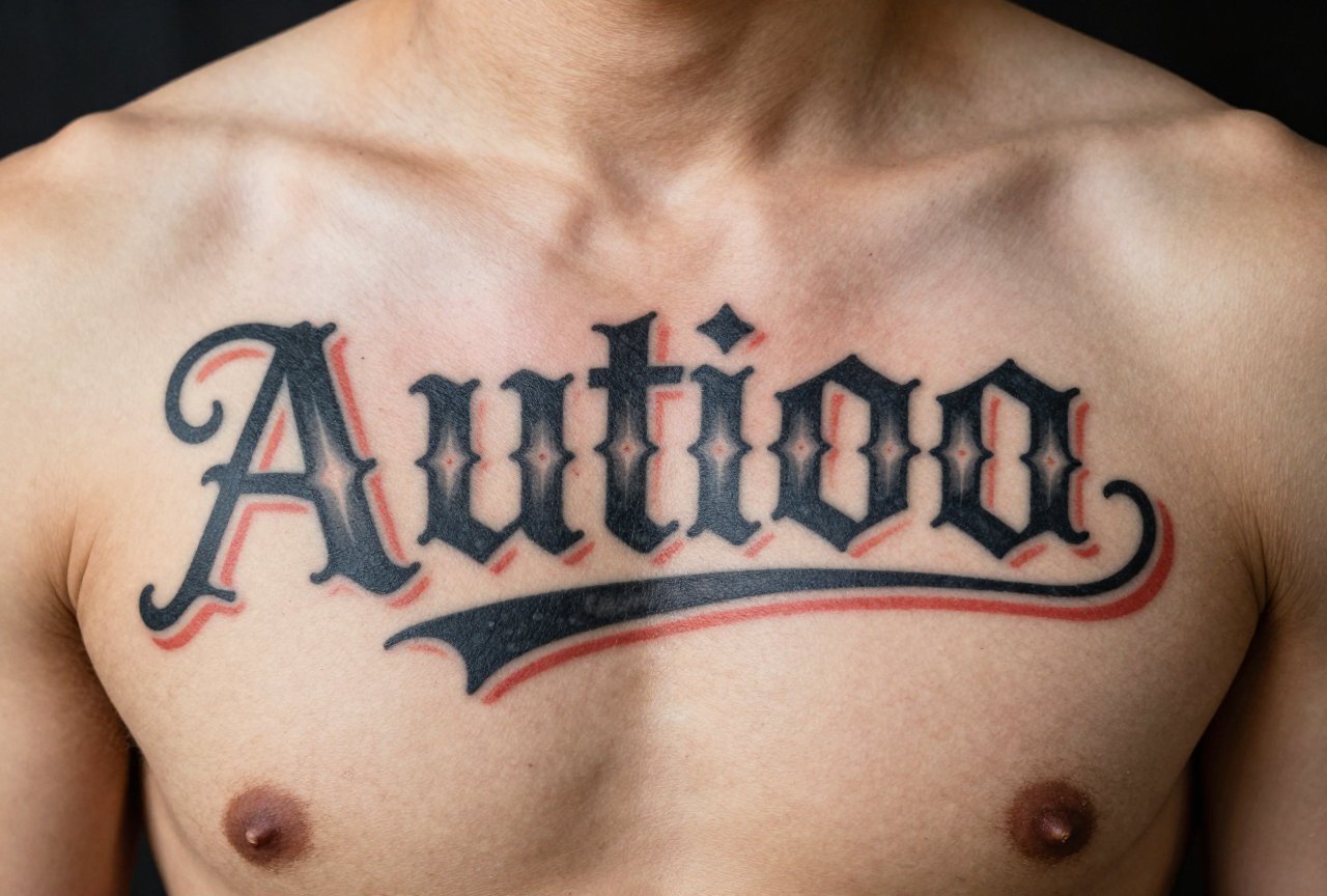
- Chest: Across the pecs, arched over the heart. Traditional placement for names, dates, memorials. The curve of the chest follows the banner shape naturally.
- Upper arms: The traditional “half sleeve” spot. Letters wrap with eagles, ships, pin-ups. Room for scale.
- Knuckles: The ultimate. Eight letters, no more, usually. I’ve done “HOLD FAST,” “TRUE LOVE,” “GAME OVER.” The skin here is thin, the healing is annoying, but the impact is permanent.
- Thighs and calves: Big canvas, good for longer phrases. The muscle stability helps with aging.
Fingers and wrists? I warn people. The skin is different, the wear is constant, the letters have to be tiny. I’ve seen beautiful traditional lettering on hands, but it needs touch-ups, and the client has to accept that reality.
Who It Suits
This style doesn’t care about your aesthetic. I’ve tattooed it on punk kids, on grandfathers getting their first piece at sixty, on sailors who actually sail, on office workers who want something that won’t look ridiculous in a conference room. The common thread is the person wants their words to last, to be understood, to carry weight.
It suits people who mean what they say. The font doesn’t do irony well, it’s too sincere. If you want “LIVE LAUGH LOVE” in traditional American lettering, I’ll do it, but I’ll ask if you understand the dissonance. The style demands conviction. I’ve had clients change their phrase mid-drawing because the font made their original choice feel hollow.
Modern Variations
Contemporary artists aren’t just replicating flash. They’re stretching the form while keeping the bones intact.
- Distressed or weathered lettering: Intentional irregularities, slightly eroded edges, that “found on a barn wall” feel.
- Mixed scale: Huge first letters with smaller follow-ups, creating hierarchy within the traditional framework.
- Non-English integration: Japanese characters, Arabic script, adapted to bold outlines and heavy weight. Tricky, but possible with respect and research.
- Neo-traditional color palettes: Muted teals, dusty roses, olive greens, still limited, still flat, but expanded beyond the classic primaries.
I experiment with some of this in my own work. The core never changes: readable, bold, built for decades. Everything else is window dressing.
Choosing an Artist
Not every tattooer who does traditional imagery nails the lettering. I’ve watched solid ship-and-anchor artists struggle with spacing, with curve adaptation, with the subtle rhythm of hand-drawn letters. Here’s what to look for:
- Portfolio focus: Do they have pages of lettering, or just a few pieces mixed in? You want someone who treats words as primary, not afterthought.
- Healed photos: Fresh traditional lettering looks great on everyone. Ask for one-year-healed shots. The real test is in the aging.
- Drawing process: Do they freehand the curve, or bend a computer font? The best ones draw every letter for the specific shape, adjusting spacing by eye.
- Shop reputation: Walk in, look at the flash on the walls, talk to the artists. The shops that respect this tradition usually feel different, more history, less hustle.
I tell clients: the consultation matters more than the price. If an artist rushes your lettering design, if they won’t adjust spacing when you ask, if they pull a stock font and call it done, keep looking. This style deserves patience.
Final Thoughts
Traditional American font tattoos aren’t going anywhere. While trends spin through this industry, watercolor, fine line, ornamental minimalism, the bold letter endures. I’ve watched it outlast every style I’ve been alive to see. The reason is simple: it respects the medium. Skin changes. Ink moves. Sun happens. Life happens. These letters are drawn with that reality in mind, not in denial of it.
Pick words that matter. Find an artist who draws them with care. Let the weight of the style carry your meaning. That’s the whole tradition, right there in the doing.
Frequently Asked Questions
How small can traditional American lettering be and still age well?
I generally won’t go below half-inch cap height for this style. Smaller than that, the bold outlines blur together and the letters lose their defining structure. For knuckles or fingers, we adapt the design but accept that touch-ups will be part of the life of the piece.
Can I use a computer font I found online for my traditional lettering tattoo?
Most digital fonts need significant adaptation for skin. The spacing is designed for screens, not curves. A good artist will redraw the letters to fit your specific placement, adjusting kerning and weight by eye rather than trusting a font file.
Why do traditional banner tattoos always seem to have those fold lines?
The folds create dimension without relying on smooth shading that could muddy over time. Three flat tones, base, highlight, shadow, read instantly as a ribbon shape, and they hold their structure for decades. It’s functional art, not just decoration.
Is traditional American lettering more painful than other tattoo styles?
The pain depends on placement and your personal sensitivity, not the style itself. That said, the heavy outlining and solid fill packing can mean longer sessions in one spot. I find clients often prefer the efficiency though, fewer return visits than multi-session delicate work.


