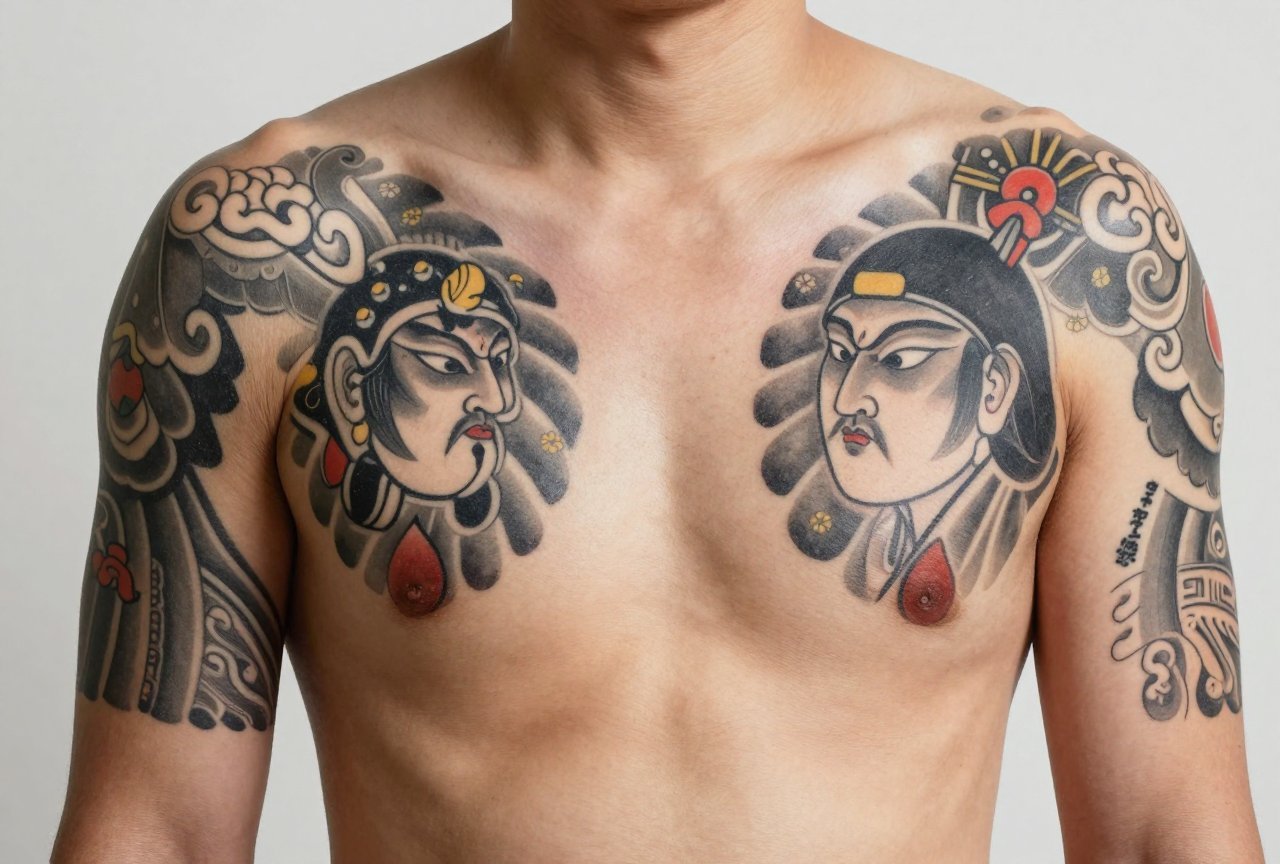
Korean traditional tattoo, minhwa tattoo to some, though that’s a bit of a misnomer, pulls from centuries of Korean folk painting, shamanic imagery, and decorative arts. I’m talking tigers with bulging eyes, magpies on plum branches, swirling clouds that don’t behave like Japanese or Chinese clouds, and those iconic lotus patterns that Korean grandmothers stitched into wrapping cloths. It’s not K-beauty delicate. It’s not neo-traditional flash. It’s louder, flatter, more graphic than a lot of Western clients expect. I’ve had people sit in my chair expecting something “subtle and Korean” and then realize they’re getting a tiger the size of a dinner plate with teeth like fence posts. That’s the style. It doesn’t whisper.
Origins & History
The visual language comes from minhwa, Korean folk paintings made by anonymous artisans, not court painters. These were household talismans, birthday decorations, screens for the rich, cheap prints for the poor. The tiger chasing a magpie. The ten longevity symbols. The carp leaping through dragon gate. All rendered with flattened perspective, bold outlines, colors straight from mineral pigments, and a sense of movement that feels almost naive until you study it.
There’s also the shamanic thread, mu traditions where images held power. The tiger as mountain spirit. The magpie as messenger. These weren’t just pretty pictures. They did work. That spiritual weight still resonates in how Korean traditional tattoos function for people today. I’ve tattooed Korean-Americans who want their grandmother’s wrapping cloth pattern. I’ve tattooed non-Koreans who just respond to the visual punch. Both are valid, but the history matters if you’re going to wear it.
From Folk Art to Skin
The jump from painting to tattoo happened mostly in the last two decades. Korean tattooing itself operated underground for years, illegal for non-medical practitioners until relatively recently. Artists developed in private studios, small spaces, often working in black and grey because color supplies were harder to source or simply because that’s what clients wanted. The folk art influence crept in as Korean tattooers looked for something distinct from the Japanese and American styles dominating Instagram. It wasn’t a movement with a manifesto. It was artists like Doy, Sol, and others finding their visual heritage and pushing it into skin.
Key Characteristics & Motifs
If you’re trying to spot a Korean traditional piece, look for these:
- Flat color fields, minimal shading, no photorealistic gradients. Think poster art, not oil painting.
- Thick, confident outlines, usually black, sometimes dark blue or red, holding everything in like a fence.
- Asymmetry and movement, tigers twist, clouds spiral, fish arc. Stillness is rare.
- Motifs with meaning, not arbitrary decoration. The tiger and magpie (jakhodo) symbolize protection and good news. The lotus (yeonhwa) means purity rising from mud. The carp (eoryeo) means perseverance.
- Pattern integration, wrapping cloth (bojagi) geometries, cloud collars, repeated wave or diamond fills.
The tiger is probably the most requested motif I see. But Korean tigers aren’t naturalistic. They’re folk tigers, stripes like flames, eyes human and intense, sometimes crouching, sometimes almost comically fierce. I’ve had clients show me photo-realistic tiger references and I have to gently redirect. That’s not this style. The folk tiger is its own creature.
Clouds, Waves, and Filler
Korean clouds (gureum) are distinct, swirling, almost spiral, with rounded tails. They read as wind and breath. Korean waves (mulgye) are often repeating patterns, geometric, not Hokusai’s dramatic spray. These fill gaps beautifully. In my chair, I often suggest a Korean traditional sleeve with these elements as the connective tissue between larger motifs. It ages better than empty skin, and it keeps the eye moving.
Color vs Black and Grey
This is where clients get stuck. Authentic minhwa was color-drenched, vermillion, indigo, yellow ochre, malachite green. But Korean tattooing developed heavily in black and grey due to practical constraints. Now you have two legitimate branches: the color purists who want that mineral-pigment intensity, and the black and grey practitioners who let line weight and pattern carry the piece.
Color Korean traditional pops. It screams. The vermillion against cobalt is practically a signature. But it needs touch-ups. Reds fade warm. Blues can go grey-green. I’ve seen ten-year-old color pieces that look like vintage posters, beautiful, but changed. Black and grey ages cleaner, stays readable, but loses some of the folk art’s joy. I tell clients: if you want the full effect, commit to color and budget for a refresh in five to seven years. If you want low-maintenance, go black and bold.
Best Placements
Korean traditional works best where it can breathe. The flat color fields and bold lines need real estate. Small spots, wrists, behind the ear, finger sides, tend to blur or lose the graphic impact. That said, I’ve done small bojagi patterns on forearms that hold up because the geometry is simple.
- Thigh, my favorite for tigers. The muscle curve gives the crouching pose natural tension.
- Back panel, perfect for chaekgeori (books and scholar’s objects) or a full jakhodo scene.
- Upper arm/shoulder, traditional sleeve start point, easy to build around.
- Side torso, flows with the body’s lines, good for elongated fish or dragon gate carp compositions.
- Calves, hold detail well, visible but coverable.
One placement I caution against: the neck. Not for job reasons, your call, but because Korean traditional relies on balance and framing. The neck’s irregular shape fights the composition. We see this a lot in consultations. I usually suggest moving the design to chest or shoulder where it can sit properly.
Who It Suits
Style-wise, Korean traditional pairs well with streetwear, with minimalism actually, it’s graphic enough to hold its own against clean lines. It doesn’t need to be “matched.” I’ve seen it look incredible on people who otherwise have no tattoos, and I’ve seen it get lost on heavily tattooed bodies where everything competes.
Skin tone matters less than you’d think. The bold outlines and flat color read on dark skin; the black and grey version is universally legible. What matters more is your tolerance for visibility. This is not a hideable style. Even a small piece draws the eye because the imagery is so specific, so culturally loaded. Be ready for questions. Be ready to either explain or deflect.
Modern Variations
The style is evolving fast. Some artists are blending Korean traditional with neo-traditional techniques, adding more dimensional shading, softer edges, Western realism’s eye for anatomy. Others are going harder into the graphic, almost vector-flat look, inspired by contemporary Korean illustrators. There’s a queer Korean traditional movement happening too, reimagining the tiger as transgressive, the magpie as camp, the symbols bent toward personal rather than folk meaning.
I have mixed feelings about some of this. The core strength of Korean traditional is its cultural specificity. Dilute that too far and you have generic Asian-inspired flash. But I’ve also seen modern variations that deepen the tradition, artists like OOO (names vary, shop dependent) who research actual museum pieces and translate them faithfully. That’s the line: respect the source, then make it yours.
Micro-Realism Crossover
One trend I’m seeing: tiny Korean traditional motifs rendered in micro-realism. A single plum blossom. A miniature tiger face. This is technically impressive but practically questionable. Those lines spread. That detail blurs. I won’t do them smaller than two inches in any dimension. Clients push; I hold the line. Better a bold small piece than a blurry one.
Choosing an Artist
This is where I get serious. Not every artist who tags #koreantraditional actually knows the tradition. Look for:
- Portfolio depth, multiple pieces, not one or two experiments.
- Knowledge of specific motifs, can they explain jakhodo versus sipjangsaeng?
- Line quality, those outlines should be confident, consistent, not shaky or overworked.
- Color mixing, vermillion should read as vermillion, not generic red. The palette matters.
- Cultural fluency, do they understand what they’re tattooing, or are they copying Pinterest?
Ask about their reference material. Real Korean traditional artists study museum collections, folk painting books, actual minhwa. If their only reference is other tattoos, that’s a red flag. I’ve turned down clients who wanted “something Korean traditional” but couldn’t articulate why, and I’ve also spent hours with clients researching their family bojagi patterns to get it right. The best pieces come from collaboration, not transaction.
Final Thoughts
Korean traditional tattoo isn’t a trend. It’s a living connection to visual culture that survived colonization, war, modernization, and underground criminalization. When you wear it, you’re carrying that. The best pieces I’ve done in this style, my own hands still remember them, were the ones where the client understood the weight and wanted it anyway. The tiger doesn’t care if you’re Korean or not. But you should care about the tiger. Know what you’re asking for. Find someone who knows how to give it. Then sit still, breathe through the pain, and let something old become part of you.
Frequently Asked Questions
How is Korean traditional different from Japanese irezumi?
Korean traditional uses flatter color fields, more asymmetrical composition, and distinct motifs like the folk tiger and magpie. Japanese irezumi tends toward dimensional shading, background waves and wind bars, and more narrative sleeve construction. The line quality and color palette are immediately different once you train your eye.
Do I need to be Korean to get this style?
No, but you should approach it with respect. Learn the meanings behind your chosen motifs. Avoid random assembly of ‘Asian-looking’ elements. A good artist will guide you toward authentic choices rather than generic orientalist flash.
How long does a Korean traditional sleeve typically take?
A full sleeve in this style usually runs 30-50 hours depending on complexity, color versus black and grey, and your skin’s cooperation. The flat color fields can actually move faster than heavy shading, but the precision lining takes time. Budget for multiple sessions.
Will the bright colors fade quickly?
Vermillion and cobalt, the classic Korean palette, do shift over time. Reds warm to orange-pink, blues can mute. The bold outlines preserve readability even as color softens. Plan for a touch-up at year five to refresh the vibrancy, and protect from sun religiously.


