Letter tattoos occupy a strange middle ground in tattoo culture, simple enough that almost anyone can request one, technically demanding enough that bad ones are everywhere. The difference between a letter piece that holds up for decades and one that blurs into illegibility usually comes down to decisions made before the needle touches skin. Font choice, scale, placement, and how the design accounts for how skin ages all matter more than the specific words themselves.
Popular Styles
Lettering tattoos fall into recognizable categories, each with different technical requirements and aging characteristics. Understanding these distinctions helps you communicate with an artist and set realistic expectations.
Script and Cursive
Flowing script relies on consistent line weight and precise spacing between connecting strokes. Thin upstrokes and thick downstrokes, mimicking traditional calligraphy, require an artist with steady hand control. The risk here is fade and spread: hairline-thin loops and connectors tend to drop out or blur together over five to ten years, especially on high-movement areas like wrists or fingers. A skilled artist will build in slightly heavier minimum line weights and avoid overly tight ligatures where letters connect.
Popular script substyles include:
- Spencerian and Copperplate-inspired formal cursive
- Loose, contemporary “signature” script with variable sizing
- Old English or Blackletter, which read as ornate block letters rather than true cursive
Block and Serif Type
Serif lettering, think Times New Roman, Garamond, or custom slab-serif designs, offers better long-term readability than most script because the letterforms have more structural redundancy. Even if ink spreads slightly, the distinct shapes of individual letters remain recognizable. Sans-serif block letters (Helvetica, Futura, or custom geometric designs) work best at larger sizes where negative space between letters won’t collapse.
Both serif and sans-serif pieces benefit from bold outlines or solid fill. Outline-only lettering, while trendy, tends to look washed out as the surrounding skin tone shifts with age and sun exposure.
Decorative and Custom Hand-Drawn
Some artists specialize in lettering as illustration, incorporating ornamental flourishes, banners, or integrating letterforms with imagery. This category demands the most from your artist. Custom hand-drawn pieces should be designed specifically for the body, not adapted from digital fonts. The curvature of ribs, the taper of a forearm, or the flat plane of a collarbone all affect how letters read once applied.
Design Ideas
Beyond the obvious names and dates, letter tattoos work well for specific conceptual purposes. The constraint of working with text often forces more creative solutions than illustrative pieces.
- Coordinates in small serif numerals, clean, private, readable at tiny sizes if the font is chosen carefully
- Single words in oversized scale, a forearm-spanning “STAY” or “BREATHE” becomes architectural rather than purely textual
- Fragmented phrases across multiple body parts, hands, knuckles, or fingers carrying parts of a longer statement
- Mirror or reversed text, readable to the wearer in reflection, deliberately private
- Letterforms as negative space, solid black shapes with words cut out, or vice versa
Avoid cramming too many words into small spaces. A paragraph on a ribcage sounds meaningful until it heals into a gray blur that requires squinting to decipher. Most successful letter tattoos err toward brevity.
Best Placements
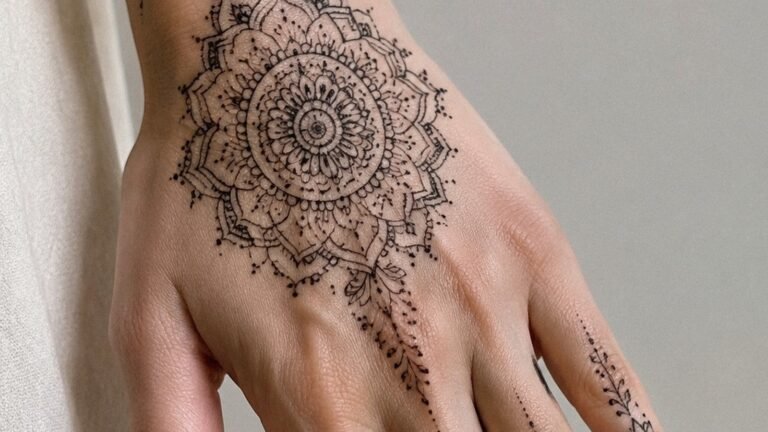
Skin thickness, movement, and sun exposure vary dramatically by location. Lettering, more than most tattoo styles, depends on stable skin conditions to maintain readability.
High-Retention Areas
The outer upper arm, outer thigh, and upper chest (below the collarbone, above the nipple line) offer relatively stable skin with minimal daily flexing. These areas heal predictably and resist the accelerated fading common to high-friction or high-sun zones. Lettering here can be smaller and more detailed while still aging reasonably.
Challenging but Common Placements
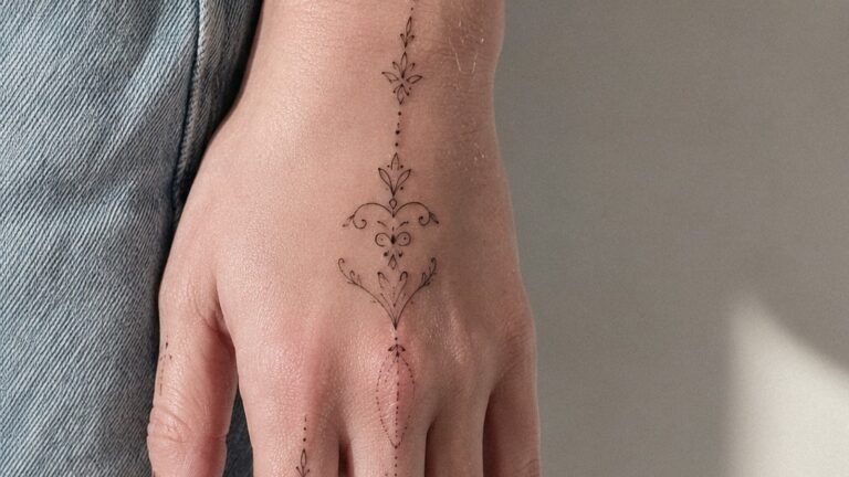
Ribs and sides accommodate longer phrases but require the artist to design with the body’s curvature in mind. Letters should follow the natural flow of the muscle structure, not fight against it. Wrists and inner forearms see constant movement and sun; expect touch-ups and accept that fine detail will soften faster here. Fingers and hands remain notoriously difficult for lettering, skin texture, oiliness, and near-constant use cause rapid degradation. Single bold letters or numbers work better than words on fingers.
Neck and throat placements demand particular confidence in your design. These are highly visible, difficult to conceal, and the skin heals differently than on the torso or limbs. Lettering here tends to look best at medium-to-large scale with strong contrast.
Color Choices
Black and gray dominate letter tattoos for sound technical reasons. Black ink provides the highest contrast against all skin tones, and carbon-based blacks are chemically stable, they don’t shift color as they age. Colored lettering introduces complications:
- Red and warm tones (iron oxide-based) often fade toward orange or salmon, especially with sun exposure
- Yellow and white require heavy saturation to remain visible; on lighter skin they can disappear entirely into the skin’s natural undertones
- Blue and purple hold better than warm colors but still soften faster than black
When color does appear in lettering, it usually functions as accent, drop shadows, background fills, or ornamental elements, rather than primary letterforms. If you want colored words, plan for a larger scale and simpler letterforms to compensate for the faster fade.
Skin tone significantly affects how color reads. What appears as bright red on pale skin may sink toward brown on darker complexions. An experienced artist adjusts pigment choices accordingly; this is one area where portfolio examination matters, look for healed work on skin similar to yours.
Tips for Choosing
The gap between a good idea and a good tattoo is where most letter pieces fail. These considerations help bridge that gap.
Font Selection Reality
Bringing a printed font or screenshot to a tattoo artist is a starting point, not a finish line. Digital fonts are designed for flat screens and crisp pixel rendering. Skin is elastic, textured, and three-dimensional. A competent artist will redraw your reference, adjusting letter spacing (kerning and tracking), baseline alignment, and stroke weight to function as a tattoo. Insist on seeing a stencil or drawn draft before application begins.
Highly detailed fonts with thin internal elements, vintage typewriter styles, distressed grunge lettering, or ornate Victorian designs, rarely translate well to skin at small sizes. The details that make them interesting on paper become muddy or disappear entirely.
Spelling and Permanence
The obvious but worth-stating: every letter is permanent. Check spelling in multiple languages if applicable. Verify dates, names, and quoted text. Artists are not proofreaders; the responsibility sits with you. Consider also that language changes, slang, inside jokes, or trendy phrases can become dated or embarrassing. Classical references, personal coordinates, or single timeless words carry less temporal risk.
Artist Specialization
Not all tattoo artists handle lettering equally well. Some excel at illustrative work but lack the technical precision for consistent letterforms. Review portfolios specifically for healed lettering, fresh tattoos look sharper than they will in two years. Look for consistent spacing, straight baselines on curved body parts, and letters that maintain their designed proportions. Ask directly about their experience with your specific style request.
Final Thoughts
Letter tattoos reward patience and restraint. The impulse to commemorate through words is understandable, but the medium has constraints. Skin is not paper. Ink is not toner. The best letter tattoos acknowledge these limitations and turn them into strengths, bold shapes, thoughtful negative space, and designs that read clearly from a distance and hold their structure as years pass. Take time finding an artist whose healed lettering work impresses you. Be willing to simplify your concept. The result will outlast any trend.
Frequently Asked Questions
How small can a letter tattoo be before it becomes unreadable?
Most artists recommend keeping letter height no smaller than 1/2 inch for simple block fonts, and larger for script with thin strokes. Below that threshold, ink spread during healing often collapses the internal spaces of letters like ‘e’ or ‘a’ into solid blobs.
Will a letter tattoo blur over time even if I take perfect care of it?
Some spread is inevitable due to how skin layers absorb and hold ink. Sun exposure, skin type, and placement affect the rate, but even pristine aftercare can’t stop the gradual softening that occurs over years. Designing with slightly heavier lines from the start helps compensate.
Is it better to get a letter tattoo in all caps or mixed case?
All caps generally age better because the uniform height creates consistent visual weight and eliminates the thin ascenders and descenders that complicate lowercase script. Mixed case works well for larger pieces where those thin elements can be built with sufficient line weight.
Can I get a letter tattoo touched up if it fades unevenly?
Touch-ups are common and usually effective for letter work, though heavily faded areas may require the artist to rebuild rather than simply reinforce. Wait until the piece is fully healed, typically six months to a year, before evaluating whether a touch-up is needed.