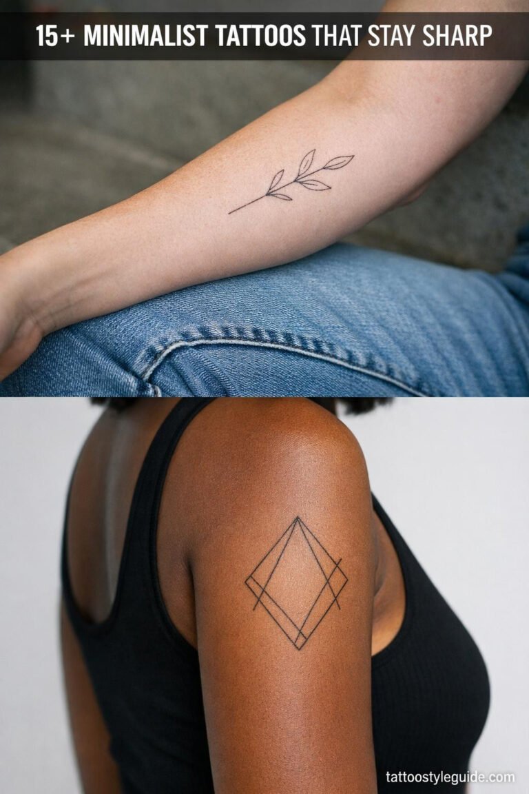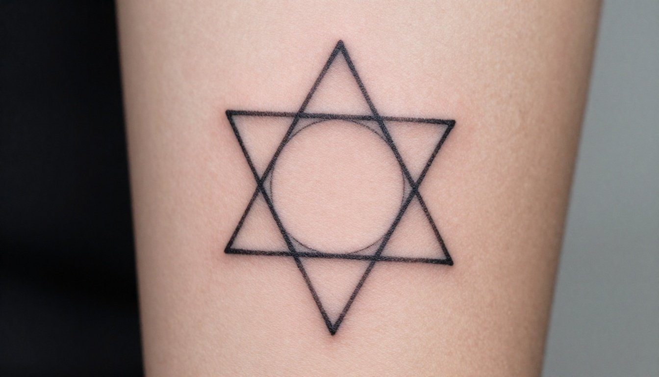
Minimalist geometric tattoos give you almost no margin for error. There is no shading to hide a wobble, no colour to distract from a crooked line, so consistent line weight, real symmetry and deliberate negative space carry the entire design. Done right, a triangle cluster or a fragment of sacred geometry reads sharp from across a room.
Quick answer: Minimalist geometric tattoos work when shapes are ruthlessly simplified, line weight is consistent, symmetry is exact and lines sit at least 2 mm apart. Use a slightly bolder outline for the main structure and finer lines for internal detail or light dotwork. Keep the smallest dimension above about 3 cm. Forearms, sternum, upper back and shoulders take linework best.
Why line weight and symmetry decide everything
Geometric tattooing is closer to drafting than illustration. Every needle pull is visible because nothing softens the edge. A uniform line weight gives that modern, almost vector-like feel and keeps the design legible at small sizes. In more complex work, a deliberate hierarchy helps: thicker lines for the primary shape, finer lines for secondary detail and stippling, so the eye locks onto the main form first.
Symmetry is the other half. Geometric pieces lean on bilateral or radial balance, and the brain catches even a small deviation instantly because it expects the two sides to match. A distorted triangle or a radial point that misses by a millimetre reads as wrong in a way a slightly soft shaded rose never would. Good artists plan the layout digitally first, then use grids and stencils so the mirrored halves and radial segments truly align on a curved body.
Geometric styles that stay clean
The filler was never the point, the space around the shape is half the tattoo.
Not every geometric idea survives being shrunk. The motifs below hold their shape because they are built from clear lines and honest spacing rather than dense internal pattern.
| Motif | Reads as | Best placement | Risk to avoid |
|---|---|---|---|
| Stacked triangles or chevrons | Direction, structure, balance | Forearm, spine, outer arm | Tips too sharp to hold ink at small size |
| Single circle with intersecting lines | Wholeness, focus, order | Inner forearm, sternum, back | Lines crossing too tight and merging |
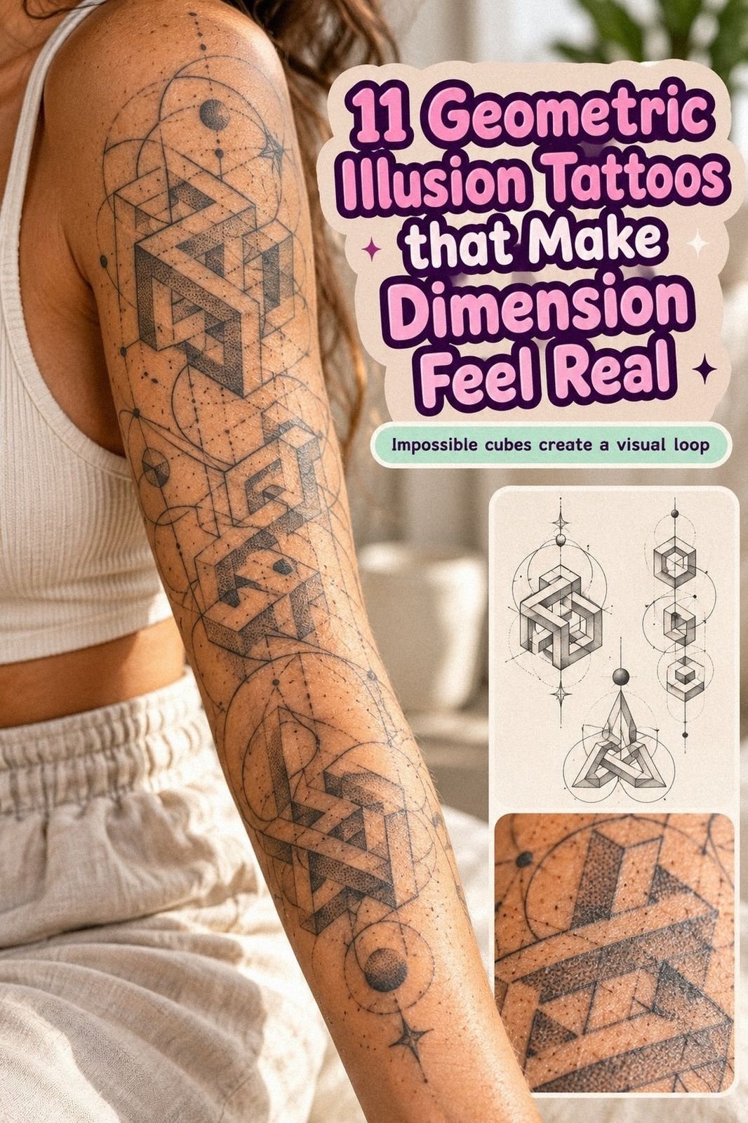
| Light dotwork gradient on a shape | Depth without heavy fill | Upper arm, thigh, shoulder | Dots packed so dense they blur to grey |
| Sacred geometry fragment (Metatron, Platonic solid) | Harmony, alignment, meaning | Upper back, sternum, outer arm | Too much internal lattice for the size |
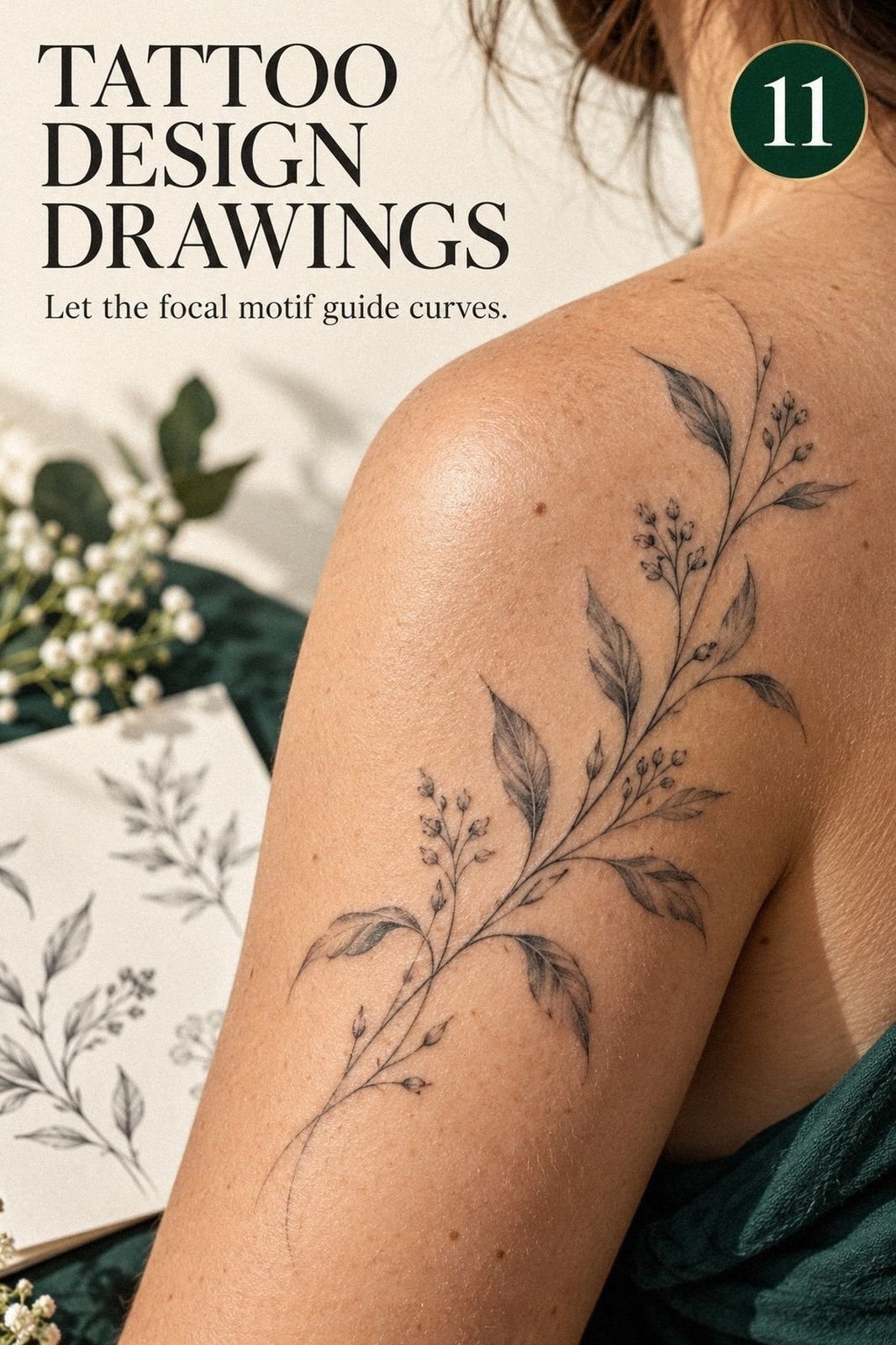
| Line-art animal or plant reduced to contour | Clean graphic identity | Forearm, calf, ribs | Adding shading later and killing the space |
Negative space is part of the design
In minimalist geometry the bare skin is not empty, it is a structural element. The balance between inked lines and untouched skin defines the forms, creates contrast and keeps the piece reading at a distance. The moment you crowd that space, the graphic impact collapses and the tattoo starts to look busy instead of intentional.
That is why spacing rules are strict here. Keep at least roughly 2 mm between parallel lines or lattice elements so they do not visually merge as the ink softens and spreads over the years. For intricate sacred geometry, simplifying the pattern almost always beats forcing a miniature version onto a small area. Light dotwork should stay a secondary tool, a halo or gradient around the lines, never a dense fill that competes with them.
How geometric work ages compared to shaded styles
Properly executed geometric and fine-line pieces can stay recognisable for ten to fifteen years or more, but they demand planning and aftercare. Over time lines become minimally bolder and slightly softer as ink spreads, which is exactly why ultra-tiny detail and tight patterns are risky.
Here is the honest trade. Heavier blackwork and shaded styles often tolerate aging better because bold fills absorb some spreading without losing the picture. Minimalist geometry has less room for error, so any blowout or asymmetry becomes more obvious as the piece settles. The upside is that a clean, well-spaced geometric design carries its meaning in the structure itself, so as long as the structure survives, the tattoo still works.
Placements that keep lines straight
Geometry wants flat, stable surfaces where straight lines stay straight and symmetry is easy to maintain. Forearms, inner and outer, are ideal for elongated compositions, bands and stacked shapes. Upper arms and shoulders suit radial symmetry like circular sacred geometry that can wrap slightly. The chest and sternum are excellent for centred designs aligned to the body’s midline, echoing the ribs or collarbones.
The upper back and spine give a broad, fairly flat field for larger or vertical compositions. Thighs and calves work for bigger dotwork pieces, with gentle curvature that can enhance a repeating pattern. Hands, fingers, ankles and feet can look striking with a tiny motif, but they are high-wear, so plan for faster blurring and more frequent touch-ups there. Wherever you place it, align the major axes with the body, vertical along the spine or sternum, horizontal around a forearm band, so the design does not distort when you flex.
Artist brief: Bring a reference and ask the artist to simplify it until every line earns its place. Request a consistent structural line weight with finer lines reserved for internal detail, at least 2 mm spacing, exact symmetry checked with a stencil, and a smallest dimension above 3 cm. Confirm placement follows your body’s natural axis.
More minimalist references
See how geometric rules compare to longevity and lotus minimalist work.
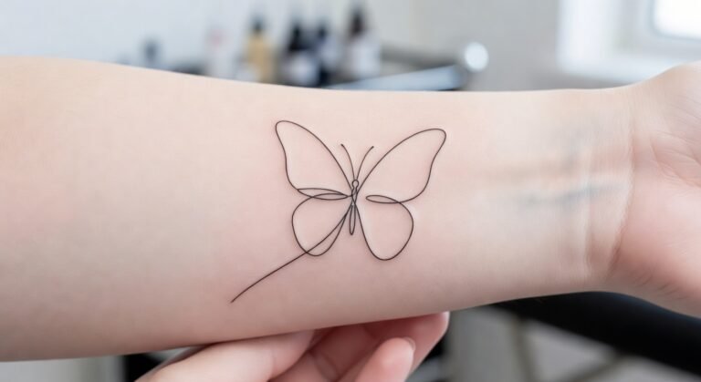
25+ Minimalist Tattoo Designs That Actually Age Well
Single-line butterflies, tiny mountain ranges, three-dot placements—minimalist tattoo designs that hold up without screaming for attention or needing constant touch-ups.
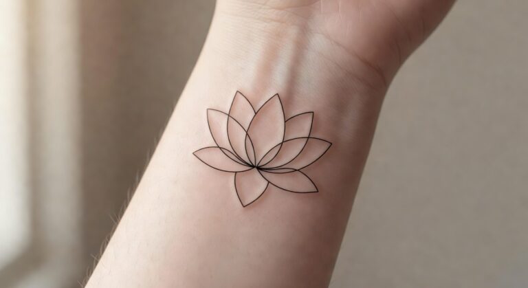
17+ Minimalist Lotus Tattoos That Skip the Filler
Minimalist lotus tattoos with clean lines and zero fill age better than shaded florals. Single-line designs on the wrist stay crisp for years without blurring.
Fine Line Tattoo Ideas: Placement, Fading and Touch-Ups
Fine line tattoo ideas that balance delicacy with real healed readability.
Reader questions before you book
Do geometric tattoos age well?
Well-executed geometric linework can stay recognisable for ten to fifteen years or more on low-friction, low-sun placements. It has less margin than blackwork, so any blowout or asymmetry shows more, which is why consistent line weight and spacing matter so much.
How small can a geometric tattoo be?
Keep the smallest dimension above about 3 cm. Under that, internal lattice and tight lines tend to blur into an indistinct mark within five to ten years.
Where do geometric tattoos look best?
Flat, stable surfaces. Forearms, sternum, upper back, shoulders, thighs and calves keep lines straight and symmetry intact. Hands and fingers look great fresh but wear fast.