Sonder is a word coined by writer John Koenig in The Dictionary of Obscure Sorrows. It means the sudden, profound awareness that every random passerby is living a life as vivid and complex as your own. Full of their own ambitions, fears, routines, memories. That quiet, humbling hit you get when you realize the world doesn’t revolve around you, and somehow that fact is beautiful instead of brutal.
People get sonder tattooed because it changed how they see the world. It’s a reminder to slow down, to look up, to feel connected to strangers without ever exchanging a word. Not a religious piece, not a memorial, not a lucky charm. Just one word or a visual idea that keeps a mindset alive on your skin.
What Sonder Actually Means as a Tattoo
Sonder carries a specific emotional payload. It’s the gut-punch realization that the pedestrian you barely noticed has a whole internal world running at full volume, just like you. Joy, grief, Tuesday-morning anxiety, a favorite song stuck in their head. When someone tattoos this word or concept, they’re committing to that awareness permanently. It’s a philosophical statement wearing the skin of a simple design.
Most people who get this tattoo describe a turning-point moment that sonder perfectly named for them. Maybe a crowded subway car, a late-night flight, a hospital waiting room. The word gave them language for something they’d felt but couldn’t articulate. The tattoo keeps that moment anchored. It’s introspective without being self-absorbed, which is rare.
The Origin of the Word and Why It Matters
Every face in the crowd is the main character of a story you'll never read.
John Koenig published sonder through The Dictionary of Obscure Sorrows, a creative project that invented precise words for complex emotions that didn’t have names in English. The YouTube video for sonder went viral in the early 2010s and the word spread fast, especially in circles that loved poetry, philosophy, and that specific flavor of existential awe that’s more comforting than scary. It is not an ancient term, not Latin, not Greek. Koenig made it up, and it stuck.
That origin matters for your tattoo consultation. Some clients worry about getting a word that isn’t in a traditional dictionary. Doesn’t matter. Language evolves. Sonder resonated with millions of people because it named something real. The meaning is solid even if the etymology is modern. Your tattoo artist doesn’t need to know the backstory to execute the lettering cleanly, but you should know it so you can speak to your piece.
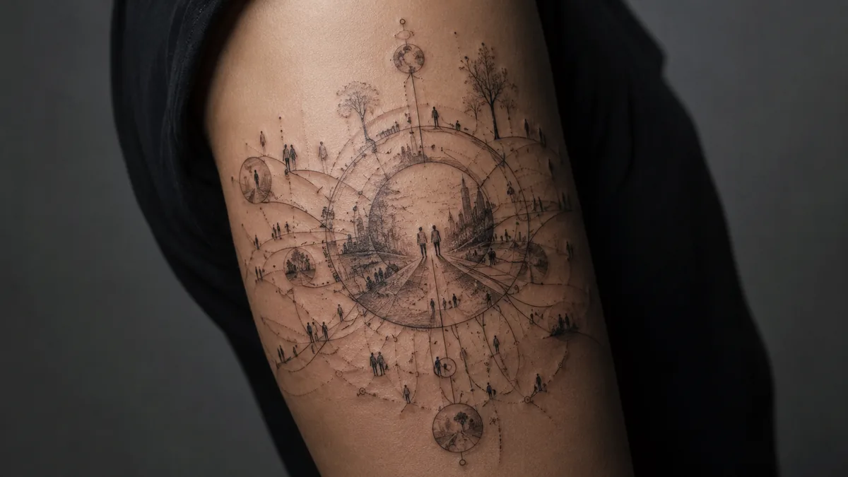
Popular Design Variations for Sonder Tattoos
The most common execution is clean script lettering, just the word sonder in a font that suits the wearer. Fine line serif fonts, delicate cursive, minimal sans-serif, all work well depending on placement size. Some clients add a small visual element: a crowd of silhouetted figures, a city skyline seen from above, a single window lit up in a dark building, or a bird’s-eye view of people on a street. These designs give the concept a visual anchor beyond the word alone.
More illustrative versions use a figure looking out over a sea of anonymous people, or an eye reflecting a bustling crowd. Geometric interpretations stack small human silhouettes into a grid or pattern. Watercolor washes behind the text add atmosphere but don’t always age as crisp. Black and grey with solid linework holds the longest and reads the clearest from a distance. Whatever route you take, the design should feel intentional, not cluttered.
Script and Lettering Styles That Work
If you’re going word-only, lettering is everything. Fine line script looks gorgeous fresh but needs the right spot. On forearms, inner biceps, and collarbones, a skilled fine line artist can make it land perfectly crispy. Avoid stretchy, high-movement zones like fingers and wrists for super delicate work because blowout is a real risk in those spots, especially with lightweight strokes. Bold will hold better over time, full stop.
Blackletter gives sonder a heavier, more formal weight, almost like a manuscript pull quote. Minimal modern fonts, think architectural, uppercase, evenly spaced, read strong and clean. Cursive with tight letterforms stays legible years out. Ask your artist to draw it out by hand rather than printing a font directly. Hand-lettering gives the piece life and avoids the stiff, printed look that dates fast. See their healed portfolio before you commit to a script style.
Color vs. Black and Grey
Black and grey is the dominant choice for sonder tattoos and for good reason. The concept itself is quiet and contemplative. Heavy saturation and bold color would fight the mood. Black and grey fine line or whip-shaded script suits the introspective nature of the word. It ages with dignity, stays readable, and pairs well with other minimal pieces if you’re building a sleeve or a collection.
That said, a soft watercolor wash behind the lettering, deep blue or muted amber, can evoke the feeling of standing in a crowd at dusk. If you go color, keep it restrained. Oversaturated rainbow fills look jarring against a philosophical word and tend to fade unevenly. Whatever the palette, the linework needs to be solid underneath. Color on top of clean structure ages far better than color trying to carry a piece that lacks strong lines.
Best Placements and How It Ages
Inner forearm is the classic go-to for text-based tattoos like this one. You see it daily, it reads well for others, and the skin there is relatively stable and flat. Inner bicep is a bit more private, good for people who want the reminder for themselves rather than the world. Ribcage placements are spicy pain-wise but give you a longer canvas for script or an illustrative version with figures. Sternum works similarly.
Hands and fingers are high-wear zones. Fine line lettering on fingers blows out, fades, and needs touchups more than almost anywhere else on the body. Collarbone placements look stunning but move a lot with posture, which can stretch fine lines over years. For longevity, forearm, inner arm, upper back, and calf are your safest bets. A good artist will walk you through placement based on your skin tone and lifestyle, specifically if you work outdoors in the sun, which accelerates fading hard.
Who Gets Sonder Tattoos and How to Make It Personal
Sonder tattoos attract people who’ve had a moment of genuine perspective shift. Travelers who had a breakdown or breakthrough in a foreign city. People who came out of grief and started seeing others differently. Therapists, writers, nurses, anyone whose job or life has cracked them open to the inner lives of strangers. It cuts across demographics because the feeling it names is universal. You don’t have to be a philosophy major to feel sonder.
To make yours personal, think about the moment that made the word matter to you. If you had it on a specific trip, consider a small geographic element alongside the word. If it hit you in a hospital, a heartbeat line or architectural detail from that place could thread into the design. Work with your artist to sketch something that holds your specific memory, not just the generic aesthetic. That’s what separates a tattoo that means something from one that just looks like one.

