When someone walks into my shop and says “I want something traditional,” I know exactly what they mean, but they might not. Traditional tattoo artwork isn’t just “old looking” or “sailor stuff.” It’s a specific visual language built on bold lines, limited color palettes, and imagery that’s been tested on skin for over a century. I’ve tattooed roses and swallows on bikers and baristas alike, and the style keeps working because it was designed to work. Let me break down what actually matters.
Origins & History
Traditional tattooing as we know it crystallized in the early 1900s, mostly around port cities where sailors got marked up before shipping out. These guys needed tattoos that would read clearly from across a bar or through salt spray. The style borrowed from Japanese irezumi, Polynesian marking, and European folk art, but it got stripped down to essentials: thick black outlines, saturated color, simple shading.
The Sailor Jerry Era
Norman Collins, Sailor Jerry, ran shop in Honolulu from the 1940s to 1970s and basically codified what we call “old school” today. His flash sheets circulated worldwide. I’ve got reproductions pinned in my station. The man understood that a tattoo on a sailor’s arm would fade in tropical sun and get banged around on rigging. So he built designs that could take a beating. That’s why traditional holds up.
How It Spread
Post-WWII, sailors brought the style home. By the 1950s, every American city had a street shop cranking out eagles, pin-ups, and “MOM” banners. The aesthetic became working-class identity. When I tattoo a traditional piece today, I’m participating in that lineage. Clients feel it too, there’s weight to these images that Instagram tribal never captured.
Key Characteristics & Motifs
Traditional tattoo artwork has rules. Break them and you’re doing something else. Here’s what defines the style:
- Bold black outlines: Usually 7-14RL needles, consistent weight, no tapering to nothing. The line carries the design.
- Limited color palette: Red, yellow, green, blue, black. Maybe purple or brown. No gradients, no “realistic” skin tones.
- Flat shading: Single-pass whip shading or sparse black fill. No smooth gray transitions.
- 2D perspective: These images sit on skin, don’t recede into it. A traditional rose looks like a graphic symbol of a rose.
- Iconic imagery: Swallows, anchors, ships, roses, daggers, snakes, panthers, pin-ups, eagles, skulls, hearts with banners.
I tell clients: traditional is like punk rock. Three chords, played loud. The constraint is the point.
Color vs Black and Grey
Here’s where shop talk gets real. Traditional can be black and grey, but it’s less common and trickier to execute well. The style was built for color.
Why Color Dominates
Those limited pigments, Intenze red, Eternal yellow, were chosen because they stay visible as skin ages and tans. I’ve seen 30-year-old traditional pieces where the red still pops and the black reads clean from ten feet. Color in traditional isn’t decorative; it’s structural. The yellow in a traditional rose separates petals that would otherwise blur together.
Black and Grey Traditional
When we do black and grey in this style, we’re usually working with higher contrast: heavier black fill, more negative space, less mid-tone gray. It can look stunning on darker skin tones where color saturation struggles, or when a client wants that 1950s prison/merchant marine aesthetic. But it requires a heavier hand. I’ve watched apprentices wash out black and grey traditional by trying to be too delicate.
Best Placements
Traditional tattoo artwork was designed for specific body real estate. The style’s flat, graphic nature means it needs relatively flat surfaces to read properly.
- Forearms: The classic. Visible, relatively stable skin, enough real estate for a proper composition. I’ve done hundreds of forearm traditional pieces.
- Upper arms/shoulders: Great for larger motifs, ships, eagles, pin-ups. The deltoid curve frames traditional imagery beautifully.
- Chest panels: The old-timers called them “shields.” Symmetrical designs, bold and centered. Hurts like hell over the sternum, but worth it.
- Thighs: Underrated. Stable skin, lots of space, easy to show or hide. I love doing traditional snakes wrapping thighs.
- Hands and neck: Controversial in old school culture, “job stoppers”, but traditional imagery holds up here because of those bold lines. We see this a lot now with younger clients who don’t have the same career constraints.
What doesn’t work as well: ribs (too much movement, curves fight the flat aesthetic), inner bicep (soft skin blurs faster), anywhere with major weight fluctuation.
Who It Suits
Not everyone. I say this with love.
Traditional tattoo artwork suits people who want their tattoo to look like a tattoo, not a photograph, not a delicate watercolor wash, not a spiritual mandala. It’s for folks who appreciate craft history, who want something that will look basically the same in twenty years. I’ve had clients come in wanting “something traditional but realistic” and I have to explain: pick one. The style’s limitations are its strengths.
It also suits collectors building cohesive bodysuits. Traditional pieces talk to each other. A traditional panther can sit next to a traditional ship and they belong together. Try that with a realism portrait and a geometric pattern.
Modern Variations
The style’s been alive long enough to spawn legitimate children. I don’t mean bastardized versions, I mean recognized substyles with their own rules.
Neo-Traditional
Takes the bold outlines and limited palette but adds more complex shading, illustrative detail, and expanded subject matter, animals, women, nature scenes rendered with more dimension. Think Audrey Kawasaki meets Sailor Jerry. I do a lot of this. The line work stays bold but the fill gets more sophisticated. It ages slightly less predictably than strict traditional, but still better than most styles.
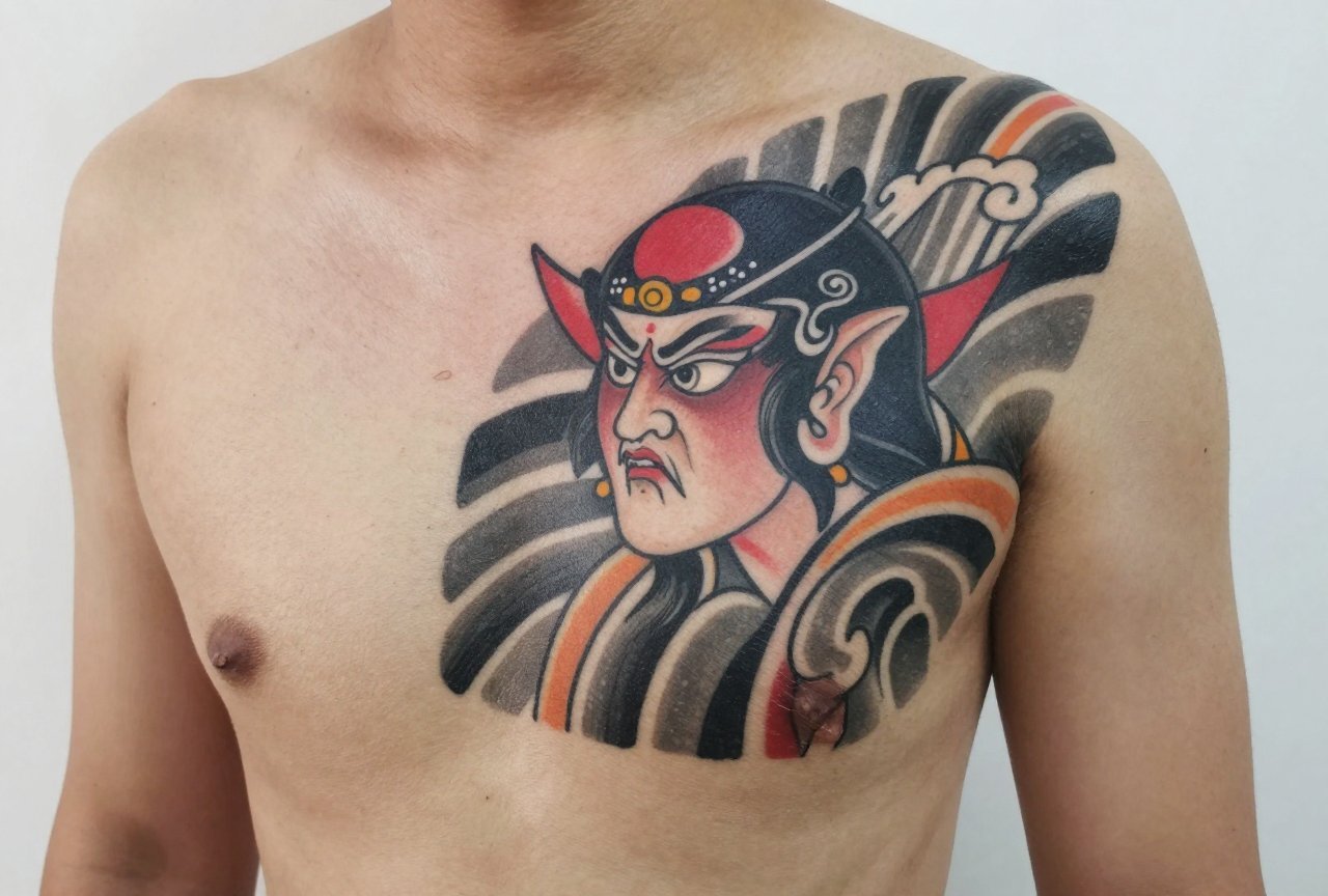
Japanese Traditional (Irezumi Influence)
Some shops blend American traditional format with Japanese imagery, dragons, koi, waves, using the bold outline approach but with more complex composition. It’s a fusion, not pure traditional, but respected when done well. I’ve got a colleague who specializes in this; his bodysuits are stunning.
Contemporary American Traditional
Working artists today, think Mike Adams, Bert Krak, Bryan Burk, keep the classic vocabulary but push composition and scale. Bigger pieces, more inventive use of negative space, sometimes unconventional color choices. Still reads as traditional from across the room. That’s the test.
Choosing an Artist
This matters more than anything. Not every tattooer who can do traditional should do traditional. Here’s what I tell people:
- Look at their healed work: Fresh traditional looks good on everyone. Healed traditional separates the pros from the pretenders. Ask to see photos from six months out.
- Check their line weight consistency: A traditional line should be the same boldness start to finish. Wobbly or tapering lines mean shaky hands or wrong needle grouping.
- Ask about their color choices: Real traditional artists have opinions about specific pigments. “I use this red because it stays”, that’s the answer you want.
- See if they tattoo from flash or custom: Both are valid. Flash purists keep tradition alive; custom designers evolve it. But they should know the difference and respect both.
- Shop culture matters: Traditional shops have a specific vibe. Walk in, feel it. Is there flash on the walls? Do they take walk-ins? That’s the real environment.
I’ve turned down clients who wanted traditional because I knew my colleague two stations down was better suited. A good artist will do the same. Ego kills more tattoos than bad ink.
Final Thoughts
Traditional tattoo artwork endures because it was built for reality. Not for Instagram’s perfect lighting, not for fresh-healed photo shoots, but for decades of living in actual human skin. I’ve watched these tattoos age on regular people, construction workers, teachers, parents, and they keep telling their stories. The swallow still flies. The rose still blooms. The banner still says “MOM.”
If you’re considering traditional, respect what it is. Don’t ask for softness where there should be boldness. Don’t chase trends that contradict the style’s nature. Find an artist who actually loves this work, who studies the flash sheets, who gets excited about a perfect 14-line eagle. Sit in their chair. Feel the buzz. Walk out with something that will outlast your current job, your current relationship, probably your current car. That’s the point. That’s always been the point.
Frequently Asked Questions
How long does a traditional tattoo take to heal compared to other styles?
Healing time is roughly the same, two to four weeks for surface healing, deeper settling over months. But traditional’s bold lines and solid color actually make the healing process more forgiving. There’s less fine detail to lose to scabbing, and the heavy saturation means minor ink drop-out is less visible.
Can traditional tattoos be covered up or modified later?
Absolutely, and they’re actually ideal for cover-ups. The heavy black outlines and dense color packing can hide older work better than delicate styles. I’ve reworked plenty of faded tattoos by framing them in traditional motifs or blasting over with solid black panther fill.
Why do some traditional tattoos look blurry after a few years?
Usually it’s line weight that was too fine, or an artist who didn’t understand how skin holds ink. True traditional with proper bold lines and adequate saturation shouldn’t blur significantly. The style was literally designed to prevent that. If it’s blurry, the execution was off, not the style itself.
Is it disrespectful to get traditional tattoos if I’m not a sailor or military?
Not at all, the style has been mainstream civilian culture for seventy-plus years. What matters is respect for the craft, not your biography. I tattoo traditional on everyone from librarians to line cooks. The imagery belongs to anyone who appreciates its history and wants to wear it honestly.


