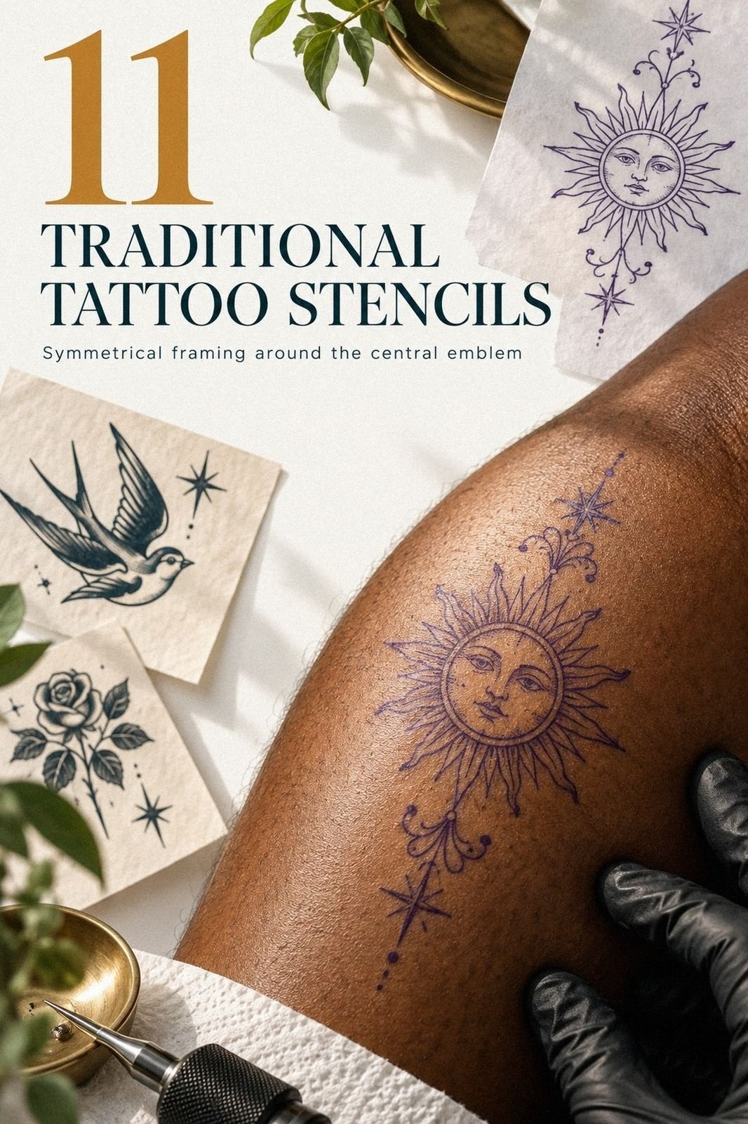
Traditional tattoo stencils can cost about $100 to $300 for a typical US piece, but my grandfather’s mark wasn’t something I could buy from a flash wall. I wanted bold traditional lines, a personal symbol, and a stencil that would still read clearly on skin. The first draft failed. The second finally felt like mine.
Here’s what it looked like before
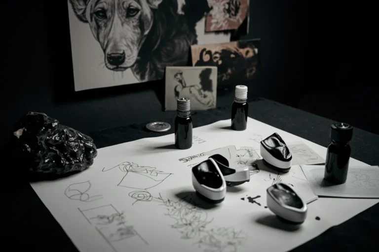
Before I drew anything, I had a blank section of skin and one faded reference: my grandfather’s working mark, copied from the inside cover of a notebook he kept near his tools. The shape was uneven, almost playful, with one hooked line and a small pointed center.
It wasn’t polished. That’s why it mattered.
I didn’t want a literal portrait or a delicate memorial tattoo. You can lose someone’s character when you clean every rough edge away.
I kept the original proportions, the awkward curve, and the sharp central point. My traditional tattoo inspiration guide helped me study old flash shapes without letting them swallow the personal meaning.
I also wrote down what the mark made me feel: raw, meaningful, and slightly haunting. Those words gave me a better direction than trying to make the design look impressive.
- Why I Chose American Traditional for the Mark
- Test the Contour on Synthetic Skin
- A Rose With Five Petals, Not Nine
- The Eagle That Needed Room to Breathe
- Which Dagger Actually Read at a Distance?
- Black Fills, Clear Skin Breaks
- Wrap the Serpent Around the Calf
- Standing or Seated? Placement Changed the Stencil
- Heart, Banner, or Too Much Message?
- Check the Stencil Before the Ink
- Healing Is Not the Same as Finished
1Why I Chose American Traditional for the Mark

I chose American traditional tattooing because the sternum placement needed a design with authority. I wanted a fierce outline, a classic silhouette, and enough open skin for the symbol to remain readable. The result needed to feel personal without becoming overly ornate.
The first draft had too many tiny marks. They looked intricate on paper, but they would’ve blurred into noise near the center of the chest.
I removed three interior cuts and widened the main contour. You don’t need every memory represented as a line.
You need one readable shape that still feels meaningful when your body moves.
That was the first real yes!
My preferred palette was simple:
– Black outline with a sharp outer edge. – Muted terracotta fill for the central symbol. – Olive accent near the point. – Clean skin breaks around the design.
I kept the stencil on ordinary tracing paper instead of printing it too cleanly. That slight hand-drawn wobble gave the mark a raw quality. If you’re building your own reference, compare it with this traditional tattoo stencils guide before deciding that more detail means more character.
2Test the Contour on Synthetic Skin

I tested the contour on synthetic practice skin before thinking seriously about placement. The first surface was too pale and too flat, but it still exposed a problem immediately: my lower curve was too narrow, so the design looked dainty instead of powerful.
I redrew that curve twice. The third version had a cleaner turn and a more graceful exit at the bottom. You want the outline to hold its identity from several feet away, not only when your face is six inches from the stencil.
My opinion is firm here: skip decorative micro-lines until the main silhouette works.
For the test, I used:
– A five-inch practice transfer. – A medium-weight black marker. – Two negative-space versions. – A thirty-minute pause between redraws.
The practice sheet couldn’t reproduce every stretch, fold, or skin tone. I used it to test proportion and rhythm, then expected an experienced tattoo artist to adjust the transfer for my body.
The final outline was less delicate and more striking. That was when I stopped copying my grandfather’s mark and started translating it. You’d be surprised how much personality appears when one unnecessary line disappears.
3A Rose With Five Petals, Not Nine
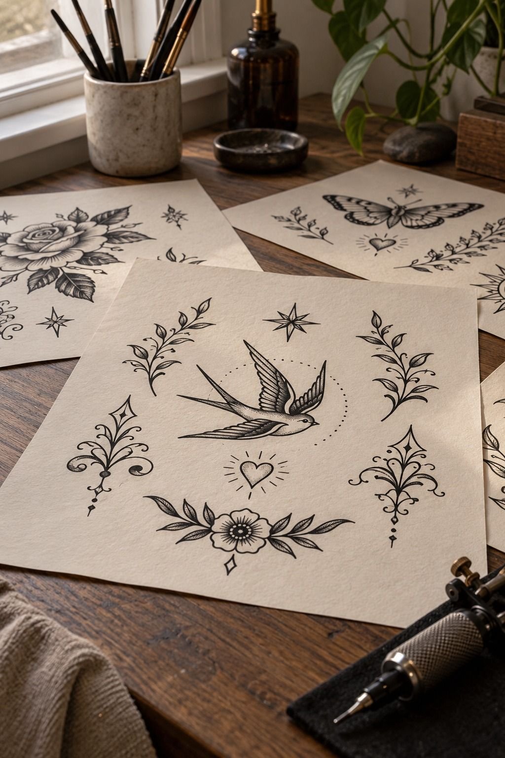
The rose study taught me what the stencil needed to lose. Roses tempt you into endless petals, especially when you’re looking at classic American traditional flash.
My first version had nine interior folds. It was elegant on paper, but the center became muddy once I reduced it.
I kept five major petal shapes instead. The outer contour stayed bold, and the inner lines became short, deliberate marks rather than a web of detail.
You can still see the flower immediately, but you won’t have to decode it. I wanted a timeless rose, not a technical drawing.
The plum, gray, and rose-gold palette made the design feel softer than the black outline suggested. That comparison helped me judge line weight more honestly.
My rule became simple: if a line doesn’t explain the flower’s direction, it goes. If you’re adapting a rose for your own traditional tattoo stencils, don’t let a vintage reference force you into copying every mark. The traditional tattoo outline guide is useful for studying structure, while your final shape should suit your skin and placement.
I also compared the rose with an American traditional tattoo design guide. It reminded me that a graceful curve can carry more feeling than a complicated center.
4The Eagle That Needed Room to Breathe

The eagle was the first design that felt genuinely fierce.
I placed the traditional eagle stencil on my forearm because the long area gave the wings room to open without crushing the body. My first version sat too close to the wrist. It looked powerful in isolation, but the lower feathers lost their direction whenever I bent my arm.
I raised the design and softened the lowest feather cuts. The eagle became more readable, more expressive, and less crowded. The central body used navy ink, with white skin breaks and a restrained warm-brown accent to keep the classic shape clear.
That small adjustment made the design feel iconic rather than merely large. I wanted the wings to carry movement, but I didn’t want every feather competing for attention. A few strong marks did more than a page of intricate ones.

5Which Dagger Actually Read at a Distance?
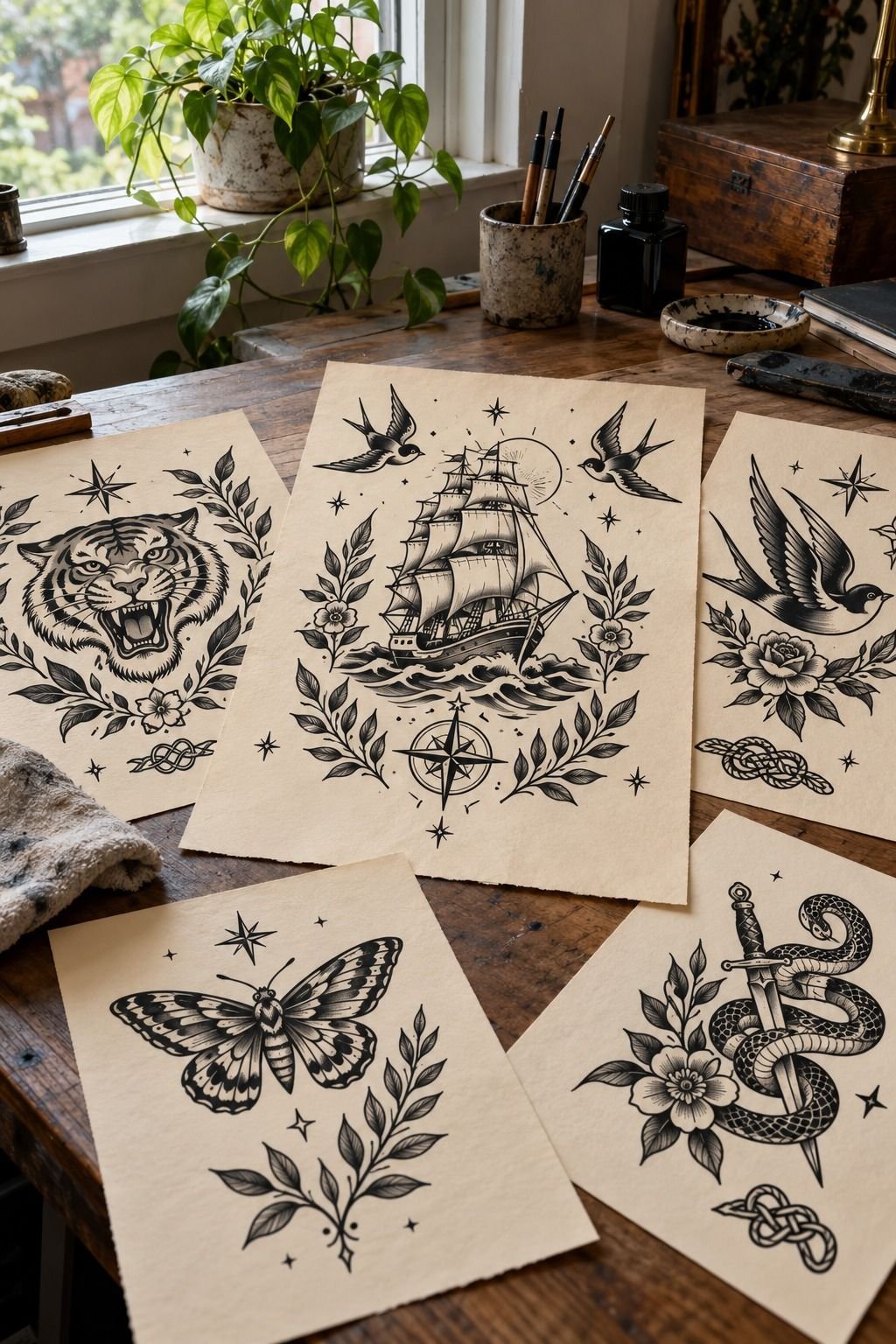
I compared two dagger stencils on aged off-white paper, and the difference was immediate. The first had a thin, ornate handle and a narrow blade. The second had a thicker black outline, a compact guard, and a more dramatic point.
The second one won because you could recognize it from across the room. That sounds obvious, but it isn’t when you’re staring at a flash sheet. A delicate dagger can feel romantic and stylish in a sketch, yet lose its edge once transferred to skin.
I wanted a raw, classic shape with enough empty space around the blade to stay crisp as the tattoo ages. The American traditional tattoo design guide helped me compare older flash proportions with newer redraws.
I marked these details in pencil:
– Blade width at the center. – Guard-to-handle distance. – Negative-space gap inside the grip. – Emerald accent position near the point.
The final palette used cream around the blade and a restrained gold detail near the guard. The colors felt vibrant without making the dagger look playful. The point still carried the daring quality I wanted.
The first stencil also leaned slightly left. I kept that imperfection because it made the dagger feel drawn by a person instead of produced by software. But I corrected the handle symmetry.
You can preserve character without preserving every mistake.
The older silhouette had more personality. The newer version was polished, but it felt less daring.
6Black Fills, Clear Skin Breaks
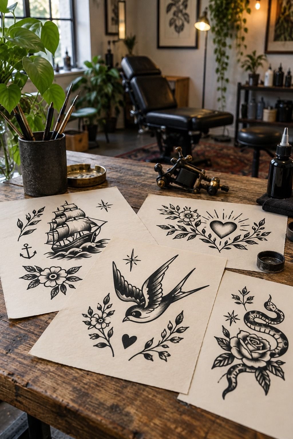
The black fills needed a separate check, especially where the design became dense.
I tested the largest areas with a forest-green fill beside a rust accent and left the surrounding skin open. That combination gave the design a gritty, vintage energy without turning the central mark into one solid block.
The difficult part was deciding where the black should stop. I shortened two filled sections and reopened a narrow gap near the hook. That break made the symbol easier to read and gave the surrounding color somewhere to breathe.
A powerful tattoo does not need maximum saturation everywhere. It needs contrast, rhythm, and a few quiet sections. I kept the strongest dark areas at the outer contour and let the interior colors do less work.
7Wrap the Serpent Around the Calf

The serpent was the most difficult stencil because the body had to travel around a curve. A straight snake would look stiff. I wanted a flowing shape with an expressive head and a clean coil.
I first made the body too thin. It looked intricate and graceful, but the stencil disappeared whenever the paper bent. I thickened the main body and reduced the scale pattern to short groups of three.
That gave the snake a sharper, more daring personality.
The final color notes were dusty rose, charcoal, and a muted gold accent. The dusty rose softened the design without making it dainty, while the charcoal kept the head sharp.
My placement test used a flexible paper strip, not a flat sheet. You should wrap your stencil around the intended area before approving the final contour. This showed me that the head needed to sit slightly higher, where it could remain visible when the leg turned.
I rejected a fully coiled version. It was ornate, but the compressed body made the design feel trapped. The longer S-curve looked more natural and gave the eye somewhere to travel.
The final result was sleek, symbolic, and a little haunting. If you’re working with a similar shape, study the traditional tattoo banner guide for ways to balance long forms without crowding them.
8Standing or Seated? Placement Changed the Stencil

A clean stencil is where the drawing becomes a real placement decision. I placed the transfer, stepped back, and immediately saw that my first position was too low.
It looked fine sitting down. Standing up, it dropped toward the ankle and lost its visual weight.
I moved it higher by a small amount and rotated the bottom edge inward. You should always check a stencil while standing, seated, and with the muscle relaxed.
Standing changed everything!
The calf placement also looked different from the front and side. The side position showed a tilt that wasn’t obvious when my leg was still. That saved me from approving a placement that worked from only one direction.
The stencil itself had:
– A crisp outer border. – Medium-width internal lines. – Clear central gaps. – A compact lower point.
The final outline felt polished without becoming sterile. I kept one tiny uneven corner from the original sketch because that mark carried the memory. You can correct a transfer without erasing its history.
For another placement comparison, I checked the neo-traditional tattoo ideas guide. I didn’t copy its style, but it helped me think about how a design travels across a curved body area.
9Heart, Banner, or Too Much Message?
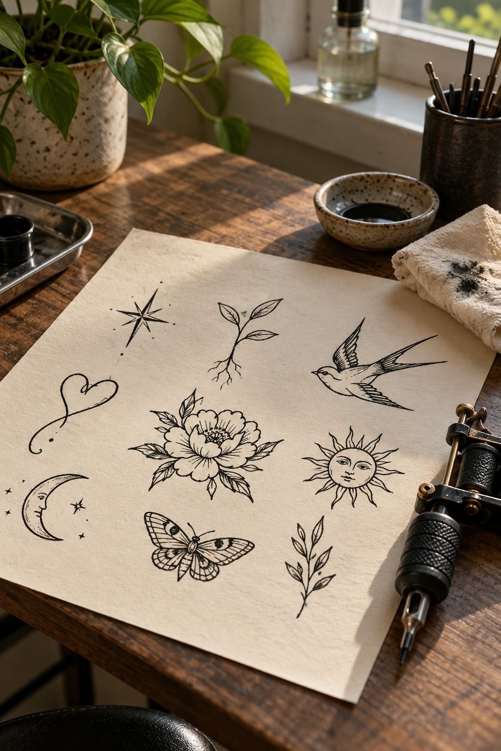
The heart and banner were the most personal combination. I used the wrist as a guide, where a bold black border could hold the small placement without overwhelming it. The first banner wrapped too tightly around the heart, so the letters looked squeezed before the stencil touched skin.
I widened the ribbon and gave each fold a clear break. That made the design more readable and less ornate. My grandfather’s mark wasn’t a quote, so I didn’t force words into it.
Instead, I used one short symbolic shape that echoed his original hook.
This was the point where I had to stop adding. A banner can be a frame, a message, or a distraction. I chose a simple ribbon fold with two pointed ends because it looked classic and personal without competing with the heart.
The final palette used midnight blue, copper, and ivory. It felt romantic but still strong enough for the wrist. The colors gave the heart an understated quality rather than turning it into a loud emblem.
The traditional tattoo banner guide helped me compare folds, spacing, and letter scale before committing to the transfer. I also reviewed neo-traditional tattoo ideas to see how other artists protect small lettering.
The finished design felt romantic but not sentimental. It was bold enough for the wrist, yet understated enough to remain mine. Honestly, that balance mattered more than making the reference look impressive.
10Check the Stencil Before the Ink
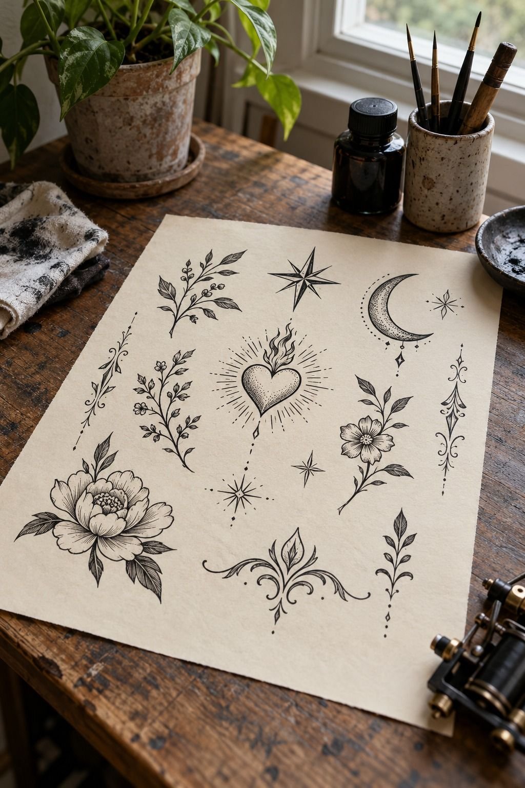
My final check compared the stencil with the finished traditional design. I wanted to know whether the transferred shape still resembled the drawing after the skin, body position, and contour changed. The answer was yes, but only after I corrected two small gaps.
The first gap sat under the central point. It made the design look broken from the side.
The second was near the lower curve, where one line ended too close to another. I moved both before the session.
I checked the design in plain light rather than dramatic shadow. You need to see the actual linework, not a flattering position. I also checked it from farther away because traditional flash should read quickly.
The final palette used sage green, warm cream, and a natural brown accent. The result looked crisp, expressive, and more personal than the original reference. The traditional tattoo numbers guide gave me another useful reminder: compact marks need clean spacing more than decorative complexity.
I checked the proportions one last time against the traditional tattoo outline guide. The stencil became part of the process, not a replacement for it. It showed me the moment before the mark became permanent, when I could still change everything.
11Healing Is Not the Same as Finished
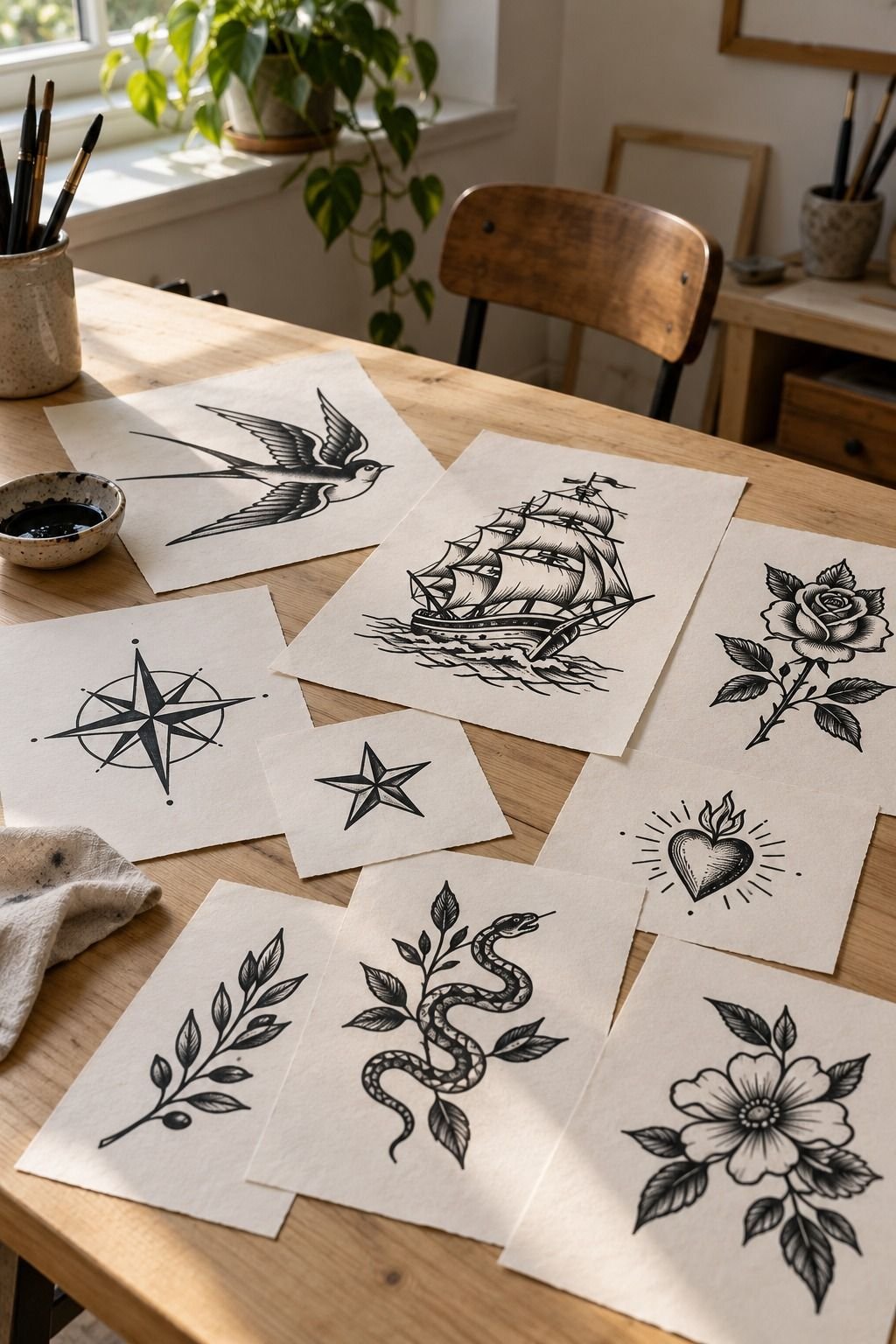
I tracked the healed result instead of judging it on the first day.
The terracotta, stone, and olive colors looked louder at first, then settled into a more balanced relationship as the skin recovered. The outer line remained clear, but two small interior marks softened. That was expected, and neither change damaged the symbol.
The healing stage taught me to separate a vibrant fresh tattoo from a timeless finished one. I followed the artist’s aftercare instructions, avoided unnecessary friction, and waited before judging the final color.
A tattoo can look powerful immediately and still need time before you understand it. Mine became more understated as it settled. That made the original mark feel even more authentic.
How much it cost: the honest US range
I didn’t invent a precise receipt for this story because tattoo pricing changes with the artist, city, size, placement, and session length. Typical US planning ranges are more useful: a shop minimum often falls around $50 to $100, while hourly rates commonly land around $100 to $250. A small or medium traditional piece may total about $100 to $300.
Your best budget question isn’t only, “How much is the tattoo?” Ask how long the stencil, placement, and session will take. An intricate design on the ribs can require more planning than a bold forearm piece, even when the finished size looks similar.
I wouldn’t choose an artist solely because the quote is lower. You want clean healed work, strong traditional linework, and a studio that takes hygiene seriously. The price matters, but the decision stays on your skin.
Why Traditional Stencils Still Read Years Later
Traditional stencils have a direct visual language. The outline does the work, the color stays intentional, and the symbol can be understood without a paragraph of explanation.
That doesn’t mean every old-school tattoo will age well. Placement, line weight, sun exposure, and aftercare still decide a lot.
I prefer bold shapes over crowded detail for a reason. Fine lines can spread as skin changes, while a crisp black border and generous negative space usually keep the design readable. You should still ask an artist to adjust the stencil for your skin, body movement, and chosen location.
The most timeless designs aren’t always the most ornate. They often have one memorable gesture, one strong color decision, and one area that stays quiet. That’s where my grandfather’s mark finally made sense.
For more structure, I returned to the traditional tattoo inspiration guide. It helped me separate a strong symbol from a crowded collection of references.
The Black Line Memory Rule
I spent longer deciding what to remove than what to draw. That was uncomfortable.
I had inherited one small mark, and every extra line felt like proof that I had taken it seriously. But seriousness isn’t the same as fidelity.
If I’d preserved every curl, the stencil would’ve become a museum copy instead of a living tattoo. The original notebook mark needed interpretation, not protection behind glass.
My first major mistake was treating the paper version as finished. It wasn’t.
Paper lies about skin because it stays flat, bright, and still. A calf curves.
A sternum rises and falls. A wrist turns.
I learned to judge each decision by three questions: Can you read the silhouette? Does the placement support the shape?
Will the negative space remain clear after healing? If the answer was no, I redrew it.
That process made the tattoo more personal, not less. The final mark still carries my grandfather’s hook, point, and uneven rhythm. It also carries my choices.
That’s the part I wanted to keep.
What I Removed Before the Transfer
I removed the extra feather cuts, two decorative curls, and one tiny point near the heart. None of them were bad by themselves. Together, they made the stencil feel less minimal and less direct.
The discarded interior lines were tempting because they looked intricate during the sketching stage. But a mark doesn’t become meaningful just because it contains more information. Sometimes the most empowering decision is leaving a section quiet.
I also removed a second color accent. The first palette was vibrant, but the extra spot pulled attention away from the hook. The final version used one terracotta area and one restrained olive detail.
That edit gave the design a more elegant rhythm. It still felt edgy and personal, but it no longer asked the eye to solve three ideas at once.
What People Always Want to Know
How much do traditional tattoo stencils usually cost?
I usually plan for about $100 to $300 for a small or medium US piece, while shop minimums may run $50 to $100 and hourly rates about $100 to $250. Your artist, region, size, and placement decide the final price, so ask for a quote after showing the stencil and body location.
Are traditional tattoo stencils a good idea for a first tattoo?
Yes, especially when you choose a readable placement and a design with clear lines. Bold traditional shapes can age well because they don’t rely on fragile interior detail. I’d consider a forearm, thigh, or shoulder before ribs, feet, hands, or sternum.
How do I choose a tattoo artist for traditional tattoo stencils?
I look for a portfolio with crisp linework, healed work, and repeated traditional pieces rather than one isolated example. A specialist should explain placement and hygiene clearly, and you should feel comfortable asking how the stencil will be adjusted for your skin.
How much do traditional tattoo stencils hurt?
Pain varies by person and placement. Ribs, feet, hands, and sternum are often more uncomfortable because they have less padding or more sensitivity. Forearms, thighs, and shoulders are usually more tolerable, though session length and your own threshold matter.
How long do traditional tattoo stencils take to heal?
Surface healing usually takes about two to three weeks, while complete healing can take around two to three months. Gentle washing, light moisturizing, and avoiding sun and pools support healing. I’d follow your artist’s aftercare instructions if they differ.
What’s the best placement for traditional tattoo stencils?
Forearms and thighs are strong choices for readable traditional designs because they offer useful surface area and generally feel more tolerable. Choose a placement that supports the stencil’s direction, and ask your artist how movement and sun exposure may affect it.
Where I’d Start First
If I had to pick one, I’d start with the simplified rose stencil. Its five major petals stay readable, and the reduced interior lines give the design room to heal without losing its identity.
I wouldn’t copy my grandfather’s mark exactly. I’d keep the hook, simplify the center, and let the artist redraw it for my skin and placement. That approach feels more personal, more expressive, and more honest.
I’d choose it again!