I got my Watercolor Tattoo Design the week I turned 30, and I nearly backed out because I’d seen too many faded, blurry examples online. I chose a botanical piece with anchored black linework instead. Years later, the color still reads clean. That wasn’t luck.
Here’s what it looked like before
The spot was a plain stretch of calf skin I’d been saving for an idea that could carry some movement. I didn’t want a tiny flower floating there with nowhere to go. You know the look, pretty for a photo, then oddly stranded on the body.
I brought in screenshots with loose pigment, petals, and splashes, but my skin was blank and the placement had to do real work. The eventual design followed the calf’s long line, with black botanical stems giving the color something solid to hold onto.
I Chose Watercolor With Anchored Linework
Watercolor without structure can get murky fast, so I asked for fine black outlines under the color. You can see that backbone on the calf: crisp stems, defined petals, then soft washes of blue, violet, and coral drifting outward.
I’d skip a fully outline-free piece unless your artist has years of healed examples. A single-needle black liner keeps the painting effect airy while giving your tattoo a readable shape at arm’s length. It’s the difference between soft and vague.
For more reference directions, I’d start with these watercolor tattoo ideas. You don’t need to copy one exact image. Bring the mood, then let your artist build it for your skin.
I Saved Floral References With Visible Brushstrokes
My reference folder had flowers, but not generic clip-art flowers. I saved peonies with loose outer petals, iris shapes with sharp centers, and paint marks where the pigment looked pulled by a brush rather than sprayed on.
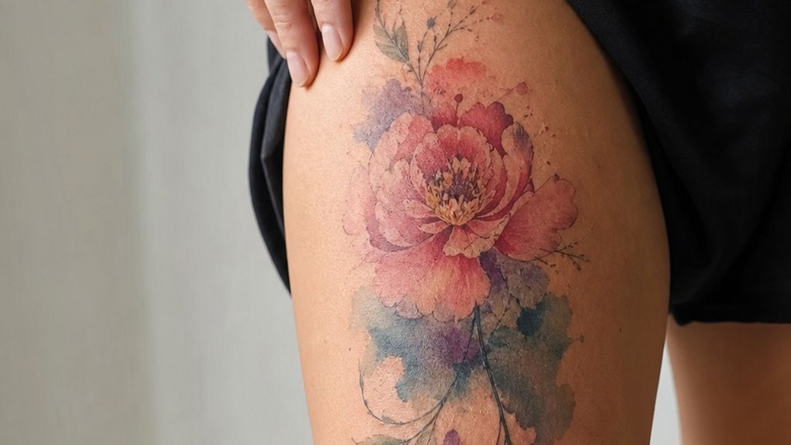
That matters because you want your artist to see the motion you’re after. In the thigh close-up, the magenta petal edges sit beside blue washes and small black veins. The black isn’t decoration.
It tells your eye where each bloom starts.
But don’t hand over twenty Pinterest screenshots and demand a carbon copy. If you want Pinterest-exact, I’m not your artist. References are for vibe, color temperature, and flow.
Your piece needs its own drawing.
I Matched the Palette to My Skin
On medium olive skin, I’d rather use stronger blue, berry, and warm red than pale pastel mist. Those softer tones can look refined fresh, then disappear once the tattoo settles under healed skin.
The thigh example uses deep indigo pigment with raspberry and coral around it. You can still see the skin between colors, which keeps the whole thing light without making it weak. Bright color needs contrast beside it.
Ask your artist to test the palette against a photo of your actual skin in daylight. You’ll see faster whether a pale lavender reads gentle or just fades into nothing.
Color is spice. Black is still your best friend for longevity.
I Picked a Botanical Subject With Meaning
I chose botanical forms because they give watercolor a natural reason to move. A stem can curve around your sternum, a leaf can trail toward your ribs, and a bloom can sit where your anatomy gives it room to breathe.
For the sternum placement, I’d choose a wildflower branch over a dense bouquet. Your chest moves when you breathe, and a packed floral cluster can feel cramped right down the center. A branching design stays elegant while it follows that motion.
You should pick meaning that doesn’t need a paragraph of explanation. Birth-month flowers, a plant from your grandmother’s yard, or a bloom connected to a turning point all work.
The tattoo is yours. The symbolism can stay yours too.
I Tested Placement on My Forearm
Before I committed, I printed the drawing at a few sizes and held it along my forearm. Glamorous?
No. Useful?
Very. You can tell right away whether the stem follows your body or fights it.
A forearm stencil mockup lets you check visibility, wrist clearance, and whether the focal bloom lands on a flatter patch of skin. I like the outer forearm for a first watercolor piece because you can see it, it heals nicely, and the pain is usually more chill than ribs or sternum.
If you’re building your own reference board, this guide on how to design your own tattoo can help you narrow down what belongs in the final drawing. Less clutter. Better tattoo.
I Scaled the Design for My Wrist
A wrist tattoo has less room than you think. That tiny watercolor flower with six petals, three color fades, and micro script might look cute on a screen, but it’s going to mush out if you force it too small.
For the deep-skin wrist example, the design works because the black leaf outline is bold enough to frame the color. The bloom has fewer petals, larger open gaps, and pigment that stays inside a clean silhouette.
That size on a wrist is gonna mush out, so bump it up the forearm if your artist says it needs air. You’ll get a calmer composition and fewer touch-ups later. Your future skin will thank you!
I Planned Color Flow Across My Shoulder
Shoulders are made for watercolor because the round surface gives the pigment somewhere to travel. I planned one strong bloom near the shoulder cap, then let blue and purple wash back toward the upper arm.
The close-up shows why restraint matters. Cobalt blue shading sits under one petal, while violet fades into clean skin instead of covering every inch. You need those open patches or the tattoo starts looking like a colored bruise.
And don’t make every flower equally loud. Pick one focal bloom, one supporting bloom, and a few quieter leaves. That hierarchy reads from across the room, sorry, across the pool or beach, even years from now.
I Built a Watercolor Sleeve Around Focal Blooms
A watercolor sleeve isn’t one giant paint cloud. I’d build it in chapters: a focal bloom near the elbow or upper forearm, a second cluster farther up, then leaves and color trails connecting the space between.
The healed sleeve shown here uses outlined peonies as anchors. The color changes around them, but the black stems repeat just enough to make the sleeve feel intentional. You can add to that over time without turning your arm into soup.
Start with a placement map before your first session. Your elbow ditch, wrist crease, and inner arm need breathing room because they’re high-wear zones. A good watercolor tattoo artist will map the whole route, even if you only tattoo one section today.
I Balanced Saturated Color With Negative Skin
This is my Two-Thirds Skin Rule: don’t color every available patch. Watercolor gets its lightness from bare skin, so I’d rather see saturated pigment beside open space than pale pigment packed everywhere.
On the olive forearm placement, coral watercolor splashes sit around a darker flower center, with enough negative skin to keep the wrap readable. The shape follows the forearm instead of forming a flat rectangle on top of it.
You can ask for color to fade outward, but make sure the edge is deliberate. Random dots without a black focal point can look unfinished once healed. Soft is good.
Confused isn’t.
I Asked About Fading During the Consultation
I asked the question most people avoid: what will this look like healed, not today? A decent artist won’t promise watercolor will stay neon forever. They’ll explain which colors soften, where the black sits, and how much room the design needs.
The stencil-versus-healed comparison should show the same basic composition, not a fresh tattoo on one side and a different piece on the other. Look for healed black linework that remains visible after the pinkness and shine are gone.
Ask whether the artist used grey wash, solid black, or diluted color around the edges. You’re paying for their judgment, not just the appointment. And if their answer is vague, keep looking.
I Checked the Artist’s Healed Watercolor Portfolio
Fresh tattoos are easy to photograph. Healed tattoos tell you whether an artist can make color settle cleanly without overworking the skin. I want to see pieces at least several months old, in daylight, on more than one skin tone.
The ankle example has blue floral shading that still holds its shape because the artist didn’t bury the whole design in tiny details. The linework is clear, and the color has softened without turning chalky.
Use a watercolor tattoo artists guide to make a shortlist, then ask each artist for healed work in the style and placement you want. Don’t settle for a good illustrator who’s a shaky tattooer.
I Confirmed the Design Would Age Clearly
Behind the ear is tiny real estate, and it’s not where I’d put a complicated watercolor garden. The skin is curved, the placement is visible, and the design needs to stay simple enough to read after the lines relax.
For that placement, a small black flower center with two or three color petals is enough. I’d skip micro-realism here. Tiny super-detailed petals can turn to soup, especially if your artist is trying to fit a whole painting behind one ear.
Could you make it bigger? Usually, yes. A slightly larger piece down the neck or toward the upper shoulder will give your color more room and age nicer.
Bold will hold.
I Prepared for a Longer Color Session
Color packing takes patience. Lines feel sharper, shading is a dull burn, and saturated color is often the spiciest part because the artist has to get it bright in one solid pass without chewing up your skin.
For a rib piece with layered pigment, I’d plan for breaks, water, food, and a realistic conversation about hours. A larger rib floral composition may take more than one session depending on detail and how your skin handles color.
Typical U.S. shop minimums run around $50 to $100, while hourly work often falls near $100 to $250 depending on the artist and region. Don’t choose based on the lowest quote. Cheap watercolor can become expensive cover-up work.
I Managed Pain Around My Rib Placement
Ribs are spicy. You’re breathing, the skin is thin, and every line can feel louder than the same line on your calf. I’d pick a simpler flow for this area, then save the densest color packing for the flatter side of the rib.
The placement guide shows a side-rib stem curving with the body rather than cutting straight across it. That’s the move. You want the tattoo to flex with you, not look bent every time you twist.
But don’t white-knuckle it because you think stopping is embarrassing. Tap out for five rather than pass out on me. A short break can keep your skin calmer and your artist’s lines cleaner.
I Followed the First-Day Healing Instructions
The first few days, it’s an open wound. Treat it like that. I washed gently with unscented soap, patted it dry with a clean paper towel, and used a thin layer of fragrance-free tattoo ointment.
Don’t suffocate it under a thick, shiny layer. Your tattoo needs clean skin, not a greasy seal. Loose clothing, clean sheets, no gym friction, no pool water.
Boring aftercare is what protects the interesting part.
And when it starts peeling like a sunburn, leave the flakes alone. Picking can pull color out and leave patchy spots that weren’t part of the design. Let it heal at its own pace.
I Protected the Tattoo From Sun Exposure
Sun is rough on every tattoo, but it’s especially rude to watercolor. UV exposure can dull those soft pinks, blues, and yellows before the black linework even has a chance to prove itself.
After the surface has healed, I use broad-spectrum SPF on exposed placements like shoulders, calves, and forearms. The shoulder photo has bright color because the design is protected, not because the pigment is magic.
You don’t need to hide your tattoo forever. You do need to stop baking it. A little sunscreen is cheaper than a color refresh, and it keeps the palette looking bright longer!
I Scheduled a Color Refresh After Healing
I don’t book a touch-up the second a tattoo flakes. Let it settle first. Surface healing takes roughly 2 to 3 weeks, while deeper healing can take 2 to 3 months, and that silver-skin stage can make color look dull before it settles.
The spine close-up uses violet pigment layers around a dark central stem, which gives an artist clear spots to assess later. If one wash heals lighter than planned, a careful refresh can bring it back without blasting the entire tattoo again.
A touch-up isn’t failure. But repeated touch-ups on high-wear skin can be a clue that your placement or design was too delicate for the job. Ask for the honest answer.
I Compared Feminine Watercolor Designs by Placement
“Feminine” doesn’t mean tiny, pale, or fragile. I’d compare placements by wear, pain, and how much motion you want, then choose a design that fits the body instead of a trend.
If you want a softer Water Colour Tattoo For Women, I’d pick the outer arm or thigh over fingers. Open petal spacing gives the design a refined look while letting your skin stay part of the image.
I Chose a Finished Design I Could Live With
My Three-Layer Anchor Rule was simple: black structure first, saturated color second, blank skin third. It made the finished shoulder design feel like a painting without asking the ink to do impossible things.
The final piece has black curved stems, a rose-toned bloom, and blue wash that tapers toward the shoulder edge. I didn’t add every flower I liked. That restraint is why it still feels warm, clear, and grown-up.
If you’re still deciding, look through watercolor cat tattoo guide for another example of using linework to keep a soft subject readable. Different subject, same rule: make the tattoo breathe.
Why I’d Never Skip the Black Anchor
I’ve watched people get talked into watercolor-only designs because they’re afraid black will make the tattoo feel too heavy. I get it.
Fresh, unlined color can look delicate and captivating in a photo. But skin isn’t paper, and a tattoo has to survive movement, sun, healing, and the slow widening that happens as pigment lives under your skin.
My own rule is blunt: if you want color to stay recognizable, give it a job description. A black stem defines direction.
A dark flower center gives the eye a landing point. A pepper-shaded leaf breaks up bright pigment so it doesn’t all melt into one soft cloud.
You don’t need a thick trad outline around every petal. You do need structure somewhere.
I made the mistake early on of treating watercolor as a style with no rules. It has rules.
You need contrast. You need negative skin. You need an artist who can make one clean pull instead of ten fuzzy ones.
And you need to accept that a tiny, pale, hyper-detailed design may look gentle today but won’t necessarily stay clear forever.
That doesn’t make watercolor a bad choice. It makes it a style that rewards good decisions.
I’d rather tattoo a slightly larger, simpler floral piece with black anchors than squeeze a whole painted garden onto your wrist. The first one ages cute on you.
The second one asks your skin to do too much.
How much it cost
My cost discussion would be based on scope, not a fake flat price. A small, anchored watercolor flower may meet a shop minimum, while a calf, shoulder, or sleeve project is usually hourly.
You can get a realistic estimate by sending placement photos, desired size in inches, and your reference direction. This guide on what tattoo design work may cost helps you ask better questions before you book.
What People Always Want to Know
How much does a Watercolor Tattoo Design usually cost?
A Watercolor Tattoo Design often costs about $100 to $300 for a small-to-medium piece, though shop minimums can be $50 to $100 and hourly rates commonly run $100 to $250. A clear consultation estimate matters more than chasing one number.
– Placement photo – Size in inches – Healed-work request
Are Watercolor Tattoo Design a good idea for a first tattoo?
Yes, if you choose a clean design and a tolerable placement like the outer forearm, thigh, or shoulder. Anchored linework gives your first tattoo a better shot at staying readable while you learn what healing feels like.
– Simple subject – Open negative skin – Black structural lines
How do I choose a tattoo artist for Watercolor Tattoo Design?
Choose an artist with healed watercolor work, crispy linework, and a clean studio process. Healed portfolio photos matter more than fresh, glossy pictures because they show how the artist’s color and contrast settle on real skin.
– Healed examples – Multiple skin tones – Consistent outlines
How much do Watercolor Tattoo Design hurt?
Pain depends on placement. Ribs, feet, hands, and sternum tend to feel spicier, while outer forearm, thigh, and shoulder are often more manageable. A smart placement choice can make a long color session far easier.
– Lines, sharper sensation – Shading, dull burn – Color packing, hottest pass
How long does a Watercolor Tattoo Design take to heal?
Surface healing usually takes about 2 to 3 weeks, while full healing can take 2 to 3 months. Gentle aftercare protects the color: wash with unscented soap, moisturize lightly, and avoid pools and direct sun.
– Clean hands – Thin ointment layer – No picking
What’s the best placement for Watercolor Tattoo Design?
Outer forearm and shoulder are strong choices because they offer room, visibility, and lower wear than fingers or feet. More breathing room lets watercolor pigment and black linework stay clear as your tattoo ages.
– Outer forearm flow – Shoulder-cap movement – Thigh-scale option
Where I’d Start First
If I had to pick one, I’d start with an outer-forearm botanical. It gives your artist enough skin for real color flow and black anchors, instead of squeezing a whole painting into a wrist-sized blur. Pin the placement, then book the artist whose healed work proves it.