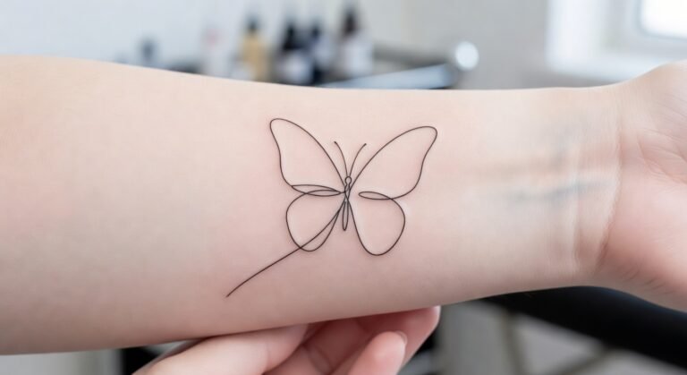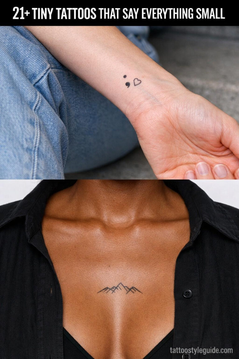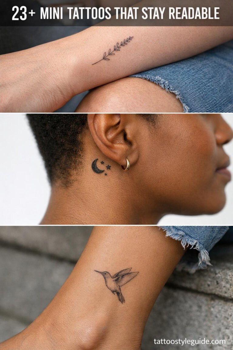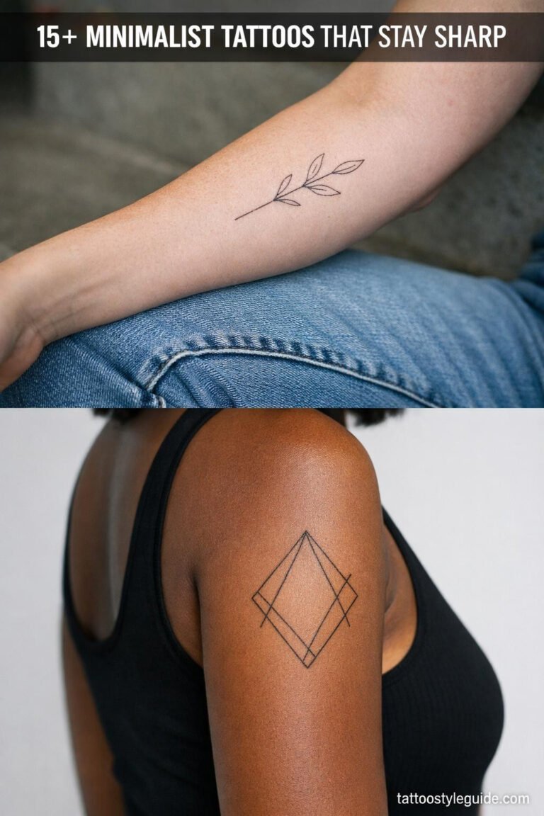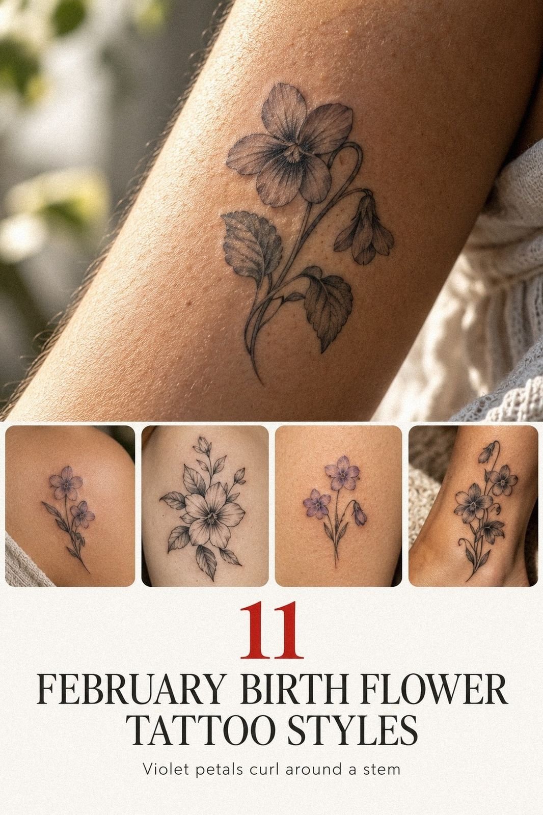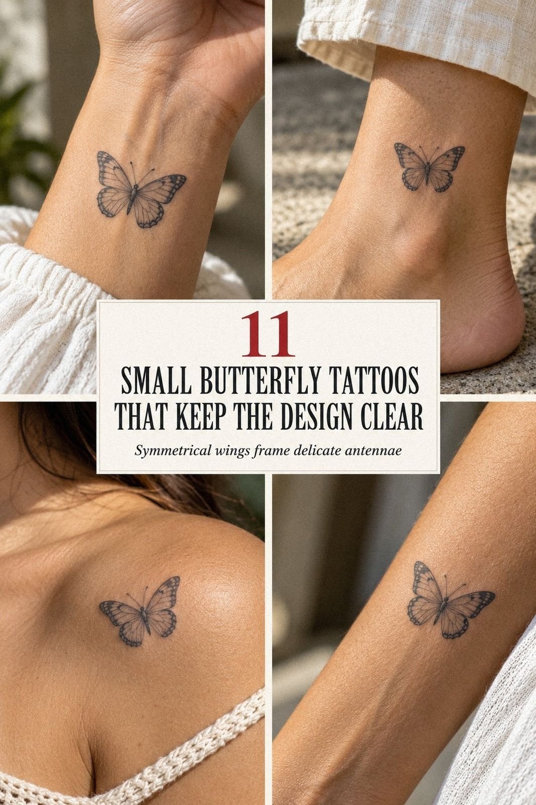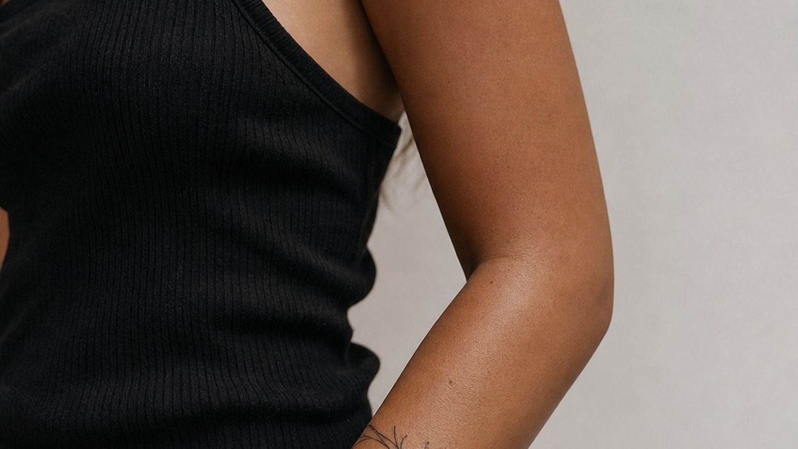
Wrist Tattoos Men can stay clean for years if you give the design enough breathing room, use solid black, and respect the placement. I got my first wrist piece the week I turned 30, after talking myself out of three fussier designs. It still reads sharp. That surprised me!
Don’t overthink: I Tested the Wrist Placement Before Booking.
Here’s what it looked like before
Before the ink, it was just a narrow patch of skin between my hand and forearm that I kept saving for some huge meaningful idea. Bad instinct. I’d scroll tiny symbols, packed lettering, dates, maps, all fighting for a couple inches of skin.
The blank wrist made me overthink it. I wanted a tattoo I’d see every day, but I didn’t want it to become visual noise beside a watch, cuff, or existing hand ink. Once I stopped treating that patch like a billboard, the answer got much clearer.
- I Chose a Blackwork Compass for My Wrist
- I Tested the Wrist Placement Before Booking
- I Picked a Minimalist Roman Numeral Design
- I Checked How Sleeves Covered My Wrist Tattoo
- I Compared Inner Wrist and Outer Wrist Pain
- I Chose Meaningful Coordinates in Fine Line
- I Sized the Lettering for Daily Visibility
- I Avoided Overcrowding My Small Wrist Tattoo
- I Matched the Ink to My Existing Hand Tattoo
- I Asked for Healing Photos Before Choosing
- I Budgeted for a Professional Wrist Tattoo
- I Followed Aftercare Through Every Healing Stage
1I Chose a Blackwork Compass for My Wrist
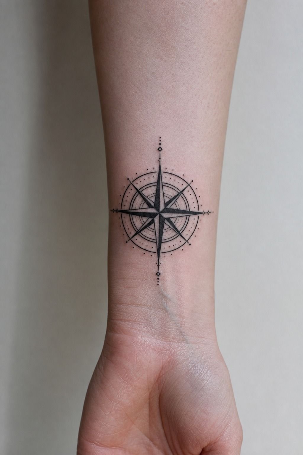
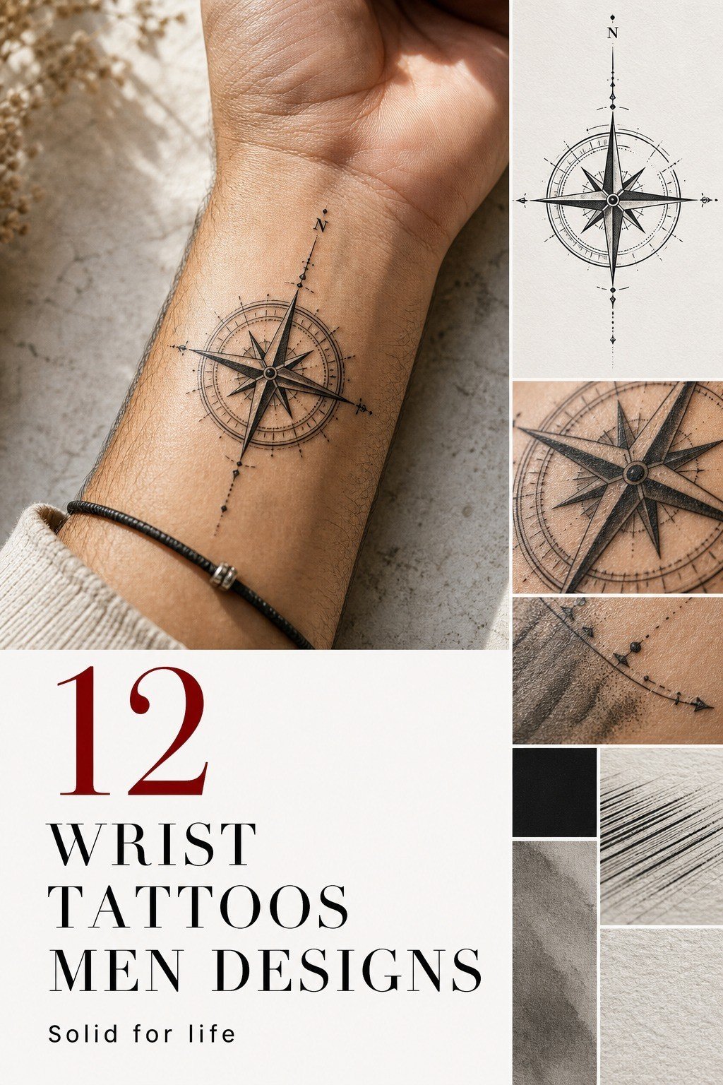
I chose a blackwork compass because it had a clear silhouette from arm’s length, not because compasses are automatically deep. Mine had four bold points, open negative space, and a small center circle. Blackwork ink gave it enough contrast to stay readable against fair, cool-pink skin.
You’ll want the outer points at least around 1.5 inches across if you expect the design to age cute on you. Smaller than that, all those directional marks can close up and turn to soup.
I’d skip micro-realism here. A wrist isn’t the place for fifty tiny shadows.
The finished piece sits just above the wrist crease, where it doesn’t get chewed up every time I bend my hand. If you’re choosing between a symbol and lettering, look at wrist tattoo ideas before you commit. Your eye needs a design that reads fast.
2I Tested the Wrist Placement Before Booking
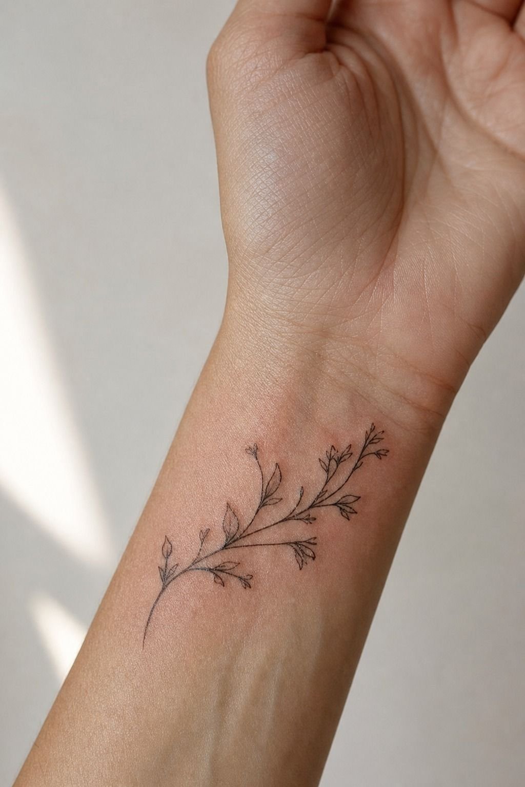
Before booking, I drew the outline on with a black eyeliner pencil and wore it for two days. I checked it while typing, washing my hands, driving, and pulling on a jacket. That test sounds basic, but it saved me from placing the design directly in the deepest crease.
You should test your tattoo facing you and facing out. Those are different tattoos in daily life. A design that looks balanced in a mirror can sit crooked when your arm rests at your side.
I marked the center line from my middle finger up my forearm, then used that as the compass axis.
But don’t test only while standing still. Your wrist folds, twists, and gets covered. For more placement comparisons, I’d use this wrist tattoo placement guide and take a few phone photos before you book.
3I Picked a Minimalist Roman Numeral Design
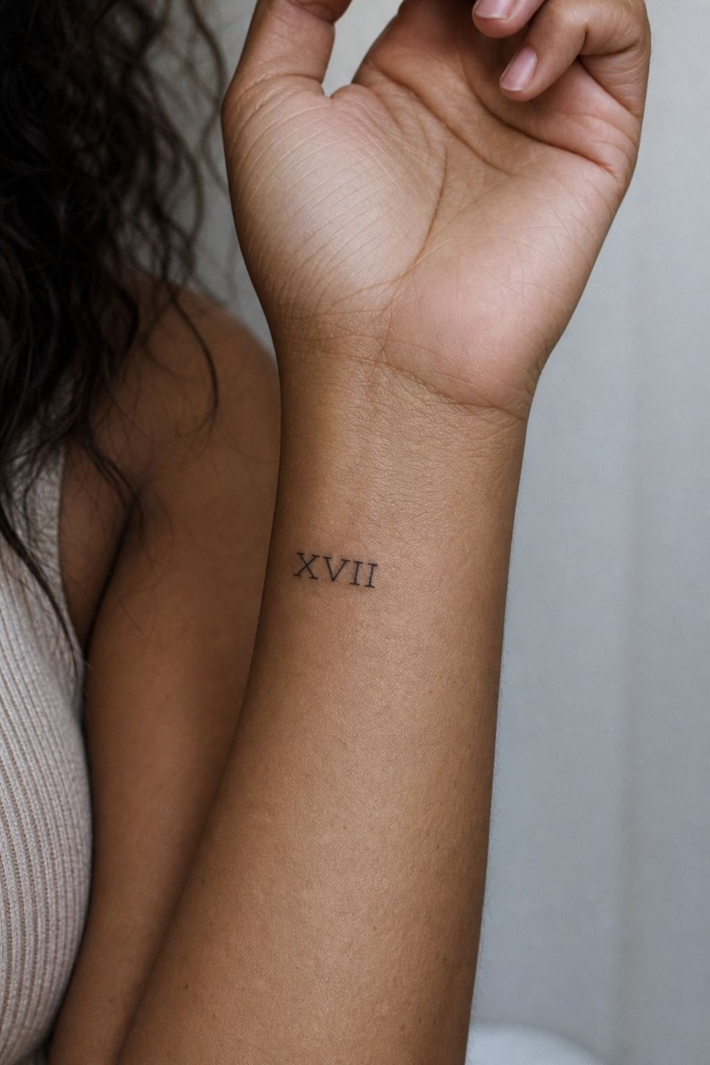
Roman numerals work when the date matters and the lettering has enough weight. I picked a stripped-back line of numerals for a client reference, no stars, no heartbeat line, no tiny quote underneath. Single-needle linework can look refined on medium olive skin, but it needs room between characters.
You shouldn’t cram eight skinny letters into one inch just because the date is long. I’d either shorten the format or move it up the inner forearm. That size on a wrist is gonna mush out, so bump it up where it breathes and ages nicer.
My preference is a clean serif or a simple engraved-style numeral, not a decorative script that loses its shape once healed. Carbon black ink is your best friend for longevity. Color is spice, but this kind of tattoo needs contrast first.
4I Checked How Sleeves Covered My Wrist Tattoo
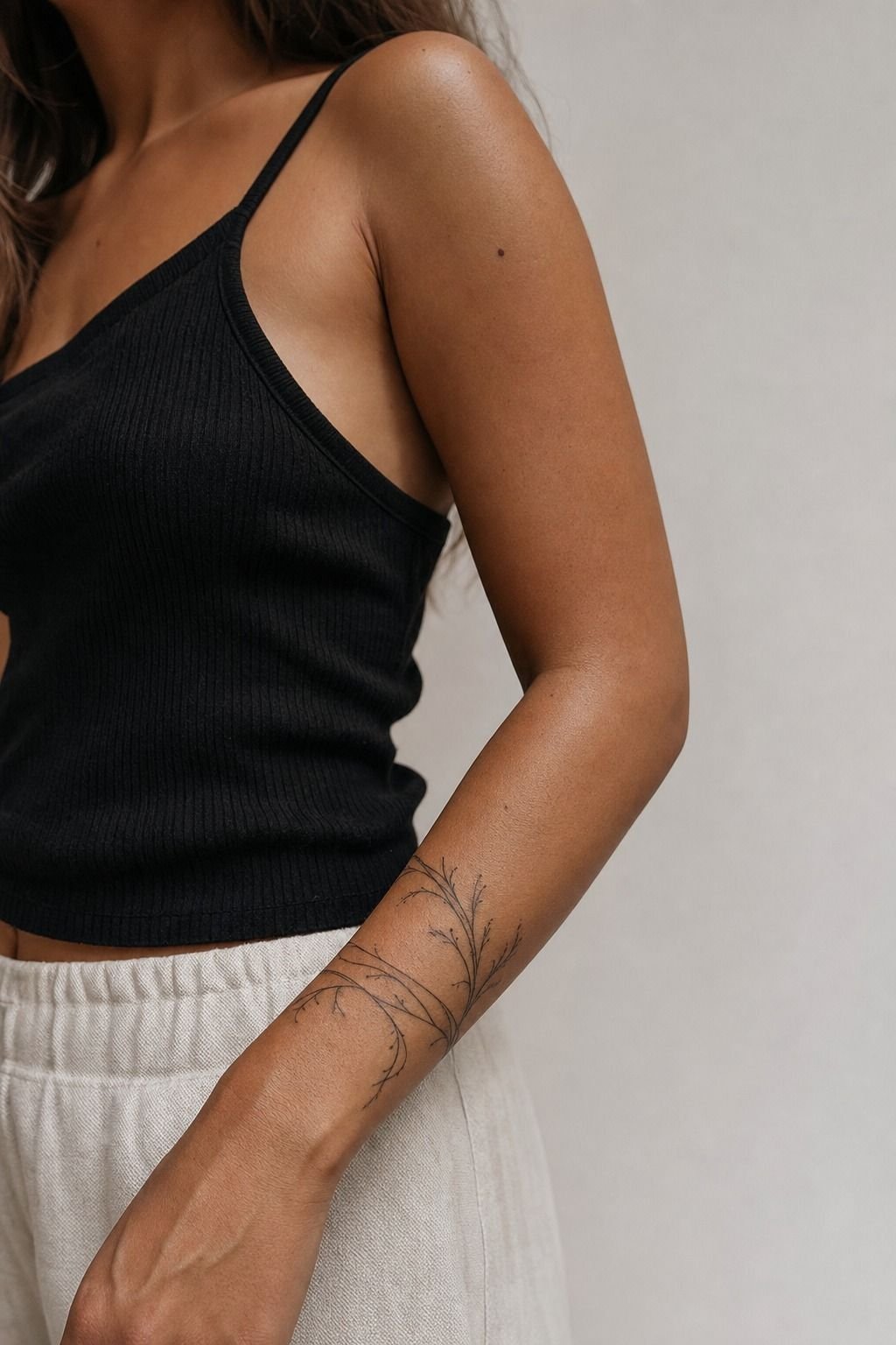
I checked my usual sleeves before I settled on the exact height.
5I Compared Inner Wrist and Outer Wrist Pain
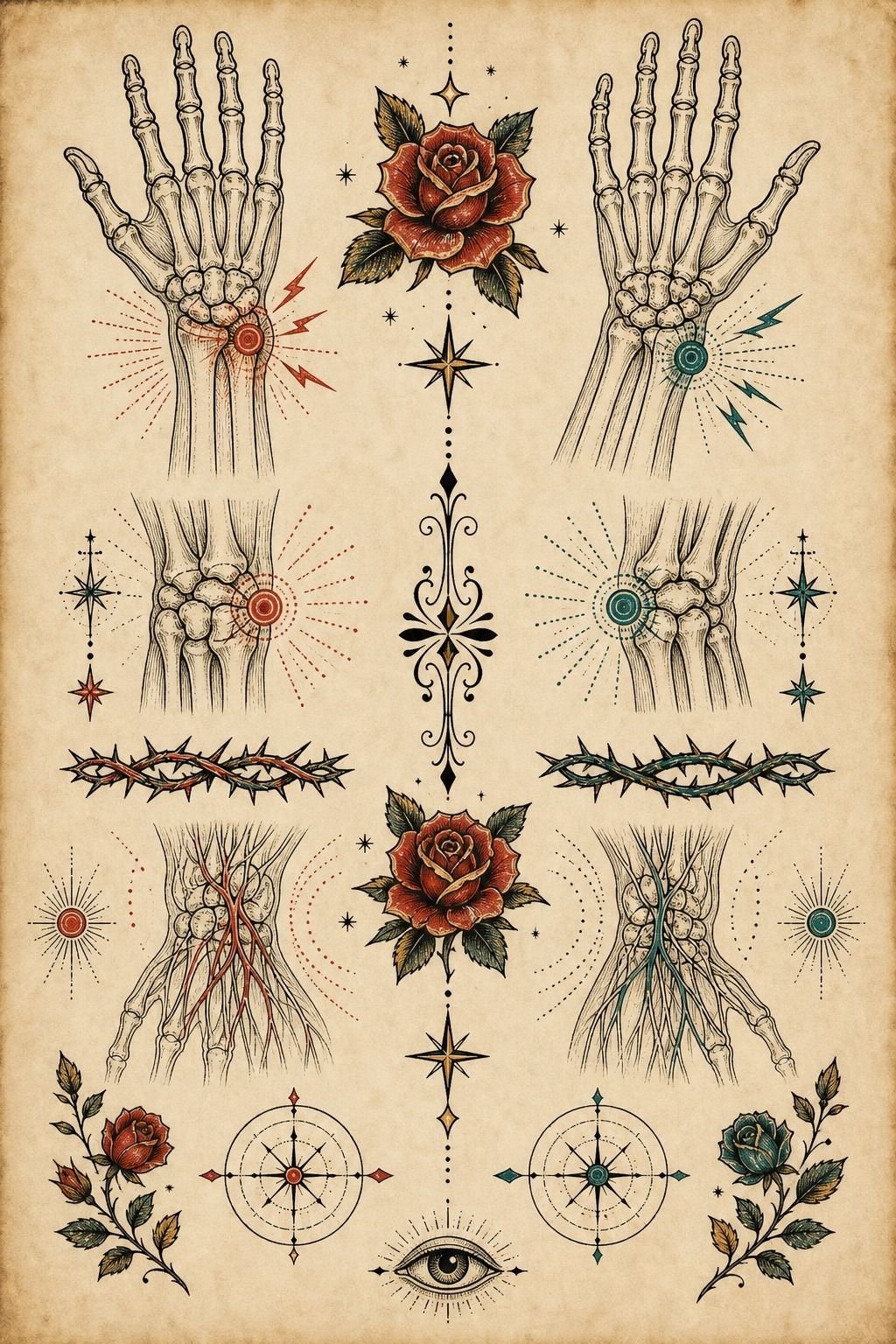
Inner wrist and outer wrist pain aren’t identical. The inner wrist feels sharper because the skin is thinner and the area is sensitive, while the outer wrist can feel more manageable until the needle gets close to bone. Lines feel sharper, shading is a dull burn, and color packing is the spiciest part.
You can handle a small tattoo there, but don’t show up dehydrated, hungover, or running on coffee. I’d rather you tap out for five than pass out on me. A clean flash sheet helps here because you can pick a design that fits the area instead of forcing a custom piece to shrink.
The pain isn’t the main issue. Placement is.
Hands, feet, ribs, sternum, and bony spots usually feel more intense than outer arm, thigh, or calf. If pain is your deciding factor, thigh tattoos for men are a much chillier first session.
6I Chose Meaningful Coordinates in Fine Line
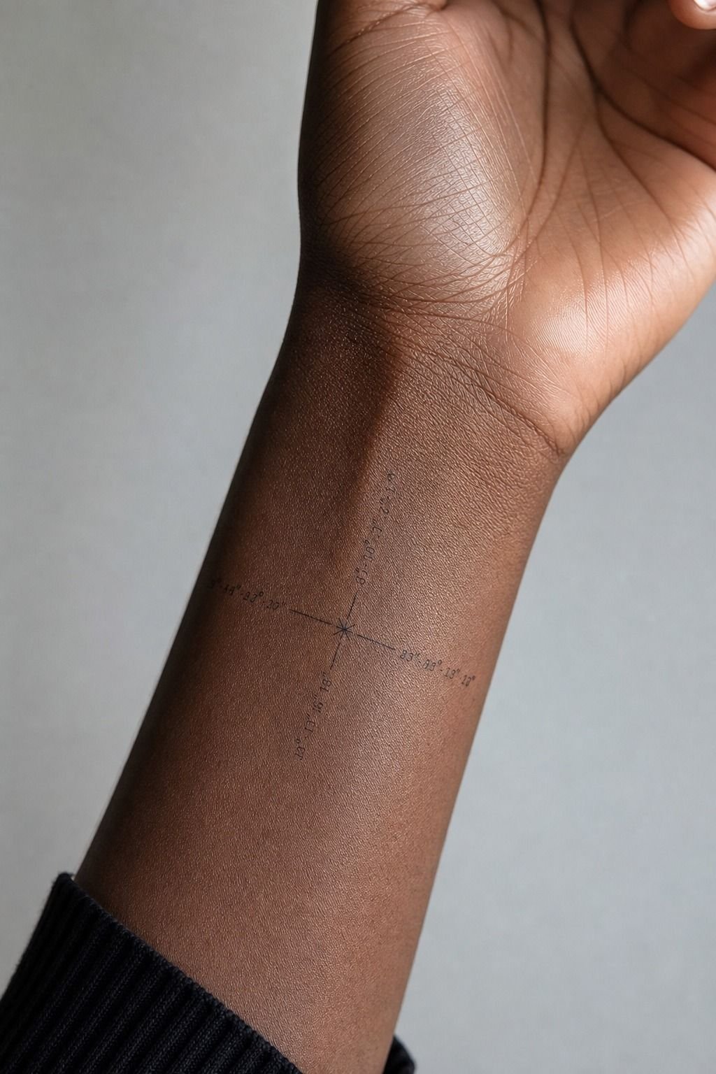
Coordinates can be meaningful without looking like a tourist souvenir. I chose a fine-line format with one clean latitude-and-longitude line, spaced evenly, no map pin dangling underneath. On deep ebony skin, high-contrast black ink matters more than making the letters ultra-thin.
You’ll need an artist who can pull crispy, confident lines in one clean pass, not ten fuzzy ones. Ask to see healed lettering on skin tones close to yours.
Fresh tattoos can look dark and flawless under studio lighting. Healed work is where you see whether the artist understands saturation and skin.
I’d skip coordinates if you can’t say the numbers out loud without needing to check your phone. That sounds blunt, but meaningful tattoos should still feel like yours after the moment has passed. A narrow line of fine-line numerals reads quiet, personal, and intentional.
7I Sized the Lettering for Daily Visibility
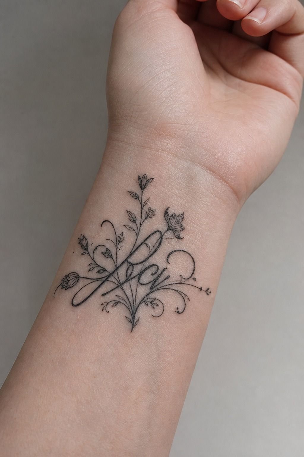
I sized the lettering for daily visibility, not for a close-up Pinterest crop. The first version looked elegant at half an inch tall. It also looked fragile.
I bumped the letter height up so each stroke could heal soft instead of getting swallowed by the skin.
For wrist lettering, you should ask your artist where the thinnest stroke can safely land. The answer depends on your skin, the font, and how much movement the placement gets. Custom stencil lettering is worth the extra time because it lets you see spacing before the needle touches skin.
But don’t chase a handwriting font just because it feels intimate. Most delicate cursive becomes harder to read once lines naturally spread. I’d choose block caps, a simple serif, or clean lowercase over fancy loops every time.
Bold will hold. That’s the whole rule.
8I Avoided Overcrowding My Small Wrist Tattoo
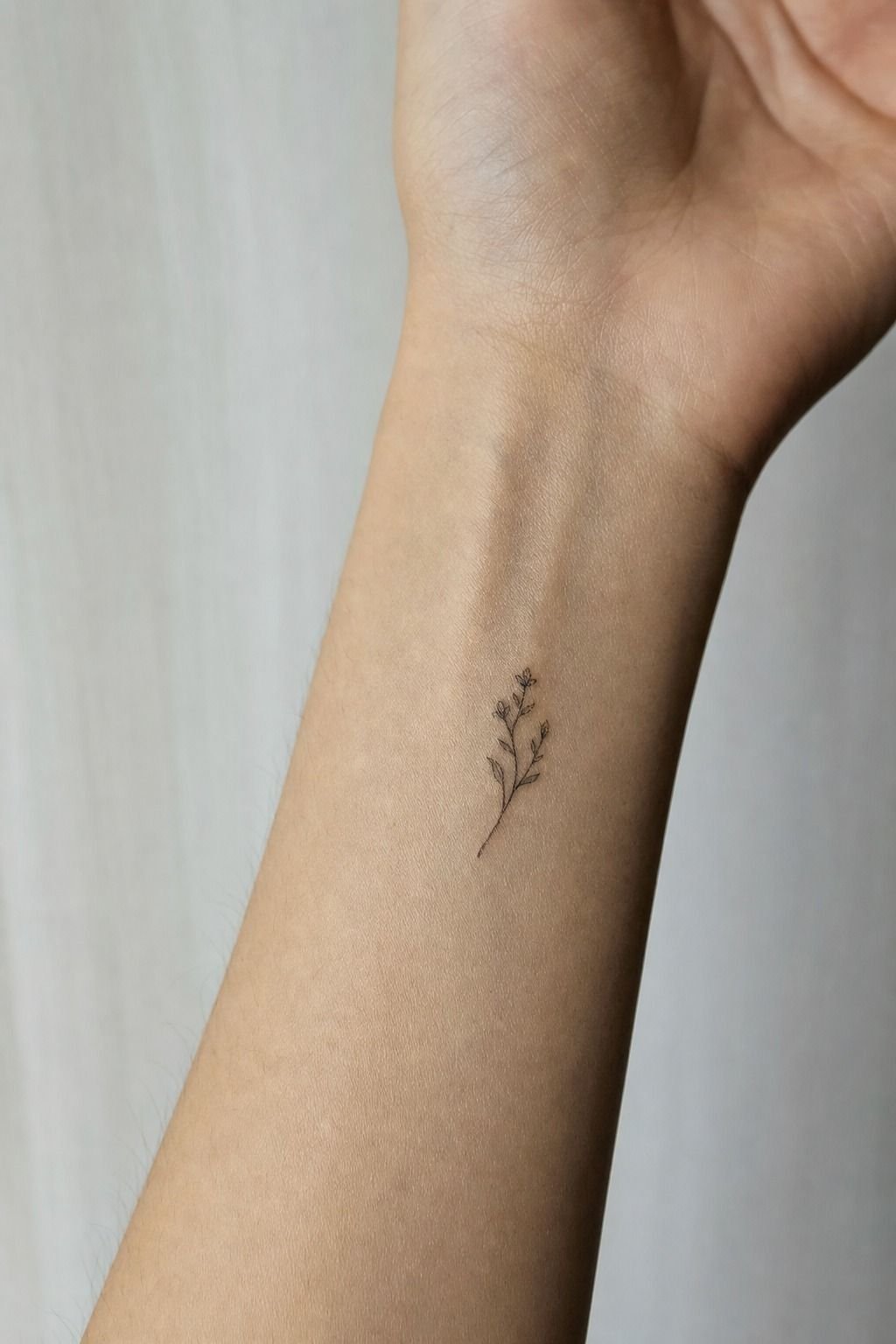
I avoided overcrowding by picking one visual idea and letting it sit alone. A small wrist tattoo doesn’t need dates, initials, a symbol, and decorative dots all stacked together. That’s how a clean design becomes a muddy little patch after a few years.
You can leave negative space. Really.
On medium warm ivory skin, a healed minimal line tattoo looks calmer when there’s skin around it, and that open skin makes the black read stronger. I’d skip the popular “add one more detail” request unless the artist tells you it can hold.
The Three-Breath Rule is simple: leave room above, below, and beside the main shape. If the design can’t breathe, enlarge it or remove something. Look through side wrist tattoos if you need more length without crowding the front of your wrist.
9I Matched the Ink to My Existing Hand Tattoo
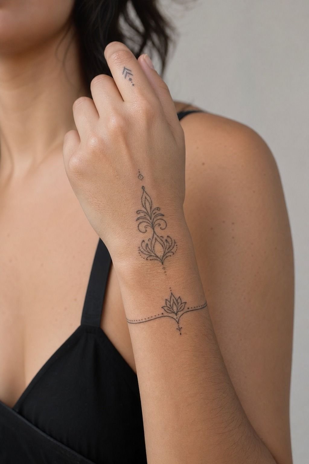
I matched my wrist ink to the nearby hand tattoo by checking line weight first. You don’t need every tattoo to look identical, but a wispy fine-line wrist piece beside a saturated hand tattoo can look accidental. Black and grey ink gives you flexibility, but the values still need to agree.
You should compare the darkest parts, the line thickness, and the amount of empty skin. My call was to keep the wrist piece lighter than the hand tattoo, then use one slightly heavier outline to connect the visual rhythm. Subtle, but it works.
And don’t put a fresh wrist tattoo right into a dense hand composition unless you’re ready for maintenance. Hands are high-wear zones.
Sun, washing, friction, and daily movement can fade them fast. See how styles connect in hand tattoos for men before treating your wrist like an afterthought.
10I Asked for Healing Photos Before Choosing
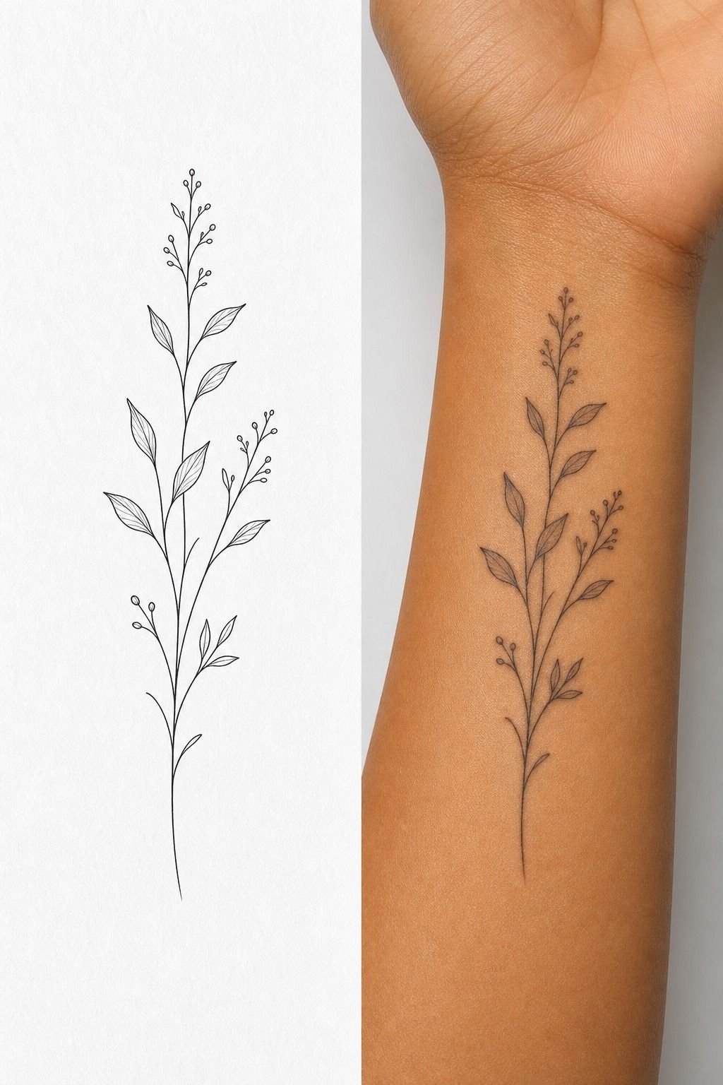
I asked for healed photos before choosing an artist, every time.
11I Budgeted for a Professional Wrist Tattoo
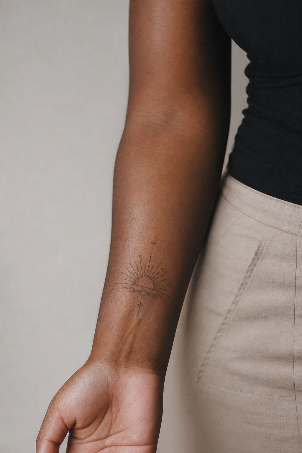
I budgeted for a professional wrist tattoo instead of shopping for the lowest quote. Small doesn’t always mean cheap. Shops often have a typical US minimum around $50 to $100, while experienced artists commonly charge about $100 to $250 per hour depending on region and demand.
You should ask what the quote includes: consultation, stencil changes, placement time, the tattoo itself, and aftercare. A simple wrist tattoo may take under an hour, but custom lettering and multiple placement adjustments can take longer. Professional studio hygiene is part of the cost, not an optional upgrade.
I’d skip anyone who pressures you to decide from a blurry message thread. If a name tattoo is involved, pause and read about girlfriend name tattoos for men first. Some choices deserve a longer beat.
12I Followed Aftercare Through Every Healing Stage
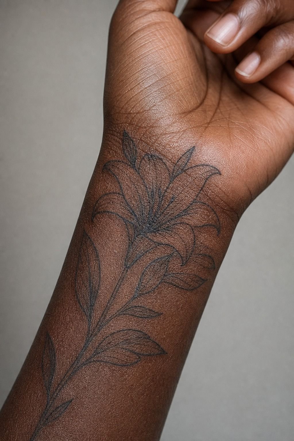
I followed aftercare like the tattoo was an open wound, because for the first few days it is. I washed it with gentle unscented soap, patted it dry with a clean paper towel, then used a thin layer of fragrance-free ointment. Thin means thin.
Don’t suffocate it.
You’ll see peeling around the first couple weeks, like a sunburn. Don’t pick the flakes or you can pull color out and leave patchy spots.
I kept it away from pools, long soaks, direct sun, and gym friction while it healed. The skin wants calm, not a full schedule.
But once it looks healed, sunscreen still matters. UV is brutal on small black details. Broad-spectrum SPF helps keep the tattoo from fading faster, especially if your wrist is exposed most days.
The piece stayed crisp because the design was simple, the placement was smart, and I didn’t treat healing like an inconvenience.
Why I’d Choose Clean Wrist Ink Again
I’ve watched people make wrist tattoos harder than they need to be. They arrive with a phone full of references, each one cropped tight enough that you can’t tell whether the tattoo is fresh, filtered, or even real.
They want a compass, coordinates, a name, a tiny portrait, and three ornamental stars in one tiny patch of moving skin. Then they’re surprised when I tell them the design needs editing.
Here’s my honest rule: your wrist tattoo should look good from across the room before it looks clever from two inches away. That doesn’t mean every tattoo needs to be huge or loud. It means the silhouette needs a job.
A compass needs points you can recognize. Roman numerals need gaps between characters.
A name needs letters that won’t weld together later.
I went back and forth on my own placement because I wanted it visible, but not trapped in the crease. That little compromise matters.
A tattoo that lands just above the crease gets less abuse, reads more calmly beside a watch, and gives your artist better skin to work with. It’s not glamorous.
It’s practical.
And practical is what makes a tattoo feel timeless. Black is your best friend for longevity.
Fine line can heal soft and refined, but only if the artist doesn’t overwork the skin and only if the design isn’t trying to do too much. The glossy fresh photo is fun. The healed photo is the one that counts.
A Few Things Worth Answering
How much does a Wrist Tattoos Men usually cost?
A Wrist Tattoos Men tattoo usually costs about $100 to $300, depending on size, artist, and region. Professional application matters more than saving fifty bucks.
– Typical shop minimum, $50 to $100 – Common hourly range, $100 to $250 – Custom lettering, added stencil time
Are Wrist Tattoos Men a good idea for a first tattoo?
Yes, wrist tattoos can be a good first tattoo if you choose a simple design and accept that the area is visible. Clean linework gives you a readable result without a long session.
– Small blackwork symbols – Roman numerals with spacing – Outer wrist placement
How do I choose a tattoo artist for Wrist Tattoos Men?
Choose an artist whose healed portfolio matches your idea, especially for fine line or lettering. Healed photos tell you more than fresh studio shots.
– Crispy healed lines – Clean, single-use setup – Style-specific portfolio – Wrist tattoo placement references
How much do Wrist Tattoos Men hurt?
Wrist tattoos can feel spicy near bone and on the inner wrist, but most small pieces are manageable. Short sessions help you stay comfortable.
– Inner wrist, sharper sensation – Outer wrist, usually more tolerable – Ribs, feet, hands, sternum, higher pain zones
How long does a Wrist Tattoos Men take to heal?
The surface usually heals in about 2 to 3 weeks, while full settling can take 2 to 3 months. Gentle aftercare protects the lines while your skin repairs.
– Unscented soap – Thin ointment layer – No pools or direct sun – No picking
What’s the best placement for Wrist Tattoos Men?
The best placement is usually just above the wrist crease or along the side wrist, where you get visibility without constant folding. Low-friction placement helps small designs age better.
– Outer wrist, easy daily viewing – Side wrist, more vertical room – Hand tattoo style comparisons
Where I’d Start First
If I had to pick one, I’d start with a blackwork compass above the wrist crease. It keeps a bold silhouette without getting crushed by movement. Pin that placement for later, then bring your artist references for vibe, not a Pinterest-exact copy.