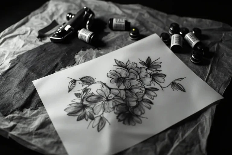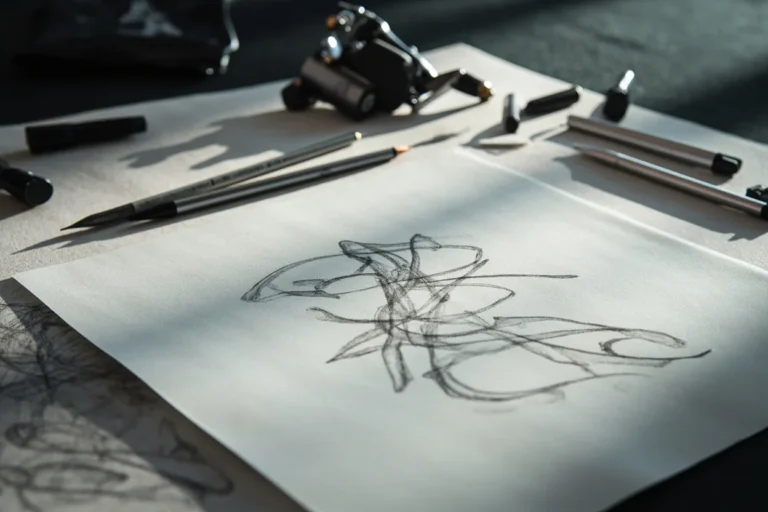
Wrist tattoo ideas sit in a strange middle ground: easy to show, easy to hide with a sleeve, and easy to underestimate. The placement is small, visible, and constantly moving.
Quick answer: Good wrist tattoo ideas include short words, initials, dates, tiny flowers, moons, stars, bracelets, small animals, and symbols placed with enough spacing to handle movement and sun exposure.
Best wrist tattoo directions
Start by deciding how public the tattoo should feel.
| Idea | Best use | Watch-out |
|---|---|---|
| Inner wrist script | Visible personal reminder | Can feel exposed |
| Outer wrist symbol | Cleaner daily wear | Sun exposure |
| Wrist flower | Soft vertical design | Petals need room |
| Tiny animal | Personal symbol | Use silhouette |
| Bracelet style | Decorative wrap | Can distort around wrist |
Horizontal text and bands wrap naturally with the wrist’s curve, so they read clean whether your arm is at your side or extended. Vertical script runs along the inner forearm side, toward the pinky, and stays legible because that skin stretches less than the inner wrist crease. Designs meant to face outward, toward a viewer, belong on the outer wrist just below the ulna bump. That placement gets less daily crumple and holds lines sharper over time.
Circular designs work best centered on the wrist cap, right over the radius. Avoid placing the focal point directly on the wrist crease, that fold kills fine detail fast. Small botanical or geometric pieces read strongest when oriented so the base sits toward the hand and the top points up the arm. That direction fights the natural taper of the wrist and makes the piece look intentional, not randomly dropped.
Pain and fading notes
The wrist is always on display, so make sure the design can hold up to that audience.
Wrist pain is usually manageable, but the inner wrist can feel sharper because the skin is thinner and the area is sensitive.
Fading risk depends on exact placement. Designs closer to the hand and high-rub zones usually need more caution than designs slightly up the forearm.
The inner wrist is spicy, no question. The skin is thin, the tendons are right there, and some clients feel a vibration that radiates into the fingers. Outer wrist over the bone is a bit more tolerable for most people. Expect a solid 3 to 4 out of 10 on a normal pain scale for the outer side, and a 5 to 6 for the inner crease. Sessions here are short though, rarely over 90 minutes for a wrist piece, so most people push through fine.
Fading is the real conversation to have before you book. The inner wrist is a high-wear zone, constant sun, friction from sleeves, and daily flexing all break down ink faster than almost anywhere else. Fine line black and grey can ghost out noticeably within 3 to 5 years without a touch-up. Bold black with solid fill holds significantly longer. Saturated color fades faster than black on this spot. Sunscreen every day after it heals is non-negotiable if you want it to stay crispy.
Artist questions
The right wrist tattoo should be tested with movement.
- Ask whether the design should move away from the crease.
- Ask how small the lettering can be.
- Ask if a watch or bracelet will rub it.
- Ask for healed wrist examples.
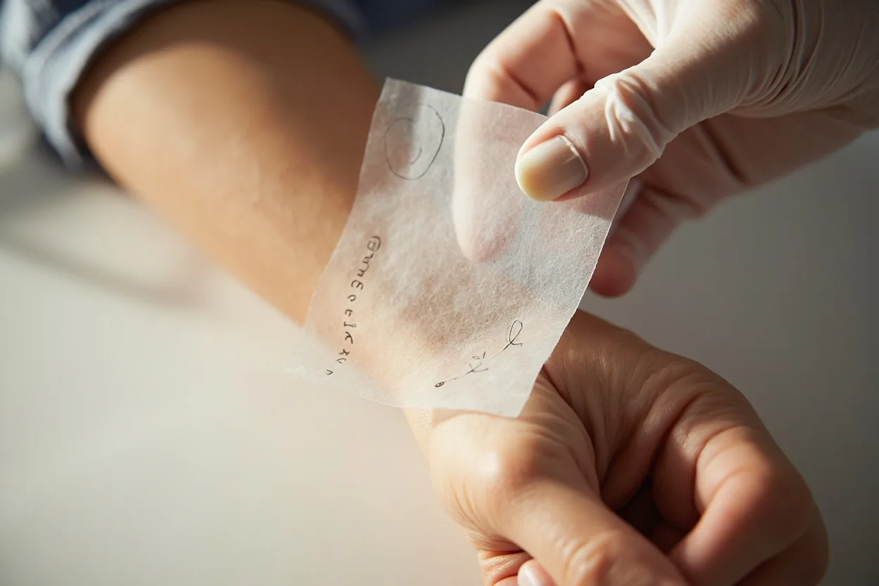
Ask your artist flat out how many wrist tattoos they’ve done and pull up the healed photos specifically. Fresh tattoo photos on the wrist look great on everyone. Healed photos tell you if their fine lines hold or blow out, and whether their shading stays smooth or goes patchy. A good wrist artist knows how to pack black and grey light enough that it doesn’t turn into a grey blob when healed, but solid enough that it doesn’t disappear.
Ask what needle configuration they plan to use for your design. Fine line work on the wrist typically calls for a single needle or a 3RL. Whip shading and soft fill in black and grey usually need a 7 or 9 mag. If they can’t answer that clearly, they’re not the right fit for a wrist piece. Also ask about their preferred skin depth on this spot. The wrist skin is forgiving of neither too shallow nor too deep. Both cause blowout or patchiness.
Wrist placement mistakes
Avoid putting fragile detail directly across a hard crease. The tattoo may still heal, but the placement makes the artist work against the body.
If you are worried about workplace visibility, test the spot with the clothes and jewelry you actually wear.
The biggest mistake is going too small with too much detail. A design that looks intricate and impressive at quarter-sized on screen turns into an unreadable blob on the wrist within two years. Fine line florals with thin petals packed close together are the number one candidate for this failure. Your artist should be pushing back if the design has more than can fit cleanly. Anything that doesn’t read from three feet away isn’t going to age well on a wrist.
Placement creeping onto the wrist crease is the second most common error. That fold moves hundreds of times a day and the ink never fully settles. Tattoos placed directly on skin that constantly folds tend to spread, fade unevenly, or develop a fuzzy edge that no amount of touch-ups fully corrects. Keep the design at least a half inch above or below the main crease. Also don’t wrap a design all the way around unless you’ve budgeted for the inner wrist session separately. The outer and inner halves heal at completely different rates.