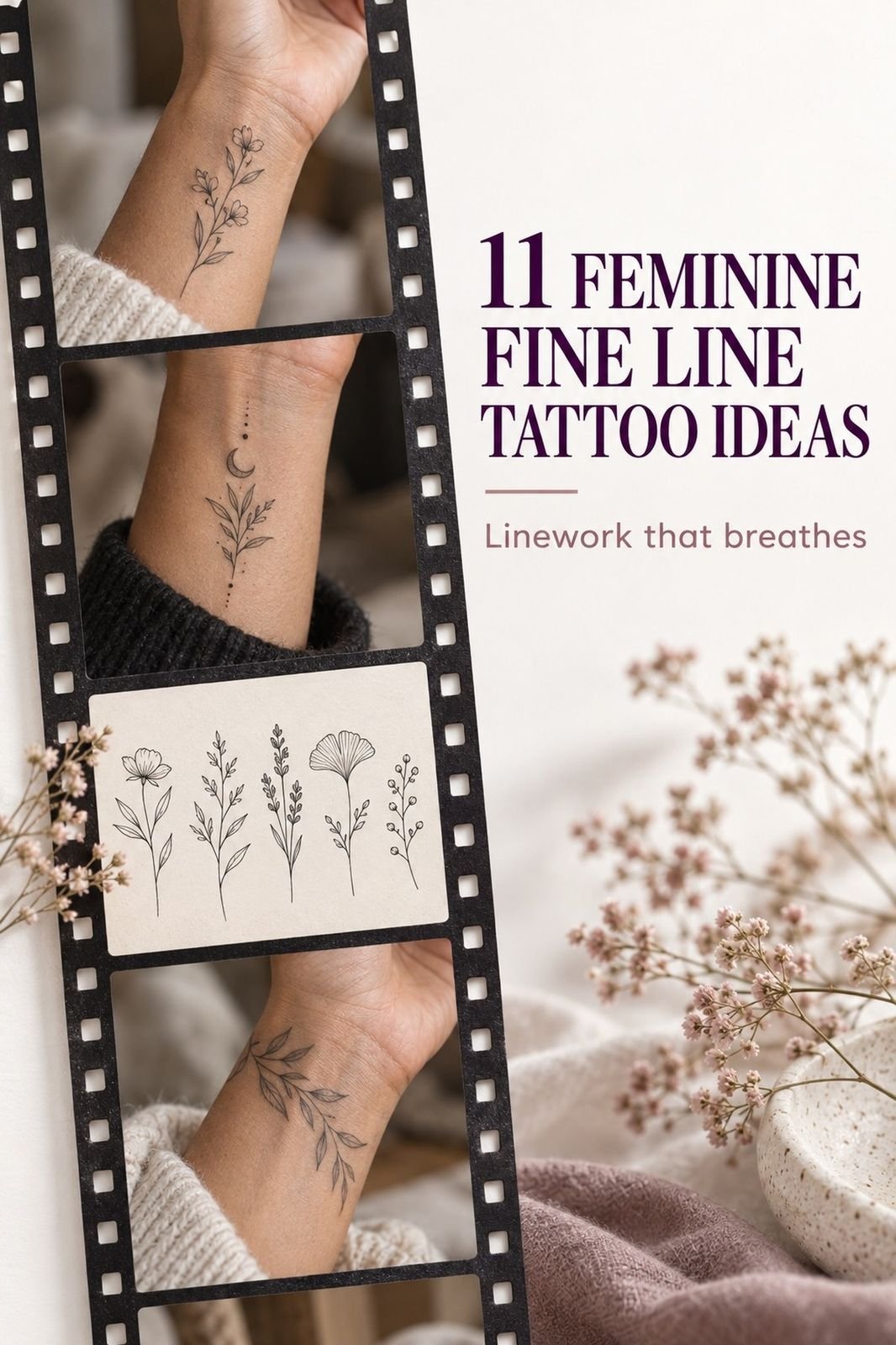
A feminine fine line tattoo can heal crisp when the artist matches the design to your skin, placement, and aftercare habits. I learned that during the week I turned 30, when my meaningful idea looked almost too delicate on paper. Then the lines settled. The result felt personal, sharp, and quietly powerful.
I didn’t choose the most intricate reference in my folder. I chose the one that still felt right after the novelty wore off. That distinction shaped every decision that followed!
Before I Booked the Appointment
Before booking, I had a clear patch of skin and too many saved references. My wrist looked ordinary beside the bracelets I wore every day. I wanted personal symbolism, but I didn’t want a loud mark that would swallow the shape of my arm.
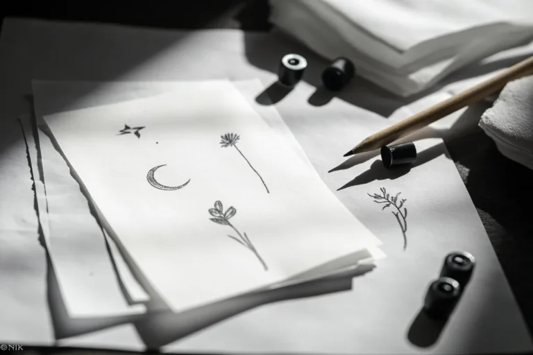
The blank area made each decision feel larger. I kept tracing a crescent, a stem, and a tiny star on paper, then changing my mind by bedtime.
My artist asked what I wanted to remember, not which picture I wanted to copy. That question narrowed everything down.
- I Chose a Dainty Botanical Wrist Design
- How I Matched the Linework to My Anatomy
- The Crescent Behind My Ear
- Temporary Fine Line Designs Tested My Choices
- Florals or Fierce Symbols?
- I Reserved Negative Space Around the Ink
- A Sharp, Brief Sting
- What I Did During Healing
- The Feminine Linework Settled Beautifully
- Why the Hidden Star Stayed
- Natural Light Showed the Finished Tattoo
1I Chose a Dainty Botanical Wrist Design
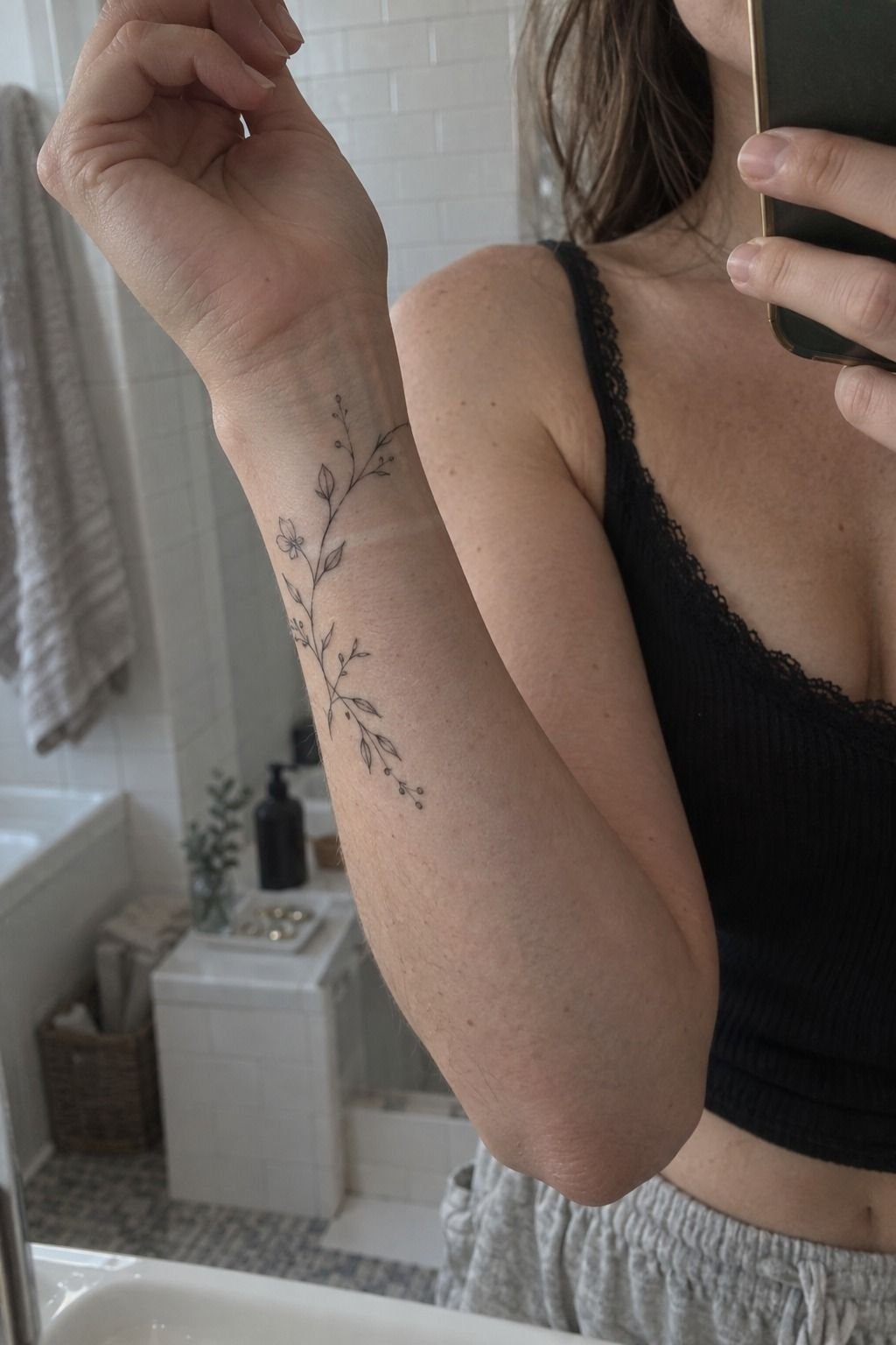
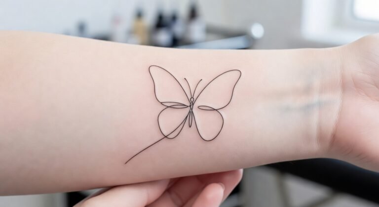
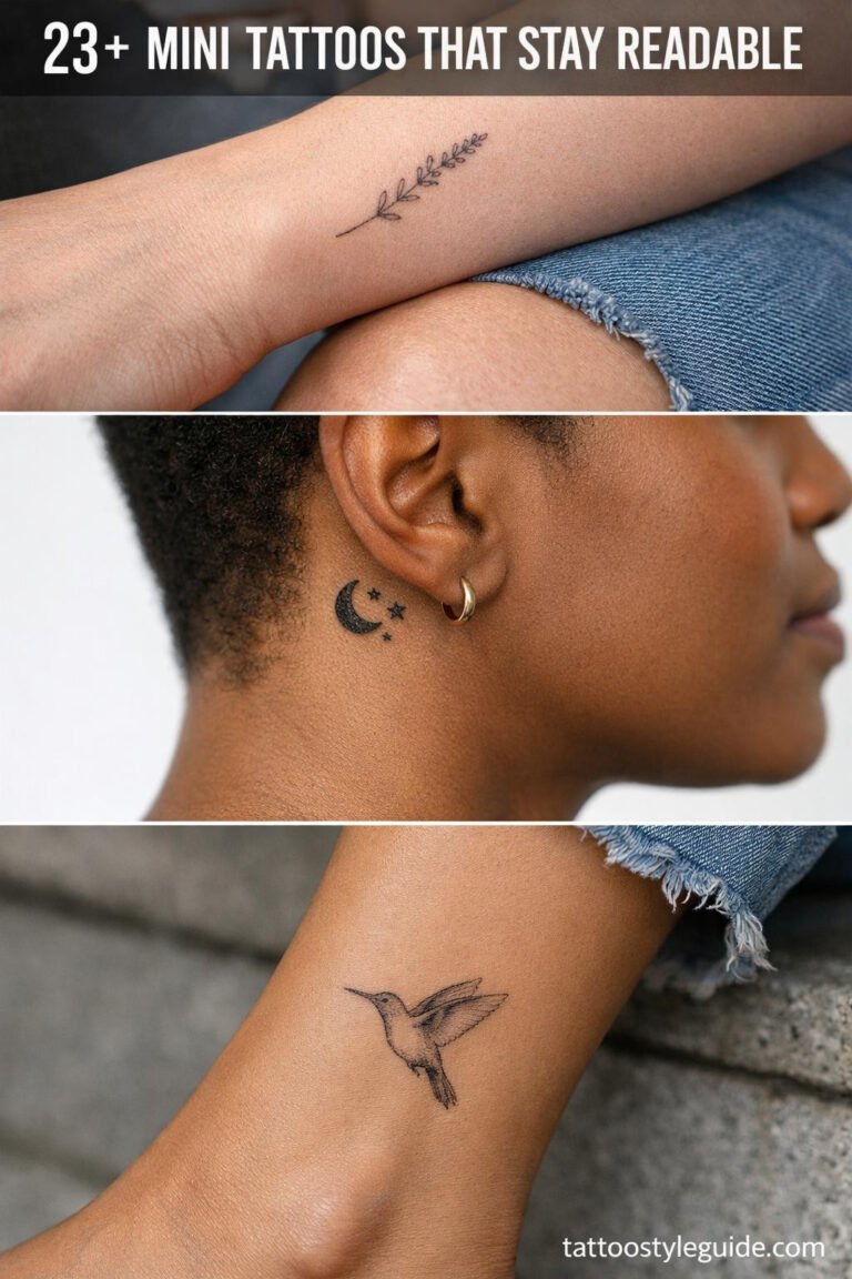
I started with a dainty botanical design because it could look delicate without becoming vague. The reference had one curved branch, three narrow leaves, and a tiny bloom near the wrist bone.
I wanted flowing movement, but I didn’t want every leaf outlined heavily. My artist reduced the sketch until the design could breathe.
You can see why this wrist placement works when you study the arm from the side. The curve follows natural movement instead of sitting like a sticker on the skin. I chose single-needle linework with black ink because the narrow marks felt crisp against my cool-pink skin.
My artist also showed me healed portfolio examples, which mattered more than fresh studio shots. I read about fine line tattoo words before booking, then decided to keep the wrist piece visual rather than adding a quote.
The emotional shift happened when I saw the stencil at full size. It looked romantic, but not childish; symbolic, but not obvious.
If you’re choosing a readable silhouette, ask whether it still reads when you step back. Mine did, and that was the first moment I stopped second-guessing it.
The First Decision Was Scale
I tested the design at three sizes before choosing the smallest version that preserved its shape. The tiniest stencil looked stylish from close up, but the leaves blurred together when I held my arm naturally. The middle size kept the readable scale intact.
Scale affects more than visibility. It changes the emotional temperature of a tattoo. A larger design can feel bold, while a restrained one may feel understated and intimate.
Neither is automatically better. The right size is the one that protects the idea.
I also asked whether the tattoo would still look elegant if one line softened over time. That question led me toward fewer leaves and a clearer curve.
Worth it! The design became simpler, but it gained more presence and a more timeless outline.
2How I Matched the Linework to My Anatomy
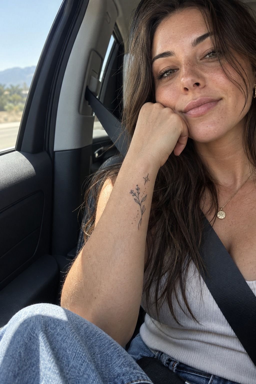
My wrist isn’t flat, so a design that looked graceful on paper could buckle across the tendons. I asked my artist to angle the stem with the movement of my hand. That small adjustment made the tattoo feel sleek and intentional instead of stamped in one direction.
You should watch your hand move before approving anatomical placement. Rotate your wrist, bend your fingers, and notice where the skin folds.
I did this three times, and my artist marked the stencil again each time. We avoided the deepest crease because repeated movement can make fine lines look less crisp.
I brought reference photos showing skin in natural light, not filtered studio lighting. The medium warm-ivory examples in my artist’s portfolio helped me understand how contrast changes across undertones. I also read this fine line tattoo needles, longevity, and placement guide before booking.
The design became more graceful once it followed my anatomy. Would I have chosen the same angle on someone else’s wrist?
Probably not. That’s the point.
Your best unique fine line tattoo should respond to your body, not force your body to imitate a saved image.
What I Asked Before the Stencil
I asked how the artist’s linework looked after six months, not only on appointment day. Fresh ink can appear striking because the edges are new and the surrounding skin is irritated. Healed work reveals whether the artist understands spacing, depth, and restraint.
I also asked about needle selection, expected fading, touch-ups, and sun exposure. The answers were practical rather than dramatic.
I saved the studio’s recommendations and returned to the placement guide when I felt tempted to add more detail. A good consultation should leave you informed, not pressured.
I checked the artist’s hygiene process, stencil revision policy, and approach to sensitive skin. Those details felt less exciting than choosing a symbol, but they gave me confidence. I also compared the artist’s healed examples with this fine line tattoo placement guide.
3The Crescent Behind My Ear
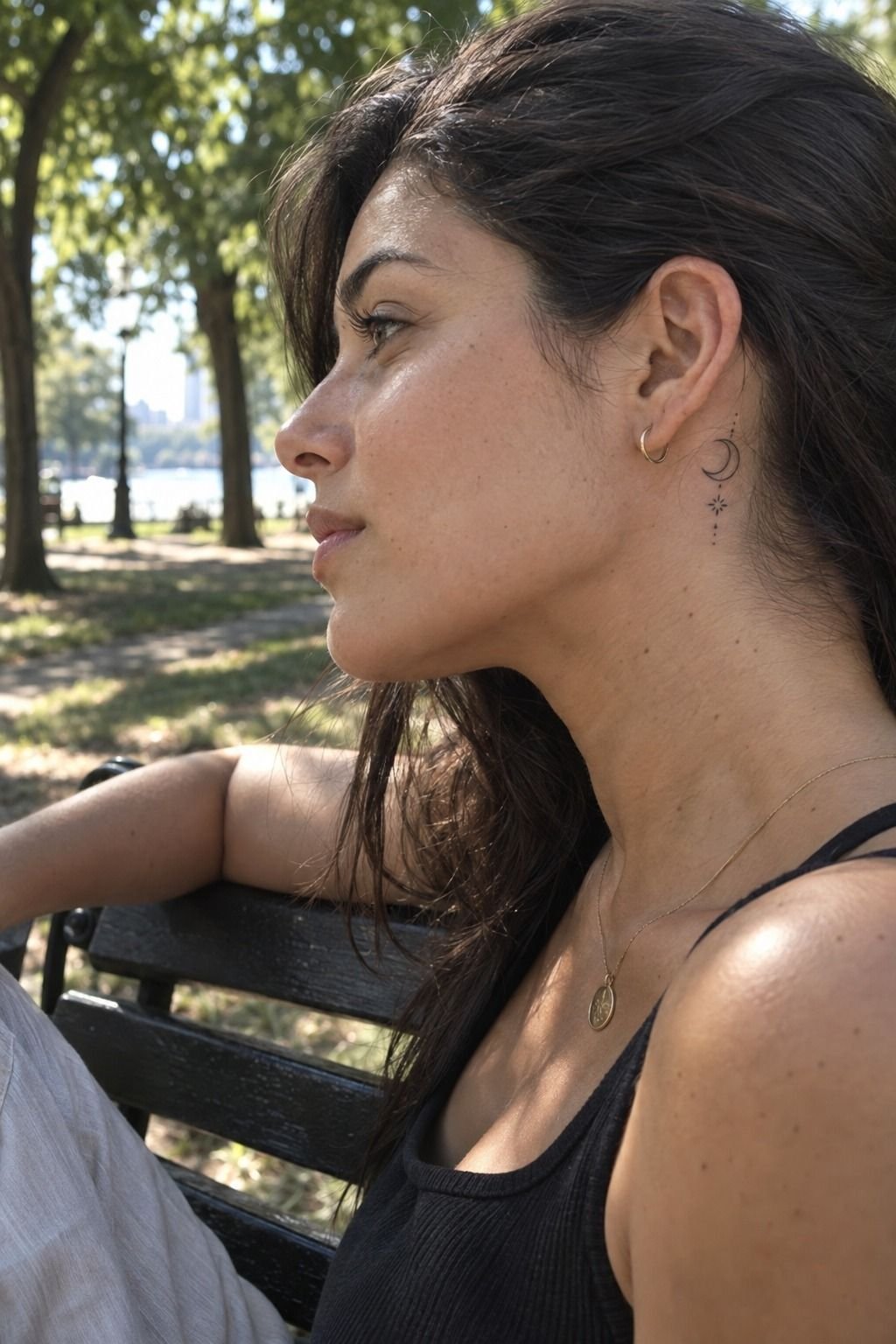
The crescent behind my ear began as a second idea, but it became the most meaningful symbol in my sketchbook.
4Temporary Fine Line Designs Tested My Choices
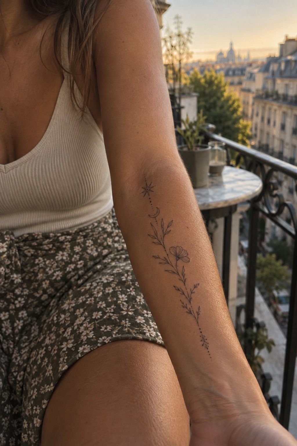
Before committing to the wrist, I tested several temporary paper transfers on my forearm. I used different sizes, including a botanical mark, a thin geometric arc, and a tiny word. The forearm gave each one more visual space, so I could compare how much detail I truly needed.
You can learn a lot from wearing a temporary design for a day. I noticed the word looked too literal, while the arc disappeared beneath my sleeve. The botanical sketch stayed readable from several angles and still looked polished after rubbing against fabric.
I skipped the oversized version. A large piece can be bold, but scale alone doesn’t make fine line work more powerful. I wanted a design that could remain visible without demanding attention in every conversation.
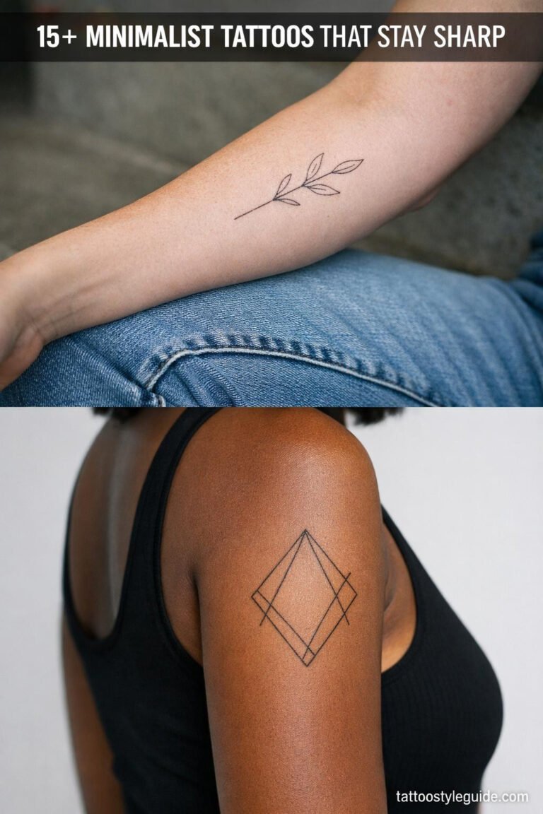
My artist explained that very fine lines can spread over time, particularly with sun exposure and poor placement. I saved the geometry reference for later and read about geometric line tattoo structure instead.
If you’re comparing cool fine line tattoos, photograph your temporary options in daylight, under sleeves, and from arm’s length. The best choice usually survives all three views. No panic!
Temporary Ink Gave Me Distance
The temporary transfers also exposed which ideas were borrowed from other people. Some looked beautiful in a saved post but felt disconnected from my own style. That was a valuable distinction.
I kept asking whether I liked the tattoo itself or only the mood surrounding it. The temporary transfer test separated those feelings.
After a day, the botanical mark still felt like mine. The tiny quote didn’t.
I also compared my choices with these fine line tattoo ideas to see whether I was responding to a lasting symbol or a passing trend. That check helped me keep the concept expressive without making it complicated.
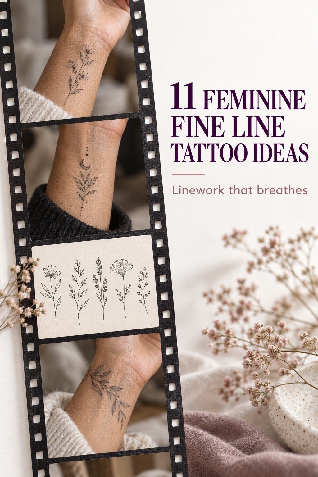
5Florals or Fierce Symbols?
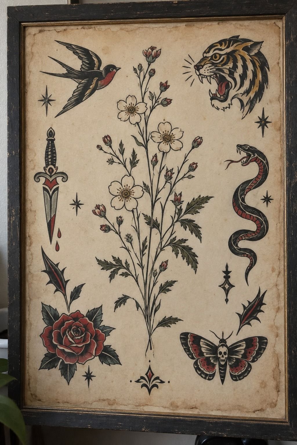
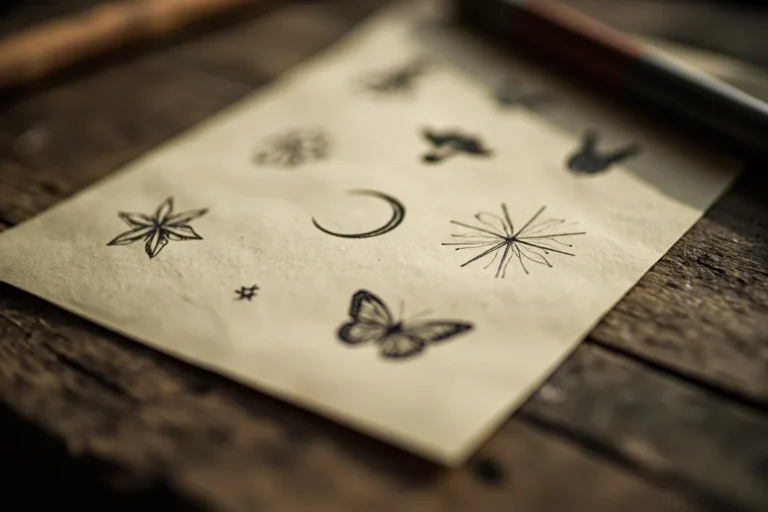
My flash sheet held two different moods. The florals were whimsical and quietly feminine; the symbols looked fierce, angular, and more confrontational. I liked both, which made the decision harder than choosing between two similar flowers.
You need to compare the emotional temperature of a design, not just its shape. I placed the floral next to a small arrow, a crescent, and a matchbook-style flame.
The floral felt like a memory I could carry anywhere. The flame felt more edgy, but I worried I’d grow tired of its sharpness.
I asked myself what the tattoo would mean on a difficult day, not only on appointment day. That changed my answer. The floral had an organic rhythm that gave me room to attach new memories.
My artist cleaned up the flower so the petals wouldn’t become a dark knot. The final drawing had intricate detail, but each line had a job.
If your reference looks impressive only when enlarged, simplify it before booking. I studied more variations in this collection of fine line tattoo designs.
6I Reserved Negative Space Around the Ink
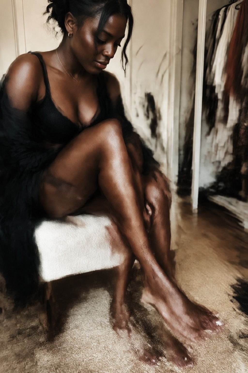
Negative space became my quietest design decision. I wanted the open skin margin around the branch to remain clear, with untouched skin separating each leaf from the next. Crowding every gap would have made the piece darker and harder to read.
Your artist should be able to explain where the skin remains visible and why. Mine left a clean margin around each leaf and separated the smallest marks from the main stem. That gave the design a vibrant silhouette without adding more ink.
Negative space isn’t empty by accident. It controls rhythm, especially when the design includes several tiny elements.
I learned this while comparing my stencil with a denser version. The crowded option looked ornate for about ten seconds, then became difficult to read.
I liked the restrained version immediately. It reminded me that a feminine tattoo doesn’t need to be fragile or overloaded with decoration. If you’re planning delicate feminine tattoos, ask your artist to show the stencil at its intended size and leave it there while you walk around.
Why Negative Space Matters Later
Open skin also gives aging lines somewhere to settle. As ink softens, tightly packed marks can merge visually. A clear margin helps each shape keep its identity.
This is especially useful for a small botanical tattoo. Leaves, dots, and petals need enough separation that they won’t become one dark patch.
The goal isn’t emptiness. It’s legibility.
I used the same principle when reviewing this fine line tattoo collection. The strongest examples weren’t always the most elaborate. They had clean spacing, a clear focal point, and enough restraint for the skin to remain part of the design.
7A Sharp, Brief Sting
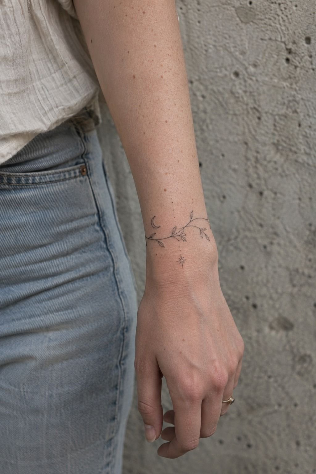
I expected pain, but I didn’t expect how brief the sharp wrist sting would be. The first pass felt raw, bright, and precise, like a hot pencil dragging across one small line. Then my body adjusted.
You should eat beforehand, drink water, and wear clothing that gives your artist easy access. I brought a sleeve that could roll above the elbow and kept my phone away once the stencil was approved. My artist worked in short passes, wiping the area gently between them.
The sound was more memorable than the discomfort. The machine buzzed, stopped, and started again while I watched the black line develop.
My skin grew pink around the stencil, but the ink itself stayed sharp. The sting was real, yet it wasn’t the part I feared.
Pain changes by placement. Ribs, feet, hands, and the sternum tend to feel more intense, while the forearm, thigh, and shoulder are often more tolerable. I read this overview of fine line spine tattoo placements before considering a future piece.
You don’t need to prove anything by choosing the hardest spot.
8What I Did During Healing
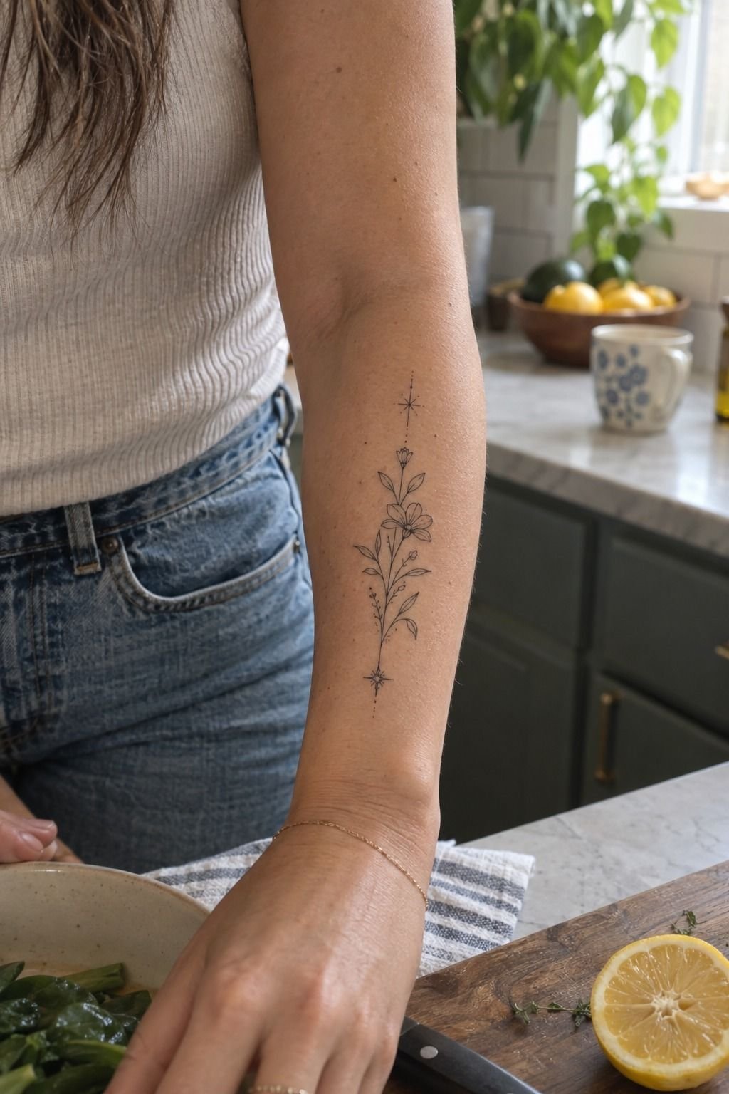
My first aftercare decision was simple: follow the artist’s instructions exactly. I washed the tattoo gently with a fragrance-free tattoo cleanser, patted it dry, and applied only the recommended amount of moisturizer. The skin felt tight for a few days, but I didn’t pick, scratch, or cover it with a random product.
You should expect the surface to heal in about two to three weeks, while complete healing can take roughly two to three months. Those timelines aren’t permission to rush back into sun exposure or swimming. I kept the area clean, avoided soaking it, and wore loose fabric when the skin felt tender.
I didn’t panic when the fresh ink looked darker than expected. The surface was irritated, and the lines softened as the skin settled. My artist warned me that fine line tattoos can appear uneven during healing, so I waited before judging the result.
I also treated sunlight as a long-term concern. UV can accelerate fading and make delicate marks look less timeless.
Once healed, I use broad-spectrum SPF 30 on exposed areas and cover the tattoo during long outdoor days. The basic routine isn’t glamorous, but it protects the linework I paid for.
For another perspective on placement and longevity, I returned to this fine line tattoo placement guide while planning future designs. The same advice kept coming up: protect the skin, respect healing, and don’t rush the result.
The Healing Timeline I Actually Followed
During the first few days, the skin looked pink and felt tight. I resisted checking it every hour because constant inspection made normal changes feel alarming. The surface healing stage required patience more than intervention.
During the second week, the tattoo looked softer and slightly duller. That wasn’t failure.
It was part of the skin settling over the ink. I kept following the same washing and moisturizing routine.
By the second month, the tattoo looked more integrated. The small star was still readable, the leaves had separation, and the curve followed my wrist naturally. That short pause mattered!
I photographed the healed lines under indirect daylight and compared them with the original stencil. The result looked crisp, but softer than the appointment-day version. That subtle shift made the tattoo feel more elegant and less raw.
9The Feminine Linework Settled Beautifully
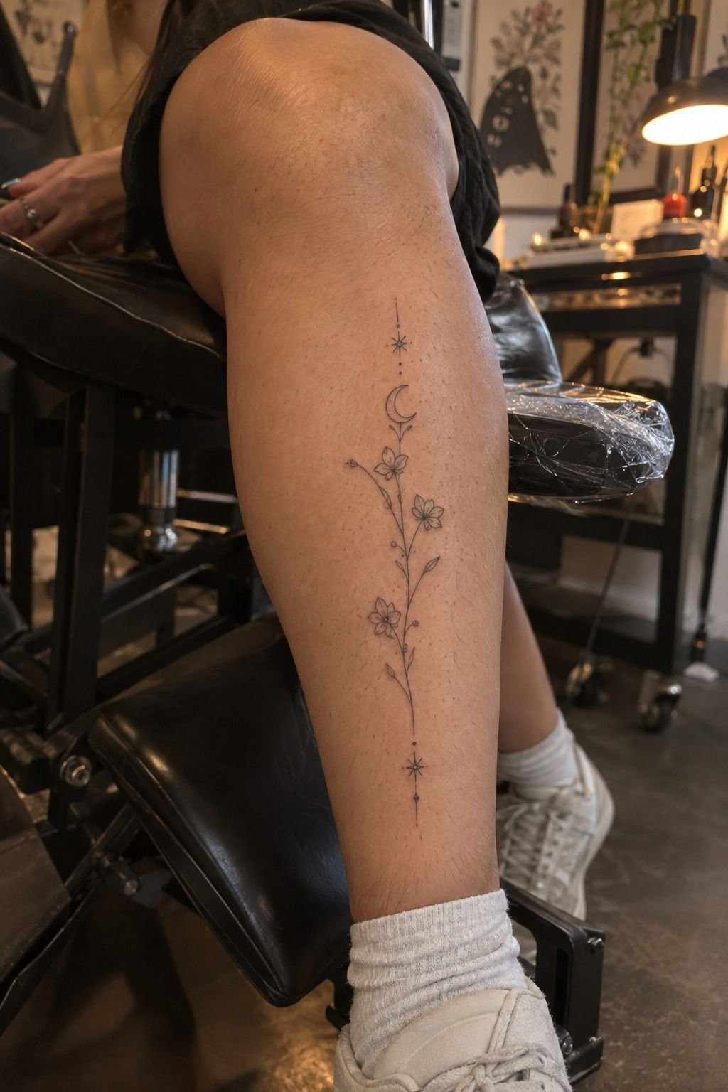
The calf reference I had saved showed how much a tattoo can change between fresh skin and healed skin.
10Why the Hidden Star Stayed
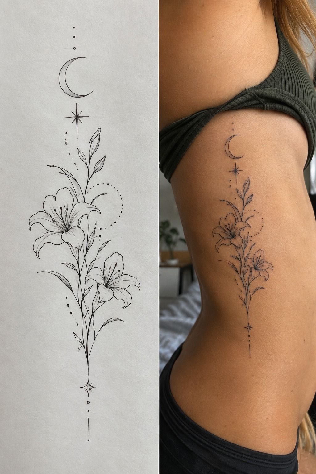
The personal detail was a tiny hidden star near the stem, based on a mark my grandmother drew beside her notes. It wasn’t obvious in the stencil, and that was intentional. I wanted an intimate reference that belonged to me before it belonged to anyone viewing the tattoo.
You can add meaning without adding clutter. My artist tested the star at two sizes and kept the smaller version because it balanced the flower. I chose black ink rather than a second color, so the complete design would remain cohesive in line weight.
The detail mattered emotionally. When I saw the healed tattoo beside the old note, the connection felt empowering rather than sentimental.
I hadn’t copied her handwriting or forced a date into the design. I carried the gesture forward in a way that still looked like my own tattoo.
The gap between concept and skin taught me to respect texture, movement, and healing. Your finished piece will be influenced by all three. For more symbolism, I checked this guide to straight line tattoo meaning before finalizing the hidden mark.
That small reference also made the tattoo feel more personal than an obvious initial would have. It was expressive enough for me, but understated enough to remain private. The symbol didn’t need to explain itself.
11Natural Light Showed the Finished Tattoo
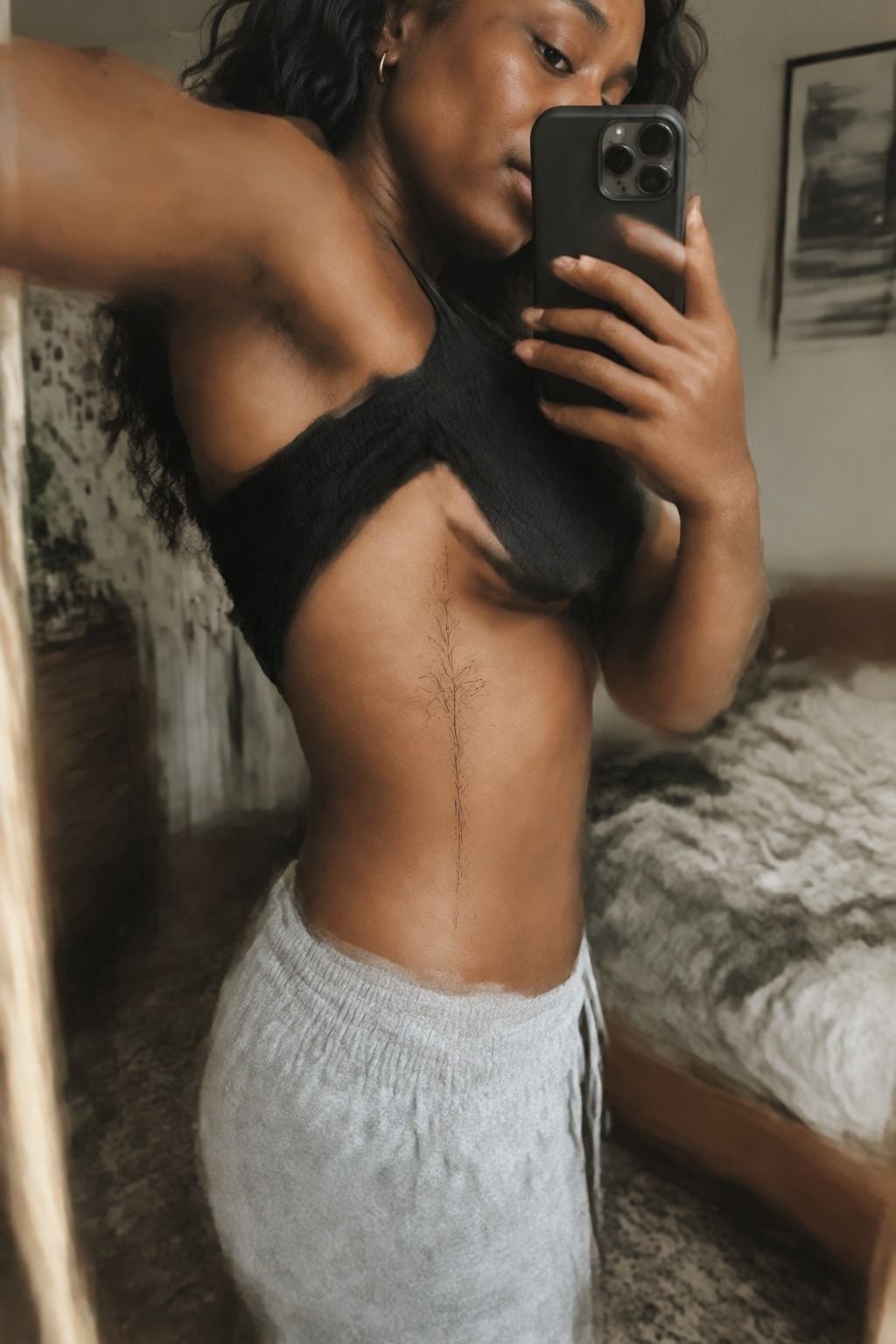
I photographed the finished tattoo in natural light several weeks after the appointment.
How Much It Cost
My appointment cost depended on the studio minimum and the artist’s rate, so I treated the budget as a range rather than pretending every fine line tattoo has one universal price. In the US, a boutique minimum commonly falls around $50 to $100, while hourly rates often sit near $100 to $250.
I asked for the appointment quote before the appointment, including whether the consultation and stencil work were covered. You should ask the same questions, especially if your design includes several revisions. A lower price isn’t useful if the artist doesn’t specialize in crisp, healed linework.
My budget went toward the artist’s portfolio and careful placement rather than extra detail. I skipped the second symbol, reduced the number of leaves, and kept the session focused.
That choice made the piece feel refined, not underdeveloped. For more design references, I browsed this fine line tattoo collection.
I also compared the quote with the artist’s healed work, not only with fresh photographs. A polished portfolio should show consistent lines at the scale you want. The artist’s approach matters more than chasing the lowest number.
The Botanical Thread Rule
I used to think a fine line tattoo became meaningful when it contained enough symbols. My experience changed that opinion. One botanical stem, one hidden star, and one carefully chosen curve said more than the crowded version I first brought to the studio.
The strongest tattoos I’ve seen have a clear visual sentence. The line begins somewhere, moves with intention, and ends before the design loses its breath.
That doesn’t mean every piece should be minimal. It means every mark should earn its place.
Your style might be vintage, gritty, playful, or classic. Mine ended up understated, but the same rule applies to a daring or ornate design. Clarity matters more than the number of elements.
I also learned that a personal tattoo doesn’t need to explain itself to strangers. People sometimes notice mine only after we’ve been talking for a while.
That delay makes the experience feel more personal. I don’t need a caption attached to my wrist.
If you’re choosing between a floral and a symbol, ask which one you’ll still recognize emotionally after the trend moves on. I wouldn’t choose the most complicated sketch simply because it photographs well. I chose the one that still felt true when the paper was plain and the ink was absent.
The tattoo healed crisp because the concept, placement, line weight, and aftercare supported one another. Together, they made the final piece feel powerful, polished, and genuinely mine.
That combination is more valuable than a larger design with no emotional center. You can explore related fine line tattoo ideas if you’re still comparing directions.
I also saved this geometric tattoo ideas guide for a future design, but I wouldn’t combine every reference into one appointment. A focused concept usually has a more iconic result.
The Questions I Get Asked Most
How much does a Feminine Fine Line Tattoo usually cost?
A feminine fine line tattoo often costs about $100 to $300 in the US, depending on size, placement, artist, and region. Some studios charge a $50 to $100 minimum, while hourly rates may run $100 to $250. I’d value a portfolio of healed work more than the lowest quote.
Are Feminine Fine Line Tattoos a good idea for a first tattoo?
Yes, they can be a thoughtful first tattoo because smaller placements such as the forearm, thigh, or shoulder are often more tolerable. I’d choose a subject that feels meaningful and review healed examples before booking. Clean linework and sensible placement give first-timers a calmer starting point.
How do I choose an artist for a Feminine Fine Line Tattoo?
Look for a portfolio with healed photographs, consistent line weight, and designs close to your preferred scale. I’d ask about hygiene, stencil revisions, and aftercare. A specialist should show both fresh and healed work, especially in this guide to fine line tattoo placement.
How much do Feminine Fine Line Tattoos hurt?
Pain varies by person and placement. Ribs, feet, hands, and the sternum can feel more intense, while the forearm, thigh, and shoulder are often more tolerable.
My wrist pain felt like a sharp, brief sting rather than sustained discomfort. Good preparation helps!
How long does a Feminine Fine Line Tattoo take to heal?
The surface usually heals in about two to three weeks, while complete healing can take roughly two to three months. I washed gently, moisturized as directed, and avoided swimming and strong sun during early healing.
Patience protects delicate lines while the skin settles. This fine line tattoo needles and longevity guide was useful when I wanted a clearer timeline.
What’s the best placement for Feminine Fine Line Tattoos?
The forearm, thigh, and shoulder are practical choices because they tend to be more tolerable and offer readable space. Wrists and ankles can look dainty, but movement and friction matter. I’d choose long-term placement by visibility, pain, and line stability, not only by the reference I saved.
Where I’d Start First
If I had to pick one, I’d start with the dainty botanical wrist design. Its curved stem follows the anatomy, and the open space keeps every leaf readable as the ink settles.
Save your favorite references, ask for healed examples, and let the stencil sit before you commit. The pause is worth it. I did one thing differently from my first impulse: I chose the tattoo that still felt meaningful after all the excitement had faded.