The neda tattoo is one of the most recognized recovery symbols in the mental health tattoo community. It represents strength, hope, and a commitment to healing from an eating disorder. It’s not decorative filler. Every person wearing it earned it.
NEDA stands for the National Eating Disorders Association. The logo itself is a flowing curved line that reads as both a human body in motion and a heart. Tattooed on skin, that shape carries a lot of weight. Here’s what it actually means and how to wear it right.
What the NEDA Symbol Actually Means
The NEDA logo is two fluid lines forming a silhouette that doubles as a heart shape. That dual reading is intentional. It ties together body acceptance and self-love in one clean mark. When someone tattoos this on their body, they’re saying they made a choice to fight, and they’re keeping that choice visible every single day.
For a lot of people, it functions the way the semicolon tattoo does in the broader mental health space. It’s a permanent reminder that the story isn’t over. Recovery isn’t linear, and having this symbol somewhere you can see it on a hard day is the whole point.
Historical and Cultural Background
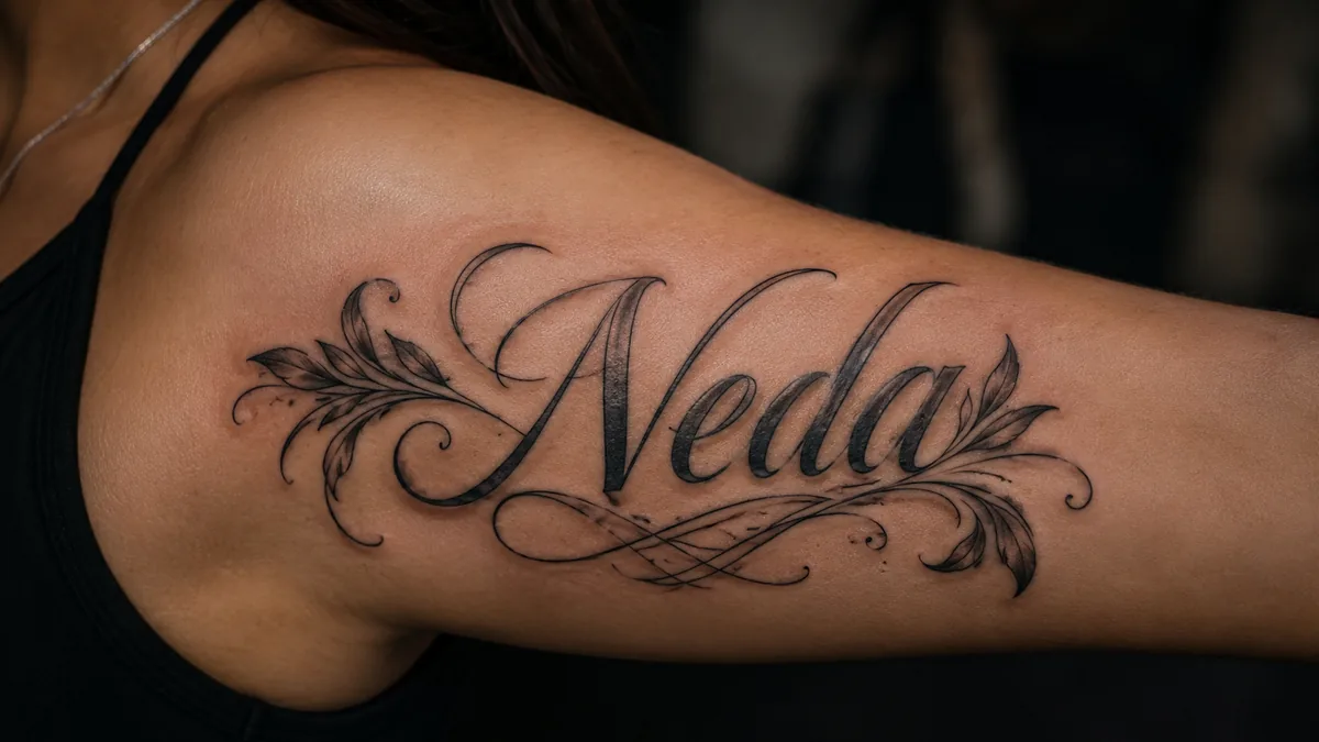
Her name means voice. The tattoo means you haven't stopped listening.
The National Eating Disorders Association has been using this logo since the early 2000s as a brand mark for awareness campaigns. Over time, the community adopted it as a grassroots recovery symbol, way beyond the organization’s official materials. It spread through recovery forums, social media, and word of mouth between people in treatment.
There’s no ancient or cultural mythology attached to it. It’s modern, community-driven, and that’s exactly why it feels honest. It means what the people wearing it say it means, and that meaning has been remarkably consistent: resilience, healing, and the choice to keep going.
Who Gets This Tattoo and Why
Most people getting a neda tattoo are marking a milestone. Leaving inpatient treatment, hitting an anniversary of choosing recovery, or just reaching a point where they want something permanent to hold onto when things get rough. Some get it to honor a friend or family member who struggled or didn’t survive their eating disorder.
Others wear it as quiet solidarity. They want to be recognizable to someone else in the community without announcing their history to every stranger in the room. It’s a handshake between people who’ve been through it. Fine line, small, tucked on the inner wrist, it reads as nothing to most people and everything to the right ones.
Popular Design Variations
The baseline is always that curved NEDA logo. From there, artists add layers. The most common additions are script, a single word like ‘enough,’ ‘free,’ or a recovery date dropped beneath the symbol in clean typewriter or serif font. Botanical elements are huge too, butterflies for transformation, wildflowers for growth, a simple stem or leaf alongside the curve.
Some people embed the NEDA shape into a larger composition, a wave, a vine, a constellation. Done right, the symbol blends in and only reads to people who already know what they’re looking at. That semi-hidden approach is popular with people who want personal meaning without wearing their medical history on their sleeve, literally.
Style Choices: Fine Line vs. Bold
Fine line single-needle work is the dominant style for neda tattoos. The symbol is small, the lines are delicate, and that whisper-quiet aesthetic fits the intimacy of the meaning. A skilled fine line artist can get the NEDA curve crispy and clean at two to three centimeters. It heals nice if you take care of it and stay out of the sun.
Black and grey with soft whip shading works well when you’re building a bigger composition, say a floral sleeve element or a forearm piece with botanical detail. Watercolor washes in blue, teal, or purple behind a solid black outline have been popular too. Just keep the outlines solid. Watercolor without a strong black base fades fast and gets muddy over time.
Best Placements and How It Ages
Inner wrist is the classic placement, and for good reason. You see it constantly, which is exactly the point. It’s a relatively low-wear area if you’re not constantly rubbing it against rough surfaces. Fine line work here can hold for years with proper sun protection. The inner forearm, running vertically toward the elbow, gives you room to build a longer composition with script or botanicals without crowding anything.
Avoid the side of the hand and finger placements. High friction, constant flex, and thin skin mean blowout risk and fast fading. Ribs and collarbone are spicy pain-wise but give a larger canvas if you want something more elaborate. For small fine line work, the wrist and inner arm are the safest bets for longevity. Bold will hold wherever you put it, but fine line needs a calmer spot to stay crisp.
Making It Personal Without Losing the Meaning
The NEDA symbol is recognizable enough that you don’t need to explain it. But you can personalize the surrounding design to tell your specific story. A birth flower for the month you committed to recovery. A star or moon for the nights that felt impossible. Your own handwriting or a loved one’s handwriting for a word that matters to you.
Talk to your artist about what that extra detail means before they sketch anything. A good tattoo artist isn’t just executing a logo, they’re helping you build something you’ll wear every day for the rest of your life. Come in with reference images, a clear idea of the mood you want, and trust that the placement and scale decisions your artist recommends are going to affect how the piece reads and ages.

